Who Owns Uncle Sam’s IOUs


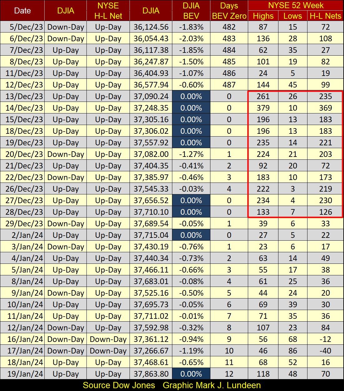
The Dow Jones closed the week at a new all-time high. This wasn’t its first, since the 12th of December, the Dow Jones has been rising to new all-time highs, or BEV Zeros in the Bear’s Eye View chart below (Red Circle). In this advance into market history, so far, the Dow Jones has made nine BEV Zeros, and since November 17th (two months now), the Dow Jones has daily closed either at a BEV Zero, or in scoring position; BEV values from -0.01% to -4.99%.
Why would this range of BEV values be called “scoring position?” Look at the BEV chart below for the Trump and the Not QE#4 Rallies. These were major advances in the Dow Jones, though in a BEV chart, every new all-time high is clipped at 0.0%, and never more. Both these rallies lasted over a year, and as they advanced, the Dow Jones daily closed either at a BEV Zero, or in scoring position, where the Dow Jones rested between new all-time highs.
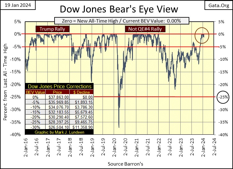
Looking at the frequency distribution tables below of BEV values for the Dow Jones during these rallies above, we view two big market advances in the above BEV plot. I’ve given the percentage advance of these rallies, but these gains only show how far the Dow Jones advanced, after it first came into scoring position, to these advances’ Terminal Zero, or last BEV Zero of an advance.
In the freq tables below, rows;
- 0% = daily closes at new all-time highs,
- -0.0001% = daily closings in scoring position (-0.01% to -4.99%).
During the Trump Rally, while the Dow Jones was making new all-time highs, it made 108 BEV Zeros, new all-time highs for 26.47% of the daily closes between 28 June 2016 to 08 February 2018. And during this market advance, the Dow Jones closed in scoring position in 296 days, or 72.55% of the daily closes during this 408-day advance.
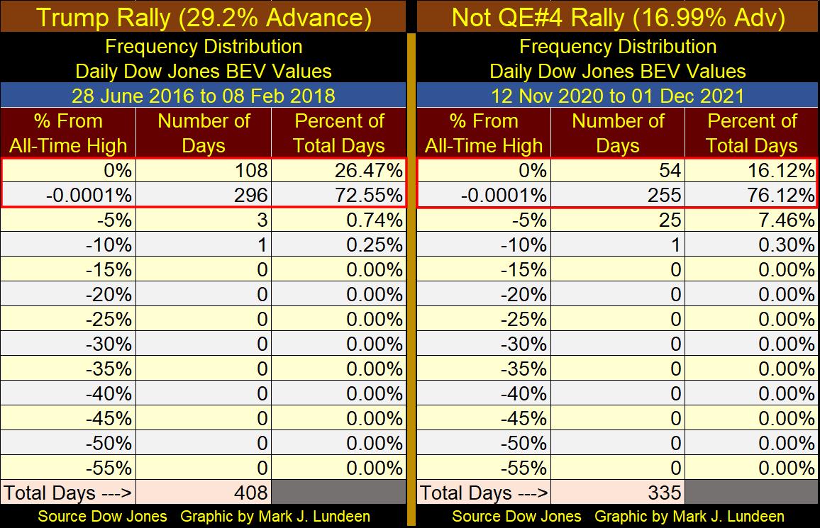
I’m not going to comment on the Not QE#4 Advance. But the data is there for my readers to review.
This week, it’s not only the Dow Jones making market history. In the table below, the major market indexes I follow are once again making BEV Zeros. At the close of the week, five major market indexes closed the week at a new all-time high, and the next seven (#6 to #12) closed the week in scoring position.
Hey, isn’t that darn bullish? Considering that making money requires a successful investor to buy at market bottoms, and sell at market tops, this seems more like a time to sell, than a time to buy.
In the anticipated future market decline, when in the table below, the best performing market index (#1) closes the week with a BEV value of -45%, a 45% decline from its last all-time high, I’d then say it was time to begin looking for a reason to buy something in the stock market. But until then, I’m not interested in the stock market, except for the gold and silver miners in the XAU, way down there at #21, which closed the week over 50% below its last all-time high of April 2011.
Thirteen years is a long time for a major market index, the XAU to be in Mr Bear’s penalty box. When the XAU, and the general precious-metals mining and exploration complex finally breaks out, and begins rising to a new BEV Zero in this table, it should be a sight to behold. This will be especially so for those who purchased these mining and exploration shares at their current low, greatly deflated prices.
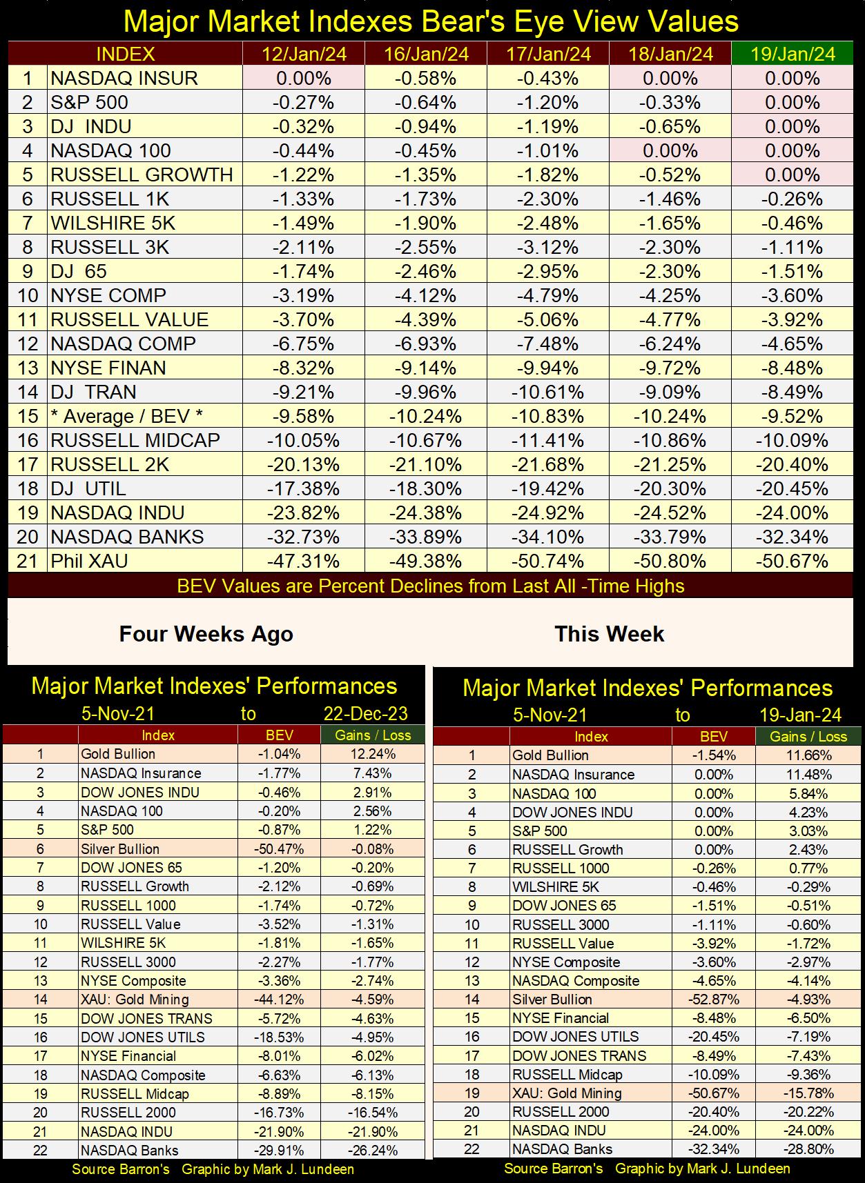
In the performance tables above, from four weeks ago gold remains at the top of the table, but some of the major market indexes are finally catching up with it. Silver bullion slipped down from #6 to #14, and the XAU slipped from #14 down to #19.
So, how can I remain so bullish on gold and silver assets? I’m just being disciplined in my approach to the market. If one makes money buying at a bottom, the place to be in January 2024 is in gold, silver and the precious metals mining stocks. If one locks in profits by selling at a market top, now is the time to exit the stock market.
Being disciplined, as opposed to allowing one’s emotions to decide when to buy and sell, though at times difficult, even frustrating, ultimately is the best approach to investing. Though I admit, being bullish on gold and silver bullion, and their mining shares, have for many years been vexing. It’s time for the gold and silver show to get on the road, but I’m not holding my breath until it does.
Next is the Dow Jones in daily bars. For the past month, the Dow Jones has been range bound, trading above and below 37,500. If this week’s break out is real, in the weeks to come the Dow Jones will be breaking above 38,000 and 38,500. Will it? At this point, I’m strictly a market commentator, sitting in the market’s peanut gallery. I’ll leave the market prognostication to the “professionals.”
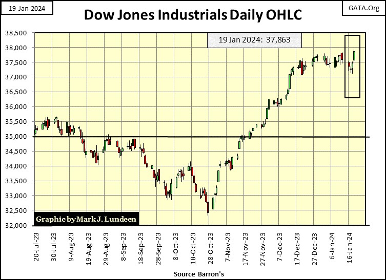
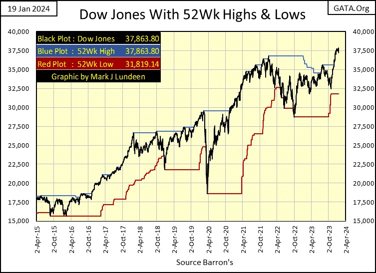
As the Dow Jones is making new 52Wk Highs, let’s look at it with its 52Wk High and Low lines in the chart below. This chart looks good, which isn’t the same as saying this chart gives us a reason to buy.
Dow Jones above 40,000 by June of next summer? That would be a BIG advance of 5.64% from this week’s close. Damn right the Dow Jones could move up by 5.64% in the next five months. However, what bothers me is the potential of it closing below 30,290 in the next five months, a greater than 20% deflation in the valuation of the Dow Jones from this week’s close.
I’m not making any predictions for the Dow Jones. In January 2024; Dow Jones above 40,000 or below 30,000 by next June is all the same to me, as I’m out of this market. But just looking at the world around us, I’m more inclined believing it will be Dow Jones will be down big by June;
- the banks are a mess,
- the deep state continues pushing the world to war with Russia and Iran,
- the national debt has become obscene,
- our money has turned into s**t, a dollar doesn’t buy much anymore, and will buy much less tomorrow,
- the economy is turning down.
- Etc, etc, etc.
Currently, even with the major market indexes now beginning to register new all-time highs in their table above, this is not the environment that will nurture a market advance for long. So, I’m out, and I’m staying out of the stock market. If you simply must buy something, then buy something cheap; like gold and silver bullion and the precious metal mining shares. I still like Eskay Mining as an exploration speculation.
Let’s look NYSE 52 Week Highs – 52 Week Low nets in the table below. The Dow Jones saw its first BEV Zero (0.00% = New All-Time High) since 04 January 2022 on 13 December of 2023. The first in almost two years, or 487 NYSE trading sessions, as seen in the Day’s BEV Zero column. Since then, the Dow Jones has made nine new BEV Zeros, including today’s so far.
Note; these BEV Zeros happened as NYSE 52Wk Highs began increasing (inside Red Box). Also, as the NYSE began seeing a falloff in 52Wk Highs, the Dow Jones ceased seeing additional BEV Zeros. That was until this week’s close BEV Zero, which happened with a NYSE 52Wk H-L Net of only +70. Meaning the Dow Jones may be seeing new 52Wk Highs, but most issues trading at the NYSE aren’t coming along for the ride.
It’s a fair assumption the Dow Jones isn’t going to see many additional BEV Zeros, unless the NYSE also sees a pickup in 52Wk Highs. Will it? Like me, we are all going to have to wait to see.
But will it? Maybe yes, and maybe no. I don’t really care, as we are at a market top, and market tops offer investors, people risking their hard-earned money hoping for some capital gains, nothing but grief.
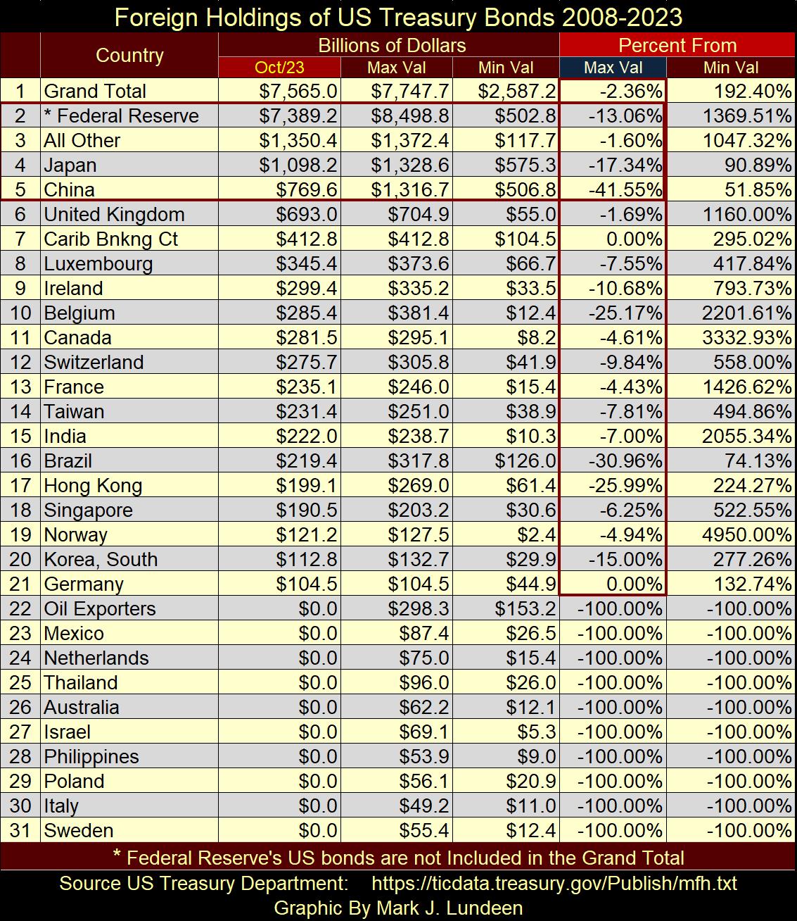
Let’s look at foreign holdings of US Treasury Debt, data from the US Treasury.
https://ticdata.treasury.gov/resource-center/data-chart-center/tic/Documents/slt_table5.html
I don’t know exactly what this data is. Are these holdings of T-debt held by the governments themselves, their central banks, private sector money managers operating within these countries, or all of the above? I don’t know. Also, is the data reporting market value of these T-bonds, or their face value. I believe the Treasury is reporting the face value of these portfolios.
The number of countries listed in this data set continues growing shorter. Last autumn (my last update for my file) the US Treasury listed the holdings of 27 countries. Now in January the list has been reduced to 17, as seen in the table below. It is what it is, and what it is, is seen in the table below, below the next two charts.
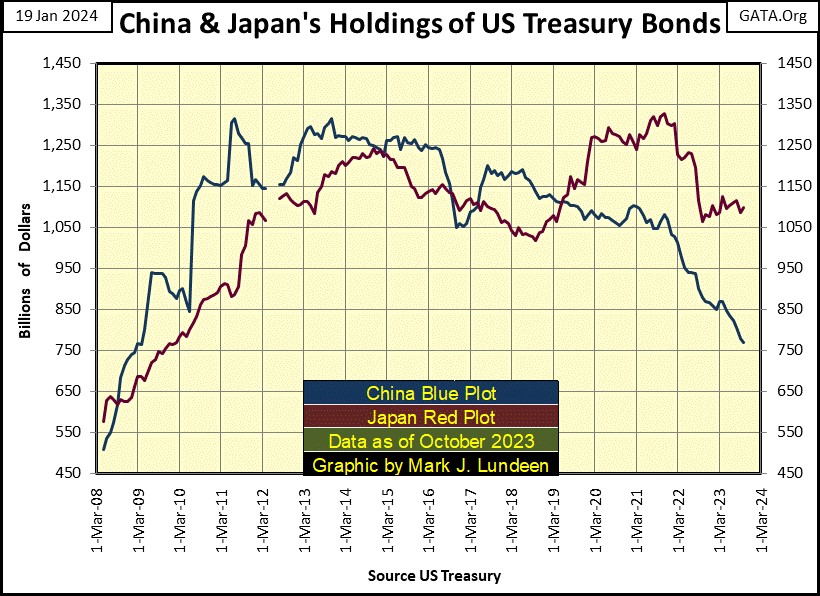
Let’s start off with a chart of the two largest holders of US T-debt in the Treasury’s data set; China (Blue Plot below) and Japan (Red Plot), from May 2008 to October 2023. Like everybody else, in the aftermath of the sub-prime mortgage debacle (2008 to 2011), both China and Japan began buying US Treasury Debt in volume, no doubt to “stabilize the global market place.”
China’s holdings peaked in 2011, and for the most part, remained stable until 2022. However, in the past two years China has reduced its exposure to the T-Bond market. As of October 2023 (latest data), China has reduced its holdings of T-debt by 41.55% from its peak holding (see table below).
That seems significant. Is China reducing their exposure due to concerns of the bear market in T-debt, or for fear of having the US Government freeze its holdings of T-debt should they invade Taiwan, or maybe both?
Japan didn’t see its holdings of T-debt peak until 2021. Though Japan has sold off some of its T-debt (down by 17.34% as of October 2023). I doubt Japan is planning to reduce their holdings of T-debt by a big 41% anytime soon, as China has, and most likely will continue to do in the future.
The next chart includes data from the Federal Reserve (Green Plot / FOMC). The data from the Federal Reserve *Is Not * included in the Treasury’s data set, but I have it, so I use it.
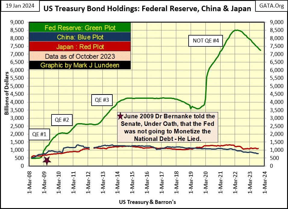
Since May of 2022, to October 2023, the idiots at the FOMC have sold off 13.06% of their holdings of T-debt via their current QT, or so we are told. On a percentage basis, that is less than Japan’s reduction in T-debt. But on a dollar basis, that is a reduction of a whopping $1,109.65 billion dollars of Treasury debt Treasury market had to absorb from the FOMC’s QT.
Keep in mind in the table below, data for the Federal Reserve (#2) is not included in the Treasury’s data set, and so not included in the Grand Total (#1). So, we can add the values for #1&2 together, understanding this table is examining who owns $14.954 trillion dollars of last October’s US National Debt of $33.675 trillion dollars, or 44.4% of the national debt. Knowing that makes me wonder; who owns the other 66.6% of the national debt?
The key column in the table below, is the “Max Val” (Blue Tab), beneath the Red Tab “Percent From,” on the table’s right, listing the percent reduction these countries have seen from their peak holdings of Treasury Debt. This data is exactly like BEV data, where a 0.00% is a new all-time high, and anything not a new all-time high is the percent reduction from its last all-time high.
And who was at a new all-time high in their holdings of US Treasury debt as of last October?
- (#7) Caribbean Banking Center,
- (#21) Germany.
I only have the data published by the US Treasury, which omits many countries. I’d like to think there were other countries who last October increased their portfolio of Treasury Debt to a new all-time high. But if they had, they were smaller countries, not likely to hold as much Treasury debt as those listed at the top of this table. Now look at the Max Value column; except for Germany and the Caribbean Banks, everyone else is selling their Treasury debt, but to who?
Oh, one more thing on this table. The Grand Total (#1) and the All Others (#2) have seen a reduction of -2.36% and -1.60%. Is this possible with China and Japan’s large reduction of their holdings of Treasury debt, and all the other sellers seen below. Brings to my mind what Benjamin Disraeli said about statistics;
Looking at the flows of T-debt into the Treasury Bond market in the table below, a reduction of holdings by the FOMC, Japan and China added $1,484.05 billion ($1.484 Trillion) to the floor of the T-bond market that someone had to purchase – but who?
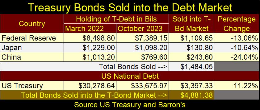
Then there is the US Treasury itself, bottom part of the table above, who since March 2022 added an additional $3,397.33 billion dollars of T-debt in the following nineteen months, financing the US Government’s spendthrift ways, as the US national debt increased from $30.278, to $33.675 trillion dollars.
In total, from March 2022, to October 2023, the Treasury Market had to absorb an additional $4,881.38 billion dollars ($4.881 trillion dollars) of supply as the FOMC, Japan and China sold off a good portion of their holdings of Treasury debt, as the US Treasury itself flooded the T-bond market with additional trillions of dollars of supply, during these nineteen months in the US Treasury’s data set. I ask again; who is buying this stuff?
I don’t know. Maybe idiots with access to other people’s money on a vast scale, or possibly, by someone who finally figured out how to get trees to grow money. Since the FOMC made it known that they were going to perform a QT to reduce their balance sheet in early 2022, buying Treasury debt has been a very unprofitable trade, making these buyers big losers. Since December 2021, the Treasury Market has seen yields rise, and prices fall significantly, as seen in the chart below.
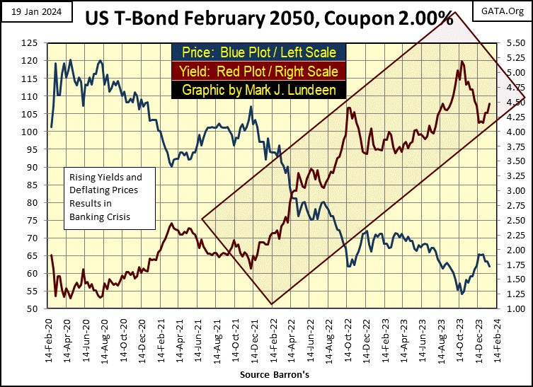
Looking at the trends in T-bond yields and prices above, ask yourself whether now is a time to buy or sell T-bonds?
Maybe the chart below plotting the Treasury’s long bond yields going back to 1952, is a better chart for determining an answer to that question. Looking at it, I’d say that T-bond yields bottomed in August 2020, and have been rising since. Buying, and then holding debt in a rising yield environment is a very poor choice for investors.
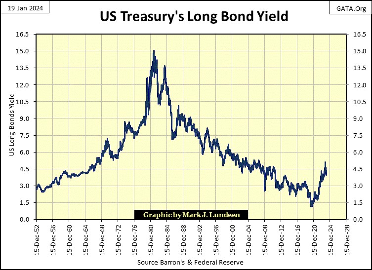
And knowing the idiots dictating “economic and monetary policy” for the United States and the world, who met this week at Davos Switzerland, for their annual World Economic Forum’s (WEF) get together, I wouldn’t be shocked seeing long-term T-bond yields at new all-time highs sometime in the next few years. As per the WEF itself, they want to “Build Back Better,” but before they can do that, they first have to destroy what is already here.
What else is to be expected from these globalists, who told the world that someday we’d all own nothing, but would be happy, and are currently working hard to achieve exactly that; poverty on a global scale.
Just one more reason to exit the stock and bond markets, and take a position in gold and silver assets.

The Dow Jones has been in scoring position since last November 20th. Gold has been in scoring position since last November 14th, a full week before the Dow Jones. Yet, since these two market series entered scoring position, the Dow Jones has made nine new BEV Zeros, while gold has seen only two BEV Zeros since mid-November.
You may ask; what is the difference between the stock market and gold? The stock market has powerful friends in high places, while gold is struggling with a gaggle of goons on the trading floor of the COMEX market. It’s as simple as that. But this too shall pass, and gold, as well as silver will have their day in the sun. When, 2024? Why not?
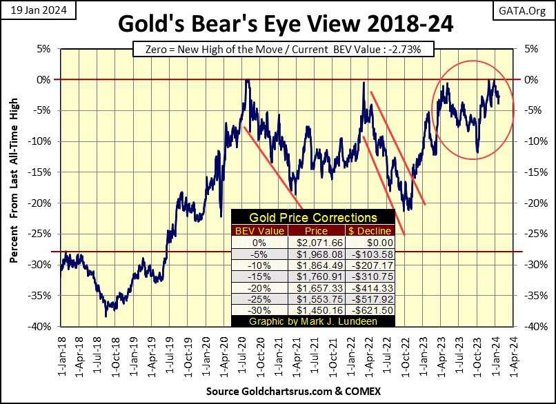
In their step sum tables below, gold is in one heck of a boring market. For the past two months it has remained in scoring position; -0.01% to -4.99% from its last all-time high in its BEV column. But for all that, its only seen two new all-time highs (0.00%), the first on December 1st. Gold’s daily volatility’s 200D M/A continues going down.
Gold is an emotional market, or is whenever big things are happening with the price of gold, either in a bull or bear market. Seeing its daily volatility decline from 0.64% down to 0.57% in the past month, tells me that currently, money in the financial markets for the most part is avoiding gold and silver.
I don’t expect much from gold until its daily volatility once again begins to rise to something above 1.00% in the table below – darn it!
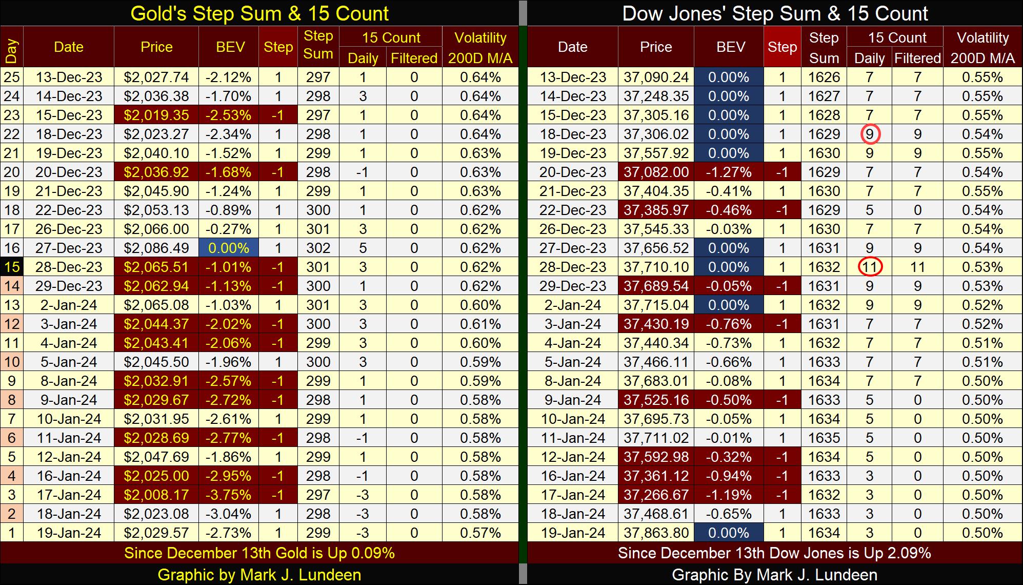
Look at all those BEV Zeros over on the Dow Jones side of the table. On December 28th, the Dow Jones’ 15-count saw a very rare +11, making the Dow Jones an extremely overbought market. Markets don’t like being extremely overbought, and typically sell off when they are. But in late December 2023, the Dow Jones decided to be different, selling off by only 1.19% from its last all-time high on January 17th, and then made a new BEV Zero only two days later.
Come on Mark, that is darn bullish market action! Okay, even I’m impressed with what the Dow Jones has done in its past twenty-five trading days seen above. But I must point out that trading volatility for the Dow Jones fell to only 0.50% at the close of this week, and such low trading volatility is a hallmark of a top in the stock market.
This has been especially so since Alan Greenspan became Primate Idiot at the FOMC in August 1987. In the chart below, had one sold when the Dow Jones’ daily volatility’s 200D M/A declined to 0.50%, and not come back in until volatility for the Dow Jones once again increased to something above 1.00%, they would have minimized capital losses, and maximized capital gains in no small way.
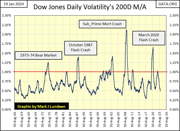
Looking at this chart above, I wonder how long before daily volatility for the Dow Jones once again begins to rise, as it always does when Mr Bear pays Wall Street a visit. Speaking for myself; I’m content just sitting in the market’s peanut gallery, waiting for a market bottom to become a buyer once again.
It goes without saying, I’m not talking about gold, and silver bullion and the precious metal mining shares.
Mark J. Lundeen
*********


