Why is the Precious Metals Complex Falling?


A subscriber asked me this week why the precious metals complex has been falling and if the charts could show the reason why. From the Chartology perspective it's really a no brainier why this sector has fallen on hard times.
Many of you may recall the bull market that occurred, in the stock markets, back in the 1990's which was a traders dream come true. During that time gold and the precious metals stocks were not even on my radar screen as I was too busy trading the tech stocks to even consider the precious metals sector. I couldn't tell you the price of gold or what a junior miner was. All I knew was that the action was in the tech stocks and that is all that mattered to me at the time. I know a lot of you folks were trading the precious metals stocks in the 90's and by looking at a long term chart for gold or the XAU, which has the most history, those were some lean years to say the least.
As the stock market finally topped out in 2000 the precious metals complex was bottoming. I didn't know it at the time that precious metals complex was going to be the trade of the decade as I didn't know anything about this out of favor sector. It was in the spring of 2002 that I just happened upon a long term chart for gold and I immediately seen the huge base that was being built, and from a Chartology perspective, that's all I needed to see. I started the process of learning all I could about this new sector that was so foreign to me. I started to look at some of the big cap precious metals stocks and liked what I seen. I still didn't know about the juniors yet but I quickly found out there could be some serious money made when I began to explore this sector.
The rest is history as they say. I traded the juniors exclusively, on the long side, until late last year when I began to notice some subtle changes being made in in the PM sector and also the stock markets. I was just as bullish on the precious metals complex as anyone else. I was expecting the latest consolidation pattern on gold to breakout to the upside and start the next impulse leg higher. I even did a post titled, All Hail the Queen, which I showed how I expected this next rally leg to unfold.
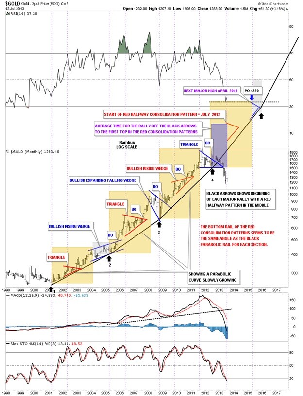
It was only a week or two after I posted that article that I began to see some things which you don't want to see when an impulse leg begins. The breakout of the little triangle kept stalling and failed to move out like all the other impulse legs did. Below is one of the charts that I used in the article, All Hail the Queen, that shows one of the most beautiful bull markets that a chartists could ever chart. As you can see each consolidation pattern broke out to the upside in an impulse move followed by another consolidation pattern. Note the last triangle at the top of the chart. At the time I thought this was going to be just another consolidation pattern followed by an impulse leg up just like all the rest. As you can see the top blue triangle did in fact breakout to the upside but there was no follow through. The longer it took for gold to make up its mind the more it began to look like a false breakout. I kept waiting for the backtest and then the move higher but the price action just drifted slowly down not creating any hysteria.
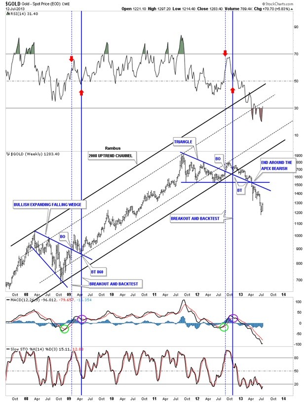
I posted this next chart to show my subscribers where to look for the backtest. The dashed blue lines shows the breakout and the solid blue line shows the backtest. As you can see everything looked fine at the backtest point on the chart that had the top blue rail of the triangle and the bottom rail of the 2008 uptrend that should hold support. It did for about 4 weeks or so when the price action started to break below the 2008 bottom rail of the uptrend channel. That was all I needed to see to know something was amiss. This is where following the price action can keep one out of trouble. The long trade was failing and an important support rail was being broken to the downside. As you can see there was one more backtest to the top blue rail of the triangle that could have saved the day but that was not going to happen. The apex of a triangle is a strong area of support or resistance depending on which way the stock is moving as all the energy is focused to that one point.. A break down through the apex of the blue triangle signaled bad news ahead. For me it signaled a top in place which was even hard for me to believe as I was a staunch gold bull. The charts don't lie it's just the interpretation of the chart is where most run into trouble.
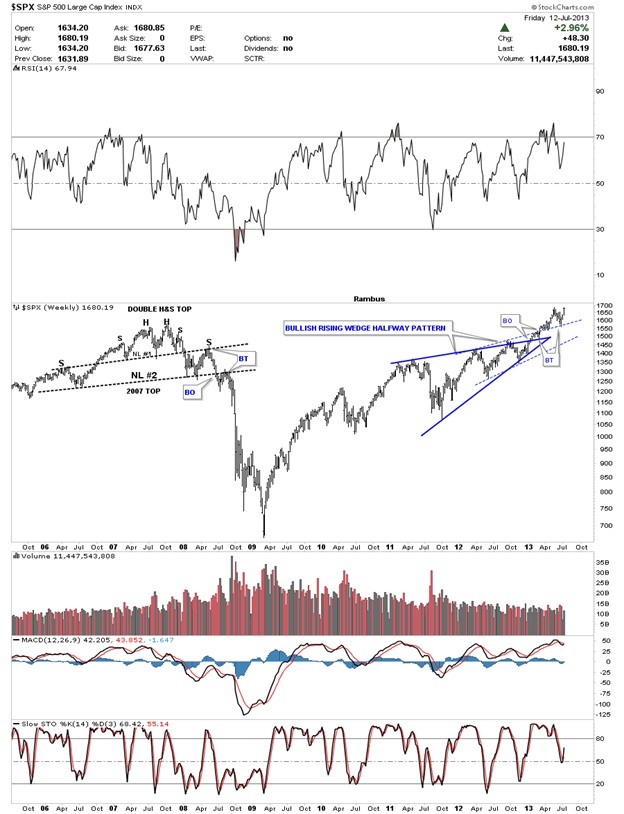
While gold was topping out in the fall of 2011 the SPX was just starting to build out a bullish rising wedge pattern that would lead to new all-time highs. All the experts said this was still a secular bear market in the SPX and that we would see another crash and burn scenario like in 2000 and 2008. Again, if you just follow the price action you don't have to worry about what all the experts are saying. You can see with your own two eyes what is happening. Below is a weekly chart for the SPX that shows the breakout and backtests of the bullish rising wedge. The SPX is right on the verge of making a new all-time high regardless of what is happening in the economy. It doesn't make any difference what the experts are saying, just look at the price action. That is the truth.
This next chart will answer any questions you may have on why the precious metals complex is in a bear market. If you are still holding your precious metals stocks hoping the bottom is in place and the next leg up is about to take off, this weekly ratio chart comparing the HUI to the SPX may give you a reason for concern. As you can see the HUI had been the place to be since it began its bull market in 2001. The HUI had outperformed the SPX handily until the HUI and gold topped out in 2011. That is the high on this ratio chart that began the steep decline for the precious metals complex. There is a massive topping pattern that has broken down below the bottom rail of the 5 point bearish expanding rising wedge reversal pattern. What this chart shows is that the breakout and backtest to the bottom blue rail in now complete. What the Chartology of this chart shows is that this ratio chart is going to start to accelerate to the downside meaning the SPX is going to outperform the HUI in a bigger way than has already happened. We are now entering the reverse symmetry portion of this chart that shows how this ratio went up is how it is going to unwind to the downside.
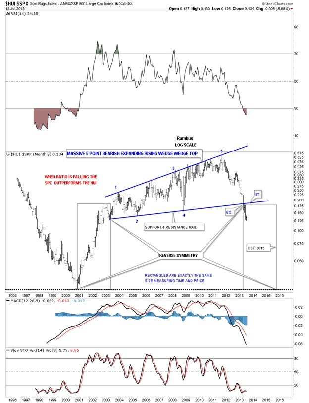
The chart above shows you why the precious metals complex is under pressure right now. Like the 1990's when the stocks markets were in a major bull market, the precious metals were weak, as money was flowing into the stock markets. The exact same thing is happening again today. Money is leaving the precious metals complex and is finding a better return in the stock markets. I know how hard it is for some folks to believe how the stock markets can go up, with everything you read and hear and how can the precious metals complex be under such severe pressure. It's in the charts folks. I don't make up these charts, investors do. I only interpret their behavior by following the price action and pay no attention to the so called experts. Clarity and perspective are a must when one puts their hard earned capital to work in the markets.
Editors Note:
Rambus Chartology is a Precious Metals Based Technical Analysis Site with a twist
"Give a Man a Chart and he can eat for a day : Teach a man To Chart and He will never Starve" More Info and Charts a http://rambus1.com/
 Meet Rambus, a seasoned trader and technical analyst renowned for his unbiased and insightful chart work. Through his website, Rambus Chartology, and Substack newsletter, Rambus shares his expertise with a global community of subscribers, providing daily updates, commentaries, and hands-on training in the art and science of chartology. With his calm, humble, and down-to-earth approach, Rambus demystifies complex market trends, helping his followers navigate the challenges of today's volatile markets. Join the Rambus Chartology community today and discover a unique blend of technical analysis, trading expertise, and time-tested protocols. Subscribe now at www.rambus1.com or https://rambuschartology.substack.com/


