Gold And Silver Markets Are Looking Up Stock And Bond Markets Are Looking Down
There is good reason to believe that gold and silver has just passed a historic low in their bull market correction. Here’s a chart comparing the 1982-2000 Dow Jones (Blue Plot) and NASDAQ Composite (Red Plot) bull markets (weeks 1 to 918) with the current bull market for gold (Green Plot) and silver (Black Plot) which have just concluded their week 648 & 608. But as a matter of convenience, I’ll assume that both gold and silver have just seen Wk 648 in their bull markets as I go on.
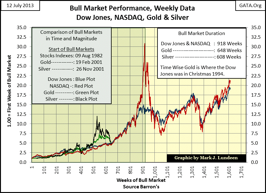
Gold and silver’s bull market gains from Wk 1 to Wk 500 were very much in-line with what the Dow Jones and NASDAQ delivered investors in their first 500 weeks (10 years) no matter what the financial media reported on the precious metals at the time. Then beginning with Wk 501 (September 2010), the price gains in the metals soon outperformed those of the Dow Jones and NASDAQ by a good measure. At the time I was very optimistic that gold and silver were entering into a phase of tremendous appreciation, which was true until April 2011 for silver and August 2011 for gold. Since then silver saw a price correction of 62% from its highs and the price of gold declined 36%. Ouch!
I know that doesn’t sound good, but true bull markets go on for a long time, with price corrections within them that can go on for years. The 1982-2000 stock bull market lasted 919 weeks, and it too had trying times that tested the resolve of its bulls for years. So far the gold and silver bull markets have seen 648 weeks. When we look at Wk 648 for the various bull markets plotted above, gold and silver has actually equaled or outperformed the Dow Jones and NASDAQ Composite index in their Wk 648 (December 1994) as we see in the table below.
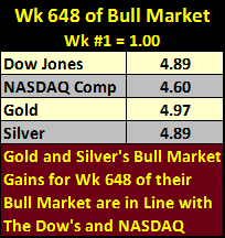
So in fact, anyone who purchased their gold and silver from 2001 to 2010, and held it until Wk 648 (12 July 2013), has made an equal, or even a slightly better profit than the Dow Jones and NASDAQ Composite delivered to investors from 1982 to 1994. Who in December 1994 was complaining about the NASDAQ? No one! But since 2001 there exists an entire industry in the English speaking world that does little but find fault with gold and silver. Because of this, most investors to this day have little respect for precious metals investments. This tells us that the bulk of metals bull market’s potential appreciation and possibly also their duration is still to come.
If gold and silver are in a bear market, which I don’t believe for a moment, then we’ll continue seeing them decline in price. But given all the information on the global demand for precious metals coming from the friends of GATA (the Gold Antitrust Action Committee), precious metals experts that are mostly ignored by the main-stream media, a fair minded person has to wonder why gold, silver and the mining shares have had such a difficult time since 2011 to the present. But here is a fact that I find fascinating; the general-stock market did no better for investors than have gold and silver in their first 648 weeks of their bull markets, as is obvious in the chart and table above.
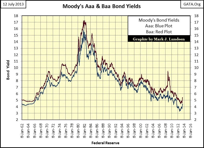
In the near future, I expect seeing the green and black plots for gold and silver to bounce off of the blue and red plots for the Dow Jones and NASDAQ in a significant fashion. I’m comfortable saying that as bond yields have been rising since last summer, as we see in my next chart. They should have been rising for over a decade. Simple logic tells us that although the current monetary and financial systems ability to create debt is infinite, the ability of governments, corporations and individuals to service their debt is not. Here is why Doctor Bernanke has declared war on “deflation”, the entire world is deeply indebted to the American banking system, and he intends to keep it that way.
Today’s debt load on the global economy is historic. If the economy was left to its own devices, free from the interference of central banks and governments, much of the current debt would have already been written off. The credit crisis began this process with US mortgages in 2008, but then the Federal Reserve began monetizing toxic home-loans, temporarily halting the market cleansing itself of unviable assets. This liquidation of unviable debt would have been immensely painful as ever dollar of debt default is also a dollar of asset removed from the financial system. We would see trillions of dollars of assets held by pension funds, insurance companies, local governments and private citizens just disappear in the process.
Wealth today is a fragile thing. The realization of this will prove to be the biggest allure of gold and silver; as they are assets with no counterparty risks. As interest rates, bond yields and bankruptcies continue to rise, a point will be reached when the general public will be forced to see this reality. This will be the point where the bull markets in gold, silver and mining shares will enter their blow-off phase, and we are not there yet.
Here’s the spread between these two yields. Seeing a large difference between Moody’s Aaa and Baa yields below indicates the bond market is in distress, as was the case in 1981-3 and 2008-09. If you can believe this bond yield spread since 2009, things are much improved today. But are they really?
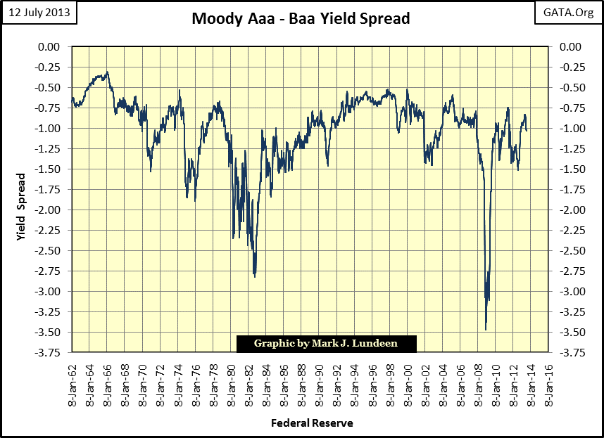
I don’t believe this data actually depicts the reality of our current situation, and neither do people in a position to know better. Every now and then these people actually speak the truth to the media. Here are a few quotes from the past I’ve kept. The first informs us exactly why the stock and bond markets recovered after 2009.
“Don’t overlook a global central bank community that’s intent on keeping liquidity flowing into the system. If we learned anything from 2008, it’s that liquidity is the key variable. Liquidity flowing into the system cures a world of ills.”
- Mitchell Stapley, the chief fixed-income officer at Fifth Third Asset Management
The corporate bond market (stock market too) recovered after the credit crisis not because of free markets, rising profits from corporate operations and an increase in the general prosperity of society, but because of manipulated markets financed by massive central bank operations. It’s been very good for the few, but most people have not done so well by the “policy makers.”
"We've made rich people richer. This is great for the Buffetts and for others who can take advantage of this multiple of great money and cheap money that's been available. The question is, what have we done for the working men and women of America? Right now, (companies are) using cheap money to buy back their stock, pay extra dividends, etc. etc. We all know what is going on."
- Richard Fisher, Dallas Fed President, 5/20/2013
In other words, as per Mr. Fisher of the Dallas Fed, the increasing valuations in the stock market, record earnings and dividends payouts are only monetary phenomena. “We all know what is going on”, he said this only a few weeks ago. So, market metrics in July 2013 are only as real as Doctor Bernanke’s “policy” can make them appear to the general public. Thinking people know that whatever Federal Reserve officials share with the public on matters related to the market is tainted with self-interest for the Federal Reserve and the banking system it serves, and is seldom questioned by the media. Confessions like the one below are reported on briefly, and then allowed to slip from media’s collective memory.
"Now that I am out of government, I can tell you what I really believe. Central banks are now so heavily influencing asset prices that investors are unable to ascertain market values. This influence is especially evident, with the Fed's purchase of government bonds, which has made it impossible for investors to use bond prices to learn anything about markets.
- Kevin M. Warsh: Former Federal Reserve Governor. Comments made to the Stanford University Institute for Economic Policy Research, 25 Jan 2012.
So, pick your favorite debt market; muni, Treasury or corporate; the same goes for the stock and housing markets, they are all over priced thanks to political intervention by central banks like the Federal Reserve. These monetary machinations in the markets have gone on for decades. I expect the coming rise in bond yields to be stunning when reality finally overcomes the best efforts of central bankers to fight “deflation” and maintain “market stability.”
This will be especially so for those people who in the past depended on interest income from CDs and other savings instruments offered by local banks. Barron’s latest published rate for a bank’s money market is only 0.11%. If you’re willing to lock your money in for 30 months, the banks will pay you 0.36%. This is a far cry from the income banks used to pay savers before Doctor Bernanke began strip-mining the elderly’s life-savings for the benefit of the high-yield bond market. A million dollars in a CD yielding 5% used to return $50,000 a year to savers. As we see in the table below, that is not true anymore, and Doctor Bernanke’s “zero interest rate policy” is responsible for this loss of income to savers.
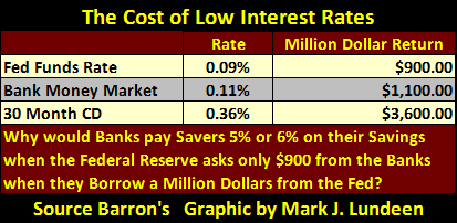
The banks are telling savers they don’t want their money anymore, and why would they when they can borrow all the money they want from the Federal Reserve at 0.09%. Grandma is never going to undercut Doctor Bernanke when it comes to lending money to Wall Street! So, since the credit crisis, when the Federal Reserve began its zero interest rate policy for the inter-bank Fed Funds market, former savers have become the dumb money in the high-risk bond market. They have no choice if they want to replace the 4-6% income they used to receive from government insured savings. Go back again to the chart plotting Moody’s Aaa and Baa bond yields. They are near historic lows, meaning that Aaa and Baa bond prices are near historic highs. When these bond yields once again go up in earnest, it will be all pain and no gain for Grandma. But we all do what we can to save the banks.
The Dow Jones did well this week. It saw new all-time highs on both Thursday and Friday of this week.
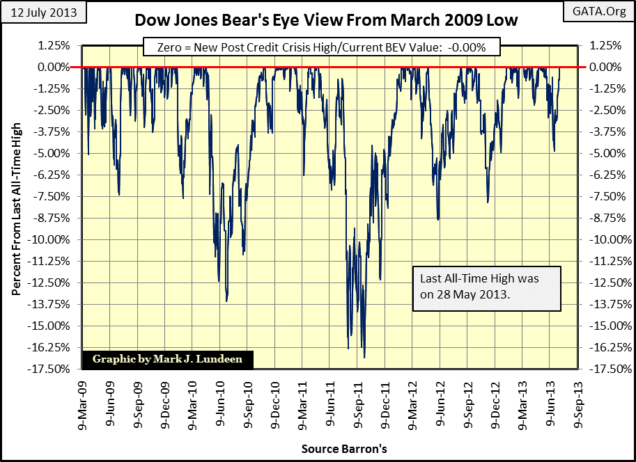
But when we look at the stock market as a whole, it becomes apparent that not every Dow Jones all-time highs Jones are created equal. After all, the Dow Jones consists of only thirty mature blue-chip stocks, while the NYSE has over 3100 stocks listed, and the NASDAQ has over 2500. In an article I published in late May, just a few weeks ago, I included the chart below showing the number of industry groups in the Dow Jones Total Market Groups (DJTMG) that saw a new all-time high along with the Dow Jones this May. In Barron’s May 20th issue (using Friday May 17th end of week data), the Dow Jones saw a new all-time high, as did thirty of the seventy-four groups in the DJTMG.
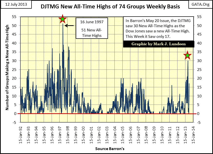
This was something not seen since the late 1990s when Alan Greenspan could, and did create buying panics in the stock market by mumbling total nonsense on CNBC. This data peaked in Barron’s 16 June 1997 issue, when an all-time high for the Dow Jones (7,782.04) took 51 of the 74 groups with it to an all-time high. I suspect Greenspan said something when this massive spike in all-time highs happened sixteen years ago. It’s important to note that while the Dow Jones in June 1997 still had two and a half years of new all-time highs and 3,400 additional points coming its way before its ultimate January 2000 bull market peak; as the bull market approached it end point, fewer groups in the DJTMG joined the all-time high parties with the Dow Jones.
Returning to July 2013, we see how this Friday’s Dow Jones all-time high saw only seventeen new all-time highs in the DJTMG. This is only about half the number of groups that made all-time highs with the Dow Jones just a few weeks ago. I expect this to be a trend, where the Dow Jones may go on to new all-time highs, but with fewer and fewer industry groups joining in the party. That is until the Dow Jones too resumes its bear market.
Now why must I always be so negative when the stock market is doing so good? Well, go back and read those three quotes I have above by two Fed officials and a Wall Street money manager. Nothing has changed since these people have gone on the record. I also keep in mind the fact that most people live for today; where the past doesn’t matter much and the future is generally ignored. However, I’m one of those strange people who hungers for any historical link from the past that might contain clues for the future.
A favorite historical data series of mine is Electrical Power Consumption (EP).

EP is used everywhere in the economy, except in abandoned factories and darken unsold homes and foreclosed condominiums. Also, EP is the best indicator of economic activities as it is measured in kilowatts, an unchanging engineering unit of measurement. Most of today’s news making statistics are based on debt backed dollars, which today are only the tools of “policy” for academics, bankers and politicians.
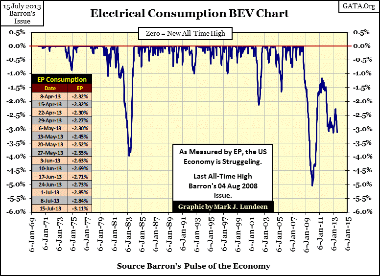
Moving on to EP’s Bear’s Eye View chart below, this week finds American electrical power consumption -3.11% below its last all-time high of August 2008. And EP has taken a twisted path over the past five years to get where it is today. One thing is certain, since the beginning of the credit crisis something continues to suppress real economic growth in the United States.
To see exactly how unique our current economic situation is today, let’s look at the data going back to 1930.
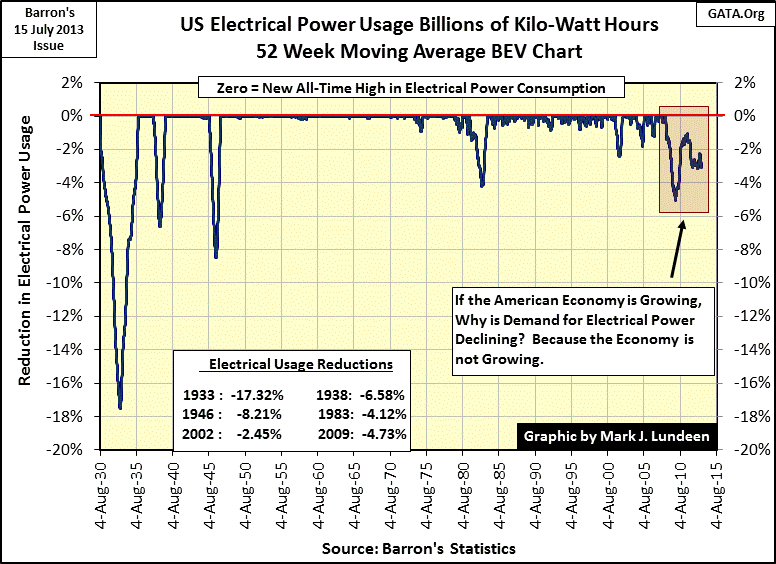
A good example of what deflating debt (writing bad-debt off) can do to economic activity is seen in EP’s 1933 -17% bottom, when Mr Bear finally finished taking out the financial-trash Wall Street created during the Roaring 1920s. I expect a similar or deeper decline in EP will occur before Mr Bear is finished with us too.
But look at the difference between our current decline in EP and EP’s past declines. Before 2008, the big declines in EP went down, bottomed, and then turned around to go on to a new all-time high. The bad times were over in a few years. But within the red box above, containing our current contraction in EP, it’s not like that at all. We see the drama of Doctor Bernanke and the entire US financial establishment opposing the forces of deflation from August 2008 to March 2009, forcing the economy back up until February 2011, where the massive weight of unviable debt once again pressed down on their unsteady arms to the present day. What is happening today in EP is absolutely fascinating, and I suspect provides the most accurate picture of what is actually occurring in the economy – the “policy makers” are currently losing the fight against Mr Bear!
When EP once again approaches its lows of March 2009, it will not be good for those investments in stocks and bonds favored by Wall Street “experts” because counter-party default will once again be consuming real economic activity and dollar wealth in general as it did from 2008-09. But this will be nothing new in financial history; thousands of years ago antiquity too had its financial panics and for the same reason – their banking system created more debt in the boom times than their economies could support in the bust. Gold and silver provided a safe harbor for personal wealth then, as it should today. Anticipating much higher future gold and silver prices is a reasonable expectation.


