Gold & Silver Have Been two of the Best Performing Assets of the 21st Century


At week’s end, the Dow Jones was only 0.25% from closing in scoring position, closing above its BEV -5% line in the chart below. This is important, as with the Bear’s Eye View (BEV), it is from scoring position that all bull-market advances reside in, as most daily closes during a bull-market advance, DON’T CLOSE at a new all-time high, but in scoring position. A zone from where new all-time highs spring from, which are BEV valuations spanning between -0.01% to -4.99%, as seen within the red rectangle below.
A few weeks ago, I thought the Dow Jones didn’t have what it took, to accomplish this. And so far it hasn’t, to close with a BEV of -4.99%, or less. But this week’s closing with a BEV of -5.24%, isn’t far from closing in scoring position.
As June approaches, will the Dow Jones once again close in scoring position? From there go on to new all-time highs, something it hasn’t done since last December 4th?
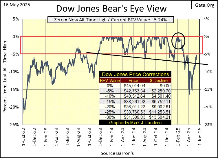
One way or the other, I haven’t a clue which way the Dow Jones will go. So, it’s best for me to keep this a spectator’s sport, and not make predictions of what will be for the Dow Jones in the weeks to come. That said, I wouldn’t be surprised should the Dow Jones still have a few more all-time highs, BEV Zeros in its BEV chart above, in the weeks and months to come.
Here is a Bear’s Eye View (BEV) chart for the Dow Jones since January 1980. A BEV plot looks at a market, not in terms of the dollars it is published in, but in terms of its new all-time highs (0.0%), and percentage claw-backs from those all-time highs.
The Dow Jones began its current historic-bull market at the star, in August 1982. I’ve placed a Red Rectangle over the BEV 0% (new all-time highs), and BEV -5% lines, noting a bull market’s scoring position, where a bull market operates in a BEV chart.
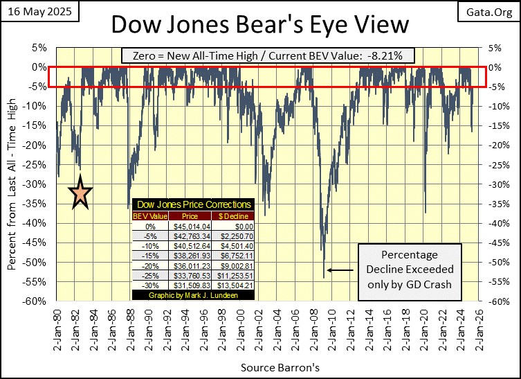
Below is the BEV Frequency Table, for the BEV data seen above. Since January 1980, the Dow Jones has seen 878 new daily all-time highs in this table’s 0% row. The next row is for daily closings in scoring position; -0.001% (BEVs of -0.01% to -4.99%). Add these two rows’ percent of total days together, to show the Dow Jones has been advancing in a bull market for 48.57% of its total days since January 1980. That is a very bullish, 45 years for the Dow Jones.
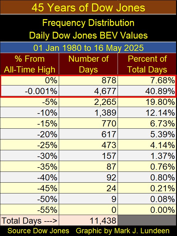
Is this the most bullish forty-five years in Dow Jones history? Since February 1885, when Charles Dow first began publishing his stock average, in a little investment sheet called the Wall Street Journal, one simply doesn’t see so many new all-time highs, and daily closes in scoring position, spanning so many decades.
In 1885, did anyone speak of BEV Zeros and scoring position? I doubt if they did. Bear’s Eye View jargon, is something I began developing in the 1990s, and have been using since I began writing shortly before the sub-prime mortgage crash, before October 2007. Looking at dollar market data, compressed within the 100 possible percentage points in the BEV format, is the best way to understand historic market data.
Below are three Frequency Tables, where the count (frequency) of the Dow Jones daily BEV values are seen. The table on the left show every daily BEV value since February 1885. Since then, the Dow Jones has seen 1,569 daily new all-time highs (0% row), or 4.02% of all daily BEV closes for the past 140 years, have been at a new all-time high.
The -0.001% row show how many daily closes happened in scoring position; BEV values spanning from -0.01% to -4.99%. Since February 1885, the Dow Jones has closed in scoring position in 8,568 of its 39,354 trading days, or 21.97% of its total trading days since 1885.
To see how bullish the past 140 years of Dow Jones history has been, we add up the percent of total days, in the BEV 0% (4.02%) and -0.001% rows (21.97%), to discover 25.99% of total days since February 1885, closed in a bull market. One day out of every four, for the past 140 years. That is damn bullish.
However, the Dow Jones is published in dollars, and the dollar has changed beyond recognition since February 1885. Until March 1934, the dollar was legally defined at $20.67 / ounce of gold. From March 1934, to August 1971, the dollar was legally defined as $35 to an ounce of gold. After August 1971, the dollar has no legal definition, which isn’t good. However, so far for the Dow Jones, it hasn’t been bad either – so far.
But note, most of the new all-time highs the Dow Jones has seen since 1885, happened after August 1971 (right table below). This was after the dollar had become nothing more than an undefined unit of monetary inflation. Units of inflation that idiots at the FOMC “inject” into the markets to “stabilize” them, whenever their valuations begin deflating, to the great relief of Wall Street, and the investing public.
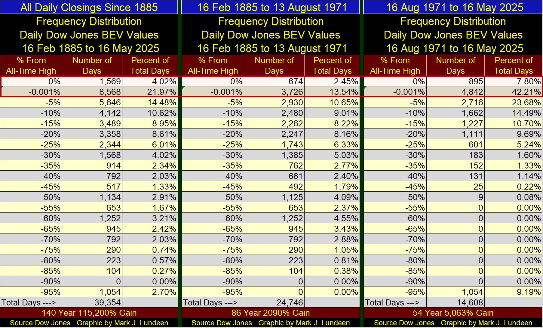
Looking at the middle, and right tables above, that splits these 140 years at August 1971, we see the impact on the stock market, of terminating the Bretton Wood’s $35 gold peg. Before 1971, only 15.99% of total days are in a bull market. After August 1971, 50.01% of total days are in a bull market, which I see as a huge inflationary bubble blown into the stock market. As all bubble inflated into a market ultimately go bust, which this bubble so far hasn’t, I don’t like this bull market on Wall Street.
Below is the Dow Jones in daily bars. Bear that I am, I like this chart better than the Dow Jones’ BEV charts above, as all this week the Dow Jones was thwarted by its BEV -5% line at 42,763. However, the market has been advancing since early April, when the Dow Jones broke below its BEV -15% line at 38,261. Will it in the weeks to come, continue advancing towards its last all-time high, seen below on December 4th, and then beyond? It could.
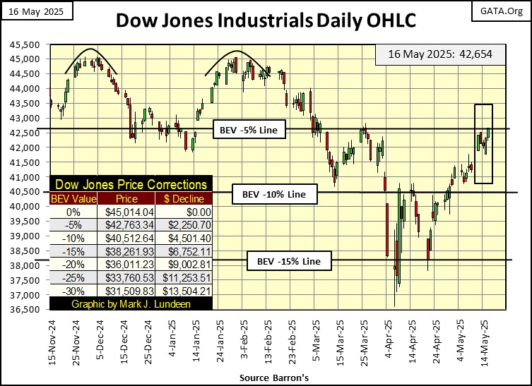
It had better. Should the Dow Jones now break down at its BEV -5% line, to begin testing its lows of last April, I can’t think of anything more bearish for the stock market.
What is this? One of my major market indexes made a new all-time high at the close of the week; NYSE Financial Index (#1), closed the week with a BEV Zero below. This is something we’ve not seen in this table since last winter, a new all-time high for a major market index.
That, plus the next twelve indexes below closed the week in scoring position, above a BEV of -5%, or within 5% of their last all-time highs. Then there is the XAU, which had shown so much promise these past few weeks, rising in the ranks below. Then came this week, where it once again closed as Tail-End Charlie at #21 in the table, 22.10% below its last all-time high of April 2011.
This doesn’t change anything. I’m still bullish on gold and silver bullion, as well as the mining companies that bring new supplies of the old monetary metals to market. Sometimes the market can be so frustrating. Like now at the close of this week. It’s best not to allow one’s emotions to cloud one’s reasoning on the market. But that is hard to do.
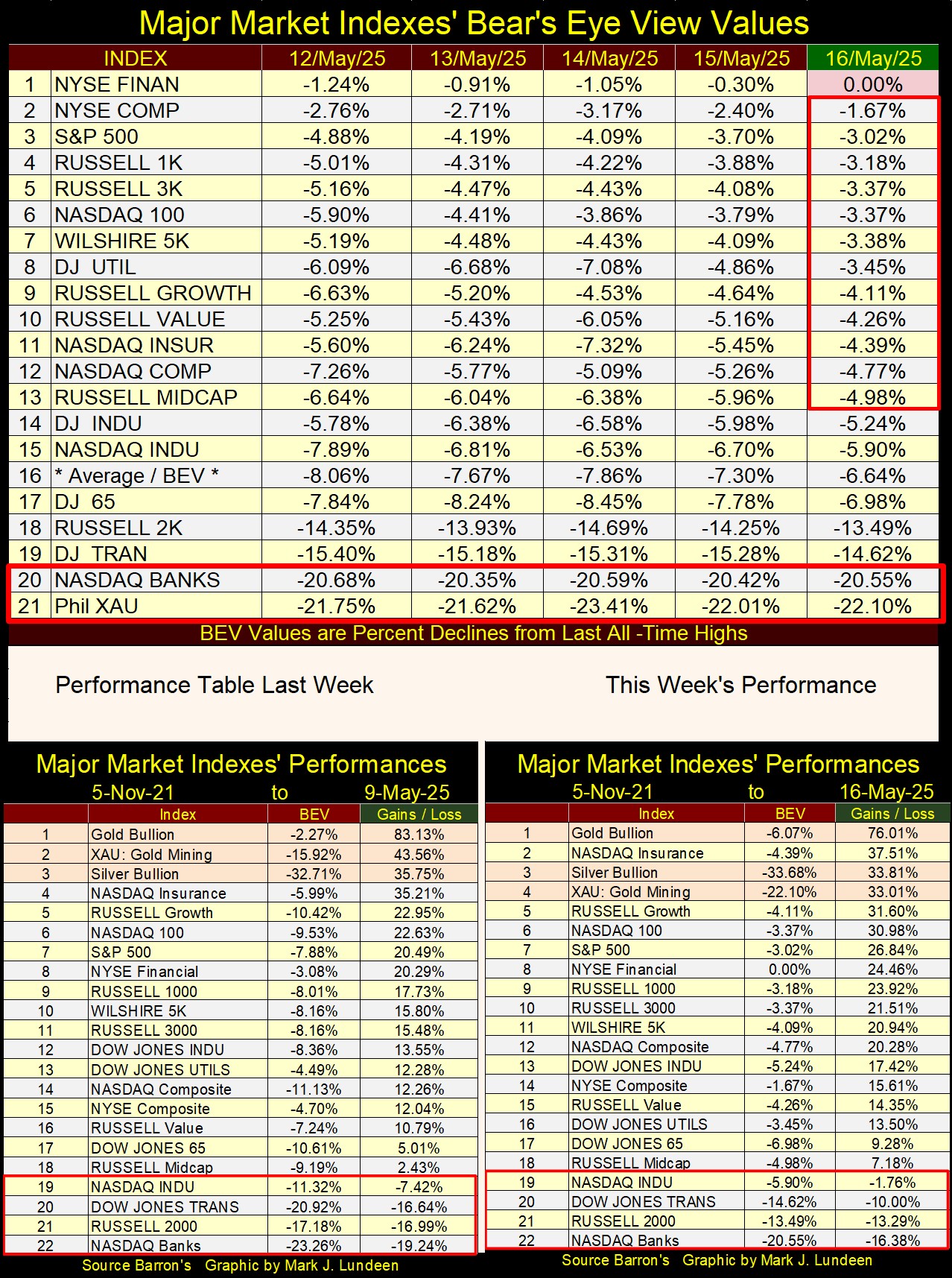
This week’s performance table above show something the above BEV table doesn’t; the bull market in gold, silver and their miners that began in November 2023 continues. They have outperformed all other major market indexes, except for the NASDAQ Insurance index, at #2 in this week’s performance table. What is with those insurance companies?
I haven’t shown any charts for mortgages or bonds for many months, making this a good week for doing so. For mortgages (Real Estate), their bull and bear market are best understood, as one understands bull and bear markets in bonds;
- falling yields = bull markets,
- rising yields = bear markets.
Using that logic, the huge bull market in real estate from October 1981, when mortgage rates peaked at 18.53%, to January 2021, when they bottomed at 2.65%, is seen below.
But bull and bear markets in real estate, aren’t exactly like bull and bear markets in bonds. Who is going to sell the home they live in, solely because it is losing its market valuation? If they did, seeing mortgage rates rise from 2.65% in January 2021, to 7.79% last October, should have crushed the real estate market, which it hasn’t.
True enough. Still, rising mortgage rates place enormous downward pressure on the size of mortgages banks can offer perspective homebuyers, making sales of real estate increasingly dependent on motivated sellers, or “buyers’ markets.” And buyers’ markets in any market, aren’t bull markets. Though, they are the best times to be a buyer.
In the chart below, I placed a table listing various mortgage sizes, a $1,000 monthly payment could purchase, at various mortgage rates. Using this table, it’s obvious rising mortgage rates aren’t bullish for real estate valuations.
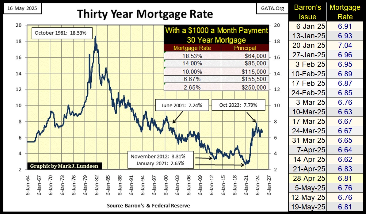
Should mortgage rates continue to rise from their January 2021’s bottom, that isn’t bullish for the real estate market. But will they? I think they will in due time. And if you want to solve the homeless problem, to make housing affordable again, rising mortgage rates is exactly the bitter pill this economy must swallow, to make that happen.
But trust the idiots at the FOMC to fight that from happening, as the current bubble in single family housing, is their bubble. They are very protective of their inflationary blunders in the markets.
Next is my chart for Barron’s Best & Intermediate Grade Bond Yields. For the year spanning from January 2022, to January 2023, lots of exciting, bearish things were happening in the corporate bond market. But as seen below, the last two years have seen things “stabilize” in the corporate bond market.
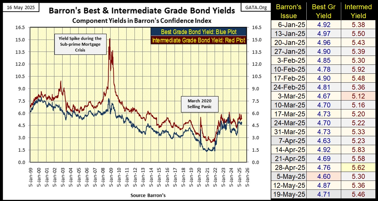
The thing to note about the plots seen above, is how intermediate grade bond yields spike far above best grade bond yields, during a market crisis. As seen above during;
- NASDAQ High-Tech Bust (2002-03),
- Sub-Prime Mortgage Debacle (2007-09),
- March 2020 Flash Crash.
This is a historic pattern seen in Barron’s Best & Intermediate Grade Bond Yields, going back to the depressing 1930s. As intermediate bond yields are currently not spiking, its safe assuming the market is not currently in a state of panic. But I keep my eye on these yields, as they have proven to be a historically useful, leading indicator of when a market crisis is at hand.
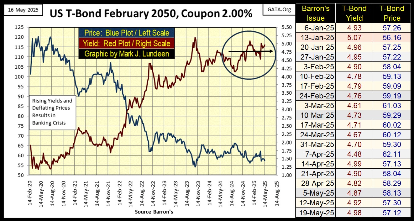
Here is my chart for a 30yr T-Bond issued in February 2020. Like the corporate bond market, the T-bond market is currently trading in good market conditions. Meaning the T-bond market isn’t in a bull or bear market, just staying where it is for the past two years or so. Which for a bond market, is good.
But this bond’s yield is sneaking up towards its 5% level, which is nothing to be concerned about, unless it begins yielding above the 5.25% seen in October 2023.
I have to feel some pity for anyone who purchased this bond in February 2020, and held on to it to May 2025. Rising yields (Red Plot) have seen this T-bond lose over 45% of its market value (Blue Plot).
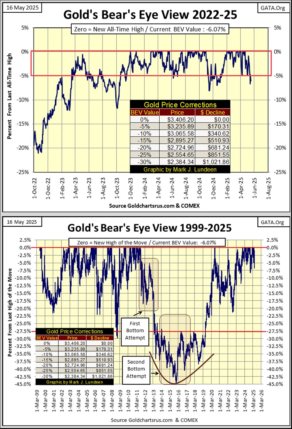
Next is my BEV chart for gold. Gold closed the week outside of scoring position, just a bit below its BEV -5% line, exactly like the Dow Jones did this week. But the Dow Jones increased to its BEV -5% line, by rising up from its BEV -15% line, while gold decreased below its BEV -5% line, by deflating from its BEV Zero line.
If the Dow Jones is in a bear market, it will soon be repelled from scoring position. If gold is in a bull market, it will soon bounce back into scoring position.
Let’s now look at the Dow Jones to Gold Ratio, which compares the relative strength of the Dow Jones to gold. A rising ratio indicates the Dow Jones is stronger than gold. A falling ratio indicates gold is stronger than the Dow Jones.
In the chart below, within the red square, since mid-2019, the Dow Jones and gold have been fighting each other, to see who is leading who. In April, just weeks ago, gold was about to break out of this square, leaving the Dow Jones behind. But a month later, gold has backed off its advance, and so remains in the box.
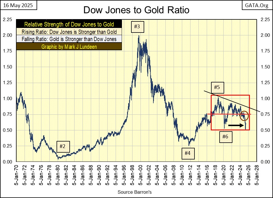

When looking at this chart, one thing that can’t be denied is, on a relative basis between the Dow Jones and gold, since 2001 (Box #3); gold has outperformed the Dow Jones by a large measure. Yes it has!
Gold has risen from $253 in February 2001, to $3406 last month. An increase by a factor of 13.46. While the Dow Jones during this twenty-four-year period, increased from 10,903 in February 2001, to 45,014 last December. An increase by a factor of only 4.12, far below gold’s quarter century’s advance.
Okay, the Dow Jones; thirty established, dividend yielding, blue-chip stocks is the little old lady, of possible investments in the stock market. So, how does the high-tech heavy, NASDAQ Composite compare to gold since 2001? The NASDAQ Composite increased from 2552 in February 2001, to its last all-time high of 20,173, seen on December 16th of last year. This is an increase by a factor of 7.90, far below gold’s quarter century increase by a factor of 13.46.
What about silver? In February 2001, silver traded at $4.40 an ounce. So far in 2025, silver has traded at $34.40 an ounce. That is an advance by a factor of 7.81. So, silver too has outperformed the Dow Jones since 2001, and underperformed the NASDAQ Composite by a very small amount. This makes the old monetary metals; gold and silver, some of the best performing assets of the past quarter century.
That today in May 2025, most investors remain in the stock market, refusing to even consider buying a few ounces of gold or silver for an investment, is amazing to me. But this is a promise of much better things to come for gold, silver and their miners. A day is coming, when the stock market will sell off, and all those undefined units of inflation (aka: the US dollar) come flooding into the old monetary metals; gold and silver for their survival.
So, the great untold story in the market today is; what a wonderful investment gold and silver have been in the 21st century, as good, or better than the stock market. This is a story the financial media, somehow never reports to the public, and shame on them.
Moving on to my step sum tables for gold and the Dow Jones below, gold is feeling the pressure of the overwhelming down days it had to endure since mid-April. Maybe seeing gold’s BEV down to only -6.07% at this week’s close, is actually an indication of gold’s market strength.
Markets being markets, gold should soon see a period where advancing days will overwhelm daily declines, exactly as seen on the Dow Jones side of these tables. If gold is in a bull market, that should soon result in some new all-time highs.
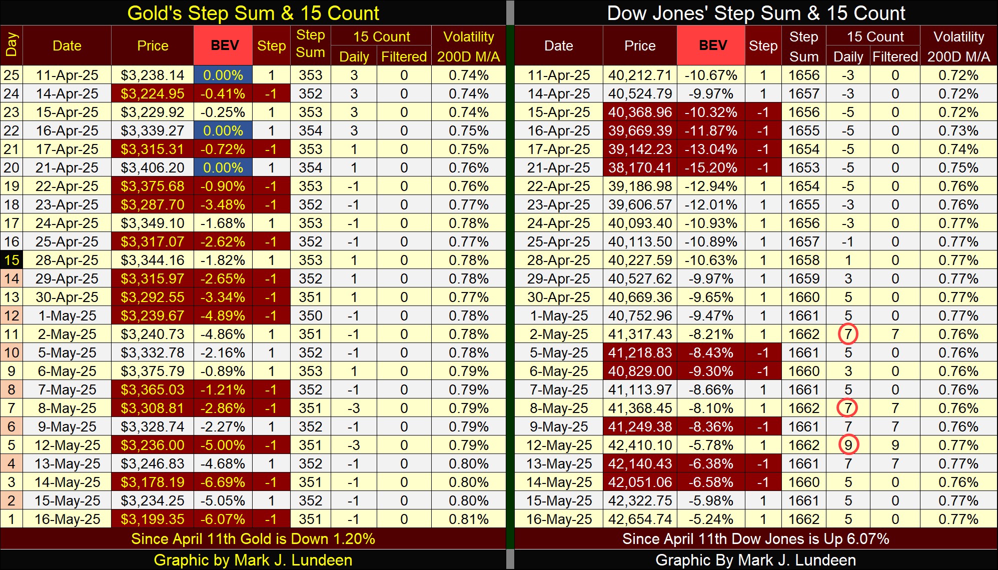
The Dow Jones’ 15-count increased to a +9 on May 12th, making the Dow Jones a very overbought market. Markets don’t like being very overbought. So, the Dow Jones should soon see daily declines once again overwhelm its daily advances, as seen on gold’s side of the table above.
Question; will these soon to be overwhelming daily declines allow the Dow Jones’ BEV values, to once again increase into scoring position, and from there to new all-time highs? Maybe, but most likely not.
I’ll tell you all about that in the weeks to come.
Oh, one more thing. Over at Eric King’s; King World News, this week Eric interviews Jonathan Haycock for thirty-minutes. Jonathan has an impressive resume from Wall Street, and Jonathan is even more bearish on the financial markets, and bullish on gold and silver, than I am. Is that possible? Well, listen to Eric and Jonathan at the link below.
https://kingworldnews.com/expect-global-chaos-one-of-the-most-shocking-interviews-of-2025/
Mark J. Lundeen
********


