The Reason I’m Such a Bear on the Stock Market!


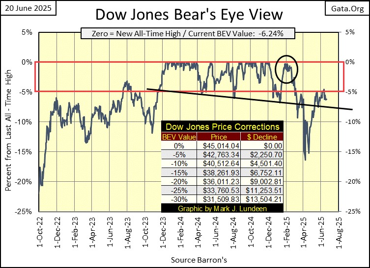
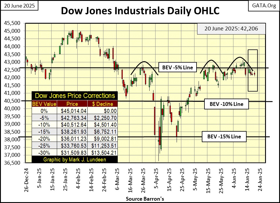
This week, once again the Dow Jones’ BEV -5% line (42,763) proved to be a no-go zone for the bulls. When was the last day the Dow Jones closed in scoring position, above its BEV -5% line? A couple of times recently. But looking at the Dow Jones’ BEV chart below, after March 7th, three months ago, the Dow Jones has been out of scoring position.
There is always the possibility the Dow Jones is only in a correction. That someday soon, it will once again rise into scoring position, above its BEV -5% line, and from there make a new BEV Zero (0.00% = new all-time high), which would be a close above its last all-time high; 45,014.04.
However, as time passes by, my bearishness for the Dow Jones, my proxy for the broad stock market, is only increasing. Why should I be so bearish? Some historical background to explain why, is called for here.
In the wake of the 2007-09 sub-prime mortgage debacle, following the Dow Jones’ second deepest percentage decline from a previous all-time high (October 2007 to March 2009), in late April 2009, “green shoots” at the NYSE were being reported in the mainstream-financial media.
Sixteen years ago, that sounded really good. But following the Dow Jones’ March 2009, 54% bottom, what investors would only discover on internet sites such as Zero Hedge, or from David Stockman’s market comments, and others such as Le Metropole Café, was how major companies were taking on massive levels of debt. Not to finance increases in production, something that would return profits to pay back the debt used to build these new production facilities, but to fund their share buyback, and dividend programs.
Historically, these programs were funded by excess profits from corporate operations, not debt. So, this new demand for shares trading in the stock market came from the companies themselves, funded with debt, a 21st century novelty for sure.
I recall Microsoft and IBM’s name being mentioned over a decade ago, though there were many other familiar names exchanging their equity for debt (trashing their balance sheets) to manipulate their share price higher.
Eventually, some of these companies became known as Zombie Corporations, companies who could pay their bills only by taking on additional debt. How many of these companies are still with us today? I don’t know. But the day is coming when we’ll all find out.
No doubt, with the behind the scenes urging of the then FOMC Idiot Primate, Doctor Bernanke, a river of “liquidity” flowed towards Wall Street from Bernanke’s QE#1, to water those “green shoots,” the mainstream financial media saw sprouting in the stock market in April / May 2009.
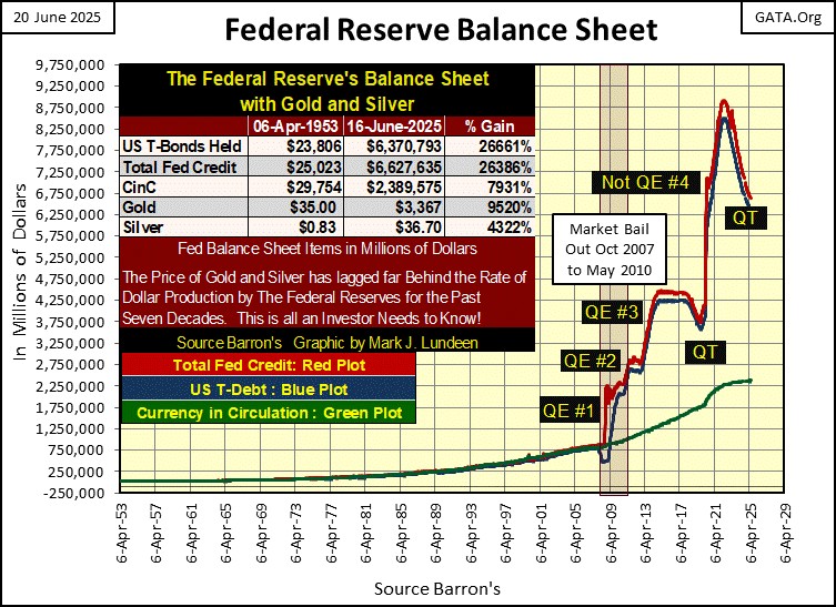
And it wasn’t just corporate America trashing its balance sheet. So too were the idiots at the FOMC, trashing the Federal Reserve’s balance sheet with the four QEs seen in the chart below. Do you want to know the real reason consumer price inflation is so much worse today? The answer is seen in the chart below!
The ultimate impact these QEs will eventually have on the dollar, will be horrendous. If not today, then someday. And when the next big market decline begins, expect to see a QE#5. What will a dozen eggs cost after that?
Dr. Bernanke had his fifteen minutes of fame in November 2002, at the bottom of the NASDAQ High-Tech Bear Market Bottom. He claimed the FOMC could always prevent any future bear market, by using monetary inflation flowing from the Federal Reserve System, to reflate deflated market valuations. Keep in mind what is said below, when looking at the chart above.
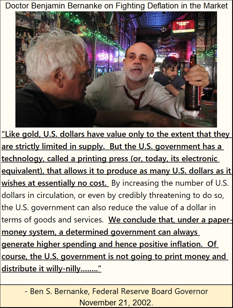
There it is, straight from FOMC Idiot Primate Bernanke; bull markets are “positive inflation.”
That was then, and this is now, and how somethings never change, as reported in King World News below.
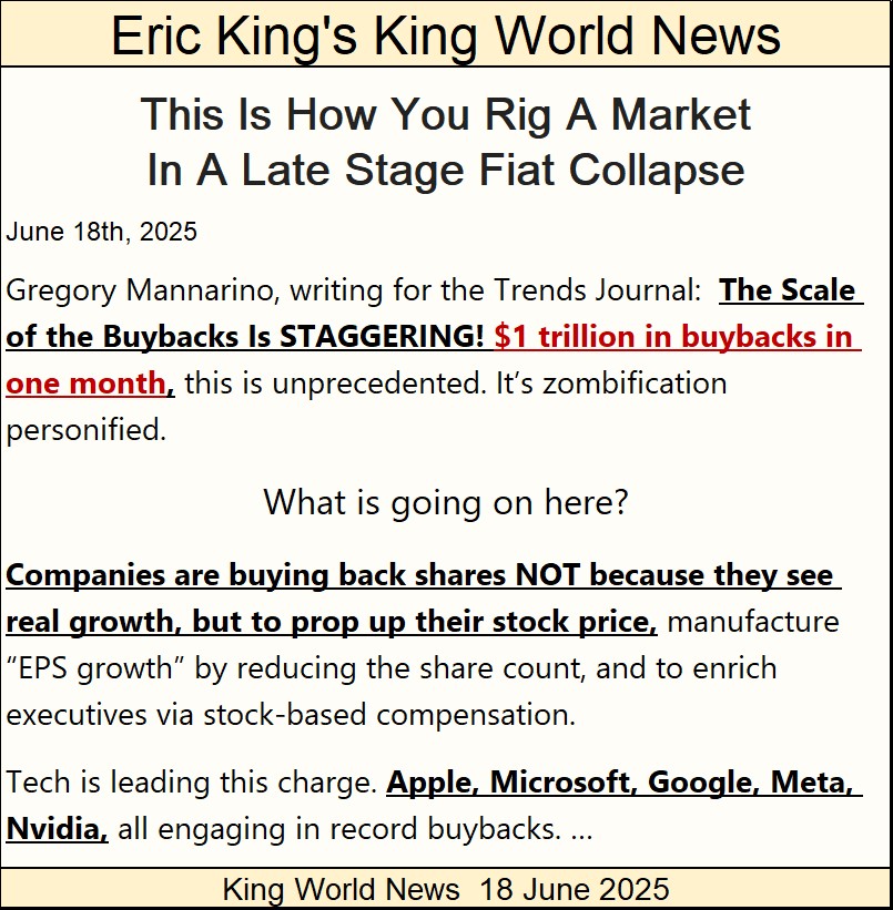
https://kingworldnews.com/this-is-how-you-rig-a-market-in-a-late-stage-fiat-collapse/
Where is all this money coming from? By these companies assuming even more debt. All that, and still the Dow Jones, and other major-market indexes, can’t increase to new all-time highs?
Take the time to read the short article above, it’s good. I wish Gregory mentioned which month this $1,000,000,000,000 in stock buyback occurred, but I’m assuming it was after the Dow Jones’ last all-time high of last December. That plus, I’m assuming this inflationary driven flow of “liquidity” into the stock market, wasn’t just a one-month affair.
If so, and it most likely is, having the Dow Jones in the past six months fail to generate an additional BEV Zero in its BEV Chart, even with an additional $1 trillion dollars (plus?) in demand in a single month, suggest the deflationary forces beneath the market and economy are enormous. Can you too now feel the magma begin to shift below Wall Street?
What would the Dow Jones’ BEV chart look like today, had this tsunami of “liquidity” not flowed into the NYSE, is something we’ll never know. But what we do know, is how earnings for the Dow Jones have grown since the idiots at the FOMC, began manipulating market valuations, via their QEs in 2009, chart below.
Reviewing the Dow Jones’ earnings data I have, they went negative during the Great Depression’s crash. As seen in the chart’s insert below, earnings for the Dow Jones didn’t return to 1929 levels until 1949, twenty years later.
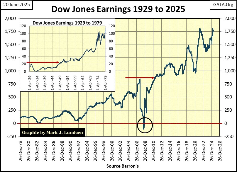
The only other time earnings for the Dow Jones went negative, was during the sub-prime mortgage debacle; from an all-time high ($843) in 2007, to -$108 a year later in 2008 (circle in chart above). This was an astounding collapse in corporate earnings. From out of nowhere, profits on Wall Street just disappeared!
Unlike the collapse in earnings during the Great Depression, earnings for the Dow Jones rebounded to 2007 levels only three years later, which I attribute to the “liquidity” flowing from Dr. Bernanke’s quantitative easing, and changes in corporate accounting standards.
I’m not an accountant. But seeing such a quick recovery in Dow Jones earnings, following the sub-prime mortgage debacle, has a bad odor for me. So, the question I have is; how much of what we see in the chart above, post 2008, is real, and how much is fictional?
I don’t know. But I fear we’ll one day see another collapse in corporate earnings, due to the massive debt burden corporate America is now carrying, as we saw in 2008. That won’t be good for valuations in the stock market. How bad was the valuation collapse when the Dow Jones last saw negative earnings in 2008?
The best graphic to tell this tale would be using my data from the Dow Jones Total Market Group (DJTMG), which split the stock market into seventy-four different sectors. I don’t maintain that data anymore, and haven’t since July 2018 for reasons I don’t want to go into. But below, I have a chart I posted in my 17 March 2017 article, that plots how many of the DJTMG sectors’ valuations were 50%, or more, from their last all-time highs.
From 1993 to 1998, when Alan Greenspan was the most well-known, and popular human being on Planet Earth, virtually none of these groups were down 50%, or more, from their last all-time highs. That was when being a central banker was lots of fun, and everyone loved Alan for inflating valuations in the stock market.
However, as the NASDAQ High-Tech bubble approached its March 2000 top, some of the groups in the DJTMG begin to anticipate the busting of this boom in High Tech, by deflating 50% or more, from their last all-time highs. At the bottom of the NASDAQ High-Tech bear market, at the same time FOMC Idiot Primate Bernanke began talking about terminating any future bear markets using monetary inflation, 29 of the 74 groups had deflated by 50% or more, from their last all-time highs.
There was a lot of pain to be seen in those 29 groups. There were news stories of overleveraged investors committing suicide, when they saw all they owned had been clawed back by Mr Bear.
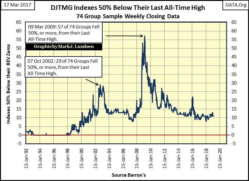
This chart above makes it very obvious, how much worse the 2007-09 sub-prime mortgage bear market was, compared to the 2000-02 NASDAQ High-Tech bear market, with its fifty-seven DJTMG’s sectors deflating 50%, or more from their last all-time highs.
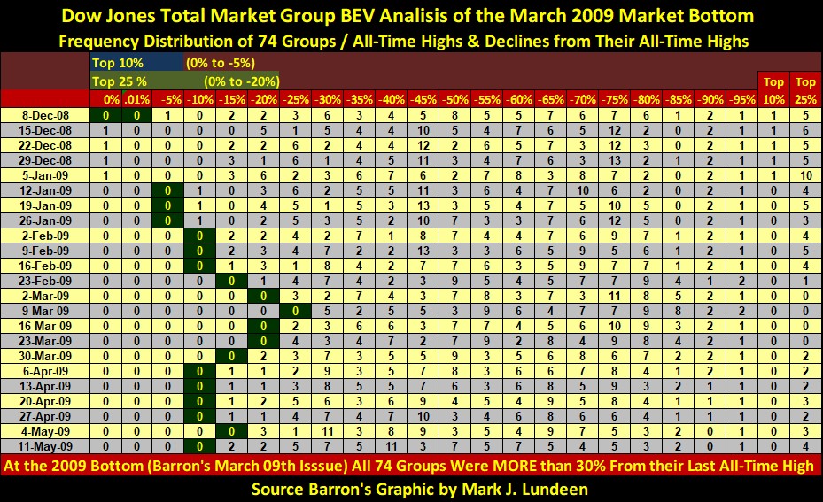
As this data is based on the Bear’s Eye View (BEV) data, we can use a frequency table (below) to look at the weeks before, and after Barron’s 09 March 2009 issue, to see exactly how this massive bear market developed, and what happened after this bear market’s bottom.
I’ll let my readers do that for themselves, as I want to focus on the data found in Barron’s 09-March-2009 issue, when the market hit its bottom. In that issue, not a single DJTMG sector was within 30% of its last all-time high. Seventeen sectors bottomed in the BEV -80% & -85% columns – Wow! The Dow Jones itself was down by 54%. That would place it in the BEV -50% column in the table below. Look at all the sectors that did worse, so much worse than the Dow Jones on March 9th, 2009!
What is the point of all this? My point is; if FOMC Idiot Primate, Bernanke didn’t “inject” the massive dose of “liquidity” into the stock market, via his QE#1 in early 2009, there wouldn’t have been any “green shoots” on Wall Street for the media to have reported on in April / May 2009. Instead of a bounce following March 9th, stock-market valuations would have continued deflating to much deeper levels, possibly matching, or exceeding those seen during the Great Depression market crash.
So, as I see things; there is a lot of unfinished business between Mr Bear, and the idiots at the FOMC. Because before our pending bear market can find an actual bottom, most of the debt used to inflate market valuations since 2008, will most likely have to be defaulted on by these corporations. And what is the market valuation for a corporation in court for bankruptcy proceedings?
But then, the idiots at the FOMC could always “monetize” this pending non-performing corporate debt, exactly as they did the toxic-mortgages following the sub-prime mortgage debacle, and “reinject” the resulting effluent back into the stock market, to “stabilize market valuations” with a QE#5, or even a QE#6, if need be.
You do realize we would not be in this current situation, had the US Government not abandoned gold and silver as money, but chose instead to allow academics and bankers to manage the dollar via the FOMC.
If today you find me sitting in the market’s peanut gallery, this is why. And I’m not returning to buy anything in the broad stock market until I see how these many trillions-of-dollars in debt, used to inflate the valuations in the stock market, is finally resolved.
But that could be years from now, as no one in finance, politics or the market’s government regulators wants to pop this bubble. That goes double for retail investors and money managers too. But everyone in the know is only stalling for time, as one day in our uncertain future, Mr Bear will have his way with the market, and he’ll choose the worst possible time to get it. Until then, gold and silver bullion, as well as their miners, looks like a damn good place to park one’s investment funds.
So, what did the Dow Jones do this week in its daily bar chart below? As it’s been doing since March, the BEV -5% line (42,763) proved to be an effective ceiling to keep the Dow Jones in its place – somewhere below it. But there is always next week.
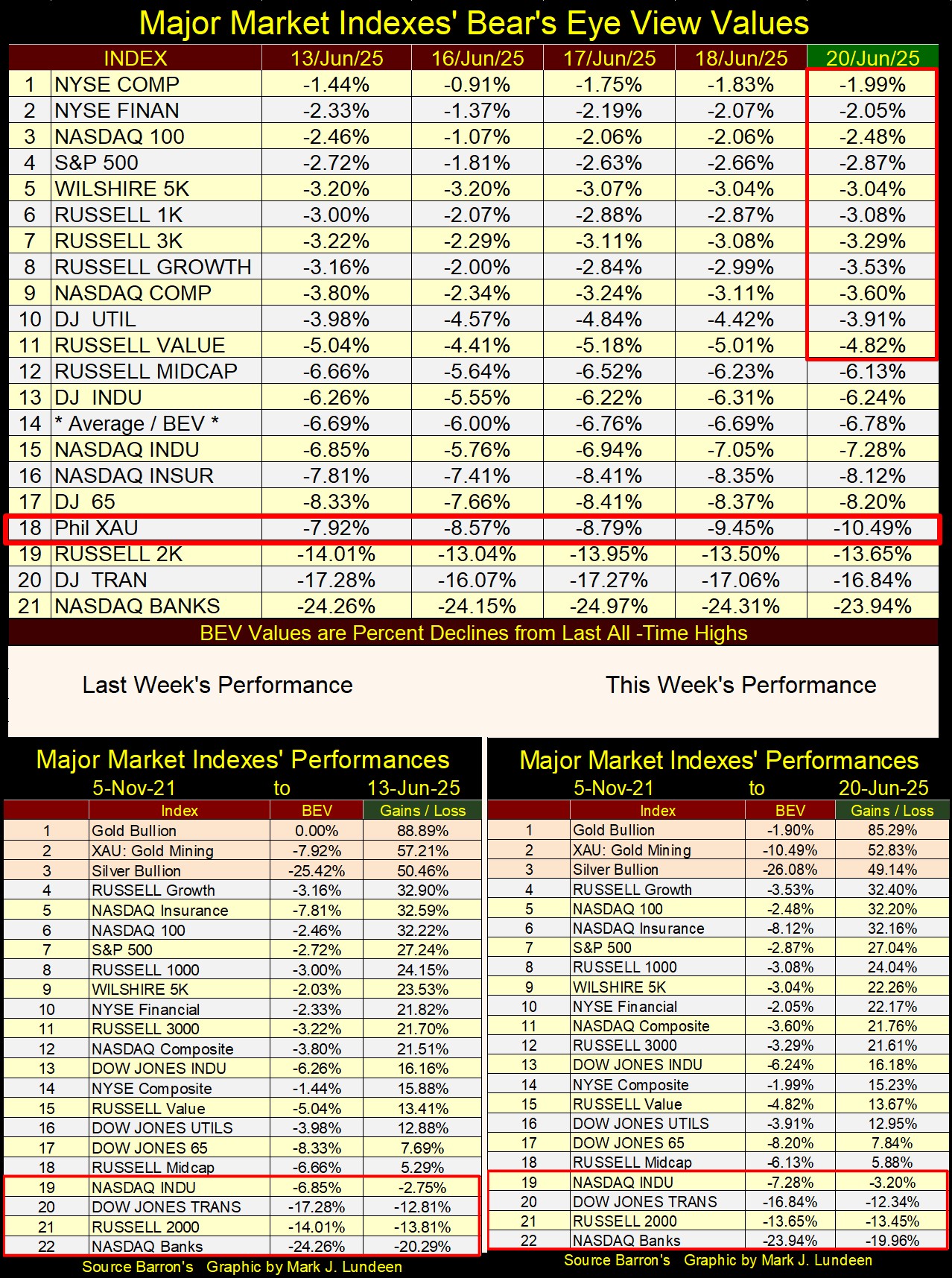
Below is my table listing the BEV values for the major market indexes I follow. Unlike in Barron’s 09 March 2009 issue, where none of these indexes would have seen a BEV value above -30%, with the NASDAQ Composite, and 100 Indexes down 75% and 78%, this week eleven of them closed in scoring position, above their BEV -5% lines.
But we should note the continual absence of any new BEV Zeros in these indexes. Odd, very odd that after months of a good portion of these indexes remaining in scoring position, that none of them can push their valuations into new all-time highs.
And what should we make of that? From where I’m sitting in the market’s peanut gallery; oh, maybe something like it was much better to have purchased stocks in March 2009, than holding on to them now in June 2025.
In this week’s Market Performance table above, not much has changed from last week’s table. It’s a slow market, a market that I find difficult writing something exciting and interesting about. Which is why I spent so much time this week looking at some market history I find much more interesting.
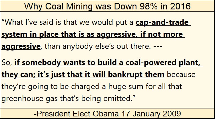
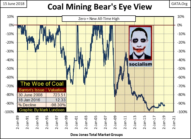
For instance, this chart below for the DJTMG’s Coal Mining Sector. I don’t know how many people remember that President Obama in 2007, actually ran as a “community organizer” from Chicago, as his main area of expertise to justify himself for becoming the President of the United States. The mainstream media loved him for it.
No one in the media ever explained what a “community organizer’s” duties were in Chicago. But I knew; he was a left-wing troublemaker, a Marxist who promised to bankrupt anyone who wanted to generate electricity with a coal fired plant.
This BS about CO2 causing “global warming” was, is, and will always be Marxist propaganda used to inflict economic damage to the Industrialized West. India and China are belching CO2 at levels that far exceed those of the West’s, and have for decades, but no one gives a damn. The Europeans, leaders in this CO2 insanity, are now struggling with their wind turbines and solar panels, which replaced their former, and very dependable / affordable fossil fueled electrical generation plants.
Anyway, the damage done to the American coal mining industry by a “community organizer” from Chicago, can be seen in the chart below. The suffering that bastard inflicted on communities throughout Appalachia, can be heard in the Iris Dement song below.
The wealth the Obamas now have is estimated to be over one hundred million dollars. That is so obviously dubious, yet no one in the media, or in government investigates the sources of this great wealth. Did the Obamas pay Federal and State income tax on it? Other than being a corrupt politician, accepting million-dollar kickbacks from friends he sent a few billion dollars of taxpayer’s money to when he was in office, how else could he have gotten so wealthy? Same goes for the Clintons.
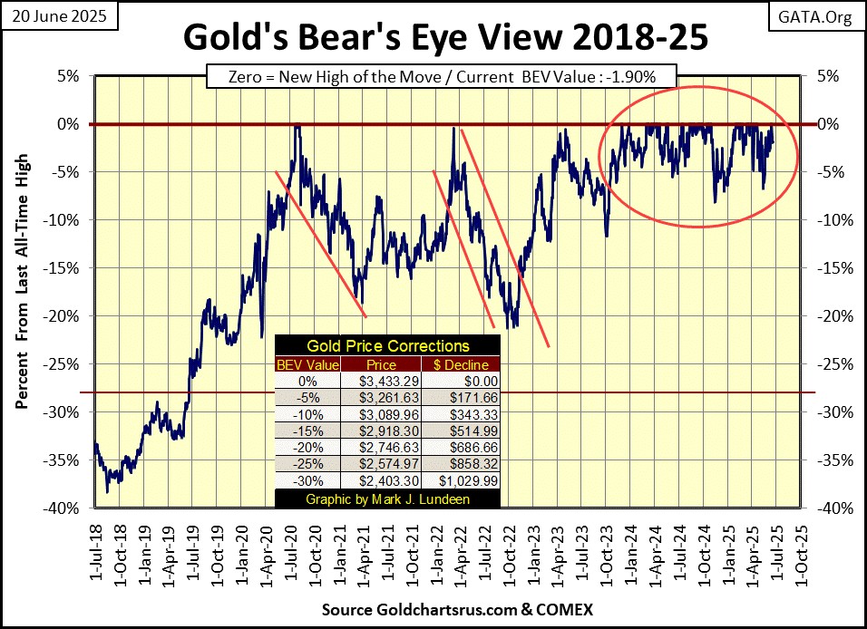
Well, back to this week’s boring market action, with gold’s BEV chart below. I look at gold frequently during the day, and in the pre-market trading overnight, and all this week it was down something like $30 or $40 every time I looked.
But all this week, gold remained in scoring position, above its BEV -5% line, closing with a BEV of -1.90%. Which tells me the bull market in gold remains intact, and we should anticipate additional BEV Zeros in the weeks, and months ahead.
Gold in its step-sum table below, also looks good, even during this period of time when it is seeing more down, than advancing days in the market. As James Dines used to say; “it’s a game fish that swims upstream!” I’m still waiting to see what gold does when once again, it enters a period of time where it sees advancing days, outnumber daily declines.
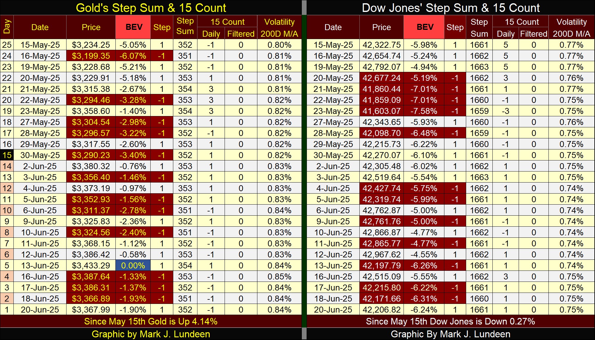
For the Dow Jones on its side of the step sum table, it too is seeing an increase in daily declines, and that isn’t helping it rise back up to scoring position. What will happen to it next week, is something we are going to have to wait to see.
Mark J. Lundeen
********


