“Policy’s” Fingerprints In Market Breadth & Volume


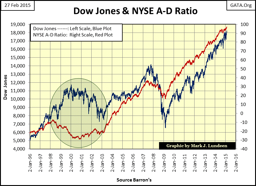
Strange things have been happening in NYSE market breadth, [also known as the Advance – Decline Line (A-D Line or A-D Ratio)] since April 1998. During the six year period from April 1998 through January 2003 (green circle below) the NYSE A-D Ratio behaved in exactly the opposite way one would expect: declining as the Dow Jones advanced, and advancing as the Dow Jones declined. This strange behavior can easily be explained by the bull market in high-tech stocks. Most non-tech shares began to deflate in 1998 as high tech issues (as well as the Dow Jones Industrial Average) continued to inflate for two more years. When the high-tech bubble reached its peak in 2000 the Dow Jones (and tech shares) began to deflate, those non-tech shares which had been trending down since 1998 began to advance, driving NYSE market breadth up.
This strange divergence in market breadth and the Dow Jones (within the green circle) had never happened before and is without a doubt due to market manipulation. The feeding frenzy in high tech issues from 1998 to 2000 sucked the oxygen from the market, which later returned when high-tech issues began their bear market decline.
Another view of this can be seen in the number of Dow Jones Total Market Group indexes making new all-time highs during the 1990s. Before the summer of 1997 many groups were making new all-time highs. In Barron’s 16 June 1997 issue, 51 of 74 DJTMGs (69% of the DJTMG) had reached new all-time highs.
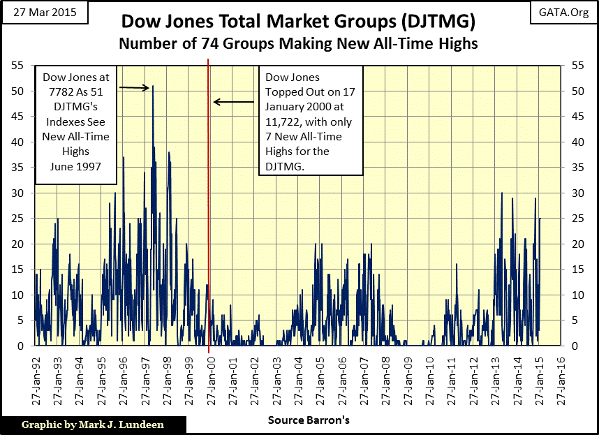
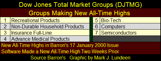
After June 1997 the bull market became increasingly more selective. By January of 2000 the bull market had become almost exclusively a high tech affair. The table below lists the seven DJTMG making new all-time highs in Barron’s 17 January 2000 issue: four were high-tech groups, with Software having made a new all-time high just two issues before.
Below I’ve plotted the total number of companies listed on the NYSE and NASDAQ markets; note the amazing growth in listings since October 1990. The NASDAQ originally came from the old OTC market, an exchange considered a cradle for new companies seeking capital with less than blue-chip prospects for survivability, but suitable for aggressive investors seeking above average returns. By the 1990s the NASDAQ had become mainstream trading giant companies like Microsoft and Intel.
However, by the late 1990s the NASDAQ had become a corrupt casino where Wall Street had their way with retail investors’ retirement funds. Weeks before a new company’s initial offering, CNBC would attract the public’s attention with the beating of copper pots with wooden spoons to highlight an IPO’s brilliant prospects. In the first hour of the IPO’s initial trading, its price would soar several hundred percent above “Wall Street estimates” drawing the suckers in as insiders (who had purchased shares at Wall Street’s estimated price) sold, locking in obscene profits in a matter of hours. Members of Congress and at least one former president were invited to these bacchanals, paid in full by a gullible public.
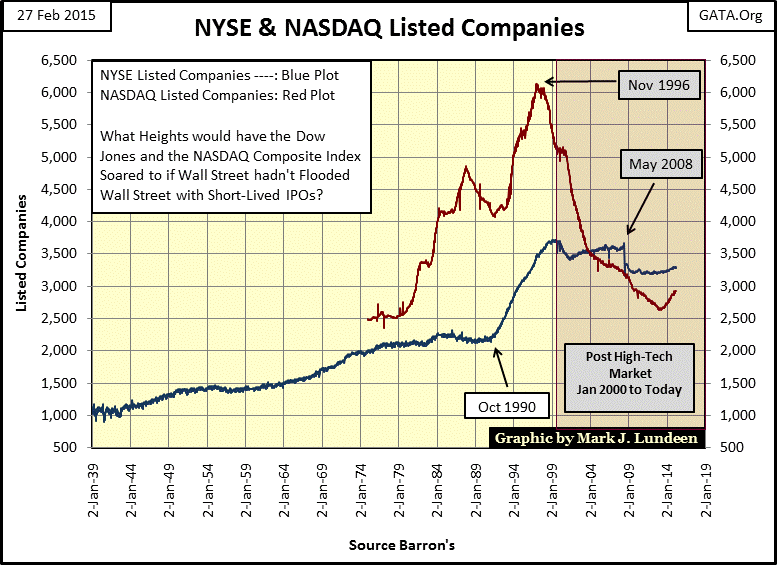
Shares listed on the NASDAQ (Red Plot above and below) peaked in November 1996, then collapsed as the NASDAQ Composite index (Blue Plot below) crumbled from March 2000 to October 2002 losing an astounding 78%. NASDAQ listings continued collapsing during the 2002-2009 mortgage boom and bust as the NASDAQ Composite Index lost 58% from 2007 to 2009. The NASDAQ stock exchange has lost many listed companies and declined many points over the last two decades, yet as we go into 2015 the NASDAQ Composite Index is again approaching new all-time highs as the number of listed stocks has rebounded in the past two years. But one has to wonder if the staying power of these new listings will prove to be any better than ones removed from the NASDAQ since 1997?
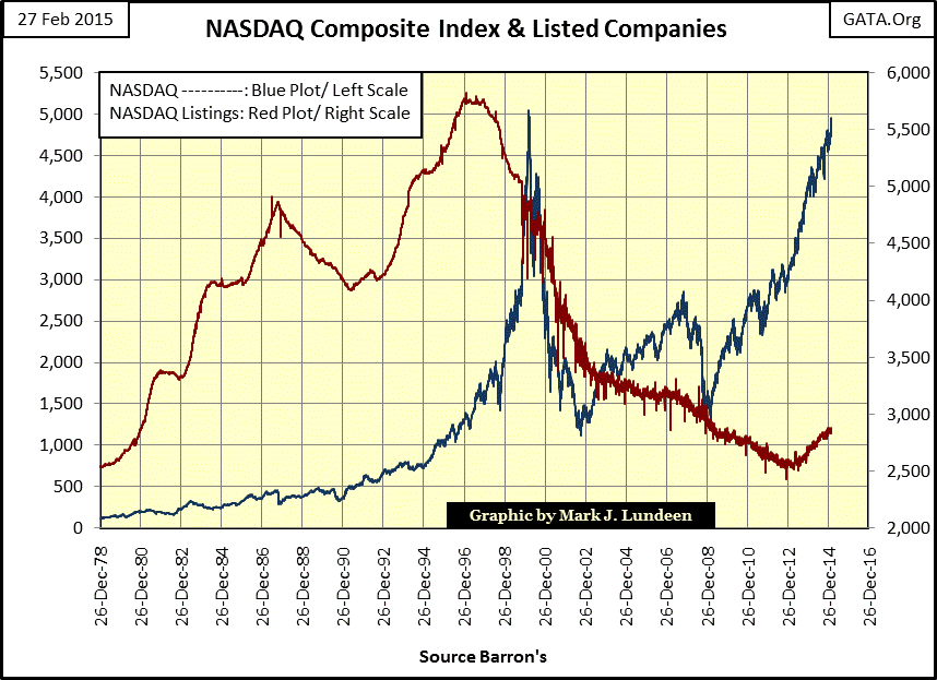
Are happy days here again for the NASDAQ? With the NASDAQ Composite Index up 290% since its March 2009 bottom, (Blue Plot / Right Scale above) I’d say the last six years have been a very happy time indeed. The real question is how much longer can the party continue? Maybe we should be asking who is paying for the drinks?
John Rubino wrote a fine piece on the various “carry trades” currently popular in finance. A carry trade takes place when hedge funds or banks borrow cheap money from one market, say from Japan for investment in another market yielding a higher return, say the United States. Everything is fine just as long the Japanese Yen stays cheap relative to the US dollar; if not the carry trade becomes a leverage method of compounding capital losses by billions of dollars. According to Mr. Rubino there’s currently a carry trade in US financial assets, as American companies borrow cheap money in the corporate bond market to finance their stock buyback programs. This makes sense because at today’s manipulated low rates, the interest they have to pay on the corporate bond coupons is actually less than the dividend payout on the shares they buy back. Here’s a table from Mr. Rubino’s article. As you can see it contains major NASDAQ listed companies, with Apple leading the pack.
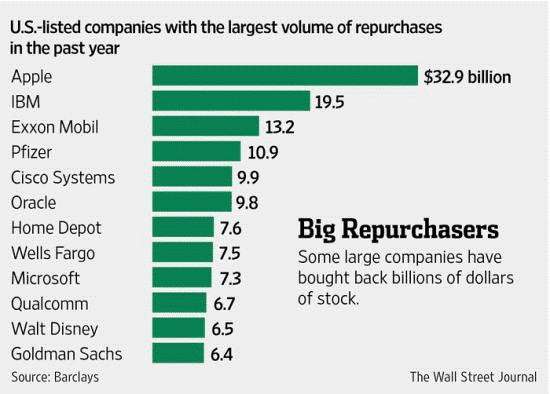
As both the bonds and stocks are denominated in dollars, there is no currency risk in this trade. Also, should interest rates rise these companies can simply cease funding their buyback program in the bond market. The danger I see with all this is: what happens should the companies come upon hard times? For instance, what happens to Exxon Mobil should crude oil prices unexpectedly decline by 50% making their operations unprofitable?
Had their dividend program been funded by profits the company could temporarily suspend its dividend payout, but failure to pay a bond coupon as scheduled is the legal definition of bankruptcy. I’m not worried about Exxon Mobil, but banks like Wells Fargo and Goldman Sachs may need another taxpayer bailout when the economy enters its next crisis.
Funding corporate stock buyback programs using cheap money from the corporate bond market may also explain another oddity in the stock market: how are the major stock indexes managing to reach new all-time highs on declining trading volume? Like the Dow Jones, for the past fifteen years since the January 2000 high-tech bubble top, the NASDAQ Composite Index has declined on rising trading volume and risen on declining trading volume.
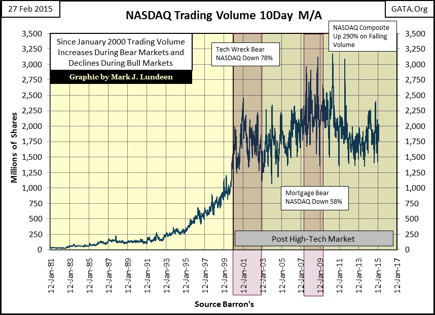
Trading volume since January 2000 can only be described as bizarre; much of this explosion in volume is coming from high-frequency trading by large Wall Street financial institutions muscling the market to keep valuations within “policy parameters.” But the law of supply and demand is not so easily thwarted. With an understanding of trading volume as demand (which it is), it’s impossible to fathom how the NASDAQ Composite Index could possibly have advanced 290% since March 2009 on declining trading volume seen above unless the supply of shares available for purchase have declined by an even larger factor.
Last June Zerohedge wrote a piece about how the global central-banking system had secretly purchased twenty-nine trillion dollars of shares trading in the global stock market (see link below). These institutions can legally print all the money they want, so I doubt these purchases were intended to reap profits.
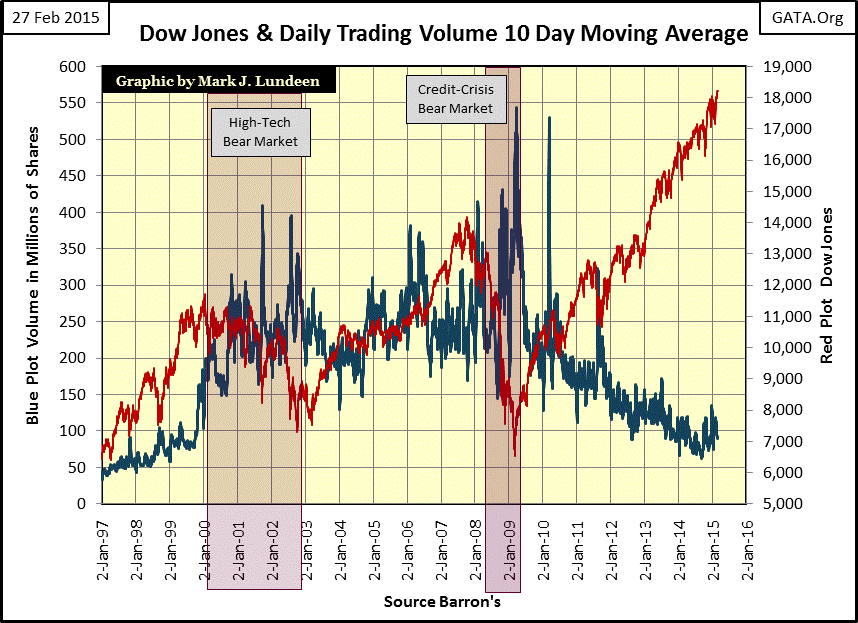
This monetization of the global stock market was designed to pump up stock prices by reducing the available supply of shares. This certainly seems to have succeeded with the Dow Jones currently at new all-time highs even with a collapse in trading volume to levels not seen since the early 1930s (chart below).
Note how trading volume soared to all-time highs as the Dow Jones was declining 38% in 2002 & 53% in 2009, during the high-tech & credit crisis bear markets. Every aspect in the chart below, post January 2000, screams market manipulation. Without the high-frequency trading by hedge funds and trillion dollar purchases by the Federal Reserve, what would Dow Jones Industrials trading volume actually be? Much less than seen below, and dragging down the value of the Dow Jones with it!
Here we see the number of companies listed on the NYSE since 1939. This is why I use the A-D Ratio and not an A-D Line because 100 advancing, or declining listings in 1939 comprised 10% of the NYSE, while by 1999 100 listings was less than 3%. So we see that when comparing breadth data over a period of decades, it’s best to use NYSE Advancing and Declining data as a percentage of total listed companies trading each day.
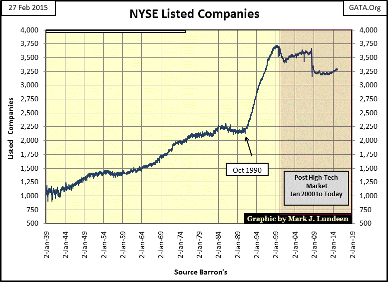
Since the Great Depression listings on the NYSE have expanded continually, until 1990 when we see NYSE listings explode by 46% in just nine years. With Alan Greenspan as Fed Chairman during this time, I suppose this was to be expected. After 1999, listings on the NYSE declined for the first time since 1939 due to the high-tech and credit-crisis bear markets. Today, with corporate America exchanging equity for debt to fund their dividend programs, we should expect further declines in the number of NYSE listed stocks come the next credit crisis.
Below we see the plot for the NYSE A-D Ratio from 1926 to present. The green areas show those times when it was profitable investing in the stock market, as represented by the Dow Jones. The red areas are those times when it was best to avoid buying stocks.
During the 1930s it was best to have avoided the stock market entirely, except during the period from July 1932 to March 1937 when the Dow Jones advanced 370%. In the second red area the Dow Jones saw two big-bear market 50% declines; once at the tail end of the Depression, the second just months after Pearl Harbor.
By April 1942 (the second 50% Dow Jones bottom) the public had totally abandoned the stock market as the Dow Jones began a bull market lasting all the way until 1966. But the NYSE A-D Ratio peaked in 1956 even though the Dow Jones continued advancing for another ten years, indicating that the bull market was becoming more selective about which shares would prove profitable.
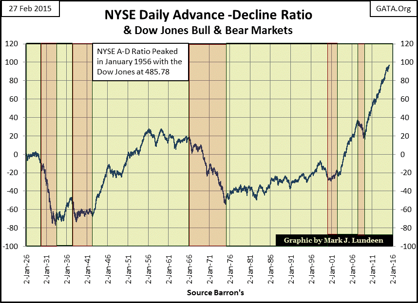
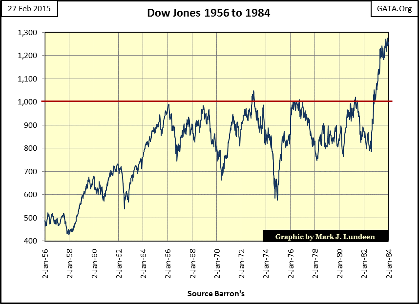
The third red area is interesting; it occurred during two decades when the Dow Jones attempted five times to break above, but failed to stay above 1000 (chart below). From 1966 to 1982 the public lost interest in the stock market as it was no longer a break even proposition. A first class stamp that cost $0.05 in January 1966 had risen to $0.20 by August of 1982. After stock investors factored in their losses from inflation (even before they paid their capital gains tax) most opted to keep their money in a savings account.
After the 45% decline in the Dow Jones in December of 1974 (chart above), the NYSE A-D Ratio once again entered a green area and began to rise (two charts up). Warren Buffet once described this bargain filled market in stocks as being a young man wandering unsupervised in a sultan’s harem. This now takes us to the Paul Volcker / Alan Greenspan bull market of 1982 to 2000. The Volcker / Greenspan market bubble has been described as the best bull market of the 20th century; still the rise in the NYSE A-D Ratio was rather modest from 1974 through 1998, making more incredible what followed from 2000 to present. At no time since 1926 has there been such a steep and prolonged increase in the NYSE A-D Ratio.
Studying the increase in NYSE A-D Ratio since 2000 makes it apparent there is nothing remotely similar to it at any time during the past ninety years. So, has the global central-banking system monetized twenty-nine trillion dollars worth of stocks on the global markets? Looking at the NYSE A-D Ratio it certainly seems so. No wonder Janet Yellen, Alan Greenspan, and Doctor Bernanke before her objected to auditing the Federal Reserve. They know what they’ve been monetized since 1987, and public disclosure of the details would be a public scandal. What we are observing is a historic bubble being inflated on the NYSE, and you won’t want any part of this stock market once the bubble pops. If the Federal Reserve is wreckless enough to pay top dollar for your stocks, now is the time to sell them and purchase some gold and silver; bullion only, no ETFs please.


