This “Policy Stuff” Is Way Past Its Expiration Date


As expected, the FOMC passed up another opportunity to raise their Fed Funds Rate this week. With 2016 being an election year, and late September just a few weeks from the November election, how anyone could believe the Yellen Fed would even consider raising interest rates last week is a mystery to me. This is especially so when doing so would only help Donald Trump’s bid for the Oval Office.
The Dow Jones was up for the week; see chart below. One of these days the stock market is going to provide more in the way of excitement than I expect most people will want. But we didn’t see any of those days last week, nor are we likely to see next week. I’m not expecting much in the way of excitement until after the election, or maybe even until after the January inauguration, no matter who wins.
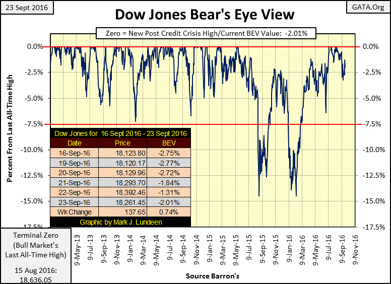
The FOMC will do everything in their power to make sure that’s how the near-term future will play out. But this “policy stuff” is way past its expiration date. Mr Bear is lurking somewhere in the shadows off Wall Street. He’s not going to stay there forever, then it will be as they say in the navy when a ship at sea approaches a hurricane; “all hands standby for heavy rolls to the port and starboard.” Be advised.
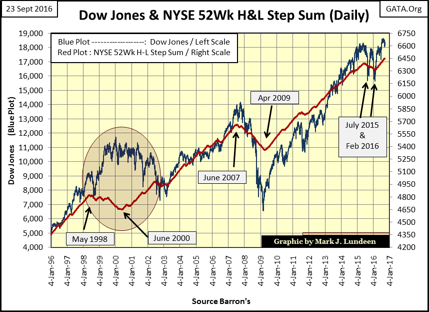
Here’s a dollar plot of the Dow Jones with a step sum of the NYSE 52Wk H-L Ratio. The ratio’s step sum turned up last March, meaning more daily 52Wk Highs than Lows for the past six months. After seven years this advance in the Dow Jones is getting stale. Look at the Dow Jones (Blue Plot) below. Since May 2015 it’s been struggling; finding it easier going down than rising to new all-time highs.
We’re due for a correction in the stock market that would send the NYSE 52Wk H-L Ratio down a bit more than we see during the 2000-02 Tech Wreck and the 2007-09 Credit Crisis. That’s another way of saying I suspect the coming bear market will be greater than the two previous bear markets.
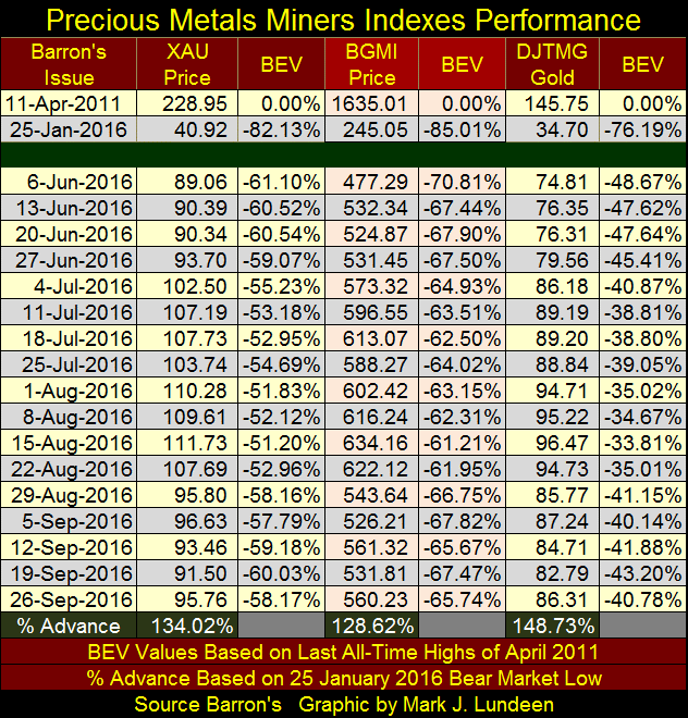
The gold miners had a good week, their first in over a month.
The same can be said for gold and silver. In the table below we see how the gold price finally saw five consecutive up days, resulting in its 15 count rising from -5 last Friday to a +1 at week’s close. Silver had a good week too; it’s up almost a dollar from Thursday of last week.
But gold and silver are two different markets. Looking at their step sums from August 19th to today tells us that. Gold’s step sum of August 19th was at 240, declined to 231 on September 16th, and ended the week at 236. I don’t publish charts of silver with its step sum because of what we see below; during market declines silver’s step sum just goes sideways. It continues to do so until the price of silver once again enters a bullish phase in the market, when it turns up with the price of silver. That’s the definition of a bear box, but silver’s bear boxes never see its step sum collapse, so we can’t use them for a leading indicator of when a market decline is approaching its bottom. It’s been like that since 1969.
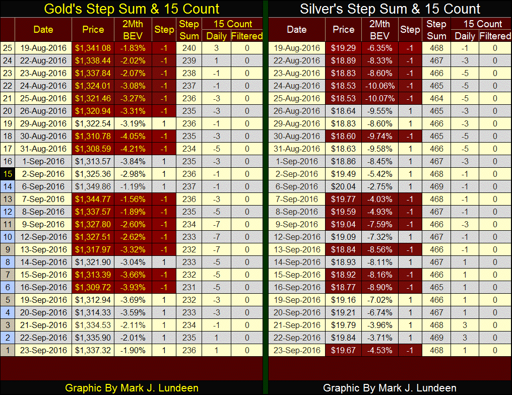
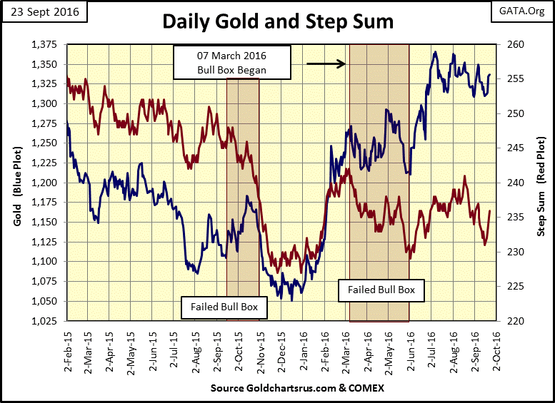
Let’s take a look at gold and its step sum (chart below), note I removed the box from last week. Like I said, unless a price trend and its step sum have diverged for about eight weeks, I don’t take the formation of a step sum box very seriously. All and all, gold’s step sum chart below is looking pretty bullish. Should gold break above $1,370 it should see a nice run to the upside, taking silver with it.
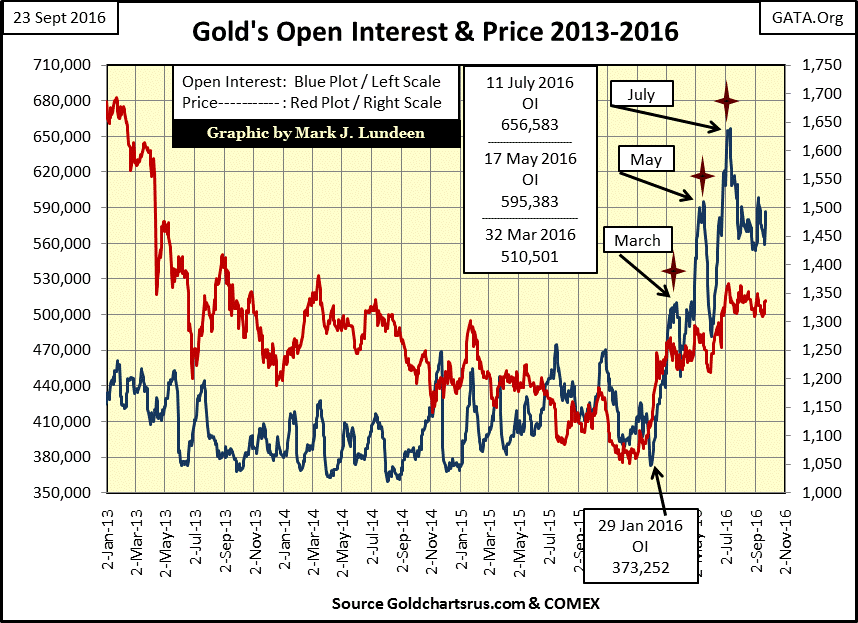
One positive development is the apparent reluctance of the big NY banks to flood the COMEX paper gold markets with their insincere promises of future delivery of thousands of tons of gold that doesn’t exist. Gold the big banks (and their market regulators) know darn well they could never get, or deliver (Blue Plot below). That may change in the weeks to come. But a quick study of the plots below show that in September of 2016, the big NY banks haven’t done what they so quickly did in April, and June of this year; drive up the COMEX Gold open interest by flooding the market with paper gold.
However, my gut instinct tells me that not much will change with gold and silver until volatility returns to the precious metals markets.
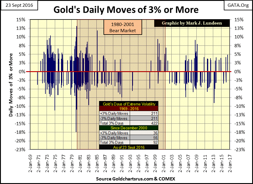
Below is a chart plotting every daily spike (up and down) in the price of gold that breached a +/- 2.99% threshold; call them 3% days. Since 1969 there have only been 422 such days, and since December 2000, the gold market has seen only ninety-two 3% days. The last was seen on June 23rd of this year, a +4.79% daily surge after the BREXIT vote.
This chart makes clear that during the gold bull market of 1969-80, daily moves of 3% or more were fairly common events, unlike our bull market that began in 2001. I hate sounding like a broken record, blaming all the market’s woes on the “policy makers”, but since 1980 Washington’s regulation of the markets and everything else has expanded exponentially. Our politicians always promise their regulation will greatly improve our lives, protecting widows and orphans from unscrupulous corporations that prey on the innocent. But they lie to us all the time. If gold has seen fewer 3% days since 2001 than it did in the 1970s, it’s because that’s how “monetary policy” has managed the gold market. This too shall pass.
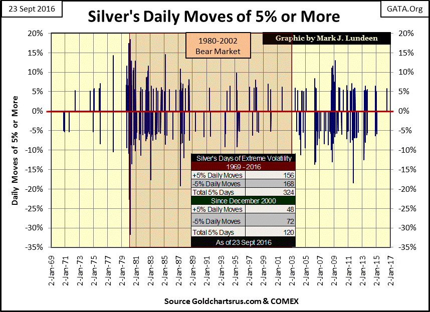
For silver I use a 4.99% threshold, the results are seen below. Silver didn’t begin seeing days of extreme volatility until a few months before it peaked in January 1980. As I’ve noted before; gold and silver are different markets. Silver’s last day of extreme volatility was seen on June 30th of this year, with a daily surge of 5.71%. This was silver’s first day of extreme volatility since January 2015.
Bond yields have been declining since October 1981, when the Treasury’s long bond’s yield peaked at 15%, thirty-five years later they continue to decline. From 1995 the demand for US Treasury debt by foreign central banks is on display in the chart below (Blue Plot). After 2002, these central banks’ appetite for Treasury debt increased greatly. In response to the deflation of the NASDAQ bubble, the global central-banking cartel inflated a massive bubble into Earth’s real-estate market. Much of the monetary reserves required to inflate this bubble can be seen in the blue plot below.
In November 2012, foreign central banks upchucked $421 billion in US Treasury debt in a single week, with no commentary by the media. This happened shortly after the Fed’s QE3 began. No doubt the Federal Reserve soaked up these obligations of the US Government, so there wasn’t an impact on Treasury yields. Had the Federal Reserve not implemented its QE3, or had the media given this market event the proper coverage it deserved, there may have been one.
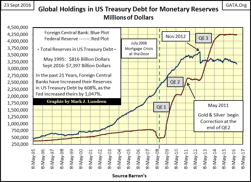
What the Federal Reserve did to save the big New York banks (Europe’s too) in the aftermath of the housing bubble is a historic scandal. Seeing gold and silver begin a five year correction beginning at the conclusion of QE2, and during the entire duration of QE3 with no critical commentary by the main stream financial media is what we today can expect from them.
The willing decoupling of inflationary price trends in consumer goods and precious metals from “monetary policy” may not be entirely the media’s fault. Since August 1971, many classes of students have graduated from college. For over forty years arguing with college professors, like Doctor Bernanke, Paul Krugman or Alan Blinder that there existed a connection to gold and silver price trends with “monetary policy” was one way a college student could ensure they didn’t graduate with top honors.
From what I see in this data, and realizing the bull market in gold, silver and the mining shares began in 2001, I expect much higher precious metals, and PM mining shares sometime in the near future as a consequence of what we see above.
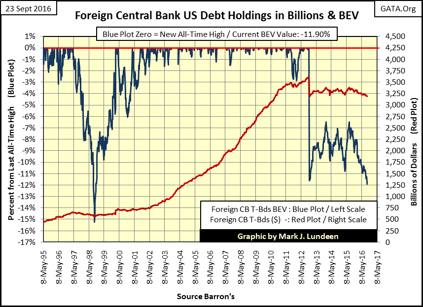
Here’s a Bear’s Eye View (BEV) plot of foreign central banks holdings of US Treasury debt seen in the blue plot above. After dumping 11% of their T bonds in November 2011, they’ve kept their portfolios of T-debt between the -6% & -11% BEV lines. However starting in May of last year, they began a sustained program of selling T-bonds to the point where they are about to break below the BEV -12% line.
This hasn’t happened since 1998, when the now long forgotten “Asian Contagion” occurred during the high-tech bubble. If the BEV plot breaks below the -12% line, I suspect it will be a non-event in the market. Should the global central banking cartel continue exiting from the Treasury market to an ever greater extent, at some point even the main-stream media will have to pick up on the story. However, I expect the media won’t have much to say on this topic until Treasury yields have actually begun to increase.
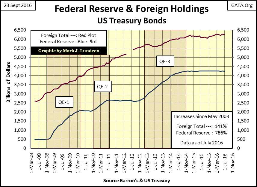
The above data is from the US Federal Reserve on foreign central banks. But the Treasury also published data on who holds US Treasury debt, the grand total is seen in the red plot below.
http://ticdata.treasury.gov/Publish/mfh.txt
After November 2014, like the Federal Reserve, foreign holdings of Treasury debt stabilized with the completion of QE3.
Next is a table using the Treasury Department’s data on foreign holders of US Treasury debt. July 2016 is the latest data. I added data from the Federal Reserve to the mix (#2), which IS NOT part of the grand total (#1). The two biggest holders are China and Japan; both have reduced their holdings by about 7%. In July there were four countries that increased their holding to new all-time highs. They show up as 0.00% in the Percent from Max Val column (column highlighted in blue). However there are thirteen double-digit percentage declines from their maximum holdings in the data.
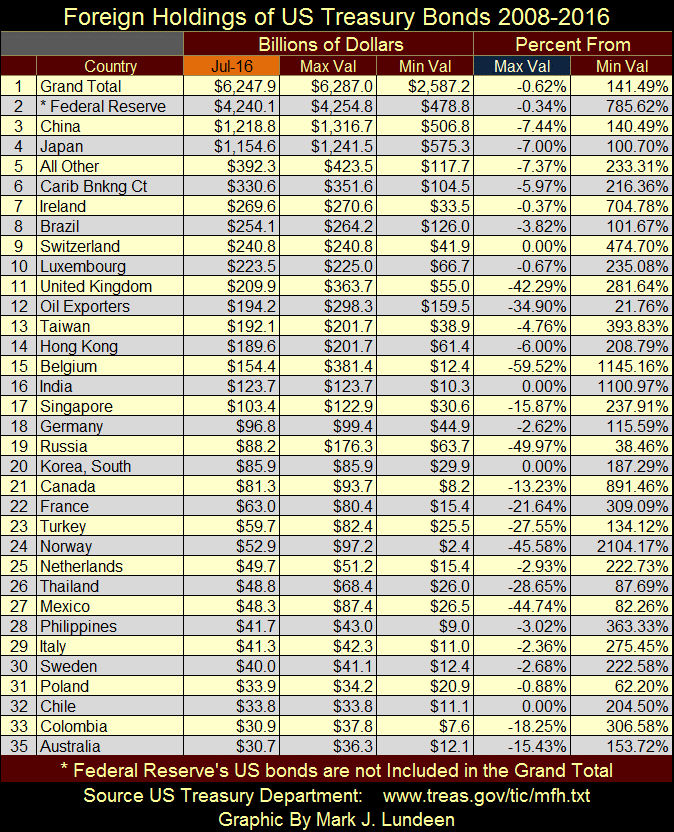
In the table I only list countries I have continuous data from May 2008 (when I began compiling this data set). Over the years there are a few countries that have come into the data, and then are withdrawn for reasons I don’t fully understand. Most likely because they only have a few billion dollars invested in Treasury bonds, so I assume their totals are included in the “All Other” category (#5) in the table. So keep in mind I don’t have the full data set published by the US Treasury.
But even the “all others” (#5) is down by 7.37%. And when I take the average to the reductions seen in the Percent from the Max Val column, the average reduction is over 14%. So how can the Grand Total (#1) be down by only 0.62%? I don’t expect my incomplete data set to match exactly with what the US Treasury has. But I have the bulk of the data, and a 14% divergence from their “Grand Total” seen in the table seems excessive.
Well, it is what it is. Looking at the table and charts above, global demand for Uncle Sam’s IOUs is on the decline. Yet bond yields for US Treasury bonds are near historic lows. How much longer can Washington’s “market regulators” keep this up?
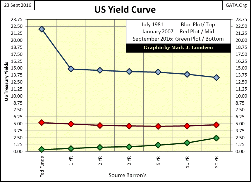
As long as they can is the answer to that question; because they have no other choice. With “monetary policy’s” suppression of bond yields in the aftermath of the credit crisis, the current yield curve (Green Plot below) is at historic lows. Should the “policy makers” allow the yield curve to shift upwards to where it was in January 2007 (Red Plot), hundreds of trillions of dollars of interest-rate derivatives would come into the money. Such an upward shift in the yield curve would create counter-party obligations the banking system could never honor or the global central-banking cartel mitigate by printing money or expanding credit.
Below are the monthly changes to the Federal Reserve’s portfolio of US Treasury debt from January 1997 to today. The source data is in the chart showing the Fed’s data plotted along with foreign central banks reserves; four charts up; red plot.
The leverage used in the banking system is amazing. From 1997 to 2007 the Federal Reserve only monetized US Treasury debt at an average rate of $2.98 billion dollars a month. Yet that was sufficient “liquidity” to inflate a bubble in the high-tech stocks in the 1990s and the real estate bubble in the early to mid-2000s.
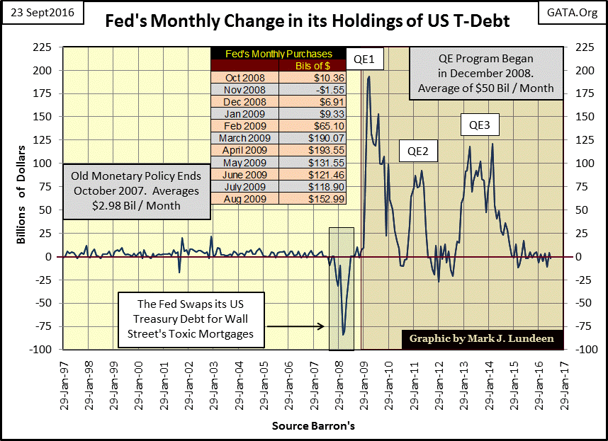
In early 2008, the Bernanke Fed began swapping its US Treasury reserves for worthless, non-performing mortgages held on Wall Street’s balance sheets. Without a doubt these worthless mortgages were purchases by the Fed at face value. In March 2008 the Fed swapped $84 billion of its US Treasury debt, purportedly the reserves backing the US dollar, for $84 billion of Wall Street’s toxic waste.
At this rate the Federal Reserve’s “tier-one monetary reserves” would have been depleted in short order. So in October 2008 Doctor Bernanke and Treasury Secretary Paulson demanded, and received from Congress “new tools” to stop the deflation in the mortgage and stock markets. In February 2009, the Bernanke Fed initiated its first Quantitative Easing program, as it monetized $65 billion dollars of Treasury Debt in a single month. See table in the chart above.
Small wonder the stock and real estate markets bottomed, and then turned upward in the following months. Doctor Bernanke was “injecting liquidity” into the financial system with an enema bag until the following August.
Though the marvels of modern “monetary policy” may astound many in the media, I’m not so easy to impress. As of this September 2016, this month, the idiot savants dictating “monetary policy” at the FOMC have monetized $4.23 trillion dollars of US Treasury debt. This is an amount that’s 80% greater than the entire US national debt at the time Alan Greenspan became Fed Chairman in August 1987. See table below.
For your information, as of September 2016 the Fed has “monetized” the entire national debt as it stood in April 1993 – up to the first three months of the Clinton Administration. Since June 1937, the Fed has monetized $3.91 dollars of every $1 increase in the US national debt. That may seem impossible, but in 1937 the national debt was a then shocking $36 billion dollars, of which the Fed had “monetized” $2 billion.
When QE4 begins, will there be sufficient Treasury debt for the Fed to “monetize?” If not that’s not really a problem. To “stabilize” the dollar and the financial markets in a future bout of deflation, the Federal Reserve could begin monetizing the trees growing in the national forests if needed. Who says they can’t? They’ve “monetized” garbage mortgages in the past, why not growing trees in the future? They’re the experts on “monetary policy”, not you or me.

The fate of the US dollar is in the hands of academic maniacs, doing the bidding of malignant-narcissist bankers and political scoundrels who don’t give a damn about anything else but their year-end bonuses or the upcoming election.
These makers of “policy” never give any consideration for those who work hard for their dollars, or of future and unavoidable dire consequences of shaping the economy and financial markets to their parochial advantage via monetary inflation. This is the world we live in. In such a world what isn’t there to like about gold, silver and the miners of the old monetary metals?
Mark J. Lundeen