20 Largest Market Caps Over The Years


Since the Dow Jones declined to its BEV -10% level at the end of October, it’s been either advancing towards record territory, closing at new all-time highs (eleven so far since November 16th), or closing within 1% of a new all-time high. Still, just looking at the Dow Jones, and not the social-media stocks, the market action hasn’t become a mania. From last February’s last all-time high, just before the 37% correction, these eleven new BEV Zeros pushed the Dow Jones up by only 5.54% above last February’s record close, not that there is anything wrong with that.
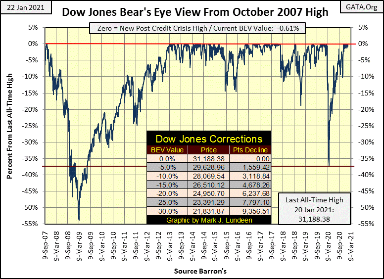
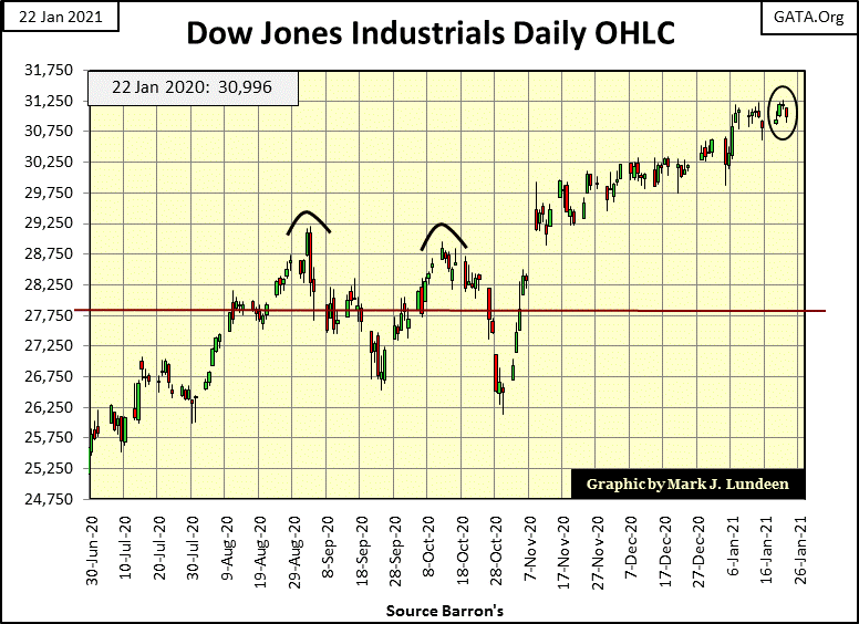
Here’s the Dow Jones in daily bars. Since the late October’s market drop off, the Dow Jones has been advancing and declining each day in little baby-steps, and that’s excellent market action for the bulls. Until we once again begin seeing days of extreme volatility, the dreaded Dow Jones 2% days, I’m expecting to see further gains in the Dow Jones, which is my proxy for the broad-stock market.
Moving on to the BEV values for the major market indexes I follow in the table below, Wednesday (January 20th) was a powerful day in the market with fourteen of the indexes closing at new all-time highs, and two more in scoring position (within 5% of a new all-time high).
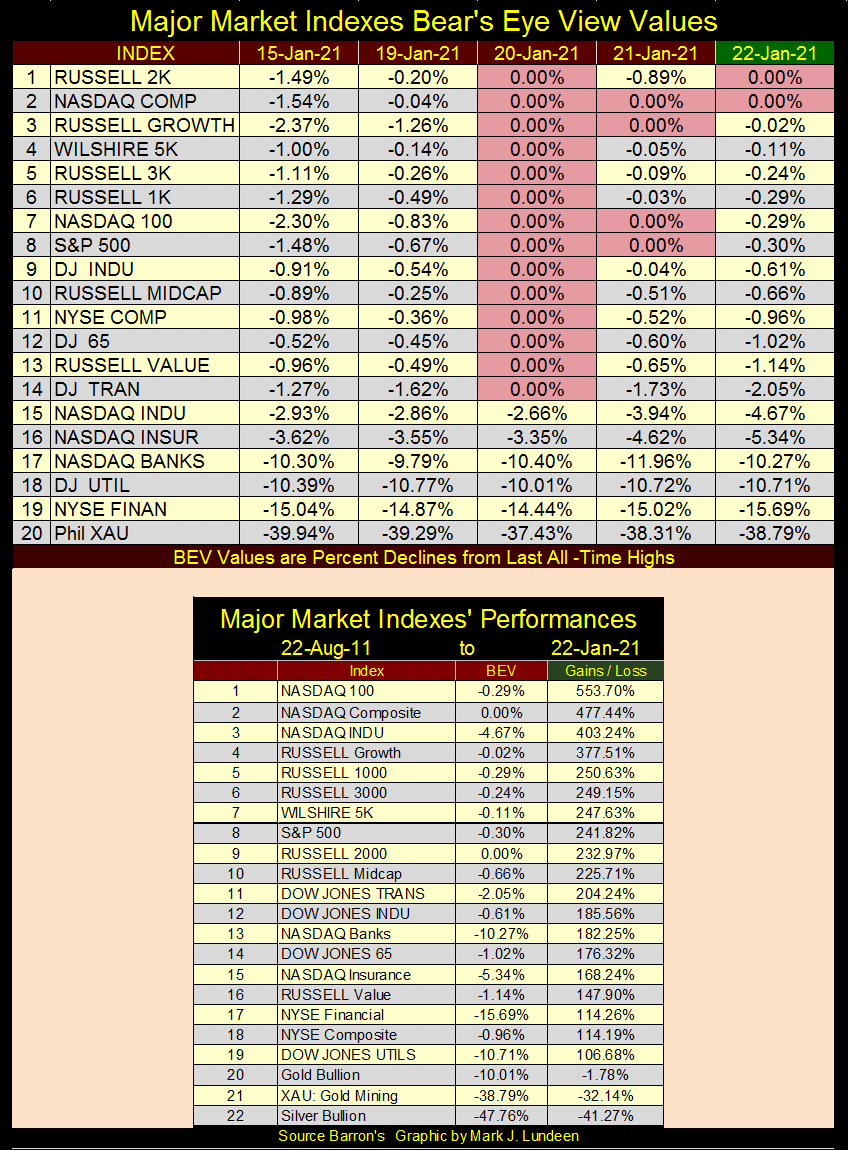
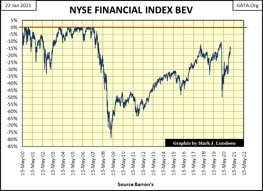
Look at the NASDAQ Bank index (#17) and the NYSE Financial index (#19). Last July they were below the XAU in this table, not now. The NYSE Financial Index in its BEV chart below hasn’t seen a new all-time high since the summer of 2007, and now it’s moving towards a new all-time high. True, this is its third attempt to make market history since 2017, and it failed on the first two. But like anything else worth doing, it’s try, try again.
Still, considering everything, as far as I’m concerned the NYSE Financial index remains damaged goods in the aftermath of the sub-prime mortgage fiasco. At its 2009 market bottom it was down by 80% from its highs of 2007. That’s a Great Depression type bear market bottom we’re seeing in early 2009. Look at how far it dropped last March; from a BEV -10% down to -50% in less than a month! But then damaged goods can do that in the stock market.
Yes but the XAU was down by 83% at its January 2016 bottom; still I’m recommending the gold and silver miners? That’s true, as historically the gold and silver miners are a volatile market sector, while financial companies are not.
Here’s a volatility comparison between banking stocks and the BGMI. From 1938 to 1971 the Dow Jones Total Market Banking Index never saw a 40% correction. However, soon after the US Treasury decoupled the US dollar from the Bretton Woods’ $35 gold peg in August 1971, all that changed as banking then became a risky business.
Freeing the US dollar from the Bretton Woods’ $35 gold peg greatly increased these banks ability to expand credit (make banks loans). Unfortunately, the new clients these banks found to extend credit to frequently defaulted on the loans made to them.
Note for the Banking BEV chart: my data only goes back to July 2018.
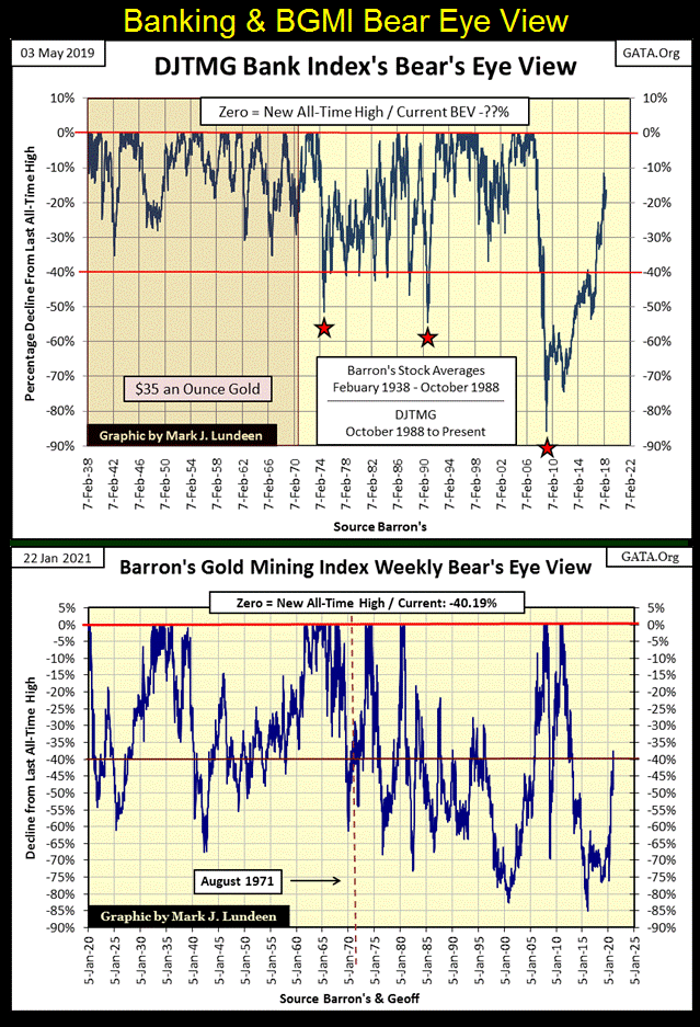
The BGMI since 1920 has seen frequent corrections in excess of 50%, as seen above. Currently the BGMI is down over 40% from its last all-time high of April 2011, coming off of an 85% bear market bottom. For the gold miners, wild volatility is just business as usual. The history seen in the BEV chart above shows that in a good market, the BGMI could be at new all-time highs by next October.
Financial companies are completely different. Since 2008 the US government has been subsidizing these financial companies with trillion dollar cash infusions and changing their accounting rules for their worthless reserves to make them appear viable. Still, the NYSE Financial Index hasn’t seen a new all-time high since the summer of 2007. Reasonable people remain fearful these financial companies may revisit its BEV -80% bottom once again sometime in the future.
Unlike financial companies, gold and silver miners have had to struggle for decades as government “regulators” allow these same financial companies to suppress the price of gold and silver. It’s like James Dines used to say; “it’s a game fish that swims upstream,” and he was right.
The gold and silver miners in 2021 are lean and mean, unlike the financial companies populating the NYSE Financial Index, who wouldn’t even be in business had the US Treasury and Federal Reserve not massively supported them in the aftermath of the 2007-09 crisis. A massive support program that most likely continues today. (See chart of M1 below)
Speaking of comparing the XAU with the other major market indexes I follow, here is my table for the major market indexes performance since gold’s last all-time high of 22-Aug-2011. Gold’s last BEV Zero before it began a brutal four year 45% market correction. How have precious metal assets, such as bullion and PM miners, done compared to the major market indexes since August 2011?
In a word; they’ve underperformed. The NASDAQ Indexes fill the top three spots in the table, and everything else not of gold or silver, have at least seen a double in the past ten years.

Precious metal assets come in last (#20-22). And what should that tell us; maybe that the trillions-of-dollars now being “injected” into the financial markets isn’t flowing into gold, or silver bullion or the valuations of precious metal mining companies?
Let me tell you how the world works; if “liquidity injected” into the economy flowed directly into precious metal asset valuations, the FOMC would refuse to “inject liquidity” into the financial system. The entire point of inflating the money supply is to create a bull market in stocks, bonds and or real estate, not gold, silver or their miners.
What drives the price of gold, silver and PM miners upwards into their bull markets is DEFLATION IN STOCKS, BONDS AND OR REAL ESTATE, which motivates investors and money managers to seek safety from Mr Bear’s day of reckoning in precious metal assets.
Every week I make much about how “liquidity injected” into the economy flows into market valuations, as opposed to during the 1960s to early 1980s when “injected liquidity” flowed into consumer good prices. The difference between the two from a “policy standpoint” is important:
- “liquidity” flowing into financial asset valuations = Bull Markets
- “liquidity” flowing into consumer good prices = CPI Inflation
One point NOT to be discussed is whether or not the FOMC should “inject liquidity” into the economy; like it or not this is what they do. So, can’t we all just get along and agree that bull markets are much better than annual consumer prices rising at double digit percentages, as they were during the late 1970s and early 1980?
Nope; not me! Consumer price inflation rising by annual double digit percentages is a painful experience that tells people something is terribly wrong. While inflation driven bull markets confuse the public into believing something terribly wrong is a benefit to society.
The problem with “bull markets”, as we’ve come to know them, driven by monetary inflation since August 1982, is they motivate people to do foolish things. Such as assume market risks, using savings that may have taken a lifetime to accumulate in overvalued financial assets that ultimately are doomed to deflate.
But before we go into that, first a note on the table below. The data is arranged by the month and year I downloaded the data from The Online Investor, for instance January 2021. But the actual data may be from 2020. The data for October 1975 is from an article by Barron’s, published in October 1975.
In Barron’s 1975 article, they covered what was once called the Nifty Fifty. So I also included the last four companies of the list of fifty as I found it interesting how #50 (Abbott Labs) came in with a market cap of only $1.03 billion. In January 2021 Abbott Labs’ has a market cap of $196 billion. Wikipedia reports in 2020 there are 2095 billionaires. In October 1975 the NYSE had around 2000 listings trading daily on it, and you can be sure there weren’t 100 of them with billion dollar market caps.
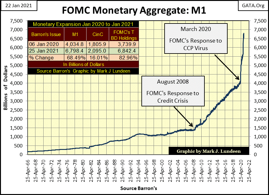
The difference between 1975 and 2020 can be seen in the chart below plotting M1. In October 1975 M1 was $0.293 trillion. In January 2021 M1 is $6.79 trillion. That’s quite a difference.
In the table at the upper left of the chart I’ve listed the values of M1, CinC and the FOMC’s holdings of T-bonds from January 2020 & 2021. The rate of expansion in these monetary metrics for the past twelve months is alarming, and if not today, will one day have dire consequences in the markets and economy.
Now on to my tables of market caps. First look at the list for October 1975; the old Nifty-Fifty Stocks. How many of them made it in the list for January 2021? Only one: Procter & Gamble. And how many companies on the January 2021 list existed in October 1975? A few did, but not the top seven.
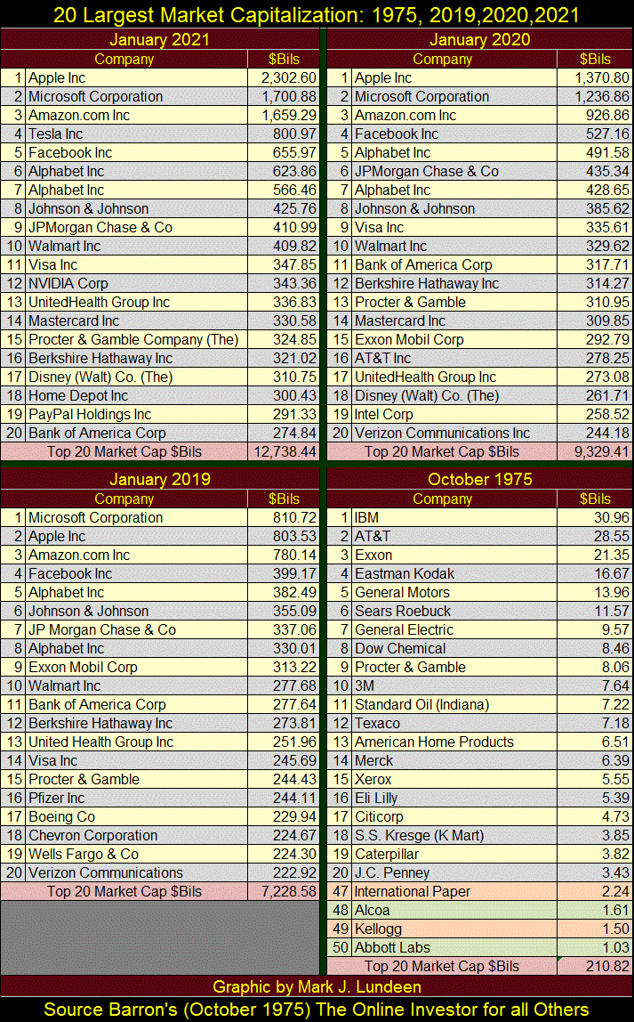
To see the impact of the FOMC’s “monetary policy” on stock market valuations, compare the market caps for Apple, Microsoft and Amazon between January 2019 and January 2021 – Wow!
I know there is an army of Wall-Street analysis diving into the “fundamentals” for earnings and whatnot for these high-tech behemoths. But “fundamental” earnings and whatnot are meaningless in this massive, inflationary driven mania in these high-tech social media stocks. The only thing that matters today is whether someone (retail investors and professional money managers) has these companies in their investment portfolios. Earnings and sales growth be damn – buy, buy, buy.
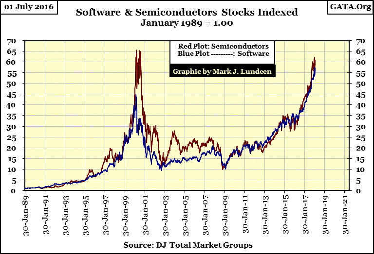
We’ve seen this before; back in the late 1990s when dot.com, software and silicon chip stocks were the hot investments everyone had to buy, buy, buy. Until after March 2000 when over the next two years a new mantra began that went like this; SELL, SELL, SELL.
Here’s another chart from my discontinued Dow Jones Total Market Group for the semiconductor and software stocks. During the 2000-2002 Tech Wreck software stocks went from an indexed value of 45 down to 10, a 77% bear market bottom. The semiconductor stocks declined from a 65 indexed value down to 10, an 85% bear market bottom.
The same happened with single family mortgages, where from 2002 to 2007 it was buy, buy, buy, only to become sell, sell, sell in 2008-2009. We almost had a new boom/bust cycle begin last March when panic selling in the stock and bond market motivated the FOMC to “inject” over a trillion dollars into the markets in only three weeks.
The FOMC’s inflationary-monetary policy has created a series of booms and busts since August 1971, of which the social media tech giants of 2021 are only the latest. This too shall go bust, resulting in trillions-of-dollars in market capitalization fleeing these companies.
But to go where? Well, if you were to look at precious metals investments during the bust cycle of the 1990s high-tech mania, the 2002-2007 real estate boom, as well as last March’s fiasco, gold and silver bullion as well as precious metal miners became top performers in the market.
This is a good time to look at gold’s BEV chart going back to 1969. It’s apparent gold (silver and the XAU too) began their current bull market as the 1990s high-tech mania began deflating in early 2000s. After closing above $1000 in March 2008, Gold began a six month, 30% correction. What actually happened was Wall Street was in the early stages of the sub-prime mortgage panic, and they decided to whack the gold and silver markets so no one got any funny ideas. But by October 2008 gold, silver and the XAU resumed their bull market as everything else continued down and Doctor Bernanke began his first of three QEs.
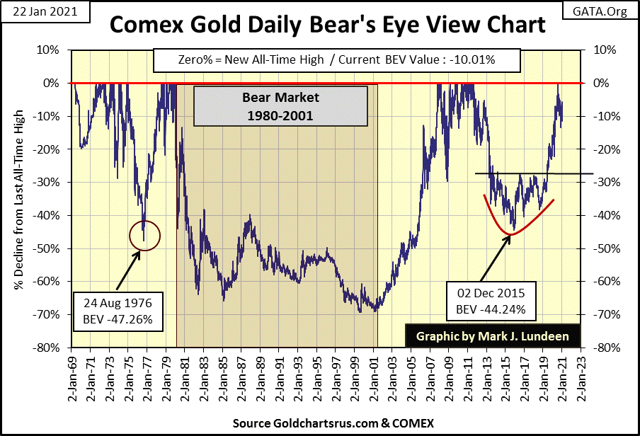
Three years later, in August 2011 gold closed at $1888, just under $2000 when it began a four year, 45% correction that bottomed in December 2015. Last August gold closed over $2000 and has been correcting since.
But we should notice when gold broke above $1000 in March 2008, it corrected by 30% six months later. Then in August 2011 when it advanced just short of $2000 ($1888), it corrected for the next four years by 45%. Then in 2020 gold actually closed above $2000 six months ago, but the bears have failed to force the price of gold below its BEV -15% line in the chart above.
I don’t know how much longer this correction in gold and silver will last. But as seen in gold’s BEV chart above, its post August 2020 correction, has been the shallowest correction gold has seen since 1999. If the bears can’t get gold to correct below its BEV -15% level, what will the bulls do to the price of gold when they resume its advance?
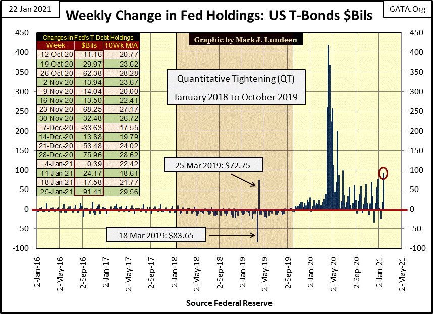
But when will the bulls once again charge up the hill? Who knows? But this week the FOMC “injected” $91.41 billion into the financial system (Red Circle below). Looking at the weekly “injections” in this chart, it’s obvious that the FOMC is seeing the necessity of increasing the weekly does of “liquidity” to the financial system. Growing “injections” of “liquidity” is typically a precursor to problems with the big banks that have plagued high finance for decades now. So what’s up with that?
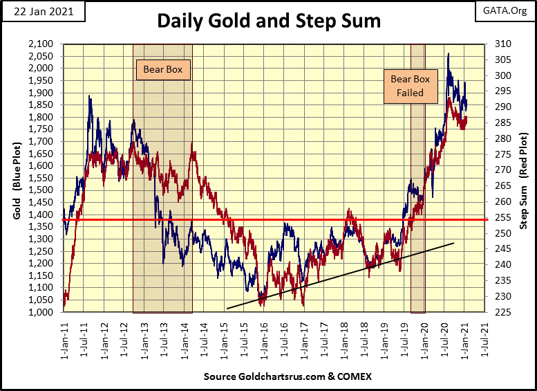
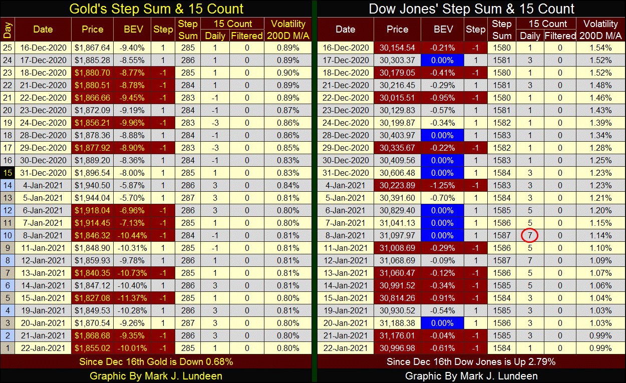
Moving on to gold’s step sum chart below, not much has changed for a few weeks now. No matter, as this chart still remains very positive for the near-term future of the price of gold.
Same goes for the step sum chart for the Dow Jones below.
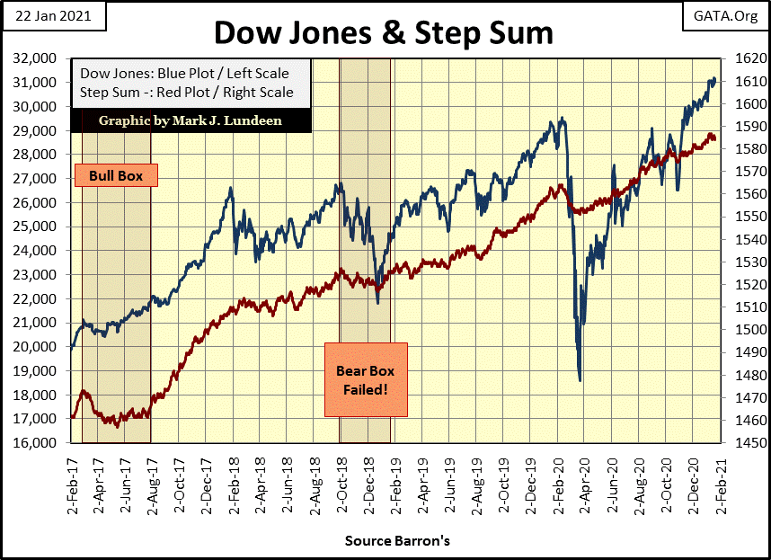
Moving on to gold’s and the Dow Jones step sum table below, we see volatility for gold decreasing from 0.89% in mid-December down to 0.80% at the close of this week. Bull markets for gold and silver are volatility markets, a factor this gold market is lacking, so I’m not surprised gold has become a bit boring. But as I’ve mentioned above, since last August the bears have failed to drive gold below its BEV -15% line. I think that is an important insight to the gold market as we progress further into 2021.
That’s all I have for this week. One thing is for sure in the markets; next week will reveal new developments. So until then may the Good Lord smile on all of us and our love ones.
Mark J. Lundeen
********


