Is 2019 Similar To 2007? What Does It Mean For Gold?


The Fed cut the interest rates at the end of July. As the previous easing cycle started in September 2007, many analysts are saying that the current year looks more and more like 2007. We invite you to read our today’s article that compares the current year with 2007 and find out what are the implications for the gold market.
The recent Fed’s interest rate cut has been the first such since December 2008, when the U.S. central bank slashed the Federal Funds Rate to almost zero. However, the Fed started its previous easing cycle in September 2007, when it cut interest rates by 50 basis points amid the severe slump in housing prices. Is this why many analysts are saying that the current year looks more and more like 2007? Are they right? And what would it mean for the gold market?
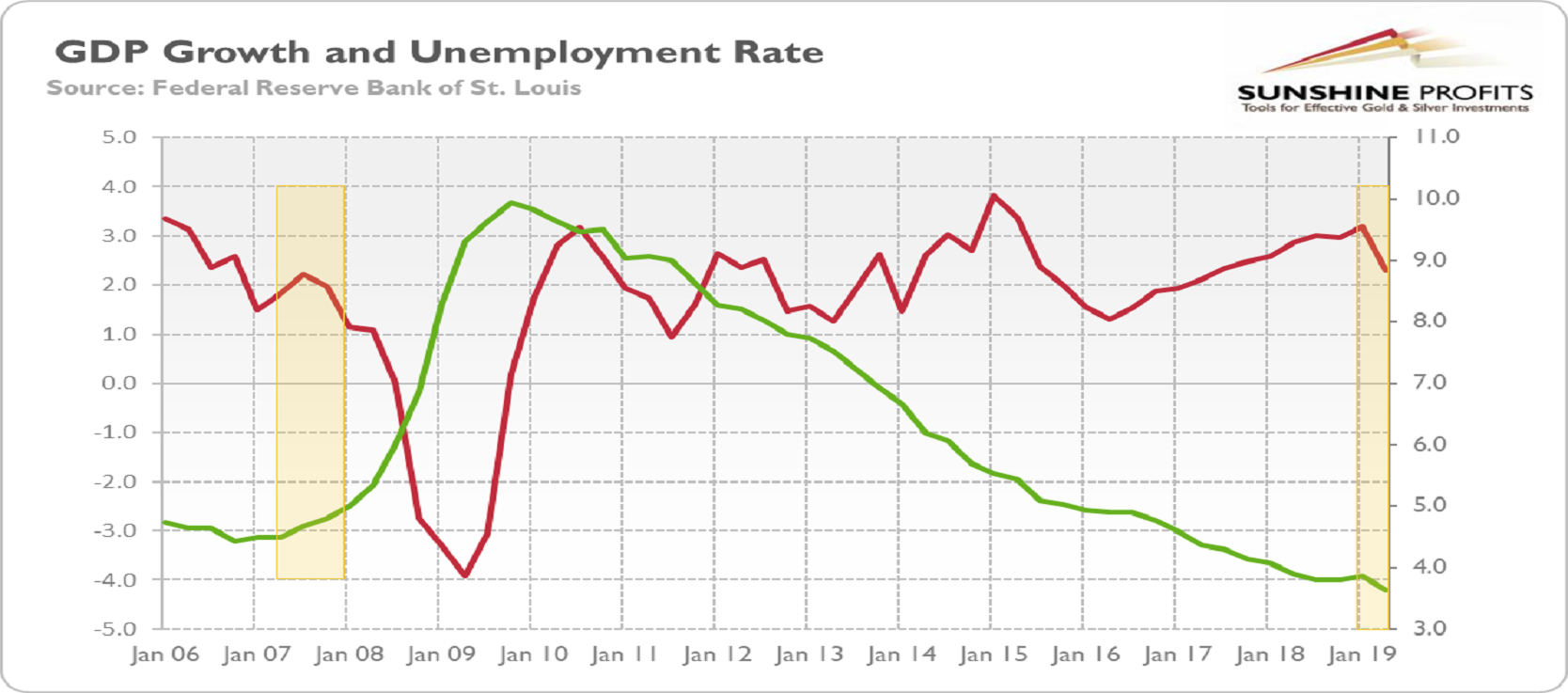
Let’s start with the two most important macroeconomic indicators: the GDP and the unemployment rate. As the chart below shows, the macroeconomic picture was uglier when the Fed cut rates in 2007. The economic growth was both slower and decelerating, and the unemployment rate was already on the rise. Today, the unemployment rate is still at an ultralow level. However, the GDP growth has started to decelerate after peaking in Q1 2019. The economic activity remains at solid rate, but if the downward trend continues, the unemployment rate may start to increase, bringing us closer to a recession.
Chart 1: The real GDP growth (red line, left axis, in % y-o-y) and the unemployment rate (green line, right axis, U3, in %, quarterly average) from Q1 2006 to Q2 2019.
And what about asset prices? Luckily for the economy, the home prices are not declining right now. It might save America from the worst-type recession, where households’ balance sheets are squeezed. This is bad news for gold, as financial crises accompanied by the housing bust and the resulting debt overhang are the most severe ones. It means that the safe-have demand for gold might be not as great as it could be.
Chart 2: S&P 500 Index (red line, left axis) and the S&P/Case-Shiller U.S. National Home Price Index (green line, right axis) from January 2006 to May 2019.
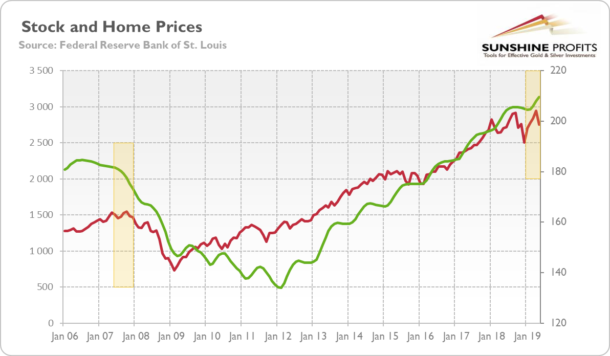
However, the U.S. stock market behaves in a way as it did in the year 2007. Twelve years ago, the S&P 500 Index peaked in October 2019, one month after the Fed cut interest rates. It may still rebound, but it seems that the index has already peaked in July 2019, just a few days before the FOMC meeting.
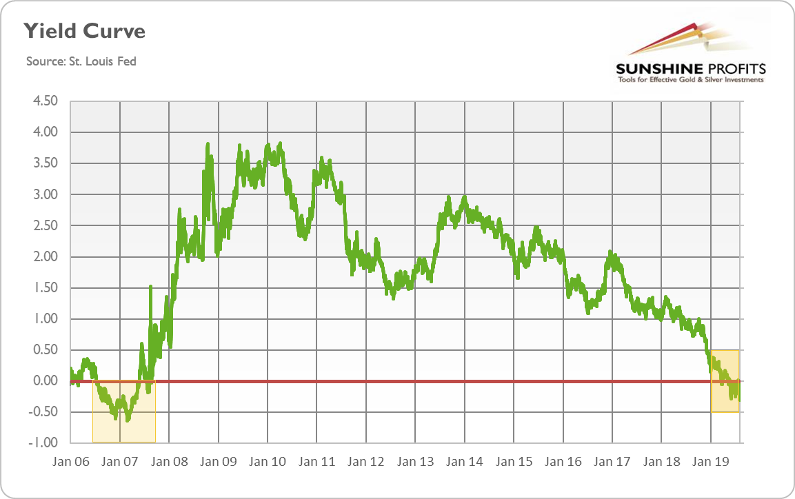
The yield curve could not be missing in our analysis. Previously, the yield curve inverted in July 2006, more than one year before the Fed’s interest rate cut and about one and a half year before the start of Great Recession. This year, the spread between long-term and short-term interest rates turned negative in May, and the Fed reacted just two months later. Now, if history is to repeat itself, the sequence should be as follows: the normalization of the yield curve in a few months and then recession in the next few months.
Chart 3: Yield curve (spread between US 10-year and 3-month Treasuries, daily numbers, in %) from January 2006 to August 2019.
And gold should shine. At least as long as people fear the economic crisis. Please take a look at the chart below, which shows gold prices from 2006 until today. As one can see, the price of gold started to rise in August 2007, just when the Fed cut interest rates. The bullion’s value has been rising until March 2008, when the U.S. central bank rescued Bear Stearns. The bailout restored, for a while, the confidence in the Fed and the economy, pushing the gold prices down.
Chart 4: The price of gold (London P.M. Fix, in %) from January 2006 to August 2019
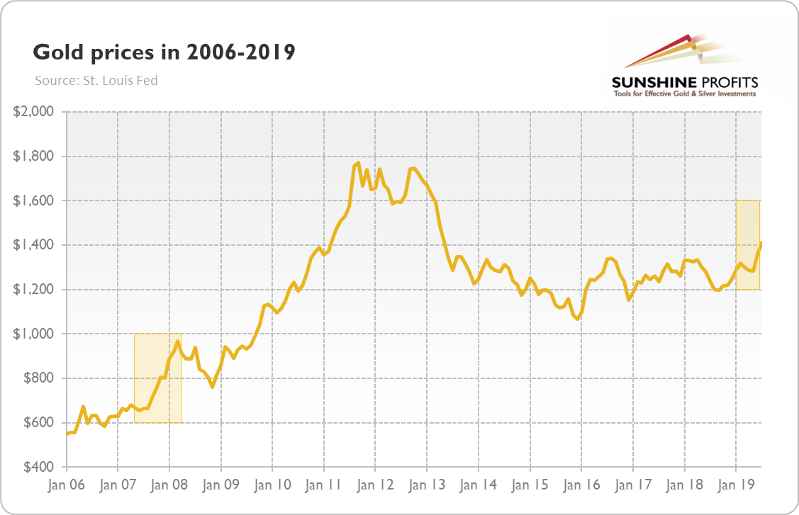
But the yellow metal managed to jump during the first phase of the Fed’s easing cycle from $665 to $968, or about 46 percent. It means that from the fundamental point of view (not taking into account the technical factors) there is still room for the bull market in gold, as gold gained “just” 17 percent amid the recent accommodation cycle. Actually, gold may rally even more when the next financial crisis hits. Why? Let’s take a look at the chart below.
Chart 5: Federal debt to GDP (green line, left axis, as %), household debt to GDP (blue line, left axis, as %), nonfinancial corporate debt to GDP (red line, left axis, as %) and total debt to GDP (purple line, right axis, as %) from 1950 to 2017
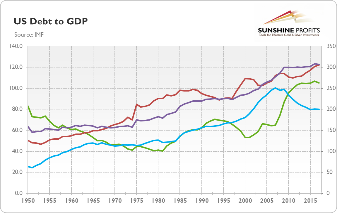
As one can see, the total debt in the U.S. economy has increased from 277 percent of GDP in 2007 to 307 percent in 2017 (and even more today), despite the fact that the household sector deleveraged. It means that the U.S. economy is more fragile than a decade ago and even a mild negative shock could shake the markets. So, even though 2019 looks better than 2007, the next financial crisis could be still ugly and boost gold prices.
If you enjoyed the above analysis and would you like to know more about the fundamentals of the gold market, we invite you to read the September Gold Market Overview report. If you’re interested in the detailed price analysis and price projections with targets, we invite you to sign up for our Gold & Silver Trading Alerts. If you’re not ready to subscribe yet and are not on our gold mailing list yet, we urge you to sign up. It’s free and if you don’t like it, you can easily unsubscribe. Sign up today!
Arkadiusz Sieron
Sunshine Profits‘ Gold News and Gold Market Overview Editor
* * * * *
All essays, research and information found above represent analyses and opinions of Przemyslaw Radomski, CFA and Sunshine Profits' associates only. As such, it may prove wrong and be a subject to change without notice. Opinions and analyses were based on data available to authors of respective essays at the time of writing. Although the information provided above is based on careful research and sources that are believed to be accurate, Przemyslaw Radomski, CFA and his associates do not guarantee the accuracy or thoroughness of the data or information reported. The opinions published above are neither an offer nor a recommendation to purchase or sell any securities. Mr. Radomski is not a Registered Securities Advisor. By reading Przemyslaw Radomski's, CFA reports you fully agree that he will not be held responsible or liable for any decisions you make regarding any information provided in these reports. Investing, trading and speculation in any financial markets may involve high risk of loss. Przemyslaw Radomski, CFA, Sunshine Profits' employees and affiliates as well as members of their families may have a short or long position in any securities, including those mentioned in any of the reports or essays, and may make additional purchases and/or sales of those securities without notice.
********

Arkadiusz Sieroń received his Ph.D. in economics in 2016 (his doctoral thesis was about Cantillon effects), and has been an assistant professor at the Institute of Economic Sciences at the University of Wrocław since 2017. He is a board member of the Polish Mises Institute of Economic Education, author of several dozen scientific publications (including in such periodicals as the Journal of Risk Research, Prague Economic Papers, Quarterly Journal of Austrian Economics, and Research in Economics), and a regular contributor to GoldPriceForecast.com and SilverPriceForecast.com. His two books, Money, Inflation and Business Cycles and Monetary Policy after the Great Recession, are both published by Routledge. Arkadiusz is also a certified Investment Adviser, a long-time precious metals market enthusiast, and a free market advocate who believes in the power of peaceful and voluntary cooperation of people.


