Barron’s Confidence Index Is Collapsing
 share
share
 share
share
 share
share
 share
share
 share
share
The week closed with the Dow Jones’ BEV -17.5% line of resistance holding, though on Wednesday the Dow Jones did close above this critical level, for a few hours anyway. Friday’s close found the Dow Jones at its lows for the week. But for the bulls out there, hope springs eternal as there is always next week.
What if the Dow Jones clears this line of resistance? I’ll just have to find another important BEV level in the chart below to see if it’s willing to perform as a proper line of resistance, better than the BEV -17.5% level has. What BEV level had for years provided a line of support during the bull market’s advance that can now perform as a line of resistance?
A quick look below and I believe the best candidate for its next line of resistance would be the Dow Jones’ BEV -7.5% line. Looking at the table for Dow Jones Correction on the chart; a BEV of -7.5% is the Dow Jones at 27,335.
Isn’t looking at the Dow Jones in the Bear’s Eye View uniquely informative? I love BEV charts!
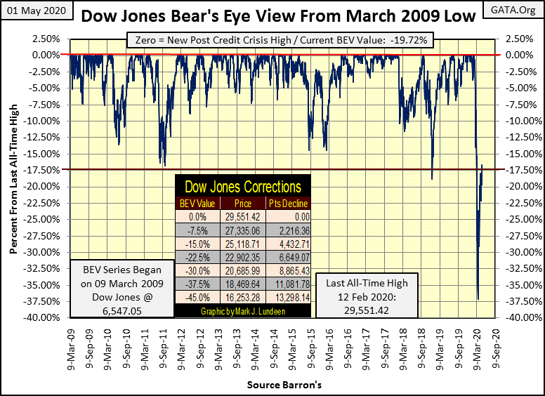
But it’s too early to be talking about shifting our line of resistance up by 10 BEV points; the Dow Jones has yet to clear its BEV -17.5% line. As 2020 progresses I believe it will become increasingly more difficult for the bulls to advance towards the goal line – a new BEV Zero (new all-time high).
The big reason is the coronavirus pandemic has shut down much of the economy. Below we see Royal Dutch Shell; a huge energy company is cutting its dividend payout for the first time since WWII.
Shell cuts dividend for first time since World War II as oil demand collapsesUpdated 9:21 AM ET, Thu April 30, 2020
https://www.cnn.com/2020/04/30/investing/shell-dividend-cut/index.html
This story isn’t just about Shell Oil. Reading between the lines it’s about what happens to aggregate corporate cash flow, and profits when demand in an economy declines – for whatever reason. I don’t know what corporate earnings will do in the months to come, in these times-of-trouble earnings are pretty much what the Government Regulators allow.
After what was allowed the financial companies that rule Wall Street during the sub-prime mortgage fiasco of 2007-09, I don’t take corporate earnings too seriously. But dividend payouts are different, as they require companies to send out cash to their shareholders, and that takes money, real money.
The payout for the Dow Jones was $659.77 at the close of this week, near its all-time highs. Whether the Dow Jones can break above its BEV -17.5% line, and stay there will depend on whether or not the Dow Jones can defend this payout during this time-of-trouble. That’s how I see it.
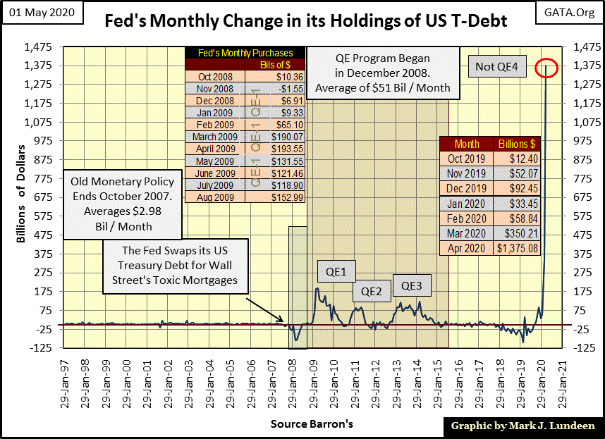
But there are those who see it differently, like the members of the FOMC who are flooding the financial markets with more dollars than is good for us, or them. In April the FOMC “injected” a whopping $1.38 trillion dollars into the financial system, a single month, and for all that they couldn’t get the Dow Jones to close above its BEV -17.5% line. What’s with that!!
Where would the Dow Jones be today had the FOMC not begun its Not QE-4 last October? My best guess is I wouldn’t have wasted time this week wondering whether the Dow Jones’ BEV -7.5% line would be the Dow Jones next line of resistance!
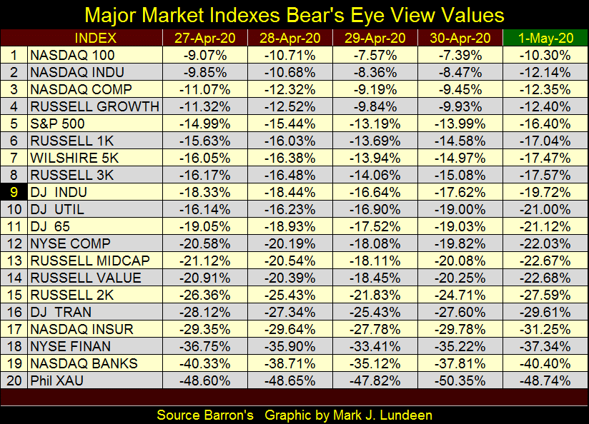
Next is my table listing the daily closing BEV values for the major-market indexes I follow; the Dow Jones is #9. The market showed some strength up to Wednesday’s close, but on Friday’s close these indexes closed at their lows for the week.
I see some single-digit BEV Values, though on Friday there were none. Will we see them return, plus more come next Friday?
Next is the Dow Jones in daily bars. The Dow Jones appears weakening as April flowed into May. Keep in mind next week could be a good week for the market. But seeing how Wednesday was the peak for the post March 23rd advance, an advance that has been dragging its tail these past three weeks, I’m thinking the next few weeks may be a time for this advance to correct.
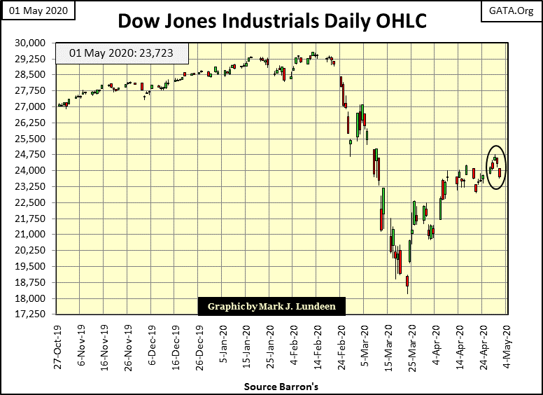
If on this supposed correction of mine the Dow Jones shows more enthusiasm to the Down side than it did advancing, the Big-Bear Market just might have begun a new phase. Not a prediction of mine, I’m just thinking to myself.
Here’s Mr Bear’s Report Card. Have you noticed how much calmer the market has been since its lows of March? Well that’s not true! What you’re feeling is the reaction of human psychology to anything unpleasant, which in the stock market is extreme market volatility, aka Dow Jones 2% days. The market isn’t calming down; we have only gotten use to its extreme volatility.
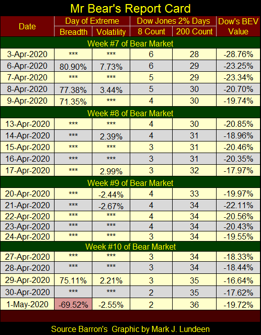
The stock market can go for years without seeing the Dow Jones move 2% or more from a previous day’s closing price. Since February 24th we’ve seen at least two extreme days of volatility, and frequently more for the past ten weeks. With the Dow Jones advancing off its March 23rd bottom, we may now feel warm and fuzzy. But seeing even one Dow Jones 2% day week after week is damn bearish – it just is.
Looking at the Dow Jones’ 8 (Red Plot / Right Scale) & 200 (Blue Plot / Left Scale) counts below, we see historic market volatility. The Dow Jones’ last all-time high was fifty-five trading days ago (February 12th). With the 200 count closing the week at 36, this means more than half of the daily closings since the Dow Jones’ last all-time high were extreme days of volatility. Nothing like this has been seen since the depressing 1930s.
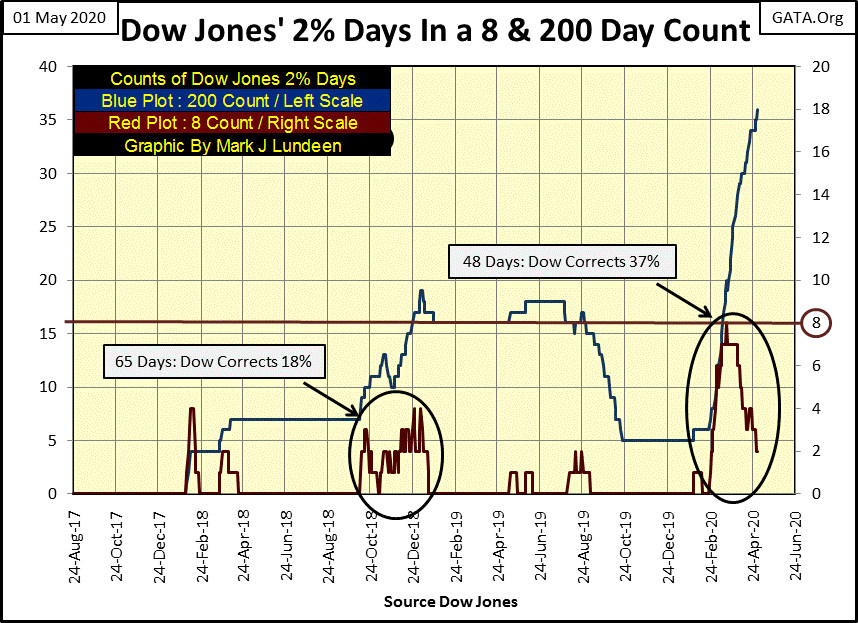
The Dow Jones’ 8 count saw a count of 8; eight consecutive 2% days in a row on March 18th. The last time that happened, the only other time that has happened was during the Great Depression in October 1933. We’re looking at history in the making in the chart above.
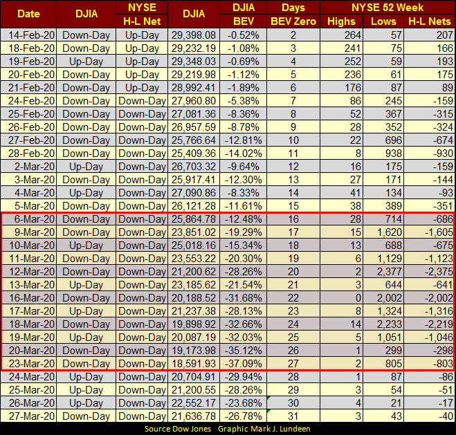
All that is true, but we really are in a calm in this bear market. From March 6th to the 23rd the stock market saw a selling panic, as seen in NYSE 52Wk Lows overwhelming 52Wk Highs in the market in the table below.
Just this past week NYSE 52Wk Highs have finally outnumbered 52Wk Lows. But so far the 52Wk H-L Nets have all been below +30. If during May, or even June the NYSE fails to see its 52Wk H-L Nets rise up into positive triple digits, it’s not good for the bulls.
This week ended at day 55 of our bear market, and yes I do believe we have yet to see this bear market’s ultimate low; far from it. But since the March 23 bottom we’ve enjoyed a nice dead-cat bounce.
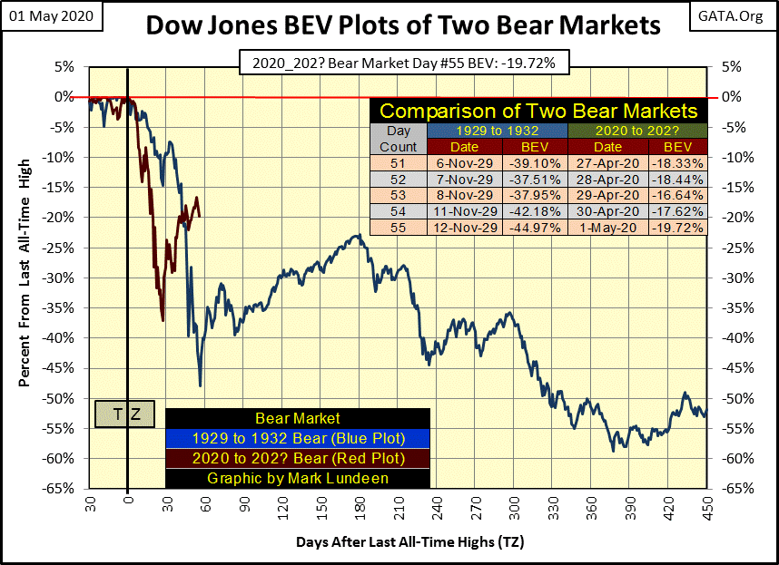
Question: how much further does this dead-cat bounce? Just eyeballing the red plot above; the Dow Jones is looking kind of tired. Let’s see what the FOMC has planned for the markets in May, because monetary inflation from the Federal Reserve is the only thing the stock market has going for it.
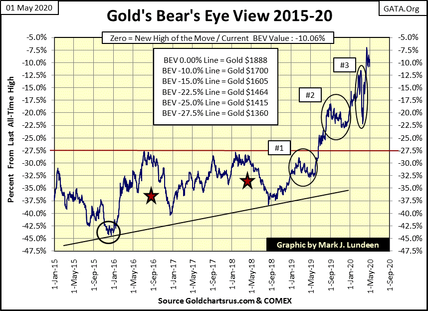
Let’s look at gold’s BEV chart below. Do I really have this right; the FOMC has “injected” $1.38 trillion dollars of “liquidity” into the financial system in the month of April, and gold is still struggling with its BEV -7.5% line?
Yep; that’s the situation gold finds itself in as the markets move into May 2020.
You do realize one of these days gold is going to see a daily advance of well over 10% or even 20%. Currently the largest daily advance for gold happened on 19 March 1980; a one day advance of 13.08% (chart below).
In 2020, can we take out that record advance from forty years ago? With the full assistance of the FOMC and their “monetary policy” of “injecting” over a trillion dollars into the financial system in a single month, what do you think? The real question is when?
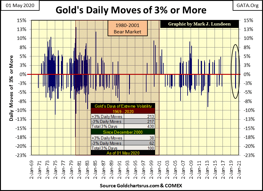
Until just this year, gold hasn’t seen any extreme volatility since late 2016. So far in 2020 it’s seen six (two positive and four negative 3% days). After a three year hiatus from extreme daily volatility (3% days), that tells me something has changed in the gold market; a promise for better things to come for the bulls.
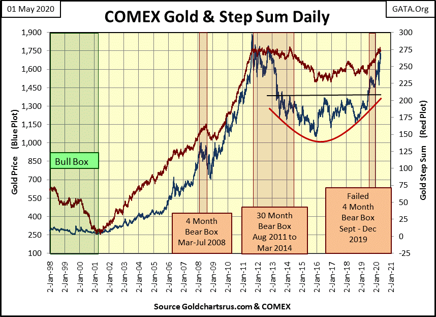
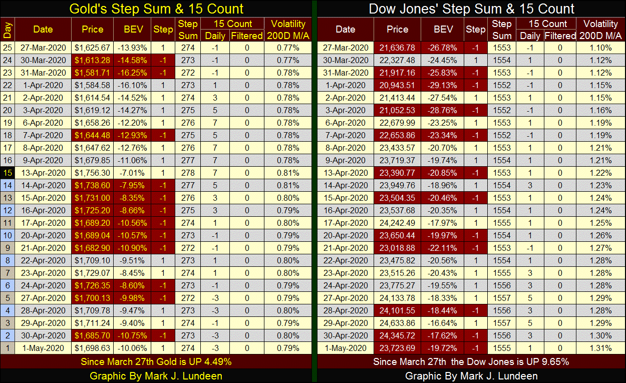
Here’s gold and its step sum chart. It continues looking good, but I’m tired of waiting for gold to break above its $1750 level, and then staying above it. Maybe in May gold will finally get it done.
For the Dow Jones below, as for gold above, their step sum charts have changed little these past few weeks. It seems we are at a pause in the market, waiting for something to change. Give it time and everything will be different from what we see today. Whether you and I will enjoy the coming change is the real question.
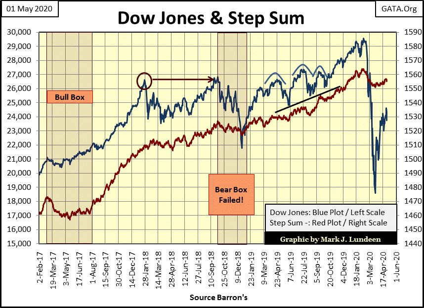
Below in their step sum tables, both gold and the Dow Jones’ step sums are stuck in neutral, not moving much from where they were on March 27th. Daily volatility for gold hasn’t moved much either. We need more extreme volatility for gold to keep me happy. As far as daily volatility goes for the Dow Jones, its 200 Day M/A closed the week at 1.31% on an uptrend. Not good for the stock market if you’re a bull.
I haven’t written anything on the Barron’s Confidence Index (CI) for years. As since Barron’s March 30th issue the CI has been in a state of collapse, maybe it’s time to review this historic market series.
Barron’s has never properly covered or promoted their own market series, so most investors have never heard of their Confidence Index. The now discontinued Barron’s Stock Averages (BSA) were published weekly from 1938 to 1988, and except for a few articles during the early 1940s, the BSA were left to Barron’s readers to scrutinize on their own.
For the past nine decades Barron’s Confidence Index’s story is much the same, which is a pity as the story it tells about the financial markets is extremely informative.
The CI is the ratio of two investment-grade corporate bond yields:
- Barron’s Best-Grade Bonds (Blue Plot Below)
- Barron’s Intermediate-Grade Bonds (Red Plot Below)
Barron’s has published this data since 1938, but I pushed it back to 1934 by using the bond tables which at the time were also published. I noted the yield for their best-grade bonds on its first week of publishing, which I then took ten bonds with similar yields, taking an average of those yields, I reconstructed Barron’s Best-Grade Bond Yields going back to Barron’s 01 January 1934 issue.
The Intermediate-Grade Bonds Yields were easy, as Barron’s used the Dow Jones 40-Bond Average Yields which they published weekly since their 09 August 1926 issue. So, below is a record of these corporate bond yields going back to the first week of January 1934.
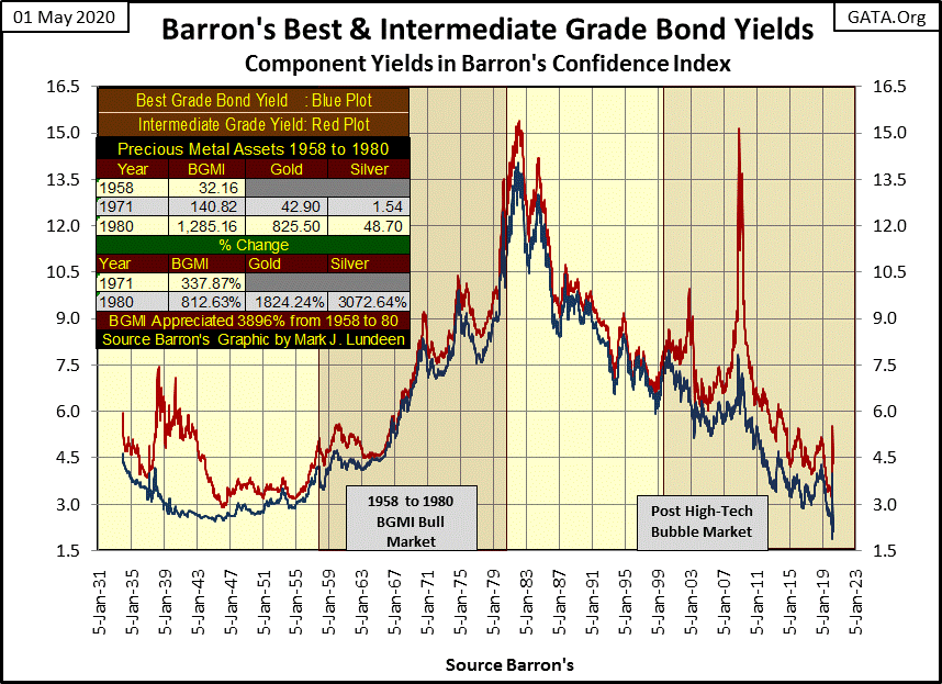
I inserted a table for the Barron’s Gold Mining Index (BGMI: the sole remnant of the BSA) as well as price data for gold and silver to illustrate how the 1957 to 1980 BGMI, and 1971 to 1980 bull markets for gold and silver happened in a rising interest rate environment.
As most “market experts” warn investors that rising interest rates are bad for gold and silver, it’s important to know this certainly wasn’t true in the last precious metals bull market. When these two historic bond yields once again trend higher; I expect our current precious metals bull market will have entered into a new and much more intense phase.
Why would this be so? Because since 1945 the Federal Reserve had been issuing more than $35 paper dollars for every ounce of gold held in the US gold reserves, and these inflationary paper dollars were flowing into consumer and producer prices. This was in disregard to the Bretton Woods $35 gold peg, but then “policy making” has always placed itself above the law of the land.
As expected, in 1957 a run on the US Gold Reserves began (chart insert below) resulting in a bull market in the BGMI that would last until 1980.
By 1971 the ever increasing supply of paper dollars (CinC) made it impossible to maintain the fiction of $35 gold, the US Treasury suspended the exchange of its paper dollars for its gold reserves. This resulted in a bull market for gold and silver bullion that would last until January 1980.
The plots in the main body of the chart below illustrates the extent the US Dollar has suffered from monetary inflation since 1925, where CinC (paper dollars in circulation) was only 4.48 billion dollars. By August 1971, when the US Treasury closed its gold window terminating the Bretton Woods $35 gold peg, CinC had increased to 59.01 billion dollars. At the close of this week CinC had increased to 1,903.43 billion dollars.
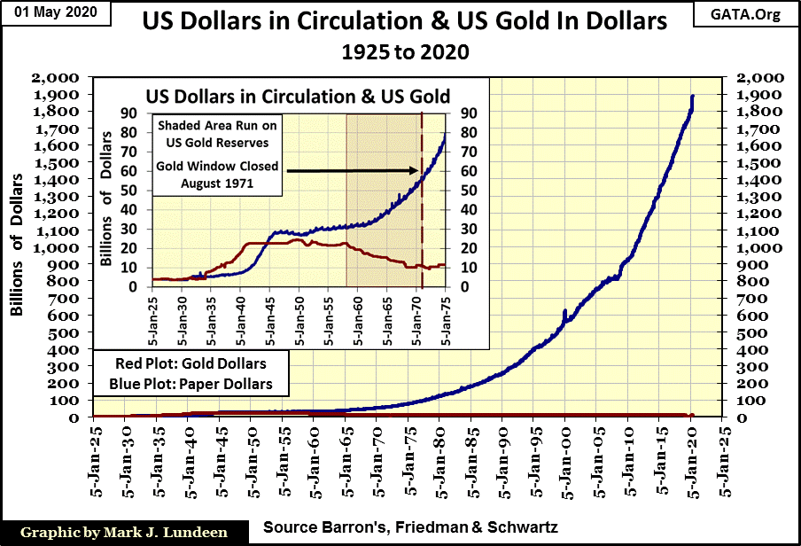
This data is from the Federal Reserve’s own publication. Claims made by FOMC members their “monetary policy” is one of low inflation are just damn lies; look at the chart above. Predictions of market watchers the price of gold will one day soar above $30,000 an ounce should be seen as inevitable.
From 1945 to the early 1980s, paper-dollar inflation flowed into consumer goods. The bond market’s reaction to rising CPI was to discount bond prices to increase their yields. In other words, CinC inflation resulted in a historic bear market for bonds from the early 1950s to October 1981 when bond yields peaked. During this period deflating bond prices (rising bond yields) offered little competition to inflating precious metal investments.
After bond yields peaked in October 1981, inflationary dollars stopped flowing into the prices of goods and services, and began flowing into financial asset valuations. Bonds, as well as stocks and real estate began bull markets that continue to this day, as official CPI inflation annual rates declined to low single digits.
Realizing monetary inflation has been a chronic-market reality since the end of World War II, looking at the component-bond yields for the CI above informs us where monetary inflation is flowing to:
- Rising yields: inflation flowing into consumer prices
- Declining yields: inflation flowing into financial asset valuations
So, what does all this have to do with Barron’s Confidence Index? Nothing really, but this historical background is still important to understand context for the current market. In 2020 Barron’s Bond yields declined to historic lows. What’s next for them in the years to come; increase to historic highs?
Investors will never get this inside scoop from “market experts” and economists. Actually, unless investors have access to historical market data, such as bond yields going back decades, they’re not even aware of the macroeconomic significance of bond yields on the flow of inflation from the Federal Reserve.
But the FOMC is very aware of the risks to financial market valuations should bond yields bottom, and once again begin a long-term rising trend as seen from 1950 to 1981. Potential liabilities for such a market event for Wall Street are in the hundreds of trillions via the OTC derivative markets.
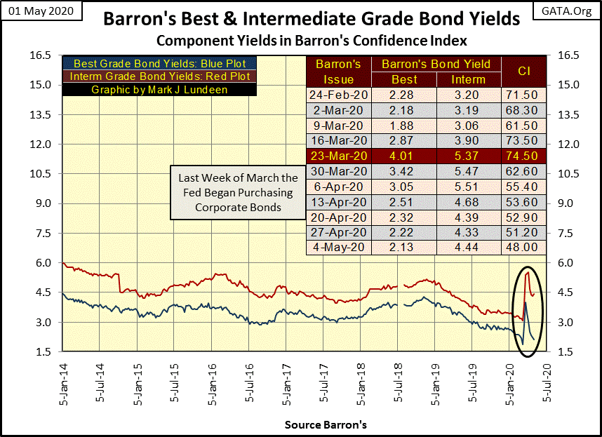
In Barron’s March 23rd issue corporate-bond yields spiked (see table in chart below). The FOMC’s reaction was immediate; they began purchasing corporate bonds to “support valuations” in the bond market for fear of capital flight from the debt market into inflation hedges such as commodities and precious metals.
That’s only an opinion on my part. However, if you take a moment to review the bond yields in the chart above going back to 1934; after a bull market in bonds that began in October 1981, with yields declining to historic lows just weeks ago, anticipating a prolonged period rising yields (bond-bear market) is justifiable.
Keep in mind that the last bull market in precious metal assets happened from the late 1950s to 1980, as bond yields increased from around 3% to double-digits. Current historic low bond yields are just another factor in deciding whether one should exit the financial markets (stocks, bonds & real estate) and take a position in gold and silver bullion as well as the precious metal miners.
With all that out of the way, now on to Barron’s Confidence Index (CI), which Barron’s explains as follows:
“High-grade index divided by intermediate-grade index; decline in latter vs. former generally indicates rising confidence, pointing to higher stocks.”
So, as the Intermediate Bond Yields declines (comes closer to the yield of best grade bonds) the CI increases in value, and a rising CI is an indication of rising confidence in the financial markets, which points to rising valuations in the stock market.
And that can be true, but not always; as since Barron’s March 23rd issue where the CI has collapsed by over 20 points (see table in chart above) as the stock market has recovered from its March lows. One thing is certainly true about the CI; it is a miserable-technical indicator for timing profitable entry and exit points in the fixed-income market (bonds).
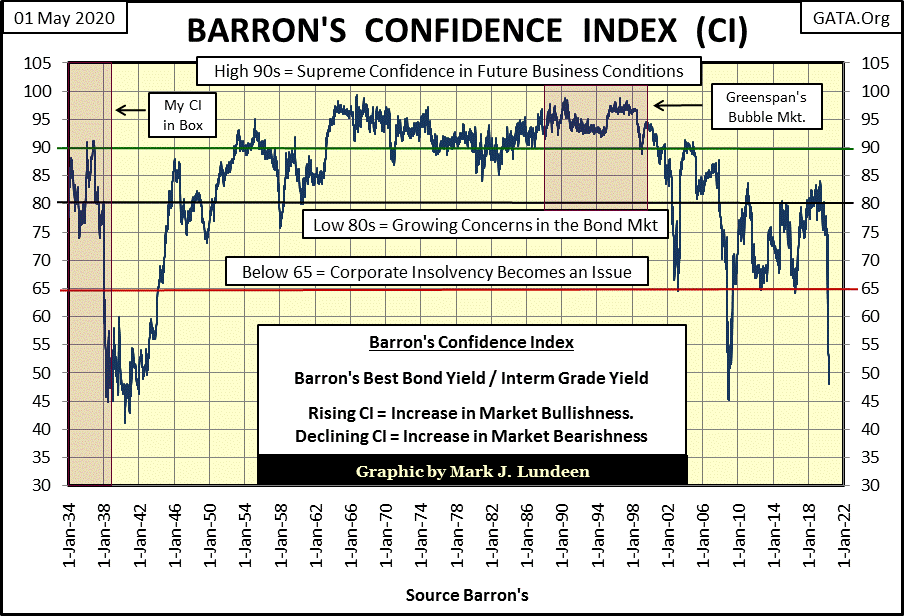
I’ve studied this data set for a few decades, and it seems the CI is actually the bond markets assessment of less than best grade bond issuer’s ability to service their debts to term.
That was certainly the case during depressing late 1930s and early war years of the 1940s. BOND HOLDERS saw nothing but losses from the early 1960s to 1981, in both nominal and inflation adjusted terms. But the CI continued showing strength during the entire bond-bear market as BOND ISSUERS benefitted greatly by borrowing in dollars that only lost value during this inflationary period of market history.
The high CI of the 1960s and 70s wasn’t promoting the bond market as a profitable opportunity for bond buyers. With bond yields rising from 3% in the early 1950s to over 15% in 1981, buying and holding bonds was only good for locking in one’s capital losses. But the +85 CI was showing that less-than-best grade corporations’ had little difficulty servicing their debts in the depreciating currency their bonds were denominated in.
And so it was until the summer of 2000 during the meltdown in the NASDAQ high tech stocks. The CI went from 90 in the summer of 2000 down to 65 in March 2003 in sympathy with the many corporate failures then occurring in Silicon Valley.
Much the same happened with the CI during the sub-prime mortgage bull and bear markets from 2003 to 2009, except the CI bottomed at a 45 in 2009. If you’ve forgotten what it was like in early 2009, bankruptcy and ruin were constant fears circulating in the financial markets of that time. A CI of 45 in 2009, a CI not seen since 1939 was completely justified.
After the three rounds of QE by Doctor Bernanke, the financial markets rebounded, but failed to rise the CI above an 85.
In Barron’s 06 May 2019 issue the post sub-prime mortgage CI’s rising trend peaked at an 84. This week, exactly a year later the CI has crashed to a 48; a level seen only twice before in the CI’s eight-six year history. Importantly; we should note this crash in the CI occurred as the bond-bull market apparently topped.
So, what is the CI telling us about the bond market in May 2020? I expect that hadn’t the FOMC “injected” its $1.38 trillion dollar of “liquidity” in April, corporate defaults in the fixed income markets (bonds) would have increased greatly and embarrassingly so!
Our “policy makers” are only buying time. But that’s okay as it allows you more time to buy gold and silver bullion at their current and greatly subsidized prices, prices which one day will no longer be discounted at the COMEX futures market.
Mark J. Lundeen
********
share
share
share
share
share