Bear-Market Interruptus


Well, they finally did it! This week the bulls took the Dow Jones Index up to, and then closed above its 20K line on Wednesday, Thursday and Friday. Bravo Zulu to our horned brethren in the market.
But we shouldn’t be shocked at seeing the Dow Jones Index closing over 20K. Since March 2009 in the chart below, the Dow Jones has only seen three periods where it made new 52Wk lows or came near to making one:
- in the summer of 2011 at the end of QE2
- after QE3 in late summer of 2015
- then again a year ago in January 2016.
No doubt about it; for the past eight years the bulls have been the trend setters in the stock market in the chart below.
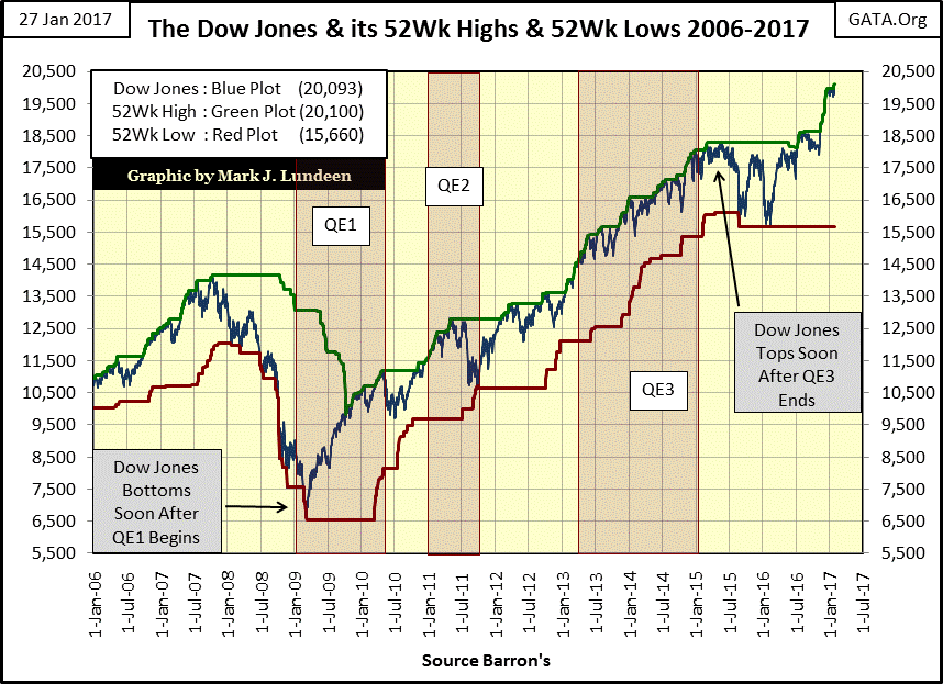
Should we be surprised? Not if you’re aware of the efforts Washington and Wall Street have gone to, to make all this happen since March 2009. Then, after the November elections, strange things began happening yet one more time.
Before the November election, seeing 75 million shares traded for the thirty Dow companies was a very typical day. Then beginning in the first days of December, daily volume has consistently been in the hundreds of millions of shares for weeks now. Exactly where this post-election demand is coming from is a mystery to me. But I doubt retail and institutional investment demand is responsible for most of it.
No matter; this doesn’t change my opinion on the stock market. I see a day coming when everyone will look back at late winter 2017 and agree that financial markets were seeing the last good days of a gigantic-mega bubble being inflated on Wall Street by the Federal Reserve. The market from here may go higher. But after it crests comes the deluge.
It’s not hard identifying an inflationary bubble blown into the stock market. The difficulty comes in believing it’s not real during the inflationary phase; the period when prices seem only to go up. But all bubbles must deflate, and deflation makes everyone a believer in the uncertainties of life.
I like the chart below. Today in January 2017, who can look at the insert for 1900-36 and fail to see the Roaring 1920s bull market was a bubble? Is there any doubt that one day in the mid 1920s, “liquidity” from the then newly created Federal Reserve began flooding into the stock market? From 1900 to 1924, seeing the Dow Jones at 100 told people they were at a market top. Four years later, everyone knew 200 on the Dow was a buy. Who in January 2017 can see the crash following 1929 as anything but expected? Look at the Dow Jones’ July 1932 bottom: 41.22. Mr Bear clawed back everything the Dow had gained since October 1904; ouch!
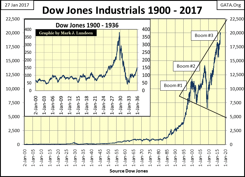
But today’s market has few similarities with that of the 1920s. One thing distinguishing the 1920s from today’s market is that the stock market bubble of the 1920s saw only five years of inflation before it began to deflate. Our bubble began inflating four decades ago in 1982.
Another is that the Roaring 1920s saw only one peak. That should have been true with the Dow Jones after it peaked in January 2000. But in the aftermath of the 1990s’ high-tech boom (Boom #1 above) Alan Greenspan began practicing what I call “bear-market interruptus”. He and his fellow “policy makers” began inflating an even larger bubble in single-family homes via the government regulated mortgage market; what could go wrong with that? At the time apparently nothing.
People were once again getting rich not only in the stock market, but also making the big money in leveraged (no money down) real-estate transactions. Real estate brokers had people lining up around the block to get quarter million dollar mortgages for quick flips in the housing market.
A decade ago, in response to unsolicited telemarketer offers for second mortgages to home owners, Congress initiated a no call list to telemarketers. For what seemed like years, I remember getting four to five calls a night from financial companies offering me a second mortgage. I’m sure I wasn’t the only person being pestered by these pesky pushers of cheap credit flowing from the Federal Reserve.
So much “liquidity” was slushing around the economy that the Dow Jones experienced its second inflationary boom (Boom #2 chart above).
We now all know how that worked out. As the inflationary boom in the real estate market began to deflate, the Dow Jones experienced its second deepest bear market bottom since 1885 as the global financial system ceased up, threatening global commerce with universal bankruptcy.
Well that Doctor Bernanke (Fed Chairman) used to teach economics at Princeton. Would they let a blithering idiot do something like that? Of course not! And that Doctor Bernanke was the man with the plan. Taking “bear-market interruptus” to a whole new level, the doctor began “injecting liquidity” into the markets with an enema bag. It wasn’t pretty, but it worked.
At its credit crisis bear market bottom in March 2009, the Dow Jones saw record trading volume – unheard of! But the chart below tells the tale. It was in March 2009 that the Federal Reserve “injected” a record 190 billion dollars into the banking system, a massive “injection of liquidity” that ultimately were followed by many others in the years that followed. With “monetary policy” such as this, should we be surprised to see Boom #3 in the Dow Jones chart above?
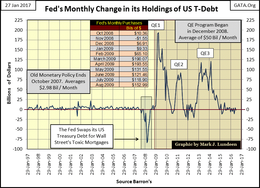
Before I move on from the chart above, here’s something you should consider. The Federal Reserve inflated bubbles first in the NASDAQ High-Tech, and then the real estate markets, as it “injected” into its banking system on average just $2.98 billion dollars a month from January 1997 to October 2007.
For the banking system under the Fed’s control, the consequences of the deflation in the sub-prime mortgage market were so horrific that the Fed first had to swap 53% of its US Treasury reserves for Wall Street’s non-performing junk mortgage in early 2008 – and that proved to be insufficient to keep Wall Street solvent. It took an additional three doses of QE seen above to finally “stabilize” the banks.
The chart above has the appearance of a monetary heart attack. One has to wonder what the “policy makers” have planned for the pending deflation in the stock, bond and real estate markets? Whatever it is, it may not be enough, and for that reason I expect the next market decline will make history.
Returning to my theme of the differences between the Roaring 1920s to today’s bubble market, there’s a third difference in the long term Dow Jones chart above between the 1920s and our current market top. The Dow Jones’ September 1929 peak (381.17) was 3.8 times the long term bull market ceiling of 100, seen in the chart insert from 1906 to 1924.
Our market too has a long-term market ceiling: 1000, seen from 1966 to 1981. In past articles, I’ve called 1000 for the Dow Jones during these two decades its bull markets’ line of death. Five times from 1966 to 1981, the Dow Jones attempted, but failed to stay above 1000. Since 1982 when the Dow Jones finally broke above, and stayed above its 1000 line, we’ve seen values for the Dow Jones inflating to ever more absurd levels.
- Boom #1 increased by a factor of 11
- Boom #2 increased by a factor of 14
- Boom #3 increased by a factor of 20
Can a price ceiling from many decades ago have any influence on market values for 2017? Like a hand rising from its grave, I see 1000 on the Dow Jones beckoning us all in January 2017. I don’t know if the Dow Jones will go down that far. However as the coming bear market approaches its bottom I expect there will be no shortage of “market experts” predicting exactly that, and for good reasons.
If it comes about, and I don’t rule it out, a future Dow Jones of 1000 would be a market decline of 95% from its current levels, worse than the 89% market decline of 1929-32.
Impossible? For those who believe bureaucrats in Washington and Wall Street wake up in the morning to serve the public’s interest, I’m sure the notion of a pending 95% decline in the Dow Jones seems irrational. But if you believe that for many decades, we had the best public officials the highest bidder’s money can buy, and I do, then other possibilities become apparent.
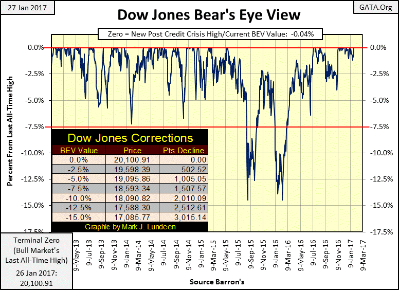
Next is the Bear’s Eye View (BEV) chart for the Dow Jones going back to 1885. What’s the Bear’s Eye View? It’s how Mr Bear looks at the market; where every new all-time high, like the Dow Jones all-time high of 39.18 from August 1886, or the 20,100 seen this week, is equal to a big fat zero and never more. Mr Bear isn’t impressed by the gains the Dow Jones has seen over the past 132 years of market history. Mr Bear only cares about how many percentage points he can claw back from each and every one of the bulls’ precious new all-time highs. And that is exactly what we see below in the BEV plot for the Dow Jones.
A BEV plot is a useful technique to visualize a market’s bull and bear markets from price data spanning decades; prices distorted by inflationary inflows from a central bank, such as the Federal Reserve.
Go back and take a quick look at my chart of the Dow Jones plotted by its dollar valuations (second chart of article), and compare that with the Dow Jones BEV chart below. There is much more useful historical information seen below than above.
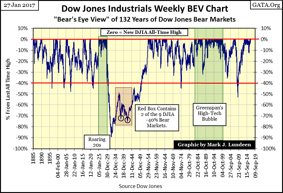
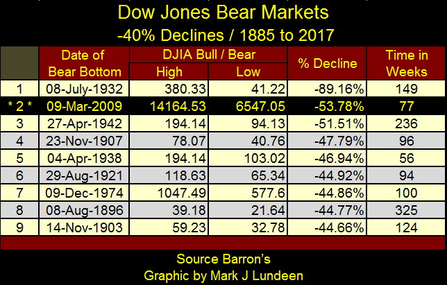
I placed a red line on the BEV -40% line in the chart above. For the Dow Jones’ BEV plot to touch or pass below this line, it must have declined 40% or more from a bull market’s last all-time high; its Terminal Zero (TZ). Since 1885, the Dow Jones has only crossed its BEV -40% line nine times, nine bear markets that have declined more than 40%. The table below lists them.
From the current bull market high of 20,100, the Dow Jones would have to decline to 12,050 to make it #10 on the table below.
That’s a long ways from where the Dow Jones finds itself at the end of this week; only 0.04% from its last all-time high of Thursday of this week. Well, before the Dow Jones can break below its BEV -40% line, it has to break below the BEV lines seen in the chart below. I placed a table listing the Dow Jones prices corresponding to those lines.
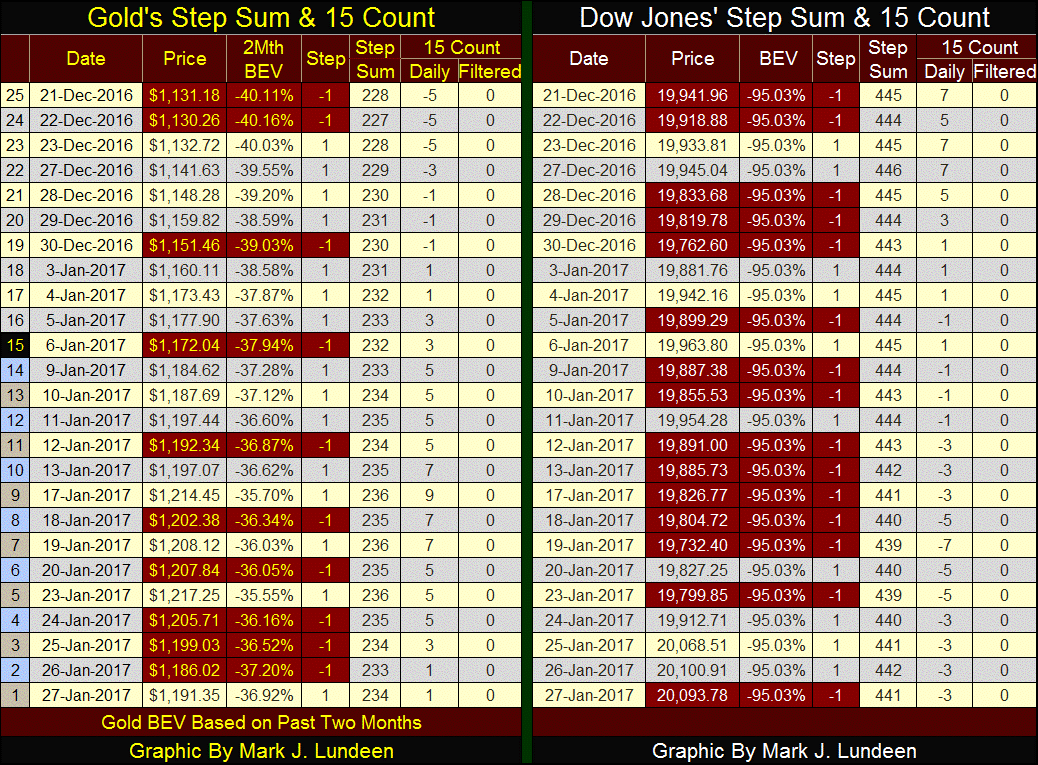
So much for the Dow Jones; what’s happening with the price of gold? This week was the first down week for gold and its step sum since gold bottomed in mid-December. This is something to be expected, but like you I would rather see gold and silver prices advance than decline.
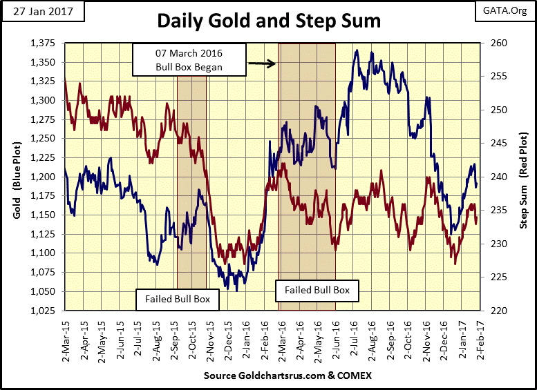
Gold’s 15 count below remains in the positive. If gold can keep that up, as well as see its step sum continue advancing, it should recover nicely from here. With the Dow Jones breaking above 20K this week, the stock market is at a psychological high. But if it can’t get its step sum advancing once again and drive its 15 count back into positive values, it may not hold on to 20K for long.
I’m not making any predictions here for either gold or the Dow Jones. Both markets are merely proxies for the success or failure of the “policy makers” to keep a lid on Hell-on-this-Earth should the many decades of inflation they’ve pumped into the markets begin to deflate. On a longer term basis, I have to favor gold (and silver) over the Dow Jones. But for the next few weeks or months, I have no idea what to expect from either market.
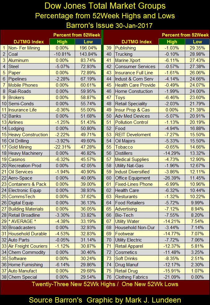
FYI; below is the 52Wk High and Low data on my Dow Jones Total Market Groups (DJTMG) data set. The gold miners were a solid #3 in the list since last summer, but now find themselves at #17. No matter, I still like the miners of precious metals.
For one thing, seeing the DJTMG with 23 new 52Wk Highs strongly suggests that the broad stock market is at or near a cyclical high. In early 2017, people just feel comfortable with their money in the stock market.
At such times, gold, silver and their miners don’t do their best. Precious metals assets outperform when the market sees them as a safe harbor in a storm. Still at #17, the gold miners are outperforming many of Wall Street’s perennial favorites.
Wall Street is always tempting the public to buy its banking stocks (#12 above), which have done really good since last February. In the Bank’s BEV chart below, they’ve advanced from below their BEV -50% line to above their BEV -30% line in the past year. In dollar terms, the DJTMG’s Banking index moved from 1307 last February to 1983 at the close of this week; an advance of 52%.
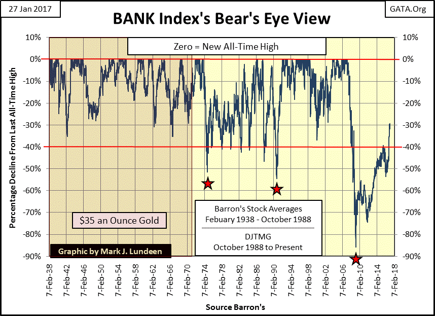
But these are the same banks that were at ground zero during the mortgage crisis. At their March 2009 bottom, they had declined 86% from their mortgage bubble highs. That’s a Great Depression era decline. Are these banks advancing because they’re healthy again? No, they’re still the same damaged goods that they were eight years ago. Today, people are just paying top dollar for them.
If you want to know when gold, silver and the mining shares soar into history, I expect that will be when these banks reverse their current advance, and retreat back towards their BEV -60% line, on their way to ever deeper declines. I wish I could tell you when, but I don’t know.
For my readers who followed me into Eskay Mining (ESK.TSXV), Eskay’s CEO Mac Balkan sent out a press release this week.
http://eskaymining.com/full_news.asp?nid=117&biraj=News%20Release
Eskay Mining Corp. has signed a letter of intent with a senior mining company to option up to a 60-per-cent undivided interest in part of the SIB property. The senior mining company is as yet unnamed, but is committing itself to fund exploration on Eskay’s property given certain parameters continue to be met.
This press release didn’t set the shares of Eskay on fire. Still its good news as it demonstrates that within the gold mining industry, geologists are not just interested in what Eskay has to offer, but there are companies willing to spend the money needed to satisfy their curiosity.
Mark J. Lundeen
More from Gold-Eagle


