Bond Market, Gold, Yield Curve and the Changes to Come


Bond Market, Gold, Yield Curve and the Changes to Come
While it is far from the only important indicator for the markets, the Treasury bond yield curve (10yr-2yr) is very important because it takes what is probably the most important market for macro signaling (the bond market) and gives us a view into the dynamics between short and long-term yields. In the bond market, duration means a lot.
For one example, long-term bonds are much more vulnerable to inflation’s negative effects than short-term bonds. Short-term bonds also act as a liquidity haven during deflationary market crises. Long-term bonds can work quite well during disinflationary times and pay out better income than short-term bonds, but in a full out deflation scare when the very system (and its exponential debt load) comes into question insofar as you want bonds, you want short-term (in my experience 1-3 year Treasury, T-bills and Treasury Money Market). In other words, relative safety.
From an American perspective, as long as the government says that stuff is safe it is safe. As long as the government is intact and functioning, that is. But it is only safe because of the fact that the governing body of a society long past its shelf life of sound monetary management says so. Otherwise, it’s a government operating under the dual pressure of unpayable debt (short of attempting to inflate it away) and waning confidence – with the first overt sign of revolution occurring on January 6, 2021.
So, short-term Treasury bonds are safe. But short-term Treasury bonds are not really safe, are they? They sure are not gold in that regard. Unlike the trillions in debt attached to the US and many global bond and currency markets, gold has no such liability as it pays no income and is just an old rock that ancient societies used as money. It had stability in its finite quantities and the fact that it was no one else’s debt. Today it is just an anchor within the storm of modern finance and in a storm you probably want your boat to be well anchored lest it be tossed to and fro and cast upon the rocks as wreckage.
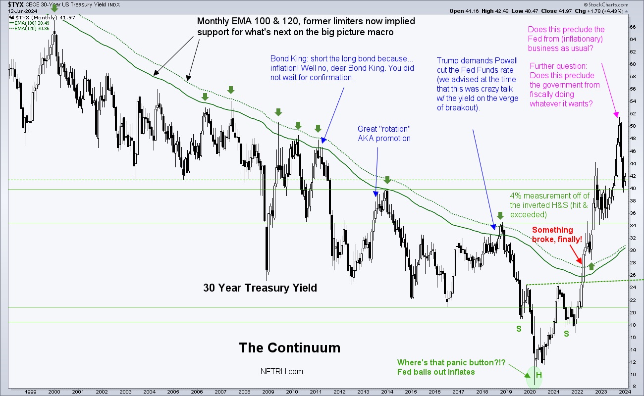
But the bond market is absolute gold as a macro signaler. Look no further than the Continuum chart we have used over the last 15 years to identifying the correct macro backdrop at any given time. Since the 1980s, and until 2022, that backdrop was signaled to be disinflationary by definition of the gentle, robotic trend downward in long-term yields.
To review…

- While the entire history is not shown on this chart, the downtrend goes back to the 1980s, coming off the Volcker panic-hike regime of the 1970s after inflation got well out of control.
- Downtrending bond yields (uptrending bonds) signaled ‘nope, no inflation problems here’ (reality might have had a different opinion, but we are talking about the signaling of a heavily manipulated market) and this was implied license for big brained Fed chair people and little brained politicians alike to create policy to inflate the system at all points of stress, let alone crisis.
- For many years we used the now-green moving averages (which can now be viewed as support for the new macro) as resistance to changing the macro. Those MA lines used to be red as were the arrows. They were the backbone of the long-term disinflationary trend. In 2022, something broke and in my opinion, it was a profound move that we are tasked with interpreting correctly, now and in the coming years. The decades long disinflationary trend by which inflating policymakers were given license, is over.
- In my opinion, if they try their old tricks on bond yield pullbacks (e.g. the big pullback we’ve seen over the last few months or even all the way back to the moving averages) the efficacy is not going to be the magical and heroic kicks saves of the past.
- The implication of the bond market rebellion of 2022 is ‘Enough!’ In my opinion a saturation point was hit and the bond market could not sop up anymore of the chicanery (i.e. inflationary bubble making by policy).
- The inflationary signaling of the broken Continuum does not mean inflation as far as the eye can see, however. It may mean that new deflationary episodes met with dovish policy response will no longer work as effectively as it did over previous decades. Again, the bond market says the system became choked with inflation manufactured from debt.
- At best, new inflationary phases may be more corrosive for more aspects of the economy and/or benefit a different set of assets, like precious metals and commodities critical to social progress (thinking Uranium, Copper, Rare Earths, Lithium, etc.). There is always a need for food/Ags as well. Ah, yes there is.
- Now that long-term yields have shown their hand I would no longer bet on real estate as a good long-term investment. RE was stellar during the Continuum’s intact phase. In the future? There could be quick bursts of optimism on yield declines, but if the new macro holds we may not see sub-3% again in some of our lifetimes. This could grind at real estate over time.
- However, a new macro may cast its net globally to emerging and frontier markets, many of which are rich in natural resources, including precious metals and commodities. In essence, we might also speculate about the possibility that the world (everything bubble) is not ending but instead, is shifting… away from the over-financialized western complex that has benefited from remote monetary management (bond market manipulation), to markets that have lagged during the era of financialization. We’ll look at a few charts of EM, Asia and the Frontiers in the report below.
I realize that just above I sound like the BRICS-promoting/De-dollarizing people I sometimes criticize. But the criticism is only for the ‘perma’ nature of those views. There is a thing called timing and another thing called activation. On a big picture, measured over years, the shift in the macro may shake out per the above and become activated.
Here we have the yield curve (10yr-2yr), doing as expected and breaking upward from the latest consolidation that gave Goldilocks a new bounce in her step as silly Santa season came to an end in December. The steepening yield curve can come under pressure of deflation or inflation or, over the course of an extended steepener, both at varying times. What it will do is signal to Dorothy that “we are not in Kansas anymore” and likely signal pain for herds of trend followers most recently conditioned by the previous flattener into inversion. That pain could come deflationary or inflationary. It’s the steepening that tends to hurt Goldilocks, one way or the other.
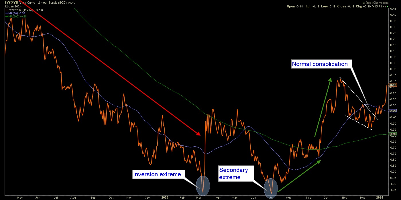
Very generally, remember that a curve flattening comes with an economic boom and a steepening comes with a bust. The flattening of the curve had implied policy makers in full control and inflation a waning problem, as short-term bonds were not well bid in relation to long-term bonds. A steepening implies that short-term bonds are now favored. Short-term bonds are a liquidity haven, long-term bonds are risk.
As for the steepening, it is heading toward de-inversion. Remember now that the media and mainstream economists have been touting the dangers to the economy of an inverted yield curve. Now that the curve has started to steepen might that not be part of the relief felt by today’s ‘happy days are here again!’ soft landers? All along we have noted that it is not the inversion that brings on the pain. It is the steepener that follows the inversion. But why let reality get in the way of good media stories?
The signaling by the yield curve is that regardless of whether it sticks to the deflationary view that has been our primary 2024 view or takes on in interim inflationary flavor (ref. Thursday’s public article) Goldilocks is destined to get eaten by 3 pissed off bears. Goldilocks dies when pleasant disinflation morphs deflationary and she also expires when it morphs inflationary.
Bottom Line
Changes are at hand for 2024. I don’t say so. The bond market says so. Our plan has been for those changes to be disinflation to a coming deflation scare. But the decline in yields since the October ‘call’ below :-) has been significant. For reasons illustrated in the article linked above we can also be aware of something unexpected by a majority (unlike a year ago), like an interim inflation trade.
The two 2024 (and beyond) options, based on the Yield Curve’s new steepener and other signals are:
- Interim inflation trades now, deflationary episode, and then in the coming years a bigger, badder and more global inflation in an age of war, unrest, social discord and shifting monetary systems from the monetized west to the commodity/resource-rich east and EM/FM. Cue the “Dedollarization” cult, I guess.
- Disinflation into deflation sooner rather than later (our original plan), followed by balls out inflation that again, will not benefit those areas (e.g. western stock markets) to the degree it has previously. Commodities, resources, precious metals and EM/FM could see a new era of out-performance.
NFTRH 792 then moved on to its usual coverage of US and global stock markets, precious metals, commodities, currencies and portfolio discussion.
For “best of breed” top down analysis of all major markets, subscribe to NFTRH Premium, which includes an in-depth weekly market report, detailed market updates and NFTRH+ dynamic updates and chart/trade setup ideas. Subscribe by Credit Card or PayPal using a link on the right sidebar (if using a mobile device you may need to scroll down) or see all options and more info. Keep up to date with actionable public content at NFTRH.com by using the email form on the right sidebar. Follow via Twitter@NFTRHgt.
*********


