Bullish Blueprint: Precious Metals Surge – How Strong is the Trend?


After two strong days to start the week, the PM complex took the day off to rest for a bit. While the rest of the PM complex rested today, the CDNX continues to push higher, breaking out from the one-year bullish expanding rising wedge.
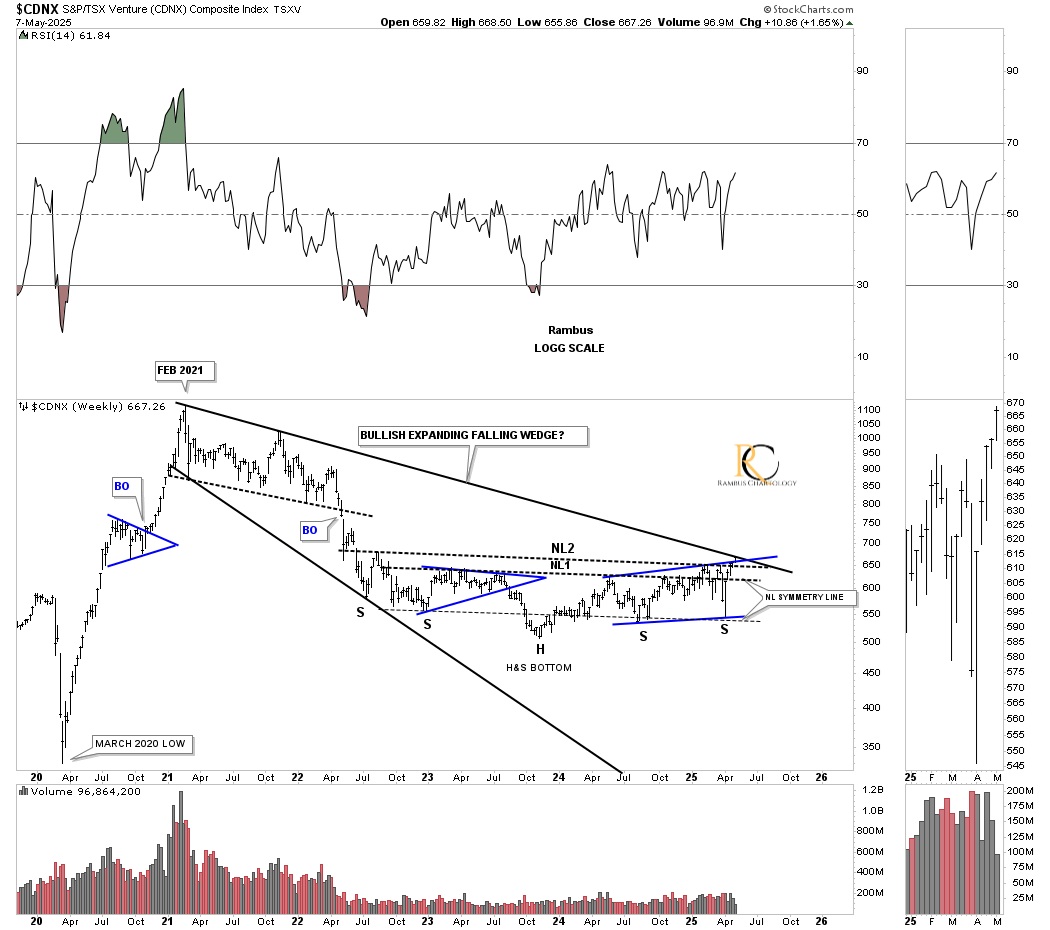
The classic breakout shows the initial hit of the top trendline and small decline before breaking out. A backtest would come in around the 655 area. This bullish expanding rising wedge is also the right shoulder of the 2022 inverse H&S bottom we’ve been following on the longer-term weekly chart.
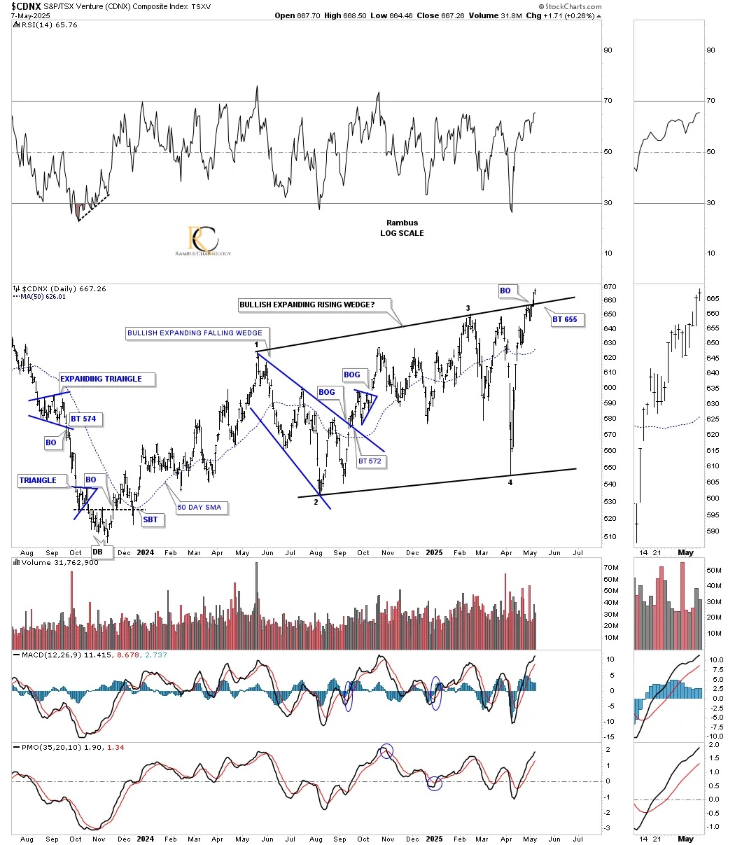
What’s so intriguing about this current breakout on the chart above is that the current price action is now testing the top rail of the 2021 bullish expanding falling wedge – two bullish patterns in one. You have to look really close, but you can see this week’s bar is forming between the neckline and the top rail of the expanding falling wedge.
This bullish expanding falling wedge is very similar to the 2020 bullish expanding falling wedges we’ve been following on the other PM stock indexes. The reason it’s the 2021 bullish expanding falling wedge and not the 2020 bullish expanding falling wedge is because the CDNX rallied for six months long out of the 2020 pandemic crash low.
Next, let’s take an in-depth look at the HUI, from the 15-minute chart to the long-term monthly chart, so you can see how all the pieces of the puzzle are put together to get to where the HUI is currently trading.
This first chart is a 15-minute look, which shows the most recent small trading ranges since the middle of February this year. On the left side of the chart, you can see the black triangle, which led to a small impulse move that topped out with the formation of the small H&S top, which at the time was a bit concerning. However, after a small decline, the blue bullish rising wedge reversal pattern formed, which led to the most recent impulse move.
That high is the beginning of the small bullish falling wedge we looked at yesterday, which is backtesting the top rail of the October 2024 bullish rising wedge. Yesterday, I mentioned that to really confirm the bullish falling wedge, we need to see the top taken out, which will create a new higher high. If that doesn’t happen right away, we could see a larger trading range forming, which isn’t the end of the world, just more of a time thing.
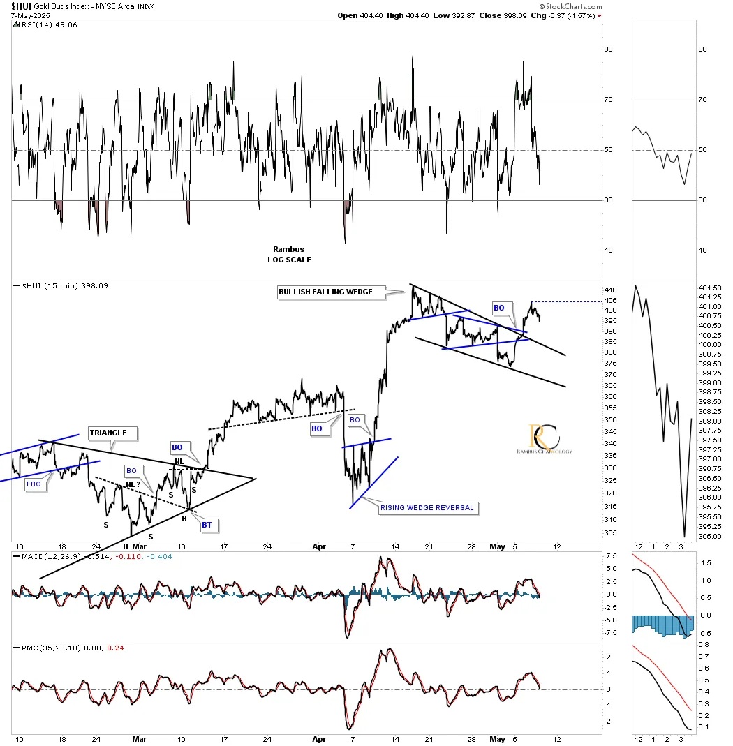
This 2-hour chart shows how the falling wedge on the 15-minute chart above fits into the slightly larger picture as the backtest to the top rail of the black bullish rising wedge. A positive aspect of today’s price action is that the HUI managed to close above the horizontal black dashed micro double top trendline.
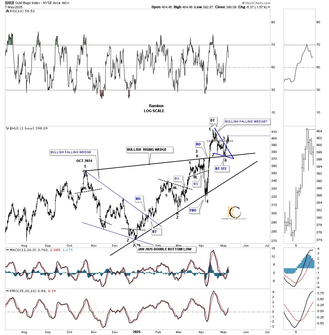
Going back about a year and a half, you can see how the black bullish rising wedge fits into the bigger picture with the smaller blue falling wedge forming as the backtest. Again, the blue falling wedge could be forming a slightly larger consolidation pattern as the backtest to the top rail of the black expanding rising wedge if the top rail is broken, which should hold as the possible backtest.
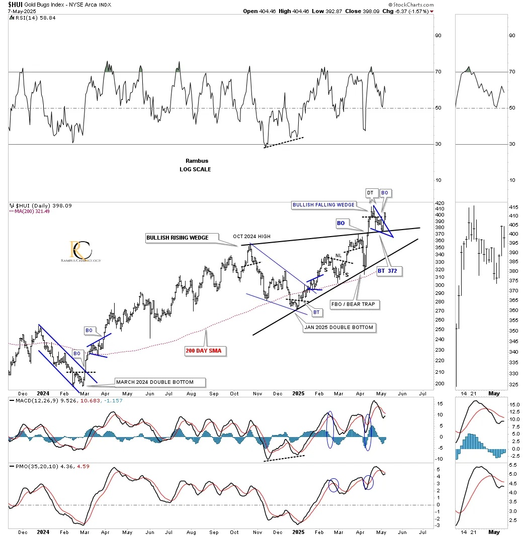
Next is the long-term daily combo chart, which begins at the 2022 low, showing the varying styles of uptrend patterns from expanding, converging, and parallel. Last Friday, the price action was strongly backtesting the top trendlines, which was concerning because most closed the week below the top trendline, which could have been bad if the PM complex had opened Monday with a hard down day and no way to get out. We were fortunate that the PM complex opened up strongly on Monday, which now looks like just your ordinary backtest. What we need to see next is for the breakout high to be exceeded to confirm the backtest is complete, but so far, so good.
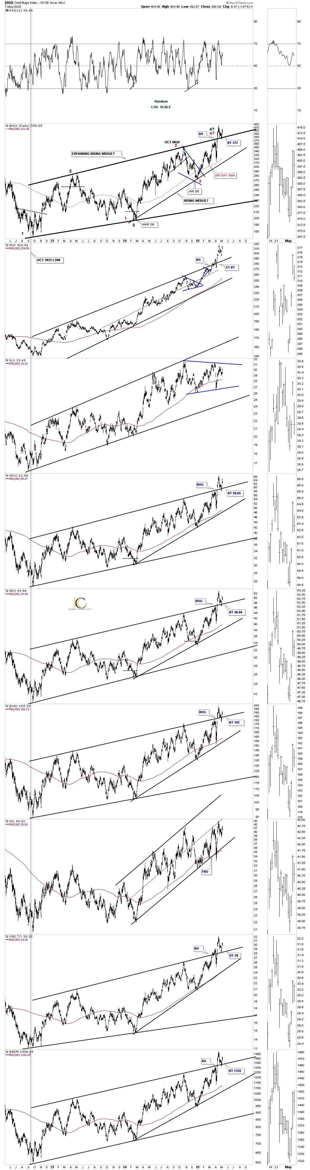
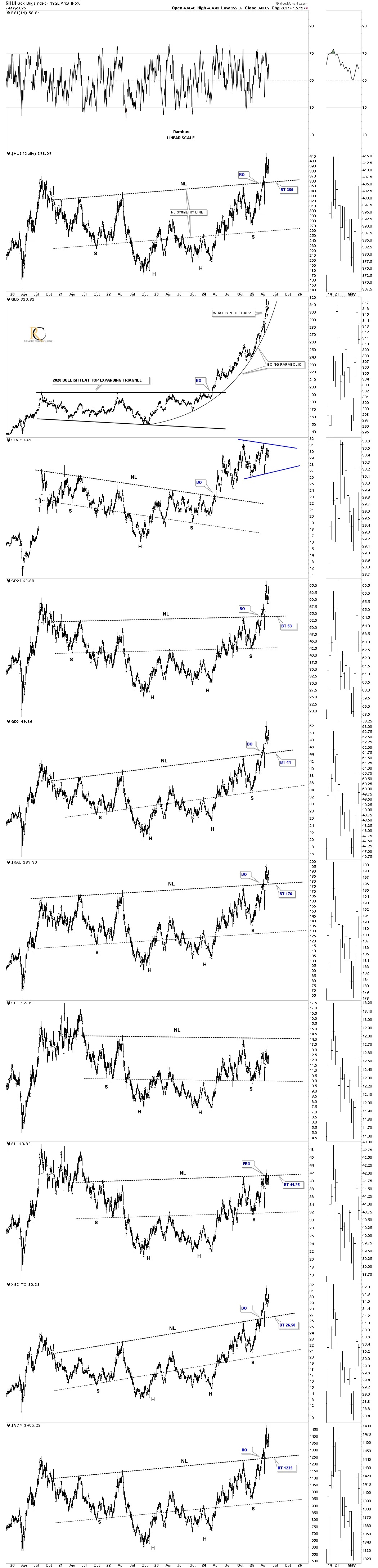
SLV is still trading in no man’s land, right in the middle of the blue triangle, while the SIL, which shows a false breakout below the bottom rail of its parallel uptrend channel, is getting closer to making a new higher high, more in line with the other PM stock indexes.
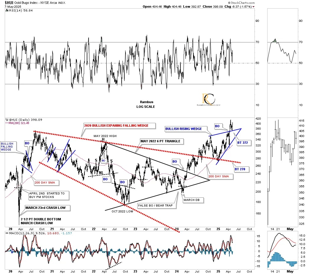
I previously highlighted the 2020 bullish expanding falling wedge in red to make it stand out better because of its importance. This daily chart starts at the 2020 crash low and shows how vertical that rally was into the 2020 high, with just one small blue consolidation pattern – the bullish falling wedge.
You can also see all the smaller trading ranges that built out the 2020 bullish expanding falling wedge, with the May 2022 triangle being the largest one. Once the May 2022 triangle showed us the breakout, the odds became very high that the larger 2020 bullish expanding falling wedge was also going to break out, which was just a matter of time.
The breakout of the red 2020 bullish expanding falling wedge took place in July of 2024 and the backtest was completed in January this year, which took the form of the October 2024 blue bullish rising wedge. It’s not at all unusual to see a smaller consolidation pattern forming the backtest. We have a similar situation taking place right now with the 15-minute falling wedge forming the backtest to the October 2024 bullish rising wedge as show on the chart below.
Again, last Friday, you can see that many of the blue bullish rising wedges closed below their top trendline, which doesn’t look like a big deal now in hindsight. However, if the price action had opened up strongly to the downside on Monday one would have a different opinion. There are always tricky inflection points like that in the markets – sometimes you win, and sometimes you lose, and sometimes safety is the better part of valor.
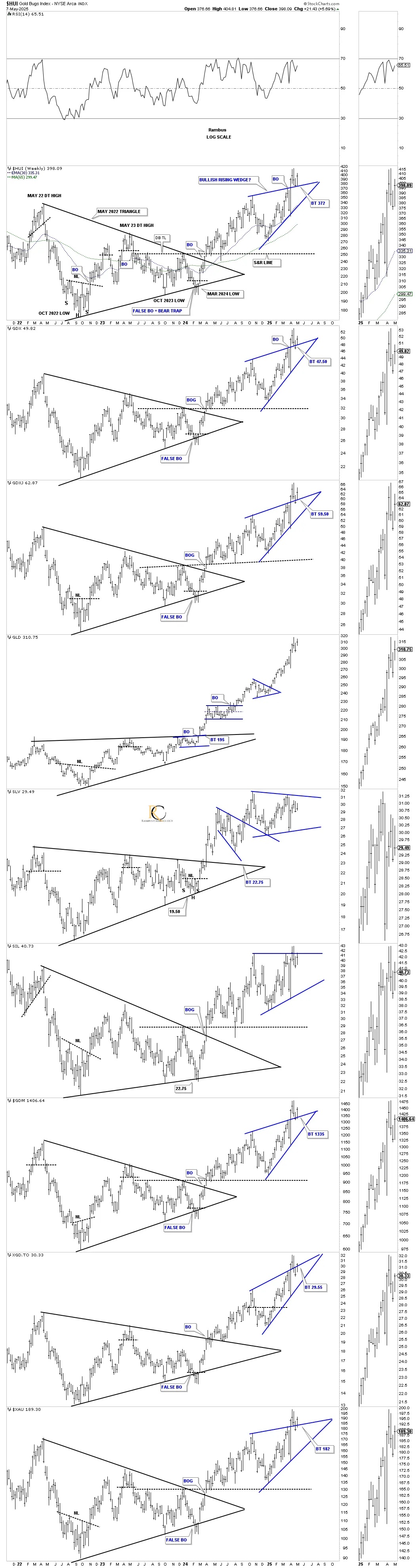
This next bullish chart shows the four-year H&S consolidation patterns with the initial breakout and strong backtest. In the silver area, you can see that SLV broke out of its multi-year H&S consolidation pattern over a year ago and has been consolidating, forming the blue triangle. SIL is now testing its neckline, while the SILJ is a bit further behind and still working on its right shoulder. GLD speaks for itself and what could happen with the PM stock indexes.
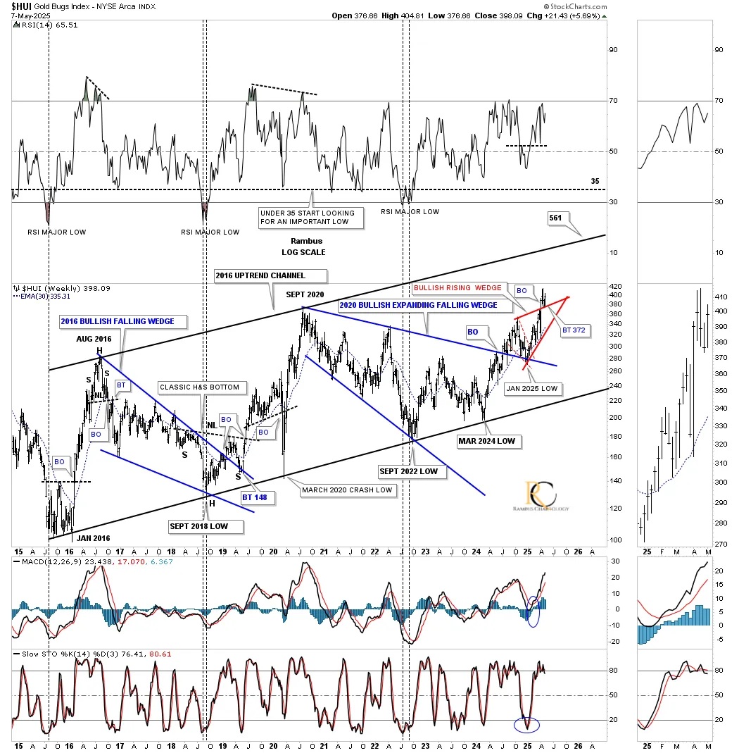
January 2016 marked the end of the 2011 bear market and the beginning of the new bull market, which has been forming a parallel uptrend channel. The two dominant chart patterns are the 2016 bullish falling wedge, which was a long-drawn-out affair that finally completed in January 2019, and the 2020 bullish expanding falling wedge, which was completed in July last year. Note how similar the breakout and backtesting process was for both of those large consolidation patterns.
The 2016 rally phase was interrupted by the 2020 pandemic crash, which found support on the bottom uptrend line. Both the 2020 and 2016 rallies that defined the 2016 uptrend channel were almost identical in time and price.
I’ve highlighted the recent breakout from the 2020 bullish expanding falling wedge, showing the red bullish rising wedge as the backtest, which has just also been backtested last Friday. You can see why I’m always looking for a backtest after a breakout has occurred, which happens way more times than not.
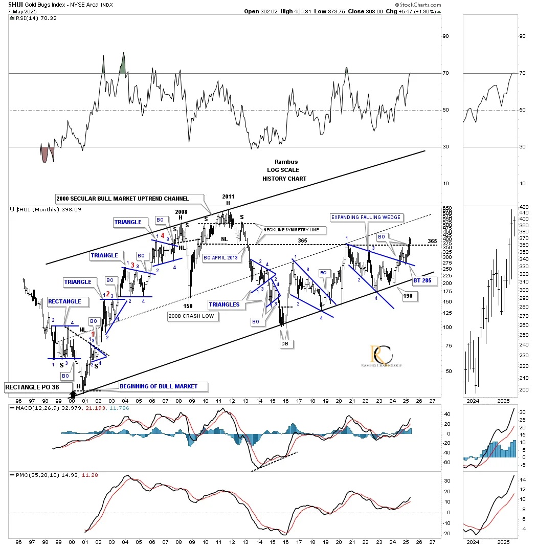
This next chart for the HUI shows its entire history and all the trading ranges it has formed since its inception back in 1996. Note how each blue consolidation pattern had at least four reversal points, which is the minimum required. The last pattern to form during the move down into the 2000 bear market low was the blue rectangle, with four reversal points, which had a price objective down to 36, marking the start of the 2000 secular bull market.
The classic bull market run into the 2008 H&S top shows one consolidation pattern forming on top of the previous one, with an impulse move between each pattern, as shown by the red numbers. At the time, I took a lot of flak for calling that 2008 H&S top because everyone was so bullish, but when a pattern shows itself, one needs to focus on what the pattern is suggesting and try to keep an open mind. That 2008 H&S top led to the 2008 crash, which caught most PM stock investors off guard.
The HUI V-bottomed and rallied strongly into the 2011 all-time high, forming a very symmetrical H&S top, which led to the bear market years until the low in 2016, where the 2016 uptrend channel begins on the weekly chart above. Note how well the center dashed midline divides the parallel 2000 secular bull market uptrend channel into two equal halves. Eventually, as the secular bull market progresses, the center dashed midline will be taken out as the HUI rallies toward the top trendline to finish the secular bull market, which is years into the future yet.
You may have noticed that I extended the 2011 H&S top neckline to the right side of the chart, which was initial resistance at the 2020 high and the beginning of the 2020 bullish expanding falling wedge. After the breakout from the 2020 expanding falling wedge, the initial rally fell just short of reaching the neckline extension line, which led to the backtest at 285.
What’s really exciting is how last month the HUI finally broke out above the neckline extension line and is backtesting it this month, closing last month at a 15-year high, going back to the breakout point on the 2011 H&S top. If the HUI isn’t showing incredible strength, then I don’t know what else to say.
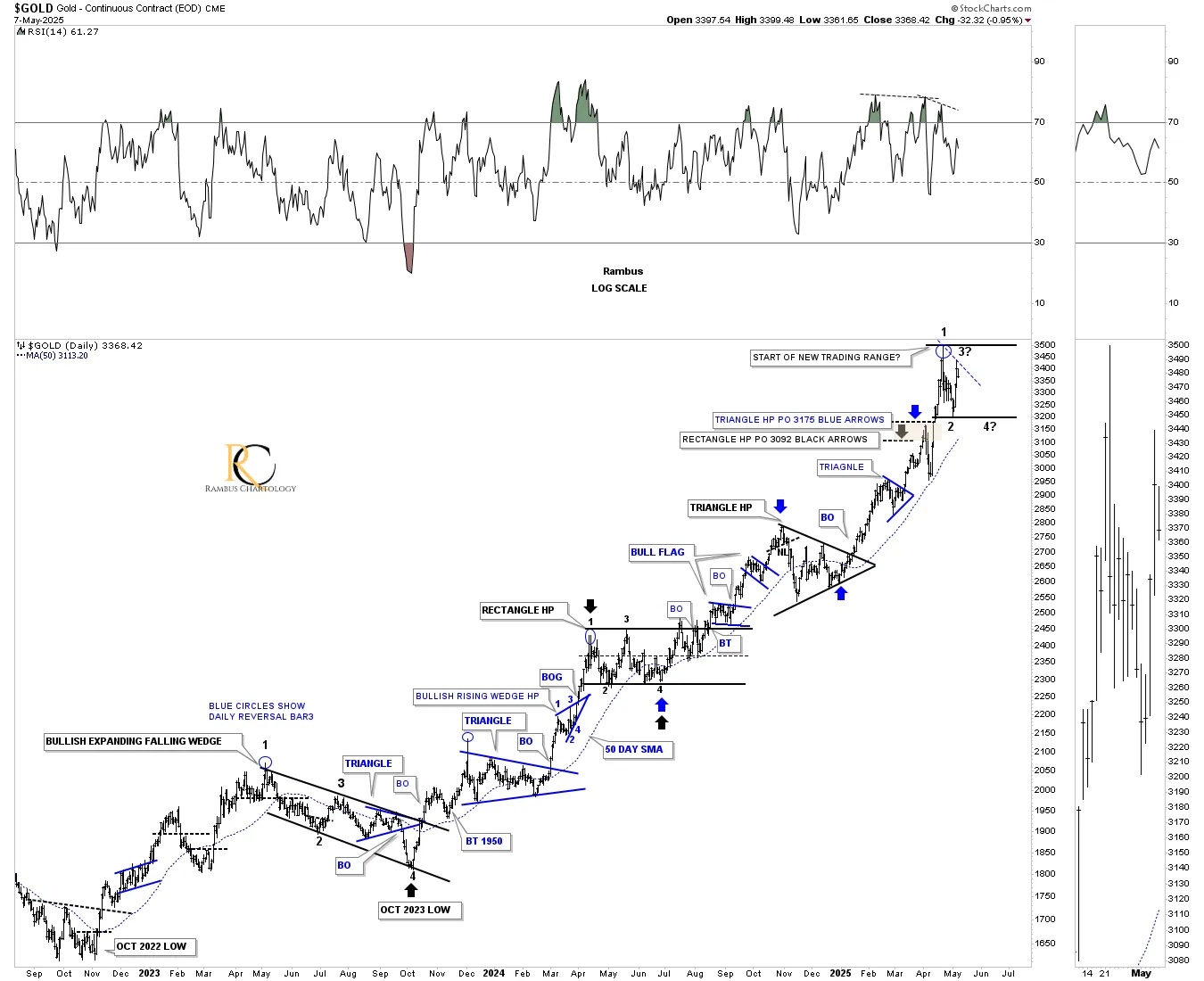
Last night, we looked at this daily chart for gold, showing all the consolidation patterns it has formed since the October 2022 low. I mentioned that the odds were favoring a possible consolidation period after such a powerful rally. It looked like the new trading range may have completed reversal points #1 and #2, and we were looking at the current bounce as the possible rally for the 3rd reversal point. It’s still too early to know yet, but with today’s move lower, gold may have completed the 3rd reversal point and is now declining to find that all-important 4th reversal point to complete the new consolidation pattern.
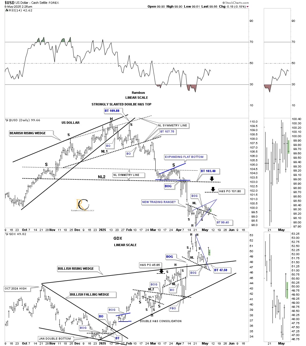
Last night, we also looked at this daily combo chart, which has the US dollar on top with the GDX on the bottom. I mentioned that the possible small H&S bottom on the US dollar was still valid until we see the right shoulder low violated, which hasn’t happened yet. If the H&S bottom plays out, its minimum price objective would be up to the 101.80 area.
On the other hand, the first chart we looked at tonight was the 15-minute chart for the HUI, which shows the falling wedge with a breakout, so I added the same falling wedge to the GDX and the inverse bearish rising wedge to the US dollar. It looks like the moment of truth is now at hand as to which pattern is going to play out. If the blue falling wedge is going to be the backtest to the October 2024 black bullish rising wedge, then the small blue falling wedge is going to win the battle, and the backtest will be complete. We should know the outcome shortly.
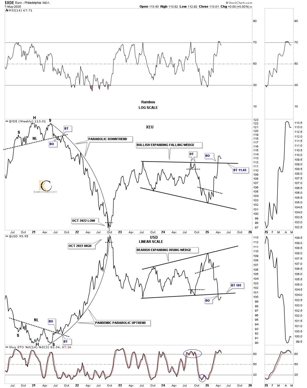
This longer-term weekly line combo chart, with the XDE (euro) on top and the US dollar on the bottom, shows the parabolic decline the euro had and the parabolic rally the US dollar had to their respective low on the euro and high on the US dollar in 2022. Currently, you can see the euro is breaking out of its two-year bullish expanding falling wedge, while the US dollar has broken down from its inverse bearish expanding rising wedge. The only question that remains is whether the backtest is complete yet on both currencies.
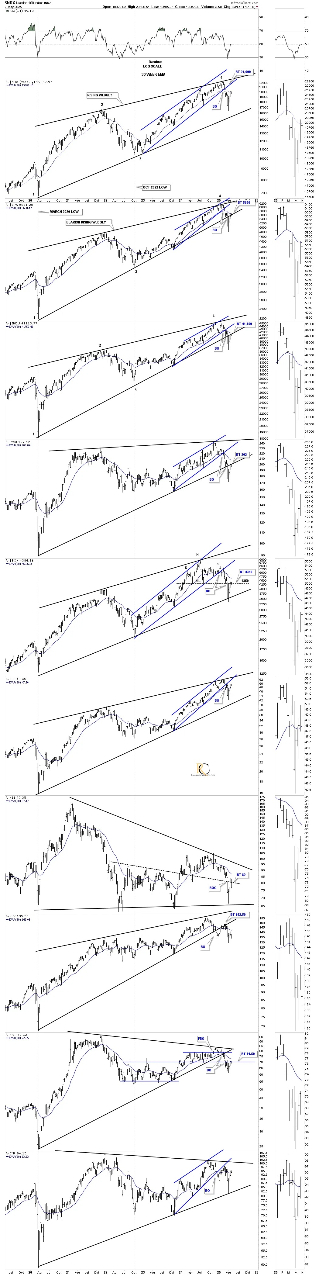
Let’s take a quick look at the US stock markets and the 30-week EMA. Below is a weekly combo chart showing the rising wedges beginning at the 2020 pandemic crash low, with the smaller blue rising channels taken from the October 2022 low in many cases.
So far, the 30-week EMA has held as resistance, inversely to when it holds as support during the rally phases. What’s also interesting is the backtest taking place to the 2020 lower trendline on the SPX, INDU, and the IWM, where the 30-week EMA intersects. The other indexes are also in a state of backtesting an important trendline.
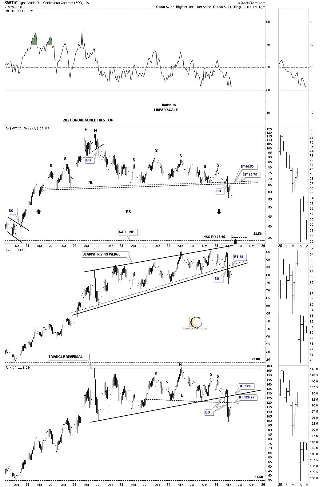
We’ll finish up with this triple combo chart, which has the WTIC on top, followed by the XLE, with XOP on the bottom. All three of these energy-related indexes have broken out of their respective large reversal patterns and have been in backtest mode. If WTIC reverses symmetrically to the downside, as shown by the black arrows, what will that mean for the US and world economies? Stay tuned, as things are really starting to get interesting. All the best… Rambus.
*********
 Meet Rambus, a seasoned trader and technical analyst renowned for his unbiased and insightful chart work. Through his website, Rambus Chartology, and Substack newsletter, Rambus shares his expertise with a global community of subscribers, providing daily updates, commentaries, and hands-on training in the art and science of chartology. With his calm, humble, and down-to-earth approach, Rambus demystifies complex market trends, helping his followers navigate the challenges of today's volatile markets. Join the Rambus Chartology community today and discover a unique blend of technical analysis, trading expertise, and time-tested protocols. Subscribe now at www.rambus1.com or https://rambuschartology.substack.com/


