The Chartology Of Currencies And Gold


In this Weekend Report I would like to show you an in depth look at some of the more important currencies on the planet to see where we’re at in the big picture and how they may affect the price of gold. In general when a currency (other than the US Dollar) is headed lower the price of gold tends to rise and just the opposite happens when a currency rises . So following the different currencies is important.
With the US dollar being the most important currency we’ll start there.
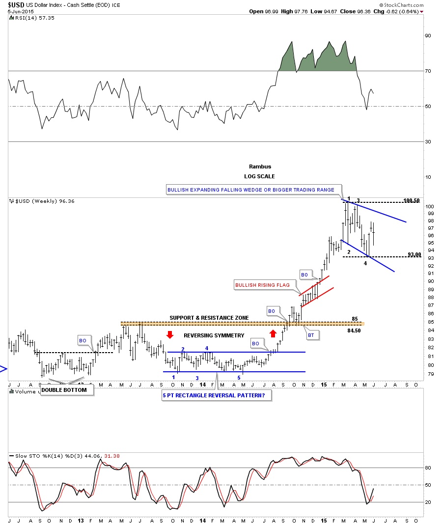
The first weekly chart for the US dollar shows the blue 5 point rectangle, at the bottom of the chart that launched the US dollar on a near parabolic move higher. The rally finally ran out of gas in March of this year and has been consolidating those gains made over the last year or so. We are at a place where I would like to see a bigger consolidation pattern forming. Bigger than any other consolidation pattern since the last reversal point on the blue 5 point rectangle pattern at the bottom of the chart. As you can see, at the top of the chart, the US dollar has been chopping out an expanding falling wedge since the March high. There have been three completed reversal points so far with the possible 4th one in progress right now.
A break of the top rail would be very constructive in completing the potential blue expanding falling wedge which I would then view as a halfway pattern to the upside. The other scenario would be that many times a chart pattern can morph into a bigger consolidation pattern. In this case reversal point #1 would still be the first reversal point in a bigger consolidation pattern but the most recent low labeled #4 would just be the second reversal point with a third one to form somewhere around the highs and then one more leg down to create the 4th reversal point. The pieces of the puzzle are coming together but we still need to see a few more pieces to complete the picture. The bottom line is that a solid breakout to new highs above the first reversal point would be extremely bullish for the US dollar and not so good for the PM complex and commodities in general.
This next long term chart for the US dollar I first showed you when it back-tested the top rail of the massive bullish falling wedge as shown by the little brown box. What this implies is that the low, on the weekly chart above, is the low for this correction even if the current pattern morphs into a bigger consolidation pattern. It will still be a consolidation pattern but just a bigger consolidation pattern.
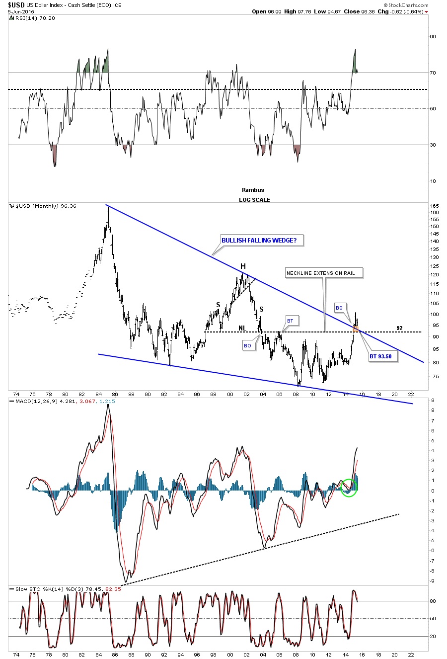
If the blue expand falling wedge fails to breakout and this pattern morphs into a bigger consolidation pattern, the monthly chart below shows you how it may look in the big picture. Regardless of which pattern eventually wins out you can see how this is a perfect area for some type of halfway consolidation pattern to build out. A halfway pattern in this area would show a price objective up to the old highs around the 120 area.
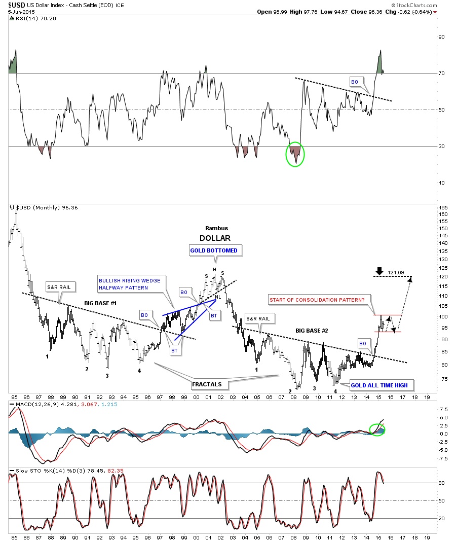
The next chart is a long term monthly combo chart that has the US dollar on top and gold on the bottom. The US dollar shows a huge rounding bottom that is reversing symmetry to the upside as shown by the blue arrows. How it came down is how it’s going back up. As you can see the US dollar is at its first important area of resistance based on the black dashed horizontal line at 98.65 which extends to the high made back in July of 2003. That little congestion area took about 4 months to compete before the price action started to break down again. We’re currently in our fourth month of consolidating the first leg up.
The gold chart at the bottom shows it just chopping around the bottom of its nearly 2 year consolidation pattern. Gold has held up pretty well based on the near vertical rally the dollar had over the last year or so. At this point, if the US dollar does in fact breaks out to new highs for this move, I think it will put enough pressure on gold will finally break below its nearly two year bottom trendline and begin its next impulse move down.
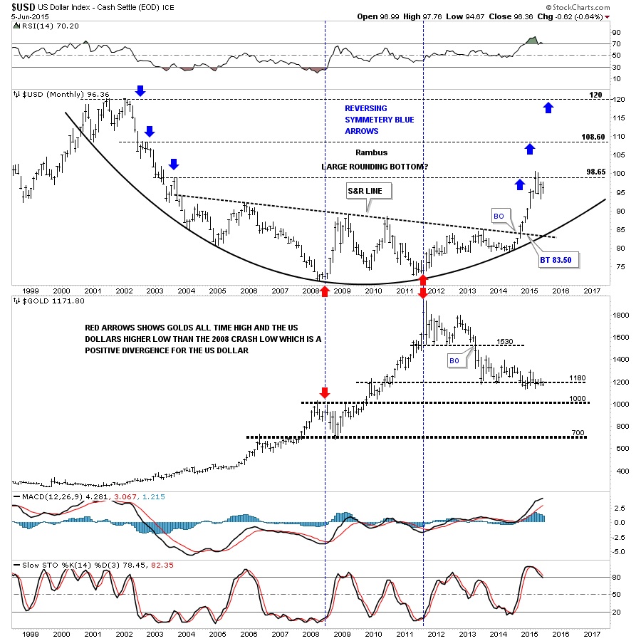
Below is weekly combo chart that has the US dollar on top and gold on the bottom which shows more clarity. The chart on top shows the US dollar has corrected 38% of its big move off of the March low from last year which is another reason why I think we’ve seen the low. The only real question is how long the consolidation phase will last?
The gold chart on the bottom shows a pretty well defined two year falling wedge. This chart also shows you the brown shaded support and resistance zone, between 1000 and 1035 or so, where anyone who is bearish on gold is looking for the Bear Market to end. However As I’ve shown you in other similar charts for gold, this nearly two year consolidation has a much lower price objective than 1000 . What we may see is a strong bounce off of the brown shaded S&R zone which would then backtest the bottom rail of the two year six point falling wedge and then one last big move down to end the bear market. It’s just speculation at this point but there will most likely be some buyers around the 1000 area that will offer initial support. At any rate things are starting to get interesting.
 Meet Rambus, a seasoned trader and technical analyst renowned for his unbiased and insightful chart work. Through his website, Rambus Chartology, and Substack newsletter, Rambus shares his expertise with a global community of subscribers, providing daily updates, commentaries, and hands-on training in the art and science of chartology. With his calm, humble, and down-to-earth approach, Rambus demystifies complex market trends, helping his followers navigate the challenges of today's volatile markets. Join the Rambus Chartology community today and discover a unique blend of technical analysis, trading expertise, and time-tested protocols. Subscribe now at www.rambus1.com or https://rambuschartology.substack.com/


