The Chartology of Deflation


 We would like to update some of the charts on the possible inflection point we looked at about three weeks or so ago. That possible inflection point is still gaining momentum to the downside as the deflationary environment still looks good to go. No market goes straight up or down so one needs to expect some turbulence along the way.
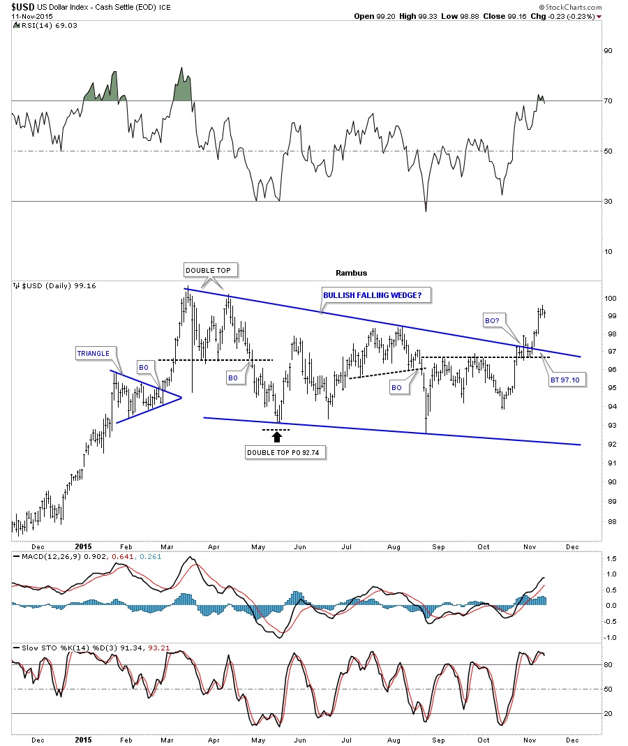
In order for the deflationary theme to play out we will need to see a strong US dollar which will affect the commodities complex and other important currencies of the world. Below is a close-up view for the US dollar that now shows the bullish falling wedge in breakout mode with one back-test to the top rail so far.
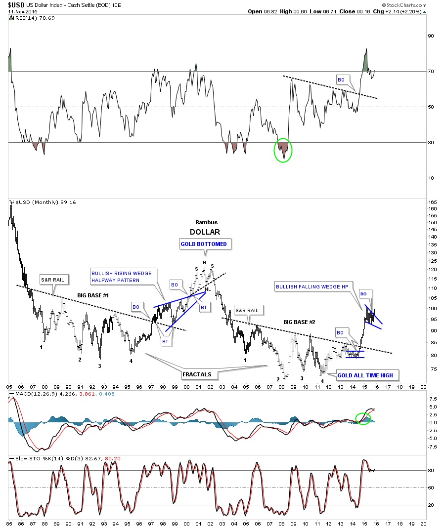
The long term daily chart for the US dollar shows its last impulse move that began in the summer of 2014 and ended in March of this year. You can see the smaller red consolidation patterns that formed during that huge impulse move up. The big blue bullish falling wedge I’m looking at as a halfway pattern separating the first impulse move up from the second impulse move up.
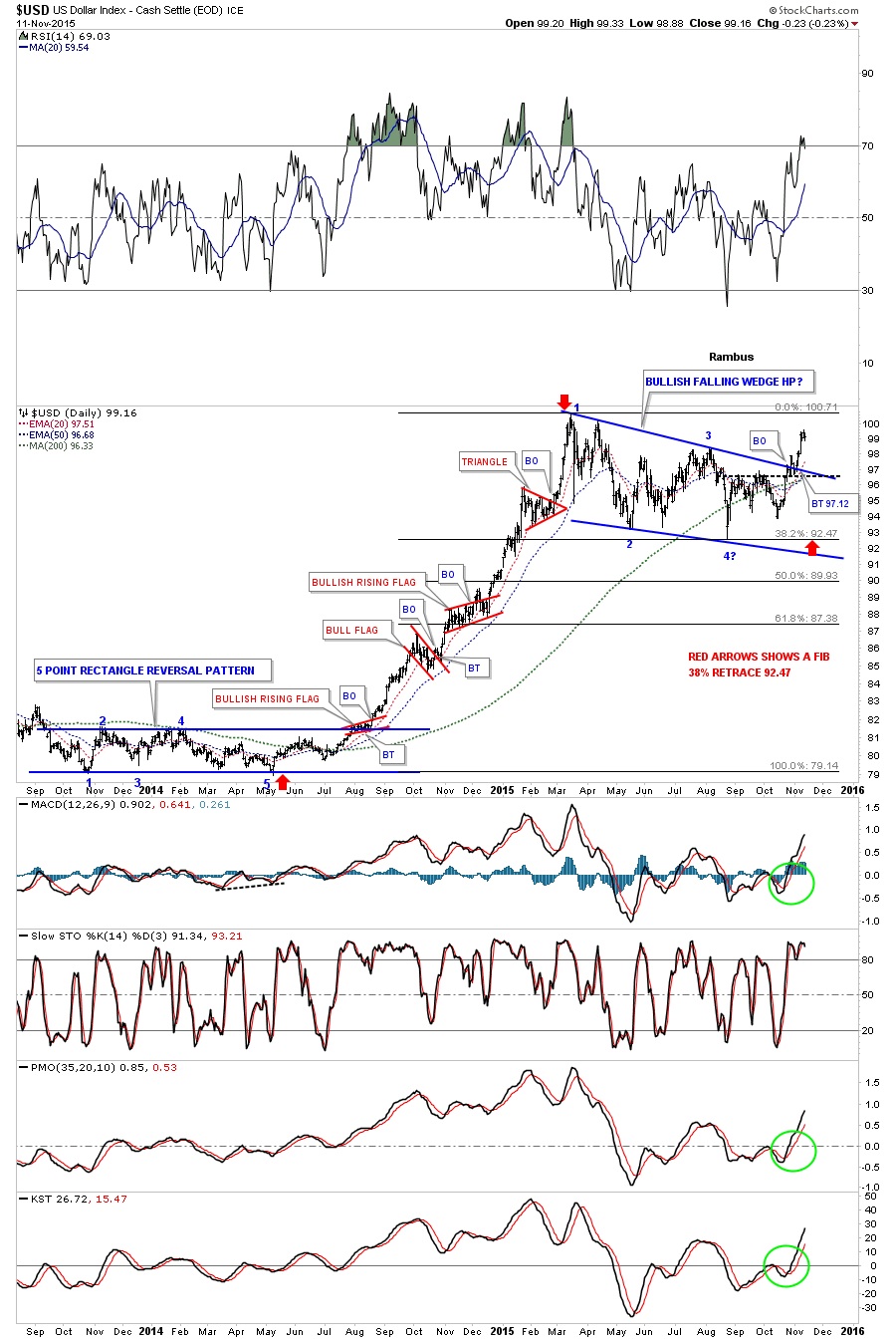
If the US dollar can close the month of November on a strong note and complete a big white candle that would be a very good step in the right direction.
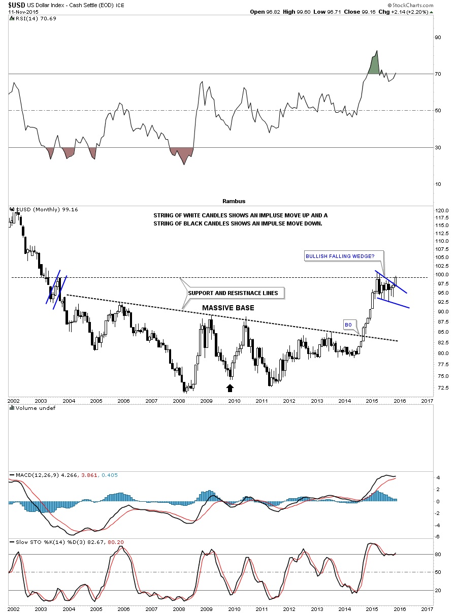
This last chart for the US dollar is another very long term monthly chart that puts the blue bullish falling wedge in perspective as it’s now showing a breakout, something we didn’t have on the first inflection point report.
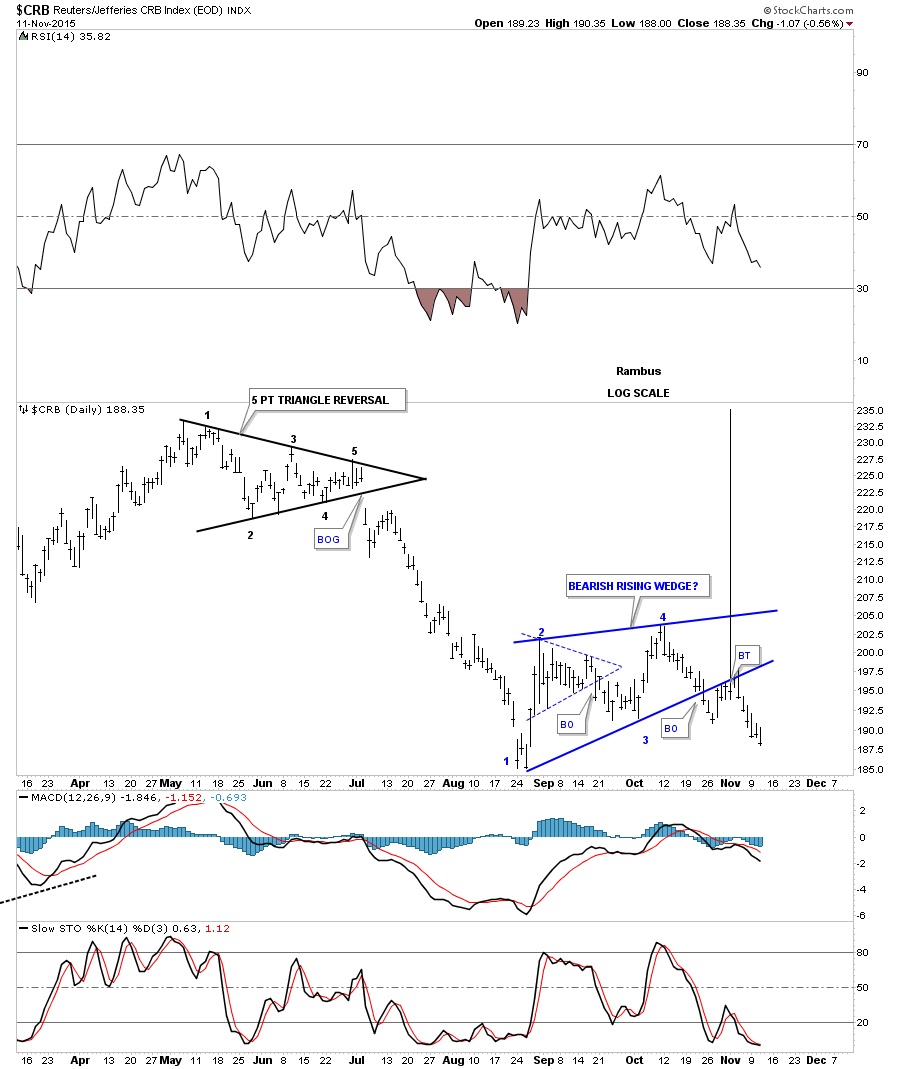
Let’s now focus our attention on a couple of commodities indexes as they have been working their way lower since the last time we looked at them. The daily chart for the $CRB index shows it built out the blue bearish rising wedge complete with a breakout and backtest.
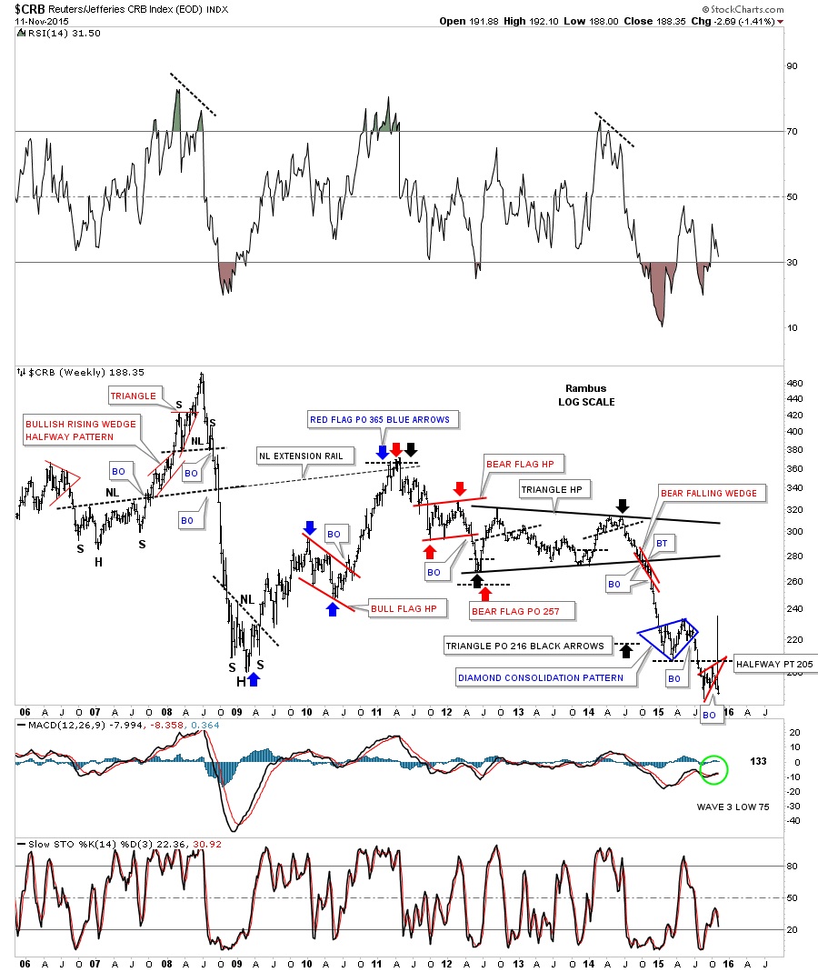
The next chart for the $CRB index is a weekly chart that has some really nice Chartology on it. Recently I just showed you the last couple of years or so but last week I started to look at the history and every time I went back a year all the old annotations came to life. For those folks that like to study measured moves and look at halfway patterns this chart has it all.
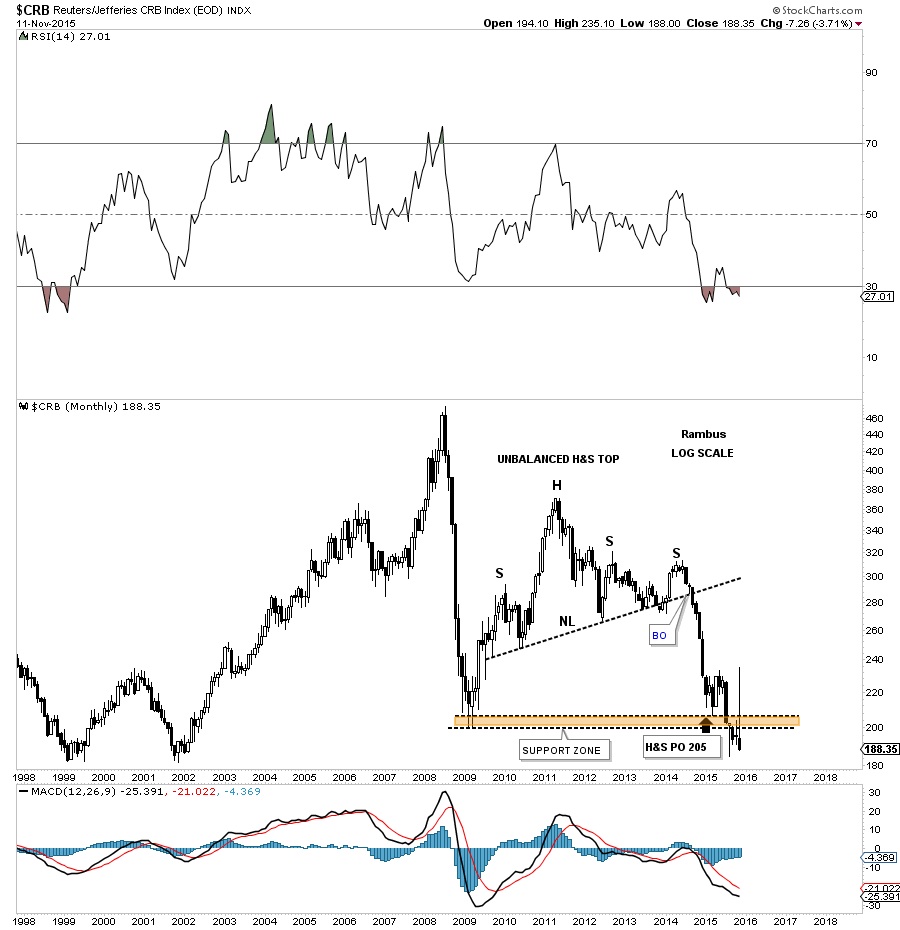
This first monthly chart we looked at a month or so ago but nothing positive has happened for the $CRB index. Just the contrary. It has been getting weaker and is building out another black candlestick and is trading at multi year lows.
You may remember this 60 year quarterly chart for the CRB index that is now trading at the low end of the brown shaded support and resistance zone. If the brown shaded S&R zone fails to hold there is little in the way of support until the 1970’s low comes into focus. It’s possible we could see a dramatic fall in this index leading the deflationary scenario.
Next let’s look at the most important commodity on the planet, oil. Since its big impulse move down from last year the $WTIC has been chopping out a potential bearish falling wedge, that like the US dollar, I would view as a halfway pattern to the downside. As you can see it’s working on its all-important fourth reversal point.
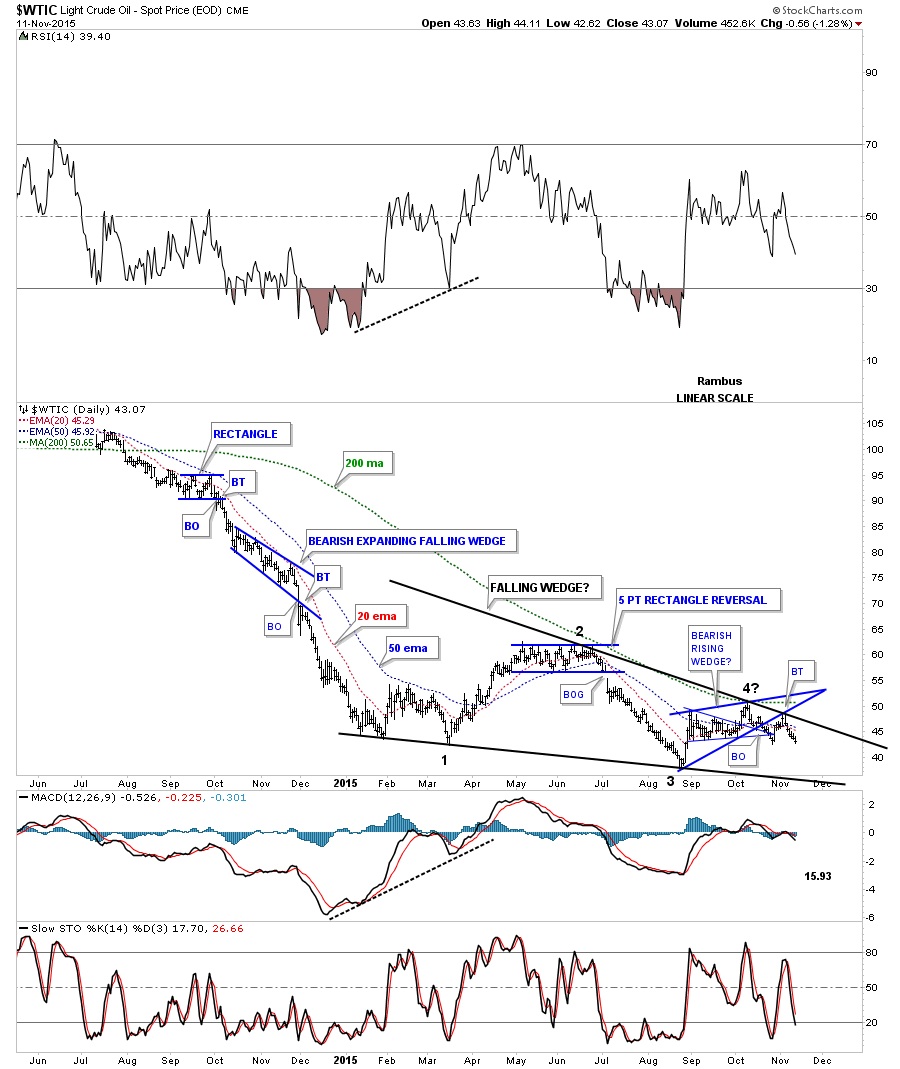
There is another possible consolidation pattern for oil and that is the H&S consolidation pattern. You can see the height for the right shoulder is in line with the neckline symmetry line. The breakout from the blue rising wedge was accompanied by the backtest which may also be the right shoulder for the much smaller H&S pattern that is forming the right shoulder. Oil closed today right on the small neckline. One step at a time. If the small H&S neckline gives way then we’ll look for a test of the much bigger H&S neckline. If either pattern, the bearish falling wedge or H&S consolidation pattern completes, it will have a negative impact for oil.
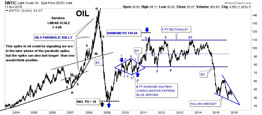
The long term look at oil shows where the real danger lies. Below is a 20 year daily chart for oil which shows its parabolic rise back in 2007 and its even steeper decline into the 2009 crash low. This chart shows you how the potential bearish falling wedge fits into the big picture as shown on the right hand side of the chart.
This next chart for oil is the history chart which goes all the way back to the early 1980’s. For over 20 years oil traded between ten on the bottom and 40 or so on the top. Then in 2004 oil finally broke out above that 20 year resistance zone and all that pent up energy was released and oil went on a parabolic run to $147. As you can see oil actually came down faster than it went up and found support right where you would have expected it to show up, the top of the 20 year trading range at 40 or so. Note how the blue falling wedge is forming right on that very important brown shaded S&R zone at 40.
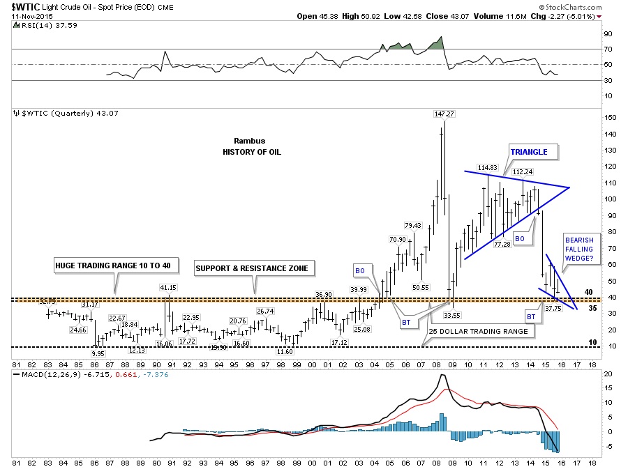
The last chart for oil is the log scale history chart which shows the 20 year lower channel actually doubled in size when the price action broke above the 40 area. It actually was a massive double bottom. You can compare this chart to the long term quarterly chart of the CRB index I showed you earlier. There is a striking resemblance of what is possible.
So the inflection point continues to take hold with most of the important commodities now breaking down out of some very large chart patterns. This also includes the precious metals complex as well. We have the big picture to follow that is so important in understanding what maybe lying just ahead of us.
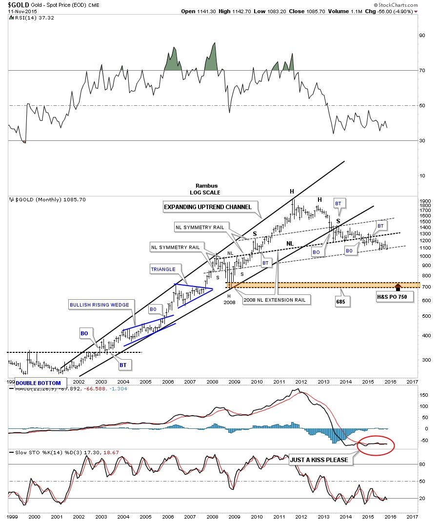
PS: Below is a long term monthly chart for gold which is showing it’s testing a very important neckline symmetry rail right now.
 Meet Rambus, a seasoned trader and technical analyst renowned for his unbiased and insightful chart work. Through his website, Rambus Chartology, and Substack newsletter, Rambus shares his expertise with a global community of subscribers, providing daily updates, commentaries, and hands-on training in the art and science of chartology. With his calm, humble, and down-to-earth approach, Rambus demystifies complex market trends, helping his followers navigate the challenges of today's volatile markets. Join the Rambus Chartology community today and discover a unique blend of technical analysis, trading expertise, and time-tested protocols. Subscribe now at www.rambus1.com or https://rambuschartology.substack.com/


