Cost Of Money And Inflation


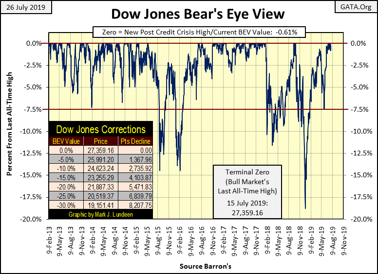
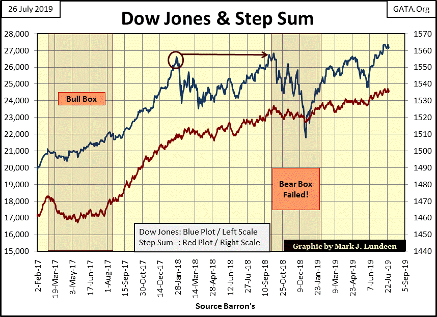
As I expected, after bouncing off the bottom of an 18% correction late last December, and a minor 7.5% correction on May 31st, the Dow Jones is losing steam as it began making new all-time highs in early July. Taking into consideration how many years this advance has been on going, I’m not surprised how since the beginning of July the Dow Jones has so far only been able to produce four new BEV Zeros in the BEV chart below.
Maybe the biggest problem with this market isn’t that the bulls are tired, but rather who the bulls are and what they want from the stock market. It’s been ten years since this advance began at the bottom of the -54% credit-crisis bear market, the second largest percentage decline in the Dow Jones since 1885.
A decade ago there was plenty of reasons to have expected the Dow Jones would have declined at least to its BEV -70% level, had not Doctor Bernanke began his program of quantitative easings. The Doctor flushed three QEs down Wall Street, flooding the market with trillions of dollars to first break the decline, and then reflate market values in the stock market.
What Doctor Bernanke wanted from all this monetary inflation he “injected” into the financial system, was first and foremost to save the banks. Then from October 2008 to March 2009, during the peak in the mortgage crisis, didn’t most people who lost their homes also say “I don’t’ care if the sheriff physically dispossess me and my family from our home, I don’t care if my wife and children starve. Please Doctor Bernanke, just save J.P. Morgan and Goldman Sachs!”
Of course they didn’t, but then the interests of the nation at large and that of the Federal Reserve and its banking system have been in conflict with each other since its inception in 1913. As the latest advance has been funded with “liquidity” flowing from the Federal Reserve, the FOMC gets to call the tune everyone must dance to.
A nice Minuet rather than a hot Cha-Cha-Cha may be exactly what the doctor ordered, because what the “policy makers” want from the market is something completely different from what you or I want. We want to make money; capital gains from advancing valuations. However in a world pregnant with hundreds-of-trillions in counter party risk, the “policy makers” want financial “stability.” So apparently, a nice Minuet on Wall Street will have to do.
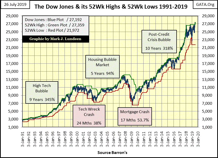
Here’s a chart of the Dow Jones with its 52 Wk High & Low lines going back to 1991. Since January 2018, the Dow Jones has lost momentum to the upside. I’m not married to my market opinions. All the Dow Jones has to do is take off and I’ll go up with it, but for a year and a half it hasn’t done much to provide profits to the retail investment public. It could break above 29K or even 30K, but a move to 30K is only a 10.3% advance from today’s closing price.
Look at this monster move. Since 1991 the Dow Jones has been up 900%, and the credit-crisis bear market, which in percentage terms is the second deepest bear market since 1885, is only a correction within it. When this bubble pops it will be historic.
Should the “policy makers” leave this market unattended (stop supporting values in the stock and debt markets), I still believe the Dow Jones could deflate by 70% or more as the debt burdens now carried by the economy begin to default. And yes, Mr Bear’s ambition for his next big-bear market will be to purge from all balance sheets unviable debts and assets. At the end of the coming bear market, there won’t be as many billionaires as are running around now.
As terrible as that would be, it’s an ill wind that blows no good. I expect the pending losses in the stock and bond markets will prove to be a historic boon to precious metal investments, with holding gold and silver bullion a special blessing. After all, counter-party failure is destined to be the primary feature of the coming market decline. As gold and silver is pure wealth, wealth free from any risk from counter-party failure, they’ll do just fine in the coming troubles.
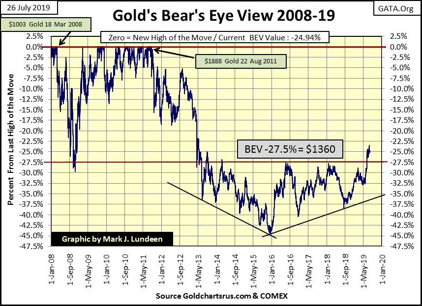
Gold has broken above its BEV -27.5% line, something that for six years seemed impossible. Currently it is holding close to its BEV -25% line as it thinks over its options. This could go on for a few more weeks; but one can’t be a gold bug without being an optimist, and the optimist in me is thinking by October gold could easily break above its BEV -20% line, about $1510. From today’s closing price that’s a $93 move in the next eight weeks. Maybe I should push my optimism to gold’s BEV -15% line; $1605, and then maybe not.
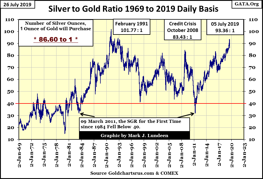
The Silver to Gold Ratio, or the number of ounces of silver one ounce of gold can purchase peaked at 93.36 on July 5th. Sixteen COMEX trading sessions later and the SGR has declined to 86.6. Should this trend continue, it will be a confirmation the bull market for gold and silver has resumed after a pause of eight-years.
Another market event I’m waiting for to confirm the resumption of the bull market in gold is for it to once again begin seeing days of extreme market volatility; days where the price of gold moves (+/-) 3% or more from a previous day’s closing price.
We haven’t seen a 3% day in gold since October 2016; almost three years that did little for the bulls in the gold market. As gold bull markets are volatile markets, if this advance in gold is real we’ll soon see some big daily moves in the chart below.
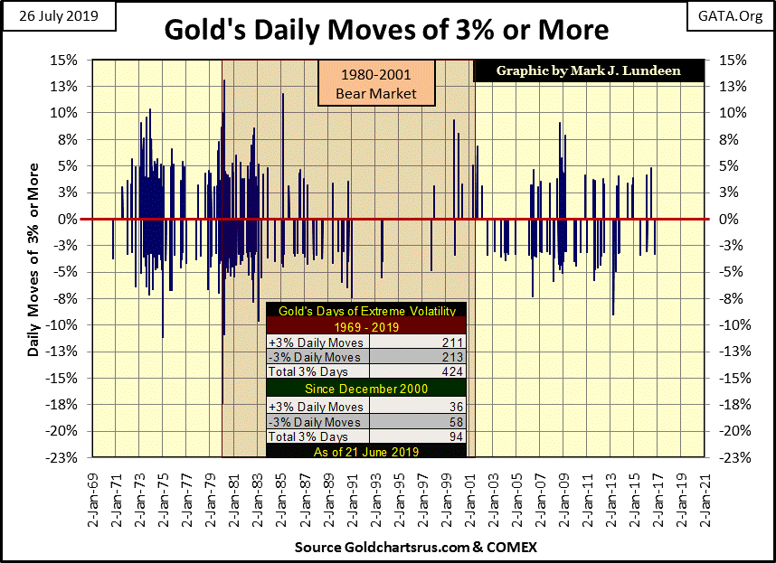
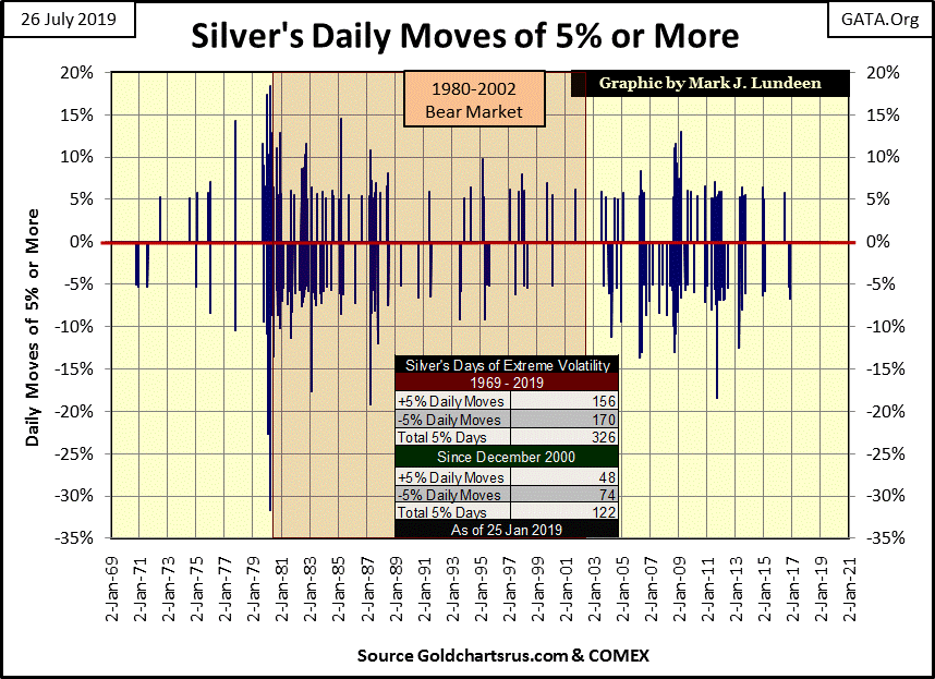
The same is true for silver, except its threshold for an extreme market event is a 5% move from a previous day’s closing price. Like gold, silver’s last day of extreme market volatility was seen in late 2016.
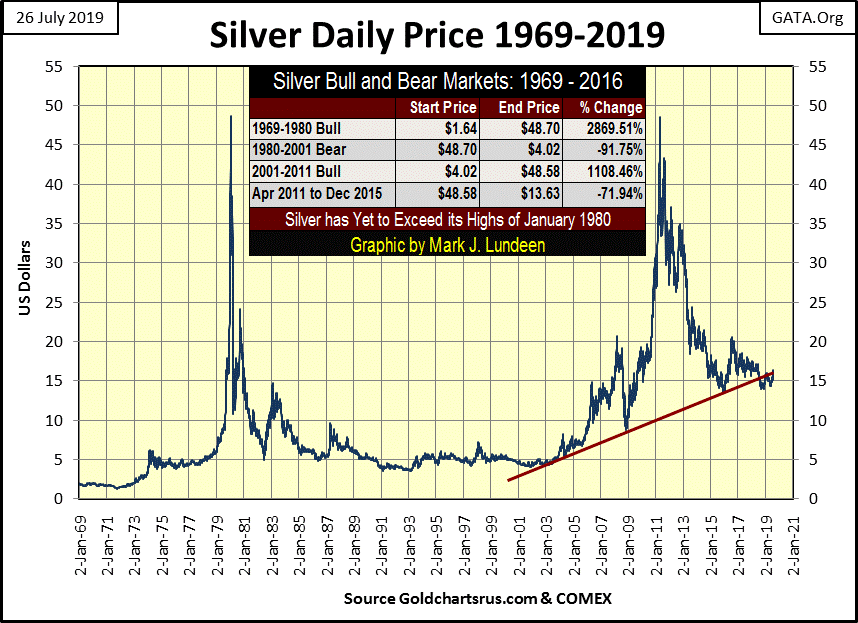
Next is the daily price of silver going back to 1969. Interestingly, silver’s last all-time high is still from January 1980, a few months short of forty years ago. And not just that, but currently silver’s BEV value at the close of the week was a -66.39%. What today can be purchased at a 66.39% discount from where it was selling in January 1980? I suspect that even horse shoes and buggy whips cost more today than they did in January 1980.
When you realize the huge industrialize demand for silver, and how most of the above ground stocks of silver have been sent to landfills in these past forty years, as silver is rarely recycled when people buy new cars, cell phones, or indoor copper plumbing, which uses silver solder to connect its joints, the potential for gains in the price of silver is stunning.
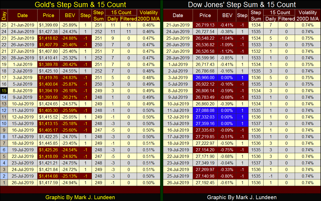
In gold’s step sum chart the bulls remain pessimistic, and I like it.
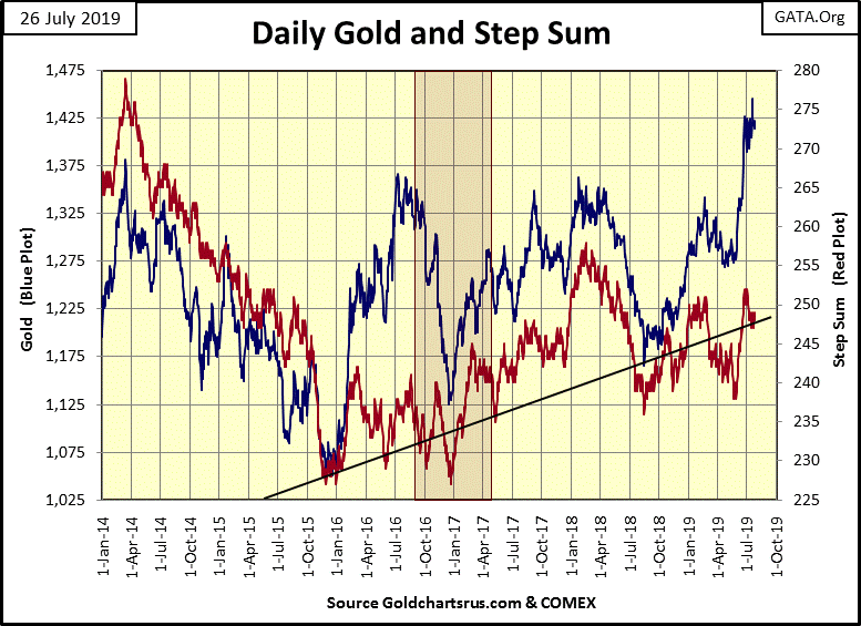
Not much has changed from last week in the step sum chart for the Dow Jones.
From June 21st to July 18th in the table below, gold saw a lot of selling (down days); still it advanced $46 as its step sum fell from 251 to 249. This is excellent market action.
Market commentators spend a considerable amount of time commenting on bond yields and interest rates; is the FOMC going to raise or lower its Fed Funds rate? How long will the ECB continue with its negative interest rate policy? One should note how rates and bond yields today are set by central banks, but it wasn’t always that way.
What are bond yields and interest rates? In the debt markets yields and rates are the rent borrowers pay to lenders for the use of their money. Rates and yields were once set by the free market, where lenders would charge as much, and borrowers pay as little as they could; the sweet spot was where lenders and borrowers agreed.
However, during the 20th century central bankers began dominating the debt markets by flooding it with cheap money and credit that cost them nothing to produce (aka: monetary inflation) to drive rates and yields down, or withdraw this same monetary inflation from the debt market to drive rates and yields up.
It’s this flow of monetary inflation from central banks that actually “stimulates” economic activity as interest rates are managed down, and the withdrawal of monetary inflation from the economy is why recessions result during periods of rising rates.
Truth be told, since before the Great Depression the Federal Reserve has “injected” more monetary inflation into the economy via the banking system it controls than it has withdrawn. Below are the indexed values of Currency in Circulation (CinC / Blue Plot: volume of paper money circulating in the economy) and the price of gold (Red Plot). In the blue plot below we see the unrelenting flow of monetary inflation flowing into the global economy from the Federal Reserve since 1920.
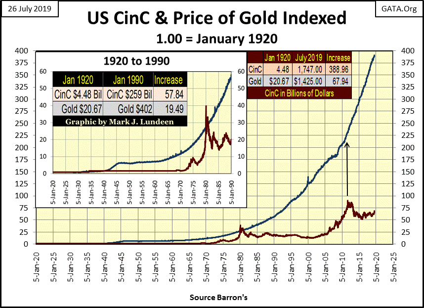
- Side Bar to Article –
I note how the indexed price of gold (Red Plot) caught up with and actually surpassed the rate of CinC inflation at the top of the 1969 -1980 bull market in gold. Will advances in the price of gold once again surpass the rate of CinC inflation? I doubt it will this year or next, but someday I expect it will. At what price would that be?
If we look at the Red Table at the upper right hand of the chart, we see CinC has increased by a factor of 389 since January 1920. Multiply that 389 by the price of gold in January 1920 and we see the potential of $8,040 for an ounce of gold.
But it will be much higher than that, as during the 1970s central banks were actually selling gold to suppress its rising price, increasing the supply of gold to the market. The next gold bull market will be completely different, as since the Credit Crisis of 2007-09 central banks have become huge buyers of gold, drastically reducing the supply of gold in the market.
I don’t know to what extent these central banks have drained the supply of gold available in the market, but as seen in the blue plot above, since the August 2011 peak price in gold, the supply of US paper money circulating in the economy has almost doubled.
- End Side Bar to Article –
Before 1934 CinC was linked to the price of gold as gold was money, while paper money (CinC) was only a liability of the US Treasury payable in gold. In other words, before 1934 you could take $20 in paper money to a bank and walk out with a $20 gold coin. Under a gold standard governments are fearful of issuing more claims on their gold (paper money) than they have gold (gold coins) to redeem them, as failure to redeem their paper money in gold was a legal definition of bankruptcy for a government in a gold standard.
Then in March 1934, when the US Treasury demonetized gold to the US domestic population, and again in August 1971 when it did the same to the rest of the world, we see the inflationary implications of freeing America’s “monetary policy makers” from the shackles of a gold standard – massive monetary inflation as seen in the blue plot above.
What are the connections of CinC and gold to interest rates and bond yields? There is a concept call the Natural Rate of Interest, which is covered in the following publication from the Federal Reserve Bank of San Francisco.
“Unfortunately, the “natural” real rate of interest is not observable, so it must be estimated. Monetary policymakers are interested in estimating it because real rates above or below it would tend to depress or stimulate economic growth; financial market participants are interested because it would be helpful in forecasting short-term interest rates many years into the future in order to calculate the value and, therefore, the yields of long-term government and private bonds.”
John C. Williams / FRBSF Economic Letter 2003-32 | October 31, 2003
I’m sure John Williams is a decent guy, loved by family and friends alike, but I don’t trust any employee of the Federal Reserve to estimate the economy’s natural rate of interest. So, to calculate my natural rate of interest, I use the published values of CinC, dividing each weeks value by the value published 52Wks prior to it.
The result (Blue Plot below) is not an interest rate, but the weekly percentage change in CinC from a year ago, which has a remarkable coincidence to the yields for Barron’s Best-Grade Bonds (Red Plot). My theory being (common sense tells me) when the annual rate of inflation exceeds that of the yield of a fixed-rate financial instrument, such as bonds or mortgages, ultimately those bonds and mortgages will become losing investments. Seeing best bond yields below annual increases in CinC inflation since 2010 in the chart below is a warning to bond holders of what will be in the years to come.
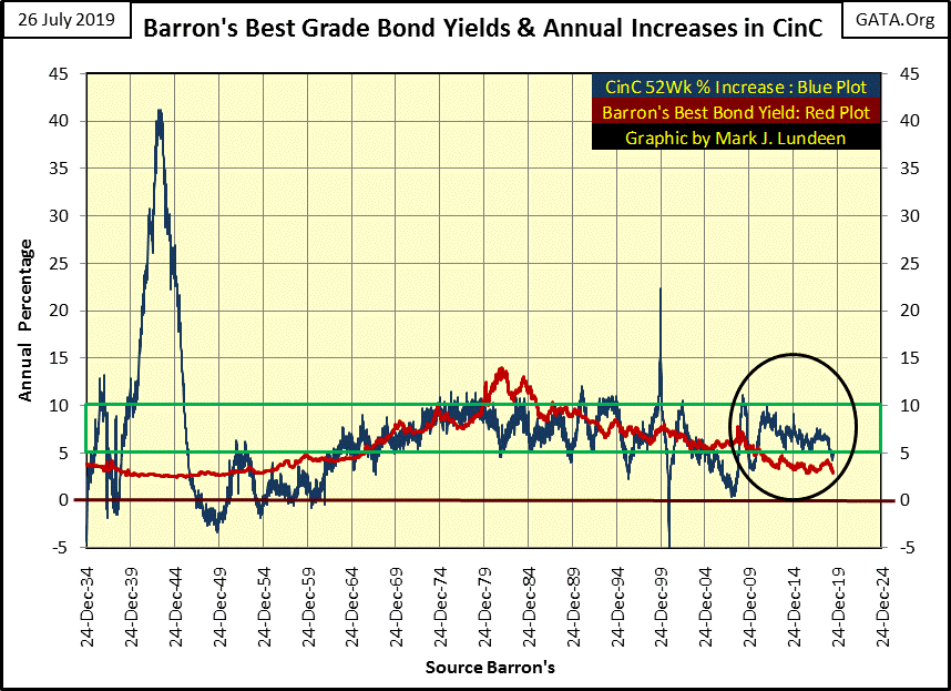
Let’s take a look at the blue plot above. The large +10% spike seen in the late 1930s was from FDR attempting to inflate his way out of the Great Depression. We then see the inflationary consequence of WWII with an inflationary spike in CinC of +40%. From 1934 to the early 1960s there was no correlation between the annual growth in CinC and Barron’s Best-Grade Bond Yields, and for much of this time bond yields were higher than the annual growth in CinC.
However, beginning in the early 1960s, around the time the London Gold Pool was established, this all changed. Annual increases in CinC became greater than yields from best-grade bonds. Worse, the inflation flowing from the FOMC was flowing into consumer goods, which made bonds with their fixed income scheme a mug’s game on Wall Street.
It wasn’t until late 1981 when annual CinC growth declined to 5% as best-grade bond yields peaked at 14% that something amazing happened; monetary inflation flowing from the Federal Reserve stopped flowing into consumer goods, and began flowing into financial asset valuations. And that is how the “policy makers” like it. In fact they’ve become instigators of a series of inflationary bubbles, all of which have ended in a deflationary bust.
- Leveraged Buyout Bubble (1982 to 1987)
- High-Tech Bubble (1992 to 2000)
- Single Family Home Mortgages (2002 to 2007)
- A reprise of all the above / and then some (2009 to ????)
It’s a real mess our “monetary authorities” have put us in, though when this latest, and their greatest bubble begins to deflate, don’t expect them to take credit for what they’ve done; not when they can blame it all on President Trump.
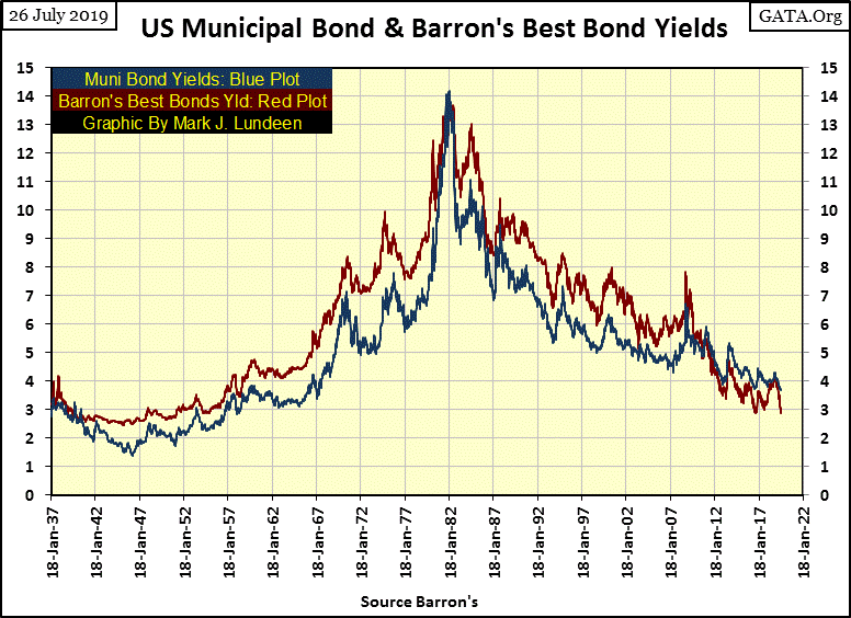
I haven’t covered municipal bond yields for well over a year, so its time I construct a chart plotting muni-bond and Barron’s Best Grade Bond Yields going back to 1937.
One never sees these charts on CNBC, so where did I get this data from? By sitting down at a microfilm reader at a college library over the course of a few years to enter data into a spread sheet from old issues of Barron’s. It’s amazing what I found there, like weekly data points for muni-bonds going back to 1937.
Bond yields and interest rates are rather complex, as there is a lot to consider when lenders and borrowers set them.
- Is the borrower already heavily in debt?
- What are the prospects the borrower can service the loan to term in good times and bad?
- The rate of inflation as lenders will never get paid back in full if the yield they’re receiving is less than the rate of inflation.
Municipal governments (local and state government) have a lot going for them. Their source of income is tax receipts, and come hell or high water they aren’t going to close up shop and go out of business. That plus income from muni-bonds is tax free. Recognizing this, the bond market has for decades, except on rare occasions, offered yields to municipal governments at lower rates than it does for best grade, and taxable corporate bonds (Red Plot), as seen in the chart below.
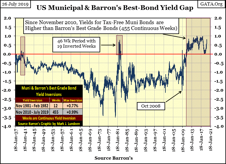
To gain a better understanding of this data we should study the spread of these two yields in the following chart. Those times where muni-bond yields are below best-grade corporate bond yields (as things ought to be) are seen in negative values. Those times where muni-bond yields are higher than best-grade bonds (when things aren’t as they should be) are seen in positive values.
Since 1937 there has only been three times where bond buyers would favor the purchase of corporate bonds with taxable income than muni-bond offering tax-free income, as seen by muni-bond yields higher than best grade corporate bond yields.
The first was during the depression era, but this anomaly lasted for only a few weeks. The second time was when bond yields peaked in the early 1980s, where during a forty-six week period, nineteen of those weeks saw muni-bond yields higher than best grade corporate bonds.
However, since November 2010 muni-bond yields have been higher than best-grade corporate bonds, as bond buyers have forsaken the pleasures of tax-free income. What’s wrong with bond buyers? Or maybe I should be asking: what’s wrong with America’s cities and states?
The links below goes to Paul Joseph Watson’s video on San Francisco and another by Will Johnson of INFOWARS. But with a little effort and a search on Duck Duck Go (I don’t Google anymore), you’d find the same is true for Los Angles, Portland Oregon and Seattle Washington and all too many other Democratic Party local government strong holds.
https://www.infowars.com/video-san-francisco-is-a-shthole/
https://www.infowars.com/san-francisco-is-worse-than-a-third-world-country/
These “sanctuary cities” are deeply in debt and falling apart. Should we be surprised how since November 2010 the bond market has been penalizing the malfeasance of these cities and states with higher bond yields, yields that are actually higher than best-grade corporate bonds. Just take a moment to study the chart above; there is something terribly wrong with the finances of America’s cities; yep – as per CNN Donald Trump.
Articles on Artificial Intelligence (AI) continue popping up in my reading material, and I believe AI is a threat to the future of human beings on planet Earth, though Silicon Valley billionaires see AI development as their key to immortality and superhuman powers for their personal benefit. I’m not kidding, they really do.
I’m going to go on into some of my personal religious beliefs in the following, but there was a time when I didn’t have any personal religious beliefs. I believed in science, I believed in being rational. I don’t have the math background to really understand the scientific theories that define science today, but there are plenty of books written by people that do have that background in science for laypeople like me.
There was a time when I believed science was the search for truth. However at some point I came to realize the truth that science was only searching for government funding, and little else mattered. This discovery led me to seek for the truth in the bible, which didn’t disappoint me.
Here’s something to consider; in the chart below I have plotted in a pie chart all of what science understands of our universe. My source is NASA. All the scientific discovery of the past five thousand years is contained in the 5% of normal matter, and as any scientist will tell you, of that 5% they have only scratched the surface.
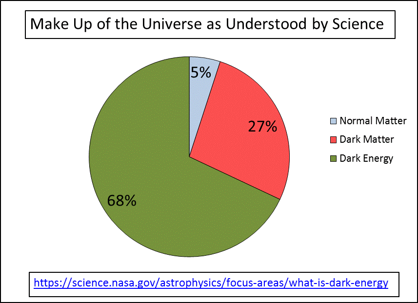
The 27% of the universe called dark matter, science knows of it only because of its gravitational effects seen on the scale of galaxies and galactic super clusters. Exactly what this dark matter is remains a mystery to science, except its not to be found in the 5% of normal matter.
Then there is the 68% of what is called dark energy, which science knows even less about except it appears to be an antigravity that works on an unimaginable galactic scale. The following link to NASA provides some excellent background on this dark stuff.
https://science.nasa.gov/astrophysics/focus-areas/what-is-dark-energy
The point of all this is to illustrate that for all of what science knows, science really doesn’t know much of anything. That’s not to say the technology scientists have created isn’t impressive – it is! But the scope of their understanding of the universe, their BIG PICTURE view of all there is, is actually not much more than was known a thousand years ago when one considers the potential for all there is to know in the universe as displayed in the chart above.
So, for someone to accept science’s claims of knowledge of the beginnings of the universe, or the existence of a “multiverse” from which our universe was formed, is as much an act of blind faith in science as it is for a Christian to accept Jesus is the son of God, who was crucified for our sins and was resurrected three days later.
Actually, accepting science’s explanations of what life is all about, the origins and destiny of humanity and the world we live in requires more faith than believing in Jesus. The prophets and Psalms of the Old Testament provided ample commentary on the birth, life and death of Jesus many hundreds of years before he was born. I was actually amazed when I first read these prophecies, as it proved to me that God is there and is watching over us, which is a real comfort in today’s world.
As far as AI goes, I believe that too was prophesied in the Bible, and it’s not good. If you haven’t left me after all that, you might just take the time to watch the following thirty minute video on AI.
https://prophecywatchers.com/videos/steve-quayle-the-end-of-man-is-here/
Mark J. Lundeen
More from Gold-Eagle


