In-Depth Examination Of The Dow Jones Bear’s Eye View


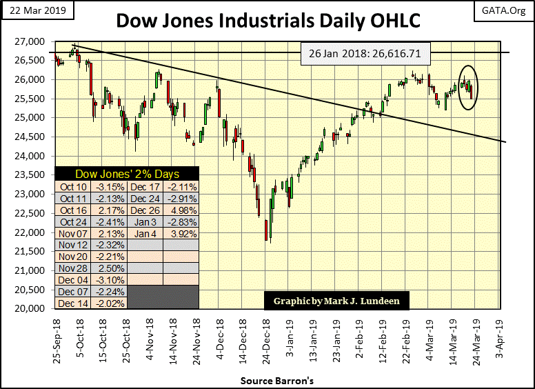
The Dow Jones saw some selling pressure this past week, closing down 4.94% from its last all-time high of October 3rd of last year.
Time to press the panic button? Not as far as I’m concerned, but then I also have no exposure to the broad stock market. But speaking as a spectator sitting in the peanut gallery, my key indicator of when the people who do have market exposure to the NYSE and NASDAQ should exit the market was, and still is when the Dow Jones Industrial Average once again begins experiencing days of extreme volatility, (+/-) 2% daily moves from a previous day’s closing price. Until the Dow Jones once again begins seeing those dreaded 2% days, I’ll be sitting in the cheap seats eating peanuts and cheering on the bulls.
This week I thought I’d use my Bear’s Eye View (BEV) chart of the Dow Jones going back to February 1885, with an in-depth analysis. It’s an amazing view of the daily ups and downs for the past 134 years in the Dow Jones. So what are we actually looking at? We’re looking at each daily close of the Dow Jones since 16 February 1885, after being processed by the Excel formula below.
=D36759/MAX(D$6:D36759)-1
Note: the above formula is located in column E of the spreadsheet. D36759 is the spread sheet cell where the daily closing price for the Dow Jones on 22 March 2019 / (Column D, Row 36759) is located. Cell D36759 is divided by the MAXIMUM Dow Jones closing price within the range from row 6 (16 February 1885) to Row 36759 (22 March 2019).
The effect of this formula is that any Dow Jones closing price THAT IS a new all-time high produces a value of 1 (and never more), from which a 1 is subtracted resulting in a 0% or BEV Zero as I call them. Any Dow Jones closing price that IS NOT a new all-time high registers as a negative percentage from the Dow Jones’ last all-time high. For example, today’s Dow Jones BEV value indicates it has closed -4.94% from its last all-time high of October 3rd 2018.
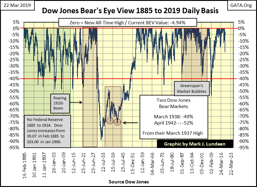
So, the above BEV plot displays 134 years (36,754 NYSE trading sessions) of daily Dow Jones closing prices, from 16 February 1885 (39.07) to 22 March 2019 (25,502.32), compressed within a range of 100 percentage points. The top of the 100 percentage point range is 0%, indicating a new all-time high. The bottom of the 100 percentage point range is -100%, a total wipe out in valuation, which to date the Dow Jones has yet to see.
The Bear’s Eye View, or looking at the market as Mr Bear does, with each new all-time high producing only a Big Fat Zero, and closing prices not new all-time highs displayed as negative percentage claw backs by Mr Bear, is an excellent method for normalizing the 134 years of Dow Jones data.
The data for the Dow Jones has been inflated from double digits in 1885 to over 26,000 in recent years. Though the Dow Jones’ valuations have been inflated by “monetary policy”, a new all-time high was the same in 1885 as it is in 2019. Likewise a 10% or 20% decline from an all-time high in the Dow Jones, whether from 40.02 in February 1885 or 26,828.39 in October 2018 would also be the same to investors.
The red line in the BEV chart above highlights a 40% decline from an all-time high. This is an important level for the Dow Jones’ BEV chart, as since 1885 a 40% decline from a BEV Zero indicated a bear market is approaching its bottom. That’s a good thing to know. The only exception to that rule was the gaping crater left in the BEV plot by the Great Depression Crash, an 89% market decline.
One look at the Dow Jones’ BEV chart above proves something unique happened in the late 1920s and early 1930s. First the concentration of BEV Zeros in the second half of the 1920s shows an unprecedented number of new all-time highs the stock market experienced during the 1920s’ boom. The effect of those new all-time highs can be seen in the chart below – the Roaring 1920s stock market boom, as well as the Great Depression Crash of 1929-32.
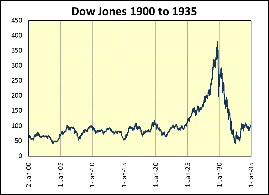
Some comments on the chart above are appropriate. The Federal Reserve was instituted in late 1913, and didn’t involve itself in markets until the 1920s. So, we see how the stock market operated before the creation of the Federal Reserve in the chart above. From 1900 to 1922, the Dow Jones oscillated between 50 and 100. Those declines from 100 towards the 50 line are the 40% market declines seen in BEV chart above, and advances from 50 to 100 were bull markets.
Not very exciting. So why did people invest in the stock market? Unlike today, investors of 100 years ago saw the stock market not so much as an opportunity to profit from capital gains, or didn’t until the boom years of the 1920s, but as a source of dividend income that was higher than banks paid on deposits, or offered by best-grade bonds.
One last comment on the Dow Jones’ BEV chart above. Before the April 1942, 52% Dow Jones bear market, the Dow Jones frequently saw market declines of 40% or more. After the April 1942 bear market, the Dow Jones has only twice seen its BEV plot break below 40%; once in December 1974 (-45%), and again during the credit-crisis bear market (-54%). Eight decades with only two Dow Jones 40% bear markets?
This is a remarkable development which demands an explanation, and I’d say this dearth of 40% bear market declines since 1942 is yet another finger print on the market left by the Federal Reserve System.
Digging deeper into the BEV data (which on my Excel file is located in column E) with a frequency distribution (tables below), we see the frequency of BEV Zeros the Dow has made since February 1885 (left table): 1,430 days in the past 134 years, or 3.89% of all daily closings.
I placed a Red Box around the BEV Zeros and the -0.000001% rows. The -0.000001% row is there to isolate actual BEV Zeros from a Dow Jones’ daily closing that maybe just a penny short of a new all-time high. This row includes those daily closings just a tad short of a new all-time high down to -4.999% from one. So, within the red box list the number of daily closings for the Dow Jones at, and within 5% of a new all-time high.
A comparison of the three tables’ frequency of BEV Zeros and the -0.000001% rows (data within the red box) is interesting. From 1885 to 2019 (left table) contains 36,754 daily closings, the Dow Jones closed at and within 5% of a new all-time high in 25% of all daily closings.
Compare that to the frequency distribution table on the far right; (13 Aug 1982 to 22 March 2019) a full 50% of the daily closings since August 1982 have been within 5% of making a new all-time high. Go back and look at the BEV chart above; compare the data from 1885 to August 1982 to the BEV plot that follows.
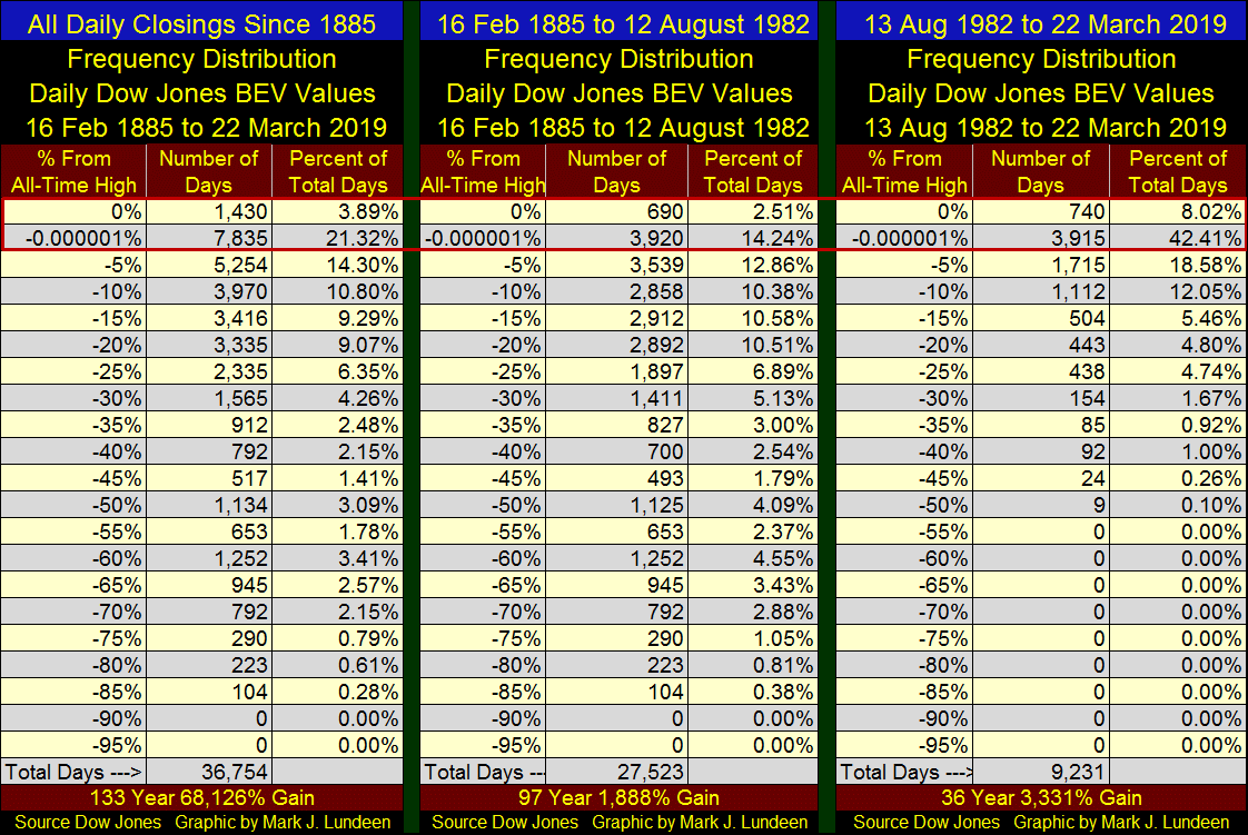
The tables above quantify the Dow Jones’ BEV plot. It’s amazing how from 1885 to August 1982, the Dow Jones made 690 new all-time highs during a 97 year period (middle table). Since August 1982 the Dow Jones has made 740 BEV Zeros in the past 36 years (right table). Why the increase in frequency of new all-time highs since 1982?
The point of this exercise is to illustrate how, since August 1982 something has changed in the stock market, and that thing is called “monetary policy” as dictated by the FOMC.
I can’t say when, but when the many decades of “liquidity injected” into the stock market reverses, and flight capital flees Mr Bear’s deflation in financial assets, trillions of dollars, yen, pounds, yuan and pesos will be seeking a safe harbor. That safe harbor will most likely be gold, silver and precious metals mining shares.
The chart below shows the market performance in the Dow Jones and the Barron’s Gold Mining Index (BGMI) from 1920 to 1939. Note: the plots are the indexed values of the Dow Jones and BGMI / the indexed value of Currency in Circulation (CinC = US paper dollars in circulation). So, we’re looking at market performance indexed, and adjusted for paper-dollar inflation.
The Dow Jones peaked in September 1929 at 4.0, after which it began an 89% market crash that bottomed in July 1932. During the crash the BGMI saw only a 25% correction in a bull market that began in 1925, after which flight capital from the financial markets fueled a bull market that took the BGMI up to 4.26 in 1936.
The BGMI in the 1930s did better than the Dow Jones in the 1920s. It didn’t hurt that in early 1934 the United States also devalued the dollar from $20.67 to $35 for an ounce of gold, which is exactly when the BGMI went vertical in the chart below.
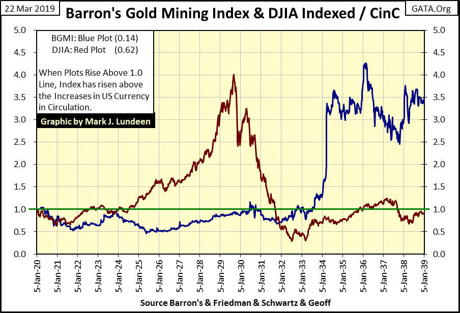
Now past performance is no guarantee of future performance. So, no one can say with 100% certainty what will happen in the next decade by looking at what happened in the Dow Jones and BGMI in the 1920s and 30s. But looking at market history recorded in the chart above provides more than just a little comfort for what is possible in precious metal assets when the stock and bond markets begin deflating in earnest.
But as seen in the daily bar chart for the Dow Jones below, we aren’t seeing any panic in the market as of yet. The Dow Jones was down for the week, but that isn’t a big deal as daily volatility is still bullish. So, what does bullish or bearish daily volatility look like?
It’s off my daily bar chart now, but daily volatility for the Dow Jones as it approached its October 3rd last all-time high appeared much as it has since mid-January below; the Dow Jones saw daily advances and declines in little steps, not the large daily moves seen below post October 3rd to early January.
Look at all those Dow Jones 2% days in the chart’s table; that’s what happens when the stock market is under pressure. That we haven’t seen a 2% day since January 4th is a big reason we’ve seen the gains in the stock market since then. With the Dow closing this week less than 5% from its last all-time high, it’s still in scoring position.
Gold below remains positive. We’re still waiting for it to take out its line of resistance at its BEV -27.5% line. The question I have is can gold do it with its current subdued daily volatility, or will gold continue to trade below its current line of resistance until gold once again sees a few days of extreme volatility? Gold hasn’t seen a 3% day since October 4th 2016, two and a half years ago when it closed down 3.30% from the October 3rd closing price.
What will it take for gold’s daily volatility to increase? Deflation in the stock and bond markets would do the trick. But then the gold and silver markets are tiny compared to even the market cap of a giant tech company these days. It would take only a couple of billionaires to decide to each purchase a few hundred million dollars of physical bullion, for storage outside the banking system to drive the price of gold up significantly.
That this hasn’t happened yet is most likely due to the cooperation that exists between the “policy makers” and the ultra-rich. After all, even Warren Buffet would have gone bust during the 2007-09 credit crises, had the “policy makers” not bailed him out too.
At the top of the food chain, one hand washes the other. So there’s no pressing need for the ultra-rich to rock the boat by driving the COMEX paper gold market into default just to become ever more ultra-rich. Maybe you or I would just to spite the “policy makers”, but Bill Gates and Jeff Bezos defiantly won’t, at least not now.
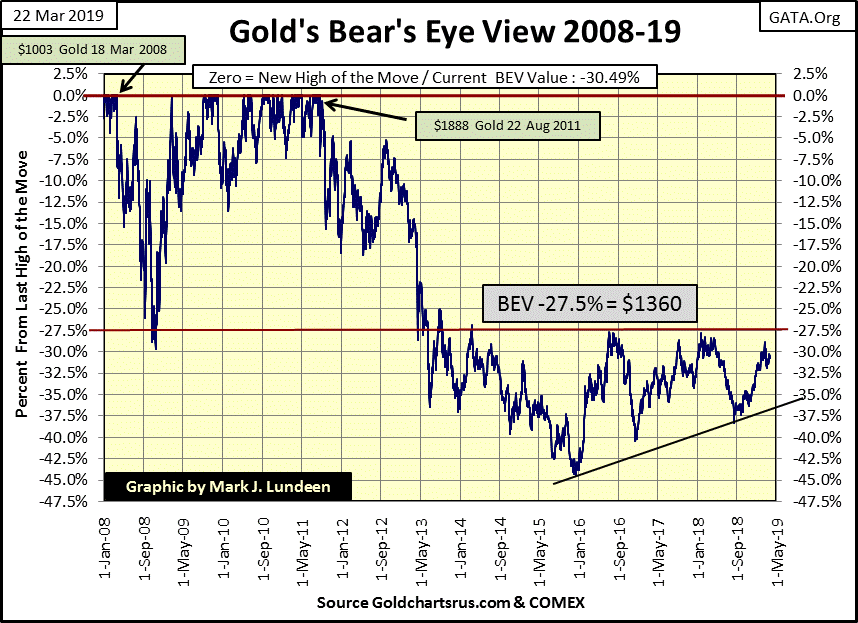
Yet for all that, gold’s BEV chart remains encouraging, so keep an eye on that line of resistance ($1,360).
Not much has changed in gold and the Dow Jones’ step sum charts, so I’m going to skip them this week and go directly to their step sum tables below.
Gold is recovering from a period of heavy selling. Since early March its 15 count has been dominated by -5s & 7s. Let’s see if the bulls can get gold’s 15 count positive again. If they do, and manage to increase the count to something above +3, gold may finally break above its line of resistance at $1360.
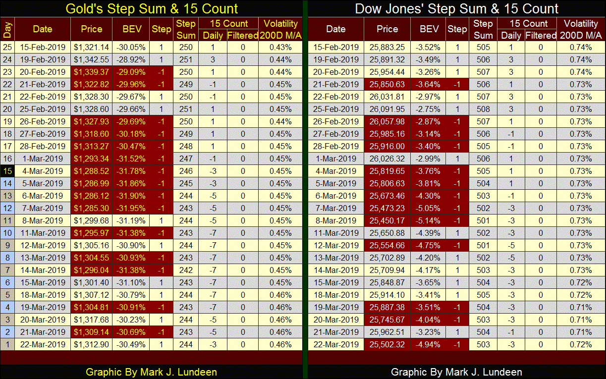
The Dow Jones, as with gold, has seen its 15 count under pressure since early March. But there are only two -5 in its count, telling me the pressure to drive the Dow down hasn’t been as intense as the pressure applied on the price of gold.
But that might change, as the yield curve has inverted (chart below). Yields for the Treasury’s two, three and five year notes are all below the Fed Funds Rate and the Treasury’s one year note. In other words; monetary policy has become tight. No wonder the FOMC passed on this week’s opportunity to raise their Fed Funds Rate by twenty-five basis points.
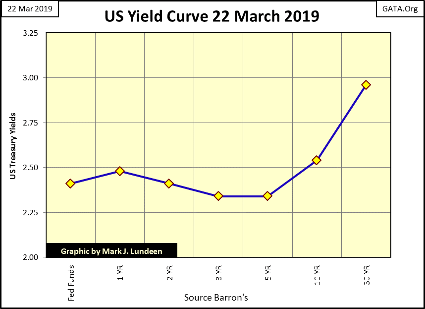
Historically, an inversion in the yield curve has always been a bellwether for a market decline at the NYSE. But the market’s reaction to a yield inversion is seldom instantaneous. So it may be some weeks or even months before the Dow Jones breaks below its lows of December. Until then, I’m sitting in the cheap seats cheering on the bulls, and will continue doing so until we once again see those dreaded Dow Jones 2% days.
The United Autoworkers Union pension fund is broke. It’s not the first union pension fund that went under, and it sure won’t be the last. Don’t think I’m gloating here. My family is about as blue collar as they come, and seeing a major pension fund go under is a tragedy.
All those years of funding one’s pension fund only to see how your funds were squandered by union officials for political purposes, or in the best case go under as interest rates and bond yields were driven down to asinine levels by the Federal Reserve to save a corrupt banking system.
This is an example of what is known as Counter Party Risk; where one’s financial standing is dependent upon the integrity and competence of another.
Mr. Mac Balkan of Eskay Mining has published an updated corporate presentation. Eskay’s joint venture with Silver Standard Resources (SSR) was terminated last November by SSR. However, SSR’s two years of drilling (18,000 meters of assayed core samples), and their $8 million dollars of exploration work have left Eskay Mining in an excellent situation for the coming decade.
To download the presentation in the link below, go to the top article and click on the “Clink Here to review document.” A Power Point file will download, that takes about a minute.
http://eskaymining.com/index.php/investors/presentations/
I personally have NOT sold a single share of Eskay Mining, and I don’t intend to until the coming bull market in precious metals finally recognizes the value of Eskay’s claims in British Columbia’s Golden Triangle.
I remember past bull markets in the gold and silver mining sector. Exploration companies sitting on what’s called “Moose Pasture” have seen their valuations explode. An exploration company such as Eskay Mining, who has been around for over 20 years in a horrible market because management sees its potential is something I want a part of. Eskay has some exciting prospects, as seen in the presentation above. The problem is for the majority of investors today, retail and institutional, gold and silver aren’t exciting. But as the UAW retirees discovered earlier in this article, things change all the time.
When gold and silver bullion are once again rising to new all-time highs and financial assets such as stocks and bonds begin deflating into a panic, I expect my patience in holding my position in Eskay Mining will be well rewarded.
As always, mineral exploration is a high risk, high reward SPECULATION. Don’t place more than 5% of your funds in precious metals mining into an exploration play. And before you invest in even a major mining company, be sure to buy some gold, and especially silver bullion at today’s prices.
Mark J. Lundeen


