Disturbing Historical Trends In GDP And The National Debt


People never want to hear bad news, especially when it’s really bad and undeniably true. So, most of us turn on the television to get our world view from “reporters” and “experts” who have apparently dedicated their lives to protect their viewers from hearing the now unavoidable consequences of our bad decisions as voters and consumers. For most people it’s a source of comfort to be able to retort to anything out of the ordinary people tell them: “if what you say is true why isn’t CNBC or CNN reporting it?” Good question!
If truth be told, considering the sincerity with which members of the media report Washington’s bogus statistics concerning inflation, GDP and employment, I suspect that most “reporters” and “experts” are just as ignorant of the United States’ structural, fiscal and economic problems as are their viewers. Fortunately as I’m not trying to sell advertising time to banks; I can examine the world from a different perspective: one of historic trends, and what I see is quite disturbing.
Below we see the indexed plots for GDP, National Debt and CinC from 1929 through 1973. Indexing this data allows us to see the relative growth of one series to the other, as in horse race. As indexing eliminates the difference in magnitude (levels the playing field) between one series and another, I’ve also placed a table on the chart listing the published values for each series along with US gold reserves (in dollars and ounces) with the yearend price of gold for 1929 and 1973. Note the values of CinC (paper money) and gold reserves valued in dollars. In 1929 the United States had more dollars in gold than the paper money previously issued by the US Treasury, but by 1973 inflation had become the official US “monetary policy” as evident in the chart’s table.
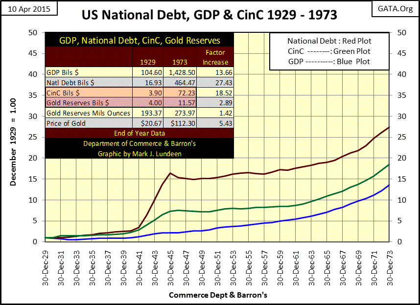
It wasn’t always this way. I have a 1924 edition of Collier’s New Dictionary of the English Language; it has no listing for the word “inflation”, but it does list “inflationist” as one in favor of an increased issue of paper money. Would an “inflationist” back in 1924 have favored increasing CinC by a factor of 18.52 and decoupling the US dollar from gold over the next fifty years? I seriously doubt it, but that’s what happened.
Here’s a listing of past Barron’s articles on Banking, gold and the US dollar, many published during the span of time in the chart above. This list is just a small sample of articles Barron’s has published on these topics over the decades.
Today financial journalists are very cavalier in their attitude toward central bank increases in the money supply. Apparently these journalists are eternal optimists. The Federal Reserve has been “injecting” trillions of dollars into the banking system since 2008, with little effect except for inflating the value of financial assets.
Truth be told, most of our current macro and micro economic problems are the result of politicians enabling central banks to expand CinC and bank credit beyond what a gold standard would have permitted. But most people today have come to expect central banks to do just that whenever the economy is not performing up to people’s expectations. I’m one of the few who believe the world was a better place back when dictionaries of the English Language had yet felt the necessity to define the word, “inflation.”
Much of my economic research uses old data series from Barron’s; they make great charts you’ll see nowhere else. But Barron’s also once advocated a strong dollar and prudence in finance. Its credo was proudly displayed at the top of the front page all during the 1920s.
“Finance: The Application of Money to Practical Ends”
- Barron’s credo from its 1920’s issues
What a different world we live in today! Ninety years later finance has evolved into how best to separate suckers from their money with low interest loans for no good purpose, which banks then bundle with derivatives, only to be bailed out by governments when the shaky credits go bust. To see how we got from there to here, you may want to read these articles from the dusty old pages of Barron’s at your local college library.
This next chart illustrates the trends in GDP, national debt and CinC since the end of the Bretton Woods $35 gold peg in 1971. Currency creation (Green Plot) and the national debt (Red Plot) have exploded with GDP (Blue Plot) lagging far behind.
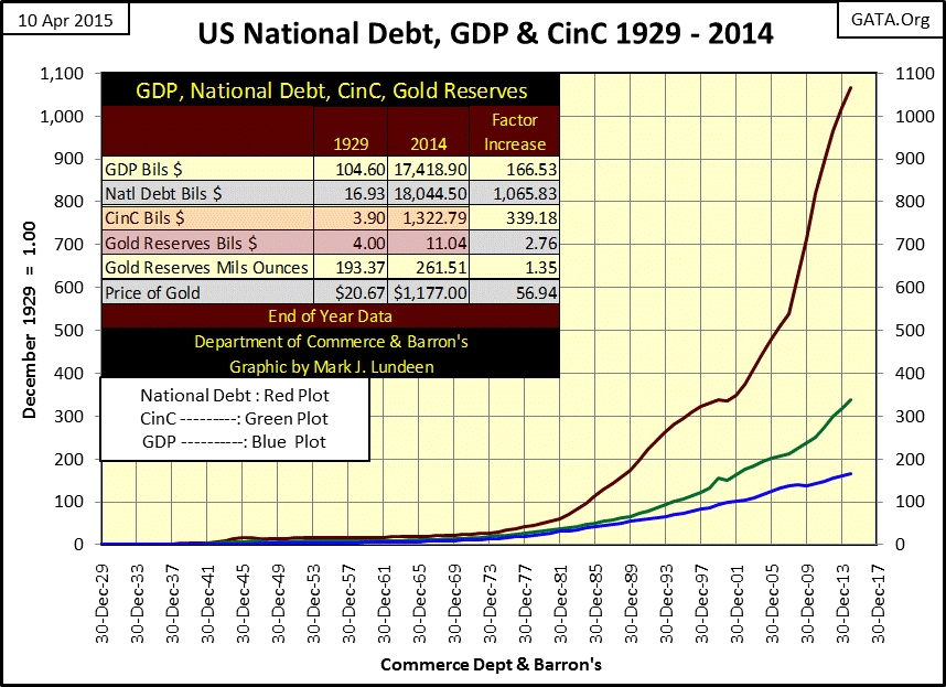
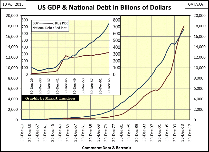
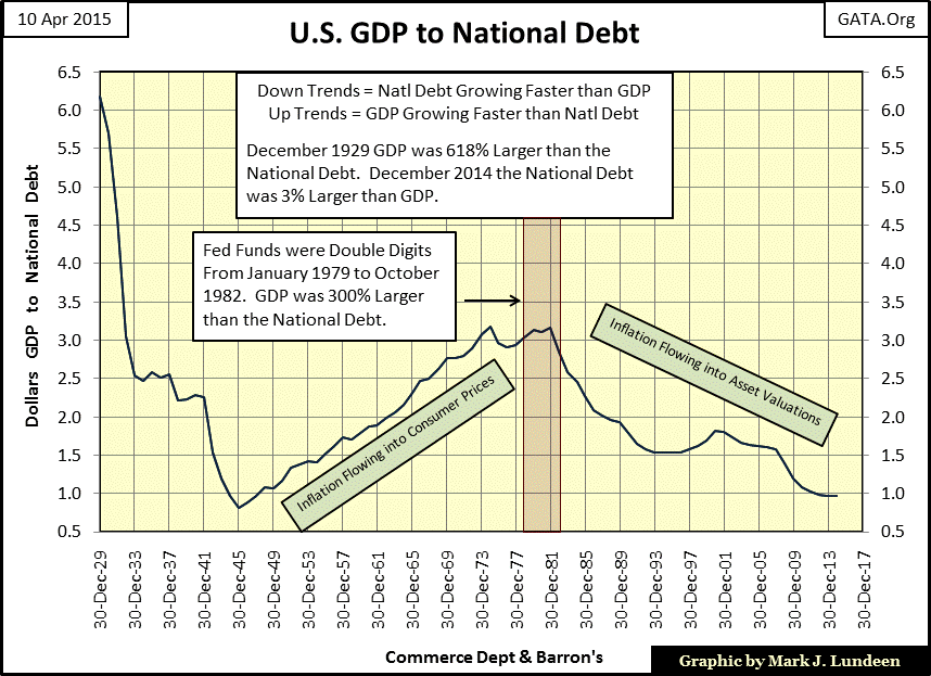
But these plots are based on the indexed growth in these data series since 1929, and while accurate, we see in the chart’s table that GDP in 1929 was six times greater than the national debt. Back in December 1929 the world had just entered a deflationary hell. American GDP would plummeted 64% by 1933. But even so, all during the Great Depression GDP was multiples larger than the national debt (see insert chart below). So the debt assumed by the Federal Government was not actually a factor in triggering the 1930s deflation. Counterparty failure from ill-considered credit banks extended to consumers, stock market speculators and businesses is what actually caused the great depression; credit made possible by the then new Federal Reserve.
Currently however, the national debt has become larger than U.S. GDP. During the Great Depression, Washington’s burdens on the economy were small, making Treasury debt one of the few safe harbors for investors. Now that the national debt is larger than GDP it’s unlikely that will be true during the coming credit contraction.
When Fed Chairman Paul Volcker raised the Fed Funds Rate to double digits (January 1979 to October 1982), the ratio of US GDP to National Debt (chart below) had increased to its highest levels since World War Two. There were three dollars of GDP supporting each dollar of US Treasury Debt. At this level of treasury debt there was little chance that Volcker’s double digit interest rates could drive the US government into bankruptcy.
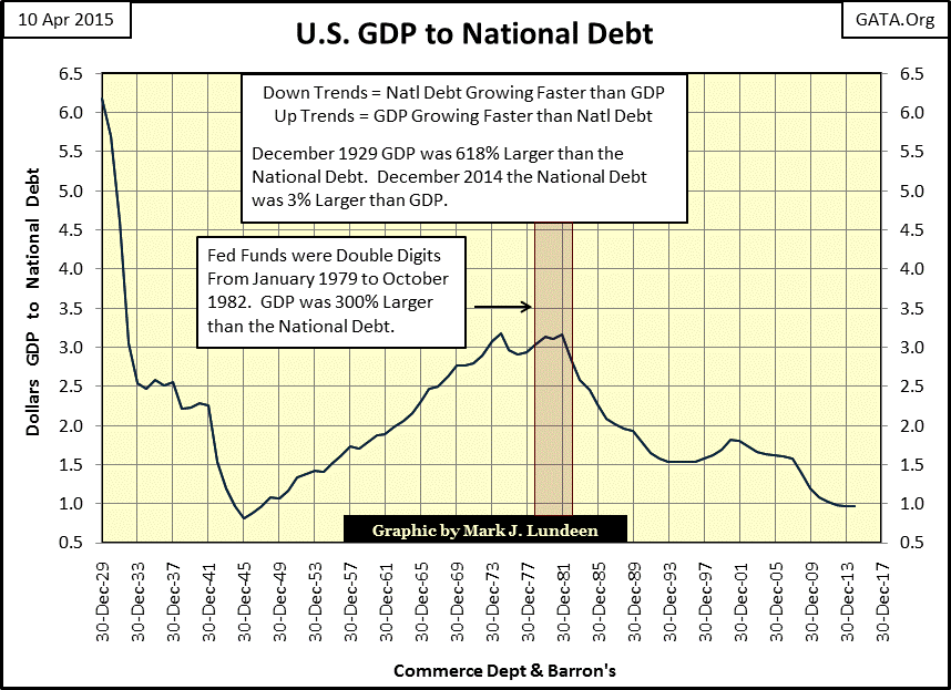
Today, after six years with the Fed Funds rate effectively at 0%, and Treasury debt yields below levels seen in the early 1950s, every dollar of GDP must now support $1.03 of Treasury debt. It’s not a question of whether bond yields will rise, but when. Back in September 1981 the US Treasury issued a 20Yr Bond with a 15% coupon without collapsing America’s economy. In fact, the double-digit yields of decades ago made the dollar a very attractive financial asset in demand the world over, unlike today with so much Treasury debt relative to GDP.
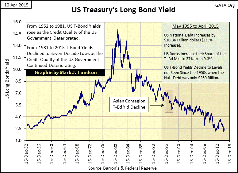
At the end of 2014 the GDP available to service the Treasury’s 18 trillion dollars of debt, (and everyone else’s obligations to the banking system) was only 17.4 trillion dollars. Rising yields in the months and years to come will certainly bankrupt the United States government (and other deeply indebted debtors). What will Washington’s dollar and Treasury bonds be worth then?
If the current ten-year US Treasury bond yield of around 2.0% increased to its average yield over the past decade (around 6.0%, and other interest rates also tripled) then our current budget deficit would triple to more the $4 trillion per year as the US Treasury was forced to rollover old debts at higher rates. The federal government currently takes in around $2.5 trillion a year in taxes. How can this debt ever be repaid as it continually increases by additional trillions each and every year? Answer is that it can’t, even at the current artificially suppressed rate of interest.
And unfortunately, GDP (as most people think of it) has not actually done as well as the data suggests. GDP is measured in dollars, and the dollar is an undefined economic unit (as Alan Greenspan admitted when pressed for its definition by Congressman Ron Paul during Congressional testimony). Be that as it may, since the end of World War Two the dollar has functioned as the world’s reserve currency, meaning that international trade, (such as sales of steel {Blue Plot} seen in chart below), is settled in dollars.
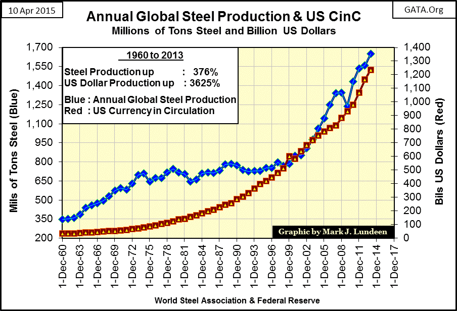
The plots in the chart above have one major flaw; it makes it appear that since 1960 global steel production and US CinC have increased at approximately the same rate. The chart’s table illustrates this fault by noting the impressive 376% gain in global steel production over the past fifty-three years, while dollar creation by Washington increased by 3625% - greater by a factor of ten.
The next chart plots increases in annual global production data of cobalt, sulfur, gold and US CinC from 1960 along with GDP. Had I included the steel data used above in the indexed chart below, it would be sitting above the 3 line, just a tad over sulfur, but far from the 30 line where CinC and GDP now finds themselves.
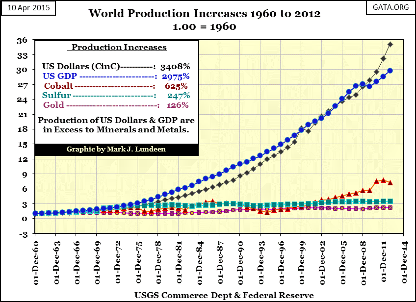
The point of the above two charts is that while U.S. GDP has “increased” by a factor of 167 since 1929 (29.75 since 1960 alone) no one would be foolish enough to claim America’s (or global) productive capacity in 2014 now delivers 167 widgets, or tons or barrels for each barrel or ton or widget it produced in 1929. This mirage of economic expansion is created by monetary inflation.
So exactly what is GDP? It attempts to measure increases and decreases in economic output, with less than perfect fidelity to production reality. Despite GDP’s official definition:
“DEFINITION of 'Gross Domestic Product - GDP' The monetary value of all the finished goods and services produced within a country's borders in a specific time period, though GDP is usually calculated on an annual basis.”
no one can say precisely what it measures because the dollars used in measuring it are an undefined unit. This is an important detail; when the Federal Reserve “monetizes asset-backed securities” such as defaulting mortgages and uncollectable credit card debt, it increases GDP via price inflation. This falsely gives the impression of economic growth, as shown by the government’s own data in the charts above.
Let’s review the U.S. GDP to National Debt chart. Notice the two green labels I’ve added. The 1929-1933 decline in GDP is certainly real in the chart below. The soup lines and massive unemployment in the early 1930s were caused by a 64% collapse in GDP (as reported by the Commerce Department).
However, beginning in 1933 with the incoming Roosevelt administration, economics (and “monetary policy”) began to be dominated by politicians and academics, as seen in the following MGM movie short from 1933.
https://www.youtube.com/watch?v=XU4brZ8vOu0
This ten minute Youtube video is entertaining and informative on the subject of inflation: the solution to all problems economic. You’ll see that Colliers dictionary still didn’t list the word “inflation” in 1933, but that would soon change.
The plot in the chart above plunged during World War Two as the national debt increased from $57.35 billion in December 1941 to $278.43 billion in December 1945 (a 385% increase). During the war, GDP also increased from $129.4 billion in 1941 to $228.20 in 1945 (a gain of just 76.35%). I suspect GDP’s “poor performance” was largely due to war-time wage and price controls. After the war the plot began a thirty-six year rise which peaked in 1981. This was due to the decrease in Washington’s voracious appetite for debt after the war, and the resulting monetary inflation flowing into consumer prices. Paul Volcker was only able to spike interest rates to double digits in 1979 because consumer prices (reflected in GDP) had been increasing three times faster than the national debt since 1945.
But Volcker’s victory in diverting inflation from consumer price to financial asset valuations eventually became Doctor Bernanke and Janet Yellen’s dilemma. Clearly we are at the point in the inflation cycle where financial assets traded on Wall Street are due for a historic correction as the continual creation of dollars revert to inflating consumer prices (gold & silver too). For the banking system this is a recipe for disaster. Janet Yellen is concerned that when the FOMC eventually begins normalizing interest rates it will trigger a cycle of deflation in financial assets and inflation in consumer prices that will transform the world into something very different than it is now.
So why do CNN and CNBC refuse to cover this story? Don’t worry; eventually they will. They’re just waiting for the Federal Reserve’s public relations department to send them the details of how someone other than the FOMC caused the disaster; which they will dutifully report to their viewers.


