The Dollar’s Last Stand


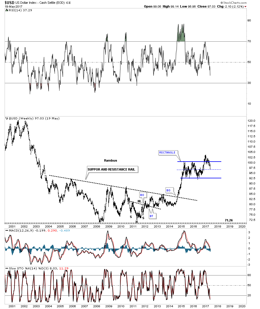
There is no doubt that the US dollar looks bad right now after breaking below the bottom rail of its 5 point falling wedge last week. Before I give up totally on the US dollar there is one thing I’m going to look for first. When all else fails I like to go back to the initial pattern which was a sideways trading range or a rectangle pattern. I’ve seen in the past that when you have a nice tight rectangle with a breakout above the top rail, there can be one very big shakeout move where the price action will decline back to the center mid dashed line, where final support may reside. If the dashed mid line fails to hold support then there are bigger problems. Below is a weekly chart for the US dollar which shows the price action testing the mid dashed center line.
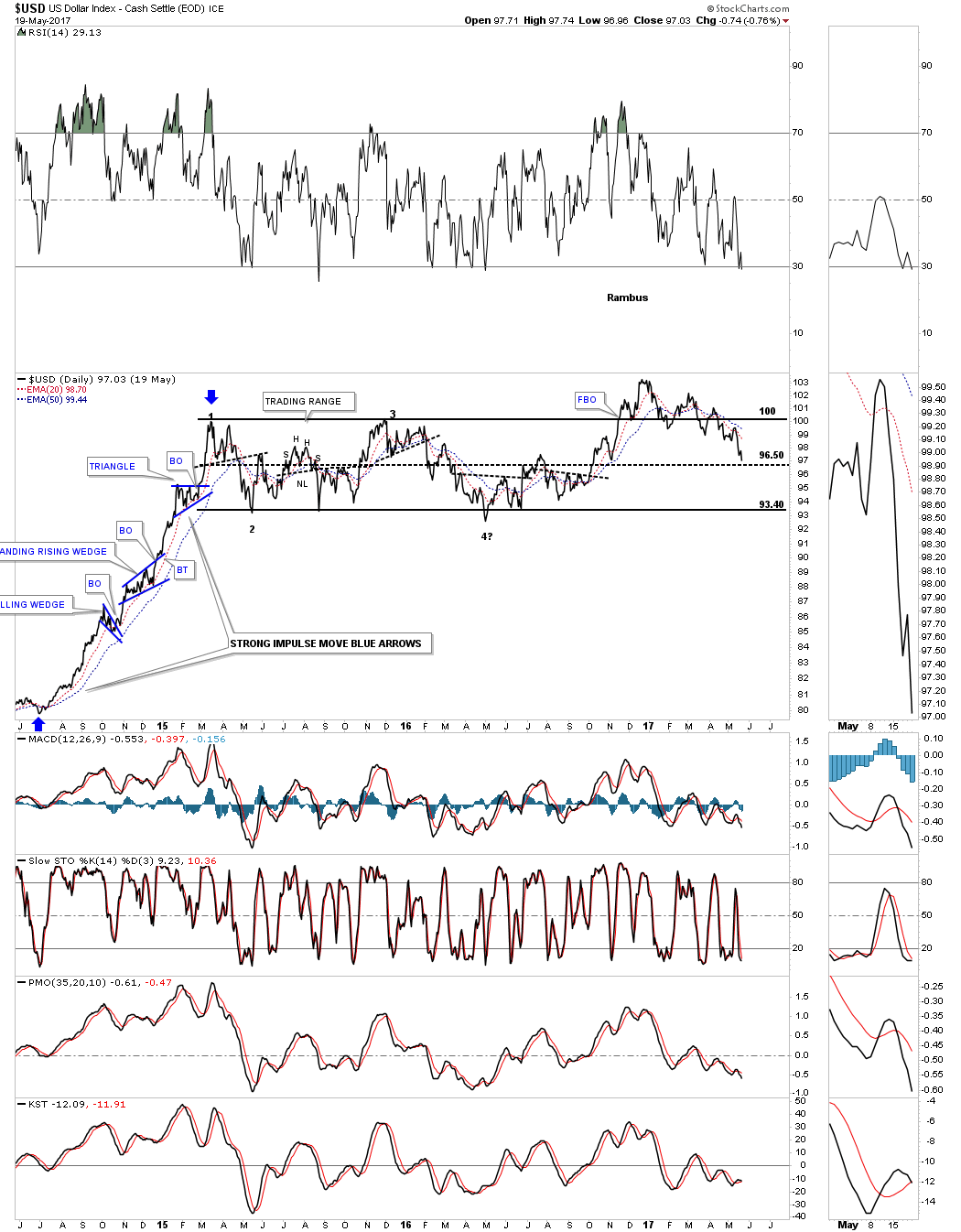
The $US dollar daily line chart.
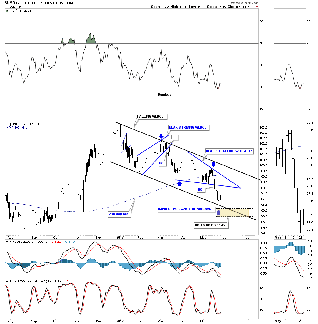
The daily chart below shows a potential downtrend channel with 2 blue consolidation patterns. If the blue bearish falling wedge is a halfway pattern to the downside the blue arrows shows a price objective down to the 96.20 area, which is labeled impulse move. The breakout to breakout price objective is a littler lower at 95.45. Those 2 price objectives come in pretty close to the mid dashed center line on the rectangle pattern above.
The million dollar question remains, is the 2 year trading range a top or a consolidation pattern to the upside?
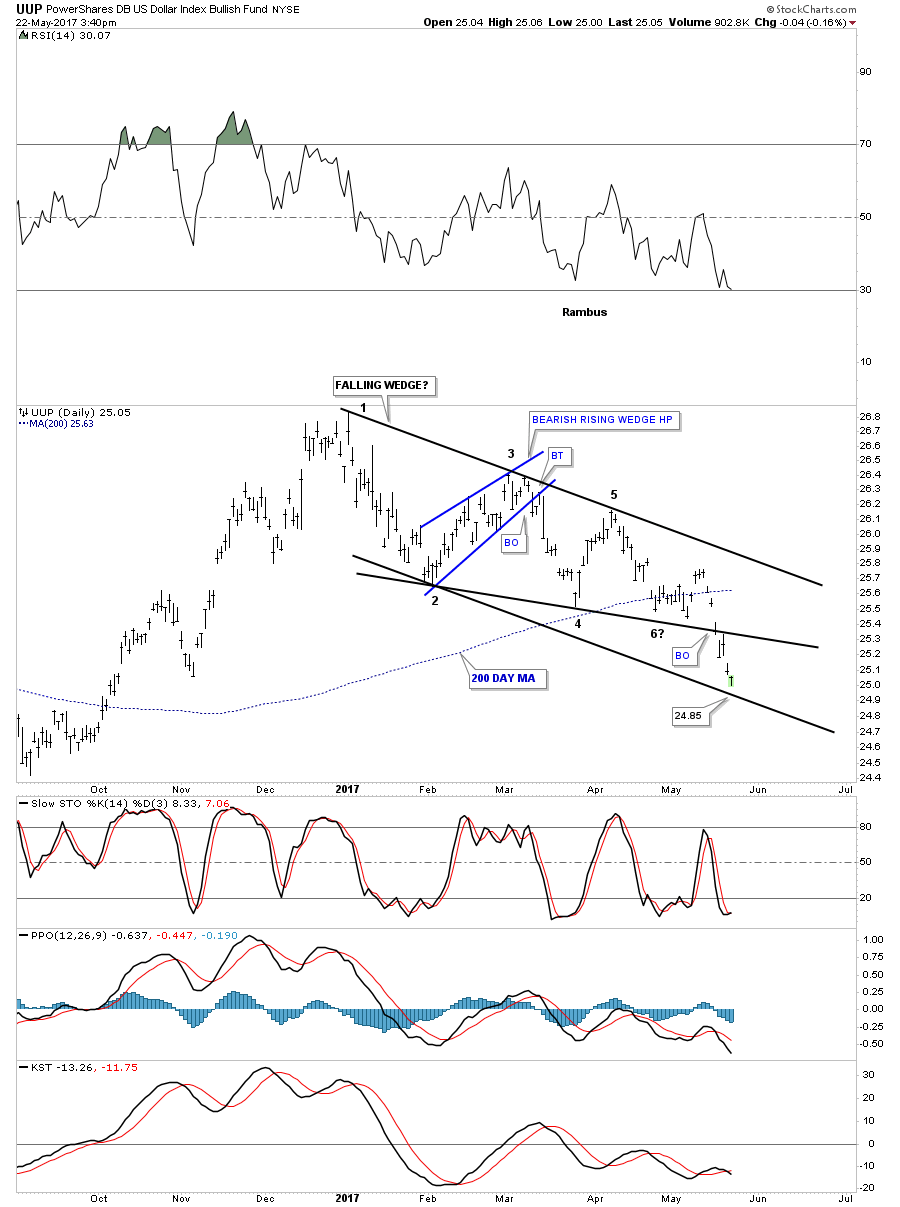
Below is a daily chart for the UUP which shows the original 5 point bearish falling wedge. I added a parallel bottom rail to the top rail which shows a possible bull flag if the bottom rail at the 24.85 area holds support.
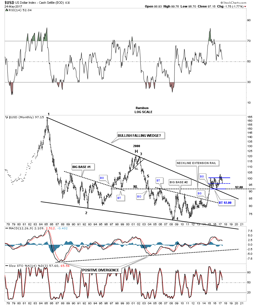
It’s been awhile since we last looked at this 40 year chart for the US dollar that shows a massive falling wedge with a breakout and 2 backtests to the top rail at 92 which is also the neckline extension line taken from the 2000 H&S top. From the 2011 low there still is a series of higher highs and higher lows in place. A break below 92 would change that.
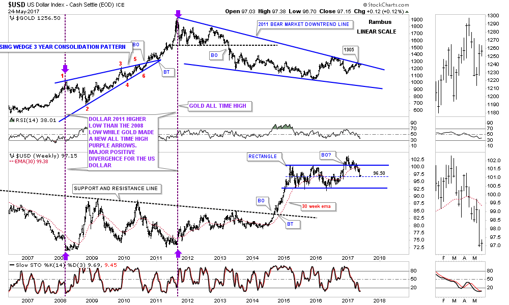
Below is a combo chart which has gold on top and the US dollar on the bottom. Six weeks ago gold hit the top rail at the 1300 area and backed off telling us that the top rail is hot. If the US dollar on the bottom chart can’t hold the 96 area, then there is a very good chance that gold will breakout above the top rail, possibly signaling the bear market is over. To say the 1300 area on gold is important is an understatement.
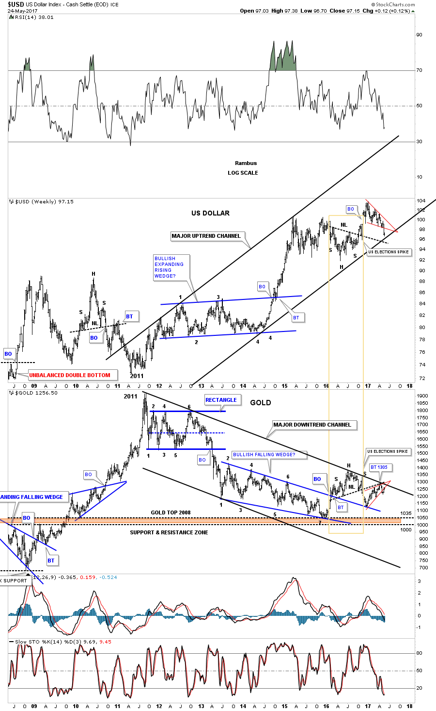
This next chart is another combo chart which has the US dollar on top and gold on the bottom which shows the inverse correlation these two generally have. The last time we looked at this chart the US dollar was still trading inside the red falling wedge and gold was still trading inside the red rising wedge. The only change I made was on the US dollar chart where I made the bottom rail of its uptrend channel parallel to the top rail. Gold was already in a parallel downtrend channel.
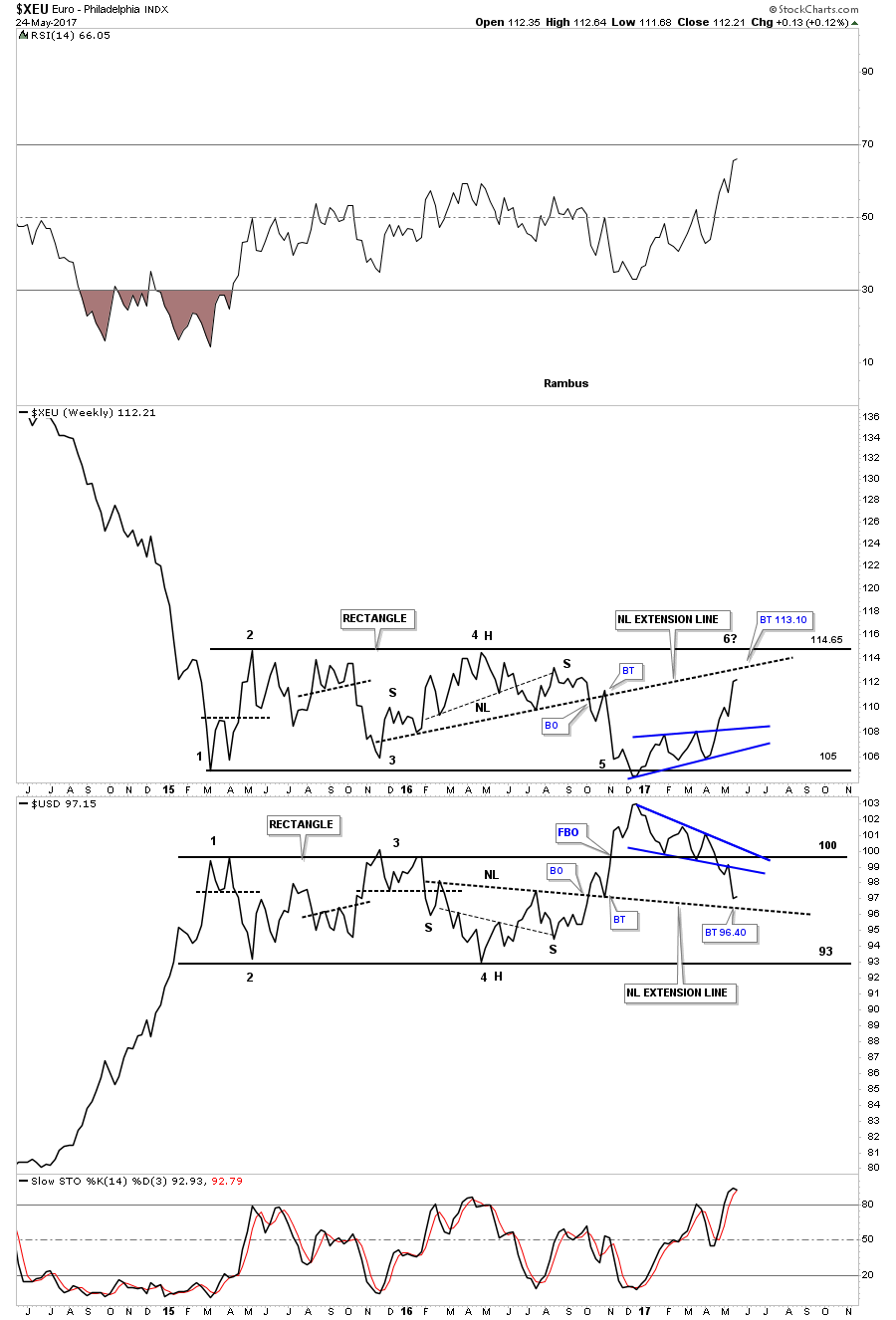
Below is a weekly line combo chart which has the $XEU on top and the US dollar on the bottom. As you can see the XEU on top is showing the blue bullish rising wedge while the US dollar is showing the blue bearish falling wedge. I’ve extended the necklines from the previous H&S patterns, labeled neckline extension line, which can be a place to look for a reversal to occur. The backtest to the neckline extension line on the XEU would come in around the 113.10 area while the neckline extension line on the US dollar would come in around the 96.40 area. Again, the million dollar question remains, is the XEU building out a consolidation pattern to the downside, and is the US dollar building out a consolidation pattern to the upside? Whichever direction these 2 year trading ranges breakout will have a big impact on many markets.
This last chart for tonight is a ratio combo chart which has the US dollar to the XJY on top, and gold on the bottom. Keep in mind we’ve been following these major trend channels since late last year before gold hit its top rail at 1305 and declined, so up to this point they have been following the script to a tee. The big question is, will they continue to follow the script to a tee? As you can see the ratio chart on top is building out a blue falling wedge while gold has built out a blue rising wedge.
It’s not every day that you find charts like this at a very critical juncture which can change the major trend in a big way. Up to this point nothing is broken yet in regards to the big picture, but that could change in a heartbeat.
The Dollar is now at the currency equivalent of The Little Big Horn. Stay tuned.
********
 Meet Rambus, a seasoned trader and technical analyst renowned for his unbiased and insightful chart work. Through his website, Rambus Chartology, and Substack newsletter, Rambus shares his expertise with a global community of subscribers, providing daily updates, commentaries, and hands-on training in the art and science of chartology. With his calm, humble, and down-to-earth approach, Rambus demystifies complex market trends, helping his followers navigate the challenges of today's volatile markets. Join the Rambus Chartology community today and discover a unique blend of technical analysis, trading expertise, and time-tested protocols. Subscribe now at www.rambus1.com or https://rambuschartology.substack.com/


