Dollars Paper And Dollars Gold 1925 To 2018


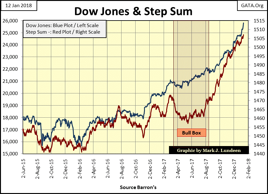
It doesn’t look like it in the Dow Jones’ Bear’s Eye View (BEV) chart below, but in the past three weeks the venerable Dow has increased 1,100 points (4.39%). Three Fridays ago the Dow Jones closed with a 24K handle. Two weeks later it has almost blown through 25,000, closing the week at 25,803. When a market series makes ninety-four new all-time highs in only fourteen months, things like this happen.
How much longer can this continue? Don’t ask me! I’m great on the WHAT in my market predictions. It’s the WHEN a market is going to do it is where my prognostications fall apart. Let’s see, in the past two weeks the Dow Jones has advanced by 4.39%. That’s a big move in a bull market.
However, in bear markets the Dow Jones can move that much, and much more in a single trading session. So, I think I’ll continue being short-term bullish until the Dow Jones once again begins seeing days of extreme volatility – daily percentage moves up or down of 2% or more.
Don’t be surprised if the Dow Jones finds itself over 30,000 before it once again sees these days of extreme volatility, but then it may happen next week.
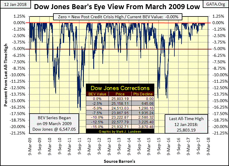
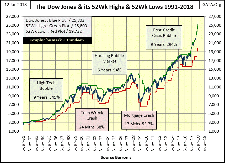
Here’s a scary chart. Since the November 2016 election (fourteen months ago) the Dow Jones (Blue Plot below) has overlaid its 52Wk High Plot (Green) as it advanced in its last seven-thousand points. You can see the problem in the Dow’s BEV chart above; not a single 5% correction going back to July 2016.
This isn’t how markets are supposed to work. So, how are they supposed to work? Look at the Dow’s BEV chart above and its point chart below. During bull market advances the Dow Jones is supposed to make a few 52Wk Highs, and then see a correction in the advance. Since the 14% correction of February 2016 (BEV chart above), the Dow Jones, my proxy for the general stock market, has refused to correct. My fear is when it does break below its BEV -5% line above, all hell is going to break loose.
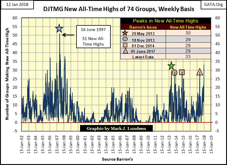
The Dow Jones Total Market Group (DJTMG) currently has 153 groups in it, but I track only 74 of them. Many of the additional groups have only been published for the past three years or so, while my 74 groups go back to 1992. Being an old geezer, I really don’t care about data that hasn’t been properly aged by a few decades and seen the bull and bear markets those years contain. This is something to keep in mind when you’re looking at my DJTMG data, like my chart on new all-time highs below.
Geeze Louise, this week 33 of my 74 groups closed at new all-time highs, a level not seen for twenty years. What’s going to happen next week; pigs sprouting wings and begin flying around the barnyard? Come on now, the stock market began this advance in March 2009, nine years ago. This isn’t how geriatric bull markets should operate, unless our central bankers are “injecting ample liquidity” into the financial system, which they are.
As I’ve said many times in the past, if what you’re doing is making money in the market, don’t stop doing it because of anything I’m saying. I’m just going on the record that one of these days Mr Bear is going to come back and all hell is going to break loose. We’ll know exactly when that will be; the Dow Jones will once again see frequent (+/-) 2% daily moves and the NYSE will also see days of extreme market breadth – NYSE 70% A-D days; extreme market events we haven’t seen for a long time.
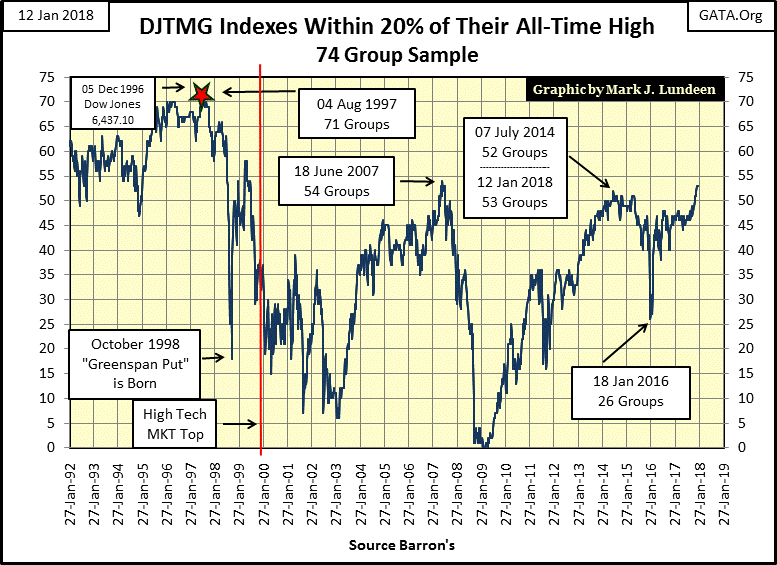
Here are the DJTMG’s top 20, or the number of groups I follow within 20% of their last all-time high. The top 20 has been at 53 for the past three weeks. Looking at what happened with this data series during the high-tech and mortgage booms and busts, this shouldn’t be.
In the past the top 20 inflated to a high during the bull market, and then deflated during the following bear market. And come Barron’s 18 January 2016 issue, when the top 20 deflated down to 26, I believed that was what was going to happen in the chart below.
But 2016 was a presidential election year, and no one in Washington or on Wall Street wants a bear market during an election year. I expect the “policy makers” were hoping Hillary would win in November 2016, and you should thank God that didn’t happen. The “policy makers” hate Trump (which is why I like The Donald so much), so why do they continue inflating financial market values? Do they plan to crash the market for the coming November mid-term elections and blame it all on Trump?
Since I took my Christmas / New Year’s break, gold has done very nicely. In my last letter of December 15th, I was concerned if gold would hold above the rising trend line below. I thought it would, but who knows anything for sure in the market?
At the close of this week, gold is in position to take out its highs of September 17th of last year (-28.58%) and then the -27.67% of July 2016. A mere 2% advance in the BEV chart below would accomplish both. A close above the BEV -25% line would create a powerful bullish chart formation.
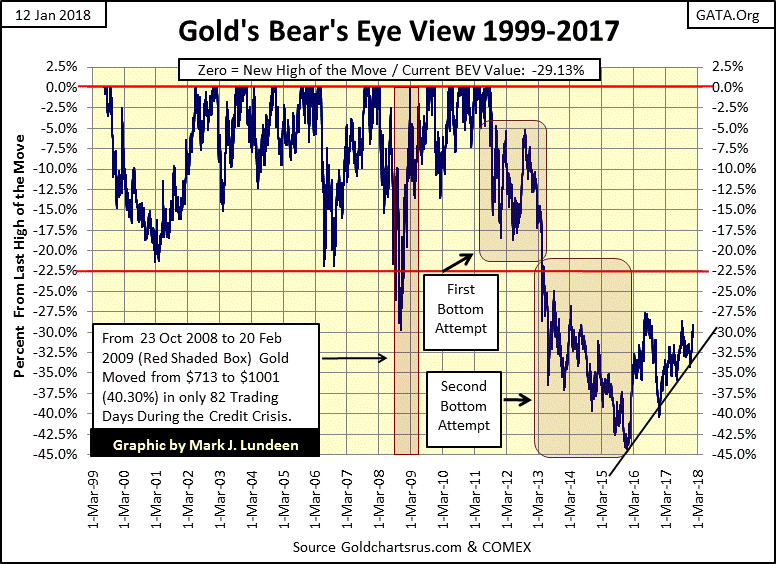
But I’m not buying any champagne just yet because of anything I see in the chart above. Don’t misunderstand me; I’m a bull on gold and silver. But until we see the bond and stock markets come under pressure, motivating some flight capital to come into precious metal assets, which includes the miners of gold and silver, I’m tempering any excitement I have for the old monetary metals.
For one thing, the Silver to Gold Ratio (SGR) refuses to come down. Heck, gold and silver bottomed in December 2015, yet the gains seen in silver have been subpar, resulting in the SGR being stuck in the 70s for most of the past two years. Until silver is able to break loose, and do what it does in a bull market – out perform gold, we’ll continue seeing the SGR stuck at its current high levels.
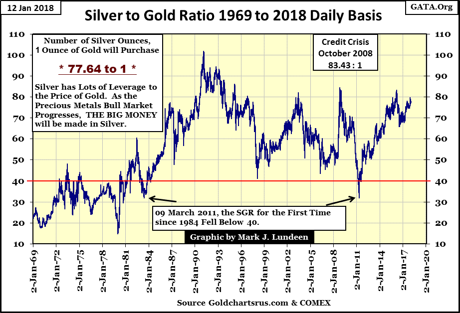
But for people interested in taking a position in the old monetary metals, this is good news. Let’s see, at the close of this week one could purchase one ounce of gold, or 77.64 ounces (4.85 pounds) of silver for the same price. What’s the difference?
Looking at the SGR above, its current level in the high 70s is abnormally high. At the peak of the 1969-80 gold/silver bull market the ratio declined down to 14.81. At the high of the central bank aborted 2008-2011 advance in gold and silver, the ratio declined to 32.63. As I’m a big believer of the past being prologue for the future, I expect as the bull market in gold and silver once again resumes in earnest, the SGR will once again decline to much lower levels.
Should the ratio decline to where it was in April 2011 (32.63), buying silver at today’s ratio will prove to be 138% more profitable than buying gold at today’s price. Should the ratio decline down to the 14.81 seen in January 1980, buying silver at today’s price will prove to be 424% more profitable than gold. These percentages are just the relative performances of silver over gold.
As you’ll see in the charts following where I cover the gold standard, the “policy makers” abuse of the US dollar of the past century could result in gold trading well above $30,000 an ounce, assuming that holders of gold and silver will always be willing to exchange their metal for the Federal Reserve’s dollar. A dangerous assumption in my opinion based on historical performance of past episodes of paper money.
“Paper money eventually returns to its intrinsic value ---- zero.”
- Voltaire (1694-1778)
The people running Washington, Wall Street, Academia and Silicone Valley are in the main malignant narcissists with no respect for the laws of God or men. People like you and me are only lab rats to these people, objects to gather data on or tax. They’ll bankrupt the United States, trashing the dollar in the process and we’ll not even get an “I’m sorry” from them. Yep, in January 2018 the stock market is doing well. But a decade from now I expect those who take a position in precious metals and their miners at today’s prices will have the real bragging rights.
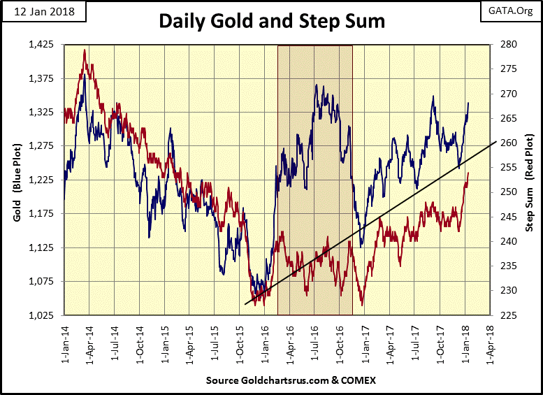
Let’s look at gold and its step sum. At its close for the week ($1338), it’s in position to take out $1375, and putting behind it the three failed advances since April 2014. I like gold’s step sum, since mid-December, powering higher with the price of the metal. If next month is like our last, gold may find itself closing above $1400. Like me, you’ll just have to wait to see what actually happens, but I’m hopeful 2018 will continue being be a good year for us gold and silver bulls.
Below, coming out of its bull box the Dow Jones has become a runaway train. It’s okay being bearish on the stock market. There are plenty of excellent reasons for it. Just don’t do anything foolish like going short or buying puts in anticipation of a market decline in the next few weeks or maybe even the next few months. For us bears, this is the time to talk the talk, but NOT walk the walk.
And so it will be until we once again see extreme-market events become regular occurrences in the market; you know daily market moves in the Dow Jones of 2% and more, and days of extreme market breadth at the NYSE, NYSE 70% A-D days. Be advised that I’ll let my readers know when they happen, but you can be sure that such days will also be big news in the financial media, because they always are.
When I left for my break, gold’s 15 count was -3. Since then it spiked up to +9 and closed the week at +7. The step sum has increased by double digits, and the price of gold is up almost by $100 since December 11th. Well done!
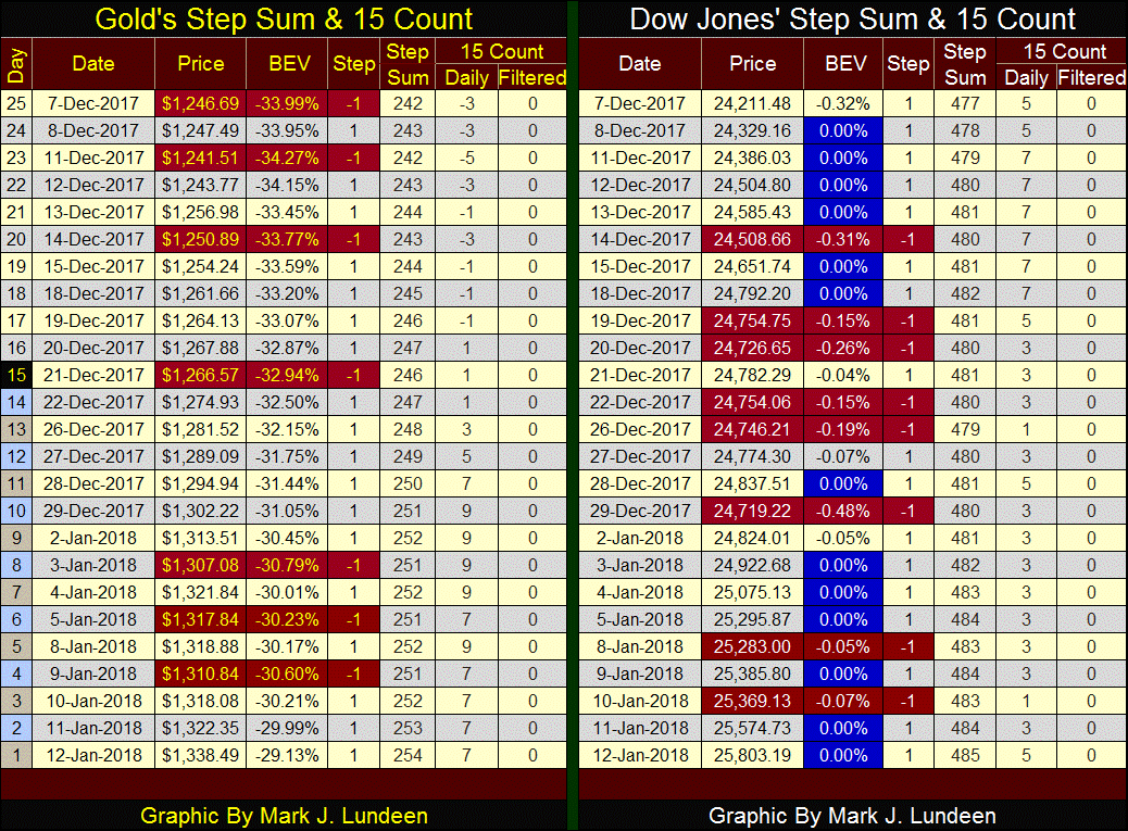
Technically, gold is doing much better than the Dow Jones in its table above, except the Dow Jones keeps making those annoying BEV Zeros. Keep in mind the only thing more historic than a “liquidity driven” inflationary boom, as seen above, is the deflationary bust that by necessity follows. But we’re not there just yet.
“Market experts” and “professional economists” haven’t discussed the pros and cons of the gold standard in the public domain since the 1970s. Certainty not the “professional economists” now employed by our “system of higher education”, as the old gold standard would never have been able to support their current school-loan program.
Here’s a sample of past articles published in Barron’s warning of the dangers of monetary inflation. Today however, a lower dollar is typically encouraged by economists as a means to facilitate international trade with no comment on the downside of currency debasement.
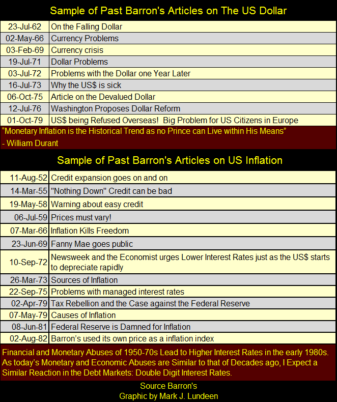
These articles were published when memories of the dollar being as “good as gold” was still in the living memories of the editors of Barron’s and its readers. Many decades later this is no longer true.
Of course this means the problems of our current monetary system, based on unlimited expansion of the money supply, is no longer brought to the public’s attention. Problems such as the debasement of not just what a dollar can purchase over time, but also the benefits students gained from a college education.
Today, debt slavery is the major consequence of a “higher education” for all too many young people. And then monetary inflation will ultimately debase public and private pension funds’ and insurance companies’ reserves. What the “policy makers” have done in the past one hundred years is the theft of the public’s saving of their lifetime and private assets.
Okay, but what was the old gold standard? It was a monetary standard where gold was money, and nothing else was. Paper money was a debt payable in gold (on demand), and it was the responsibility of the issuer of the paper money to never issue more paper money in circulation than there was money in gold coin.
There was more to it than just that. Nonetheless, it was amazingly simple compared to today’s “monetary policy” based on unlimited inflation, as well as being self-regulating, but in a nutshell that’s it. With a gold standard there was no “monetary authorities” controlling short and long term interest rates. What key commodities or financial assets are trading at was not a concern of the managers of the gold standard. Come boom or bust in the financial markets, the only concern of the issuer of paper money in a gold standard is whether or not the paper money they issued can be converted into gold coin on demand.
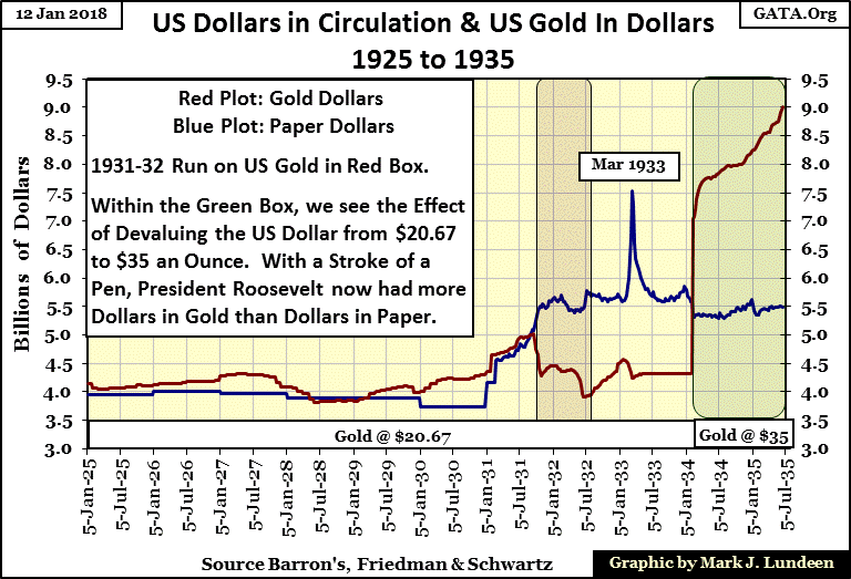
So let’s go back and take a look at the reported numbers of dollars in gold and in paper money (Currency in Circulation / CinC), and see how the world was weaned off precious metals for money and ushered into a monetary standard based on unlimited inflation; a monetary standard that benefits the few at the cost of the many.
Note on chart below. Barron’s began publishing weekly gold dollars in circulation in January 1925 (Red Plot), but didn’t do so for weekly paper dollars in circulation (CinC) until February 1931 (Blue Plot). I filled this six year gap with annual CinC data from Milton Friedman and Anna Schwartz’s Monetary History of the United States.
The first revelation this chart had for me is that all during the 1920s the total stock of money fueling the Roaring 20s was never more than $4.5 billion dollars. Today Oprah has that many dollars and Amazon’s Jeff Bezos is reported to now have a net worth of $106 billion. After ten decades of the current inflationary monetary policy we shouldn’t be surprised.
So, with the number of dollars in circulation in the 1920s being limited by the gold standard, how can it be said that the 1920s was the first inflationary boom for the then new Federal Reserve? Simple, they inflated the economy with unchecked bank credit. The 1920s was the first decade where the US banking system extended wholesale credit for consumer consumption / buy now pay later for consumer goods.
I don’t have any data for consumer credit during the 1920s. However here’s a chart for the Dow Jones (Blue Plot) and NYSE Margin Debt (Red Plot) from 1926 to 1935 illustrating my point how the then new Federal Reserve system not only inflated the stock market during the 1920s, but the resulting deflation following the Dow Jones’ peak in September 1929 made the 1930s so depressing.
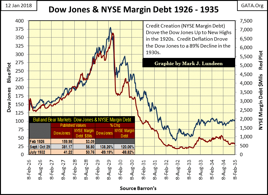
From 1929 to 1932, NYSE Margin Debt contracted by $6 billion (88.82%). What happened with bank credit created for consumer debt and real estate loans must have been similar. In an economy having only $4-$5 billion in gold circulating in it, seeing so many billions of dollars of credit evaporate so quickly was excruciatingly painful. Small wonder the Federal Reserve system began inflating the supply of paper money in 1931, resulting in a run on the US Gold Reserves (2 charts up).
Returning to the chart on US gold and CinC (2 charts up), we can see that the new Federal Reserve was no supporter of the gold standard. Since 1914 CinC have been Federal Reserve notes, it was their paper money. From 1931 to 1934 they had issued more paper money than the gold supply allowed.
In defense of the Fed, it was true the deflation of the early 1930s pushed the United States towards revolution and great social unrest, inflating the supply of paper money in circulation mitigated the crisis. But then it was also true that it was the Federal Reserve’s expansion of credit in the 1920s that brought America and the wider global economy to this sad state of affair in the 1930s. This is when Hitler came to power in Germany, and the Federal Reserve deserves much of the credit for the disaster that followed from 1933 to 1945.
Returning to the chart plotting gold and CinC, we see how the US dollar was devalued from $20.67 to $35 an ounce in 1934, but first FDR called in all the gold coins, and made holding gold illegal for US citizens. In 1934, only 20 years after the creation of the Federal Reserve, with a stroke of FDR’s pen, once again the US had more dollars in gold than in paper money after this 70% devaluation in the US dollar.
So, once again the US dollar was on the gold standard, even if it was the type of gold standard where Treasury agents sent US citizens to prison for holding gold coins or bullion. But the Federal Reserve’s inclination of maintaining a linkage of its paper money to gold was always feeble, as we see in the following charts.
Oddly, following FDR’s devaluing of the US dollar in 1934, US Treasury’s gold reserves (Red Plot) increased during the remaining years of the 1930s. This flow of gold came from foreign central banks seeking safety for their monetary gold from Nazi Germany in the basement vaults of the New York Federal Reserve Bank. Barron’s reported on this flow of monetary gold at the time. Soon after the December 1941 entry of the United States into World War Two, the US Government greatly increased is circulation of paper money (Blue Plot), obviously to finance the war.
Note, with the 1945 termination of the war, the inflation of paper money ceased. But the effects of it continued for years to come.
“November 15, 1951 reached a new low of 53 cents in terms of 1935-1939 dollar value. In extended comment on the shrinkage of the dollar, the National City Bank’s December Letter says: “From the standpoint of the creditor—the buyer of Savings bonds, the pensioner, the insurance beneficiary, the school teacher with lagging pay—the experience during and since World War II has been disheartening. Inflation is a concealed type of tax and these are the people who took the brunt of it.” In line with the repeated views of Professor Sumner H. Slichter, the City Bank adds: “People reconciled to a dollar of wasting value look around for real estate or other equity investments as a hedge against price inflation and dollar shrinkage.”’
- Barron’s Editorial, 31 Dec 1951
* * *
“The real problem with retiring is money. Most people save their whole lives to retire in the same style they enjoyed when they were working, only to realize that they can’t live like they used to even while they’re still working. You see these ads for retirement and they always have fishing boats in the background. That’s because for $120 a month, fishing is the only way retired people can feed themselves.
- George Burns: Burns and Allen Television Show / Season 8 Episode 9, 1957
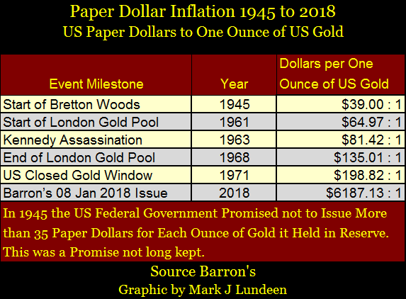
In 1945 the US Senate ratified the Bretton Woods Monetary Accords, which created the post war monetary system. With Bretton Woods came the International Monetary Fund and World Bank, as well as a $35 gold peg on the US dollar. In 1945, everybody was very familiar with how a gold standard worked; everyone understood with the ratification of the Bretton Woods Accords the United States Government committed itself not to issue more than $35 paper dollars for each ounce of monetary gold held by the US Treasury.
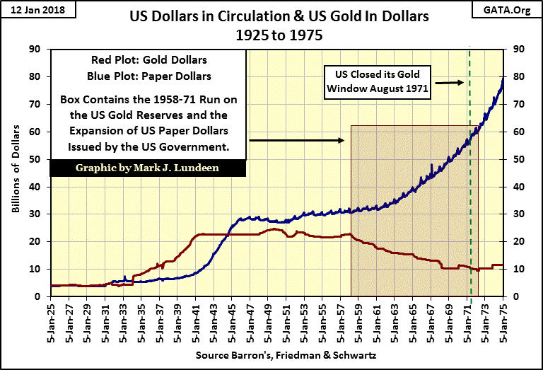
However, as seen in the chart above, from data reported by the Federal Reserve and published in Barron’s, the “policy makers” never took the Bretton Woods’ $35 gold peg seriously. Post war paper money inflation eventually resulted in a run on the US Gold reserves from 1958 to 1971. REMEMBER, much of the gold in the US gold reserves were from deposits by foreign central banks in the 1930s. These central bankers remembered how FDR ripped off American Citizens in 1934, and saw the day coming when Nixon would do the same to them in August 1971. So, realizing the implication of the rising blue plot in the chart above, the smart central bankers got their gold back from the US Treasury while they still could.
The table below lists the ratio of Federal Reserve Notes to one ounce of US Treasury gold at key dates. It’s interesting seeing when President Nixon closed the gold window, the $35 gold peg had been degraded by the “policy makers” to $198.82 paper dollars for each ounce of Treasury gold.
They don’t hide what they have done and continue doing. In Barron’s 08 January 2018 issue the ratio has increased to $6187.13. “Market experts” and “professional economists” don’t care, or even follow these data series since the 1970s. But I do and I’m very happy to cover this data a couple of times a year for my readers.
Here are the data series plotted from 1925 to the present. Since 1971 US gold reserves have remained around $11 billion dollars (assuming this gold is still there), but CinC has rocketed up to over $1,600 billion. Take a moment and go back to the chart above and compare it to what’s to be seen below.
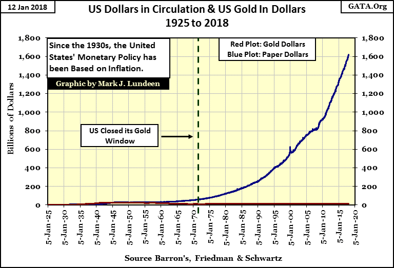
It’s really sad that so many people today have what is consider as a higher education from attending college for four years, where a course in “economics” is a requirement, are clueless to what is happening to the US dollar. To most educated people, when shown this data are at a loss seeing the danger that’s quickly approaching us. Well as it is said, for those who forget the past are doomed to repeat it. Do yourself a favor and buy some silver, and then forget about it for a few years, until you really need it.
Mark J. Lundeen


