Dow Jones Earnings & Currency in Circulation


As it was at this week’s close, the Dow Jones is again having difficulty rising above its BEV -5% line. It’s been like this for months now, as both bulls and bears on the market continue to hurry up, waiting for something to change.
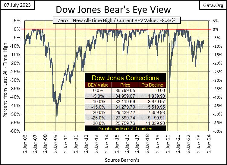
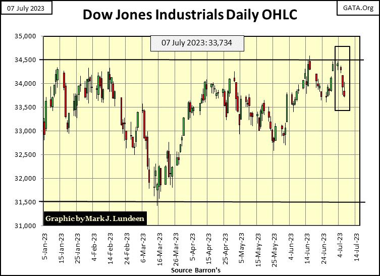
Moving down to the Dow Jones in daily bars below, as in all previous attempts to break above 34,500 since last November, the Dow Jones again proved unable to close above this growing, ever more important level of resistance; 34,500.
It’s becoming clear to me, if no one else, there are big-money managers wanting to lower their exposure to the stock market by selling as much of their position as possible, and are using the Dow Jones at 34,500 as a trigger for doing so. They’ve been doing this since last November, so I’m not surprised at what happened – again – this week in the chart below.
How long can this go on? Don’t know, so I can’t say. But this could go on for longer than you and I can imagine, or it might stop next week with a close well above 34,500. As market watchers, this is an excellent time to keep quiet about what may or may not be, and just focus on what the market is actually doing.
In any case; either bullish or bearish, we’ll know when this repeating pattern of selling off at 34,500 is over, when something dramatic in the Dow Jones happens some time in our uncertain future. A strong surge above 34,500, or a dramatic decline below 31,000 would have to taken very seriously, that something has changed in the market. Until then, we watch and wait.
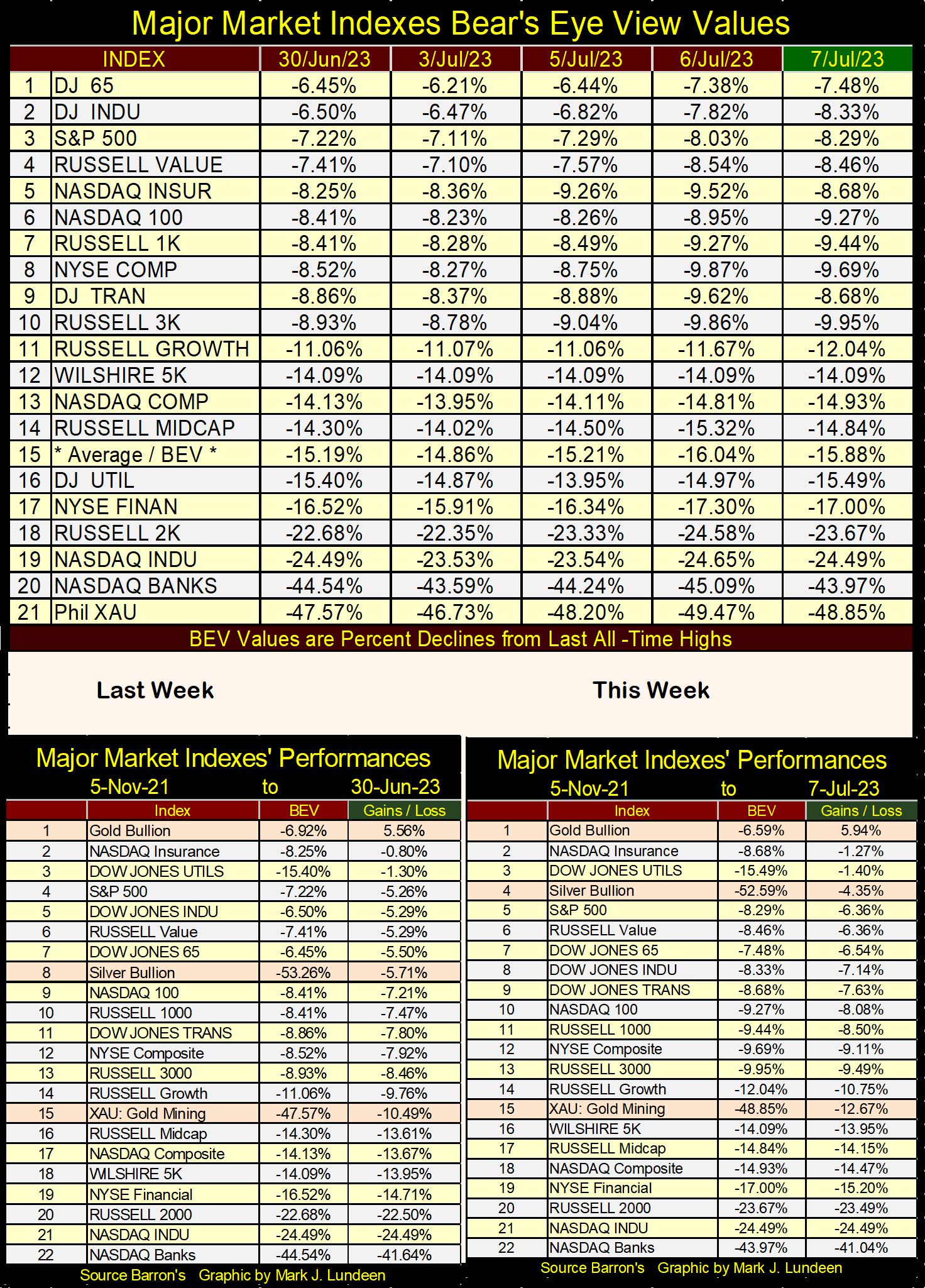
Moving on to the major market’s BEV values below, most of them lost ground this week, but the NASDAQ Banking index (#20) crept higher a bit this week, moving up from last week’s BEV value by 0.57% BEV points. Not much, but the banks did rise as most everything else went down. The Dow Jones (#2) dropped this week by 1.83% BEV points in the table below.
Maybe it’s time to consider buying the banks? I don’t think so; not with bond yields, both corporate and T-bonds, once again creeping higher. See chart below, how both Barron’s bond series’ yields are off their lows of last April and May. That plus, Barron’s Best Grade Bond Yield closed the week at 5.02%, matching, if not exceeding its post January 2022 high.
Any yield for Barron’s Best Grade Bonds above 5.02% will be a break out in the bond market, and very bad news for the banks.
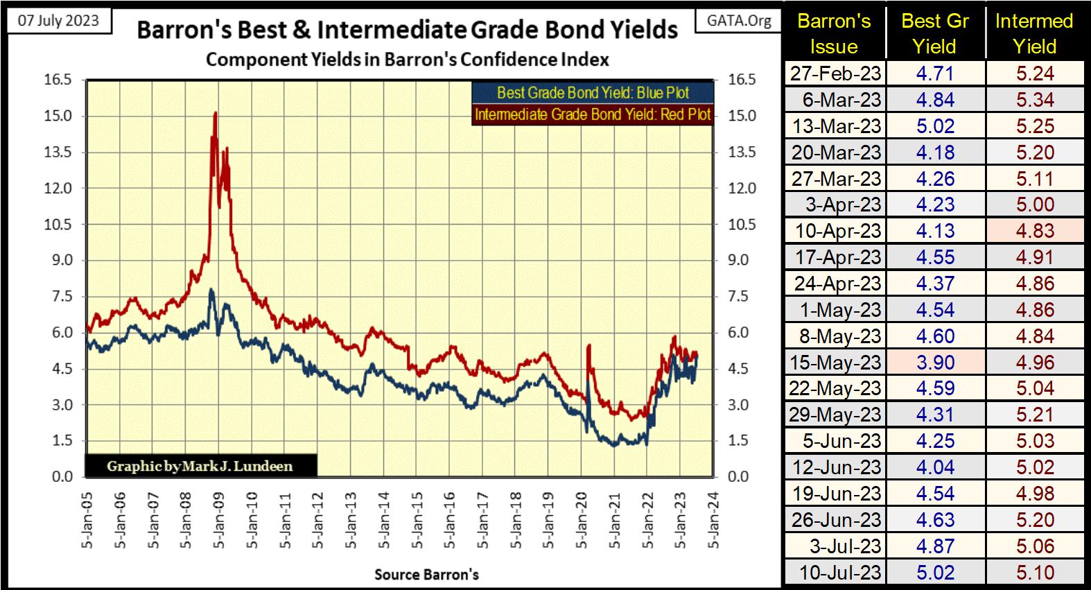
Keep in mind rising bond yields are what took out those banks in Silicon Valley, as rising yields eroded the market valuations of their reserves of bonds. This is a story common with all too many banks still today. Seeing the yields for Barron’s bond indexes above rise above 6%, and I’ll be standing by for more bank failures. That would be a bad thing to have happen, but having bad things happen are what bear markets are all about.
As a bear; rising bond yields, and more bank failures are what I’m waiting to happen. I’ll not celebrate when this does happen, but I recognize how the idiots at the FOMC have been driving down interest rates and bond yields for decades, and now they are going up.
In doing so, they’ve creating situations in the market place that will have devasting effects on the lives of people everywhere, when these situations come to bear fruit. This situation of rising bond yields placing banks at risk is but one of many we’ll all see happening before Mr Bear is finished with Wall Street.
Let’s look at NYSE Margin Debt, or the credit banks extended to brokerages’ clients for speculating in the stock market (Red Plot / Two Charts down). NYSE Margin Debt has been contracting since October 2021; almost two years now. That is a big drain of money from the stock market. That plus, the QT the idiots at the FOMC implemented in May 2022, to withdraw the excessive “liquidity” they “injected” into the financial system with their Not QE#4 seen below.
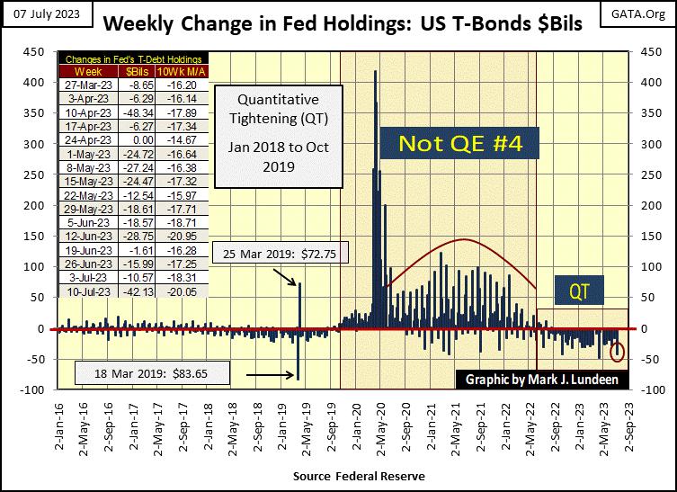
Then there is the increase in bond yields and interest rates since January 2022. All this makes one wonder; how has Dow Jones (Blue Plot below) not crashed in the past eighteen months?
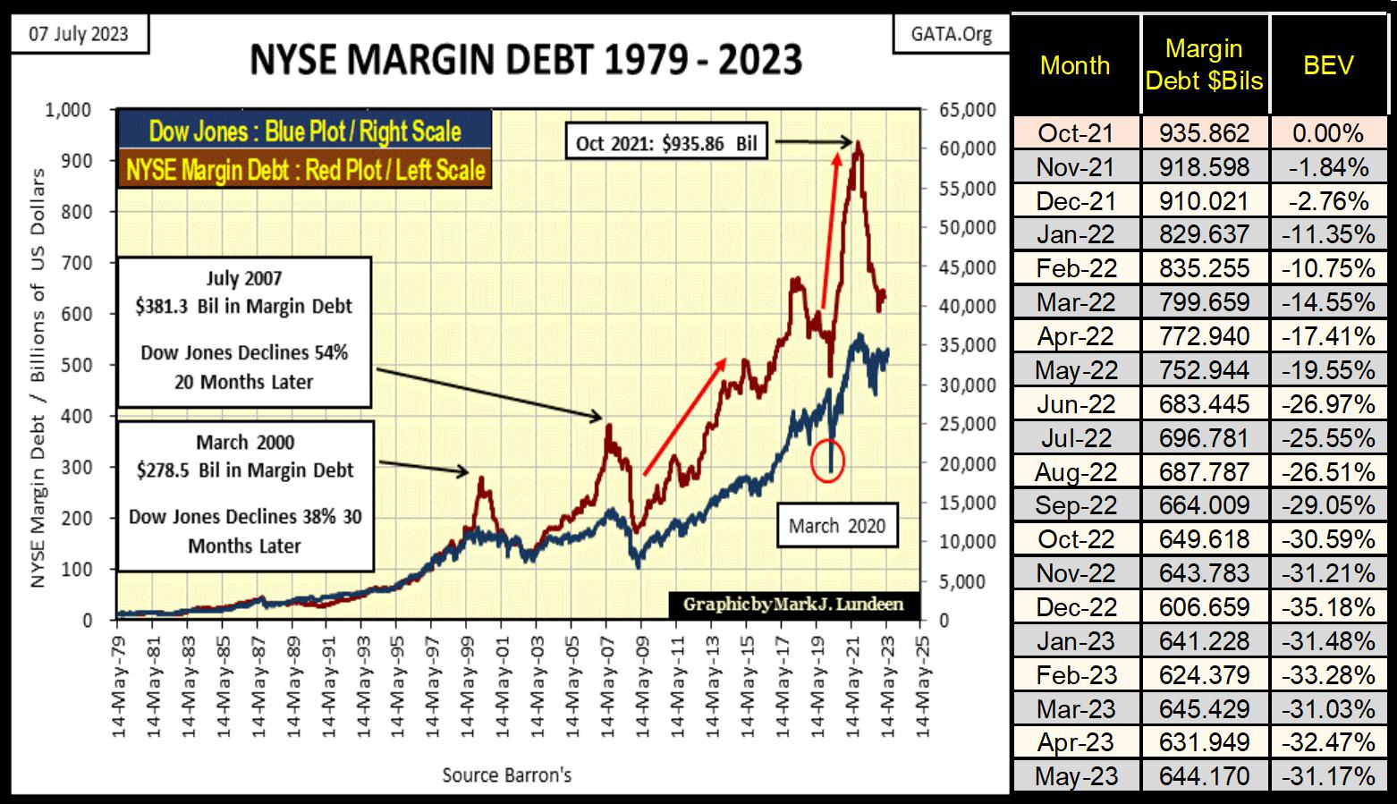
Looking at the above decline in margin debt since October 2021, it’s really a stunning decrease in leverage in the stock market – or is it? Keep in mind the stock market functions within an inflationary-monetary system. Meaning in the chart above, $1, or a $billion dollars from years ago, say in March 2000 and July 2007, were worth much more than the diluted dollars used in October 2021.
The best way I know of eliminating monetary distortions from decades of monetary inflation on market valuations, is to plot margin debt above in Bear’s Eye View (BEV) format. As Mr Bear sees things with his Bear’s Eye View; every new all-time high is converted into a 0.00%, a big-fat Zero, aka BEV Zero, and never anything more. Also, every data point not a new all-time high, is converted into a percentage claw back from its last all-time high.
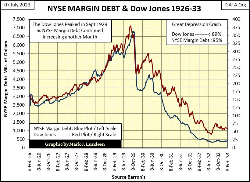
As seen below (two charts down), the current claw back in margin debt (-31.17%) is a smaller reduction in margin debt, than seen during the NASDAQ High-Tech bust (2000-03), and the claw-back in margin debt during the sub-prime mortgage debacle (2007-09). Both saw margin debt claw-backs of over 50%. Both those reductions in margin debt are dwarfed by the 95% reduction in margin debt (Blue Plot) during the Great Depression crash, seen below.
We know those claw-backs from long ago, are now fixed in market history. What we don’t know is; what will be the ultimate bottom for our current claw-back in margin debt. Is the 35% claw-back seen in December 2022, the bottom of our current reduction in margin debt? If so, the stock market may be ready to advance once again in the not-too-distant future.
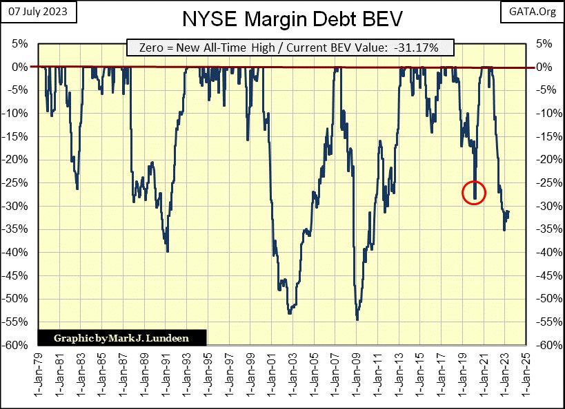
Or, will Mr Bear succeed in clawing back still more margin debt, to levels far below those for the NASDAQ Tech Wreck or Sub-Prime Mortgage debacle; greatly in excess of their BEV -50% claw-backs. In that case, investors best get themselves a seat in the markets’ peanut gallery, and enjoy the carnage below from a safe distance.
Is a safe distance from such a thing is even possible? It isn’t if most of one’s wealth is stored in a bank, or invested in the stock market. Though I still favor investing in the gold and silver miners, as well as gold and silver bullion should the world come to a crisis.
In whichever case above proves to be our future, that is something currently impossible to know. But being the big-bad bear that I am, I’m thinking the bottoms for the NYSE Margin Debt, and the Dow Jones are still not in. Though I realize it may take a few more years for these bear markets in margin debt, and the stock market’s valuation to fully play out.
Here is a little market fact most people are unaware of; from 1929 to 1979 (fifty years) an increase in CinC of a billion dollars, resulted in a $1 expansion in the earnings for the Dow Jones, as seen in the chart insert below. Note the plots below are NOT indexed, but in as published dollars for the Dow Jones earnings, and billions of dollars for CinC.
I admit, this fifty year, $1,000,000,000 / $1, fifty-year relationship between CinC and Dow Jones earnings plotted below were at times not bolted together. Though from 1949 to 1974, twenty-five years, they might as well have been.
All that changed after 1974, or 1979 in the main chart, and intelligent people have to wonder why? Ask yourself; why did CinC (Red Plot) begin climbing exponentially soon after the 1970s? Maybe because after the $35 gold peg was cast aside in 1971, it could, so it did, because it was good for Washington and Wall Street?
Was it good for the average American? Hard to say. Maybe it would be best to ask those now homeless, but once weren’t in America’s major cities, how “monetary policy” creating a bull market in housing valuations benefitted them?
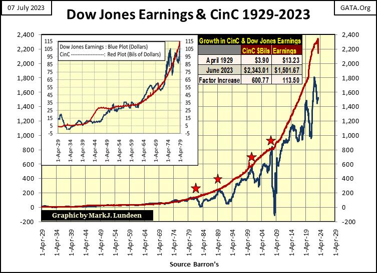
Following 1979, CinC continued increasing, as earnings for the Dow Jones began to waver. Four times (the four stars), Dow Jones earnings caught up with CinC, but when it did, faltered. The last time Dow Jones earnings caught up with CinC was at the top of the sub-prime mortgage bubble in October 2007. Achieving that, Dow Jones earnings then crashed, and for only the second time since the 1920s, went negative. Since then, Dow Jones earnings have tried to catch up with CinC, but so far have failed to do so.
So, exactly what are we looking at in the chart above?
I’m not an economist, with vast knowledge in this, that and all that other stuff, I’m only a former fleet sailor, and currently a market enthusiast, my best guess would be;
From 1929 to 1979 (chart insert above), “liquidity injected” into the financial system, flowed into the corporate earnings, as well as into other things. But did raise Dow Jones earnings by around $1, for every $1,000,000,000 increase in CinC.
From 1979 to 2007 (chart main body), “liquidity injected” into the financial system still flowed into corporations, but economic recessions, induced by the idiots inverting the yield curve (the four stars), caused a reduction in corporate earnings.
Since 2007, CinC is still flowing into corporate earnings, but increasingly has also flowed into other areas of the economy, like consumer goods and services.
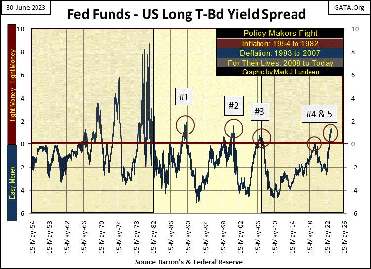
I’m borrowing a chart from last week’s article on yield-curve inversions. Please excuse my lack of motivation to create a new chart whose box numbers below would line up with the red stars in the chart above. But as it is, call box #3 below, star #4 above. Star #1 above would be the huge yield-curve inversion from the Volcker Fed in 1978-81 below.
The question in my mind is; with inversion #5 below, how far will Dow Jones earnings once again fall in the not-too-distant future? Will it, as it did in 2008 & 2009, once again go negative? As corporate America is currently so burdened with unprofitable debt, should bond yields continue rising, there is an excellent chance of that happening; another historic decline in the earnings for the Dow Jones, courtesy of the idiots at the FOMC.
Mark, why are you always ripping on members of the Federal Reserve Open Market Committee (FOMC), by calling them idiots? It’s so rude, you risk turning off some of your readers. I do it because I don’t like them for what they are doing; playing God with interest rates, the economy, and our money. If someone wants to see these idiots being praised for what they do, let them go somewhere else. There are plenty of sites where such economic nincompoopery is greatly honored.
These are gifted people, very much capable of doing good service to humanity. But the sad fact is, we’d all be better off if these idiots would do something useful, such as building a better mouse trap, than allowing them to do what they are doing now; dictating “monetary policy” to the point of extinction for the US dollar.
With that goal now close at hand; the death of the dollar as a universally accepted economic asset, these idiots are now scheming how to best implement their digital currency. This would be a fiendish device which would allow these idiots to turn on and off this digital money, people deposited on a bank’s hard drive, at their discretion, depending upon if you and I are behaving ourselves. Writing articles such as this, or reading such articles, would most likely result in having one’s money turned off.
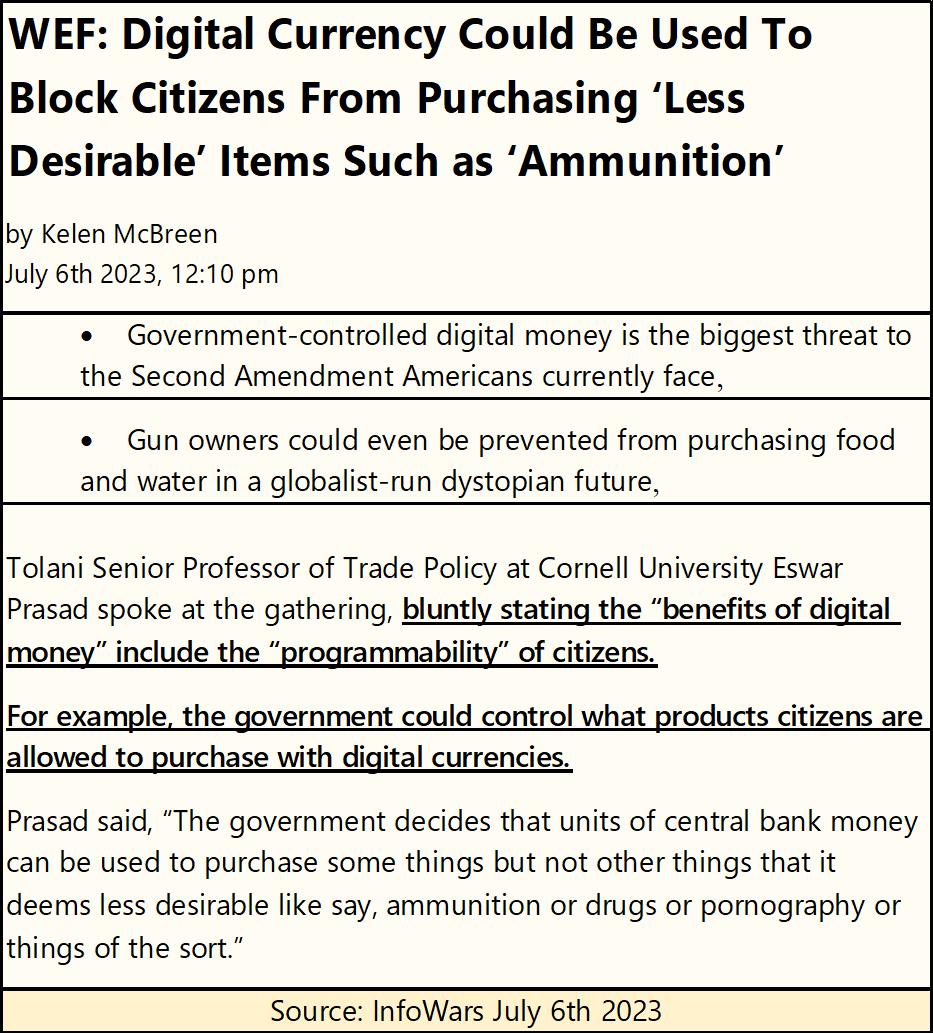
Here is a very short video of Professor Prasad on this topic from the WEF;
https://twitter.com/i/status/1676953720343646213
Would an idiot willingly, and knowingly commit their lives to such a goal, that ultimately will lead to the bondage of humanity on a global scale? It seems an evil idiot would, and the WEF has no shortage of evil idiots, who are much admired by the mainstream media.
Looking at the two charts below, what are we to learn from studying them? That using that marvel of marvels; monetary inflation, one can not only inflate market valuations in the stock market (top chart), but also induce dividend payouts to rise (bottom chart).
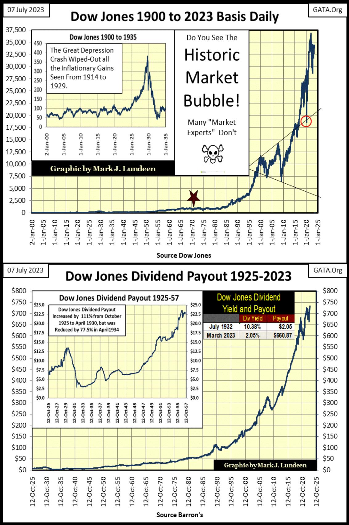
But the charts above are published only for context on the chart below, where I’ve plotted a ratio of how many dollars of Dow Jones valuation, $1 of Dow Jones dividend payout supported. Data is weekly basis, from 1925 to this week.
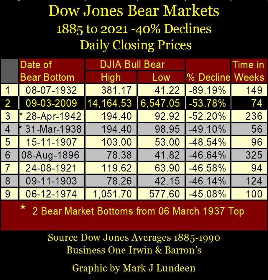
The five # boxes note those times the Dow Jones saw a bear market bottom of greater than a 40% decline from a bull market’s all-time high. The Great Depression’s 89% market crash resulted in this ratio declining to below $10 dollars of market value for $1.00 of Dow Jones dividend payout. That is called a historic low market valuation, one few people in July 1932 took advantage of by buying. One year following this market low, the Dow Jones had advanced by 163% by July 1933. The greatest annual percentage advance in Dow Jones history, happened during the Great Depression!
The other lows in this ratio of Dow Jones valuation to its dividend payout (#2-4), never broke below the 10 line, but proved to be important bear market bottoms astute investors took full advantage of.
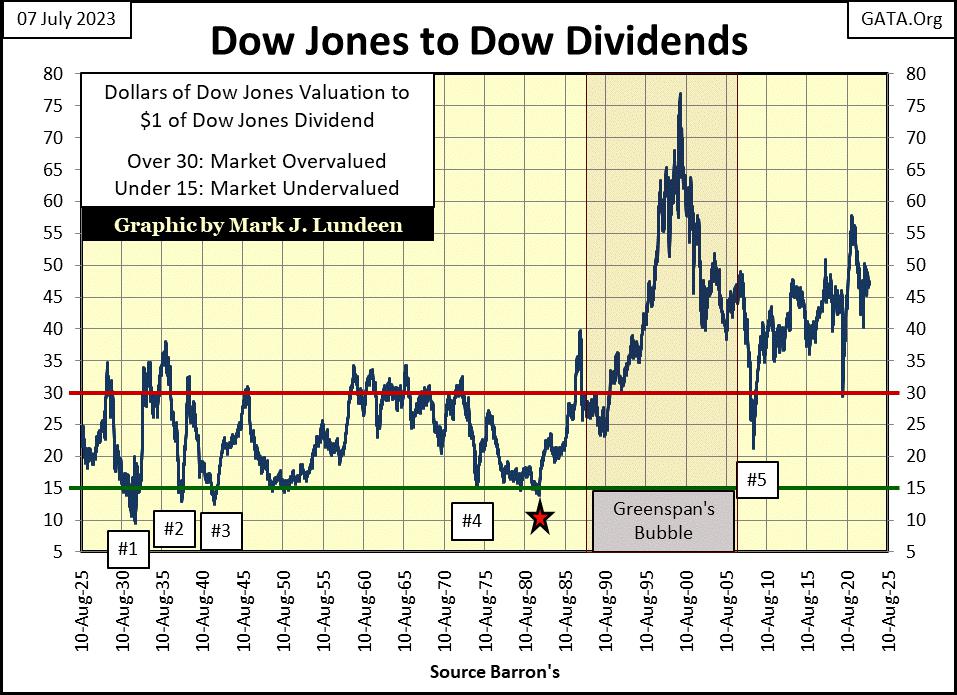
Which brings us to #5 in the chart above; the March 2009 bottom of the sub-prime mortgage debacle, the second deepest bear-market decline in the Dow Jones since 1885 (see table below). This bear market bottomed with $1.00 dollar of dividend payout supporting $21.37 dollars of Dow Jones valuation.
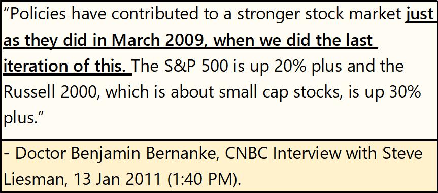
It would have gone deeper, possibly below the $15 line. But the pain from this bear-market collapse was so immense, it motivated the US Congress, on live, commercial free TV on CNBC, to let everyone know they were going to allow Fed Chairman Bernanke to do whatever it took to reinflate market valuations – ASAP, no questions asked.
There is just something so wrong with that, preventing this ratio to fall to the $15 of Dow Jones valuation, per $1.00 of Dow Jones dividend payout green line in the chart above.
But why? That why would be Alan Greenspan, the bubble-master himself, who from 1987 to 2000, inflated a historic bubble in the stock market. For the past two decades, this monetary bubble in the stock market has never been allowed to properly deflate, as allowing it to do so, would devastate retirement, and managed-money accounts invested in the stock market.
In dividend payout terms, the bubble peaked in November 1999 when a $1.00 of Dow Jones dividend payout supported $76.92 dollars of Dow Jones valuation. As mentioned previously, this bubble deflated down to $21.37 at the March 2009 sub-prime mortgage bottom. This bottom was pure agony. But Doctor Bernanke, with his three QEs reinflated it until it reached $50.94 dollars of Dow Jones valuation for $1.00 of Dow Jones dividend payout in November 2017.
The March 2020 flash crash took this ratio down to $29.41, the pain from this motivated the Fed Chairman Powell to implement his massive Not QE#4, which drove this ratio up to $57.14 a year later in March 2021.
This ratio of Dow Jones valuation to its dividend payout closed the week at $47.39 dollars of Dow Jones valuation for every $1.00 of dividend payout, a value that tells us the stock market remains wildly overvalued, as it has been since Alan Greenspan took over the Federal Reserve in August 1987.
That is a long time. After a long time, an abnormal situation created by the idiots at the FOMC can appear to be normal, much as a bad habit. But it’s not, and Mr Bear knows all about it. It’s just another of those situations created by the idiots we talked about earlier, that everyone will become very much aware of as Mr Bear and his clean-up crew goes about their business on Wall Street. But when will that be? I can’t say as I don’t know, but I know when Mr Bear and his clean-up crew do go to work, you’ll not need me to tell you they’ve begun.
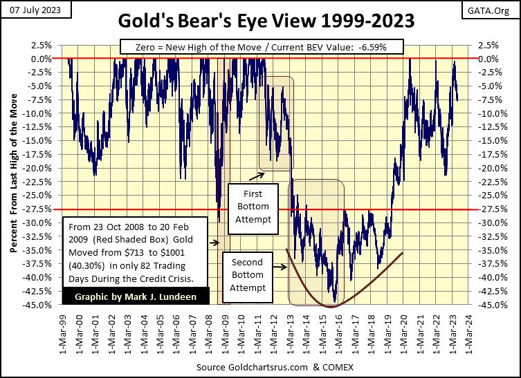
It’s time to move on to gold’s BEV chart to see what happened with gold this week. Gold hasn’t seen a new all-time high (BEV Zero) in its BEV chart below since August 2020, though it has made two attempts to since then; March 2022, and again in March 2023.
After gold’s failed March 2022 attempt, the goons took it down to its BEV -23% line. But I notice following gold’s latest attempt to make market history last March, so far, the goons have yet to drag gold down below its BEV -10% line. It’s been four months, what are they waiting for? Is it the bears in the gold market lack the desire, or their inability to force gold deep into BEV double-digit territory?
I don’t doubt the desire of the COMEX goon squad to take gold down to $0.00, so the issue must be their inability to drive gold below its BEV -10% line ($1855), at least so far – knock on wood!
As I’ve said before, I’m out of the market prediction business. The “policy makers” have their meat-hooks set deep into every market they care about, which is all of them, and they don’t play fair. So, guessing what is going to happen next in the gold and silver market, is something I don’t care to speculate on.
Still, just looking at what is happening above following the near new all-time highs in March 2022 & 2023, last July, four months following the March 2022 failed attempt for a new all-time high, the COMEX goons sold gold down to its BEV -16% line. Now in July 2023, once again, four months following another failed attempt at a new all-time high, gold is refusing to be clawed-back below its BEV -10% line.
For what it’s worth, this is constructive market action, and I like it.
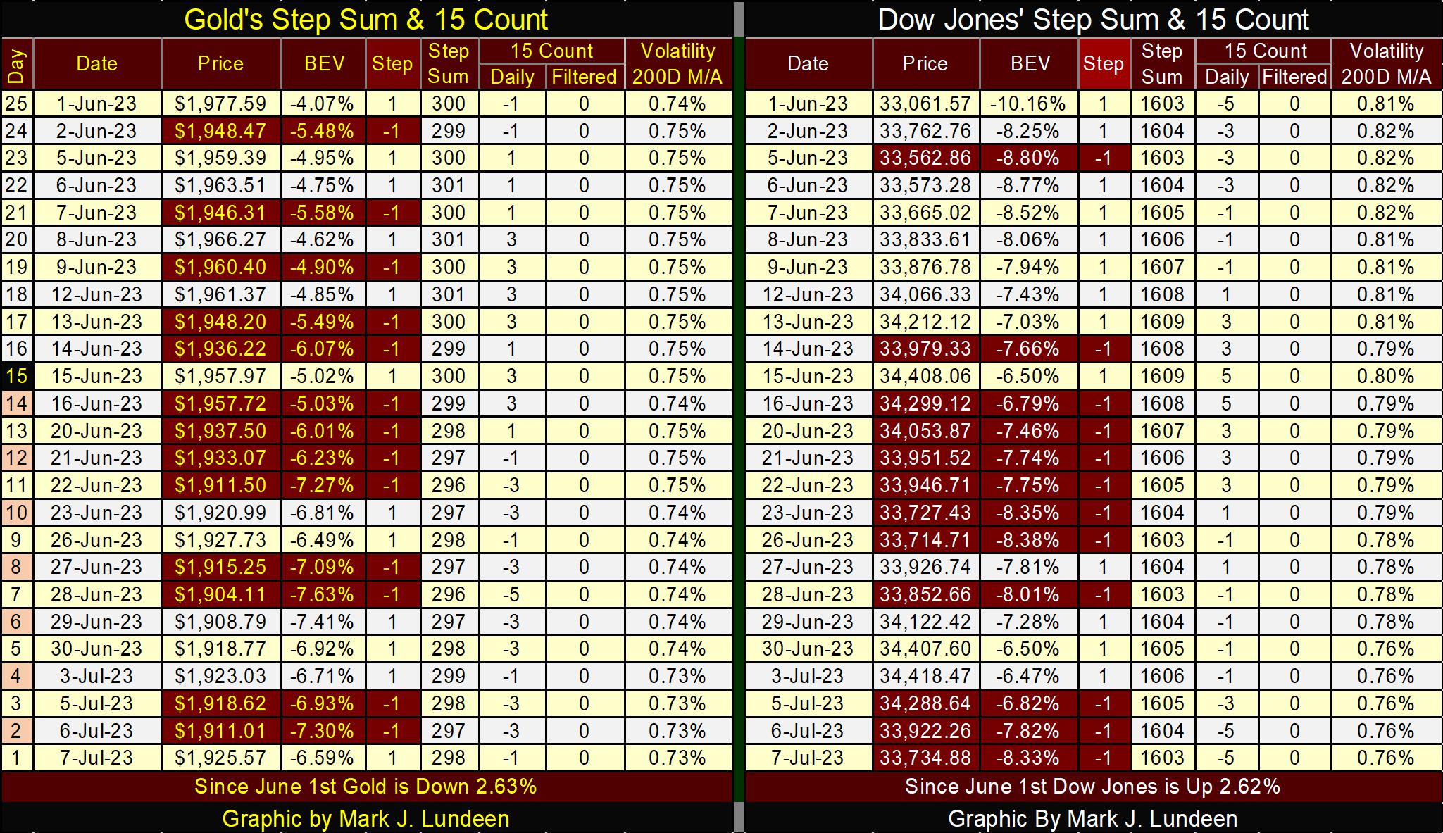
In gold’s step sum table below, it’s obvious the selling pressure is relenting. With gold closing the week at $1925, it seems gold is responding bullishly to the drop off in declining days. Volatility in the gold market continues to decline, closing the week at 0.73%.
What the gold market really needs to break out of its current trading range, is an increase in extreme-market volatility, which for gold are daily moves from a previous day’s close of (+/-)3%, or more. So far in 2023, gold has seen only two 3% days. In a strong advance, gold would have seen well over ten.
If bond yields are in fact beginning their next advance towards double-digits, I expect we’ll see lots of bullish excitement in the gold and silver markets, as the financial markets’ valuations deflate. So, if you like gold, silver and the precious metal miners, keep an eye out for rising bond yields.
Since June 13th, the Dow Jones has seen plenty of selling. Look at all the daily declines above. But for all that, valuation for Dow Jones has not really declined that much. It’s a strange market, a market that may best understood when downing a few glasses of bourbon, as one savors a cigar. I’ll be back next week.
********


