Dow Jones Total Market Group's (DJTMG) 52 Week Highs & Lows


Two years after the credit-crisis panic in the autumn of 2008, and 21 months after the March 2009 stock market bottom, let's take a look at what's hot and what's not.
Using:
- the Dow Jones Total Market Group: ( yellow and grey)
- various major market indexes: (Red),
- inflation indexes, the national debt & US Currency in Circulation: (Blue),
- Metal prices: (Dark Green)
I created the following table to give us a snapshot of the percentage gains of the market from two particular issues of Barron's: the bottom of the March 2009 stock market panic and now. But understand that while early March 2009 was a bottom for the stock market, gold and silver saw their bottoms in early November and late October, while copper in late Dec 2008. As the table does not show the metals total gains from their bottoms, I'm listing them here:
- Gold……………………….+ 88%
- Silver……………………+ 193%
- Copper……………….…+194%
By the time the March 2009 DJIA bottomed, the metals were well into their current run up in price.
The end point chosen, Barron's 19 Nov 10 issue, is used as it has the latest weekly closing prices I have in my files as I wrote this article. Still, the gains since March 2009 in all classes of investments have been well above average, too spectacular, but only for those who had the courage to purchase stocks when the panic in the market was at a peak. For myself, I don't believe in reaching for a falling knife with a short handle, and would never purchase stocks during a time when it looked like the entire credit system was melting down. At the time, I thought the 53% decline in the DJIA was insufficient to fully correct for the damage done to the financial markets by Doctors Greenspan and Bernanke's inflationary monetary policies - and I still do.
So I'm posting these numbers now because I think we are close to the top values these assets will see on this up-leg in the Bear Market Correction. I'm expecting that sometime in the next year or two, we'll see the lows of March 2009 tested, and they will not hold. And investments in Gold, silver, mining shares and commodities in general will continue to provide returns above the rate of inflation.
This is what I'm expecting, but what may actually happen may be something different. Still, I don't think my expectations will fail me, because we are in that point in the inflation cycle where the Fed's "liquidity" naturally wants to flow into consumer prices, away from financial assets. That means that the DJTMG sector gains seen below are artificial and won't last. So the more the Fed uses its Quantitative Easings programs, the more right I'll be. You and I will just have to wait to see if I'm right or wrong.
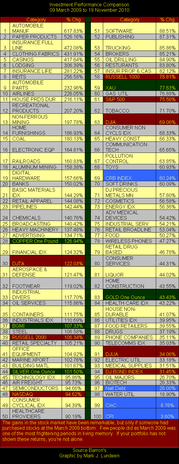
In general, as usual, the biggest gainers in November 2010 were the biggest losers of 09 March 2009. But seeing the auto stocks at the top really bugs me. President Obama bullied GM and Chrysler's management, and the bond holders of these distressed companies before firing them, or paying back pennies on the dollars owed them. Then for all practical purposes, Obama, with the approval of Congress, and the courts, nationalized these companies' assets, and in a very third world fashion, divided the spoils with his political supporters in the unions and elsewhere. We shouldn't forget that, or the sweetheart subsidies and tax breaks the Obama Administration has showered his auto empire with. As far as I'm concerned, buying anything with GM or Chrysler's name on it; as an asset or for transportation purposes is dealing in stolen goods.
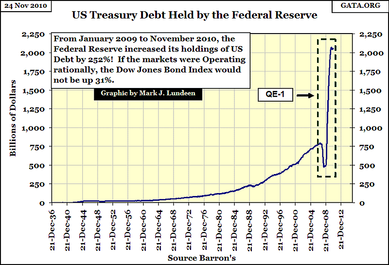
But getting off my soapbox, the gains in the stock market has really been phenomenal. In normal times, even water utilities (#98, gain of 18.90%) is a superb 21 month advance in such a stodgy industry. But these are not normal times. No longer do markets function as a price determining mechanism, but as "Policy's" theater of the absurd. Seeing the Dow Jones Bond Index (#94) gaining 31.45% as the US national debt (# 97) expanded by 26%, and the Federal Reserve monetized over a trillion in US Debt, doesn't sit well with me.
We see below who is financing the current bull market in financial assets; the same source that financed the 1990's High Tech, and 2000's US Mortgage bubbles, and we all know how those bubbles ended. If you're someone who expects the current "bull market" in stocks and bonds will continue for the unforeseeable future, you're one of the many who still doesn't understand the consequences of the massive inflationary flows coming from the Federal Reserve. Had I included the increase in the Fed's portfolio of US Bonds in the table above, it would have placed #9 in the table with an increase of 252%, well above the gains in gold and silver.
I'm not an investment advisor, so the following opinion is not a recommendation for retail investors or anyone else; BUT it seems very likely that these high double and triple digit high flyers of the past 21 months are going to be the diseased dogs of the next two years. I just have that feeling, and for good reasons obvious in the above table. Seeing 77 asset classes gaining over 50%, with 44 of them gaining over 100%, in just under two years, is a performance that is not going to be repeated! I still believe this is a bear market, and the gains of the past 21 months are only a reaction from the bear market lows of March 2009. So it seems to me that the stupendous gains we see in the table above is Mr Bear's setup for the next stage in the 2007-2010 bear market.
Gold and silver based investments are off my above list of the doomed, because the Federal Reserve and the European Central Bank can't monetize unlimited amounts of financial toxic waste, and not accelerate the gains in the old monetary metals.
Copper, the best performing metal in the table, may suffer if the economy goes all-back-full in the months ahead; and then maybe not. There's always the wise-guys informing us that gold and silver have been demonetized, and will never be used as cash again. I doubt that, but acknowledge that this is true for copper. But in a world where financial assets, and money itself are becoming worthless, don't be surprised if major industrial concerns might disagree with me and the wise-guys, and monetized as much copper, and Portland cement as they can get their hands on while their dollars and euros still have purchasing power.
If the European "monetary authorities" insist on bailing out the victims of its credit bubbles, in the fashion of the Federal Reserve, and it appears that this is indeed their intention, count on lots of basic materials to become monetized, as global commerce demonetizes the central bank's money supply. If the world's "banking authorities" continue to prohibit the writing off of unserviceable debt, choosing instead to monetize tens and hundreds of billions in toxic financial waste, the day is coming when no one is going to want the US dollar or the Euro. But in their absence, preformed base metals, such as copper piping, and basic materials in sufficient bulk might do nicely as assets for a construction company trying to recover its business. It goes without saying that if such a situation is allowed to occur, life as we know it will be only a memory. So don't believe for a moment that I'm looking forward to $10,000 gold - I don't. But life goes on, and people will pick up the pieces of their lives as society again reorganizes itself, hopefully without a socialist police state. So I recommend that my readers purchase gold and silver, and take it home with them. Leave the monetizing of copper piping and bags of Portland cement to someone else.
DJTMG's 52 Wk Highs & Lows
One of my favorite predictors of future market trends in the stock market is 52 Wk Highs and Lows. NYSE 52 wk high and low data can be used, but I like using the Dow Jones Total Market Groups (DJTMG) data base. A stock may advance one day, and decline the next, but it's a real statement of strength, or weakness for a stock, or stock sector to move up to a 52 wk high, or down to a 52 wk low. This is because it takes time for a stock to move from one 52 wk extreme to the other. Right now the DJTMG's 52 wk highs have flashed a strong sell signal on the stock market, the following will explain why.
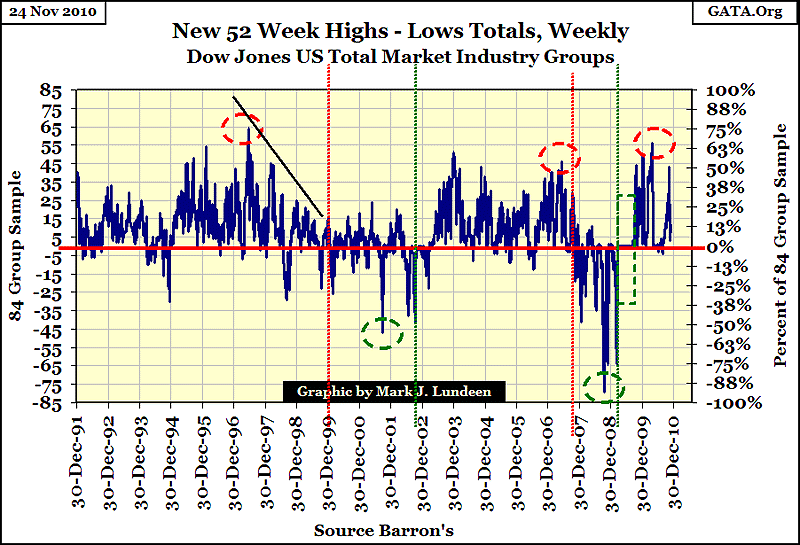
The key in the above data is that 52 wk highs (NYSE or DJTMG) almost always see a * maximum peak * prior to the final high in the DJIA or S&P 500; and 52 wk lows will see a * maximum peak *almost always prior to the final lows in the DJIA or S&P 500. Take a moment to study the chart above. The vertical lines mark the turn in the DJIA, with Red lines mark tops for the DJIA, green lines for DJIA bottoms.
Note that after a maximum peak in 52 wk highs, it's typical to have a following * BUT * weaker 52 wk high peaks as the DJIA continues climbing to higher levels. The gap between the maximum peak in 52 wk highs (or lows), and the turn in the general stock market can be years, as it was in 1997, or a few months as in 2007.
In the chart above, I used red circles and vertical lines to note tops in the market. The red circle is the top in the 52 wk highs in the DJTMG, and the red vertical dashed line marks the date when the DJIA actually peaked, starting its downward reversal. Almost always as the end of a bullish-long-term trend nears, the DJIA continues rising as the number of 52 wk highs decline, as seen in weaker peaks of 52 wk highs. That is a bad sign, and the reason I chose red for the up markets, as RED means WARNING! The market from 1997 to December 1999 was really outrageous. I see Doctor Greenspan's finger prints in the market in this chart, as the DJIA continued to climb for two years as the 52 wk highs in the DJTMG just crumbled. From 1997-2000, few people noticed the stagnation in most of the DJTMG's groups, as all eyes were focused on Microsoft and Cisco. But in a typical after the fact manner, we now can see how the action in the DJTMG's 52 wk highs and lows signaled that the end was coming.
As green means GO, I chose it for the DJTMG's 52 wk lows. Note that as with 52 wk highs, the 52 wk lows reached their declining, maximum peak before the DJIA's ultimate bear market bottom. Take a look at the peaks in the DJTMG's 52 wk lows from 2000 to 2003. Its 52 wk lows bottomed in October 2001, with the DJIA down about 25%, while the DJIA itself didn't find its bottom until October 2002 where the DJIA declined to 34% from its bubble high. But we should note the DJIA's ultimate low occurred with fewer DJTMG 52 wk lows than the year before, though it's hard to see this in the chart, due to my placement of the green dash line used to mark the DJIA's bottom.
If you're looking for a technique for timing long term entry and exit points in the stock market, this is a good one. Major peaks, with over 50% of the Stocks at the NYSE, or sectors in the DJTMG seeing 52 wk highs, are infrequent, but significant signs of exhaustion of an up trend. If as we see above, where the following peaks are weaker, even if the market is still rising, this is an appropriate time to start selling your position on strength, and not buying back on weakness. This is a better-than-house-odds situation that a significant sell off in the market is pending, and you should be out of the market, waiting for a much better opportunity to buy even cheaper stocks. The reverse logic is used for down markets.
Let's take a look at a short term view of this data, using the chart below. Note the pattern of DJTMG's 52 wk highs and lows prior to the DJIA's changes in direction. In early June 2007, the 52 wk highs saw a maximum peak three months before the October 2007, final peak in the DJIA itself. The two subsequent minor 52 wk high peaks, in July and when the DJIA actual saw its top in October, tells a story of liquidity draining from the market.
During 2008 we see the same pattern, but in its mirror image: twice. For a few months, it looked like the down spike on 08 January was going to be the bear market's maximum peak in 52 wk lows. The two minor peaks in February and July was a nice touch by Mr Bear. However, by midway in the month of October 2008, Mr Bear took 79 of the 84 groups in my sample down to new 52 wk lows. When 94% of the DJTMG's sectors are hitting their 52 wk lows, it's an ugly thing to see. But for all of that, the DJIA itself only fell 40% from its 2007 highs, the first time the DJIA saw a 40% decline since 1974, so it was a serious low. But as we all know now, the worst was still to come. Only 5 months later the DJIA was to fall 53%, the second deepest bear bottom since 1885, * BUT * with only 64, or 76% of the DJTMG's hitting a new 52 wk low. Study the chart below; this pattern is the exact mirror image of what happened in 2007 when the DJIA went to its all-time high.
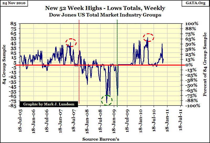
Now, the reason I'm writing this is to enlighten you that this pattern is once again developing in the stock market. In April, the DJTMG saw 56 (66%) of its groups hit new 52 wk highs. Seeing 66% of the DJTMG groups hitting new 52 wk highs is a rare occurrence. This alone is a sign of the coming exhaustion in market strength. But after the DJIA's sharp correction from May to July, the DJIA has since exceeded its highs of April, * BUT * it has done so with fewer sectors in the DJTMG making new 52 wk highs. I also note that the November 2010 spike in 52 wk highs disappeared as quickly as it appeared. If the past is prologue, the stock market is coming into a period of weakness. If in the next two years interest rates begin to climb, The stupendous gains we saw in the table above will evaporate quickly.
Presently, I can't say if this pattern in the DJTMG's 52 wk highs is signaling the beginning of the end of the March 2009 bull run. With the Fed monetizing 600 billion in US Debt in the next 7 months, we may see the DJIA, and DJTMG's 52 wk highs go on to new highs, but then maybe not. So I put a red circle around the April 2010 peak, because I suspect that the next few months will prove a better opportunity to selling stocks on strength, than buying them back on weakness. Who knows what's going to happen? The best the law allows is to study repeating patterns in the market, and position ourselves accordingly. But I'm expecting the DJIA to retest its lows of March 2009 before this bear market is over, so I want nothing to do with anything that isn't gold and silver related for the foreseeable future.
For my readers who would like to follow NYSE 52 wk highs & lows on a spreadsheet, and do a little due diligence for their investments, the following site provides free, historical daily NYSE advancing & declining data, as well as daily 52 wk highs & lows. One never wants to be totally at the mercy of "expert" financial advice.


