Fighting Inflation, Fighting Deflation, Fighting For Their Lives


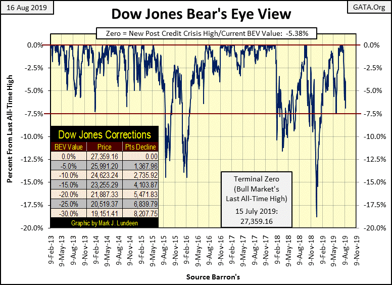
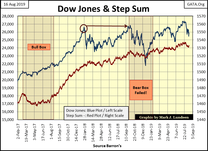
The Dow Jones Index closed the week down 5.38% from its last all-time high of July 15th, a month ago. But looking at the Dow Jones as Mr Bear does in the BEV chart below, with every new all-time high registered as a 0.0%, or BEV Zero, and all other daily closings as a percentage decline from their last all-time high, comes short of displaying what has happened in the stock market since July 15th.
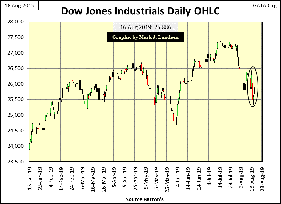
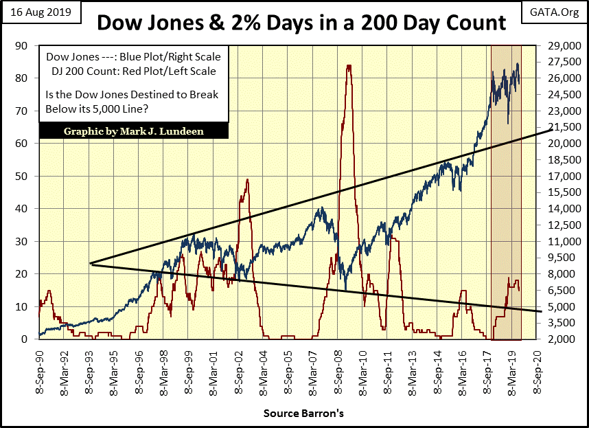
Looking at the Dow Jones in daily bars below reveals the increase in market volatility the stock market has seen in the past three weeks. It’s as if someone on July 30th turned on a switch for market volatility. Well, that’s what happens when Mr Bear comes to visit Wall Street; a big increase in daily market volatility begins. Seeing the huge increase in daily volatility in the past three weeks for the Dow Jones, I’m thinking we’re seeing fresh bear sign at the NYSE in the chart below.
And bear markets are so much more than just declining share prices; bear markets are a time for reckoning of past errors management made that no one really cared about during the previous bull market advance – but they do when Mr Bear comes calling. I’m talking about General Electric. GE is a storied company that was included in the original Dow Jones’ all Industrial (no rail road companies) Average of May of 1896, until it was delisted from the Dow Jones in June 2018.
https://www.investors.com/news/ge-industrial-engines-sale-advent-dow-jones-industrial-average/
The past year hasn’t been kind to GE, not with financial-super sleuth Harry Markopolos, the man who took down Bernard Madoff eleven years ago, now fixing his gaze on it.
https://www.bbc.com/news/business-49352765
GE’s business is huge; from jet engines to plastics to steam turbines for electrical utilities. But for decades GE’s pride and joy has been their financial division. I have no opinion on this story of Markopolos v GE. At this point who knows what is true or not? But bear markets have a way of forcing the truth to the surface, and I wouldn’t be surprised reading in the months to come that it was GE’s financial division that was the cause of their problems.
Bad things happen in bear markets; bad things like seeing the Argentine Peso devalued by 21% this week. Actually I saw on CNBC this devaluation happened in a single day, along with a single day 35% crash in the Argentine stock market.
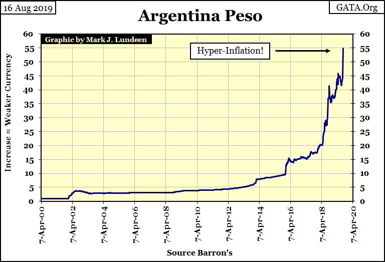
Most people would say they’re sorry to hear about GE’s problems, and Argentina is a long way from the New York Stock Exchange; all that is true. But after an inflationary advance in the global financial markets that has lasted for more than a decade, I think of Earth’s stock and bond markets, as well as its banking system as a big-rotten apple Mr Bear is going to tear into. And when he starts working, he won’t stop until he finds something solid. So far, it’s only been GE and Argentina. If we are in a bear market, much more will follow.
It will be as Warren Buffet once said: “no one knows which swimmers have any cloths on until the tide goes out.”
The stock market is behaving strangely in mid-August; all the wild daily volatility seen last week, yet at the end of the week the major-market indexes I track haven’t moved much from their close of last Friday. I’d say that most of them are still within scoring position for making new all-time highs in the weeks to come.
But that is only if the stock market can rid itself of the daily volatility seen in the Dow Jones bar chart above. If it can’t, expect to see some stunning daily moves to the downside that will demand everyone’s attention.
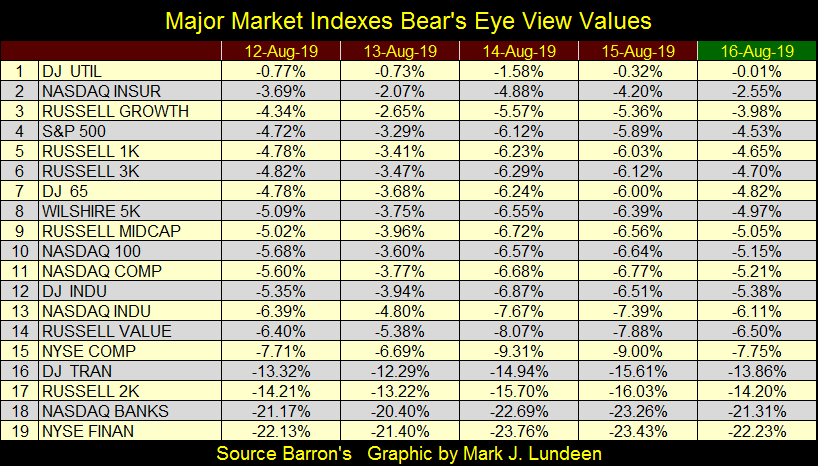
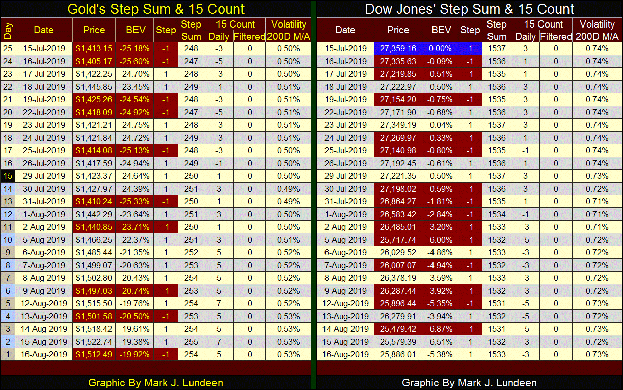
So far in August, we’ve seen two Dow Jones 2% days; day’s #15&16 in the table below. And in August we’ve seen all of last October’s days of extreme volatility expire in the Dow Jones 200 count, but the stock market is adding new extreme days as the old days expire. This is not bullish.
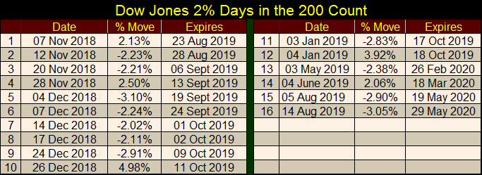
Here’s the Dow Jones and its 200 count plotted below. We see the huge increase in the Dow Jones 2% days during the NASDAQ High-Tech crash and the sub-prime mortgage debacle in the red 200 count plot. When the Dow Jones begins to deflate in earnest, expect a similar expansion in the Dow Jones 2% days once again.
Looking at the Dow Jones in this chart (Blue Plot), since January 2018 the Dow Jones hasn’t done much for investors but churn its valuation. Yes, it has made new all-time highs just last month, but since January 2018 it does so with only a hand full at a time, before it begins to deflate in a correction. If an index won’t go up, maybe it’s time for it to go down?
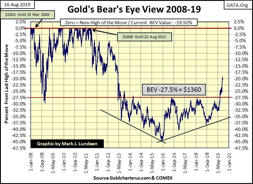
Gold is a market on the move, closing this week with a breakout above its BEV -20% line weeks before I thought possible. Are we going to see it correct before it takes out its BEV -15% line? It’s been going up since early May when it was at its BEV -32.5% line. Reasonable people would expect that it would correct after such an advance.
But after being held below its BEV -27.5% line for six years, it may be awhile before we see much of a correction in this advance, and gold still hasn’t seen a 3% day since late 2016!
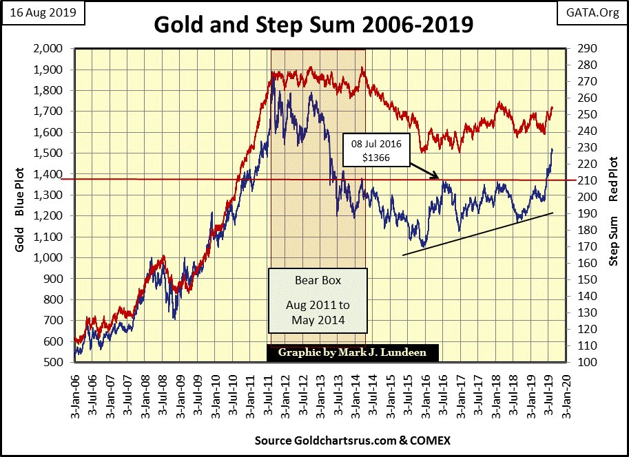
Gold in its step sum chart looks great too! Look at the five year run from 2006 to 2011 for gold (Blue Plot) and its step sum (Red Plot). The step sum moved from 105 to 275, taking gold up $1300 as it did. After an eight year pause where gold corrected by 45% from its highs of 2011, it’s very possible it could do that again, and maybe much more. And if gold does that, the gains in silver will outshine whatever gold does.
If I had one word to describe the Dow Jones Index and its step sum in the chart below, it would be exhaustion. A sorry bunch of tired old bulls waiting to be delivered into the claws and gaping jaws of Mr Bear somewhere below.
Without comment, here are my step sum tables for gold and the Dow Jones.
I frequently cast abuses at the financial MSM and academics; they damn well deserve it. Case in point is this Bloomberg interview of Alan Greenspan reported by Market Watch on the global collapse in bond yields.
First, the same word of warning Greenspan once gave Congress in the late 1990s as he inflated the NASDAQ high-tech issues into a historic market bubble applies to what he said below.
"I guess I should warn you, if I turn out to be particularly clear, you've probably misunderstood what I've said."
- Alan Greenspan, Federal Reserve Chairman; During Congressional Testimony
He actually said that to Congress, and we best understand what he meant by it; something or something else as I recall. Now back to the Bloomberg interview where Greenspan said:
“There is no barrier for U.S. Treasury yields going below zero. Zero has no meaning, besides being a certain level.”
- Alan Greenspan, Quote to Market Watch on August 14th 2019
Tell that to a pension-fund manager who must produce income to cover their monthly obligations to the fund’s beneficiaries.
Greenspan’s following explanation of why bond yields are in a state of collapse is so typical of the reality-disconnected mindset academics in control of “monetary policy” have:
“Why people continue to buy long-term Treasuries at such low yields may be also due to forces having altered people’s time preferences. But there is hundreds of years of history showing the long-term stability in time preference, so these changes won’t be forever.”
What, did I miss something? Did Greenspan just blame “people’s altered time preferences” for negative bond yields? I think the bubble master did.
One has to have a Ph.D. in economics to understand (believe) that. Left unmentioned in the interview is the wholesale “monetization” of government debt by central banks.
Since the beginning of our era of quantitative easing, the primary demand for government debt is from central banks. These institutions care nothing about getting an honest return on investment, but purchase these bonds by wholesale volume to affect “market stability”, or for the “stimulative effects” these purchases are alleged to have.
Small wonder bond yields have gone negative; funding their purchases with monetary inflation, central banks have inflated bond prices deep into the no-man’s-land of fantasy valuations. As a result the global-bond market is nearing the top of a historic bubble.
Bloomberg’s reporter failed to ask Greenspan about this. Market Watch’s Mark DeCambre also failed to mention this undeniable fact to his readers. And journalists wonder why a growing number of people are calling their communiques to the public FAKE NEWS; because it’s increasingly apparent they are willing propagandists for our very corrupt established order.
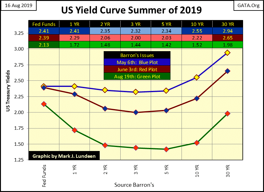
This week the entire yield curve for the US Treasury market became inverted when the yield for the 30yr T-bond fell below the Fed Funds Rate. The last time this happened was in 2007, not long before the Dow Jones began its sub-prime mortgage 54% bear market.
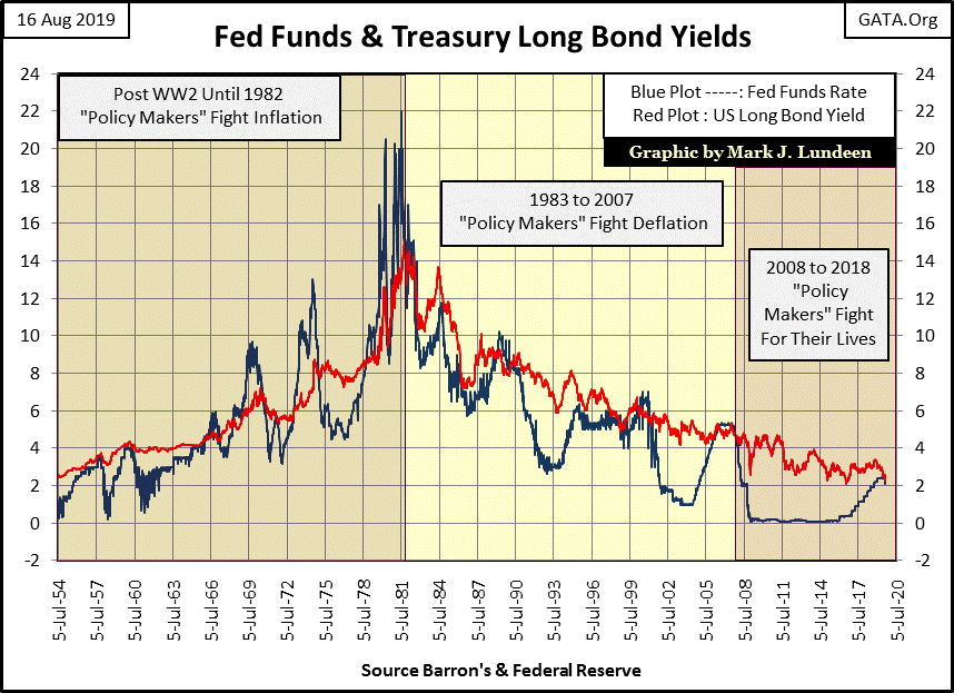
This is very, very bad! To see why let’s look at the history of the Fed Funds Rate’s interaction with the US long bond’s yield. In it we can identify three eras of “monetary policy” since the mid-1950s.
-
“Policy Makers” Fight Inflation (1954 to 1981);
-
“Policy Makers” Fight Deflation (1982 to 2007);
-
“Policy Makers” Fight For Their Lives (2008 to Today).
But first let’s take a look at how the Federal Reserve inflated the supply of dollars since 1920 in the chart below. The rising black plot is the indexed value of CinC; the volume of paper dollars circulating within the economy. Since January 1920 the Federal Reserve has increased the supply of paper dollars by a factor of 390. That’s a horrendous inflation of the money supply.
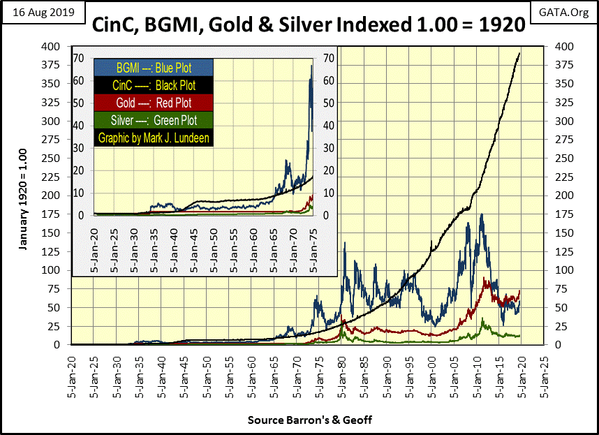
Economists frequently refer to the “flow of funds”, or where within the economy is money flowing to and from. Those areas where dollars are flowing to are being inflated, those areas where dollars are flowing from are being deflated.
CinC inflation seen above was flowing into consumer prices from 1954 to 1981. As a result of rising CPI inflation, interest rates (Blue Plot below) and bond yields (Red Plot) were rising. People today don’t think of the 1950s as an era of consumer price inflation, but they were.
From a Barron’s editorial of December 1951:
“In extended comment on the shrinkage of the dollar, the National City Bank’s December Letter says: ‘From the standpoint of the creditor—the buyer of Savings bonds, the pensioner, the insurance beneficiary, the school teacher with lagging pay—the experience during and since World War II has been disheartening. Inflation is a concealed type of tax and these are the people who took the brunt of it.’ In line with the repeated views of Professor Sumner H. Slichter, at City Bank adds: ‘People reconciled to a dollar of wasting value look around for real estate or other equity investments as a hedge against price inflation and dollar shrinkage.’”
- Barron’s Editorial, 31 Dec 1951
Here is a quote from the popular Burns & Allen show from the 1950s on what to expect from a monthly $120 Social Security check.
“The real problem with retiring is money. Most people save their whole lives to retire in the same style they enjoyed when they were working, only to realize that they can’t live like they used to even while they’re still working. You see these ads for retirement and they always have fishing boats in the background. That’s because for $120 a month, fishing is the only way retired people can feed themselves.
- George Burns: Burns and Allen Television Show / Season 8 Episode 9, 1957
Here’s my favorite quote on consumer price inflation from this era:
“On the issue of inflation, I think I could solve it no matter how much money it takes.”
- Pat Paulson: 1968 Presidential Candidate & Comedian
These inflationary trends continued during the 1960s and 1970s, as seen below in my sampling of past Barron’s articles from those decades.
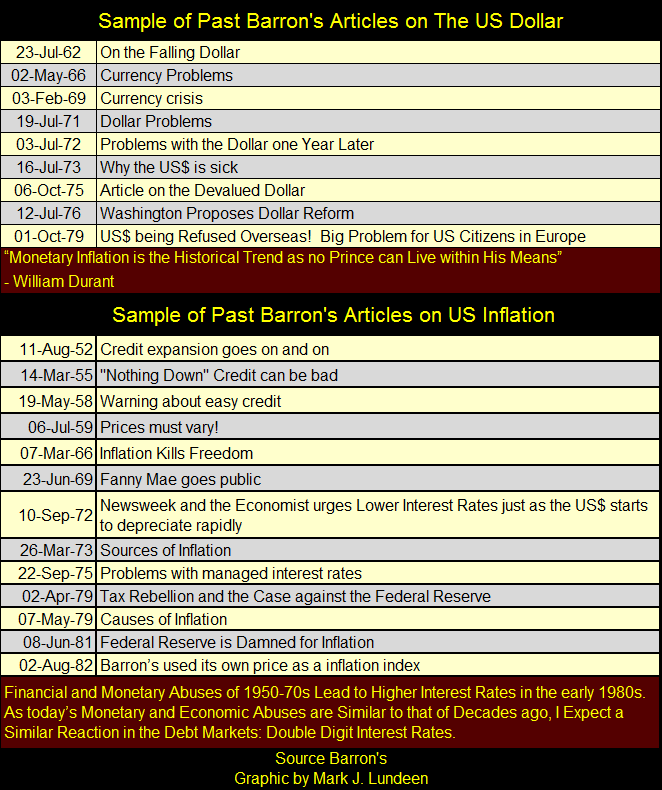
People hated the ever rising costs of living. Politicians and central bankers would do anything to stop it – as long as they could continue to inflate CinC as people’s losses was their gain. So what the “policy makers” did do was manage the effects of their monetary inflation by increasing the Fed Funds Rate above or below the yield of the US long bond, which is very obvious in the chart above.
This did nothing to check CinC inflation. But CinC was the base from which the banking system created credit within the economy. By inverting the yield curve; raising the overnight Fed Funds Rate above the long-term T-bond’s yield, forced banks to contract credit within the economy. To what extent inverting the yield curve checked consumer price inflation I don’t believe anyone actually knows, but it did result in recessions and rising unemployment within the economy.
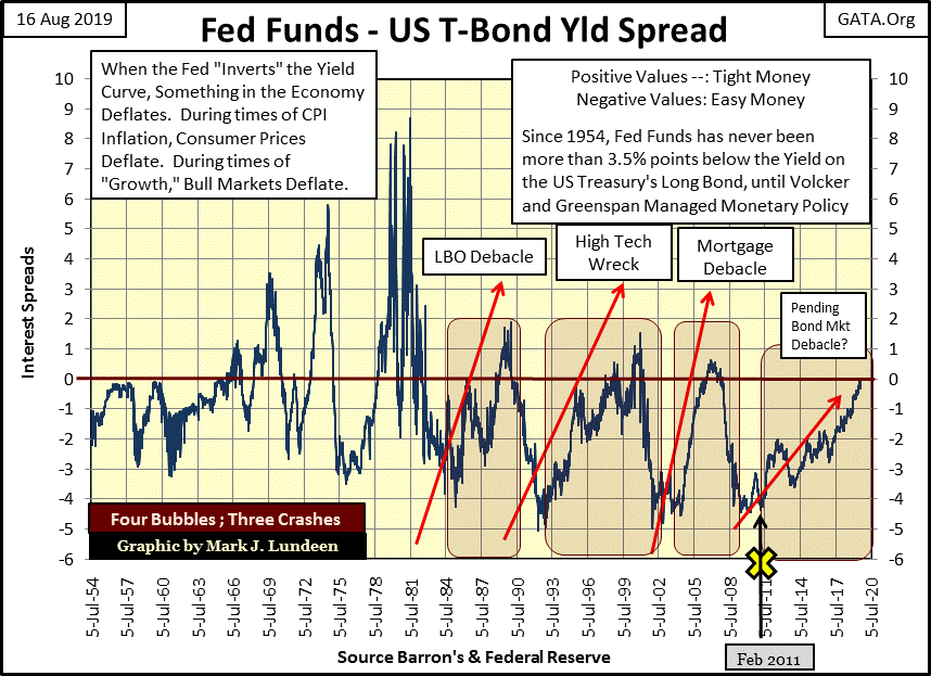
To make things simpler I’ve taken the spread of these two rates and plotted it in the chart below.
-
When the Fed Funds rate is equal to the US Long Bond Yield, the plot rests on the 0% red line.
-
When the Yield Curve is inverted – Fed Funds is Greater than the Long Bond’s Yield; the plot is positive and its value is the percentage Fed Funds is above the Long Bond’s Yield.
-
When the Yield Curve is normal – Fed Funds is Lower than the Long Bond’s Yield; the plot is negative and value is the percentage Fed Funds is below the Long Bond’s Yield.
Those times where the yield curve is inverted are said to be times of “tight money”, when the “policy makers” are contracting credit in the economy. Those times where the yield curve isn’t inverted are said to be times of “loose money”, when the “policy makers” are expanding credit in the economy.
Keeping these two conditions in mind:
-
times of tight money; Fed Funds above Long Bond’s Yield
-
times of loose money, Fed Funds below Long Bond’s Yield
Let’s study the FOMC’s “monetary policy” since 1954 in the chart below.
The first is when the FOMC was fighting inflation (1954 to 1981). During times of easy money the spread between Fed Funds and the US Long Bond Yield was never deeper than -3%, and the FOMC didn’t invert the yield curve until 1966. But after 1966 the “policy makers” found it necessary to invert the yield curve to ever more extreme levels to check consumer price inflation, until July 1981 when they found it necessary to raise their Fed Funds Rate a whopping 8.5% above the long bond yield.
Go back to look at the actual Fed Funds Rate and bond yield in the chart above. They were at double digits for a long time, yet bankruptcy was not a problem during this era. People and businesses were thrifty back then, meaning banks at this time were places the public deposited their savings in, much more so than places the public went to for loans. As Richard Russell once said:
"Those who understand interest -- collect it;
those who don't understand interest -- pay it."
It should be noted that most people living during the 1970s and early 80s wouldn’t say it was a great time to be alive. The disco music was great, but there were frequent recessions and job layoffs. This was the era when America’s “Rust Belt” was forming along the Great Lakes States; from New York to Minnesota’s Iron Range.
And it wasn’t only interest rates and bond yield that increased to double digits. Consumer Price Inflation also increased to double digits. Frequent pay increases were a feature of this era, but wage earners and people living on fixed income understood they were on the losing side of inflation.
Note for chart above: February 2011 Doctor Bernanke initiated his “Operation Twist” to lower long term bond yields.
Then something amazing happened in 1982; monetary inflation from the Federal Reserve stopped flowing into consumer prices, and began flowing into financial asset valuations. No longer were prices rising at the supermarkets; instead valuations of stocks trading at the NYSE were rising, and bonds began a “bull market” that continues to this day.
Like rising consumer prices, rising financial asset valuations were a consequence of an inflationary monetary policy. But unlike the pre 1982 era where the FOMC was damned for its monetary inflation (see my table on Barron’s articles above), after 1982 the FOMC was praised for stimulating “economic growth” as seen in investors’ stock portfolios. What could go wrong with that?
So, let’s look at the chart above to see how the “policy makers” managed this era where they no longer fought consumer price inflation, but fought deflation in financial asset valuations (1982 to 2008).
First and foremost, in the four market bubbles the FOMC has inflated since 1982, they now feared inverting the yield curve, as they once fearlessly did before 1982. This was because every time they increased their Fed Funds Rate above the yield for the US Long Bond, they popped the market bubble they inflated. And it didn’t take much of an inversion to pop a bubble, as seen in the chart below.
-
A yield inversion of 2% popped the Leverage Buyout market bubble (LBO Bubble).
-
A yield inversion of 1% popped the NASDAQ High-Tech bubble.
-
A yield inversion of 0.5% popped the Sub-Prime Mortgage bubble.
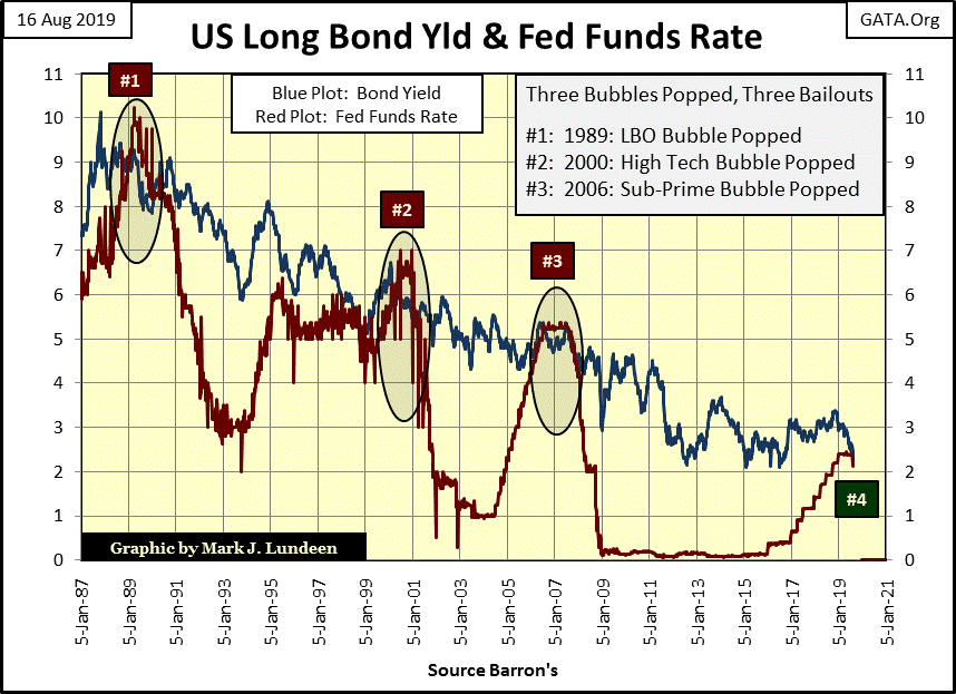
I added a #4 on the chart as this week the yield curve for the Fed Funds and the yield on the 30Yr T-bond has once again inverted, and that can’t be good for the bulls.
The disturbing feature of our current yield inversion is that it wasn’t the FOMC that inverted it by raising its Fed Funds Rate above the long bond yield. As in a Financial-Zombie Apocalypse, on its own the US long bond yield slipped below the Fed Funds rate: Whiskey – Tango – Foxtrot!
Once it was the FOMC that dictated “monetary policy” to the markets. In August 2019, it’s now the bond market that is dictating “monetary policy” to the FOMC.
Which brings us to our current era, where the “Policy Makers” are fighting for their lives, and have been since the 2007-09 credit crisis. And exactly how does a “Policy Maker” do that? For the past eleven years (since January 2008) they’ve never tighten monetary policy by inverting the yield curve. If this week the Fed Funds / 30Yr T-bond yield curve once again became inverted – it was because the bond market did it without first asking the “policy makers” permission.
A quick inspection of the chart above plotting the Fed Funds Rate US Long Bond yield spread reveals that the yield curve hasn’t been inverted since 2007 (until this week). But the table below containing the frequency distribution for the weekly spreads between the Fed Funds and Long Bond yield is a more precise graphic.
I’m not going into detail on these three tables except to point out the best place to start out is looking at the totals at the table’s bottoms. In Table #1 the “policy makers” were fighting inflation; for three decades one week out of three saw the yield curve inverted, and they’d invert the curve (raise their Fed Funds Rate over the yield of the 30Yr T-bond) by 3% to over 8%. That’s tight money!
For the twenty-four years the “policy makers” were fighting deflation (Table #2) they inverted the curve for only one week out of eight, and not one of those weeks saw the yield curve inverted by more than 3%. And look how loose they made “monetary policy”; 25% of these weeks saw the Fed Funds 3% or more below the long bond yield. Compare that to the 1.24% weeks money was this loose during the “policy makers” years of inflation fighting.
Small wonder how since 1982 the financial markets experienced one market boom / bust cycle after another, as the “policy makers” recklessly inflated CinC and credit in their banking system, targeted to flow into market valuations.
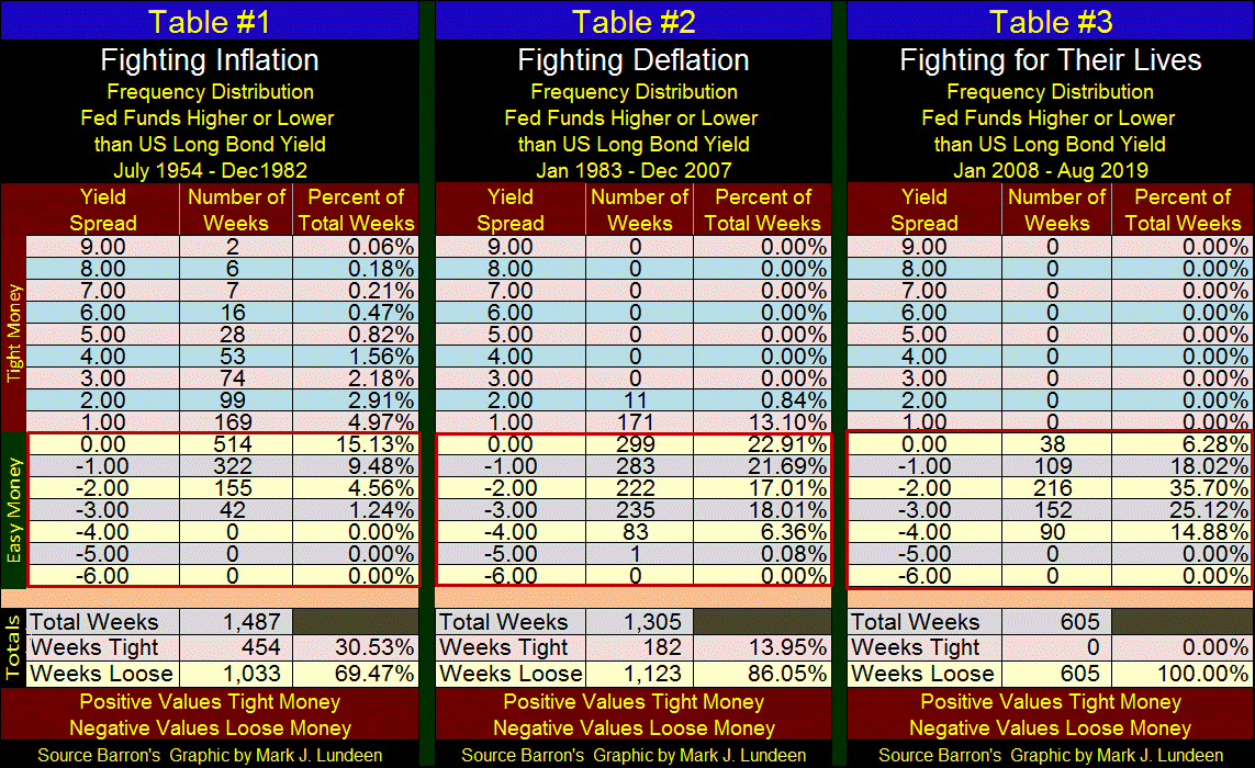
In freq-distribution Table #3 where the “policy makers” were fighting for their lives, it’s not difficult ascertaining that truth as since January 2008 (607 weeks) they haven’t once inverted the yield curve – until this week – when the bond market forced a tight monetary policy upon them.
I think I’ve made the case that what is coming our way has been coming for a very long time. But once it begins, watch these monetary maniacs blame everyone but themselves, and on the top of THEIR LIST of who is responsible will be President Trump.
Every night I pray I’ll see justice done during my lifetime by President Trump filling Camp Gitmo with the charlatans and Wall-Street Mugs that have run our world into the ground with their criminal malfeasants in managing the US Dollar and the American banking system for the past 100 years. Hillary and the FOMC? Lock them all up
Mark J. Lundeen
********


