The Fleecing Of America: Tech Stocks, Cars, Education And Fracking For Oil


The gold market has been under considerable pressure recently from the “policy makers.” Gold’s step sum has dropped a net of six down days since March 7th, but despite all that selling, the price of gold has been holding up pretty well. I can’t label the action of the past month “a bull box” yet, but if the “policy makers” can’t get the price of gold to break down under this pressure, the price of gold could suddenly take off to everyone’s surprise. What won’t go down must eventually go up.
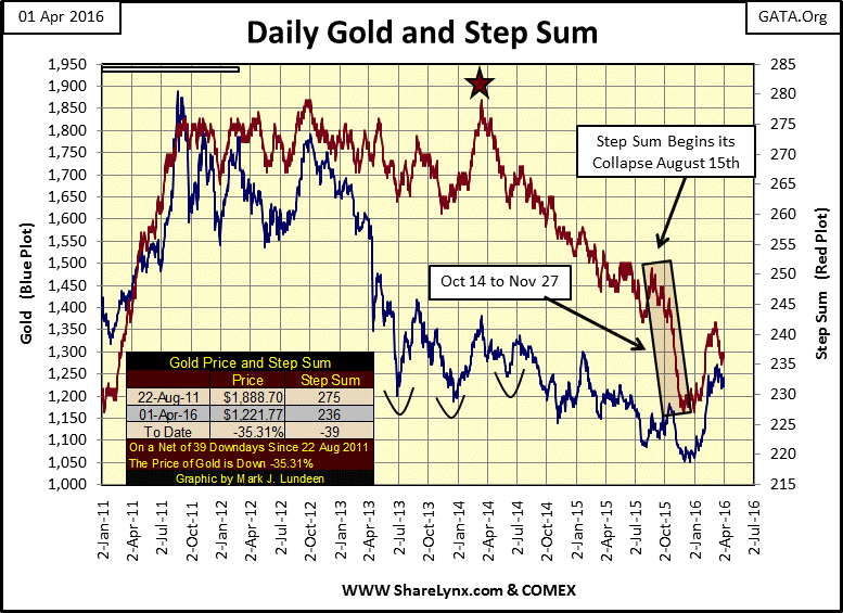
Let’s have a closer look at the price of gold and its step sum in the table below. Down days are highlighted in Red, and since February 26th (twenty-five trading days ago) there have been lots of them. At the end of the week the price of gold is just slightly below where it was on February 26th. The manipulators aren’t having as much effect on the price of gold as they must have desired.
The step sum can only move up (or down) one step per day. Each up day cancels out a down day, as each down day cancels out an up day in the step sum. So, when you see the step sum move down a net of six days, as it has since March 7th, realize that actually the market has actually seen a lot of down days (see table below). Knowing this you’ll better appreciate the twenty-one-day collapse in gold’s step sum from August through November 2015 in the chart above. Considering the colossal effort it must have taken to collapse the step sum by a net twenty-one days above, the minimal gold price decline of just $100 during the collapse was actually quite bullish. But if you’re like me somehow it didn’t feel particularly bullish at the time. But then came January and everything changed.
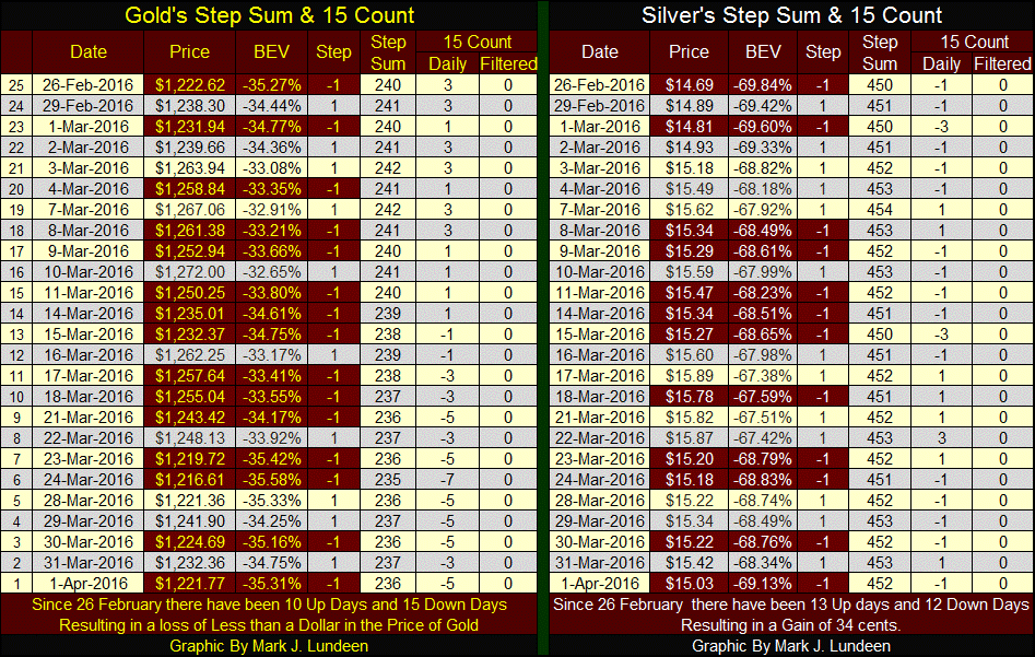
The 15 count is similar to the step sum but counts only the net sum of up and down steps during the past fifteen trading days. It ended the week at -5 (five up days + ten down days). +/- 5 is a relatively high value for the 15 count. Double digit values in the 15 count have seldom been seen since 1969. But during last autumn’s step sum collapse, gold’s 15 count dropped to -13, while silver’s actually reached a first time ever: -15; fifteen consecutive down days!
I’ve been covering silver less than gold lately, since the silver market has been pretty boring. Remember, during both bull and bear markets there are roughly the same number of up as down days, leaving the typical 15 count value to range between -2 to +2. Hard to believe but true. However bull markets typically have a bullish bias in the step sum, as bear markets have a bearish bias. Right now the silver market is just biding its time, waiting for something to happen.
Meanwhile, the Dow Jones continues its advance toward its previous all-time high reached in May (which is also its last 52 Wk High).
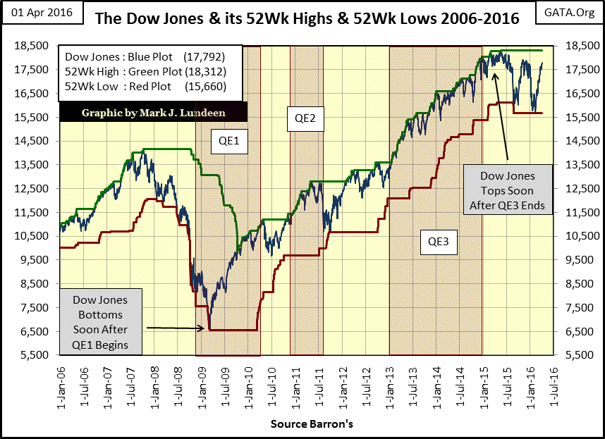
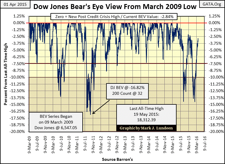
Looking at the Dow with the Bear’s Eye View (BEV) it still hasn’t managed to rise above its -2.5% line, or exceed its highs of last November. I may be a bear, but I’m not blind; the Dow Jones is going up. However if you look at the recoveries from its three double-digit corrections since March 2009, it’s never risen straight up from a correction low to a new all-time high. So I’ll assume the Dow will be seeing a little selling pressure in the weeks to come. If it breaks down below its -5.0% line, say below 6% from its last all-time high in the BEV chart, the market may be in trouble. But I’m just anticipating possible market scenarios. The only thing that really matters is what Yellen and the FOMC believe the stock market should do, at least until Mr. Bear comes back to town – but when will that be? That’s the 69 trillion dollar question!
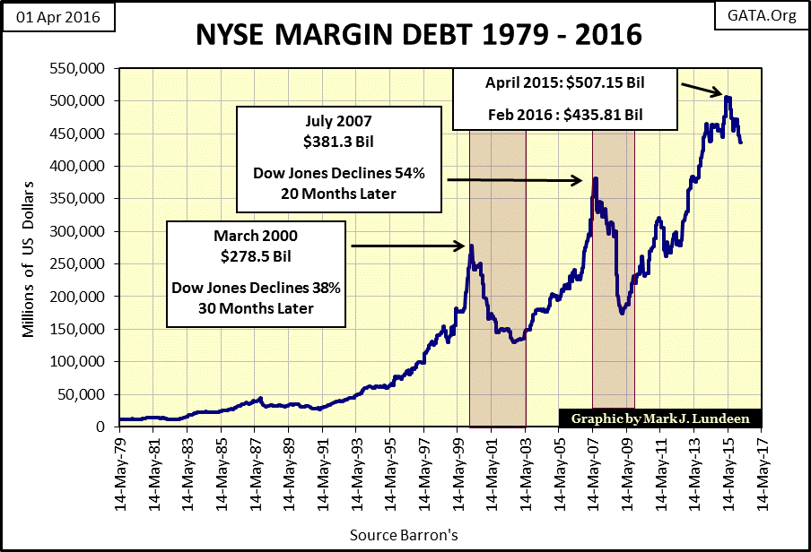
But then maybe we are closer to the top than I suspect. The following chart plotting NYSE margin debt strongly suggests the top for the Dow Jones is already in. Seeing margin debt peak at 507 billion dollars a year ago, and decline by 70 billion since then follows the same pattern set during the high-tech and mortgage bubble tops. The 38% and 54% bear markets which followed the NYSE margin debt peaks of 2000 and 2007 are now part of market history. Considering all the monetary madness we’ve seen since March 2009, I think we’ll be lucky if the Dow Jones in the coming bear market sees just a 70% decline.
Electrical Power Consumption (EP) is my favorite economic indicator. It’s measured in an engineering unit (the kilowatt), making it impossible for statisticians in Washington to manipulate the data up or down to suit their political masters desires. And EP’s relationship with the economic life of the nation is intimate. What doesn’t run on EP? Idled assembly lines in darkened factories and vacant strip malls are some examples of what doesn’t run on EP.
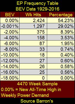
EP tells the incredible story of growth in the American economy from 1929 through 2008, during which there was record demand for electrical power nearly six out of every seven weeks. EP’s frequency table of its Bear’s Eye View data of its weekly 52Wk Moving Average shows that from 1929 to 2016; 2424 weeks of the 4,470 week sample (1929-2016) saw EP at an actual new all-time high. The 1,297 weekly hits in the -0.001% row are just a tiny fraction of a percent from being a new all-time high, so we may as well count them as new all-time highs. So from 1929 to 2016, the economic demand for EP saw a new all-time high for 83% of the 4,470 weeks in the sample.
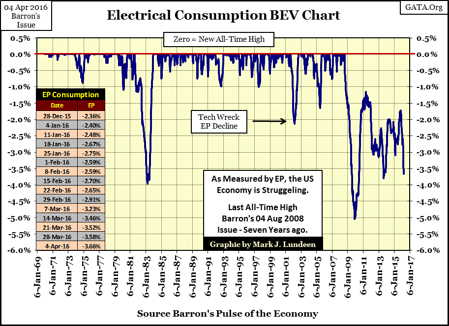
But then came the credit crisis and all that changed. As you can see below, not since August 2008 has demand for electric power reached a single new all-time high. Since then EP’s plot has snaked up and down in response to monetary policy’s success (or lack of success) in creating phony prosperity.
Beginning in November 2015, for the third time since August 2008, Electric Power consumption began descending toward new lows. In just the past five months national demand for EP has declined by 2%, and now for the third time in nearly eight years, America’s demand for EP finds itself 3.5% below its previous all-time high reached in August 2008. In August 2013, Electric Power consumption bottomed 3.8% below its August 2008 high. The question today is whether that old low will hold. Should it drop below that level our attention will move down to the 5% line; EP’s credit crisis bottom.
Is a move down to the 5% line likely? I’d say that it’s inevitable sometime in the future. The deflationary forces that drove EP down to its 5% line in 2009 are still in place and unresolved. In 2008, the banks were on their deathbed in the Federal Reserve’s Intensive Care Unit. To revive his patients all Doctor Bernanke did was “monetize” the toxic waste that put the banks in the ICU in the first place, and “re-injected” the resulting effluent back into the banking system. If a medical doctor had done something similar to one of their patients, the District Attorney would be demanding the death sentence. But we’re talking about doctors of Keynesian Economics, and that makes all the difference in the world to the DA. Looking at the above plot of EP, it’s apparent the economy’s been having a hard time since Doctor Bernanke received his “new tools” from Congress back in October 2008.
After the reckless inflation of asset prices during the Roaring 1920s, hard times followed in the 1930s as Mr. Bear purged the stock and real estate markets of their inflated valuations. This caused a brutal 17% decline in Electric Power consumption in the process. I personally feel that the current inflationary excesses are larger and more dangerous than at the top of the 1920s bull market. They’ve been building ever since Greenspan became Fed Chairman in August 1987 – three decades ago.
These problems are not going away until the “policy makers” get out of Mr. Bear’s way and allow him to purge the economy and financial system of its non-performing assets and deflate the market’s inflated valuations. We’ll be lucky if EP’s ultimate post credit-crisis bear market bottom remains in single digits.
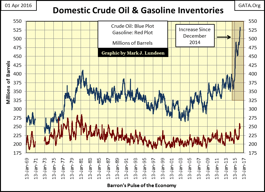
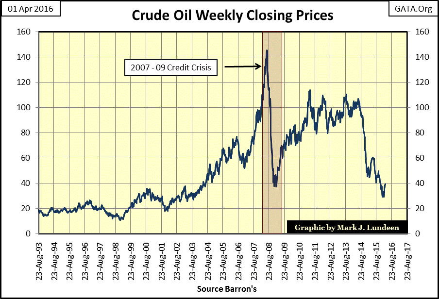
Let’s look at crude oil and gasoline inventories. Gasoline stockpiles have been within historic levels, but look at the soaring inventories of crude oil. For decades “experts” have warned that North America has passed “peak oil” production. Common sense tells us that in our finite world, North America, like the Middle East can have just so many barrels of recoverable oil. However over the past decade, crude-oil inventories have doubled due to increasing production of shale oil, with most of the gains occurring since December 2014. So much for the dire predictions of “peak oil” production “experts” have been warning about since the 1980s. I’m not denying that “peak oil” doesn’t exist, I’m just pointing out that once again the “experts” have proven they don’t know as much as they’d have you believe.
But the problem petroleum industry “experts” had in calling “peak oil” was their assumption that they lived in a world ruled by rational people. Unfortunately, our world is managed by incompetent academics who throttle “aggregate demand” by manipulating interest rates and “injections of liquidity” based on recommendations by Ouija Board analysts employed by the Federal Government.
Look at it this way; above we see one of many inflationary booms resulting from the Fed’s three QE programs. The fact that the shale oil industry was producing oil in response to no increase in market demand didn’t prevent the Fed and its banking system from extending trillions of dollars in credit to barely profitable shale oil producers, resulting in a predictable glut. They needed someone to assume trillions of dollars in debt to stimulate “economic growth”, and like college students who gladly took on debt to finance their education, shale oil producers were more than willing to sign the papers to finance new wells.
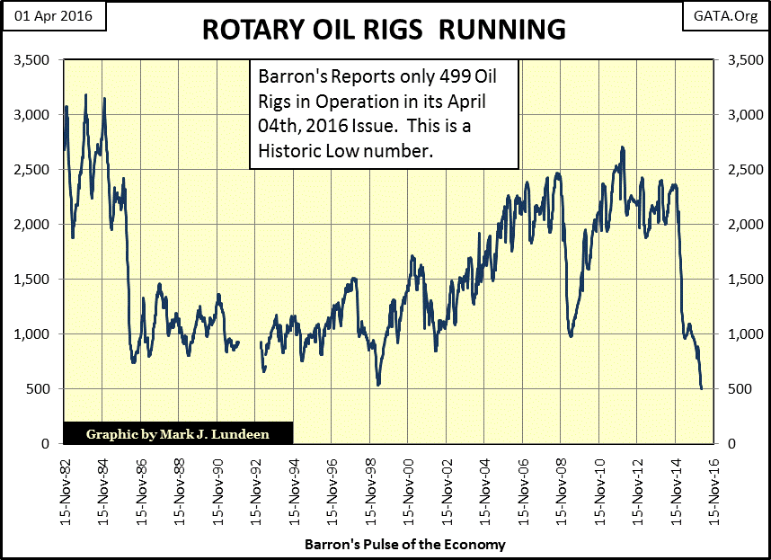
Now ask yourself who since 1913 has been responsible for every boom and bust the economy has suffered? If you said the Federal Reserve you would be correct! As for the oil industry, above we see the boom, and below the bust; the lowest drilling rig count in four decades.
The economy is now suffering from low oil prices only because the banking system is now sitting on trillions of dollars (or soon to be) non-performing loans they extended to the shale oil industry. That’s what’s negatively impacted the price of oil in the global energy market. Who else besides North Dakota’s oil industry is now at risk of massive debt default due to low oil prices? Venezuela? Russia? Saudi Arabia? What’s the Fed going to do now, monetize the petroleum already in storage at $100 a barrel? As it’s an election year Congress and Obama may just allow it.
As always the “market experts” on TV identify the symptoms of the economic malaise as the problem rather than the actual cause: central banking. Lately, we’ve been hearing that crashing oil prices are to blame for our current market dislocation. But during the credit crisis, petroleum prices declined even more sharply than currently, but the problem then was identified as “troubled mortgages.” The inescapable fact is that both the credit crisis and the current bust in shale oil production have the identical root cause: the “policy makers” at the FOMC intentionally inflated a bubble in the economy, and inflationary bubbles always go bust.
The sub-prime bubble was in response to the bust resulting from the crash in the high-tech boom, and in response to the bust in the mortgage market, the FOMC inflated a sub-prime boom in the shale oil industry which by busting seven years later has now come full circle.
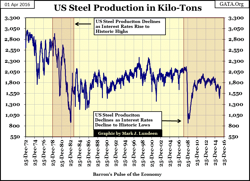
Next is US steel production since 1972. The amazing thing about this chart is how during the 1970s and 80s steel production plunged as interest rates soared to double digits. Then note how the next collapse in steel production occurred as the Federal Reserve instituted its Zero Interest Rate Policy (ZIRP). The same thing happened in the EP chart above. One has to ask themselves, what changed between 1980 and 2008? I’d say about twenty-eight years of “policy making”, inflating market values, and vast sums of credit created with zero chance of ever being serviced to term.
David Stockman has written an excellent article on sub-prime auto loans:
http://davidstockmanscontracorner.com/bubble-fracture-alert-subprime-auto-loans-heading-south/
Twenty years ago there was mini-crisis in sub-prime auto loans; now we have another. With “monetary policy” set by Ivy-League Academics, how could we not have another pending crisis in sub-prime auto loans? The most frustrating thing for me is that with college education nearly universal these days, most people find it impossible to comprehend what is actually happening here: Janet Yellen, and the FOMC have their meat-hooks deep into everything and everyone. They are a menace to the “global community.” ISIS may be a concern of mine, but Janet (the clueless) Yellen haunts my sleepless nights with monetary mayhem.
Mark J. Lundeen


