The FOMC has Inverted the Yield Curve Watch out Below!


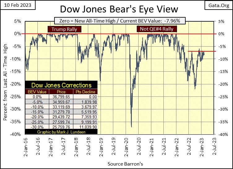
In the BEV chart below, the Dow Jones continues having difficulty breaking above its BEV -5% line. Since last August (six months now) it’s tried on several occasions, but so far has failed to make happen, what must happen if the Dow Jones really is in a bull market; break above its BEV -5% line, and go on to a new all-time high (BEV Zero) in the chart below.
What about other possibilities, something like should the Dow Jones once again break below its BEV -10% line, what happens then? Maybe something big, bad and ugly. It’s a concern of mine, but no need to panic until it first breaks below its BEV -15% line. Should the Dow Jones break below its lows of last September (BEV -21%), that would be really bad.
Most of the major market indexes I follow lost ground from Monday to Friday’s close. The NASDAQ Insurance Index (#1 table below) made a new all-time high on Tuesday, but then slipped on Thursday and Friday. Still, it closed in scoring position, a BEV of something less than -5%.
What’s to say about all of this; the market is lackluster? To be polite about it; yes, the market is lackluster. Though I can think of other more colorful terms to label this market. But call it what you want, it’s a market that offers little potential for reward, while pregnant with the risk for monumental losses to investment funds exposed to it. So, I’m out of it.

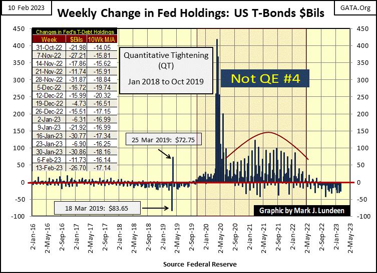
I’m not surprised, as the FOMC is making good on its promised QT. Since July 1st, the FOMC has pulled “liquidity” from the financial system every week, except for two weeks last summer. This week they pulled out another $26.70 billion.
To my knowledge, the idiots haven’t told us when they will terminate this QT. Are they going to drain “liquidity” from the market until; until what? Maybe like their first QT, they’ll continue until some chaos develops somewhere in the market, as it did in October 2019 with overnight repo rates shooting up into double digits.
Then five months later all hell broke loose at the NYSE, with the March 2020 flash crash. You can see exactly when that happened below, when the idiots began “injecting” hundreds-of-billions of dollars weekly into the market to “stabilize” it.
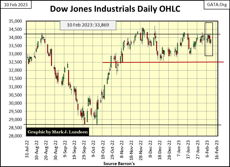
The Dow Jones in daily bars below gives an excellent picture of what is happening in the market. Since early November, it’s been ranged bound between 32,500 and 34,250. That is a long time for the market to be ranged bound. This won’t go on forever. One day the Dow Jones will break out to the upside, or the downside.
But, I’m not the guy to ask exactly what and when the next big thing in the market happens. However, with the QT above remaining in operation, I expect the next BIG move in the market will be to the downside.
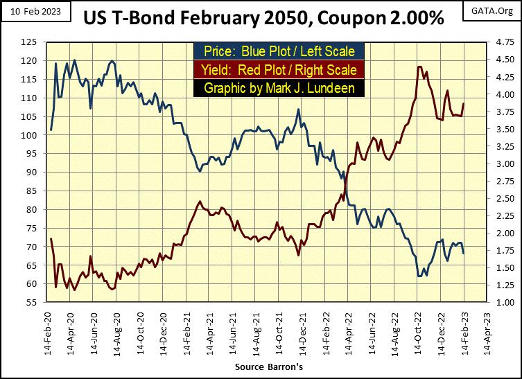
Bond yields were up this week (bond prices down). Since December, this T-bond’s yield (chart below) attempted to break below its 3.65% level. Then this week its yield jumped up to 3.87%. Still, nothing to worry about until its yield breaks above the 4.05% it closed at in the first week of January.
What am I saying? The entire bond market has been a tale-of-woe since August 2020. This bond has done nothing but lose money for its owner since it began trading three years ago, and that has been the story for the entire bond market. With the world as it is, it’s only a matter of time before the bond market resumes it money losing ways. I want nothing to do with this AAA-rated junk.
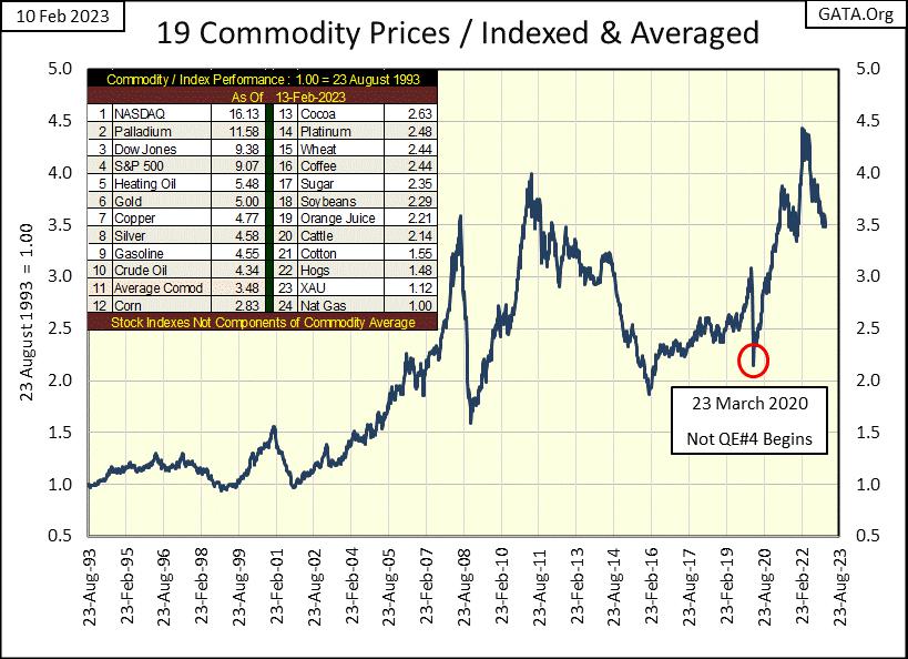
Last year, the big story was consumer price inflation increasing by double-digits percentages. Looking at my plot below consisting of the 19 commodities I track weekly, in the past year consumer prices have come down a bit, at least in the wholesale market where these commodities trade, if not at the grocery store where I shop.
What’s next for commodity prices? I’d like to see their prices continue declining, but I wouldn’t bet money on it, or go short in these futures markets.
Geeze Louise, look at the XAU in the table; #23. It’s advanced only 12% in the thirty years since August 1993. In other words, a $1.00 in 1993 gets someone a $1.12 in 2023. What does that make the gold and silver miners? Under-owned and undervalued. Quite the difference from the NASDAQ Composite at #1, where a $1.00 in 1993, gets someone $16.13 in 2023. What does that make the glamour issues trading at the NASDAQ? Over-owned and overvalued.
If we are at the cusp of a big bear market, and I believe we are, where should one’s money be? Something that over the past thirty years became over-owned and overvalued, or something over the past thirty years remained under-owned and undervalued?
The situation we’re in today may prove to be remarkably similar to the stock market of the Roaring 1920s and depressing 1930s. In the Roaring 1920s, the then glamor issues trading in the Dow Jones all saw fantastic advances, till one day in October 1929 they no longer did, and wouldn’t for many years to come. While the gold miners in the Barron’s Gold Mining Index (BGMI) were unloved and unwanted by all at the NYSE.
Then came the depressing 1930s, when Mr Bear came to visit the Big Apple, and clawed back all of the gains of the 1920s from the glamor issues, while the gold miners in the BGMI became the only issues trading at the NYSE that saw gains superior to the advances in the Dow Jones of the 1920s.
Is market history going to repeat itself now, almost 100 years later? That’s what I believe is going to happen in the next few years. But before the big move up in the gold miners, we first need a crash in everything else. Patience is called for here.
The big problem I have with the market in general, is currently there is no trend to follow. Is this or that market bullish or bearish? Hard to say with everything I’m following. What is needed is a technical signal, a market event that has a solid long-term record of being a dependable predictor of the market.
As you read below, such a market signal was given beginning in early November. What November? Why are we only now hearing this from you? I check this data every week, but somehow this one slipped past me – sorry!
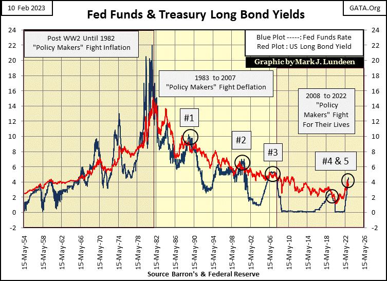
If there was one data-set I’d used to best describe post WWII “monetary policy”, and its consequences, it would be plotting the Fed Funds Rate with the yield for the US Treasury’s Long Bond. The predictive value of this data, for economic recessions and stock market crashes has been remarkable, and I suspect will continue to prove to be remarkable in the future.
Here is a little background on the T bond yield data. At times the long bond was a 20yr bond, and others a 30yr bond. In the long bond yield plot below, which weeks were from 20yr or 30yr bonds? I don’t believe that’s important. When I compiled this data, I kept it simple by going to the T-Bond tables, and got the yield for the longest bond published in Barron’s for that week, or better yet simply downloaded the long T-bond yield data from the Federal Reserve data archives. That was also true with my data for its Fed-Funds Rate data.
But to answer this question the best I can; the US Treasury’s longest bond was a 20yr bond until President Carter became president (1977 to 1980). President Clinton eliminated the 30yr bond early in his term of office (1993 to 2001). I recall the stated reason was to reduce long-term bond yields. Another example of manipulating bond yields lower. It did, as insurance companies now found 30yr T-bonds becoming ever rarer, and so the insurance industry bid up the prices of T-bonds with longer terms, which reduced their yields.
So, in the early 1990s once again the 20yr bond became the standard issue for the Treasury’s long bond. However, keep in mind for the next 10 years, former 30yr bond issued before Clinton became president continued trading, and were in fact the longest bonds in the T-bond market.
During the presidency of George W. Bush, once again the US Treasury routinely issued 30yr bonds, and has done so to this year.
The thing to note in the chart below is the blue Fed Funds Rate; those times it was above, or below the red T-bond yield.
Those times the blue Fed-Funds Rate were above the red T-bond yield, the FOMC made their “monetary policy” tight. This is also known as inverting the yield curve, the raising of short-term money rates above long-term bond yields. Tight money forces the Federal Reserve’s banking system to contract credit, pull bank loans back from business. And the higher the Fed-Funds Rate is above the yields for the long bond, the tighter the FOMC’s “monetary policy” is. Though the idiots at the FOMC may not say it this way; the purpose of tight money is to pop inflationary bubbles the FOMC previously created, as a means of managing the monetary inflation they create.
Those times the blue Fed Funds Rate were below the red T-bond yield, the FOMC made their “monetary policy” loose. Loose money encourages the Federal Reserve’s banking system to expand their credit, allowing business to expand, via bank loans, with additional “injections of dollars” into their balance sheets. And the lower the Fed-Funds Rate is below the yields for the long bond, the looser, or more inflationary the FOMC’s “monetary policy” is.
I have divided the history of FOMC “monetary policy” into three periods in the chart below, where the “policy makers” fight;
Inflation: 1954 to 1982,
Deflation: 1983 to 2007,
For their lives: 2008 to present.
The “policy makers” fought inflation from 1954 to 1982, because their “monetary policy” was one of inflation. They refused to limit the volume-of-dollars in circulation to the confines of gold held at the US Treasury, as per the Bretton Wood’s $35 gold peg.
By the time the US Treasury terminated the $35 gold peg in August 1971, the “policy makers” had issued $199 paper dollars for each ounce of US Treasury gold. A government can’t maintain a gold standard, if a government refuses to abide by the rules of a gold standard. Which in our case was only $35 paper dollars for every ounce of gold held by the US Treasury. As of right now, there are 8,763 paper dollars for every ounce of gold the Treasury claims to hold in its gold reserves.
These dollars-of-inflation; dollars in excess of the $35 gold peg from 1954 to 1982 were creating problems in the economy and financial system.
In 1957, a run on the US Treasury’s gold reserves began that didn’t end until the Treasury closed its gold window in August 1971. This closing of the gold window prevented foreign central banks from converting their paper US dollars into gold bullion held at the US Treasury,
These dollars-of-inflation were flowing into consumer prices. CPI inflation increased into the high teens by the late 1970s,
Bond yields and interest rates were rising into double digits (see chart below).
Paul Volcker, Fed Chairman (1979 to 1987), increased his Fed-Funds Rate far above the long bond yields, to pop the FOMCs’ bubble in consumer prices, as seen in the blue plot below. Note; post WWII monetary inflation from the Federal Reserve had driven all T-bond yields into double-digit percentages by the late 1970s, and stayed there for years. Don’t think that can’t happen again, because it can.
After several years of this historically tight “monetary policy”, Volcker did manage to pop this bubble in consumer price inflation. But these were hard years in the economy, with high unemployment and stagnant stock market valuations. Since 1966, the Dow Jones five times attempted to break above, and stay above 1,000, but failed. Valuations in the bond market had actually seen massive deflation!
That noted, we now move into the era where the “policy makers” fight deflation. One can tell exactly when this shift in “policy” happened; when T-bond yield peaked in October 1981, and began trending down. No longer were dollars-of-inflation flowing into consumer prices. From 1983 to 2007 inflation was flowing into financial asset valuations;
stocks,
bonds,
and real estate.
In this new era of “policy making”, where central bankers fought deflation, central bankers such as Alan Greenspan became heroes, because their bubbles in financial asset valuations were believed by the public to be bull markets, and truth be told, by most members of Congress. As monetary inflation flowed into Wall Street, fueling huge bull markets, the public began accepting perpetual rising asset valuations as normal market events, as they still do today.
However, these bubbles on Wall Street weren’t normal, and the FOMC knew it. They continued seeing the need to invert the yield curve to pop the bubbles they were inflating, as they talked nonsense about “soft landings in the economy.” But the big difference was, previous to 1982, bubbles in consumer prices were hated by the public, so the idiots felt free to raise their Fed-Funds Rate far above US long bond yields.
After 1982, the bubbles they inflated were in market valuations trading on Wall Street. Popping one of these bubbles resulted in a bear market for the public’s retirement accounts, or home valuations, and that got everyone’s attention! Note the post 1982 yield inversions above; #1-4. These inversions were far smaller than the yield inversions seen prior to 1982.
Also note, the times of easy money before and after 1982. After 1982, the “policy makers” made their “monetary policy” loose to a degree they never felt safe to do before 1982, as they fought deflation in market valuations trading on Wall Street. Evidence of this is best seen in the table on these eras I posted below.
The third and last era of “monetary policy”, where the “policy makers” fight for their lives began in 2007, at the peak in the sub-prime mortgage bubble. In the subsequent bear market in housing, Doctor Bernanke began his prescription of quantitative easings (QE #1-3). These QEs were a “policy response” of panic at the highest levels of “policy making”, and everything since changed.
I’m surprised I missed this, it’s a huge market event I haven’t written about until this week. But since the last week of November, the idiots had again inverted the yield curve, their fifth (#5 below) inversion since 1982.
If the past is prologue, the idiots’ fifth, post 1982 inversion of the yield curve will once again set off panic in the financial markets;
#1: October 1987 flash crash,
#2: NASDAQ High Tech bubble popped,
#3: Subprime Mortgage bubble popped,
#4: March 2020 Flash Crash
#5: ???
As post 1982 yield inversion have gone, the current one is creating very tight money in the financial system. Tighter money than the yield inversions which triggered the sub-prime mortgage crash (#3), or the March 2020 flash crash (#4).
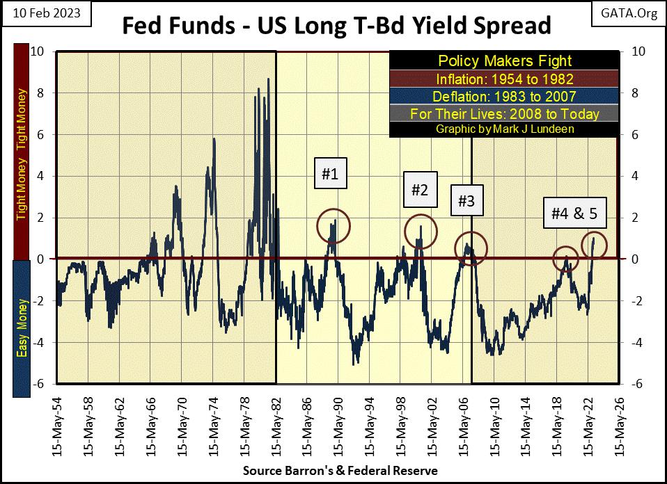
The table below looks complicated, but actually its very simple. It’s a weekly survey of how tight or loose “monetary policy” has been since 1954, by how many percentage points the Fed Funds Rate was above or below the long T-bond yield by the FOMC.
Positive Values = Tight Monetary Policy
Negative Values = Loose Monetary Policy
For example, in Table #1, Row 1, contains a 2. As the “policy makers” were fighting CPI inflation, for two weeks the Fed-Funds Rate was between 9.00% and 8.01% above the long T-bond yield. The next row down has an 8, as the “policy makers” for eight weeks raised their Fed-Funds Rate between 8.00% and 7.01% above the yield of the long T-bond yield.
After December 1982, the FOMC never again made their “monetary policy” that tight. The tightest “monetary policy” became in Table #2 was eleven weeks where the Fed-Funds Rate was between 2.00% and 1.01% above long T-bond yields. Quite a difference!
In Table #3, the FOMC had never tighten their “monetary policy” by more than 1% above the yield for the long T-bond. The fourteen in the 1.00 row are for the Fed-Funds Rate between 1.00% down to 0.01% above long T-bond yields. Then came Barron’s 30 January 2022 issue, where the idiots increased their Fed-Funds Rate 1.03% above the long bond yield. See the red circle in the table below.
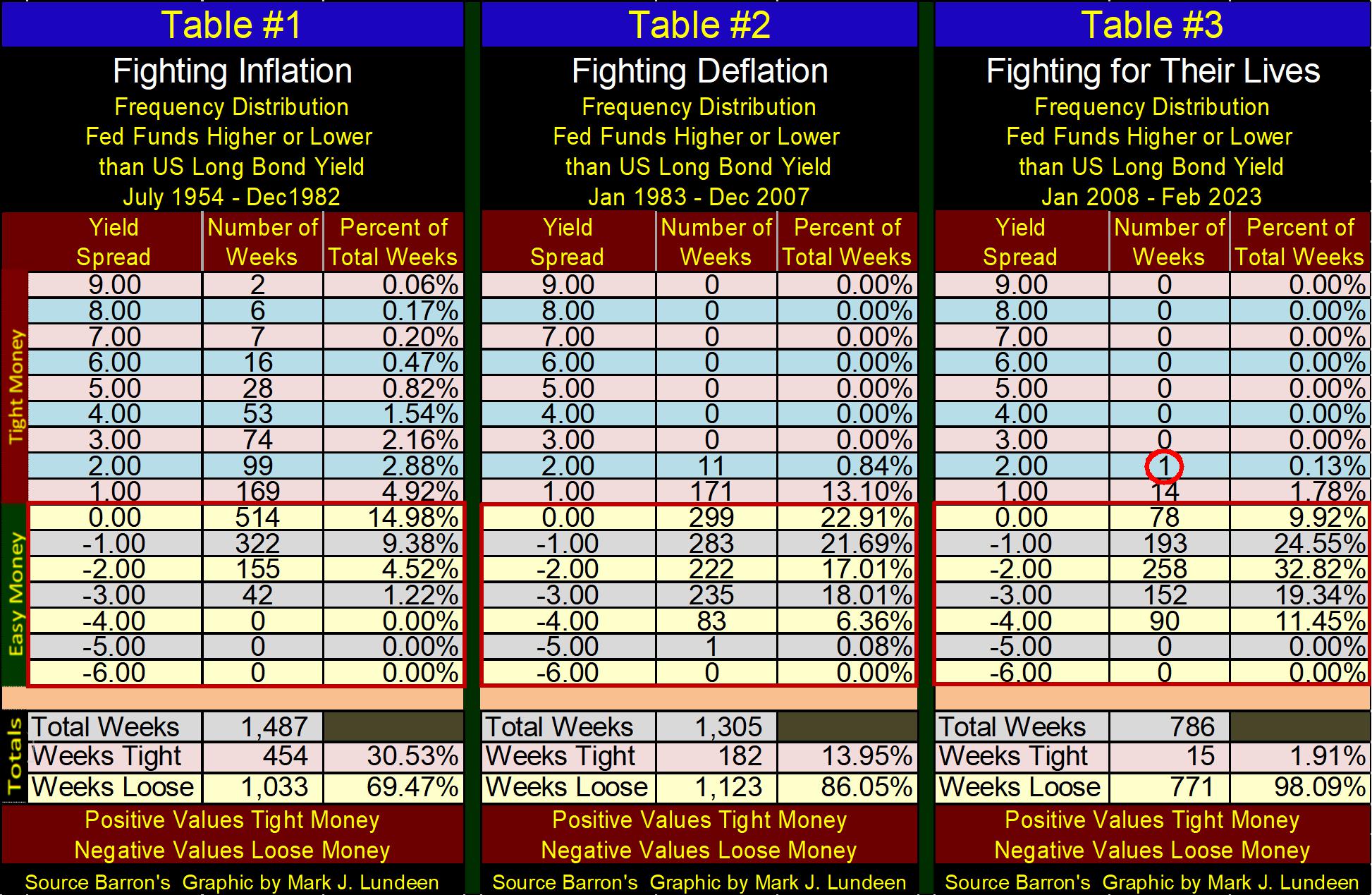
Go now to the bottom of these tables to the Total sections. How many weeks had the FOMC made money tight?
Table #1: 30.53%
Table #2: 13.95%
Table #3: 1.91%
Since the end of the (their) sub-prime mortgage crisis, the policy makers have been fearful of making their monetary policy tight. So, they stopped inverting the yield curve. Well, that’s not true. They inverted the yield curve for five weeks in August 2019, #4 in the chart above by a tiny 0.15% above the long bond yield during their first QT, and disaster struck in March 2020.
Now, since the last week of November, “monetary policy” is once again tight, #5 in the chart above, and we wait to see what comes from it.
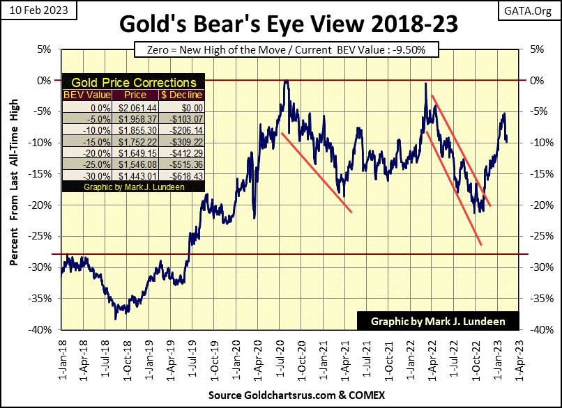
Gold in its BEV chart below is now correcting the September 2022 to January 2023 advance. Corrections within market advances, and also in market declines are only to be expected. But I know gold’s current decline was from the COMEX goons taking it down. No matter, I remain positive on my outlook for the gold market.
Now we see what gold does next; break below is BEV -15% line or break above its BEV -5% line. I really have no clue which will happen first, but should gold actually break below its BEV -20% line, I’ll still be positive on the entire precious metal market and the miners.
Moving down to gold’s step sum table below, it’s very overbought 15-count of +9 has been delt with in the past three weeks. If the bulls want to take gold higher, they’ll find gold has seen a nice correction and is no longer very overbought. But are the bulls in the gold market up to the task? We’ll see about that next week.
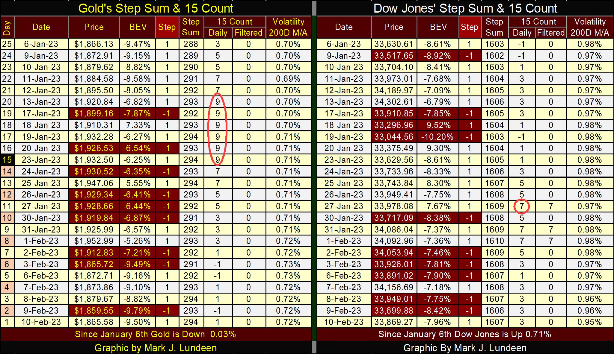
The Dow Jones too became overbought, with three 15-counts of +7 in late January. As expected, it sold off in early February, but not by much. The tables above aren’t really all that helpful in guiding my opinions for what is to come in the weeks ahead of us. Well, that’s usually the case for market prognosticators.
One market trend for both gold and the Dow Jones that is positive is their daily volatility’s 200D M/A. Gold’s daily volatility is trending upwards, that is a positive as gold-bull markets are volatile markets. While daily volatility for the Dow Jones is trending down, and is now below the critical 1.00% line. That’s a positive as bull markets in the Dow Jones are always low volatility markets. But with the idiots inverting the yield curve for the fifth time since 1982, we’ll see how long this will last.
Mark J. Lundeen
********


