Gold’s Step Sum Gives Strong Buy Signal


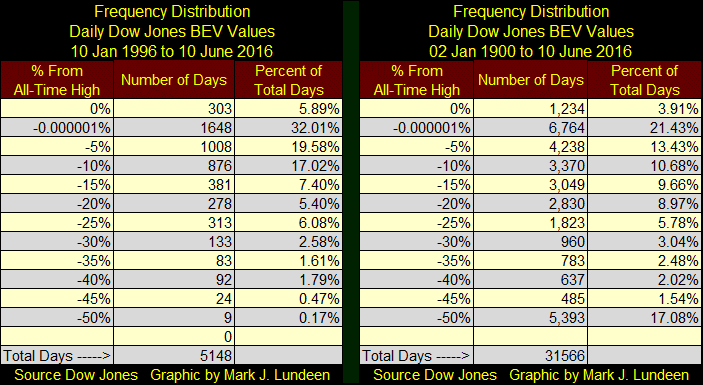
I haven’t published this Bear’s Eye View (BEV) chart for the Dow Jones since last February. Therefore, it’s time for a review. Here’s the frequency distribution for the below BEV series (left table) with a frequency distribution of the same data going back to 02 January 1900 (right table) for a historical comparison. Since 10 January 1996, the Dow Jones Index found itself closing the day at a new all-time high (BEV 0%) 303 times…with the last one occurring on 19 May 2015. That’s about one new all-time high for every twenty daily closings in the last twenty years. Amazingly, the Dow Jones has also closed within 5% of a new all-time high (-0.000001%) 1,648 days (32.01% of the 5,148 daily closings) in the past 20 years. We shouldn’t be surprised the Dow Jones has so frequently found itself in rarefied heights when our central bank has had Fed Chairmen (and Women) who see the financial markets as their arena to execute “monetary policy.”
Remember, the BEV plot looks at the market just as Mr Bear does; each new all-time high is a big fat zero to him, as he’s only interested in how much of a percentage he can claw back from the bulls. And that is precisely what we see below. Since January 1996, every day the Dow Jones made a new all-time high, the BEV plot increased to the Red 0% Line, but never higher. Each day the Dow Jones failed to make a new all-time high; the daily BEV value is expressed as a percentage decline from its previous all-time high. So, we’re looking at new all-time highs and the percentage declines from all-time highs. This is an excellent visual display for what the stock market has been through for the past twenty years: lots of new all-time highs fueled by “liquidity injections” from the Federal Reserve with progressively deeper bear markets as a market reaction to the Fed’s inflationary stimulus.
From the bulls’ point of view, this chart should be a bit disturbing. The last BEV Zero (all-time high) for the Dow Jones was on 19 May 2015, over a year ago. Since 1996 there hasn’t been a similar period of time where the Dow Jones went for over a year without a new all-time high, unless the stock market was actually in major bear market; the Tech Wreck and Sub-Prime Mortgage bear markets. Twice in the past year (August and January) the Dow Jones saw double-digit declines, and both times the market’s recovery was widely admitted to be from “policy actions” taken by the Yellen FOMC.
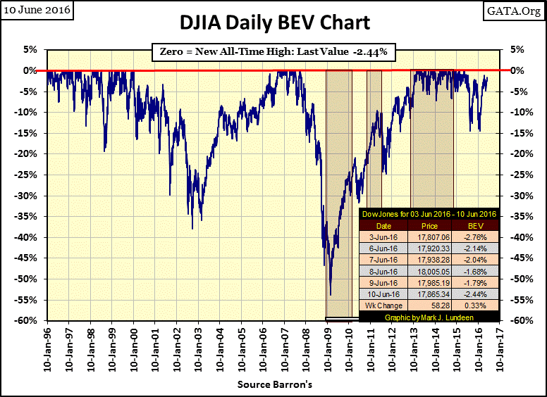
The Dow Jones closed the week only 2.44% away from making a new all-time high. But where would the Dow be today if last August or January, the FOMC had stayed its hand and allowed the market to find its own bottom? Personally, I expect it would have quickly fallen to or below the lows it made in March 2009, but the bulls would disagree, and so far they have been correct. But for most of the stock market bulls in June 2016, being correct isn’t the same as making money.
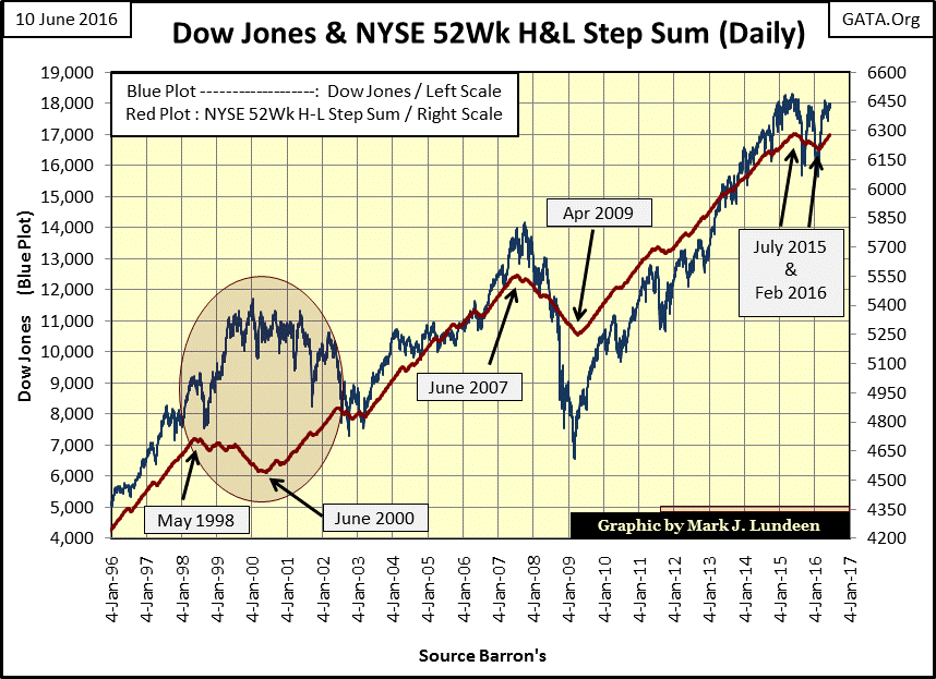
Next, I have the Dow Jones plotted with a step sum of the NYSE 52Wk High – Low Ratio. Every day the NYSE sees more 52Wk Highs than 52Wk Lows, it’s a +1. Days with more 52Wk Lows than 52Wk Highs produce a -1, and the step sum is just an Advance Decline Line using the daily steps of the NYSE 52Wk High – Low Ratio.
Inside the Red Egg we see what happened at the end of the High-Tech bubble and the following Tech-Wreck Bear Market. The Dow Jones and the high tech issues may have peaked in early 2000, but most of the stocks at the NYSE, and the different groups in the Dow Jones Total Market Groups actually peaked in 1998, beginning their bear market two years earlier. So, we see the NYSE 52Wk H-L Ratio step sum beginning its decline in May 1998.
The Dow Jones and the high-tech issues saw their bear markets span from 2000 to 2002, but as you can see with the NYSE 52Wk H-L Ratio’s step sum, most of the issues trading at the NYSE that weren’t high-tech companies, began their recovery beginning in June 2000. But then, as now, “market experts” seem only to be interested in what was happening in Silicon Valley.
Since 2003, the NYSE 52Wk H-L Ratio’s step sum has resynchronized with the Dow Jones, which is how it should be in a bull and bear market. The Ratio’s step sum began turning down last July, and didn’t reverse upwards again until February. The question this chart begs to be asked is: can the NYSE 52Wk H-L Ratio continue seeing more 52Wk Highs than Lows without the Dow Jones following its lead? I’d say no.
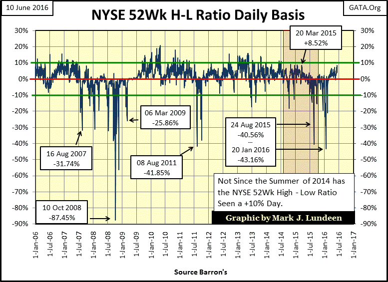
Here’s the chart for the NYSE 52Wk H-L Ratio, and the recovery from its January 2016 low of -43.16% has been rather tame. Meaning that yes, since February, 52Wk Highs have dominated the NYSE, but not in the quantity a strong market would see. The last time the Ratio was over +10% was two years ago; that tells me except for the glamor stocks that have caught everyone’s fancy, this is a weak market. Unless something changes that would drive more NYSE listings to new 52Wk Highs, taking the Dow Jones up with them (QE-4?), I’d say the market is near a top, making this a prime time for taking profits, or cutting one’s losses if that is the case.
So should people hold on or exit the stock market? It all depends on how they view the effectiveness of the “stabilizing efforts” by the Federal Reserve. Here’s a Janet Yellen lampoon I borrowed from David Stockman’s blog, titled: Great Leader Janet Gives Us a Happy Life. It must be nice believing the Great Helmswoman of “policy” has everything well in hand. For myself, I’m out of the stock market, except for the precious metals miners.

Gold and its step sum are flashing a strong buy signal. After seeing a bull box fail, we should have seen gold’s price and step sum trends continue trending down. Instead, the gold market is acting as if the bull box closed normally, with the price and step sum trends reversing to the upside with some enthusiasm. What a great chart, and I expect much more advances in these trends coming in the weeks and months ahead of us!
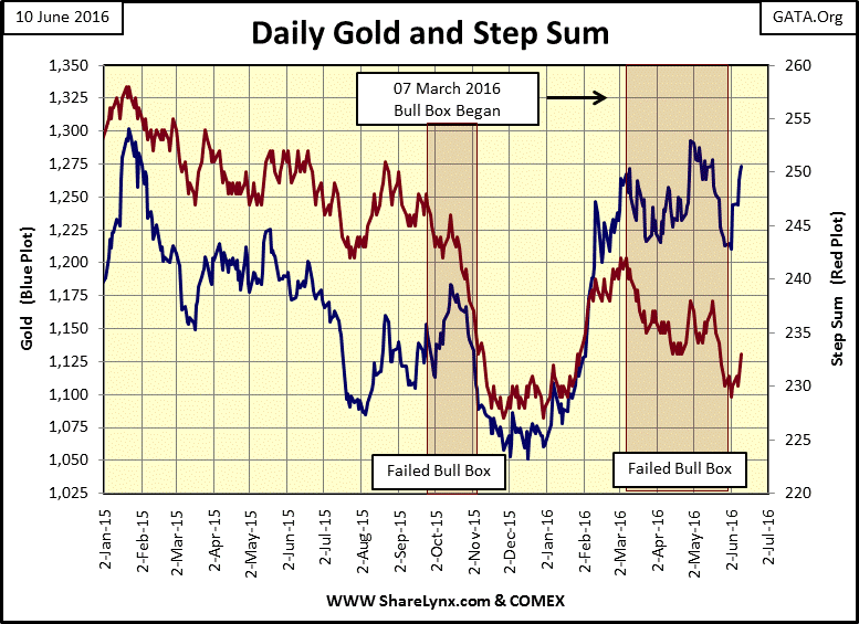
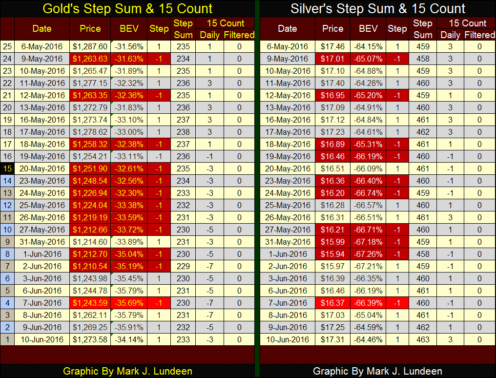
Moving on to gold and silver’s step sum and 15 count table; the change in market sentiment is very evident. Since last Friday (June 3rd) there has been only one down day for the old monetary metals (June 7th), and the bears only got $1.19 on the decline in gold and $0.09 for silver, while the advancing days saw solid gains. If this continues, gold’s 15 count will become positive in the next five to seven trading days, as the bears lose their grip on the precious metals market. I note that silver’s step sum closed the week at 463, at a twenty-five day high, while gold at 233 is still below its May 17th high of 238. Looking at gold’s step sum above (Red Plot) that should change in the weeks to come.
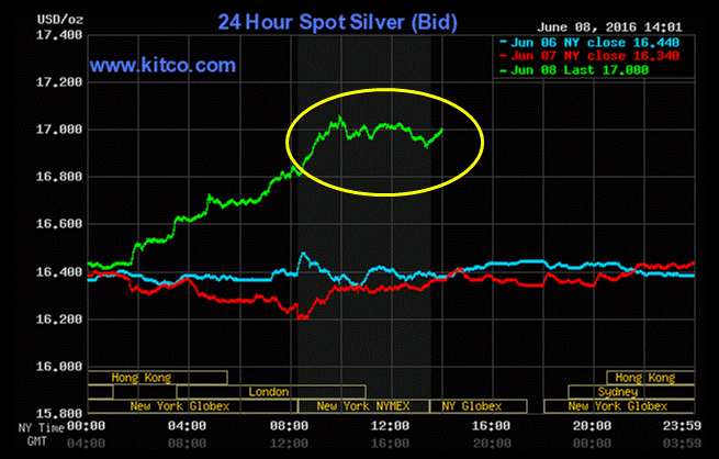
For investors in gold and silver, the past few weeks have been a refreshing change. However the “policy makers” have yet to call it quits in capping the advances in the old monetary metals. This chart from Kitco tells the tale; on June 8th silver sees a nice $0.60 gain from midnight to the first two hours of COMEX trading, then the price advance hits a ceiling. If this was only for June 8th it wouldn’t be a big deal. However, for everyone who daily has checked Kitco for gold and silver prices knows, when the gold and silver bulls are charging boldly upward, this is how 99% of the big daily advances have ended for the last two decades: capped.
For the “policy makers”, such capping activities have had their desired effects. Looking at silver’s days of extreme market volatility, or 5% days, since December 2000 (chart below) there have been only 119 days where the price of silver has moved 5% or more. And since the beginning of silver’s bull market in 2001, with the exception of the 2008-09 credit crisis, those advances rarely exceed 6%. For daily declines of 5%, or more, it’s a different story.
Silver hasn’t seen an extreme day of market volatility since January 2015, when it saw both a negative and positive extreme day. Looking at Kitco silver’s chart above, silver saw a +4% day on June 8th. Had the “policy makers” not capped silver’s advance seen in the chart, I expect silver would have seen a positive 5% or 6% day.
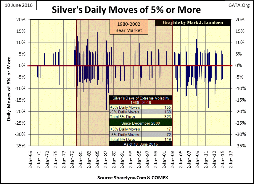
Next is the chart plotting gold’s extreme days of volatility. Note I’ve given extreme days for gold a threshold of 3%, as the daily moves for it are smaller than those we see in the silver market. Note how from 1969-70, gold saw frequent 3% days, while silver saw few 5% days. While both gold and silver are both precious metals, and by nature are countercyclical to the financial markets, the two metals are not the same.
The old monetary metals, unlike the Dow Jones Index with its days of extreme volatility (2% days) see extreme days during both bull and bear markets, where as for the Dow Jones, its 2% days occur almost exclusive during significant market declines.
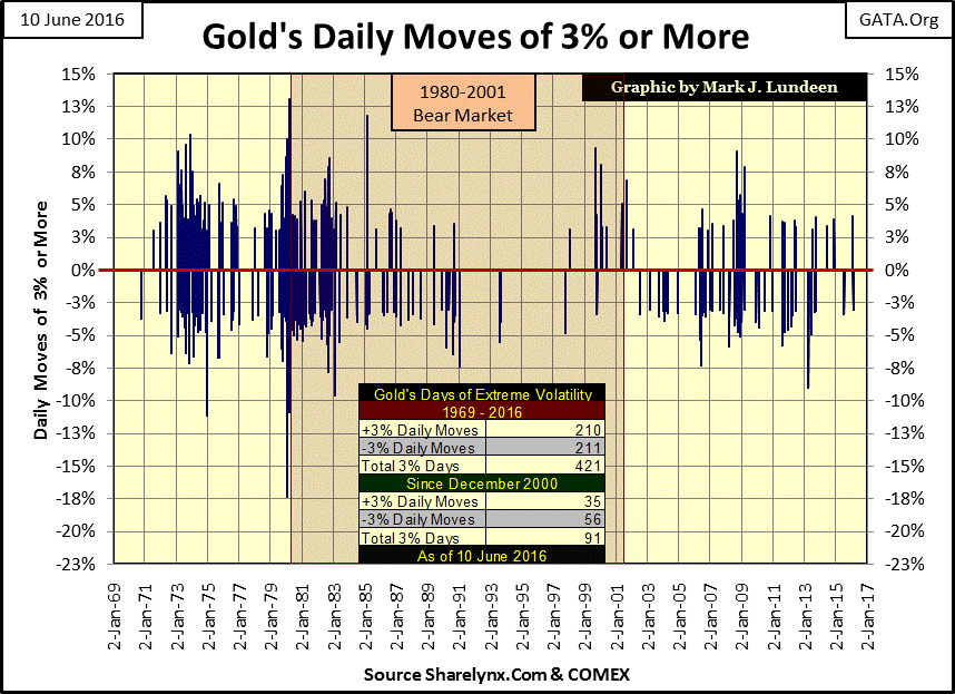
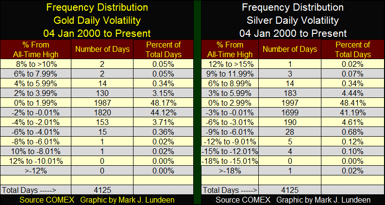
Using the daily moves in gold and silver seen in the charts above, I’ve created their frequency distribution tables below, but only from January 2000 to the present. It’s good knowing the majority of daily moves for gold are within +/-2% of UNCH and +/- 3% for silver. However, as the data shows, there are days where the price of gold and silver have moved well outside that range.
As I noted above, the Dow Jones mostly sees its days of extreme volatility during market declines. In fact for the stock market, bull markets are almost free of Dow Jones 2% days while in bear markets they’re a regular feature. But, as is evident in the charts above, gold and silver can see their days of extreme volatility during both bull and bear markets. Typically, their extreme days (both positive and negative) concentrate during periods when euphoria or despair dominates the gold and silver markets. Looking at the data, I anticipate that in the coming months, as the bears lose the control of the precious metals markets, we’ll see some outsize daily percentage moves (positive and negative) in both gold and silver as their bull markets resume in earnest.
I’d like to see a +10% daily move in gold, or a +15% move for silver. But as is evident in the charts above, when the precious metals are seeing frequent extreme days of volatility, they come in both positive and negative flavors. So don’t be disheartened should a -10% day follow shortly after a big up day. Since 1969, that’s just something that happens in bull, and bear markets for gold and silver.
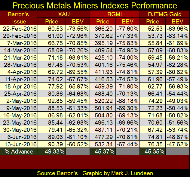
The gold mining stocks continue advancing. At their close of the week they were at their highs of 2016. However, the gains posted at the bottom of the table understate their actual gains since their five year lows seen in Barron’s 25 January 2016 issue. Last January the lows for the indexes were as follows:
-
XAU: 40.92
-
BGMI: 245.05
-
DJTMG Gold: 34.70
That would make their 2016 bull market gains at the close of the week as follows:
-
XAU: 120.00%
-
BGMI: 117.23%
-
DJTMG Gold: 120.00%
I have some bragging rights when it comes to the Barron’s Gold Mining Index, as I’m the guy who resurrected the BGMI from its grave in college libraries from the old issues of Barron’s stored in rolls of microfilm. I personally spent years compiling data from dusty old issues of Barron’s. Understandably, my reintroducing the BGMI to the public domain is something I’m proud of.
Burt Coons has done a marvelous job analyzing the BGMI from 1939 to the present, and he’s expecting the gold miners to go much higher from even their current elevated levels, and I agree with him.
Gold Stocks Ultimate Objective in a World of Monetary Transition
Just make sure your portfolio includes a good portion of actual gold and silver bullion. For most retail investors, equal dollar investments in gold and silver bullion and the miners seems the thing to do. I also recommend a small speculative exposure to gold and silver exploration shares. As my readers know, I like Eskay Mining.
The idea of the very politically incorrect Donald Trump becoming the next president is driving most people in the media and politics into a state of dementia. I understand the venom “conservative Republicans” have for Trump. Like Newt Gingrich in the mid-1990s, who received the same treatment from the “conservatives”, Trump is someone who actually wants to change the way things are done in Washington. But the danger Trump poses to Washington’s establishment, is much greater than that posed by Gingrich.
To understand why, it’s helpful seeing Washington for what it actually is; the drain into which all too much the nation’s wealth (trillions of dollars) flows into annually. It’s the establishment of both political parties that decides where the money comes from, and more importantly, WHO IT GOES TO. The former mayor of Pittsburgh; Joe Barr, explains the political process below.
“When you hold political power, you have control over so much money and so many jobs. You have to know and understand who ought to get the money, and who gets the jobs. If you can figure that out, you can succeed in politics. “It has been true since about forever. Back in the days of ancient Egypt, what do you think Pharaoh spent most of his time doing? I'll bet that every night, Pharaoh and his chamberlains sat around at some table in the great hall, looking over the contracts they were letting out to build the Pyramids. Who gets the contract for limestone? Who builds the barges to haul the granite from Aswan? Who supplies the bread for the workers? It's all about who gets the money and who gets the jobs. Think of ancient Rome and the Caesars, building roads and monuments. Think of China and her Emperors, building the dikes and the Great Wall. It hasn't changed in thousands of years.” - Joe Barr, former Mayor of Pittsburgh (1959-1969).
This is the way it is! To believe anyone in Washington or the media actually gives a sweet rat’s petutti about some gaff Mr. Trump spoke in public, rather their fear of what his presidency poses to the establishment is the cause of their dementia is to admit one’s political naivety.
And it’s an embarrassing situation Washington’s current establishment now finds itself in; their inability to properly account for the funds coming in, or going out for decades, a situation Congress’s IRS would never allow leeway for a large corporation. The only thing that could be more embarrassing would be having the finances of Washington DC properly accounted for all to see.
So it’s all about the big-honey pot on the Potomac River. The abject fear our leaders have is that Trump, someone who easily has the business contacts to fill most of the key positions in the US Treasury (and Justice Department), people who would be loyal to him, and not to the establishment, would begin demanding answers to embarrassing questions.
What happens if President Trump and his Treasury Secretary decided to audit America’s gold reserves? They haven’t had a proper audit since the Eisenhower administration. No wonder key “conservatives” have gone public that they would favor Hillary for president. There’s a reason the Republican Leadership haven’t pushed for the Justice Department to further their investigation on her E-Mails and financial connections to the Clinton Foundation. It’s Trump that’s a danger to them, not Hillary.
These rat-bastards no doubt plan to engineer the market crash should Trump become president, in a pin the tail on the donkey fashion. But don’t expect Trump to be a stooge for this gang of reprobates. The Donald, in control of the Justice Department, will come right back at them; tooth and fang. With Congress’ and the media’s favorability polling in the low single digits, it’s a war Trump can win.
Mark J. Lundeen


