Gold’s Tea-Cup With A Handle Continues


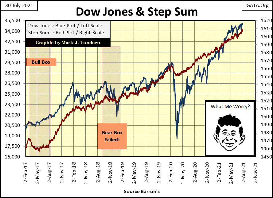
The Dow Jones saw a new BEV Zero (new all-time high) on Monday this week, then closed within 0.64% of that in the following four days. From the perspective of the Dow Jones Bear’s Eye View chart below, that’s about it. But then, a BEV chart only displays new all-time highs as 0.00%, and daily closings not an all-time high as percentage clawbacks by Mr. Bear. At times such as these, where for the past eight months the Dow Jones has been making a series of new all-time highs, yet never deflating more than 5% from any of them, a BEV chart becomes tedious.
Since the Dow Jones began making new all-time highs last November (after its -37% flash-crash of March 2020 seen below), it has seen a series of BEV Zeros, with #35 on Monday this week. It’s noticeable how since last November, the Dow Jones has never been allowed to deflate below its BEV -5% line. I say “allowed” as I believe valuations for the Dow Jones are managed by the “policymakers” at the FOMC.
What’s so important about the Dow Jones BEV -5% line in the BEV chart below? I haven’t a clue, except maybe someone is worried that should the Dow Jones deflate below its BEV -5% line, what would come next? Possibly the FOMC fears they would have to implement their Not QE #5?
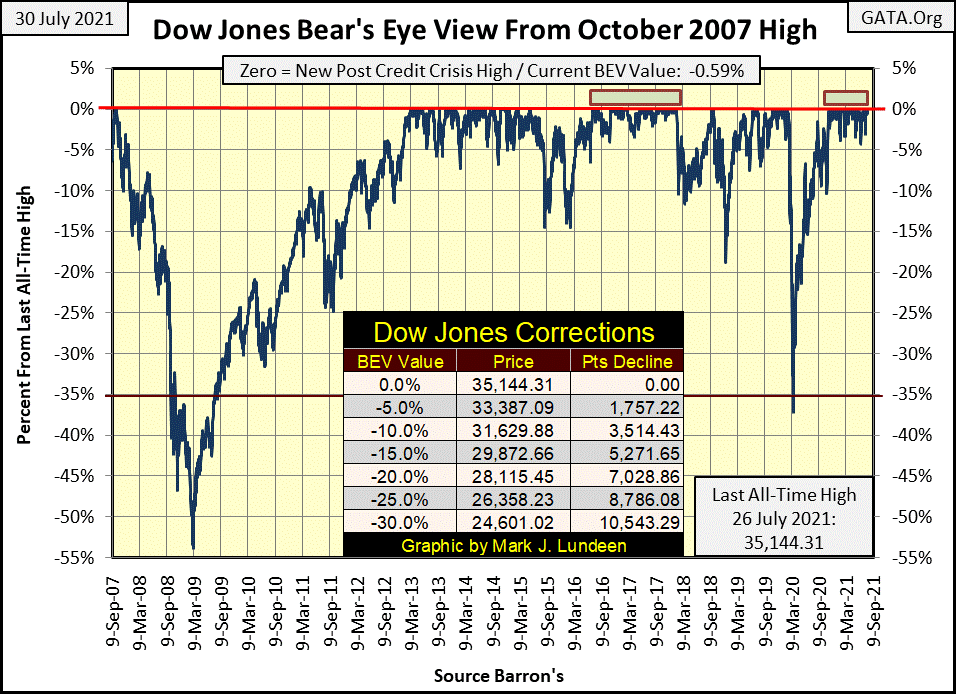
Like I said before, BEV charts are weak at displaying the drama of an advancing market, one seeing a sequence of new all-time highs, as is happening now. After all, this is the Bear’s Eye View; or how Mr. Bear sees the Dow Jones advancing. And for him, this is a dreary market. So, let’s take a look at the Dow Jones in daily bars below.
This week I’ve studied this chart; it didn’t fail to provide some insight into the stock market. Beginning last January, the Dow Jones crossed its 31K level (31,000), and then corrected something less than 5%, as per the BEV chart above.
The same happened in February, with the Dow Jones’ 32K level; again the Dow Jones corrected something less than 5%. March saw the Dow Jones advance up to its 33K level, April its 34K level and then May with the Dow Jones 35K level, all-seeing something less than a 5% correction after the crossing.
But since early May, the Dow Jones has been stymied at its 35,000 level. Today was the last trading day for July, and the Dow Jones closed sixty-five points BELOW 35,000. After three months of attempting to break above 35,000, the Dow Jones failed to stay above 35,000.
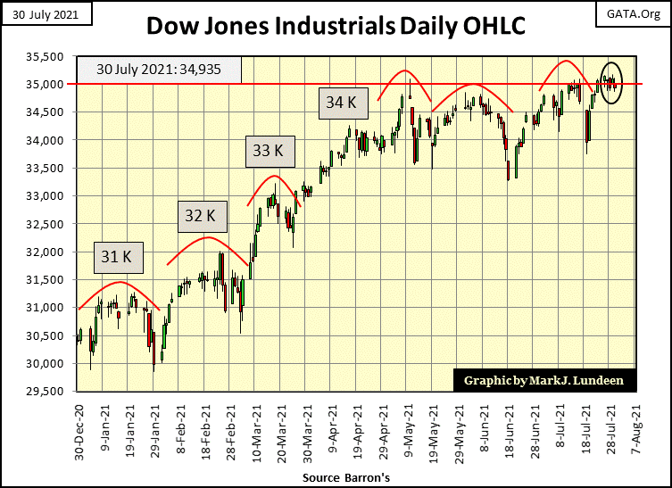
What’s going on here? Obviously, since May something has changed in the market when the Dow Jones first crossed, if not closed above its 35,000 line. Still, I’m going to assume the path of least resistance for the Dow Jones remains up. I’ll continue believing that until the market once again begins seeing a series of days of extreme volatility (Dow Jones 2% days) and market breadth (NYSE 70% A-D days). Until then, I believe the post-March 23rd, 2020 advance will continue.
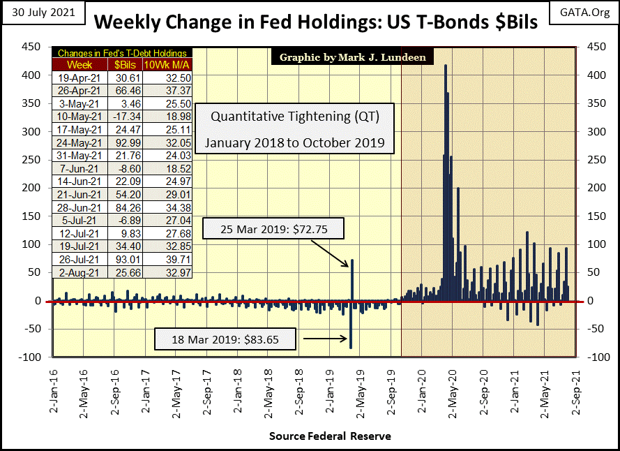
Of course, the Dow Jones isn’t advancing all by itself. This week the FOMC “injected” another $25.66 billion into the financial system. That’s not even newsworthy. But it should be.
Charts, like this one below plotting the weekly “injections of liquidity” by the FOMC, are graphics investors will never see from the mainstream financial media. Too bad, as the one chart I publish that people would want to see, it is the chart below, as it provides so much background to the market’s current situation and future problems. Since the Idiot Savants terminated their Quantitative Tightening (QT) in October 2019, they’re having increasing difficulty maintaining their valuation regime in the market.
Moving on to the BEV values for the major market indexes below, Monday saw eight BEV Zeros. On Thursday the market saw two more. Friday closed with no new BEV Zeros, but thirteen of the indexes closed in scoring position, or less than 5% away from making a new all-time high. Next week is set up for good things to happen in the marketplace.
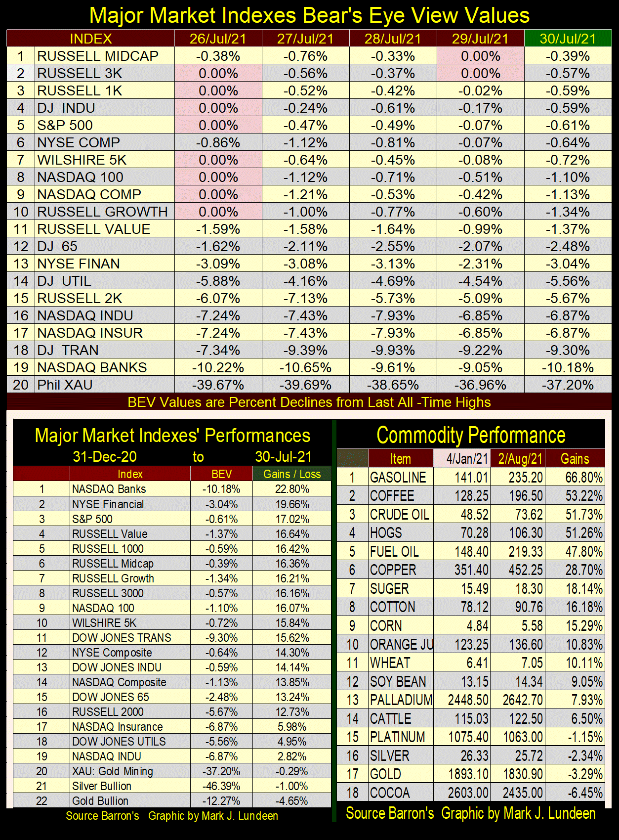
BUT – things look a bit different when we look at the tables above. So far this year, sixteen indexes (left table) have advanced by 10% or more, with the NASDAQ Banks (#1) advancing 22.8%. The problem I see the financial markets are going to have is key commodity prices (right table), for example, energy and others have gone up by multiples of these gains.
At some point, rising commodity prices are going to impact the debt market, as bond buyers begin demanding an inflation premium. This is exactly what they did beginning in the 1950s, until October 1981 in the chart below. Having bond yields increase from 4% up to 14% didn’t just happen; they happened because CPI inflation increased from single digits to double-digit percentages during this period of market history. So, from the 1950s to 1981 in the chart below, we’re seeing the bond market’s reaction to increasing consumer prices, and it will happen again.
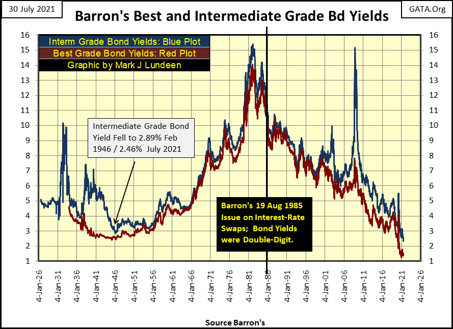
I remember this period of market history very well. A remarkable fact of these three decades was these double-digit bond yields didn’t result in waves of corporate bankruptcy on Wall Street. That was because corporations, individuals, and yes even the government’s balance sheets were like battleships, as society as a whole desired to be thrifty, shunning consumptive debt. Memories of the Depressing 1930s, the catastrophe of excessive debt burdens from the “buy now, pay later” 1920s were still alive in corporate management and households. No one who lived through that wanted to go through that again!
If one is a creditor, on the receiving side of debt, one likes double-digit yields. And decades ago, most people and companies whose shares traded on Wall Street were creditors who benefitted from double-digit rates and yields.
But today, corporations, individuals, and especially governments are degenerative debtors, loaded down with ill-conceived debts that people prior to 1981 would have refused to have taken on. Who pays cash for a car anymore? Lots of people did before the 1980s. People also used to save money to purchase home appliances and Christmas presents too. Credit cards weren’t even available to the public before October 1981. People paid cash because that is what people did, because banks back then were for depositing money, not for offering credit cards.
Mortgages in 2021 are back to the no-money-down type seen during the 2001-07 sub-prime mortgage fiasco. When mortgage rates were double-digit in the early 1980s, don’t bother to ask a mortgage broker for an appointment unless you had the mandatory 10% down payment. That was then, but not anymore.
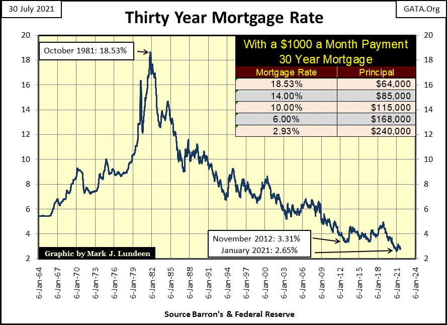
The one thing the FOMC supplies to the world at large is debt. Creating debt is the only thing the FOMC does, and they are very good at it. They’ve been so successful that today, should rates and bond yields rise up to where they were before the sub-prime mortgage fiasco (greater than 5%), before the FOMC implemented their QE #1-3, and their current Not QE #4, it will be very, very bad. Because the debt assumed since 2007, for corporations, governments and individuals can no longer be serviced at more than 5%.
It’s the same for real estate. Mortgage rates before January 2009 were over 5%. But with the FOMC’s QEs, mortgage rates soon fell far below that. A return to precrisis mortgage rates, something over 5% would crash the real estate market by 30%, possibly more.
The table in the chart below shows the principle a monthly $1,000 mortgage payment could service at various rates. It describes how the bull market in real estate happened following peak rates in 1981. It also describes how a bear market in real estate will happen should mortgage rates once again begin to rise.
My technical analyses of the markets for the most part is different. I’ve studied books on technical analyses when a thought occurred to me; that others have also read these same books. What good could come to me by doing exactly the same technical work that others, including professional traders, were using? Mimicking everybody else could leave me a day late and more than a few dollars short in the markets, so I made an effort to invent my own tools in analyzing the market.
One was the step sum; a single item A-D line of a market series, such as the Dow Jones or gold. On days the market series advances, it’s a +1. On days the market series declines it’s a -1. The step sum is simply the summation plot of all the daily advancing and declining steps. In bull markets, it advances with the market series, but not always. In bear markets, it declines with the market series, but not always.
Looking at the Dow Jones and its step sum during the Great Depression Crash is very interesting. The price of the Dow Jones (Blue Plot) and its step sum (Red Plot) usually trended with each other – but not always, as seen below. So, what happened inside the bear box?
It seemed pretty obvious, following the -47.87% market crash of November 13th, 1929, the bulls believed the worse was over and came back into the market in a big way. And they were right to do so, but it was only a dead-cat bounce. Then came April 1930, and the dead cat stopped bouncing. The Dow Jones then began its 90% descent into market history. It was at this point the Dow Jones’ price and step sum plots decoupled, marking the start of the bear box.
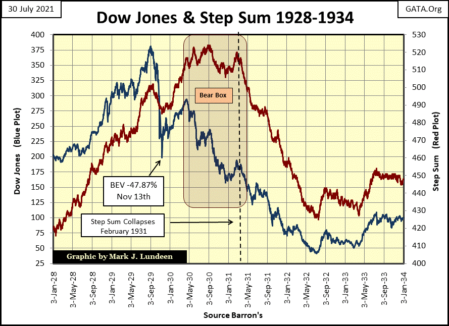
The first thing to note about the step-sum bear box above is the bearish-price plot of the market series proved a more reliable predictor of the future than did the bullish-step sum plot. Think of the blue price plot as Market Reality, and the red step sum plot as a market-sentiment indicator. From April 1930 to February 1931, the market reality (Blue Plot) was bleak, but market sentiment (Red Plot) refused to believe it; the bulls kept buying ever-greater bargains, waiting for a bottom that never came.
Inside the bear box, the bulls saw daily declines as buying opportunities, so they came back the following day to buy what they believed to be bargains. And so it went, until February 1931, when the bulls finally accepted they were sinking in quicksand.
This is the point when the bear box was closed, the point where the Dow Jones’ step sum plot, after a delay of ten months, finally recoupled with its price plot. From this point on, bulls became former bulls, who no longer bought on weakness, but began selling their money-losing positions on market strength.
A nice feature seen in the above bear box above is it provided an unambiguous buy signal. The July 1932 bottom was confirmed when both the Dow Jones’ price and step sum plots reversed vigorously to the upside. This reversal in the plots indicates the ill-fated bulls of the 1920s had finally exited the market, taking heavy losses as they did. For the new bulls of the 1930s, having bought near the market’s bottom, they weren’t so anxious to sell, unless they could do so at a profit. And so, a new bull market began.
Gold since 1969 has seen two significant bear boxes. The first was from 1987 to 1995. I can understand why the bulls remained stubborn for these eight years; the price of gold had deflated by 65% in 1985. How much worse could it get?
The thing about bull and bear markets, it’s not just a question of valuation, but one of duration too. In 1985, gold’s bear market still had another fifteen years to go, as inflation flowing from the Federal Reserve was flowing into the stock market, especially into the NASDAQ high-tech issues. In retrospect, it’s easy seeing in the chart below that a new precious metals bull market would have to wait until the bubble in the NASDAQ popped in early 2000, which is exactly what happened.
But from 1987 to 1995 (in the bear box below) gold bulls refused to see it that way, as seen by the refusal of gold’s step sum plot to recouple with its price plot inside the bear box. When gold’s step sum plot did begin recoupling with its price plot later in 1995, it continued collapsing for the next six years.
But, the price of gold bottomed in summer 1999, only four years later. For the next two years, the gold market was dominated by selling, more down days than advances, as seen in the still collapsing step sum. Trying with all their might, the bears failed to drive gold down below its BEV -70% line ($250); the bottom of a twenty-year bear market in gold and silver was in. In early 2001, both gold’s price and step sum plots reversed to the upside, signaling the beginning of our current bull market in gold.
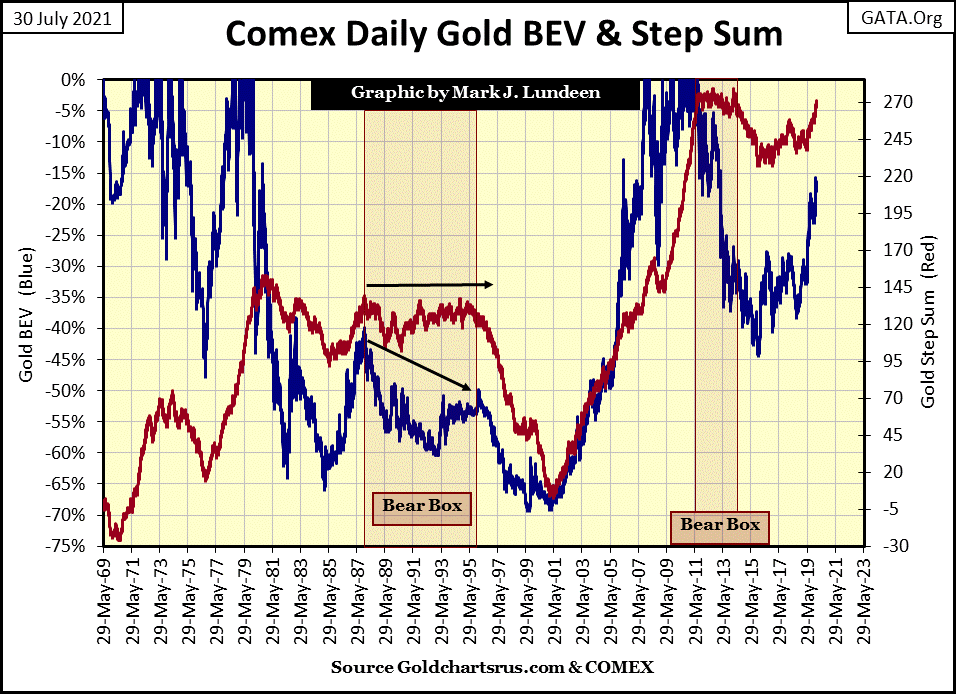
Gold’s second bear box began ten years later in 2011, as seen in the chart above. But a better view of it is provided below. I remain a work in progress, so forgive me if I’m having second thoughts about whether gold’s bear box below began in August 2011, or January 2013. I’ll let my readers decide which is best for them. In any case, gold’s price and step sum plots were decoupled by the spring of 2013, indicating the gold bulls continued bargain buying long into a massive decline in the price of gold.
With the recoupling of the red step sum plot to the blue price plot in March 2014, the gold bulls began exiting their losing positions. In October 2015, gold’s set sum plot just collapsed, straight down as market sentiment became bleak and bottomed, with the price of gold in December 2015.
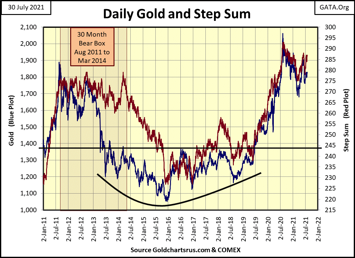
This was a very hard bottom. The bulls were battered and bruised. Still, the bears failed to force gold down below $1,000. And once again, as both gold’s price and step sum plot reversed, and advanced once again, a safe re-entry point back into the market was flashed to anyone who was watching.
Looking at gold’s BEV chart below, at the close of July we still don’t know which of gold’s BEV levels it will cross next; the BEV -15% or -10% line? I’m an optimist. I’m thinking the bottom is in for gold’s current correction, and we’ll next see gold rise above its BEV -10% line.
Look at the BEV Zeros for 22 August 2011 ($1,888) and for last August ($2,061), and what lies between them; a massive nine-year bottoming formation. After all that, gold so far has exceeded the high of August 2011 by only $173 at its highs of last August, but still closed this week at $1813, seventy-five dollars below its highs of ten years ago.
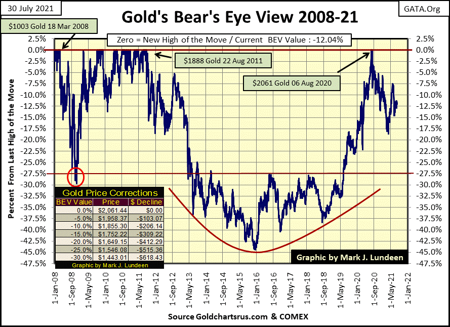
Like me, the chart pattern above remains a work in progress, something Jim Sinclair once described as a tea-cup with a handle; a powerfully bullish chart pattern. I would think this is especially so since it’s taken ten years for it to form as we now see it above. Mr. Sinclair knows his stuff when it comes to the gold market. I’m expecting big things to follow when gold finally, and decisively breaks above last August’s BEV Zero ($2,061).
But it’s not only the technical chart patterns seen in the chart above that lead me to expect big things to come in the gold and silver markets. Look at all the monetary inflation the FOMC has “injected” into the economy in the past ten years (table below).
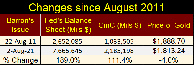
After all this “liquidity” being “injected” into the economy since August 2011, gold’s ten-year return at the close of this week is a pathetic -4.0%? As we’d say in the Navy when confronted with stunning absurdity: Whiskey Tango Foxtrot!
The above substandard performance in the price of gold, silver too in the face of a tsunami monetary inflation isn’t going to continue forever. A day is coming when the decades malfeasance; which is “monetary policy”, has inflicted on the dollar by the “policymakers” will finally be consequential.
When that day comes, gold and silver are going to be trading for more dollars than people today can believe is possible. Maybe the day is coming when someone with an ounce of gold or silver will refuse to trade it for dollars, no matter how many millions are offered.
This has happened before in history. Twice in 18th century France, paper money became worthless. Ditto for Germany in the 20th century. With the idiot savants we now have managing “policy” at the FOMC, don’t think it can’t happen to the US dollar in the 21st century.
I’ve covered gold’s step sum chart above, so let’s move on to the Dow Jones below. Nothing has changed from last week, so let’s skip this too and move on to the step sum tables below.
Good stuff is to be seen on gold’s side of the table. Gold’s 15 count has worked off its overbought +7 from last week, closing this week at a very reasonable +3, while remaining above $1800.
Gold’s daily volatility’s 200-day moving average remains low, which for gold is not a favorable factor for us bulls. Expect to see some excitement when volatility for gold seen below increases to something over 1%.
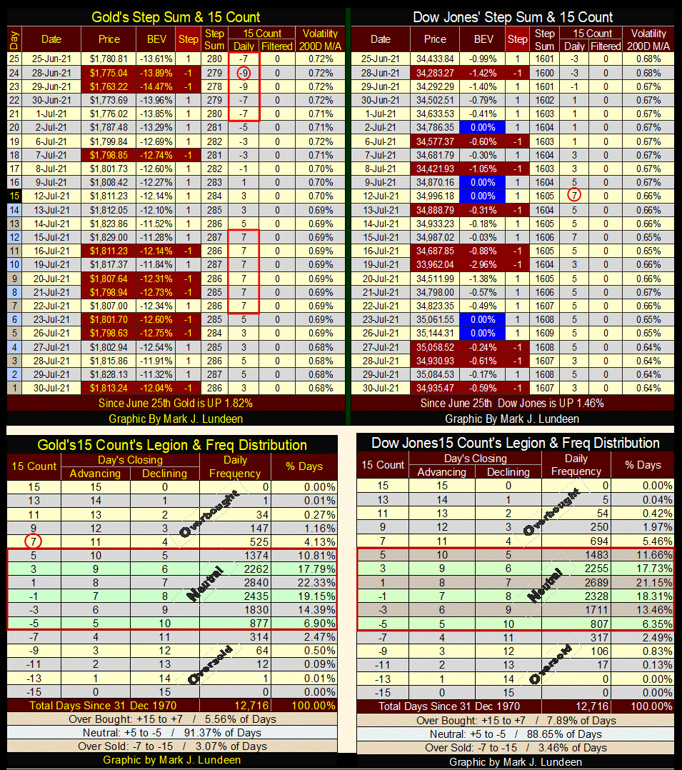
For the Dow Jones’ step sum table, daily volatility remains low. Which is a requirement for any bull market on Wall Street. Its 15 count closed the week at a +3, so the stock market isn’t overbought. But the most bullish thing on the Dow Jones table is that it continues generating new BEV Zeros, new all-time highs, which is the most bullish thing any market can do.
Given time, we’ll see some blue BEV Zeros on gold’s step sum table above too. Count on it!
Mark J. Lundeen
********


