Gold And Silver Price Forecasts: Silver’s Silent Scream


Precious metals aren’t just about gold, as silver can send equally powerful and prescient signals for both: itself, and its bigger brother – gold. The key analogy in the white metal continues to be the one between 2008 and the 2016 – now periods. The yellow metal investors better pay good attention, as big price moves in both precious metals are likely to take place at the same time.
Silver’s Self-Similarity
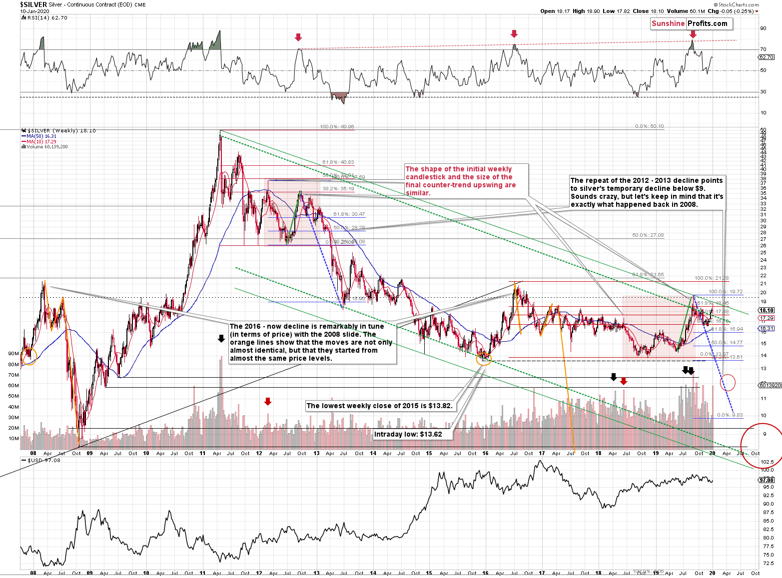
As far as the similarity between 2008 and 2016 – now periods is concerned, there is no meaningful link in case of time, or shape of the price moves. However, once we consider the starting and ending points of the price moves that we saw in both cases, the link becomes obvious and very important. Price patterns tend to repeat themselves to a considerable extent – sometimes directly, and sometimes proportionately.
The rallies that led to the 2008 and 2016 tops started at about $14 and we marked them both with orange ellipses. Then both rallies ended at about $21. Then they both declined to about $16. Then they both rallied by about $3. The 2008 top was a bit higher as it started from a bit higher level. And it was from these tops (the mid-2008 top and the early 2017 top) that silver started its final decline.
In 2008, silver kept on declining until it moved below $9. Right now, silver’s medium-term downtrend is still underway. If it’s not clear that silver remains in a downtrend, please note that the bottoms that are analogous to bottoms that gold recently reached, are the ones from late 2011 – at about $27. Silver topped close to $20.
The white metal hasn’t completed the decline below $9 yet, and at the same time it didn’t move above $19 - $21, which would invalidate the analogy. This means that the decline below $10, perhaps even below $9 is still underway.
Naturally, the implications for the following months are bearish.
Let’s consider one more similarity in the case of silver. The 2012 and the 2018 – today performance are relatively similar, and we marked them with red rectangles. They both started with a clear reversal and a steady decline. Then silver bottomed in a multi-bottom fashion, and rallied. This time, silver moved above its initial high, but the size of the rally that took it to the local top (green line) was practically identical as the one that we saw in the second half of 2012.
The decline that silver started in late 2012 was the biggest decline in many years, but in its early part it was not clear that it’s a decline at all. Similarly to what we see now, silver moved back and forth with lower highs and lower lows, but people were quite optimistic overall, especially that they had previously seen silver at much higher prices (at about $50 and at about $20, respectively).
The 2012 corrective upswings were actually the final chances to exit long positions and enter short ones. It wasn’t easy to do it back then just as it’s not easy to do so right now. But the size of the decline that followed speaks for itself. In investing and trading, what’s pleasant and what’s profitable is rarely the same thing.
Last week’s performance – silver reported a huge reversal – confirms what we saw in gold. Silver’s volume didn’t set a new record, but it was huge nonetheless. Definitely more than enough to make silver’s reversal important and reliable. It’s very bearish on its own and extremely bearish when examined together with gold’s reversal.
Silver’s Clear Reversal
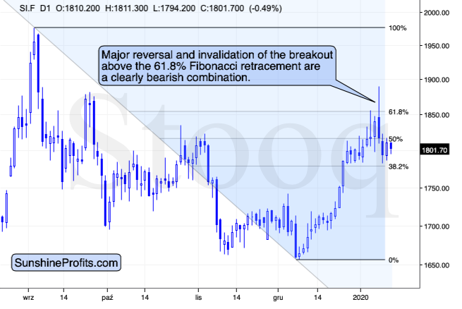
On a short-term basis, we see that silver tried to move above the 61.8% Fibonacci retracement based on the most recent decline and at the same time, it moved just a little above the 61.8% Fibonacci retracement that you can see on the previous long-term chart. Taking the 2016 top as the starting point and the 2018 low as the ending point, we get $18.45 as the retracement. Silver had moved less than 10 cents above it and then it invalidated this tiny breakout. Then it invalidated the more short-term breakout as well (the one that you see on the above chart).
The odds are that silver’s December – January upswing is already over.
Before summarizing, we would like to reply to a question that we received – namely, is the situation now similar to what we saw in late July 2019. After all, it appears to be the case when looking at the silver chart.
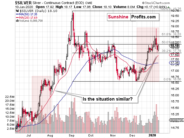
In short, it doesn’t seem very likely, even though both situations do indeed share some similarities. One similarity for instance is that the overall medium-term outlook didn’t really improve despite higher gold and silver prices. Why? For instance, because none of the long-term points that we made in our previous analyses, were invalidated based on gold and silver moving higher since July. Most importantly, the long-term outlook for the USD Index and the way gold is likely to react to USD’s big upswing, remain unchanged.
Why isn’t the situation just like it was back in mid-2019? The most important reason is because we recently saw both the yellow and white metals’ inability to keep on rallying despite positive news. The U.S. – Iran conflict was nowhere near as critical as it is right now and yet both precious metals declined recently. That’s particularly visible in case of silver, which was unable to even move above the August high during the most recent run-up.
Gold-to-Silver Ratio’s Message
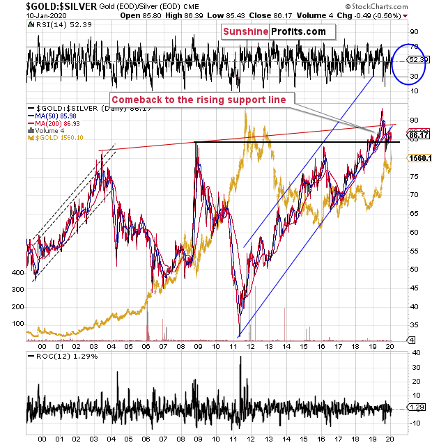
Moreover, in early July 2019 the gold to silver ratio topped after breaking above the previous highs and now it’s after the verification of this breakout. Despite the sharp pullback, the ratio moved back below the 2008 high only very briefly. It stabilized above the 2008 high shortly thereafter and now it’s moving slowly up once again. Well, slowly if you take the day-to-day price movement into account. In case of the long-term point of view, the strong uptrend simply resumed after a quick breather.
Anything after a breakout is vulnerable to a quick correction to the previously broken levels. On the other hand, anything after a breakout that was already confirmed, is ready to move higher and the risk of another corrective decline is much lower.
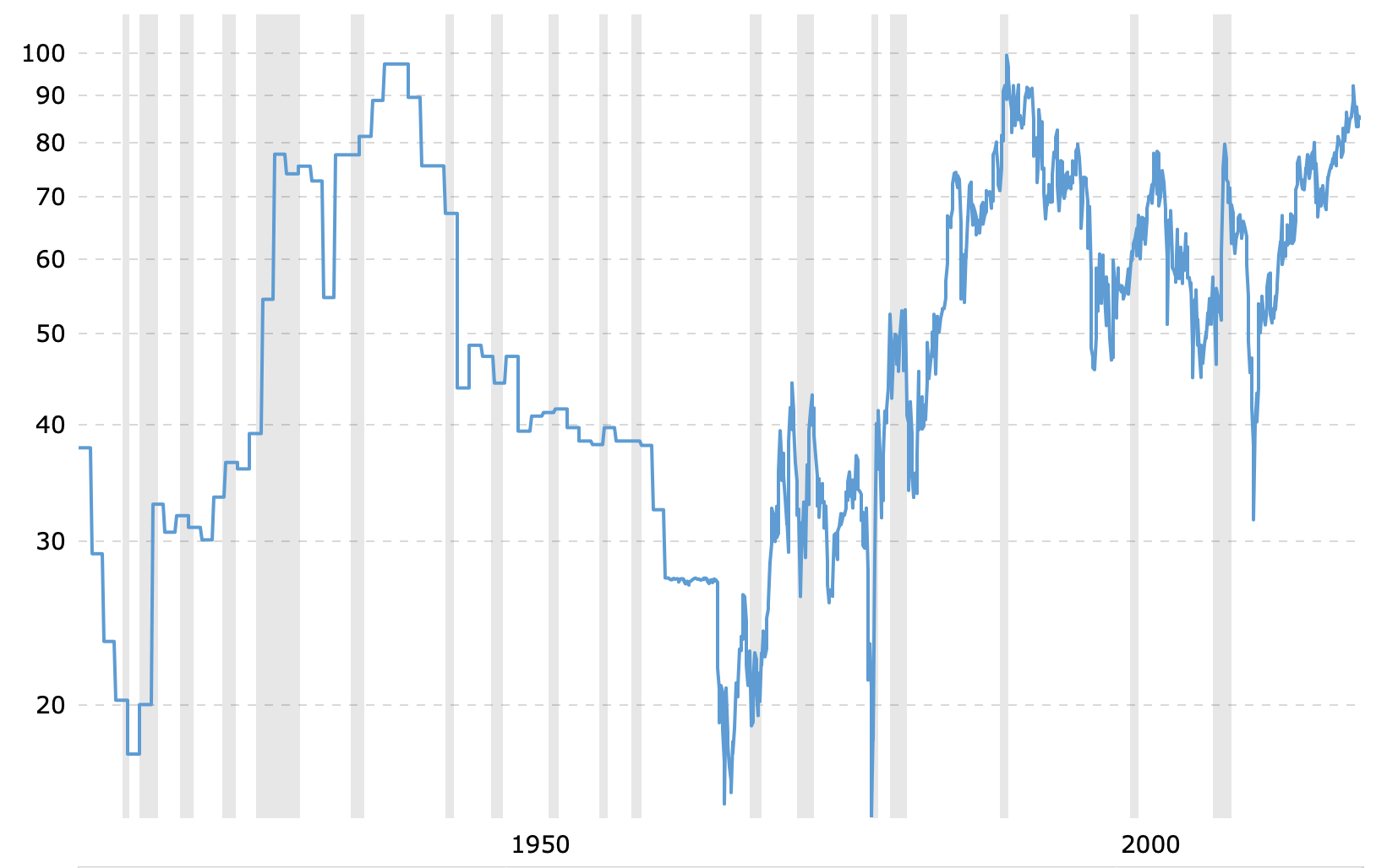
The most important thing about the gold and silver ratio chart to keep in mind is that it’s after a breakout above the 2008 high and this breakout was already verified. This means that the ratio is likely to rally further. It’s not likely to decline based on being “high” relative to its historical average. That’s not how breakouts work.
Besides, the true, long-term resistance in the gold to silver ratio is at about 100 level. This level was not yet reached, which means that as long as the trend remains intact (and it does remain intact), the 100 level will continue to be the likely target.
The implications for both: gold and silver are bearish as the major moves in the ratio tend to take place in the opposite direction to the one in which the metals are moving. Just as the ratio bottomed in 2011, the PMs topped. Even though the last several months of gold’s performance seem to indicate otherwise, the ratio confirms that the precious metals market remains in a major downtrend and that the 2015 bottom was just an interim, not the final low.
Summary
Silver is flashing many warning signs that point to high likelihood of lower prices ahead. These include the analogy between 2008 and the 2016 – now periods, analysis of the current corrective upswing and its last week’s reversal in broad daylight. Finally, the gold-to-silver ratio throws in its two cents in support of the white metal’s upcoming decline relative to gold and in support of decline of both precious metals in dollar terms.
The following months are not likely to be pleasant times for anyone who refuses to jump on the bullish bandwagon just because prices moved higher in the previous months. But what’s profitable is rarely the thing that feels good initially. As silver often moves in close relation to the king of metals, forecasting gold’s rally without a bigger decline first is thus likely to be misleading. The times when
When gold is trading well above the 2011 highs will come, but they are unlikely to be seen without being preceded by a sharp drop first.
Naturally, the above is up-to-date at the moment of publishing and the situation may – and is likely to – change in the future. If you’d like to receive follow-ups to the above analysis, we invite you to sign up to our gold newsletter. You’ll receive our articles for free and if you don’t like them, you can unsubscribe in just a few seconds. Sign up today.
Przemyslaw Radomski, CFA
Editor-in-chief, Gold & Silver Fund Manager
Sunshine Profits - Effective Investments through Diligence and Care
* * * * *
All essays, research and information found above represent analyses and opinions of Przemyslaw Radomski, CFA and Sunshine Profits' associates only. As such, it may prove wrong and be subject to change without notice. Opinions and analyses are based on data available to authors of respective essays at the time of writing. Although the information provided above is based on careful research and sources that are deemed to be accurate, Przemyslaw Radomski, CFA and his associates do not guarantee the accuracy or thoroughness of the data or information reported. The opinions published above are neither an offer nor a recommendation to purchase or sell any securities. Mr. Radomski is not a Registered Securities Advisor. By reading Przemyslaw Radomski's, CFA reports you fully agree that he will not be held responsible or liable for any decisions you make regarding any information provided in these reports. Investing, trading and speculation in any financial markets may involve high risk of loss. Przemyslaw Radomski, CFA, Sunshine Profits' employees and affiliates as well as members of their families may have a short or long position in any securities, including those mentioned in any of the reports or essays, and may make additional purchases and/or sales of those securities without notice.
 Przemyslaw Radomski, CFA, is the founder, owner and the main editor of SunshineProfits.com. You can reach Przemyslaw at: http://www.sunshineprofits.com/help/contact-us/.


