Gold Looking Drab


Gold needs a shine to get it’s sparkle back. In the good ole days, news the likes of the Malaysia Airlines crash would have sent gold soaring. But that’s the difference between a bull trend and a bear trend. Good news in a bear trend can see a small burst of optimism before turning back down and making the whole experience rather underwhelming. There has been so much turmoil in the world the last few years but you wouldn’t know it by looking at the gold chart. Let’s do just that beginning with the daily chart.
DAILY CHART
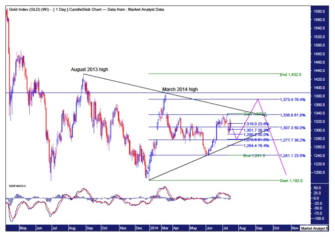
Sorry if the chart looks a bit confusing but corrective patterns can be confusing. So let’s just say the chart is in keeping with a corrective theme! Price recently made a low at the start of June at US$1241 and culminated in a recent a top on the 11th July at US$1333. And as with most rallies that have occurred since the 2011 all time high, the gold perma-bulls are there to celebrate the occasion and calling the next great bull market to now be underway. I’m not sure what chart they’re looking at. Perhaps they’re not even looking at a chart. Well, whatever they are looking at, I’m definitely not seeing it! That daily chart does not look impulsive in nature to me. Quite the opposite. The chart shows that the trading has been wishy washy for around a year now. Typical of trading that is corrective in nature.
But let’s try and break it down anyway. I have drawn two trend lines. One trending down across the tops of August 2013 and March 2014. The other along the two most recent lows. Price now looks headed down and I expect that the lower trend line will contain this move.
Before we get further into that, I have added a Moving Average Convergence Divergence (MACD) indicator which shows the red line currently above the blue signifying lower prices are likely in the very short term. Ok, let’s move on.
I have added Fibonacci retracement levels from the most recent low in June to the July high. I have also drawn Fibonacci retracement levels from the larger move of the August 2013 high to the December 2013 low. Now an interesting observation is the 61.8% level of the smaller range is around the same level as the 38.2% level of the larger range. This is around the price US$1278. I think this level is a great candidate for the current move down to end. We can see on the chart the pink line I have drawn that leads to this level.
Personally, I think gold is in the middle of a multi month bear rally and so once the next minor low is in price can head up to a new rally high. And where will that rally high be? Well, I have drawn a pink line to where I think it will end. That is the 76.4% retracement level of the larger range at US$1373. This would also conveniently bust the down trending black line which a lot of people are looking at. Busting that trend line would surely run some stops in the process. Breaking higher above the March 2014 high, as denoted by the horizontal line would be the first real sign the bulls are taking control. Unlikely in my opinion.
Let’s now take a look at the weekly chart.
WEEKLY CHART
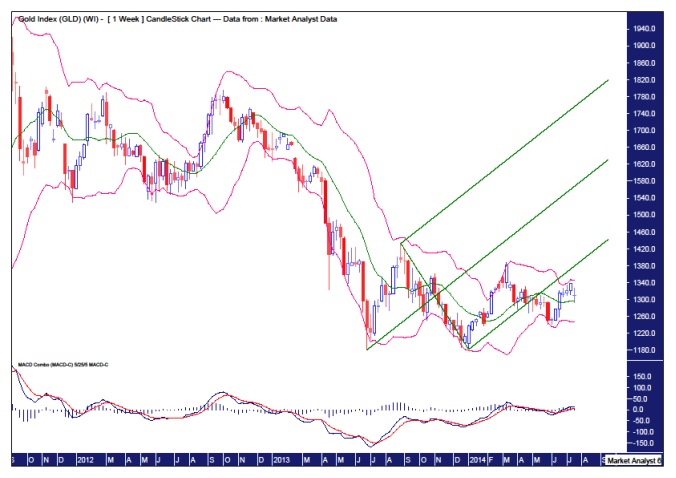
I have added some Bollinger Bands and ever since price made the first low at US$1180 back in June 2013 it has been toing and froing between the upper and lower bands. This can be a sign of corrective action or it could be, just to give the permabulls a bone, a sign of a trend change. I favour the former, especially considering no major swing high has been broken yet.
The MACD shows the red line below the blue line indicating higher prices in the coming weeks are likely. And from the daily analysis we already have a potential target for that move up to end.
Now, what I find most interesting on this chart derives from my application of the Andrew’s Pitchfork which is denoted by the three green parallel lines. A bearish development recently was price breaking to the downside of the lower channel line. It needs to get back up into the lower half of the pitchfork to get the bullish case back on track. Let’s see if the next push higher can do it. I doubt it!
Now let’s wrap it up by looking at the monthly chart.
MONTHLY CHART
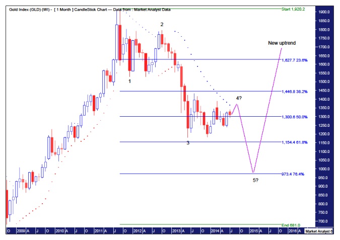
I have added some simple Elliott Wave annotations to give some structure to the whole downtrend since the all time high. It appears gold is still tracing out a corrective Wave 4 with one final move to low awaiting.
I have also added the Parabolic Stop and Reverse (PSAR) indicator as denoted by the dots. I suspect price can break to the upside of the dots next month which would relieve some tension and help unwind some of the negativity. Then perhaps we get a final Wave 4 high in September.
I have added Fibonacci retracement levels of the upleg from 2008 low to 2011 high. I think price can eventually bottom out at the 76.4% level which would also conveniently break the critical psychological US$1000 level. That would see the perma-bulls in complete despair. Just the type of sentiment required for a major low.
And perhaps then the next real bull market will start while the perma-bulls dejectedly call it just another rally in a bear market. Bingo!


