Gold & Market Update


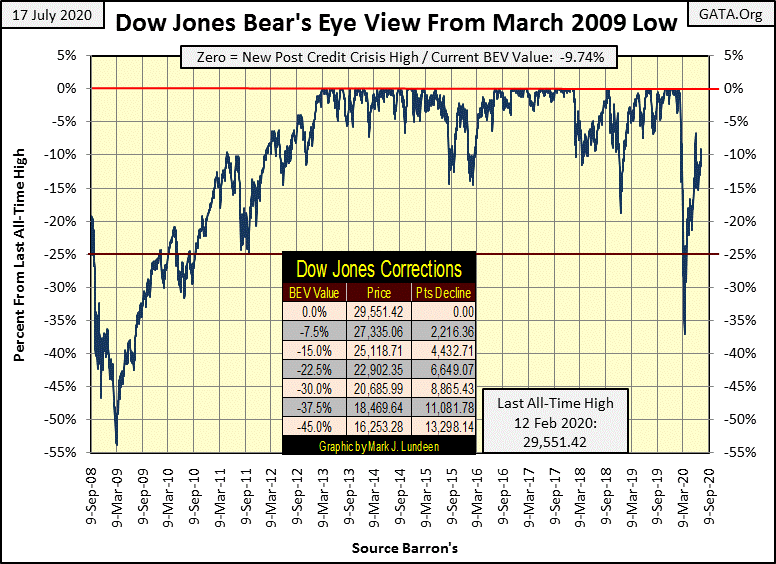
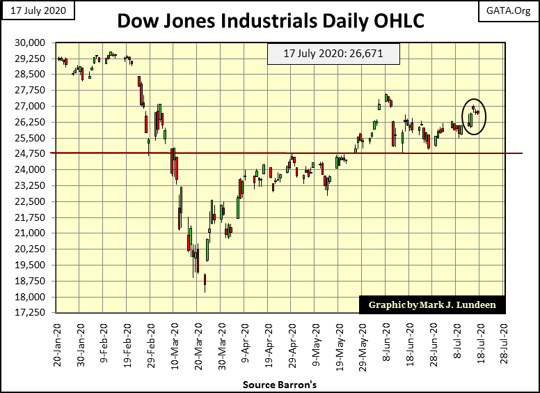
On June 8th the Dow Jones increased to a BEV -6.70%, and so far that has been the peak in the advance off its March 23rd’ BEV -37.09% bottom. Since early June (the last twenty-eight NYSE trading sessions) the Dow Jones has oscillated between its BEV -5% and -15% lines; so my commentary has changed little for the past month. This won’t last forever, and I believe whether the Dow Jones breaks above its BEV -5% or below its -15% lines will be an important development.
One advantage of maintaining a Bear’s Eye View (BEV) plot of a market series is it enables a study based on the one hundred-percent range a market series is confined in it, from:
- 0% (BEV Zeros / All-Time Highs);
- -100% (Total Wipeout in Market Valuation).
This allows a direct comparison between the Dow Jones when it traded daily below 100 in the early 20th century, with the Dow Jones in the 21st century as it now trades over 25,000.
In the tables below is a comparison between the Dow Jones from January 1900 to December 1999 (100 years) with the Dow Jones since its 09 March 2009 bottom.
To keep it simple, here’s how the BEV daily closings are sorted in the table below:
- 0% Row contains new all-time highs and nothing else.
- -0.000001% Row contains daily closings just short of a new all-time high down to -4.99999% from one.
- -5% Row contains daily closings from -5% down to -9.99999% from one.
- And so on and so forth.
So within the red box are all the daily closings at new all-time highs and within 5% of making a new all-time high, or as I’ve put it before – daily closings in scoring position for a new all-time high.
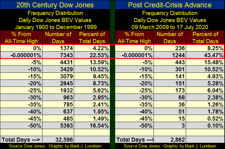
Looking at the Percent of Total Days columns of these two tables, during the 20th Century (Left Table) the Dow Jones found itself at a new all-time high or “in scoring position” of one for 26.75% of its 32,596 daily closings. True, the 20th Century also includes the Great Depression, but the 20th Century enjoyed its fair share of bull markets too.
Compare this with the performance of the Dow Jones since its Sub-Prime Mortgage Bear Market Low of 09 March 2009 on the right side of the table. In the past eleven years the Dow Jones was either at a new all-time high, or in scoring position for 51.72% of its 2,863 daily closings even after working itself out from a huge 53% market bottom. This is twice the market performance the Dow Jones saw during the 20th century – Wow!
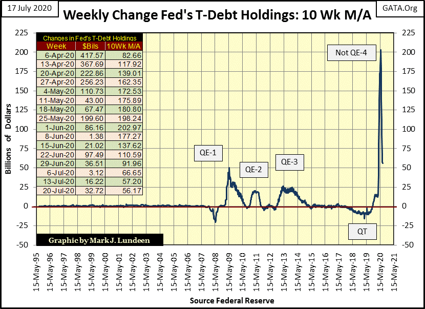
This propensity for the Dow Jones to be at a new all-time high, or in scoring position for over 50% of its daily closings since March 2009 has to explained, and looking at the “policy makers” “monetary policy” since 2009 in the chart below does so.
If the Dow Jones since March 2013 has so frequently found itself in scoring position, it’s only because the FOMC has flooded the market with “liquidity”, floating the Dow Jones to ever higher valuations.
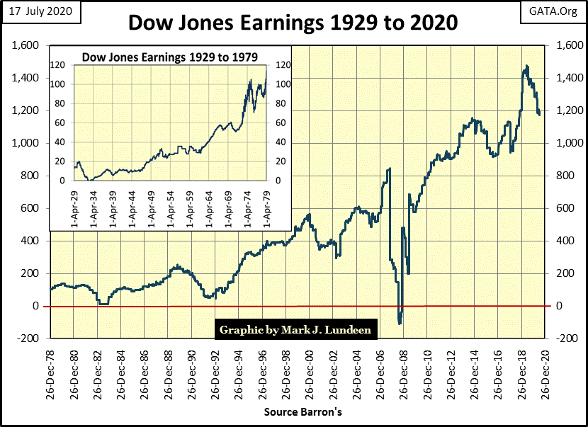
Even a 20% reduction in Dow Jones earnings since July 2019 hasn’t negatively impacted its valuation, not so far anyway.
It’s as I’ve said before, and you can be sure I’ll say it again in the weeks and months to come; the only thing keeping the stock market up is the aggressive manhandling of market valuations by the FOMC. So far things have been great for the bulls, but this is a game that can’t continue forever. One day Mr Bear will have his way, and claw market valuation back down to reality, and it won’t be pretty.
That things are changing beneath the surface might be seen in the BEV values for the major market indexes in the table below. For the second week the XAU (#19 gold mining) closed higher than the NASDAQ Banking index (#20). Not since March 2013 has this been so. So seeing the XAU’s BEV value now closer to a BEV Zero than is the NASDAQ Banking index is a big deal, positive indication that money has begun flowing into precious-metal assets.
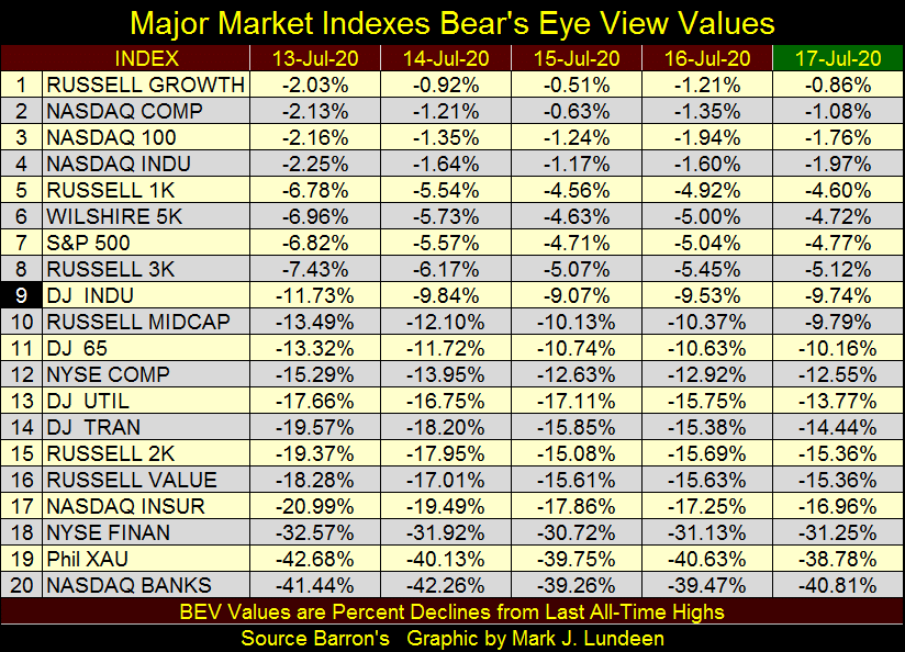
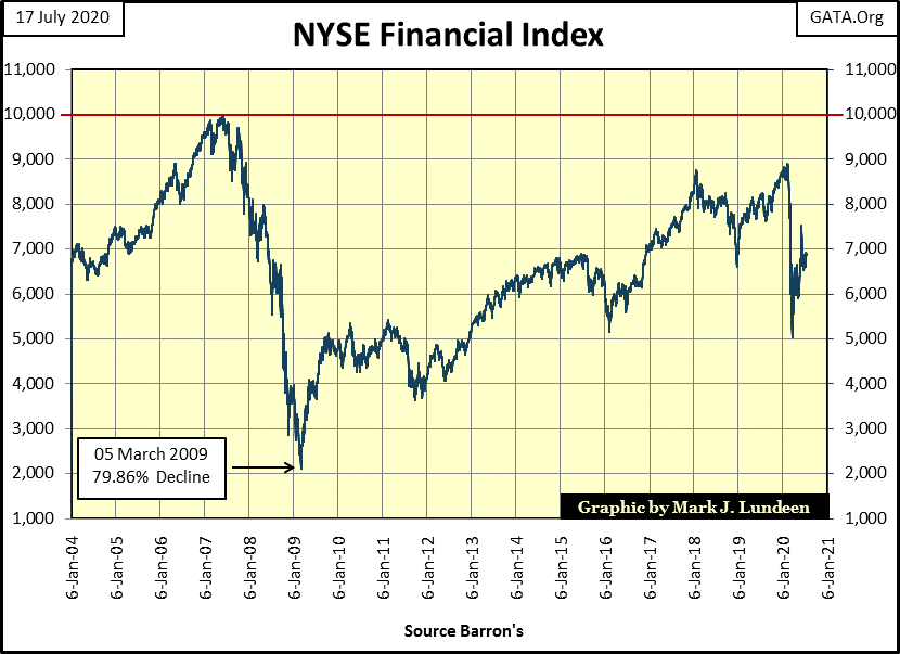
Why are the NASDAQ Banks and NYSE Financial Index perennially underperforming the NASDAQ glamor indexes at the top of this table? Because the financial system is seriously dysfunctional, and has been since the top of the sub-prime mortgage bull market (2007).
How many trillions of dollars have been “injected” into the financial system since 2007, and changes in their accounting rules so the big banks didn’t have to declare bankruptcy during this or that crisis? Yet the NYSE Financial Index hasn’t seen a new all-time high since July 2007? Something is seriously wrong with our financial system.
As has always been the case since January 2000 (twenty years now) market declines are noted by rising trading volume, while market advances are noted by declining trading volume.
This is a reversal of the economic law of supply-and-demand. Before January 2000 it was the exact opposite, where market declines saw investors walk away from the market resulting in falling trading volume, and market advances saw investors come into the market resulting in rising trading volume.
So what happened in the chart below during;
- August 2002 (bottom of the high-tech bear market)
- March 2009 (bottom of the sub-prime mortgage bear market)
- March 2020 (bottom of our -37% market decline)
The FOMC became the buyer of the last resort to “support market valuations” using monetary inflation to purchase shares at prices everyone else refused to pay. The FOMC’s aggressive support of the market put a floor under every 21st century market bottom, but corrupted the dollar’s reserve base in the process.
An audit of the Federal Reserve, which since 1913 has never happened, would most likely reveal our central bank is currently the largest owner of many companies trading on the NYSE and NASDAQ.
Note how each 21st century market bottom was reversed only with ever greater purchases of shares by the Federal Reserve. In fact March’s 37% market decline required more inflation to reverse its decline than did the March 2009’s 54% market decline – a lot more inflation!
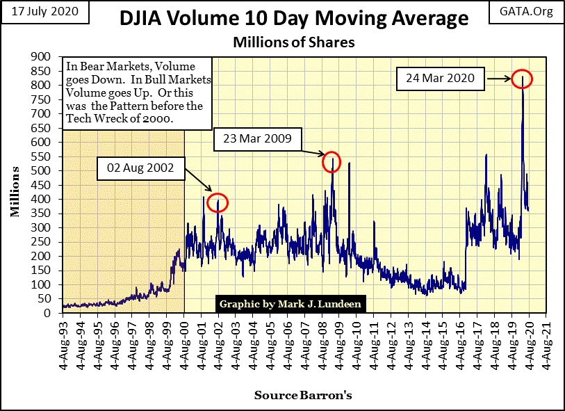
The way to look at this is with the passing of time Mr Bear is getting stronger as the FOMC is getting weaker, and that isn’t a positive development for the bulls.
But I admit that today there are people making money on this fraud, a fraud they are not complicit with so good for them. If you are one of these people, keep doing whatever you’re doing. Just realize one day this crooked game is going to end as it must.
To my way of thinking, moving your capital into precious-metal miners is the way to go as July 2020 draws to a close.
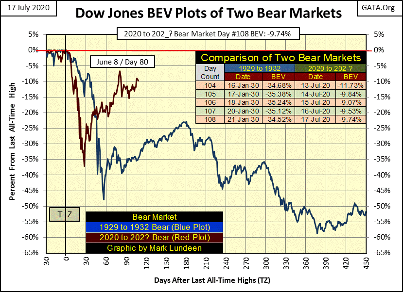
Looking at my comparison between the Great Depression and our bear market below has yet to reveal whether our current advance (Red Plot) is a dead-cat bounce, or not off its March 23rd market bottom. If the Dow Jones goes on to a new BEV Zero, it’s not a dead-cat bounce. If in the chart below the Dow Jones reverses itself and breaks below its -37% BEV low seen on day 27 (March 23rd), I believe we’ll see a repeat of the Dow Jones’ performance seen in the depressing 1930s.
Why would this be? Because the Federal Reserve and the banking system it controls has created massive levels of unsupportable debt that now weighs down all sectors of the economy. In the next crisis much of this debt will default, and so take down the financial system as it does.
In the red plot below we’re looking at the FOMC slugging it out with Mr Bear. But Mr Bear is getting stronger while the FOMC is becoming weak. Driving the Dow Jones up that final 9.74% to a new BEV Zero may not be as easy as the bulls believe it to be, but it could happen.
Looking at the Dow Jones below in daily bars isn’t giving any certainty for which way the Dow Jones is going to break; up or down. Maybe the FOMC is saving their ammo for the next market decline instead of using it to drive the Dow Jones into new all-time highs.
Well look at that – gold is now in scoring position in its BEV chart below. What a beautiful chart; we could see gold at a new all-time high before the close of July. But that won’t happen without a fight! Keep in mind how over time the FOMC is getting weaker, so a break out above gold’s August 2011 $1888 is a sure thing sometime in the not too distance future.
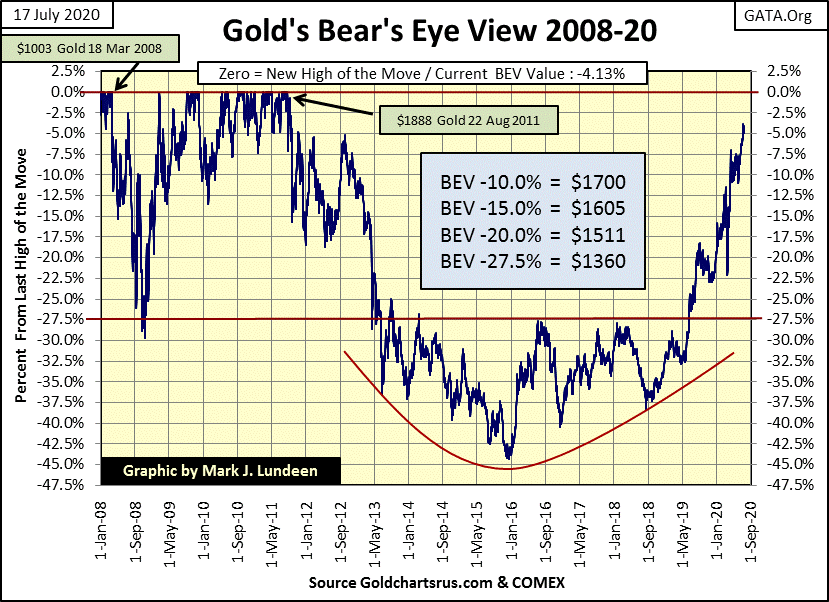
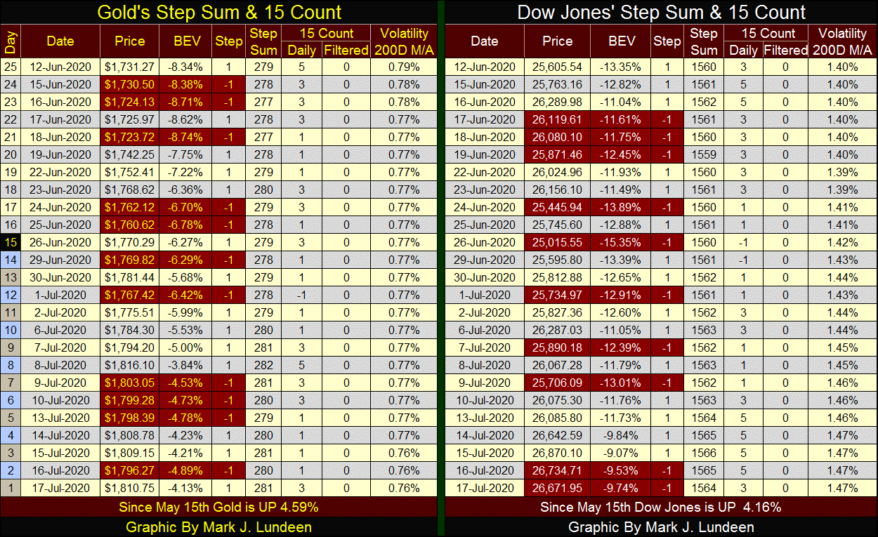
Now on to gold’s step sum chart. Gold since early this month has seen several daily closes over $1800, but failed to remain above this critical level. Then this week saw gold close over $1800 ($1810), so we now also have an $1800 close on a weekly basis, which is important as a lot of technical work is done on a weekly basis.
So the question in my mind is with gold now breaking above $1800 on a weekly basis, can it now also stay above $1800? $1800 is an important technical level; if it can’t stay above $1800 in the days and weeks to come, expect it to decline down to $1750 or even more.
But when it comes to gold, I’m the eternal optimist. Any correction down to $1700 or even $1600 from here would only be a short term market event in gold’s advance to new all-time highs. Heck, gold closed at $1687 just two months ago. I don’t see a pullback from $1800 as inevitable, but should this happen it would not be a big deal.
In the Dow Jones step sum chart below, its step sum plot (Red Plot / market expectations) continues rising, but the Dow Jones itself is having problems taking out its high of early June. If it can take out that high I might take back some of the bad things I’ve said about the “policy makers”, and then maybe not.
You know in the late 1990s these people called themselves “the Masters of the Universe” for good reason; as they could do, and would do anything to drive share prices to ever higher levels. But the Dow Jones’ current market advance is lacking much of the old “Masters of the Universe” panache from decades ago.
When Alan Greenspan was Chairman of the Federal Reserve (1987 to 2006), members of the Congress and the media would fawn over his “brilliant insights” on this, that and the other thing during his congressional testimonies. I wish I had videos of Greenspan’s old performances before Congress as he mumbled, yes mumbled total nonsense for hours to the amazement of both members of Congress and the financial mainstream media alike.
As far as I can tell, the only honest thing he ever said under oath was the following; which at the time only resulted in chuckling from our elected officials who cared only about the bull market on Wall Street:
"I guess I should warn you, if I turn out to be particularly clear, you've probably misunderstood what I've said."
- Alan Greenspan, Federal Reserve Chairman; During Congressional Testimony
Being a central banker today isn’t as much fun as it used to be. There is nothing Chairman Powell can say today that is humorous to anyone, as the Dow Jones now struggles to break above its high of a month ago.
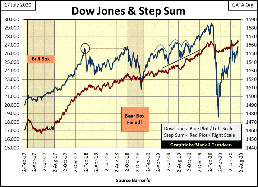
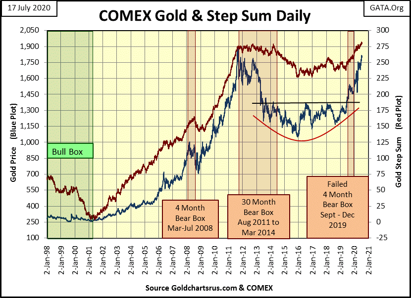
In the step sum tables below, for both gold and the Dow Jones, their step sums and valuations continue advancing. Market volatility for gold is decreasing while it continues to rise for the Dow Jones. The Dow Jones saw another 2% day on Tuesday, July 14th.
For the week, that’s all I have to say. Maybe next week something exciting will happen in the stock or precious metals market.
Let’s take a little review of the history of the official sector’s machinations in the gold market.
In general gold, as with crude oil, is priced in US dollar terms in the global market place. And since the summer of 1999 when then Chancellor of the Exchequer; Gorden Brown announced he was selling 56% of the UK’s gold reserves (401 tons) in a “Dutch Auction” to insure the UK would receive the worst price possible, gold has been in a bull market.
Why would any Chancellor of the Exchequer do such a thing? I can’t claim insider knowledge on this, but although the citizens of the United Kingdom did receive the worst price possible for their gold, you can be sure someone else received the best price possible; that is, the lowest price. On 19 July 1999 gold closed at $253.70. This bear market low is also called “Brown’s Bottom” by the old timers; a 69.27% decline from its 21 January 1980 top ($825.50).
In the months following Brown’s Bottom, gold advanced above $300. This 18.24% increase in the price of gold resulted in a panic at the highest levels of finance:
“We looked into the abyss if the gold price rose further. A further rise would have taken down one or several trading houses, which might have taken down all the rest in their wake. Therefore at any price, at any cost, the central banks had to quell the gold price, manage it. It was very difficult to get the gold price under control but we have now succeeded. The U.S. Fed was very active in getting the gold price down. So was the U.K.”
- 2000 – Eddie George, Governor of the Bank of England and director of the BIS
Apparently in the autumn of 1999, the big banks were over leveraged and massively short gold futures contracts in a rising gold market. Officials at the highest levels in the US and UK entered the gold market in a massive effort to suppress the price of gold to save their precious banking system.
Brown’s sale of the British people’s gold continued for the next two years. Gold then saw a double bottom on 15 February 2001; $255.10. This was not “Brown’s Bottom” but it is the low which we can consider as the start of our current bull market, as from that point on gold would rise up to a new all-time high in November 2007.
For their successful scheming to save the banks, Gordon Brown was made Prime Minister for the UK from 2007 to 2010; Eddie George was knighted in 2000 and made a life peer in 2004.
In the table below I’m using the February 2001’s double bottom, rather than “Brown’s Bottom” of July 1999, as when we look at a chart for gold, it was in February 2001 when gold actually began its advance to new all-time highs.
The data is close of week basis. I have daily gold and silver prices going back to 1969, but my foreign exchange data is close of week going back to Barron’s 01 September 1975, issue because this was Barron’s first issue publishing foreign exchange rates.
The reason for this is simple enough. Before the US Treasury closed its gold window in August 1971, the dollar was pegged to gold at a rate of $35 to one ounce of gold. Other currencies were pegged to the US dollar as specified by the Bretton Wood’s Monetary Agreement of 1945, so forex rates didn’t “float” as they would soon after August 1971. However, when the United States Treasury insisted on inflating its dollar, soon so did every other county around the world.
Below I have a 1979 quote from Robert M. Bleiberg pointing this out:
“Extravagances and absurdities like * floating exchange rates * and Special Drawing Rights [IMF’s SDR] come and go. Gold endures.
“And what a lot it has had to put up with. After insisting for decades - over optimistically, in the event – that the dollar was as good as gold, the U.S. monetary authorities, by fiat, so to speak, desperately sought to prove that in global financial affairs it was better. First they closed the gold window thereby reneging on a generation of solemn pledges to the contrary. They threw their weight behind the Special Drawing Right, a bastard form of what John Exter has aptly termed the “I-Owe-You-Nothing.” Several years ago as hundreds cheered, gold was officially drummed out of the international monetary system and the IMF launched on a series of sales aimed at disposing of the barbarous relic forever. In turn, the Treasury beset by a plunging dollar has stepped up its own liquidation from 300,000 ounces per month to the current rate of 1.5 million.”
- Robert M Bleiberg: Barron’s Managing Editor, 29 January 1979
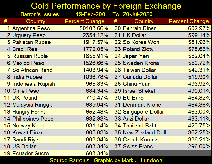
Looking at the table below I took the data provided weekly by Barron’s for the North and South American currencies and highlighted the portion that lists how many national units-of-currency for one US dollar.
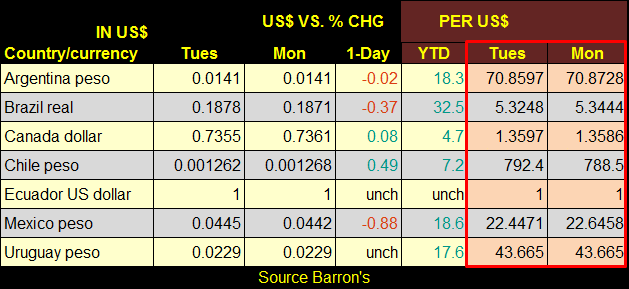
I then take this data from Barron’s 19 February 2001 and 20 July 2020 issues and multiply it by the US dollar price-of-gold in these issues to derive the percentage changes seen below. What this table makes readily apparent is increases in the price of gold are actually a function of the rate-of-inflation any particular nation has imposed on its unit-of-currency. That an ounce of gold no longer pegged at $35 is proof this is also true for the global reserve currency – the US dollar.
Another thing not fully appreciated is the more the price of gold is inflated in any particular currency, the larger that nation’s government bureaucracy becomes. And the larger a nation’s government bureaucracy becomes, the smaller that nation’s citizens become in the eyes of that government bureaucracy. At some point this inflated bureaucracy sees it major justification for existence as providing management of the “human resource” that funds it with taxes.
Mark J. Lundeen
********