Gold Market Update - and Announcing The Launch Of Great Reset Gold...


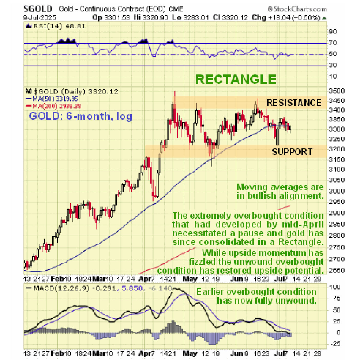
Gold has made impressive gains so far this year, but when it spiked up to touch $3500 in the middle of April it become heavily overbought which is why it then went into a rectangular consolidation pattern that has given time for the overbought condition to fully unwind, as shown by the MACD indicator on its 6-month chart below, and has also allowed its moving averages to catch up, especially the 50-day which has now fully closed the gap with the price. Because there is still a considerable gap with the 200-day it means that there is room for the price to break down from the Rectangle and correct back towards or to this average.
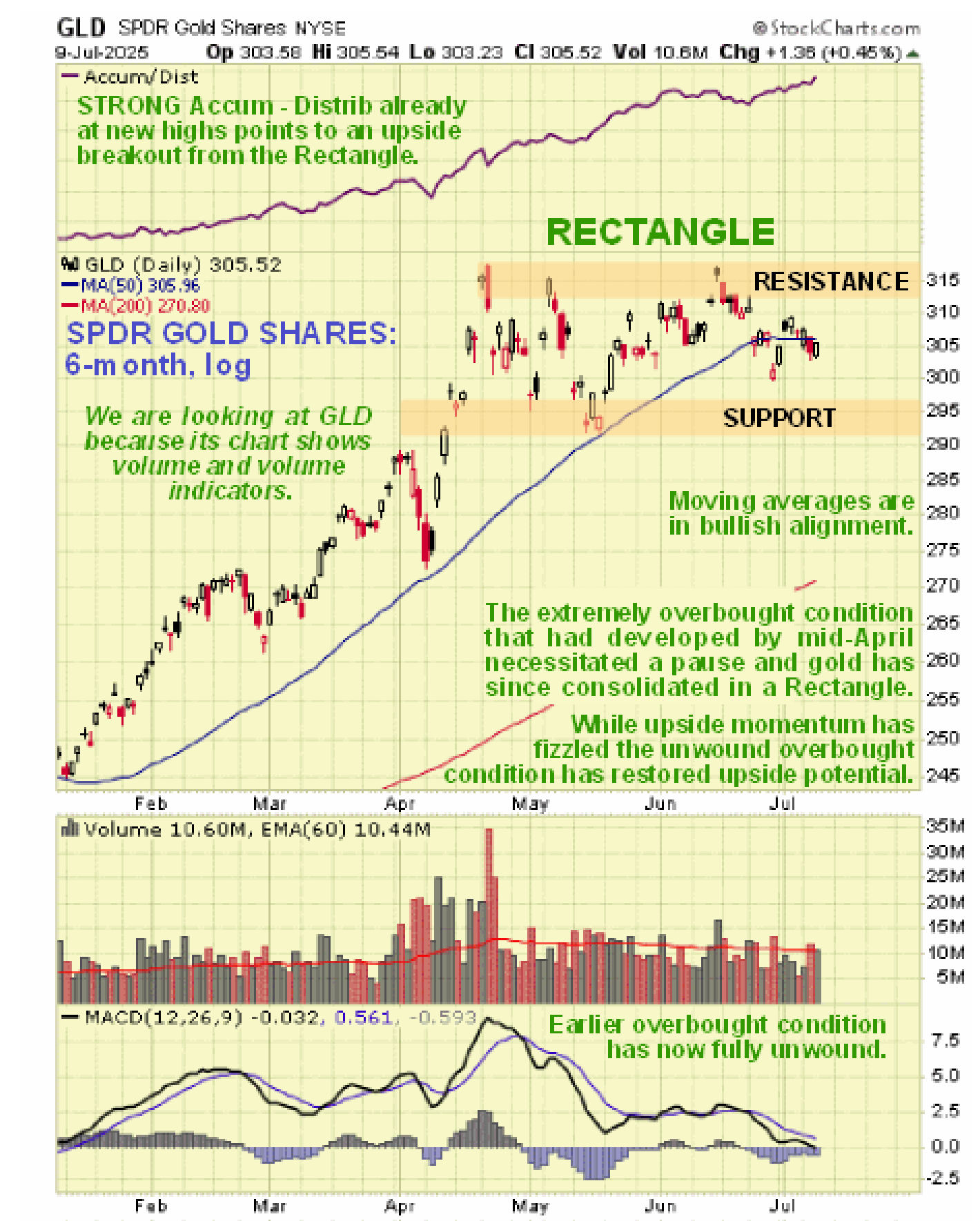
In attempting to weigh the probability of this happening versus the price instead breaking out upside from the Rectangle we need to inspect the volume pattern and volume indicators which normally provide valuable clues in a situation like this. However, volume and volume indicators are no longer provided by Stockcharts for the metals but we can get around this problem by using a chart for the same time period for reliable gold proxy SPDR Gold Shares, whose chart is almost identical, which does show volume and volume indicators.
So, on the 6-month chart for SPDR Gold Shares we see that, while the volume pattern is a little hard to decipher, the Accumulation line has continued to trend higher from the April peak as the price has tracked sideways and has even made new highs in recent days. This is bullish and implies that, rather than breaking lower into a correction, GLD and thus gold itself will instead break higher into a new upleg. If it does break lower a likely scenario is that a short, sharp drop is followed by a rapid reversal to the upside.
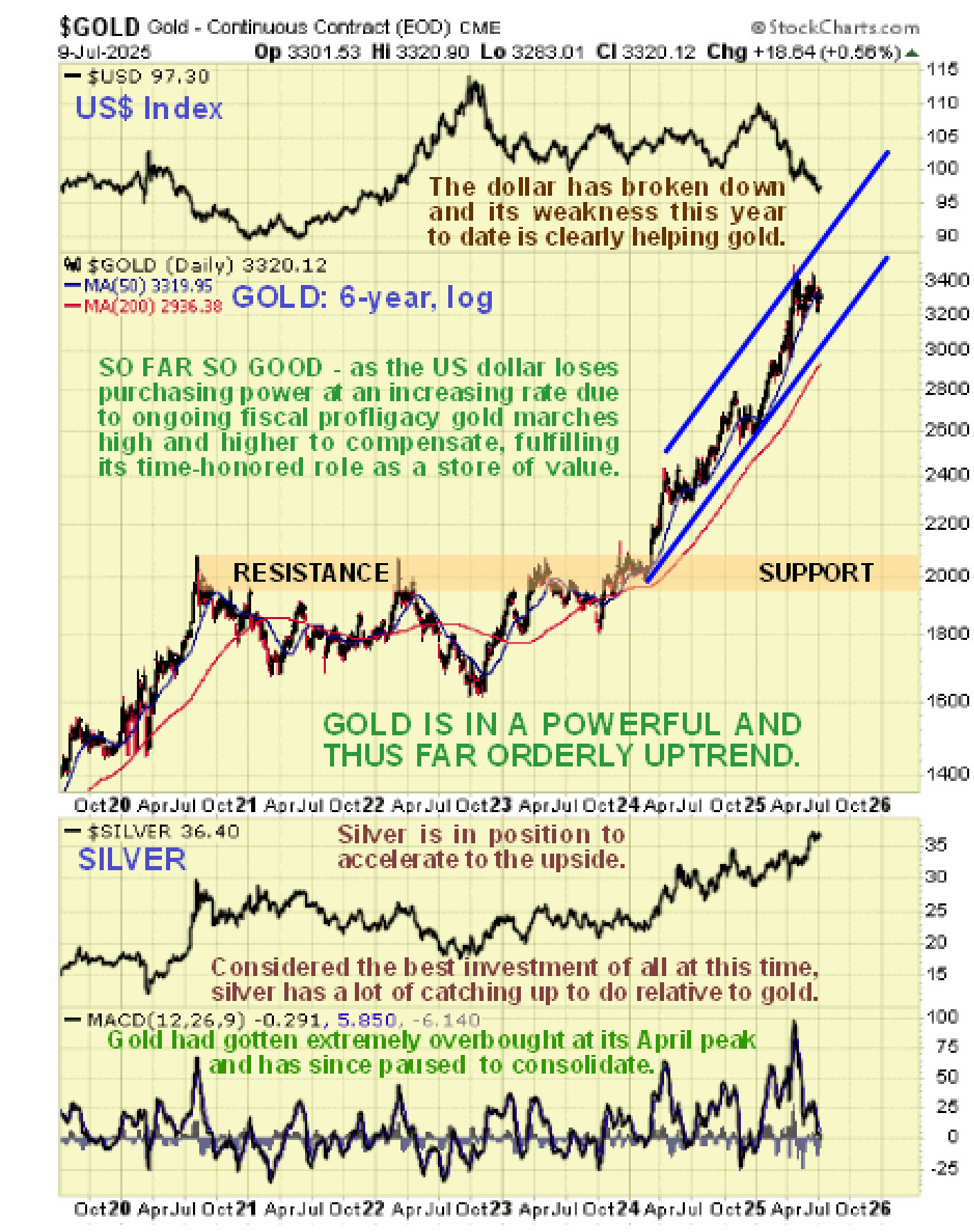
Zooming out now to look at gold on a longer-term 6-year log scale chart we see that it broke out early last year from a big trading range to commence a powerful uptrend – an uptrend that remains very much in force, with the price still well above the lower rail of the channel – even if it broke down from the Rectangle shown on the chart above and dropped to the $3100 level it would not violate this channel. On this chart we can better see just how overbought gold got last April, hence the trading range that has since formed that we looked at above.
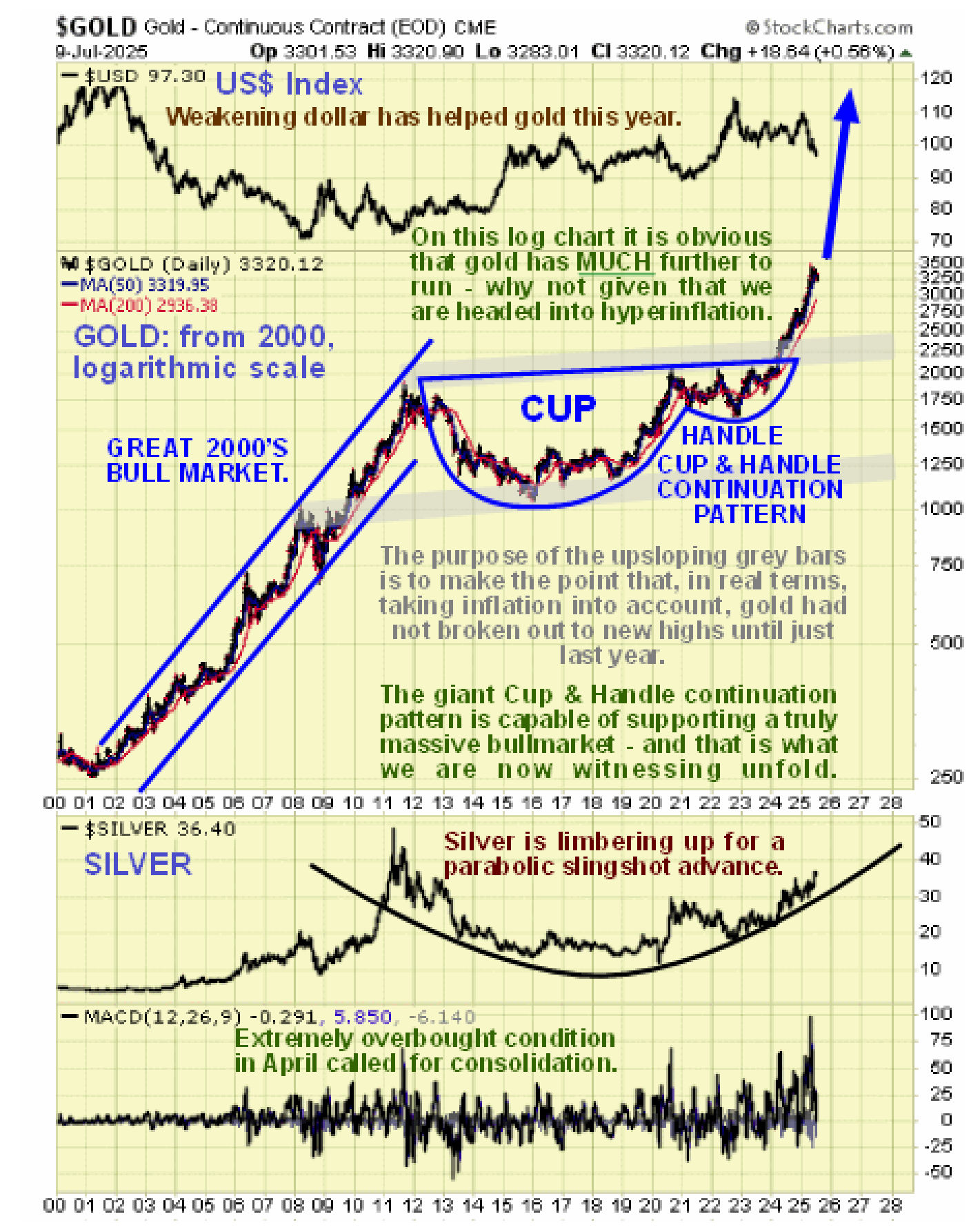
Zooming out again via a very long-term log-scale chart going all the way back to the start of the millenium, i.e. to the year 2000, affords us an overall Big Picture perspective. This chart makes clear that the breakout early last year from the large trading range that started to form in the middle of 2020 actually marked the breakout from the Handle of a gigantic Cup & Handle continuation pattern that started to form as far back as 2012. This is a truly enormous consolidation pattern that certainly has the capability to support a correspondingly big bull market and as we are only about 16 months into this major new bull market, it clearly has much further to run.
In conclusion, we are looking for a breakout from the current rectangular trading range that has formed from April into another major upleg. If gold should instead break down from this range and correct back towards or to its rising 200-day moving average and the lower rail of its uptrend channel, it should then reverse back to the upside into a vigorous uptrend. Volume indicators are suggesting that the former scenario – a breakout into another upleg from the trading range without any further corrective action first – is more likely to prevail.
********

Clive P. Maund’s interest in markets started when, as an aimless youth searching for direction in his mid-20’s, he inherited some money. Unfortunately it was not enough to live a utopian lifestyle as a playboy or retire very young. Therefore on the advice of his brother, he bought a load of British Petroleum stock, which promptly went up 20% in the space of a few weeks. Clive sold them at the top…which really fired his imagination. The prospect of being able to buy securities and sell them later at a higher price, and make money for doing little or no work was most attractive – and so the quest began, especially as he had been further stoked up by watching from the sidelines with a mixture of fascination and envy as fortunes were made in the roaring gold and silver bull market of the late 70’s.
Clive furthered his education in Technical Analysis or charting by ordering various good books from the US and by applying what he learned at work on an everyday basis. He also obtained the UK Society of Technical Analysts’ Diploma.
The years following 2005 saw the boom phase of the Gold and Silver bull market, until they peaked in late 2011. While there is ongoing debate about whether that was the final high, it is not believed to be because of the continuing global debasement of fiat currency. The bear market since 2011 is viewed as being very similar to the 2-year reaction in the mid-70’s, which was preceded by a powerful advance and was followed by a gigantic parabolic price ramp. Moreover, Precious Metals should come back into their own when the various asset bubbles elsewhere burst, which looks set to happen anytime soon.
Visit Clive at his website: CliveMaund.com