Gold Price Forecast: Gold Topped, Just Like In The 90s


Michael Jordan is no longer the key NBA player, Britney Spears and Backstreet Boys are no longer winning in the top charts, and the new movie hits are not about gigantic cruising ships crashing into icebergs (Leonardo DiCaprio continues to enjoy his fame, though), but there is something about the 90s that one needs to be aware of. At least if they are interested in making money on the precious metals market.
As we explained to our subscribers last week, the similarity between a specific part of the 90s and the current situation in the USD Index and gold is uncanny from both: macro, and micro perspectives. In this free gold analysis we will share our findings regarding USD and gold also with you.
The most surprising thing about the 90s – now analogy is… That we didn’t discover it sooner. Well, we did discover it before practically everyone else, but still, it should have been apparent that such a similarity existed earlier. Why didn’t we discover it earlier? Because when one looks at the very long-term charts, the things that catch one’s eye are the really extreme values and the values in the middle are usually less interesting and they may even appear boring. The catch here is that what may appear boring right now, was very exciting when it was taking place. Just like most investors are currently focusing on the “gold rallied so much in the last couple of weeks!” narrative and forget that most of the precious metals sector didn’t rally visibly, people were focused on the short-term price changes when they took place instead of taking into account the really big picture. This means that when looking at the relatively distant past (like the 90s – time flies and it really is distant future – did you notice that the Shrek movie came out 18 years ago? And that that the year 2035 is closer to today than 2000 is?), it’s important to focus on the small details just as much as it is to focus on the really big price extremes. That’s exactly what we’re going to do today.
One of the gold trading tips is to look at the related markets, not only at gold itself. We will therefore start with discussing the situation in the USD Index as it provides important background for the analogy in gold. The discussion starts with the following question:
Do you know what the USD Index is doing right now?
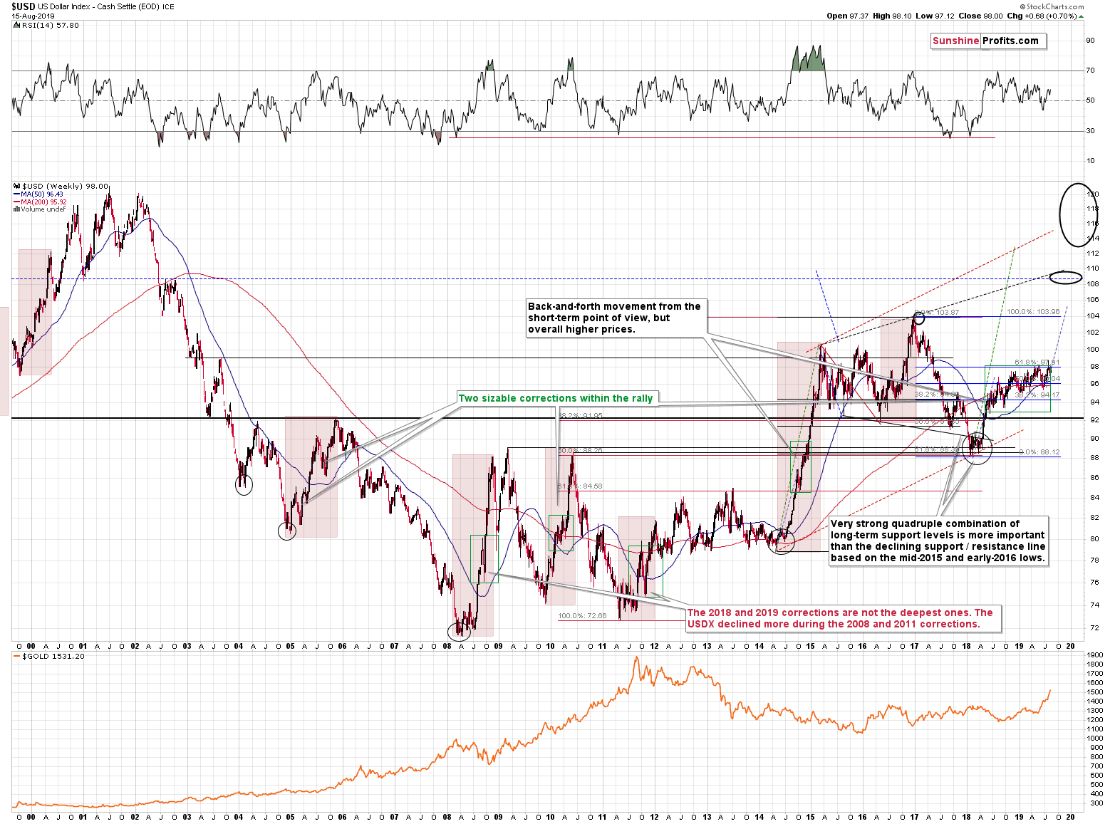
It’s holding up extremely well despite Trump’s calls for lower USD values, the major shift in Fed’s policy (moving from rate hike policy to rate cut policy). The only thing that the above combination of strong bearish factors was able to do, was to prolong USD’s consolidation. Consolidation, during which the currency moves higher on average anyway. Running corrections like that are typical of the strongest of the bull markets.
Even though the above chart appears to be very long-term, it’s not long-term enough and it misses the most important technical development of the previous years.
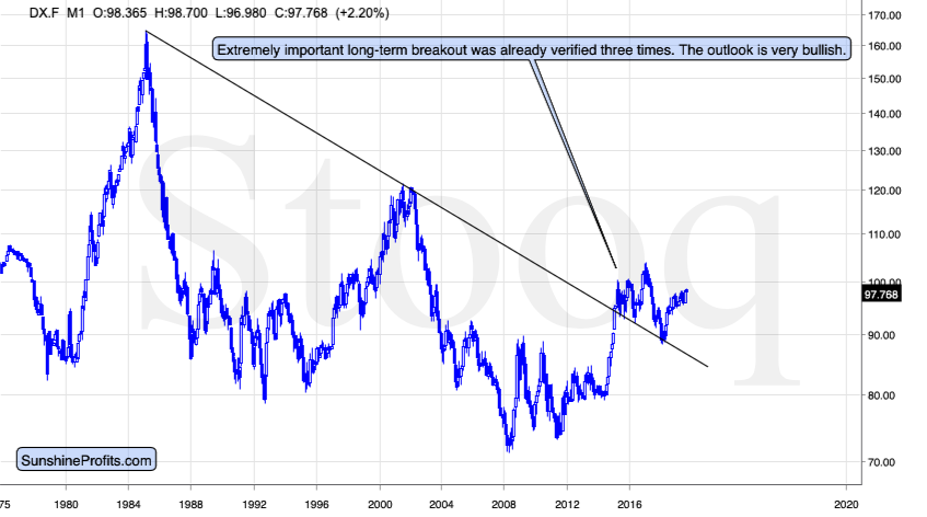
The 2014-2015 rally caused the USD Index to break above the declining very-long-term resistance line, which was verified as support three times. This is a textbook example of a breakout and we can’t stress enough how important it is.
The most notable verification was the final one that we saw in 2018. Since the 2018 bottom, the USD Index is moving higher and the consolidation that it’s been in for about a year now is just a pause after the very initial part of the likely massive rally that’s coming.
If even the Fed and the U.S. President can’t make the USD Index decline for long, just imagine how powerful the bulls really are here. The rally is likely to be huge and the short-term (here: several-month long) consolidation may already be over.
There are two cases on the above chart when the USD Index was just starting its massive rallies: in the early 1980s and in 1995. What happened in gold at that time?
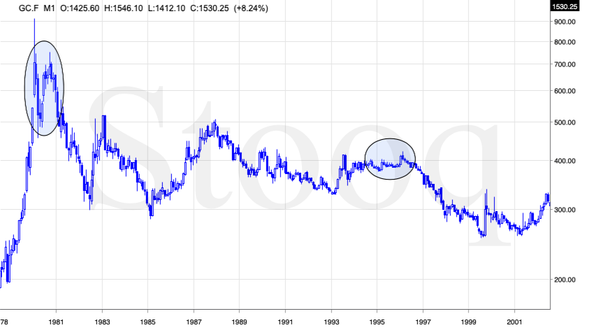
These were the starting points of gold’s most important declines of the past decades. The second example is much more in tune with the current situation as that’s when gold was after years of prolonged consolidation. The early 1980s better compare to what happened after the 2011 top.
Please note that just as what we see right now, gold initially reported some strength – in February 1996 – by rallying a bit above the previous highs. The USD Index bottomed in April 1995, so there was almost a yearly delay in gold’s reaction. But in the end, the USD – gold relationship worked as expected anyway.
The USD’s most recent long-term bottom formed in February 2018 and gold seems to have topped right now. This time, it’s a bit more than a year of delay, but it’s unreasonable to expect just one situation to be repeated to the letter given different economic and geopolitical environments. The situations are not likely to be identical, but they are likely to be similar – and they are.
What happened after the February 1995 top? Gold declined and kept on declining until reaching the final bottom. Only after this bottom was reached, a new powerful bull market started.
But gold just rallied so significantly in the last several months!
… And that’s most likely what people were saying in early 1995, while they were buying at the top.
It’s easy to get carried away by momentum and emotions that it generates (which makes day trading very difficult to some). We’re here for you to analyze the market as objectively and with as much cold logic as possible. And the key points in gold’s supposedly bullish story simply don’t add up. Not yet.
Having said that, let’s look how gold performed before the final 1996 top.
The Profit is in the Details
Without getting into details, just have a glance – please ask yourself the following: are these two charts similar?
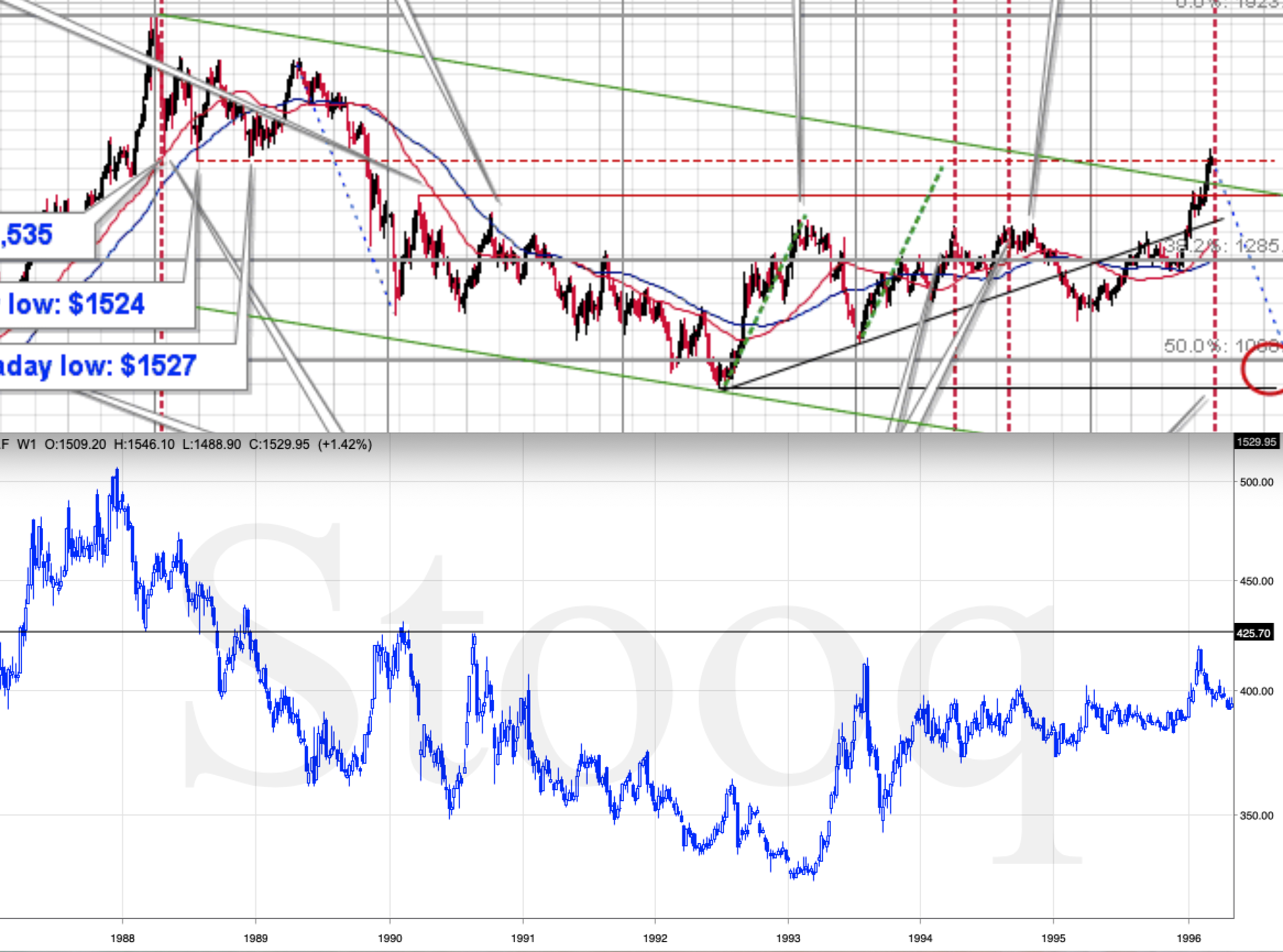
Of course, they are. They are very similar. Not identical, but definitely very similar. They both start with a top and a sharp decline that is then corrected. Then the decline continues, but the volatility declines in the second half of the decline, where the price of gold moves lower in a relatively narrow trading range.
The bottoms (late-2015 and early-1993) are followed by a sharp rally, which is then followed by just as sharp a correction. Then the price moves higher in a less volatile manner. The 2018 high and the late-1994 high are similar as well – gold topped a bit below the previous important (late-2015 and early-1993) highs and then declined (not as much as after the previous important tops though). The late-2018 and 2015 bottom was U-shaped and it was followed by yet another lower top (early-2019 and early-1995). This is when the analogy gets even more interesting.
The February – May 2019 is the time when gold declined a bit, but not much, while the USD Index was moving higher. That’s exactly what happened during most of 1995.
And now, the grand finale of the analogy: in the late 1995 and in May 2019, gold soared, and in both cases, it happened when the USD Index was still moving higher on average, but in a relatively orderly manner. If you look at the very long-term USD Index chart above, you’ll see that the shape of the price move in late-1995 and 1996 is very similar to what we’re seeing since 2018. And how did gold soar?
In recent months, gold rallied a bit more than it did in the initial part of the rally (late-2018 – early-2019) and it moved above its important previous highs.
What happened in 1996? During the final upswing gold rallied a bit more than it did in the initial part of the rally (early 1995) and it moved above the important previous highs (the 1993 high).
What about the shape? Gold soared sharply recently, and it had soared sharply in early 1996 as well.
The similarity is uncanny.
What about the fundamental situation – surely, it’s entirely different right now than it was in early 1996?... Or is it?
The widening yield curve is a bullish factor for gold from the fundamental point of view – we discussed on Thursday. But, just because it heralds recessions, it doesn’t mean that one has to start right away and that gold has to react by rallying right away. The fundamental situation is positive, but… What did the yield curve do in the 90s? It declined.
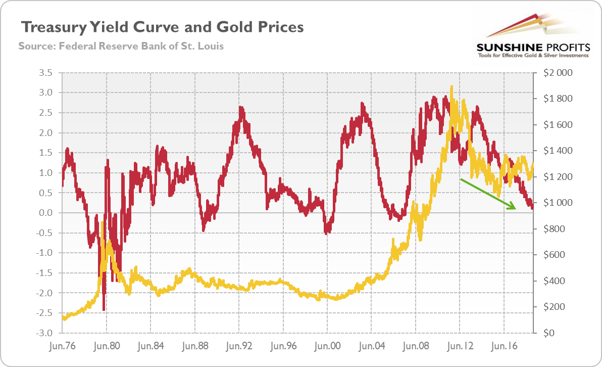
The slide in the spread between 10-year and 2-year Treasury bonds in the first half of the decade was just as profound as what we saw in the last few years. There were rebounds, but overall the decline in the spread continued until the year 2000. And the same happened with the gold price.
The widening yield curve inversion is a bullish factor for gold – in general and for the long term – but it doesn’t prevent a meltdown in the medium term. In fact, the current analogy to what happened in the mid-90s and its bearish consequences for gold are not invalidated by the situation in the bond market. One could even say that they support history’s repeat.
Summary
Summing up, the situation in the USD Index is very bullish for the following months, and suggests that gold’s recent action was likely a fake upswing, similar to the 1995-1996 one. Silver and mining stocks confirm the importance of the 1996-2019 analogy. Gold is likely to move much higher in the following years, perhaps based on a recession, but not before declining substantially first as the USD Index soars. The relatively weak performance (from the long-term point of view) of silver and mining stocks confirms it.
We know that these are not pleasant times for anyone who refuses to jump on the bullish bandwagon just because prices are moving higher, but what’s profitable is rarely the thing that feels good initially. In those circumstances, we simply cannot forecast gold at higher prices in the medium term. There will most likely be times when gold is trading well above the 2011 highs, but they are unlikely to be seen without being preceded by a sharp drop first.
Naturally, the above is up-to-date at the moment of publishing and the situation may – and is likely to – change in the future. If you’d like to receive follow-ups to the above analysis, we invite you to sign up to our gold news newsletter. You’ll receive our articles for free and if you don’t like them, you can unsubscribe in just a few seconds. Sign up today.
Przemyslaw Radomski, CFA
Editor-in-chief, Gold & Silver Fund Manager
Sunshine Profits - Effective Investments through Diligence and Care
* * * * *
All essays, research and information found above represent analyses and opinions of Przemyslaw Radomski, CFA and Sunshine Profits' associates only. As such, it may prove wrong and be a subject to change without notice. Opinions and analyses were based on data available to authors of respective essays at the time of writing. Although the information provided above is based on careful research and sources that are believed to be accurate, Przemyslaw Radomski, CFA and his associates do not guarantee the accuracy or thoroughness of the data or information reported. The opinions published above are neither an offer nor a recommendation to purchase or sell any securities. Mr. Radomski is not a Registered Securities Advisor. By reading Przemyslaw Radomski's, CFA reports you fully agree that he will not be held responsible or liable for any decisions you make regarding any information provided in these reports. Investing, trading and speculation in any financial markets may involve high risk of loss. Przemyslaw Radomski, CFA, Sunshine Profits' employees and affiliates as well as members of their families may have a short or long position in any securities, including those mentioned in any of the reports or essays, and may make additional purchases and/or sales of those securities without notice.
 Przemyslaw Radomski, CFA, is the founder, owner and the main editor of SunshineProfits.com. You can reach Przemyslaw at: http://www.sunshineprofits.com/help/contact-us/.
More from Gold-Eagle


