Gold Price Forecast: How Margin Debt Can Affect Gold


“Quick, get in on the action! Plenty to go around for everyone! After all stock prices are only going higher…what can go wrong?” So seem to think the legions of investors who are engaged in an overleveraged and speculative feeding frenzy. Prospect of a market bubble anyone? Is there really cause for concern?
But before we get to overleveraged markets, let’s look at how gold, silver and the miners are hesitating recently while the USDX seeks direction.
Gold dipped slightly in today’s morning trading and yesterday proved to be quite uneventful. Even though the USD index did move a bit higher, it seems that the traders are not buying this week’s strength.
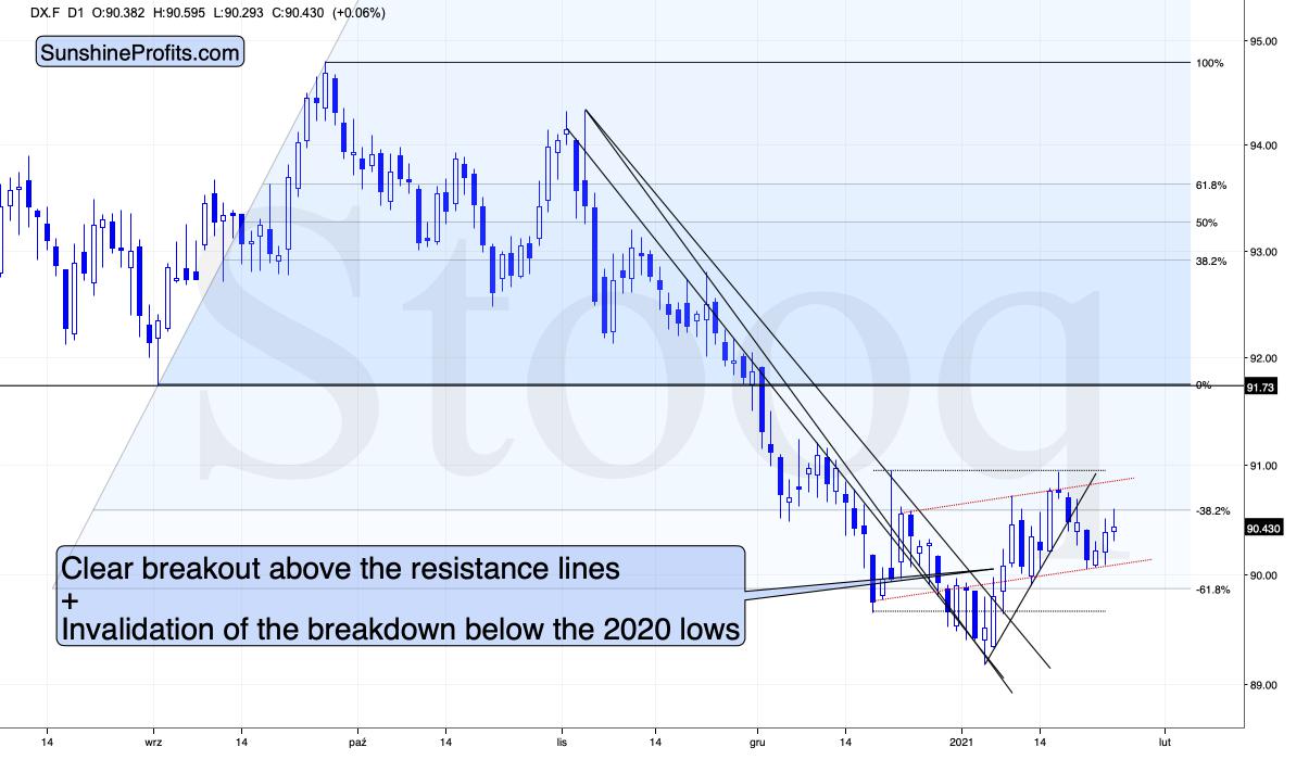
Figure 1 – USD Index (DX.F)
And I don’t blame them, because it doesn’t look convincing to me, either. Don’t get me wrong – I think that the USD Index is likely to rally in the following weeks, but as far as the next several days are concerned, the situation is relatively unclear.
The USD Index finds itself after the breakout above the declining medium-term resistance line, but it’s also after a breakdown below the rising short-term support line. Consequently, it’s very short-term outlook is relatively unclear. In all cases, I don’t see it moving visibly below the previous 2021 low.
And since the situation is unclear with regard to the short-term in case of the USDX, it would be natural for gold to hesitate.
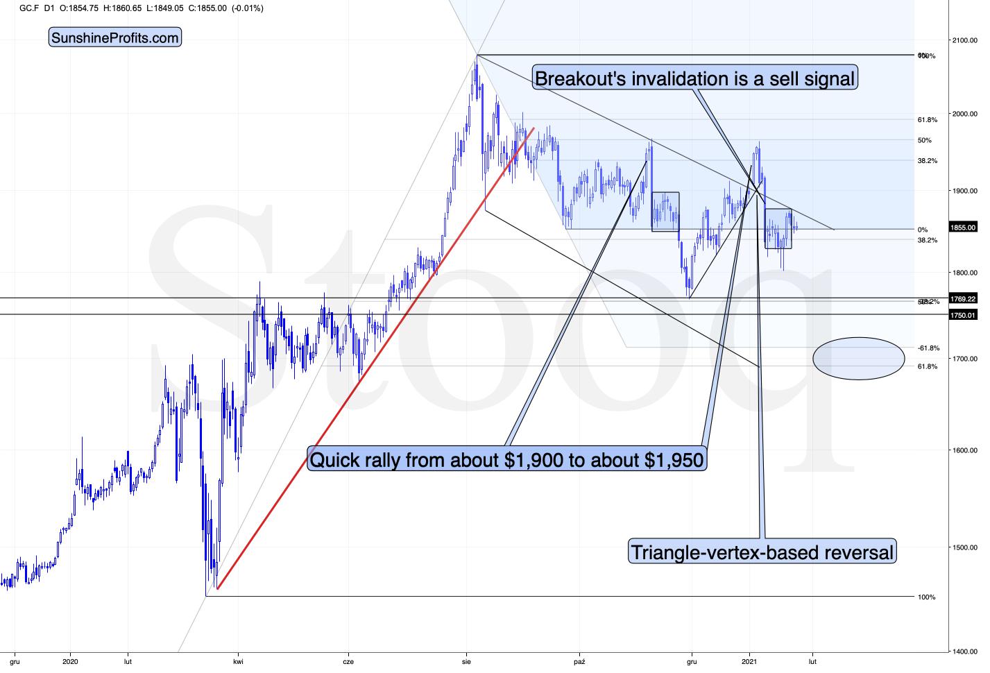
Figure 2 - COMEX Gold Futures (GC.F)
And that’s exactly what it’s doing.
Looking at the above chart, I marked the November consolidation with a blue rectangle, and I copied it to the current situation, based on the end of the huge daily downswing. Gold moved briefly below it in recent days, after which it rallied back up, and right now it’s very close to the upper right corner of the rectangle.
This means that the current situation remains very similar to what we saw back in November, right before another slide started – and this second slide was bigger than the first one. Consequently, there’s a good reason for gold to reverse any day (or hour) now.
And what happened last Friday (Jan. 22)?
Well, gold fell by 0.52% as the Yellen-led intoxication began to wear off. Gold also continues to decline in today’s (Jan. 25) pre-market trading, despite a small move lower in the USD Index.
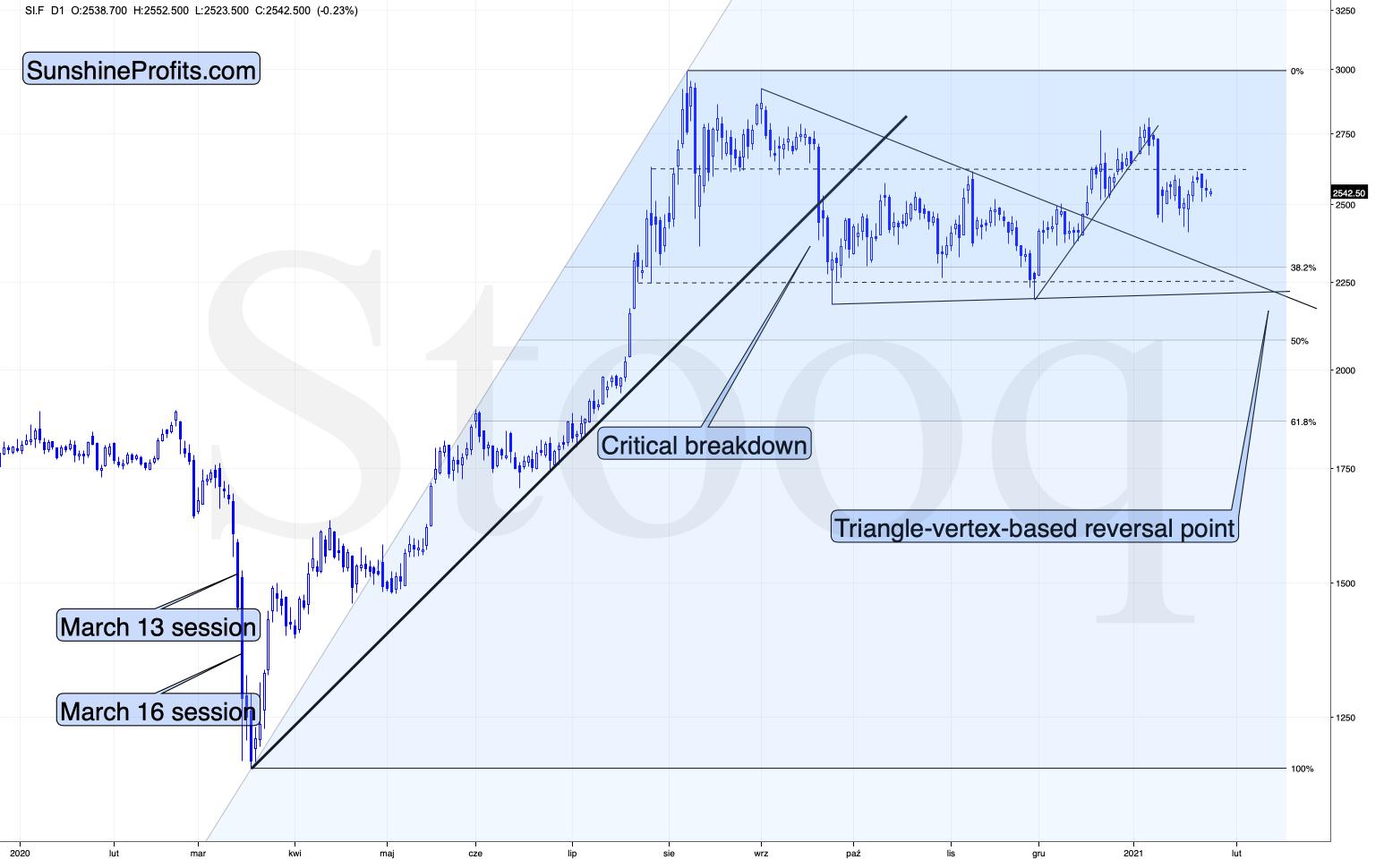
Figure 3 - COMEX Silver Futures (SI.F)
Similarly to gold, silver is not doing much. The white metal is moving back and forth after the big January slide and it seems to be preparing for another move lower.
Let’s keep in mind that silver has a triangle-vertex-based reversal in late February – close to Feb. 23. Based on what we’ve seen so far, it seems quite likely that it will be a major bottom (not likely the final one for this slide, though).
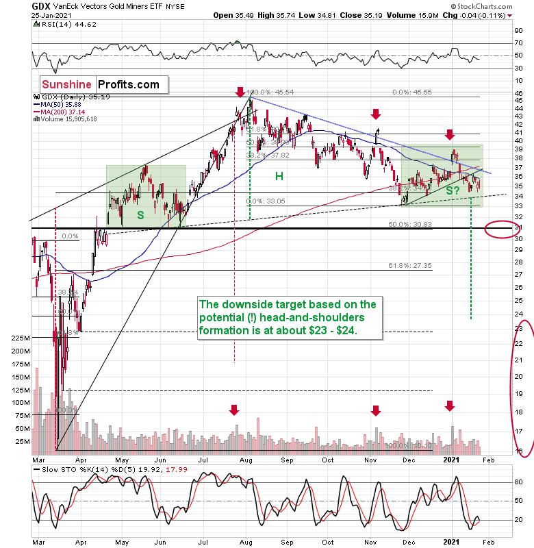
Figure 4 - VanEck Vectors Gold Miners ETF (GDX)
Miners didn’t do much yesterday either.
If you analyze the chart above, the area on the left (marked S) represents the first shoulder, while the area in the middle (H) represents the head and the area on the right (second S) represents the potential second shoulder.
Right now, $33.7-$34 is the do-or-die area. If the GDX breaks below this (where the right shoulder forms) it could trigger a decline back to the $24 to $23 range (measured by the spread between the head and the neckline; marked with green).
And after analyzing Thursday’s (Jan. 21) price action, I wrote the following (on Jan. 22):
As far as the miners are concerned, mining stocks didn’t correct half of their 2021 decline. They didn’t invalidate the breakdown below the rising support line, either. In fact, the GDX ETF closed yesterday’s session below the 50-day moving average. Technically, nothing changed.
Regarding the GDX ETF’s current consolidation pattern (November to present), it mirrors what we saw between April and June of last year (the shaded green rectangles above).
I added:
Both shoulders of the head-and-shoulder formation can be identical, but they don’t have to be, so it’s not that the current consolidation has to end at the right border of the current rectangle. However, the fact that the price is already close to this right border tells us that it would be very normal for the consolidation to end any day now – most likely before the end of January.
If we see a rally to $37, or even $38, it won’t change much – the outlook will remain intact anyway, and the right shoulder of the potential head-and-shoulders formation will remain similar to the left shoulder.
But with many paths to get there, is hitting $37 or $38 a prerequisite to the eventual decline? Absolutely not. The GDX ETF could reverse right away and catch many market participants flat-footed.
Remember, it’s important to keep last week’s rally in context. Despite the Yellen-driven bounce, the GDX ETF is still down considerably from its January highs.
I recently received a question as to whether the H&S pattern is indeed symmetrical or not – i.e., are the shoulders really similar to each other.
In general, we will be able to better estimate that only after the GDX breaks below the neck level of the pattern (the dotted line). Until that happens, the formation is only a “potential” one and we don’t yet know how long the right shoulder will take to form. Based on yesterday’s (Jan. 25) closing price, the right shoulder is still “under construction”.
The green rectangles are identical (Figures 4/5) – I marked the left shoulder with it, and I copied and pasted it to the current situation. If the GDX breaks below the neckline this week, both shoulders will be identical or almost identical in terms of time.
Let’s take a closer look at the shape of these shoulders.
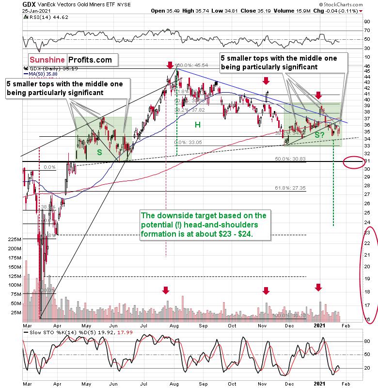
Figure 5 - VanEck Vectors Gold Miners ETF (GDX)
Each of them consists of five individual tops, with the middle one being particularly significant. The volatility is smaller this time, so the tops are not as clear, but they are still visible.
Moreover, when taking into account the current rising support line that was broken in mid-January, we see that it’s symmetrical to the declining support line that we saw in May and early June. The symmetry implies that the current breakdown would be symmetric to a “breakdown” that would have taken place if one moved backwards in time. This sounds esoteric, but it’s quite simple when one looks at what happened on the chart in mid-May. What preceded this “breakdown”? Consolidation, and before that we saw a rally and then some more back and forth movement. We see something symmetrical this time, so it all “fits”.
Naturally, the history will never repeat itself to the letter, but it seems that the above is enough to view both shoulders as being at least “similar”.
Regardless, the bearish implications will be in place only after we see a confirmed breakdown below the neck level. Until that happens, the bearish implications are only “potential”.
Having said that, let’s take a look at the market from a more fundamental angle.
Up, Up and Away!
Like pouring gasoline on a fire, I warned on Dec. 29 that record margin debt was fueling equities’ speculative frenzy.
I wrote:
Margin is used by investors to increase the amount of assets in their portfolio. Essentially, it increases their buying power. For example, if an investor has $100,000 in cash, he can borrow $100,000 and increase his portfolio holdings to $200,000 (50% margin). And in a nutshell, speculative investors use margin to increase their total returns.
However, like a double-edged sword, margin also increases losses when trades go south. At the same time, brokerages can issue a ‘margin call’ and force the investor to sell all of his holdings.
And while November’s data pegged monthly margin at $722.19 billion, in December that figure ballooned to an all-time high of $778.04 billion.
Please see below:
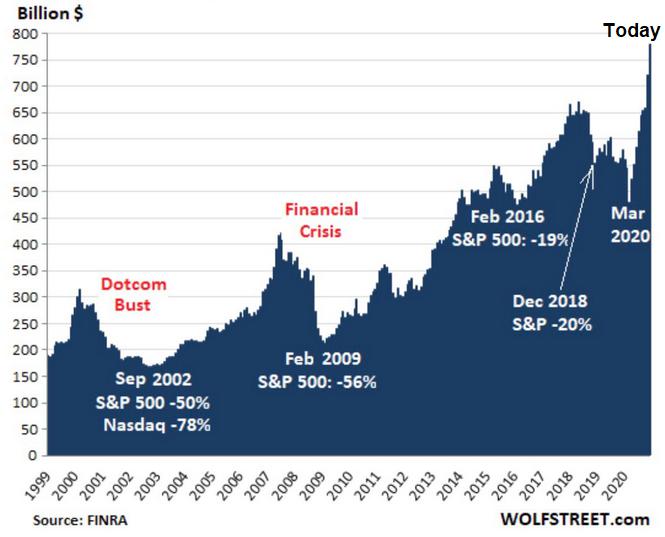
Figure 6 - Margin Debt to Economic Drawdowns Comparison (1999-2020)
If you analyze the chart above, you can see that each time margin debt swelled, a reversal occurred, with the eventual unwinding of excessive leverage which resulted in sharp and violent drawdowns.
To explain, notice how the S&P 500 moves in lockstep with monthly margin debt?
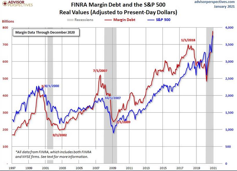
Figure 7
For context, the red line above depicts monthly margin debt, while the blue line above depicts the S&P 500. And like a scene out of The Exorcist, the S&P 500 is essentially possessed by the debt-driven binge.
Even more striking, notice how (from left to right) the previous highs in monthly margin debt actually preceded the dot-com bubble and the 2008 financial crisis? And considering where margin levels are today, those two drawdowns look like child’s play.
In addition, monthly margin debt has surged by 62% over the last eight months. Excluding today, a rush of this magnitude has only occurred four other times in history:
-
Aug. 1973: a bear market followed
-
Jul. 1983: a 14% decline followed
-
Mar. 2000: a bear market followed
-
Jun. 2007: a bear market followed
For context, a bear market occurs when an asset’s price declines by 20% or more.
Please see below:
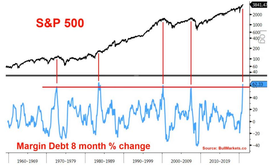
Figure 8
To explain the chart above, the light blue line depicts the eight-month percentage change in margin, while the vertical red lines intersect with the S&P 500 at the above-mentioned dates. As you can see, three of the four occasions resulted in substantial declines – with the S&P 500 falling by 50% or more following the margin buildups in 1973, 2000 and 2007.
At the corporate level, it’s nearly identical. If you analyze the chart below, you can see that combined companies within the Russell 2000 index have (by far) the highest aggregate debt/EBITDA ratio when compared to other historical crises.
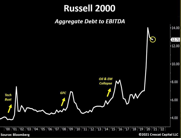
Figure 9
To explain, aggregate debt represents the combined principal and interest payments owed, while EBITDA is an acronym for earnings before interest, taxes, depreciation and amortization. Furthermore, because interest is paid before taxes (and depreciation and amortization are non-cash charges) lenders use EBITDA as a proxy for a company’s debt-service cash flow.
However, with aggregate debt liabilities nearly 13x their EBITDA, companies within the Russell 2000 are more levered now than ever. In addition, if you follow the three yellow arrows, during the dot-com bubble, the global financial crisis and the 2015/2016 oil crash, aggregate debt/EBITDA never even hit 9x. It seems like everyone and their brother now think that taking on more debt is a great strategy.
As another sign of the debt binge, the riskiest companies are now able to borrow at the lowest interest rates ever. On Thursday (Jan. 21), the yield on CCC rated bonds hit an all-time low.
Please see below:
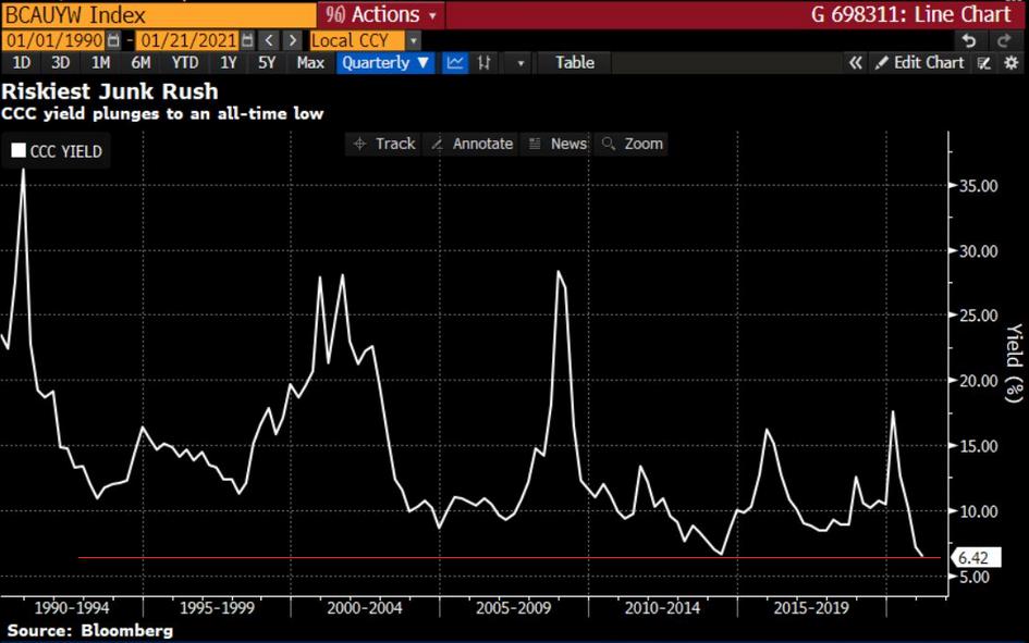
Figure 10
For context, Standard & Poor’s (S&P) classifies CCC bonds “as having significant speculative characteristics.” Furthermore, the U.S. ratings agency labels CCC companies as “dependent on favorable business, financial, and economic conditions.”
Please see below:

Source: S&P Global Ratings
In addition, and because yields and prices move in opposite directions, all-time low yields means that CCC bonds are now trading at their highest valuation ever. And considering we’re nowhere near “favorable business, financial, and economic conditions” does investors’ capital allocation behavior seem rational?
To summarize, the surge in speculation is likely to end similarly to other historical feeding frenzies. But more importantly, the precious metals will likely suffer as well.
Please take one more look at the above chart and note that the previous extreme low was somewhere in mid-2013. What does it signal for gold? Remember what happened then in gold, silver and mining stocks? Carnage.
Case in point? The percentage of NASDAQ Composite companies trading above their 200-day moving average is now at its highest level since 2004. Being long might not be the best investment idea at this time – at least with the medium term in mind.
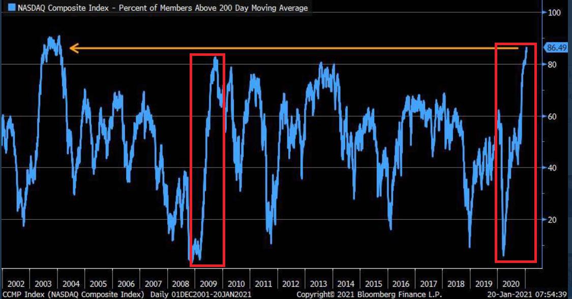
Figure 11 - Source: Bloomberg/ Liz Ann Sonders
To highlight why averages exist in the first place, notice the identical pattern that emerged from 2009 to 2010 (the red boxes)? Following the 2008 financial (housing) crisis, U.S. equities bottomed in March of 2009. Several months later, euphoria took hold and the percentage of NASDAQ Composite companies trading above their 200-day MA surged back to record levels (near the end of 2009).
Another happy ending?
Not quite.
As valuations decoupled from reality, a Minsky Moment struck in early 2010, with the NASDAQ Composite plunging by more than 17% in just over two months.
Along for the ride, the NASDAQ 100 – the largest 100 companies in the index – also declined by nearly 16%.
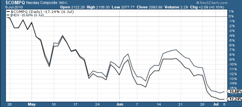
Figure 12 – Nasdaq Composite Index
And circling back to the precious metals, the performance of the NASDAQ 100 is an important variable. If you analyze the chart below, you can see that the last five times the NASDAQ 100 declined by more than 2% in a single day – gold, silver and the gold miners all suffered significant drawdowns.
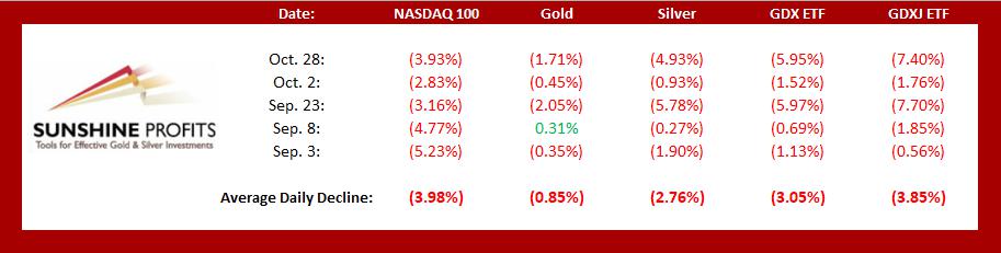
Figure 13
In conclusion, U.S. equities continue to walk the tightrope. And while their balance remains sure-footed for the time being, history suggests the eventual unwind will be quite spectacular. More importantly though, once the fall occurs, the PMs won’t be given a safety net. As a result, another move lower is likely to happen before an attractive entry point presents itself.
Summary
The top is in and the following days are not likely to be pleasant times for anyone who jumps on the bullish bandwagon just because prices moved higher in the previous months. But what’s profitable is rarely the thing that feels good initially. As silver often moves in close relation to the yellow metal, forecasting gold’s rally without a bigger decline first is thus likely to be misleading. Silver is likely to slide as well. The times when gold is continuously trading well above the 2011 highs will come, but they are unlikely to be seen without being preceded by a sharp drop first.
Thank you for reading our free analysis today. Please note that it is just a small fraction of today’s all-encompassing Gold & Silver Trading Alert. The latter includes multiple premium details such as the outline of our trading strategy as gold moves lower.
If you’d like to read those premium details, we have good news for you. As soon as you sign up for our free gold newsletter, you’ll get a free 7-day no-obligation trial access to our premium Gold & Silver Trading Alerts. It’s really free – sign up today.
Przemyslaw Radomski, CFA
Editor-in-chief
Sunshine Profits - Effective Investments through Diligence and Care
* * * * *
All essays, research and information found above represent analyses and opinions of Przemyslaw Radomski, CFA and Sunshine Profits' associates only. As such, it may prove wrong and be subject to change without notice. Opinions and analyses are based on data available to authors of respective essays at the time of writing. Although the information provided above is based on careful research and sources that are deemed to be accurate, Przemyslaw Radomski, CFA and his associates do not guarantee the accuracy or thoroughness of the data or information reported. The opinions published above are neither an offer nor a recommendation to purchase or sell any securities. Mr. Radomski is not a Registered Securities Advisor. By reading Przemyslaw Radomski's, CFA reports you fully agree that he will not be held responsible or liable for any decisions you make regarding any information provided in these reports. Investing, trading and speculation in any financial markets may involve high risk of loss. Przemyslaw Radomski, CFA, Sunshine Profits' employees and affiliates as well as members of their families may have a short or long position in any securities, including those mentioned in any of the reports or essays, and may make additional purchases and/or sales of those securities without notice.
********
 Przemyslaw Radomski, CFA, is the founder, owner and the main editor of SunshineProfits.com. You can reach Przemyslaw at: http://www.sunshineprofits.com/help/contact-us/.


