Gold Ratio Charts are Speaking...Are You Listening?


In this Weekend Report I would like to compare gold to some of the more important markets to get a feel for the bigger picture that seems to be shaping up or gold. During gold’s bull market years it generally was stronger than most areas of the markets but since the 2011 high that has changed significantly. Gold has been under performing just about everything to a certain degree. The picture I’m going to try and convey to you is gold still has a lot of work to do on the downside before it can put in a long term low. We can see short to intermediate term rallies at anytime but to get a bear market bottom gold is going to have to start showing some strength compared to a lot of areas in the markets.
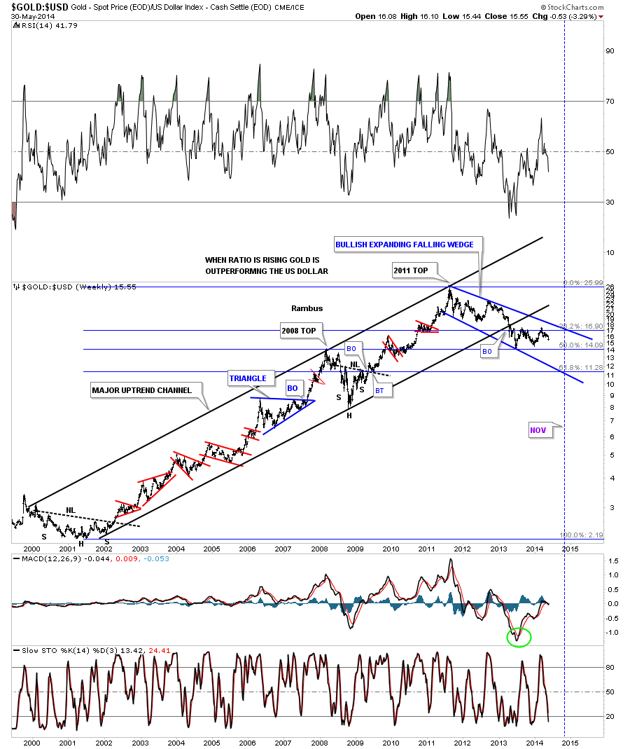
The first ratio chart I would like to show you compares gold to the US Dollar. This weekly chart encompasses gold’s bull market that began in 2001 vs the US Dollar. As you can see it was a classic bull market that created one consolidation pattern on top of the other with the exception of the 2008 crash. From the low in 2008 gold went on to form higher highs and higher lows until the bull market top in 2011. As you can see the major uptrend channel was broken in April of last year when carnage came to the PM complex.
There is good news and bad news with this ratio chart. First the bad news. As you can see this ratio has been building out an expanding falling wedge where a fib 62% retrace would come in around the 11.28 area. This would coincide with gold going under 1000. The good news is this expanding falling wedge could be a consolidation pattern within the gold’s secular bull market. All we know right now is that gold is in a bear market as its been making lower lows and lower highs since the bull market top in September of 2011.
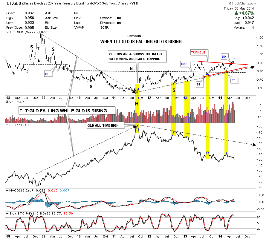
This next chart I would like to show how the TLT, 20 year bond, is doing compared to gold. This chart has been speaking volumes to me as it does a good job defining the big trends in gold. As you can see when the TLT is under performing gold the yellow metal rises. Since gold made its bull market top in 2011 the ratio has been steadily rising carving out a massive H&S bottom. This ratio formed a red triangle right on top of the neckline that strongly suggested that this ratio would begin to rise once the breakout and backtest occurred. Note the last bar on the far right hand side of the chart that shows this ratio in now starting to takeoff as all the work is done. This chart is telling us the decline in gold isn’t going to end anytime soon. Yes we could get a short term rally but not a major rally at this time IMHO.
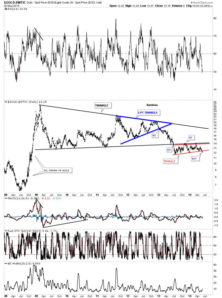
The long term weekly chart that compares gold to oil has been forming a massive triangle reversal pattern that broke down in June of last year. As you can see its been building out a red bearish rising wedge, just below the bottom rail of the big triangle, that is just now starting to breakout to the downside. It looks like oil is going to be stronger than gold on a relative basis.
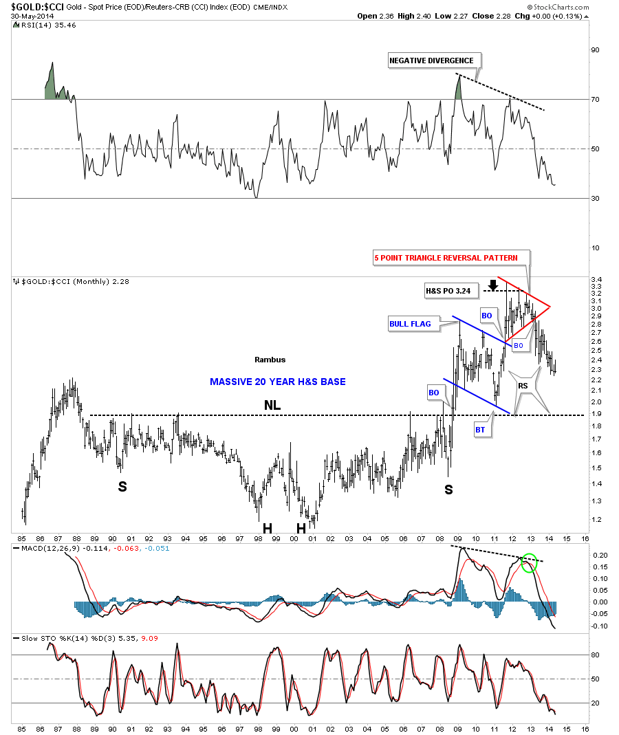
Let's now compare gold to the CCI, commodities index that shows how this ratio formed a massive inverse H&S bottom that led to the bull market for gold vs the CCI. This chart shows some classic Chartology. The massive inverse H&S base had a price objective up to 324, black arrow at the top of the chart. It then formed the red 5 point triangle reversal pattern that ended the bull run. If you look at the far right hand side of the chart you will see this ratio is right on the verge of making new yearly lows. It wouldn’t surprise me if this ratio reverses symmetry down to the 190 area before it finds some important support.
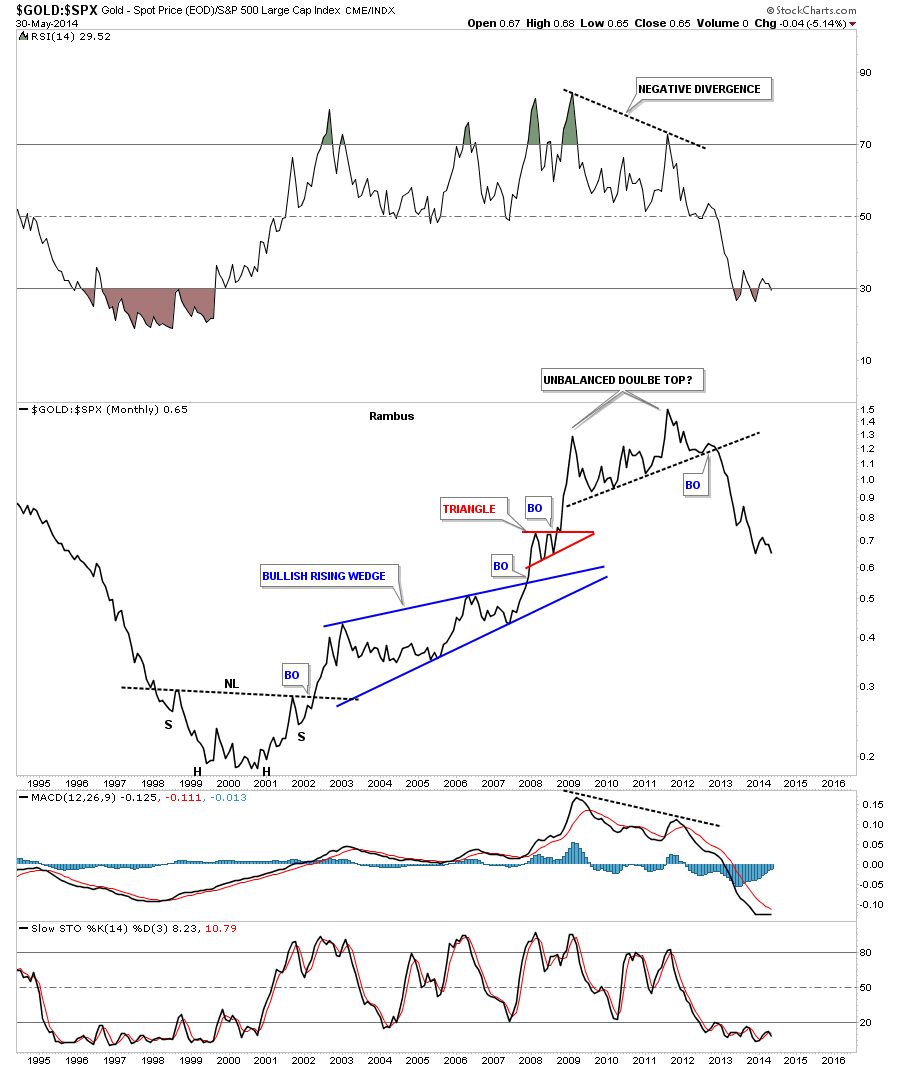
Next I would like to compare gold to the SPX because that is where the real truth lies. I first posted this chart right after the breakout from the unbalance double top. At the time I was wondering if that was truly a major reversal for this ratio. Keep in mind gold had just made a new all time high and the SPX was in the 2011 correction. As you can see the SPX has clearly been the place to invest vs gold since the 2011 top. For whatever reasons, why gold has to go up and the stock markets have to go down, this Chartology ratio chart says just the opposite. I believe this ratio chart is showing us cash is leaving gold and finding its way into the stock markets.
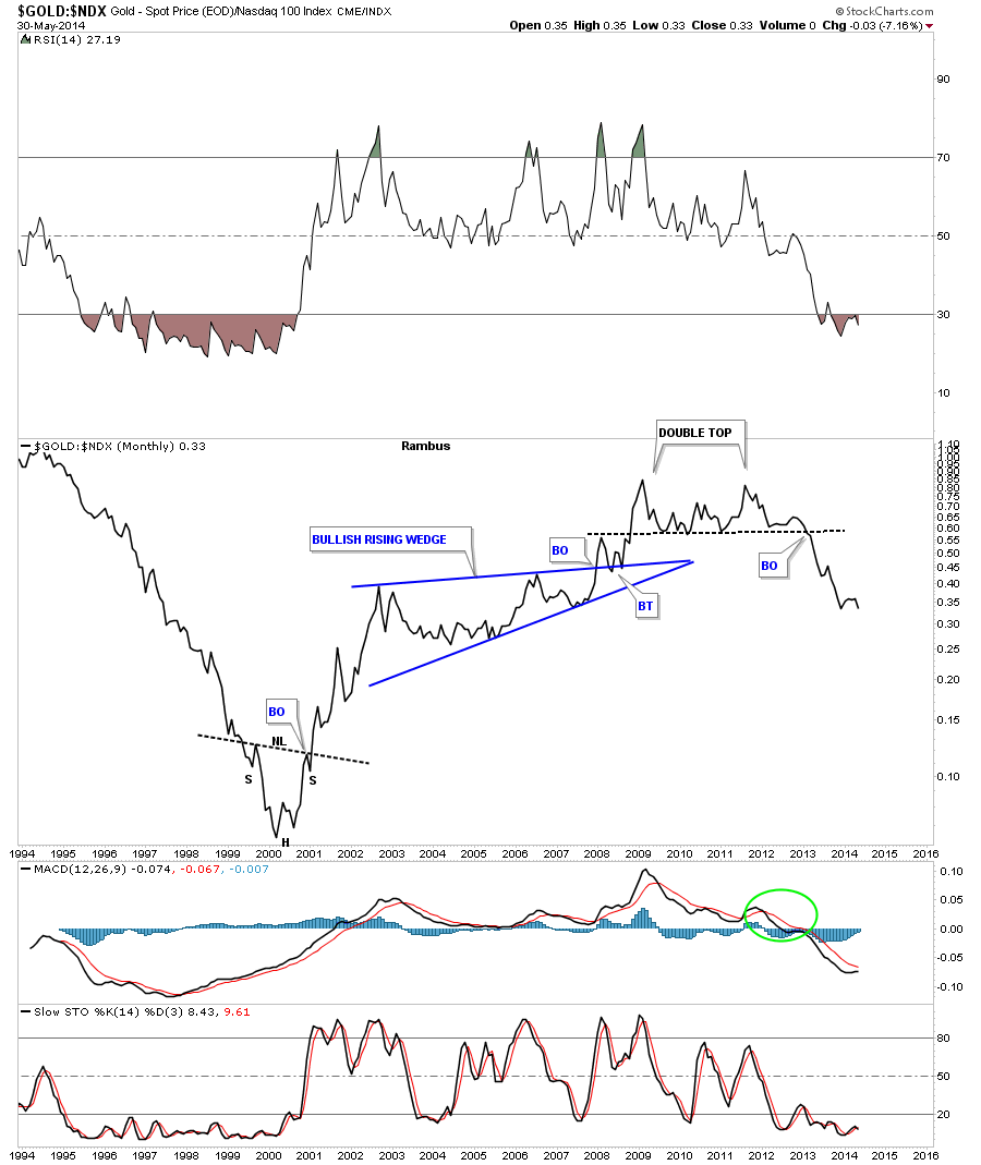
This next chart compares gold to the NDX which has the 100 biggest tech stocks. The double top on this index has more of a traditional look. Note the little inverse H&S bottom that formed in 2000 that led to the bull market for gold vs the NDX.
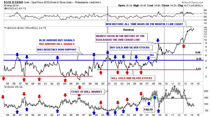
There is one place that gold is outperforming another area. This ratio chart literally blows my mind by the magnitude that gold has been rising vs the XAU. I’ve been showing the chart for years expecting this ratio to revert back to the means. Just when you think it’s ready to do so it produces another all time high high. There was no one on the planet that could have foreseen this ratio being so far out of whack especially during the bull market years. As you can see once the ratio broke above 6.00 that was the beginning of the end for the precious metals stocks vs gold. One day we’ll know what has caused this relationship between gold and the XAU to get this far out of sync but for the time being that isn’t important, it’s knowing that it’s way out of sync and not getting any better, that’s what’s important to grasp.
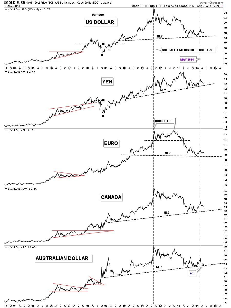
This next chart for gold is a combo chart that shows how gold is doing in other major currencies. Since gold’s all time high vs the US dollar in 2011 the Yen is the only currency to make a higher high. The euro basically put in a double top while the rest have been making lower highs for the most part. As you can see since the small rally in May of this year gold has been falling in all these major currencies.
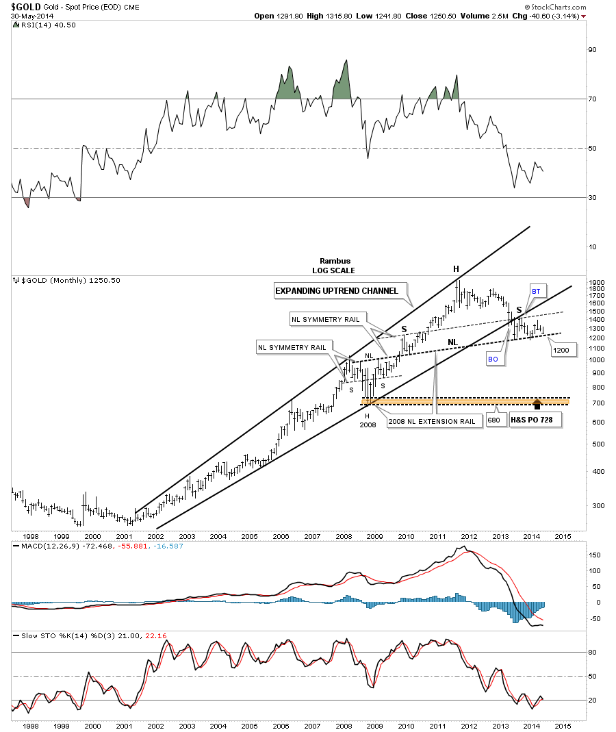
I know how hard it is for a lot of folks to look at this last chart for gold that is showing a potential massive H&S top building out. My job is to interpret the Chartology with an unbiased opinion nothing more nothing less. I wish we were looking at a massive inverse H&S bottom like in 2000 but that isn’t the case. We’ve been following this potential H&S top for eight months or so at Rambus Chartology waiting patiently for this pattern to mature. It looks like 1200 is going to be the key area of support to watch even though 1180 has the previous two lows. Stay tuned as all these charts above are painting a rather negative picture for gold that seems to be getting weaker not stronger vs many different sectors of the markets. All the best…Rambus
 Meet Rambus, a seasoned trader and technical analyst renowned for his unbiased and insightful chart work. Through his website, Rambus Chartology, and Substack newsletter, Rambus shares his expertise with a global community of subscribers, providing daily updates, commentaries, and hands-on training in the art and science of chartology. With his calm, humble, and down-to-earth approach, Rambus demystifies complex market trends, helping his followers navigate the challenges of today's volatile markets. Join the Rambus Chartology community today and discover a unique blend of technical analysis, trading expertise, and time-tested protocols. Subscribe now at www.rambus1.com or https://rambuschartology.substack.com/
More from Gold-Eagle


