Historic Economic Charts


Employment is an important topic for Washington and Wall Street. Citizens who are fully employed are more likely to vote for the political party currently in power and continue making payments on their monthly mortgages. But when examining Department of Labor unemployment data there’s reason to doubt what they release for public consumption. For one thing the Labor Department ignores those unemployed who they classify as “marginally attached.” The quote below by Louis Efron writing for Forbes last August highlights the inadequacy of government unemployment statistics.
“Marginally attached” describes individuals not currently in the labor force who wanted and were available for work. The official unemployment numbers exclude them, because they did not look for work in the 4 weeks preceding the unemployment survey. In July, this marginally attached group accounted for 2.2 million people. To put that in perspective, there are currently 16 states in the U.S. with populations smaller than 2.2 million.
741,000 discouraged workers – workers not currently looking for work because they believe no jobs are available for them – are included within the list of marginally attached people. Another 7.5 million were not considered unemployed because they were employed part-time for economic reasons. Those people are also called involuntary part-time workers – working part-time because their hours were cut back or because they were unable to secure a full-time job.
When you look at state populations – using the 7.5 million – the number represents more than the population of Washington, Massachusetts, or Arizona.
- Louis Efron, Forbes August 2014
Last August, Mr. Efron estimated the unemployment rate was actually 12.6%. However the Department of Labor reported last August’s unemployment rate as 6.2% as seen below. The divergence between these two numbers may best be explained by the fact that 2014 was an election year. The Democrats’ big loss in November’s election suggests the voter, like Mr. Efron, doubted Washington’s unemployment numbers.
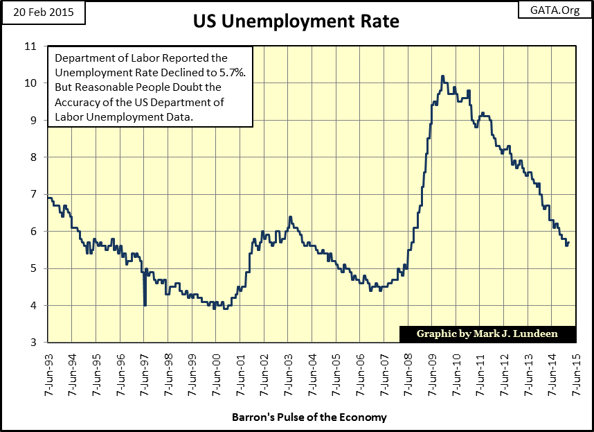
Regardless of their precision, the Labor Department’s unemployment numbers faithfully reflect the inflation and deflation in the American stock market. Greenspan’s high-tech bubble can be seen in the 1993-2000 decline from 7% to 4% unemployment. The “Tech Wreck” bear market of 2000-03 can be seen in the jump in unemployment. The same can be said for the Sub-Prime Mortgage bubble as the unemployment rate more than doubled from 2007 to 2009. Though we may doubt the veracity of the Labor Department unemployment statistics, the data may be best used as a timing system for entering and exiting the stock market, and right now it’s signaling a solid buy in equities. But with the Dow Jones ending the week at a new all-time high, you may want to take some profits just the same.
Another view of employment can be seen in the rising government payrolls and declining manufacturing payrolls over the past twenty years. In the aftermath of the high-tech bubble (2000 to 2003), American manufacturing (Blue Plot below) saw a contraction of four million jobs. The housing bubble (2003-07) did little to reverse the trend, but the credit crisis (2008-2010), like the tech-wreck resulted in a net loss of another four million jobs for a total of eight million lost paychecks between 2000 and 2011.
In the past four years the number of paychecks issued by American manufacturers has increased by over a million, but are these paychecks the same total amount with similar benefits as the ones lost since 2000? And are any of these new paychecks going to employees laid off during the credit crisis? I don’t know, but for the eight million American factory workers laid off between 2000 and 2011, most had to seek employment outside of manufacturing, taking a substantial cut in pay and benefits. If these workers took on excessive mortgage debt during the housing boom, they now face even more difficulty as they approach retirement age.
In the meantime, Americans employed by the government (Red Plot) increased by four million from 1993 to 2010. Government paychecks were reduced by just under a million in the following year and have hovered around 22 million ever since, and this is a problem. Manufacturing jobs (blue plot) create wealth; government jobs (red plot) consume wealth. Right now there are more paychecks going to government employees in the US than there are to those employed in manufacturing.
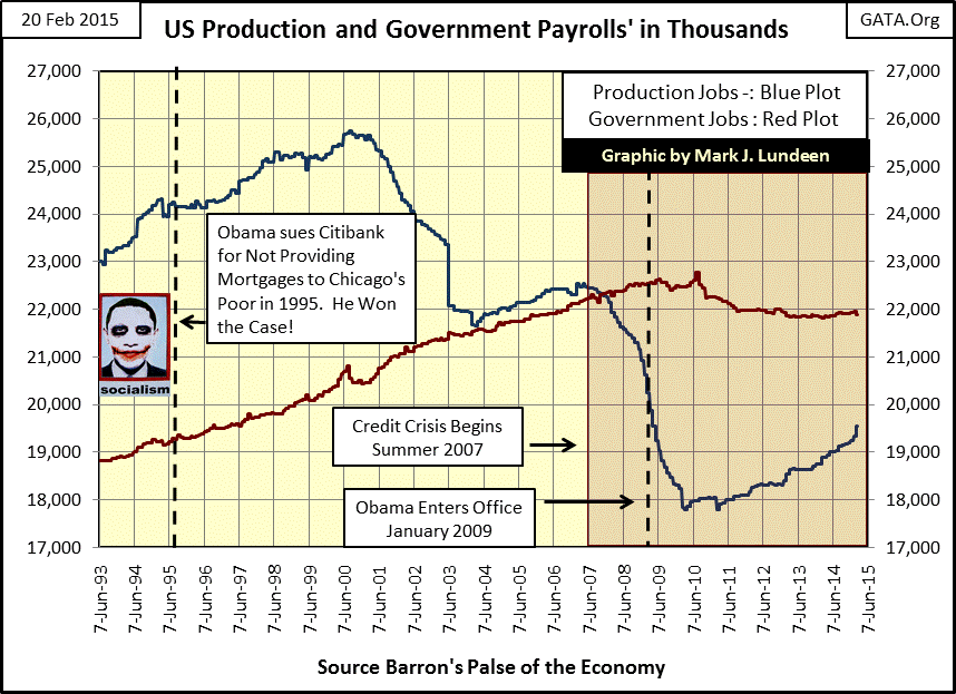
“Policy makers” rarely see any problem with more paychecks going to government employees than to factory workers. “Policy makers” are typically employed by Wall Street or government. But the promises that the government from Washington to city hall has been making for decades to its employees are more than its tax base can support.
Ultimately these trends in employment will bankrupt the country and render the dollar worthless. The national debt now exceeds eighteen trillion dollars, and as I noted two weeks ago in my article on bond yields tax exempt muni-bond yields have been higher than best-grade corporate bond yields since November 2010. This can only be explained by concerns that state and local government pension and benefit packages are placing these municipal bond issuers at risk of default; think Detroit.
I’ve placed President Obama’s photo in the chart above to note his role in the sub-prime fiasco. As a Chicago community organizer Obama won his civil action against Citibank in 1995, forcing the bank to lower lending standards for mortgages to Chicago’s inner-city poor. At the time this victory was reported in the pages of the Chicago Sun-Times, but totally omitted by the media during his 2007-08 presidential campaign when the term “sub-prime” became a dirty word. Let’s take a look at housing permits issued since 1969 to see changes in the construction market for single family homes over the past five decades.
The early years of the 1970s were a boom time for construction, until January 1973 when the Dow Jones entered its first 40% bear market since 1942; housing permits declined by 68% over the next two years. Then, from 1975 to 1991 the housing market saw two boom and bust cycles; permits increased from 750,000 to about 2,000,000, twice, only to decline again to 750,000. The boom in housing permits from 1991 to 2006 is interesting as it was all boom and no bust, that is, until October 2005 when housing permits peaked at 2,240,000. By the summer of 2007, permits had already fallen by 33% even before the news that two of Bear Stearns’ hedge funds were insolvent due to defaults in the mortgage market. By May 2009, permits had fallen to a five decade low of 494,000, a collapse of 72% from October 2005.
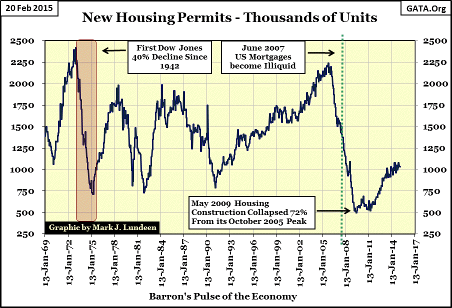
Since the May 2009 bottom in permits the single family home construction industry has improved, but this recovery is lackluster at best when compared to past recoveries since 1969. The problem is that after the recent boom there is no shortage of new homes, and the pool of qualified prospects for new home financing is relatively small. But current prospects in home construction are but a small part of what we see in the chart above. The boom in home permits during the Greenspan Fed, and the Bernanke Fed’s mortgage bust shook global financing, and ultimately destroyed two historic Wall Street houses: Bear Stearns and Lehman Brothers.
This REUTERS article lists twelve key dates and share prices for the Bear Stearns mortgage debacle. lt’s important to note how slow Wall Street research analysts were to price Bear Stearns’ mortgage problems into their shares. Prudent Bear's Doug Noland was highlighting the fraudulent nature of the mortgage market years before disaster stuck.
There is good reason to doubt that today’s Wall Street research is any better, especially in their coverage of central banking. Central banks, like the Federal Reserve were the source of inflation that created bubbles in stock, bond and mortgage markets worldwide. When those bubbles ruptured, instead of forcing the financial system to mark those bad assets to market and take losses to free the economy from unserviceable debt, they “monetized” garbage-debt instruments held by their banking systems, and “injected” the liquefied residue back into their financial system. But bailing out the banks didn’t solve the problem; it only shifted the problem of illiquid debt to the balance sheet of the central banks.
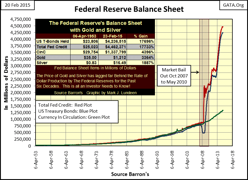
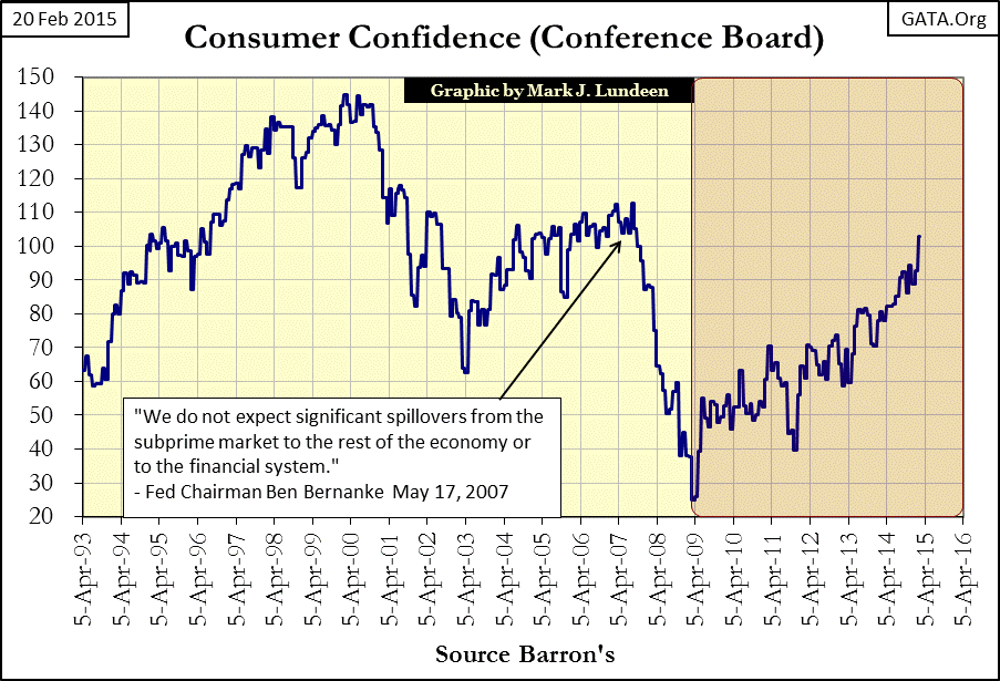
The Federal Reserve’s balance sheet above is the only reason one needs to justify selling stocks and bond and purchasing precious metals. However most retail investors still trust Wall Street based investment advice. I know that to be true when I look at the Consumer Confidence Index below. Most people still believe the system has everyone’s best interest at heart; but they’re wrong.
In the past few decades Americans have fallen in love with their credit cards. As a percentage of their income the burden of consumer debt has increased from 13% to 22% of their income. Though that’s a dangerous trend, but I wish Congress was managing its finances as well as US taxpayers.
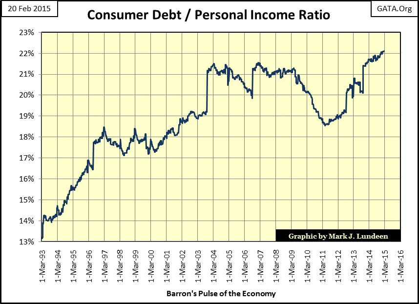
I find it interesting how academia and Washington think of private citizens (taxpayers) as “consumers” when in fact it is they themselves who are the ungrateful consumers of the taxpayers’ money.
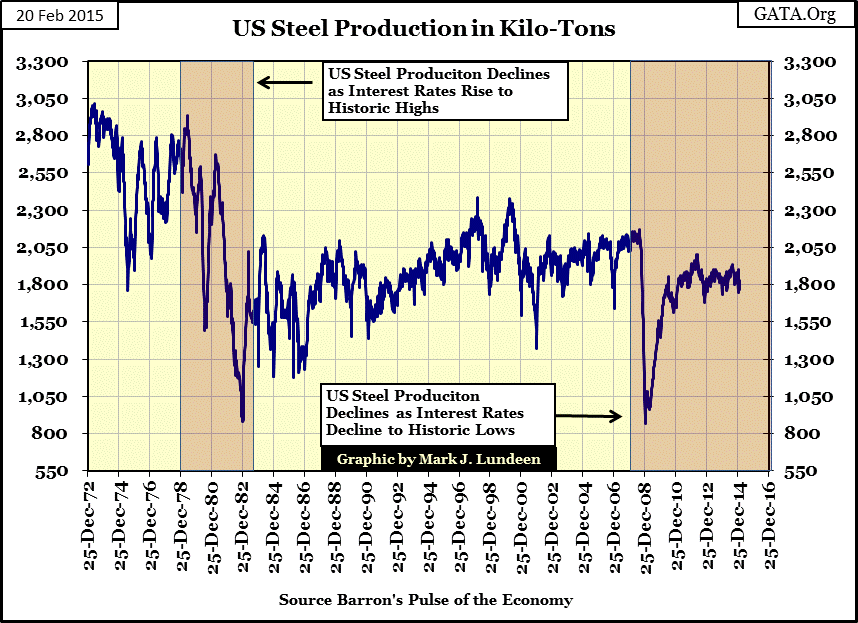
Next is a chart showing U.S. steel production in kilo-tons; I wish I had this data going back to the 1920s. Barron’s ran a series of articles on the domestic steel industry in the early 1950s. At the time Barron’s was concerned that the unions were preventing modernization of the US steel industry by demanding large pay raises and benefits packages. The unions were concerned that a modernized steel industry would employ fewer union members, so they wanted to deny steel companies the capital needed to modernize by increasing the cost of labor. The early 1950s was also the time of the Marshall Plan to aid in the reindustrialization of Europe and Japan. Except for Canada and the United States, the global industrial base had been bombed into the stone age, ensuring that any steel infrastructure rebuilt outside North America would be ultramodern.
The decline in U.S. steel production in the early 1970s wasn’t just due to rising interest rates, but the unfortunate fact that the American steel industry built by Andrew Carnegie in the 1870s & 80s, the same steel industry the American unions fought for in the 1950s, just could not compete with the steel mills in Japan and Germany in the international market. By the late 1970s the American steel industry in Illinois, Indiana, Ohio & Pennsylvania had become the “Rust Belt.” With the decline in the American steel industry many union members lost the high-paying jobs and benefits, including pensions won two decades earlier. They learned the lesson that one should be careful what one wishes for; as you may get it.
I find it fascinating that steel production has experienced two large declines since 1972; the first as Paul Volcker raised the Fed Funds rate to double digits, and the second as Doctor Bernanke lowered the Fed Funds rate below 1%. Since the credit-crisis bottom, steel production in the U.S. has seen a nice increase but still has not recovered to pre-2008 levels.
One area that shows promise is domestic oil production, at least until Saudi Arabia flooded the global oil market with excess crude. Be that as it may, it’s remarkable that just a decade ago the most popular topic of discussion concerning energy was “peak oil.” I’m sure that day “peak oil” will eventually come, but as you see below there is no sign of it in 2015. In fact the US domestic oil industry is producing more oil today than at any time since 1972.
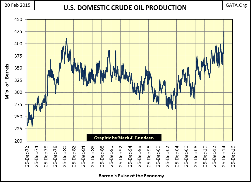
There’s been a lot of talk about how fracking shale-oil formations will ultimately prove disappointing to its advocates, however the fact is that since the 19th century there have always been concerns that the oil would run out. With the discovery of new deposits and breakthroughs in technology, the oil industry has somehow filled the gap for over one hundred years. I’m optimistic this will prove to be the case in the future long after sanity once again returns Wall Street and Washington. But before we see that sunny day, there are hundreds of trillions of dollars in bad debt and dubious financial instruments to be sanitized from the world’s balance sheets by Mr Bear and that process will not be pleasant.


