A Historical Study of Dividend, and Bond Yields


The Dow Jones, and most major-stock indexes continue trading near their all-time highs, but that doesn’t mean this is a legitimate bull market. Below is something by Gerald Celente, from King World News to keep in mind when thinking about the stock market in 2025.
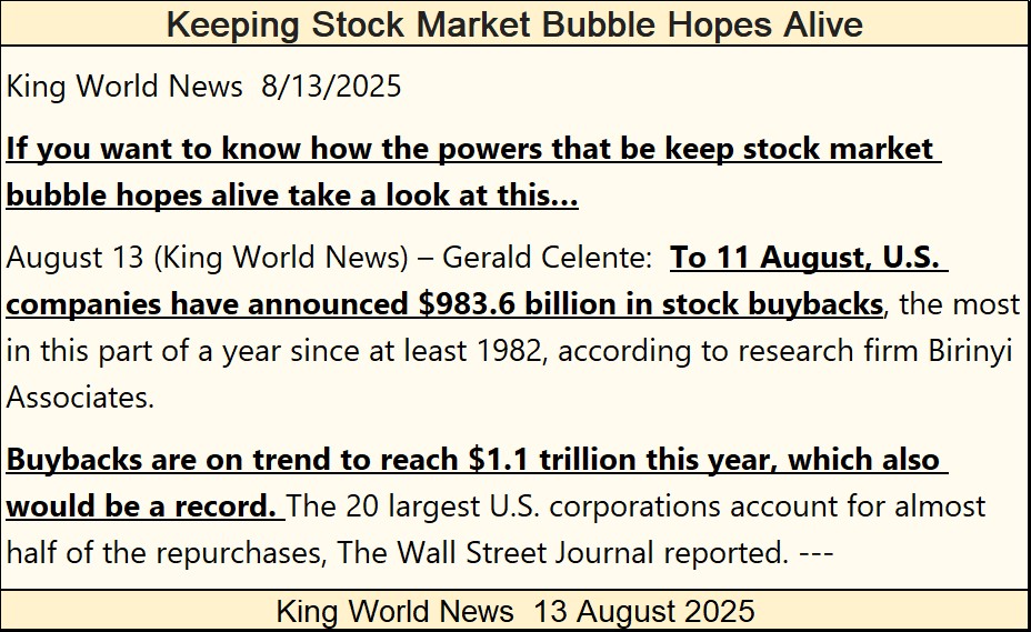
https://kingworldnews.com/keeping-stock-market-bubble-hopes-alive/
These corporate buybacks result in a diminished supply of shares trading in the stock market, as well as manipulating higher earnings, as earnings are always expressed in the ratio of dollars per share. With a smaller float in the market (reduced volume of shares trading in the market), earning per share rise, even if they are actually declining on the whole.
The rise in Dow Jones’ earnings per share for 2025, seen below is significant. But how much of this increase in earnings is due to an increase in sales and profitability for the thirty corporations in the Dow Jones, and how much is due from these thirty corporations buying back their shares? That is a very good question I doubt the main-stream financial media would care to answer, should it be asked of them.
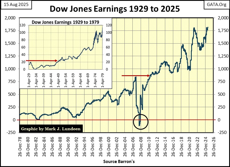
And, where are these corporations (not just the thirty in the Dow Jones) finding the money to buy back their shares? A trillion dollars for 2025 is an enormous amount of money. I suspect much of this money, is coming by compromising their balance sheets, by taking on additional debt.
In the 1950s, major public corporations would buy full page ads in Barron’s, where with little comment, they’d publish their balance sheet to show, come hell or high water, they’d weather the worst the market could throw at them. But that was seventy years ago, when the trauma of the debt crisis that was the depressing 1930s, was still fresh on everyone’s mind. Today, who thinks of the debt crisis of 2007-09?
In 1932, earnings for the Dow Jones went negative. The next time Dow Jones earnings went negative was in 2008, during the sub-prime mortgage debacle. Another debt crisis, another implosion in the earnings for the Dow Jones.
Is there a pattern here we should note? I think there is. So, how much longer must we wait, before the current orgy of corporate-debt accumulation takes the earnings for the Dow Jones, for the third time negative in a century, in the chart above?
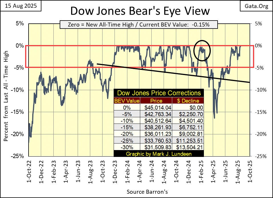
Well, that didn’t happen this week, and most likely won’t next week either, or so I believe after looking at the Dow Jones’ BEV chart below. The Dow Jones last all-time high was on December 4th, 2024, eight months ago. Since then, it came very close to making a new BEV Zero in its BEV chart below, last February (Black Circle), and again in July, and now August, rising up to, but somehow not able to advance to a new all-time high. That would be a new BEV of 0.0%, or in dollar terms a close above 45,014.04.
What BEV did the Dow Jones close this week at? -0.15%. In dollar terms, that is only $67.93 from making a new all-time high. It came closer to making a new all-time high on July 23rd, when it closed with a BEV of -0.01%, only $3.76 from making a new all-time high. Then last February 5th, the Dow Jones closed with a BEV of -0.31%, only $140.77 away from making a new all-time high.
All of these are close calls for making a new all-time high for the Dow Jones. Yet somehow, the Dow Jones for the last eight months can’t make that happen; a new all-time high. This is very weird.
After all of these close calls of the past eight months, with none of them, so far resulting in a new all-time high for the Dow Jones, what would it indicate should once again, the Dow Jones retreat below scoring position, below its BEV -5% line from this week’s close?
I don’t want to think about that. So, I’ll merely repeat what I’ve said many times before; as long as something in a BEV chart remains in scoring position, closing within 5% of its last all-time high, additional all-time highs should be anticipated. New all-time highs for the Dow Jones in the weeks to come? Maybe, and then maybe not. I’ll tell you all about that – next week.
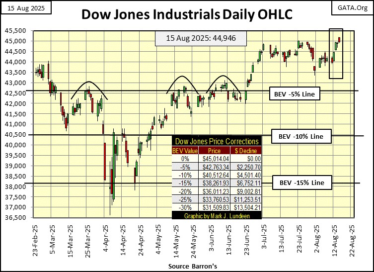
Moving now to the Dow Jones in daily bars below, how hard a ceiling the 45,000-line has been since early July is clearly seen. What is the problem with the Dow Jones closing above 45,000, plus another 15 points, to close above its last all-time high of 45,014 from last December?
Unlike the Dow Jones, the XAU below, after wandering in the wilderness for the past fourteen years, since April 2011, and suffering an 83% bear market decline in 2016, is once again making new all-time highs. Three so far; on Thursday and Friday last week, and again on Tuesday this week, closing on Friday with a BEV of -0.22%.
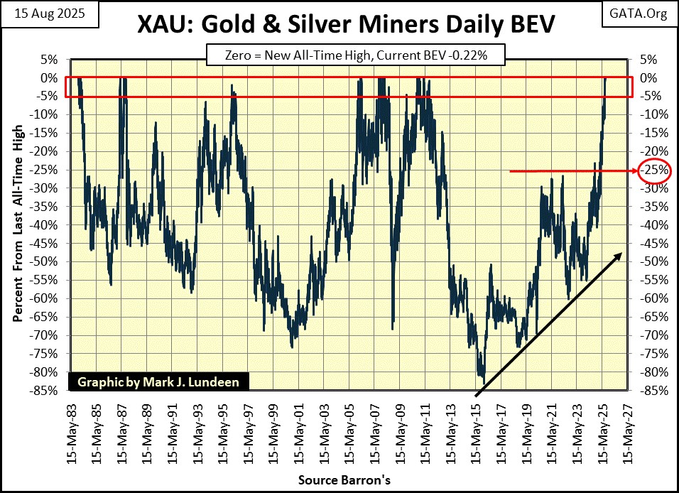
If one were asked to identify a bellwether-market event for 2025, I’d say it is the excellent market action for the XAU seen above, which doesn’t bode well for the general stock market, or the bond markets in the year to come.
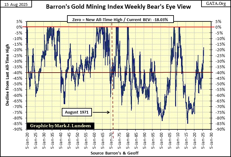
It is only a trickle of money flowing into the gold and silver mining sector, so far, causing this rise in the XAU. But money is coming into the gold and silver miners. The Barron’s Gold Mining Index (BGMI) this week closed at a 52Wk high, though 18.03% below its last all-time high from May 2011, as seen in its BEV chart below.
Let’s look at some bond yields, Barron’s Best & Intermediate Grade Bonds and a 30yr T-Bond issued in February 2020, charts below.
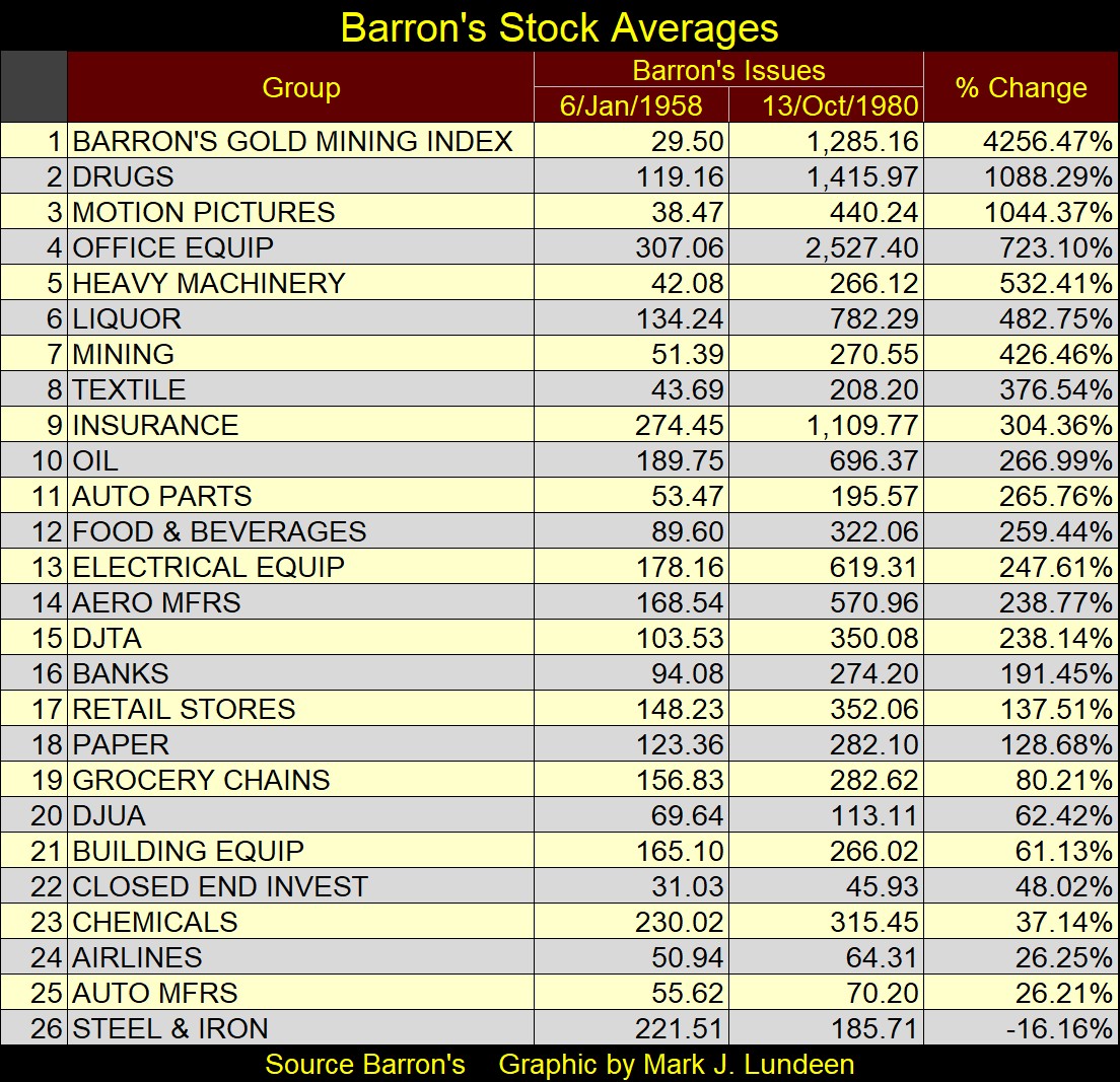
It seems one can’t be a “market expert” unless one knows rising bond yields and interest rates, are bad for gold, silver, and their miners. However, if one takes the time to actually see what gold and silver, and their miners did during the massive 1958 to 1981 bond-bear market, where bond yields increased from low single digit, to over 15%, precious metal assets were the place to be, as seen in the table below.
Below, we see corporate bond yields spiked in 2022, and have “stabilized” since. But no market remains “stabilized” forever. So, what is the next big move in corporate bonds?
Considering the economy currently seems to be going along okay, it is only a matter of time before the economy stumbles. Considering the massive debt the economy is currently servicing, come a turndown in the economy, the risks of debt default come to my mind. And as the market finally prices in the risks of massive debt default in the bond market, these bond yields seen below, have nowhere to go but much higher.

This week, the US National Debt went above $37 trillion dollars. It first went above $36 trillion dollars just last November, only nine months ago. As you can see above, since last November, the yield for this bond has only gone higher, as this bond’s valuation only went lower. That is how things go in the bond market; where rising yields = lower prices.
With the US National Debt’s next target being $38 trillion dollars, say by next April, do you really believe long-term T-bond yields won’t break above 5.25% before it does, possibly violently as they do so? What does all this mean?
I could write a book on what I think it means. But what a waste of time that would be, when all I have to say is the XAU, after fourteen miserable years, and an 83% bear market decline in 2016, made three new all-time highs since Thursday of last week.
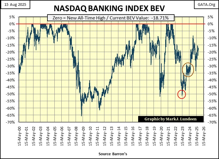
Here is another pathetic chart; the NASDAQ Banking index’s BEV chart. This week, these banks closed with a BEV of -18.71%, or 18.71% below their last all-time high of November 2021. If everything is doing so well with the economy, and business in general, why can’t these banks make a new BEV Zero (new all-time high = 0.0%) in this BEV chart?
These banks made it above their BEV -10% line in November 2024, but that didn’t last long. Like the XAU being a bellwether for the market, I believe the same could be said for the NASDAQ Banking Index seen below. And what would this bellwether be a prediction of?
Below are my major market indexes’ BEV values I follow. This week saw some new all-time highs. That the XAU (#2) is now making BEV Zeros, along with NASDAQ Composite (#8), seems to be saying something about the market.
Friday closed with no BEV Zeros, but saw sixteen of these indexes close well within scoring position, within 5% of their last all-time highs. That is pretty bullish, but then all market tops look like that – bullish.
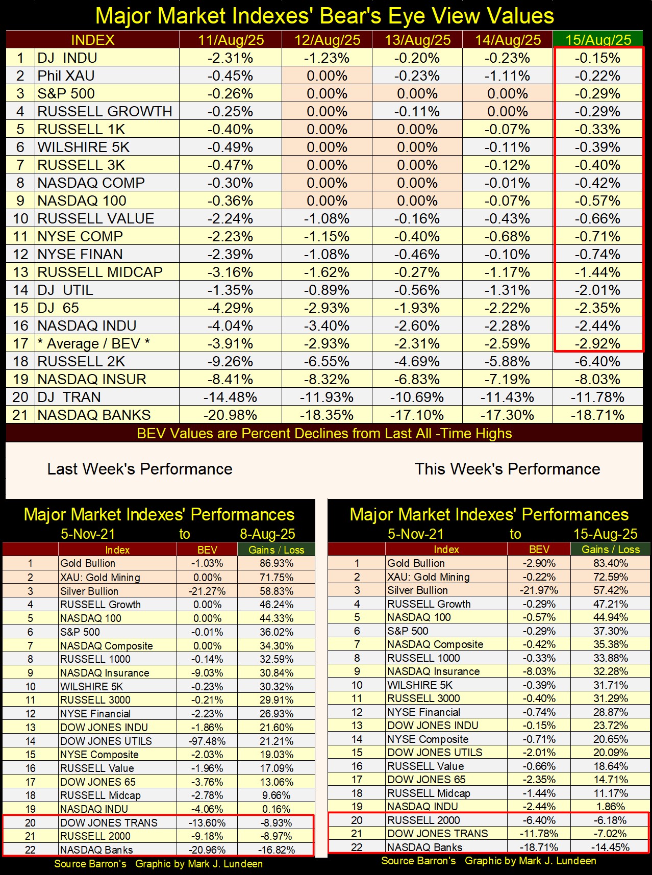
In my performance tables above, not much has changed from last week. But gold, the XAU and silver remain in the top three spots, as they have for months now, and likely will remain there for a long time to come.
The financial markets of today, operate very differently than they did a century ago, before the 1920s. For one thing, over a hundred years ago, most people lived far from Wall Street, so weren’t in a position to participate in the stock market, even if they wanted too.
Wealthy people, or large financial institutions in Europe, California, or other faraway places could always send a telegram, via morse code, from a telegraph office to their broker in New York. But that cost a lot of money. Picking up a phone to call a broker wasn’t an option for most people, as before 1920, most peoples’ access to phone service, especially long-distance phone service, didn’t exist.
Before the Roaring 1920s Bull Market, the chief attraction of buying stocks wasn’t for their potential capital gains. Having the dollar pegged to $20.64 to an ounce of gold, prevented that from happening. Using the as published values for the Dow Jones is a tricky exercise, as the construction of Dow Jones of 1885, was to change many times in the following decades. The Dow Jones (the average) started in February 1885 at 62.76, increasing to only 107.23 by December 1919, a gain of only 70.85% over these thirty-four years.
Still, wealthy people purchased stocks; why?
People long ago chose to buy stocks, as a means of increasing their income, via dividend payouts, rather than from interest payouts from depositing their money at a bank, or by buying bonds.
When writing about the markets prior to the Great Depression Crash (1929-32), one finds market data rather limited. But Barron’s began publishing dividend yield dta on the Dow Jones in October 1925, and data on their Best Bond Yields in 1938, though I pushed that back to 1934 using yields found in Barron’s bond table.
Below, I’ve charted the yields for the Dow Jones dividend (Blue Plot), and for Barron’s Best-Grade Bonds (Red Plot). A key point to keep in mind is; the greater the return (or yields) on any investment, the greater the risk to principle. Though as you will see, that is not always true in the market.
Previous to 1958, the return on invested funds (yields on dividend income) was greater than for yields from high-grade bonds, as risks (potential loss to investment), were greater with stocks, than risks to invested funds in best-grade bonds. As seen below with the dividend yield for the Dow Jones, when compared to the yield to Barron’s Best-Grade Bonds.
One can use the dividend yield for the Dow Jones, to identify the bull and bear market investors had to deal with many decades ago. From 1934 to 1982, when yielding close to 3.0%, the Dow Jones was close to a bull market top. When yielding something over 6%, the Dow Jones was close to a bear market bottom. So, for the Dow Jones dividend, risks to invested funds were actually higher when its dividend yield was at 3%, than when it was yielding over 6%.
Let’s look at the market action between the yields for dividends and bond payouts, from 1934 to 1958. For any investor seeking a return greater than what could be found with Best-Grade Bonds, to have purchased stocks when the Dow Jones is yielding close to 3%, was to expose their invested funds to a massive bear-market decline. A loss of principle of something over 40% in the next few years. Was the gain of a few percentage points in yield worth that? No, it wasn’t.
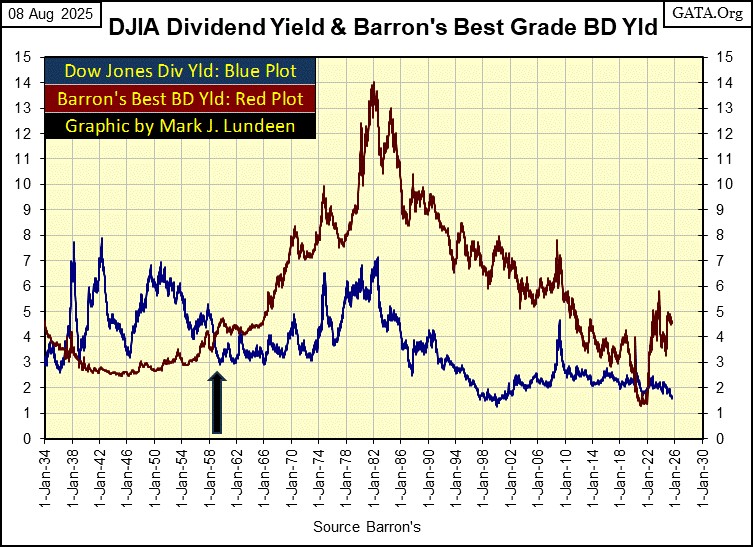
From 1934 to 1958, come bull or bear markets on Wall Street, the risk of losing a significant portion of your investment’s principle didn’t exist when investing in high quality bonds, as seen by the low volatility in the yield for Barron’s Best-Grade Bonds above.
All that is true. * BUT *, if a pre-1958 investor had purchased stocks when the Dow Jones was yielding something over 6%, a yield Best-Grade Bonds would never provide to investors, they could lock in that 6% yield, and expect to see their principal double in the years to come. Why? Because that is what happens when investors purchase high quality blue-chip stocks, such as those found in the Dow Jones, at the bottom of a bear market.
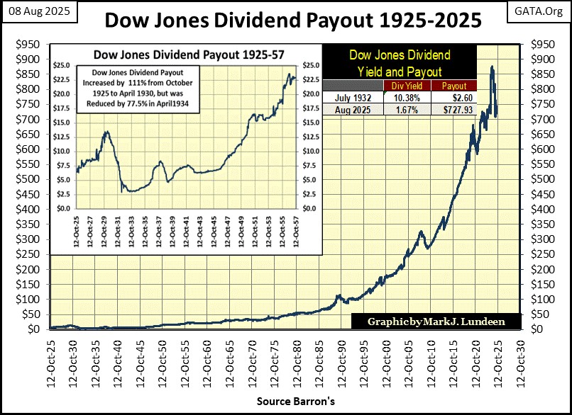
And unlike the fixed income a bond pays out, a coupon payout that never changes during the life of the bond, dividend payouts do change over time, as seen below.
But something happened in 1958, where the yield for Barron’s Best-Grade Bonds, increased above the dividend yield for the Dow Jones, and would remain that way, except for a short time in 2022. What happened to cause that?
The post WWII monetary system was defined by the Bretton Woods’ Monetary Accords in 1945. The dollar was to be pegged at 35 paper dollars for each ounce of gold held by the US Treasury; a $35 gold peg. However, as seen in the quotes from Barron’s, and the table below, the US Government never took this $35 gold peg seriously.
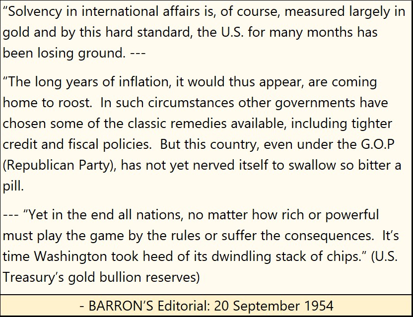
Below is a table giving the ratio of paper dollars to one ounce of US Treasury gold, at key milestones in history. I haven’t updated the latest figure in the table, but using the data in Barron’s 11 August 2025 issue, there are now $9,187.15 paper dollars issued, for each of the 261.5 million ounces of gold the US Treasury claims it holds.
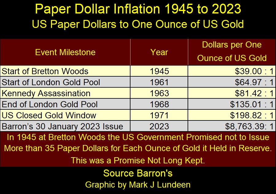
In the table above, by the time President Kennedy was assassinated in November 1963, the US Government had issued $64.97 paper dollars for every ounce of gold held in the US Treasury. By the time President Nixon took the dollar off the gold standard in August 1971, the US Government had issued $198.82 paper dollars for every ounce of gold held in the US Treasury. This was NOT how the issuer of the world’s reserve currency, was supposed to maintain a $35 gold peg.
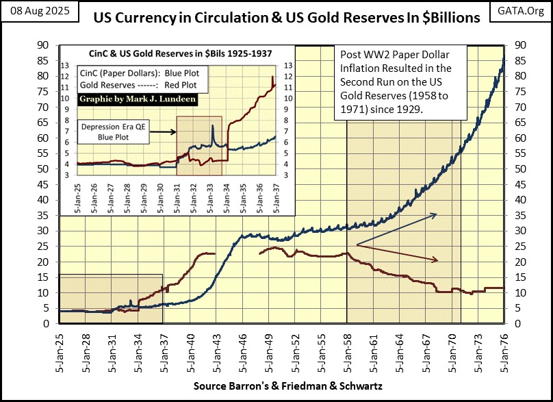
The problem this inflation in paper money had for the US Government was, the Bretton Woods’ Accords allowed foreign central banks to exchange their paper dollars for US gold, at a rate of $35 paper dollars / one ounce of US Treasury gold. And they were, resulting in a massive loss of gold at the US Treasury.
Looking at the chart below, a run on US gold began in 1958, which was the same year yields for Barron’s Best-Grade Bonds, increased above the dividend yield for the Dow Jones. Go back above, to see chart plotting the yields for Best-Grade Bonds and the Dow Jones. The heavy black arrow notes 1958.
Was the beginning of a run on US gold in 1958, the cause for the yield of Barron’s Best Grade Bond to rise above the dividend yield for the Dow Jones? I’m sure these two market events were connected; how could they not be? This inflation in paper dollars seen above, resulted in rising consumer prices. So, for the buyers of bonds to protect their principal investment, they began demanding an inflation premium in the yield for dollar denominated bonds. And like stock dividend yields, higher bond yields meant lower bond prices.
But the 1950s and the 1970s were a long time ago. Those were times when in the minds of the public, a gold standard backing the dollar very much mattered. Now in 2025, that is no longer true. Sadly, a good portion of today’s young people wouldn’t recognize a Morgan Silver Dollar for what it is, if they saw one.
What is true today in the minds of the public, is the fact that the idiots at the FOMC dictate “monetary policy” and set interest rates. What that is, and what that ultimately means is unimportant to them. That if the US Treasury were to reinstate a gold peg today, it would have to do so with a peg of $9187 dollars for each ounce of US Treasury gold, which is neither here, nor there to the public, the banking system, or to the “policy makers” in Washington.
We live in interesting times.
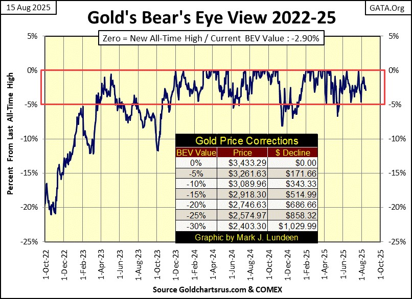
Next is gold’s BEV chart, where for the week gold closed with a BEV of -2.90%, or 2.90% away from its last all-time high of two months ago.
After hours, late at night, I check the pre-market trading for the stock market, T-bond yields, and gold and silver. Frequently it is disheartening, as I see gold and silver down by big values, such as down by $50 or more for gold, and over $0.50 for silver. But then at the end of the day, after I’ve updated my market data, and see that gold remains in scoring position, the world is once again put to right.
With gold’s BEV still in scoring position, trading within 5% of its last all-time high, as it has been since November 2023, we should expect to see additional new all-time highs (BEV Zeros = 0.0%) in its BEV chart below.
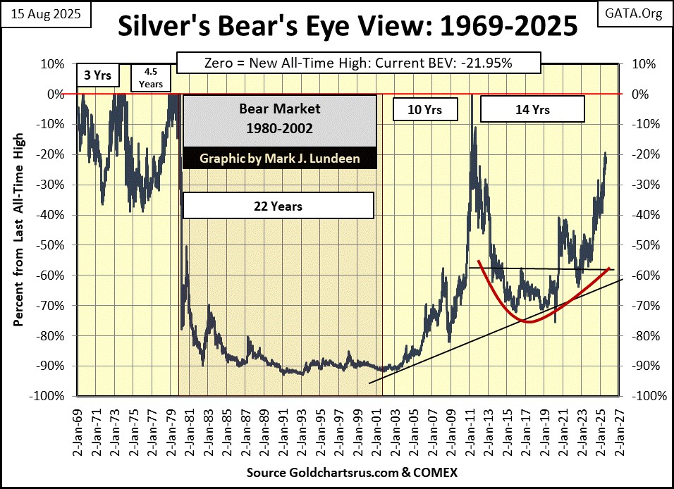
For the most part, I don’t cover silver, as silver is so annoying. I actually like silver more than gold. But for the sake of my mental health, I found it best to ignore silver for as much as I can get away with. But for the benefit of my readers, this week I’m risking another trip to the rubber room by publishing silver’s BEV chart below.
Silver’s last all-time high is still from January 1980, over forty-five years ago. For decades, I’ve daily followed the price of silver, and looking at this chart, it’s a miracle I’m not now a wife beating, puppy kicking alcoholic.
What in the hell has been going on in silver since January 1980!?
- I don’t know,
- I don’t care,
- I need a drink.
That said, what might happen after silver does see its first BEV Zero since January 1980, is a damn good reason to be a buyer of silver bullion at today’s prices.
Next are my step-sum tables for gold and the Dow Jones, where I look at these markets’ daily advances and declines, to hopefully gain an insight into where their price trends are trending. The 15-count is simply the running sum of the daily steps a market has seen in the past fifteen trading days, with down days a -1, and advancing days a +1.
For gold, looking at its 15-count since July 14th, it has been alternating between being positive and negative. When positive, a 15-count indicates gold has seen more daily advances than daily declines, with some +3s and +5s in July. So, where are gold’s BEV Zeros; new all-time highs?
Well, that didn’t happen, but on July 22nd, gold did see a BEV of -0.04%, only $1.50 from making a new all-time high, as its 15-count peaked at a +5. But today, August 15th, I don’t care about what happened a month ago, I want to see some more new all-time highs. So, with gold still in scoring position, it’s a good thing there is always next week.
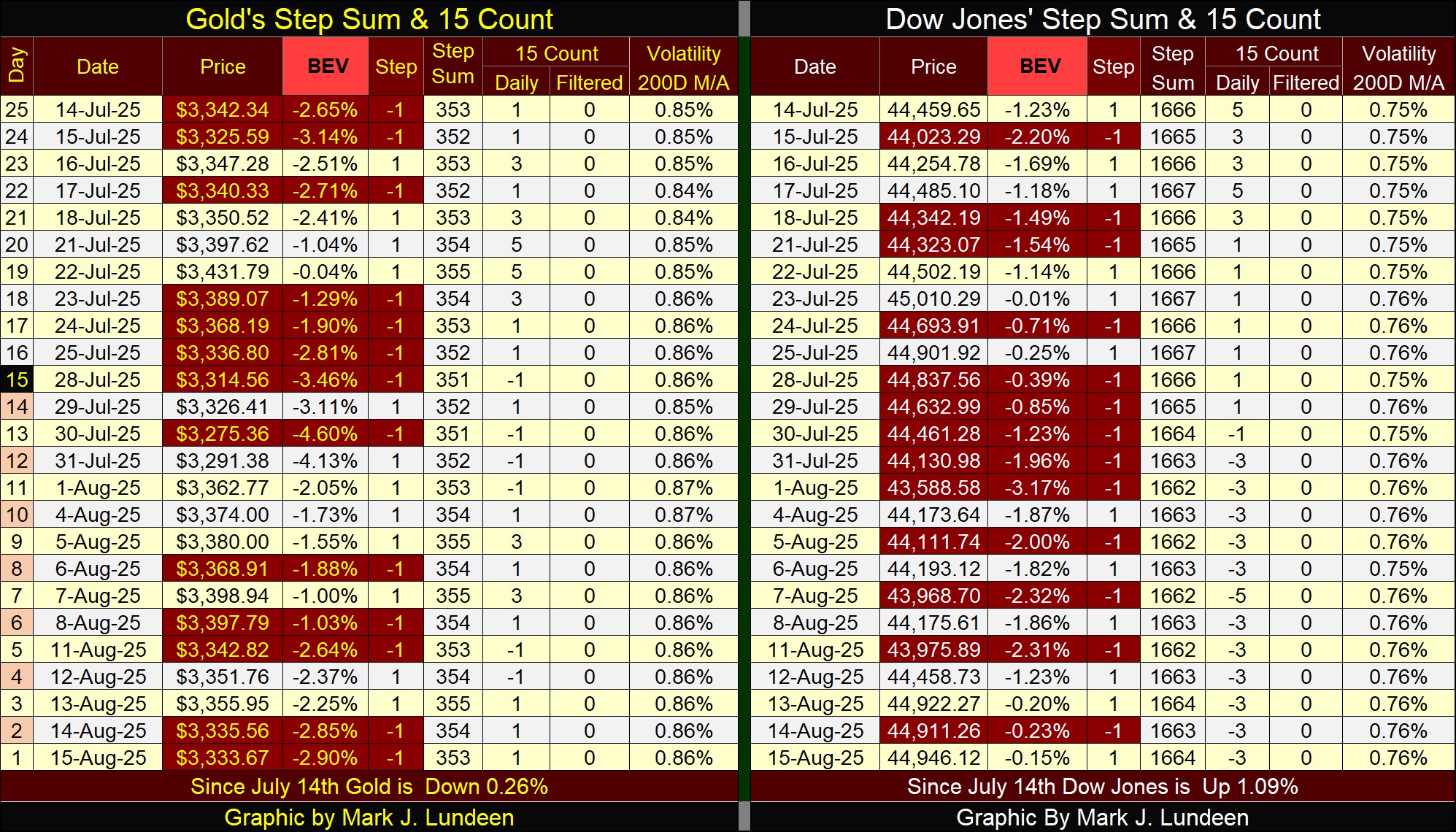
For all the negative market commentary I’ve routinely provided for the stock market, it seems the stock market is ignoring me. Look at the Dow Jones’ 15-count, it’s been negative since the end of July, and mostly -3s since then. And after all those down days, this week the Dow Jones was within 0.25% from a new all-time high from Wednesday, to Friday’s close.
Be this due to Gerald Celente’s massive buybacks, as noted at the beginning of this article, or something else I’m totally unaware of, this is an excellent display of market strength, to see a market advance, as its down days outnumbers its advancing days.
So, short term, I’m bullish on the stock market, and expect to see the Dow Jones generate additional BEV Zeros in the weeks to come. And the Good Lord willing, so too shall gold.
Mark J. Lundeen
*******
More from Gold-Eagle


