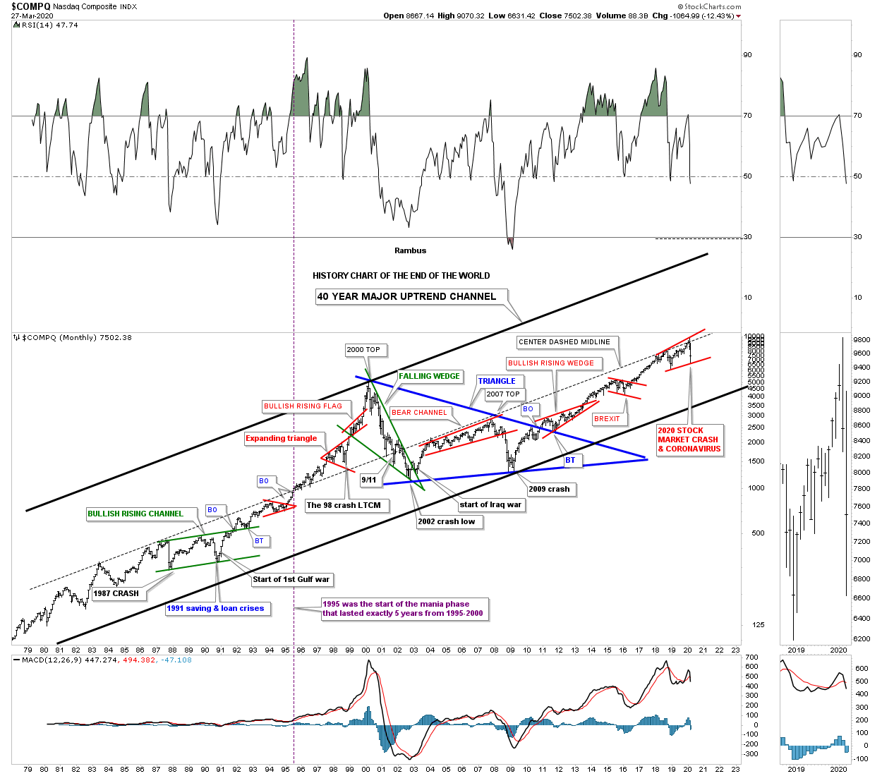
The History Of The End Of The World Chart


There are just a handful of events in one’s lifetime that are truly history making in their magnitude. For instance the 1918 Spanish Flu pandemic, the 1929 stock market crash, Pearl Harbor, the 1987 stock market crash and 911 to name a few. When all of those historical events took place it felt like the end of the world for those that were living in that time period. How could our world ever be the same after everything around them was crashing?
Since the beginning of 2020 we are currently witnessing two historical events going on at the same time that people in the future will be analyzing in detail, the 2020 Coronavirus pandemic and the 2020 stock market crash. As citizens of the world we are truly living smack dab in the middle of these two history making events which we won’t know how things are eventually going to turn out until they come to an end. In a year or two from now it will become very clear what the outcome was, but when you are living through these historical events it can feel like the end of the world.
Years ago I built a long term monthly chart for the $COMPQ that goes back 40 years which I call, “History Chart of The End of The World.” This chart shows all the important end of the world events going back to 1980.
If you look at this chart starting at the bottom left hand corner I’ve labeled all the important historical events that felt like the end of the world if you were trading in the markets back then. There was one day during the 1987 crash that is still the biggest one day percentage decline in history where the markets were down around 23% or so.
The COMPQ quickly recovered from that low and rallied into the September 1989 high which began another correction caused by the Saving and Loans crisis. If that was’t bad enough a year or so later began the start of the Gulf war which the markets shrugged off as not important. Those 3 history making events created the green bullish rising flag with a nice clean breakout and backtest. Less than 10 years later the COMPQ finally put in its bull market high. Just before the bull market high was established there was one more historical event which most have forgotten about, but at the time the markets were really rattled by the 1998 LTCM, Long Term Capital Management, debacle.
After the 2000 top was completed came the first real bear market since the 1970’s as shown by the green falling wedge. The percentage decline for the COMPQ was massive and it felt like the end of the world back then. Many thought another Great Depression was beginning that would last for years to come. Again, if that wasn’t bad enough then came the start of the Iraq war at the bear market low. How could the markets ever rally with all this bad news? The markets did find a way to stabilize and found a way to rally higher into the 2007 housing and banking crises. At the November 2007 high began the infamous bear market decline that this time for sure was going to put the US in the next Great Depression.
As the INDU and the SPX began their great bear market decline taking out their 2002 lows the COMPQ on the other had declined far less because its 2000 to 2002 bear market was much more severe than the INDU and the SPX which produced a clear positive divergence for the tech stocks. Finally in March of 2009 the bear market that was going to last for many years came to an abrupt end and the SPX rallied strongly out of that 2009 bear market low creating the biggest bull market of all time with one consolidation pattern forming on top of the previous one. Note the 10 year blue triangle consolidation pattern which was needed to consolidate more than 20 years of the last secular bull market. You can also see the clean breakout and backtest to the top rail of that 10 year blue triangle consolidation pattern.That 10 year blue triangle is a halfway pattern between the two secular bull markets with the first one starting in the mid 1970’s and our current one that began at the 2009 low. When we look at this, “End of The World Chart,” in a year or two from now are we going to see the end of the world or will it be delayed until the next crises?
There was a short term pattern that showed up during the crash decline off the February 13th high at 28,045 to the March 23rd low at 18,189 on the INDU which is a pretty rare halfway gap or breakaway gap pattern. These halfway gaps show up in nearly vertical moves either up or down and show roughly the halfway point of the move. What these halfway gaps can also show us is that the impulse move has come to an end. Sometimes we can see a bottoming pattern start to form that will be a reversal pattern which tends to be the case most of the time. After some chopping and filling a consolidation pattern may form which would take the stock much lower.
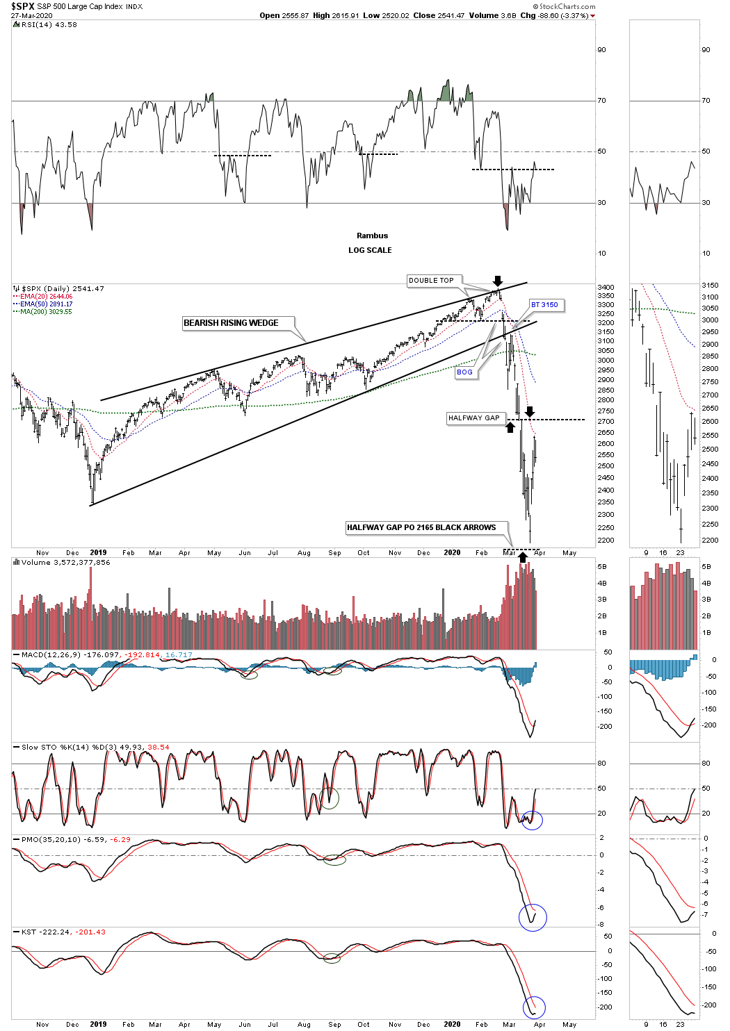
If you recall I was very bullish the US stock markets going into the all-time highs on February 13th. Once I saw the double top forming I suggested for everyone to exit all long positions because a double top is a reversal pattern and you don’t argue with a reversal pattern no matter how big or small it may be. I also posted that the double top was forming just below the top rail of the 2019 bearish rising wedge which could be the last reversal point. The last point I made about the top setup was that if the bearish rising wedge played out like it should we would most likely see a waterfall decline. We got the waterfall decline, but I had no idea it would be one of the biggest declines in the history of the stock market.
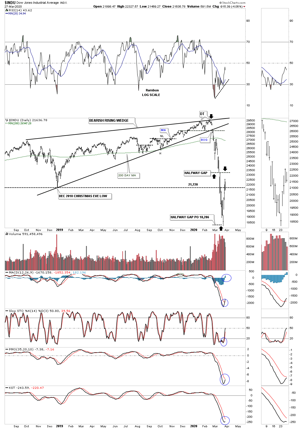
Normally when you see a halfway gap on one index it will show up on other indexes. Below is the 2019 bearish rising wedge with its halfway gap and price objective as shown by the black arrows.
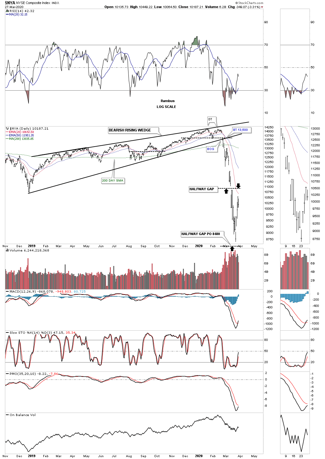
The $NYA with its halfway gap and price objective.
All the analysts are now trying to figure out what comes next in regards to the US stock markets. Some are comparing the 2020 crash to the 1929 crash which have a lot of similarities as both initial crashes were pretty dynamic and historic. Then there was the 1987 crash that produced the biggest one day percentage move in history of around 23% or so.
I’m going to present my take on what I think is possible based on some of the long term charts we been following for many years. This is just a possible scenario that could very well blowup tomorrow. As I’ve stated many times I’m not a big fan of fractals as they can workout beautifully until they don’t and they usually fail right when you expect them to play out the best, but when they do play out they can offer some great results. On the charts above we looked at some of the 2020 halfway gaps that formed on some of the US stock markets. Remember these gaps show up in fast moving markets.
The fractal I’m going to show you compares our recent 2020 crash to that massive 1987 crash on the SPX. There are some striking similarities between these two events which we’ll look at in detail. This first daily chart for the SPX we just looked at on the daily chart above which shows its halfway gap in the middle of its impulse leg down.

Next is the massive impulse leg down the SPX experienced in 1987. As you can see the SPX produced a halfway gap to the downside during its 1987 crash which is very similar to the halfway gap on the 2020 crash. The 1987 crash low marked the low that has held to this day. After the 1987 low was established there were two more attempts to take out 1987 bottom, but the bears failed and the rest they say is history.
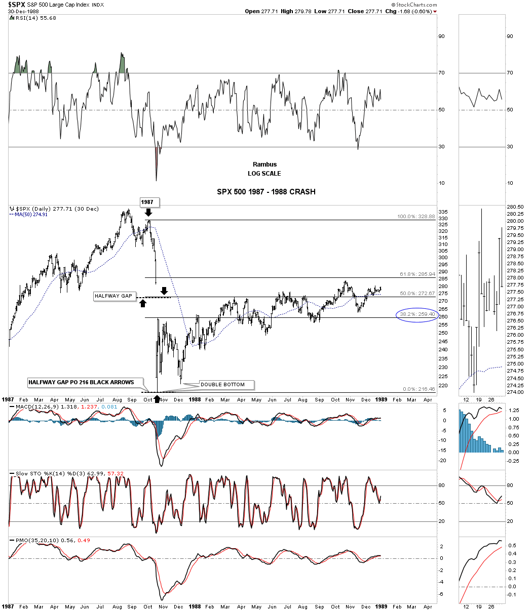
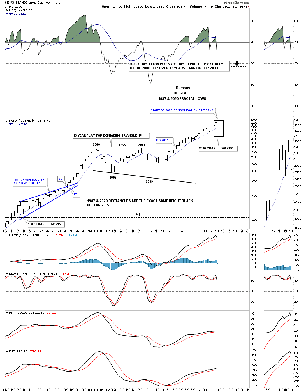
Now let’s take the 1987 and 2020 fractal a step further and look at a long term quarterly chart for the SPX which starts at the 1987 crash low so you can see what took place afterwards. Starting at the bottom left hand corner of the chart you can see where the 1987 crash found its low. Now look at the current 2020 crash at the top right hand side of the chart. The black box in 1987 and the one in 2020 are the exact same height which measures price not time. What followed after the 1987 crash was the formation of the blue 1987 bullish rising wedge halfway pattern which took about 8 years to complete. What this chart doesn’t show is the price objective for the 1987 bullish rising wedge HP which was reached at the 2000 secular bull market high.
If we compare the black rectangle in 1987 to the black rectangle in 2020 you can see there is very little room for the 2020 price action to drop below the initial low made at 2191 to keep the fractal alive. From that 1987 low it took almost 2 years of trading before the SPX could make a new all time high above the 1987 high. The 12 month sma also did a good job of holding support all the way up to the 2000 bull market high.
The other very important feature on this chart is the massive 2013 flat top expanding triangle that I view as a halfway pattern in the really big picture going back many years we’ll look at in a minute.
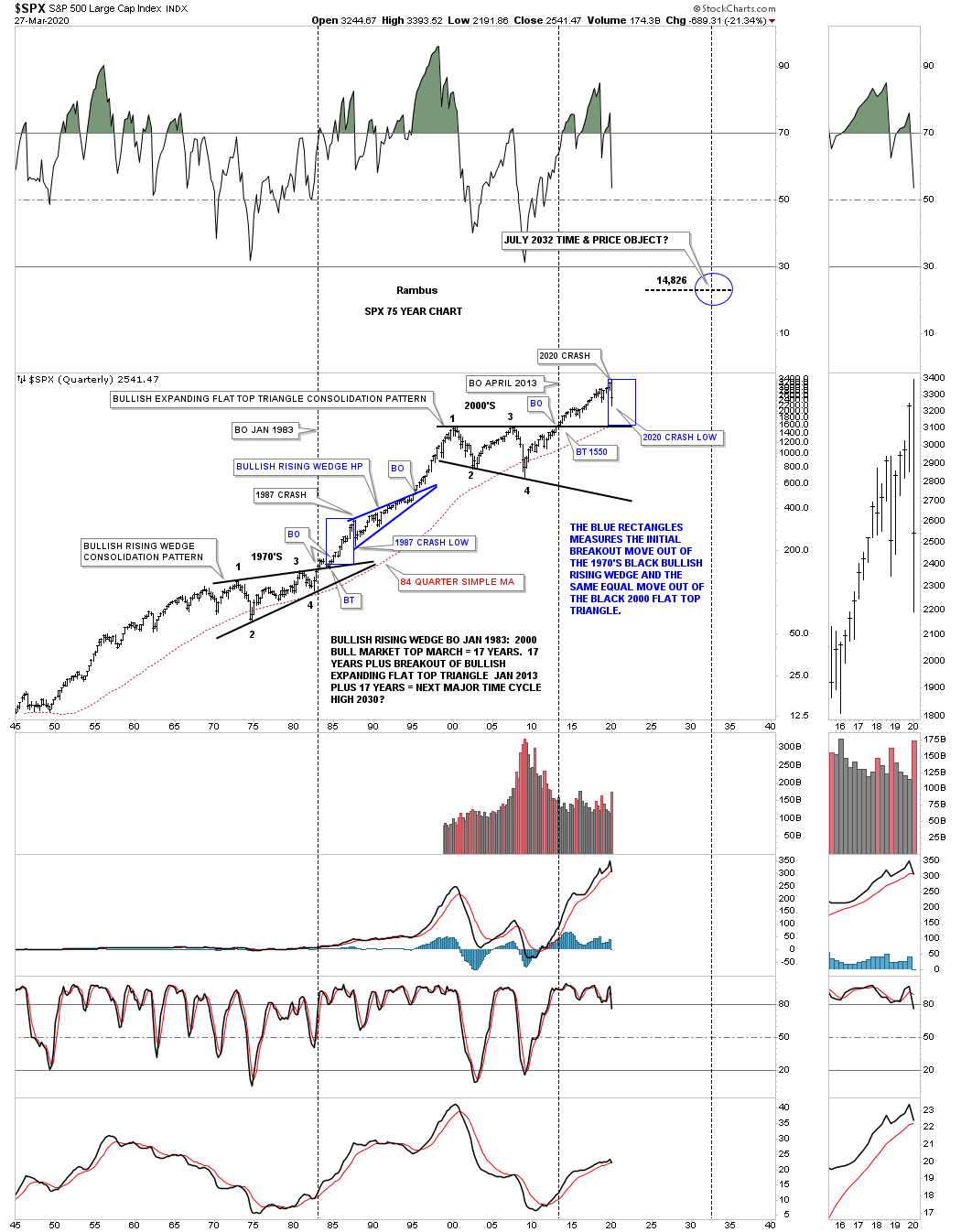
This next very long term quarterly chart for the SPX runs from 1946 to 2002 which puts the 1987 bullish rising wedge, we just looked at on the chart above in perspective as a halfway pattern. Also, you will be able to see why I call that massive 13 year flat top triangle a possible halfway pattern to the upside. Before the 1987 crash the SPX was enjoying a strong bull market that began at the last reversal point in the 13 year bullish rising wedge which was needed to consolidate the last secular bull market.

This last chart for tonight is a 75 year quarterly chart which ties everything together. The blue rectangle at the 1987 crash is the exact same height as the 2020 blue rectangle which measures the first rally out of their respective massive 13 year consolidation pattern before their record setting crash with the 1987 crash low holding. We won’t know for some time if the current low on the 2020 crash is going to hold support.
All we know right now is that the 1987 and the 2020 crashes are very similar along with what the long term charts are showing. So is this massive fractal thats been developing for many years going to fail right at the moment of truth? It is what it is until it isn’t. Please everyone take care of yourselves and look after your loved ones. All the best…Rambus
*********
 Meet Rambus, a seasoned trader and technical analyst renowned for his unbiased and insightful chart work. Through his website, Rambus Chartology, and Substack newsletter, Rambus shares his expertise with a global community of subscribers, providing daily updates, commentaries, and hands-on training in the art and science of chartology. With his calm, humble, and down-to-earth approach, Rambus demystifies complex market trends, helping his followers navigate the challenges of today's volatile markets. Join the Rambus Chartology community today and discover a unique blend of technical analysis, trading expertise, and time-tested protocols. Subscribe now at www.rambus1.com or https://rambuschartology.substack.com/
More from Gold-Eagle


