How Cheap are the Mining Shares? The Barron’s Gold Mining Index Tells All


The Dow Jones is making its third attempt since last August at closing above its BEV -5% line; closing in scoring position. If it closes above its BEV -5% line (34,959), it may go on to new all-time highs. If not? Well, let’s not get ahead of ourselves. But its failure to do so may not be pleasant.
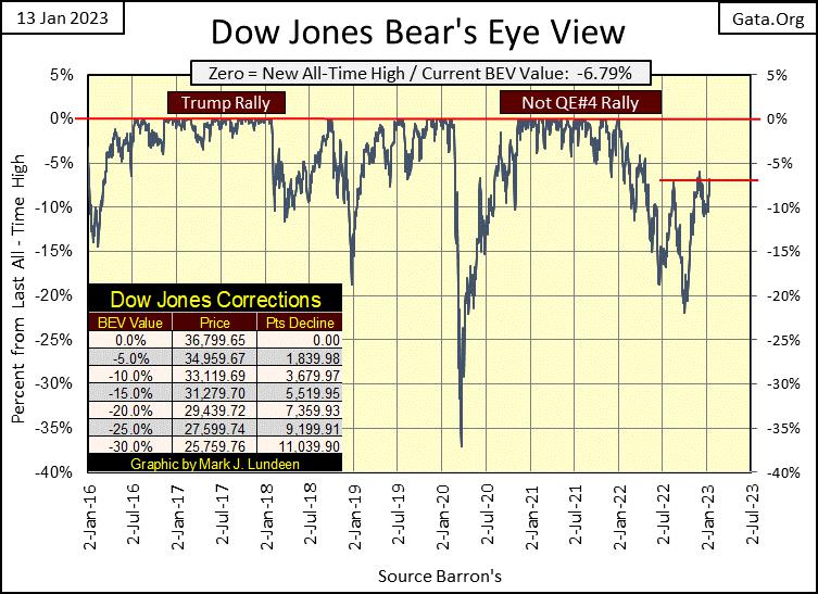
The major stock indexes below haven’t done much for the few weeks I was away. The NASDAQ Insurance index continues attempting making new all-time highs, but hasn’t since December 2nd. And everything else has failed to rise up into scoring position, that being a BEV of less than -5%.
In my last letter, the XAU’s BEV was -48.64%. At this week’s close, it almost broke above its BEV -40% level. With gold closing this week above $1900, maybe the precious metals and their miners are making their move into market history. If so, we’ll soon see the XAU rising in the list, which I think is very possible.
Oh, I’ll stop being coy; the broad stock market is nearing the edge of a big-bear market decline that will shock people. The gold miners have historically been counter-cyclical to the broad market in times of its distress. A historical pattern I believe will be repeated in the coming years.
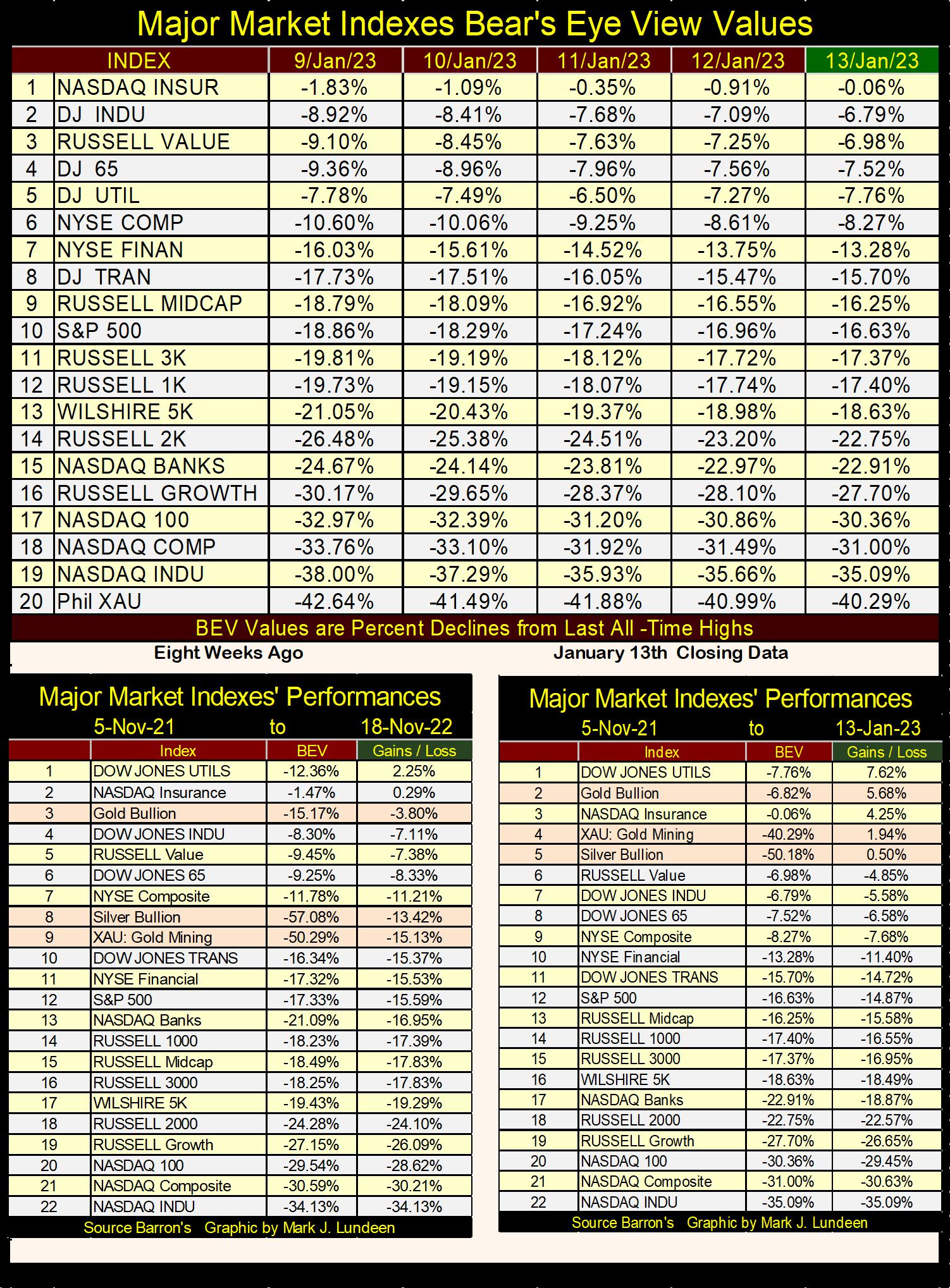
Both tables above use the week of 05 November 2021 as a base. That week was the peak in the bull market for these indexes, a five-day period where these indexes saw sixty-six new all-time highs. These tables both use 05 November 2021 as their base, and are separated by eight weeks, so a comparison between this week and the market eight weeks ago can also be made.
Two things stand out looking at these two tables;
how poorly the former NASDAQ glamor stocks are doing,
how well precious metal assets have done.
Last week, Barron’s had its headline article titled Tech’s Bills Come Due. Looking at the tables above, with the NASDAQ 100 & Composite indexes down 30%, I wouldn’t argue the point. In the past, buying the tech stocks had always been profitable when purchased at deep discounts, as they are now.
Will that be true this time? After many decades of the tech stocks leading the market, maybe it’s time for something else to become the leader of the pack.
The rising star in this market has been precious metal assets, which this week closed in three of the top five positions in the table (right side) containing this week’s closing prices.
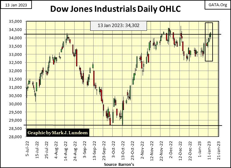
As seen in the Dow Jones’ BEV chart above, in its daily bar chart below, for a third time since last summer, the Dow Jones is attempting to break above 34,250, and then stay above 34,250. Can the Dow Jones do that? For the sake of the bulls running wild and free on Wall Street, I believe it better.
Think inflation is too high? So does Fed Chairman, Powell in the quote below.
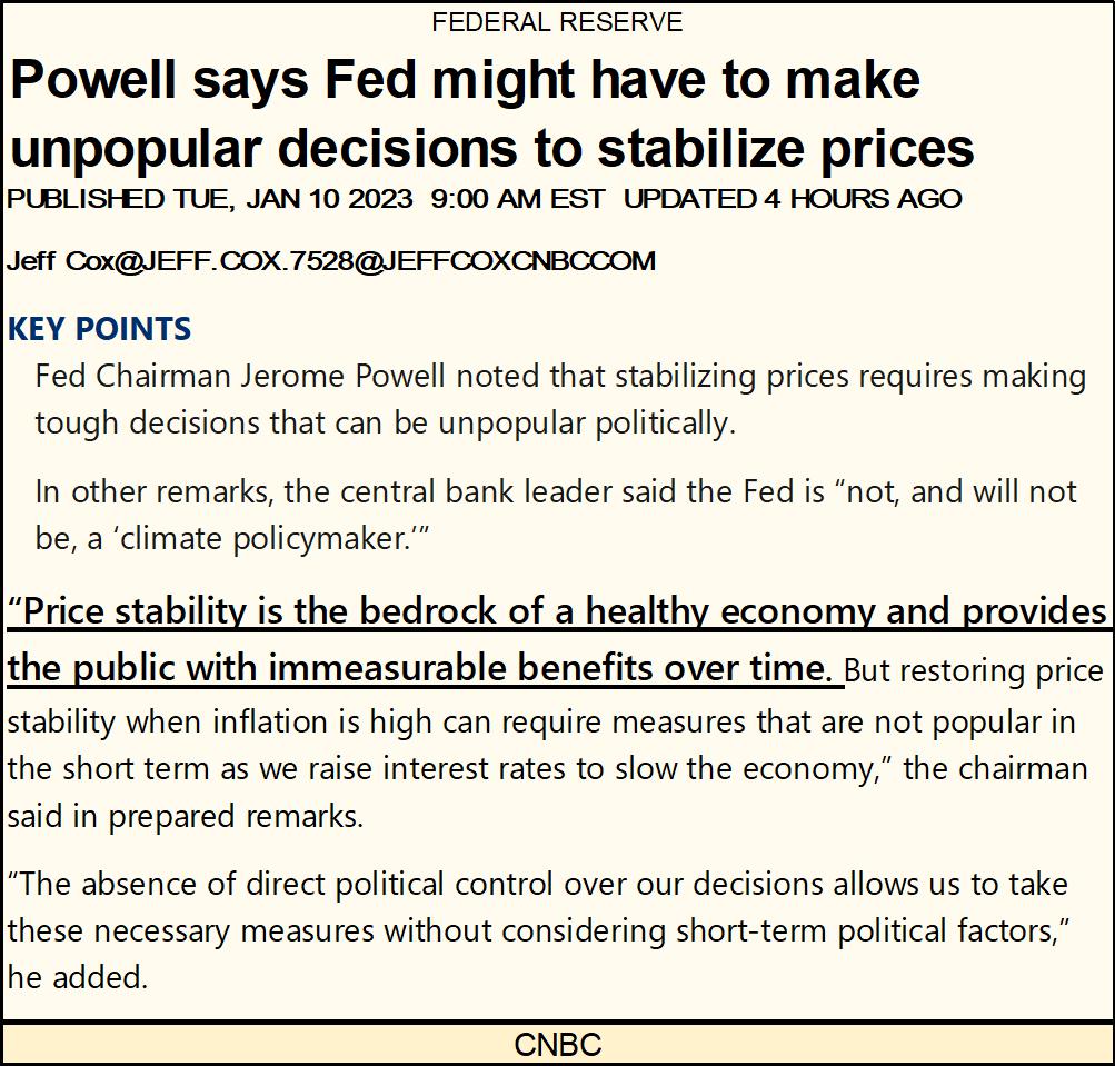
I like the line in the quote above where Powell said “price stability is the bedrock of a healthy economy - yada yada yada.” Which is of course is why he “injected” over two-trillion dollars into the financial system in only eleven weeks during the spring and early summer of 2020, increasing the Fed’s balance sheet by 52% in less than three months.
And why did he do that? It’s not polite asking such questions, but if you must know, at the time Powell was attempting to “stabilize” the then evaporating valuations in the stock and corporate bond markets. “Market experts” at the time blamed the meltdown on the “covid-virus pandemic.”
Me? I think the market was then (as is now) historically overvalued, so highly vulnerable to a valuation mauling by Mr Bear. The March 2020, 38% Flash Crash was only the market attempting to impose some reality on the bloated financial system. A reality then, as is now rejected by the idiot savants at the FOMC.
That the Fed’s two-trillion-dollar “price stabilizing operation” in early 2020 also resulted in a blowoff top to the bull market which began way back in August 1982, a forty-two-year advance that topped out a year ago, as well as destabilizing consumer prices eighteen months later, are market events you’ll never hear about in the mainstream media.
Let’s take a look at the chart below where I’ve plotted the indexed values of:
currency-in-circulation (CinC /Green Plot: volume of paper dollars in circulation),
the Dow Jones (Red Plot),
and Barron’s Gold Mining Index (BGMI / Blue Plot),
with January 1920 = 1.00.
So, with indexed CinC currently at 515, know the “policy makers” printed an additional 514 paper dollars for each dollar then in circulation in January 1920. That since January 1920, the indexed Dow Jones has increased to only 309, and the indexed BGMI up by only 95, illustrates the stock market in the past century hasn’t kept up with increases in inflation.
This is a horrific inflationary increase in CinC, and it has only gotten worse since the 2007-09 sub-prime mortgage crisis. Note the increase in the slope of the green CinC plot beginning in June 2008. Then in March 2020 (black circle), CinC went vertical for the next two years. Note, this huge “injection” of monetary inflation canceled the March 2020 bear market, turning around the Dow Jones, which in November 2020 was once again making new all-time highs.
However, the last all-time high for the Dow Jones was on 04 January 2022, a year ago. Whether the Dow Jones will see a few new all-time highs in the months to come is something we’ll have to wait to see. But whatever the Dow Jones does in the coming year, I suspect the gap between it, and CinC will only grow wider in the chart below.
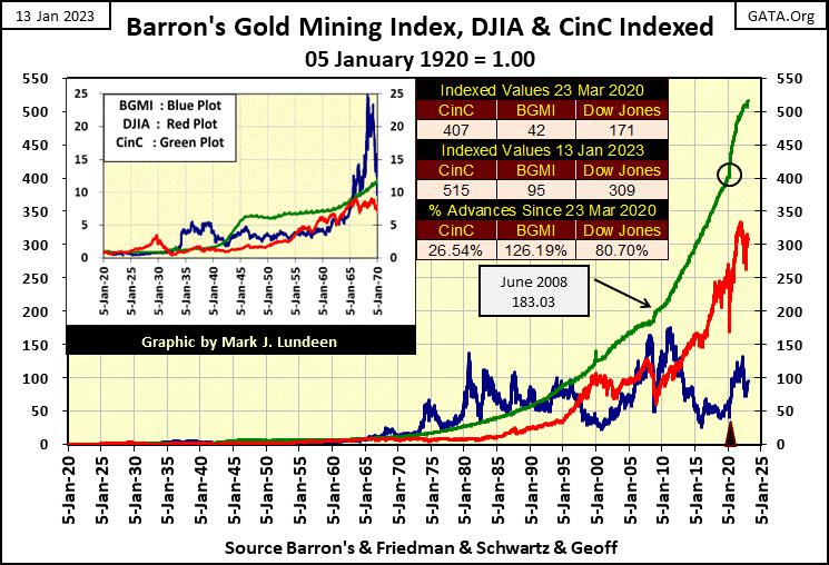
But just because the Dow Jones, or anything else is making new all-time highs, doesn’t mean investors are actually coming out ahead in terms of inflation. This is because market valuations are measured in dollars. Currently, the purchasing power of the US dollar is going down faster than the dollar valuations seen rising daily in the stock market.
The chart above is a great chart, even if I say so myself. The green CinC plot shows the level an investment must rise above to produce an actual, inflation-adjusted profit for investors for the past 103 years. Whenever the Dow Jones or BGMI is above the green plot, it is beating the rate of inflation. Whenever the Dow Jones or BGMI falls below the green plot, it is failing to beat the rate of inflation.
Looking at the Dow Jones; the last time it gave investors a rate-of-return above the rate-of-inflation was during the Roaring 1920’s bull market – 100 years ago. It came close to doing so again in 1966, and again in January 2000, but twice failed to actually break above the CinC green plot. For our historic bull market that began in August 1982, at no time, to this day, did the Dow Jones provide investors a return above the rate of inflation.
What about dividends? I doubt dividends could close the gap between the green CinC and red Dow Jones plots seen above. Also, dividends are taxed, and taxes from one investor to another can be very different. How is someone to plot something that is unknowable? So, I’m keeping it simple, and just use published data for CinC, the Dow Jones and the BGMI.
Looking at the BGMI in the chart above, comparing it to the Dow Jones, the gold miners during the depressing 1930s saw a bull market that outperformed the Dow Jones during its Roaring 1920s bull market. With the world as it is today, that’s something nice to know.
Then from 1966 to 1990, for twenty-four years, advances in the BGMI remained above increases in CinC, as seen by the blue plot (BGMI) remaining above the green plot (CinC). This is a historical fact, but a fact easily ignored as volatility in the gold miners prevented most people from profiting from investing in gold mining. If there is one group investors should buy at a bottom (when no one wants it), and then sell at the top (when everyone wants in), it’s the gold miners.
But most people aren’t interested in any investment until it becomes popular, and historically that hasn’t work with gold and silver mining.
The next chart uses the same data as the chart above (indexed values), except the plots are ratios of the Dow Jones (Red Plot) and the BGMI (Blue Plot) with CinC. This chart is easy to understand; the 1.0 green line is the rate of CinC inflation. When advances in the Dow Jones or the BGMI exceed CinC inflation, their plots will be in excess of 1.0. When they fail to keep up with the rate of CinC inflation, the plots will decline below 1.0, something the Dow Jones and BGMI have both done since 1995.
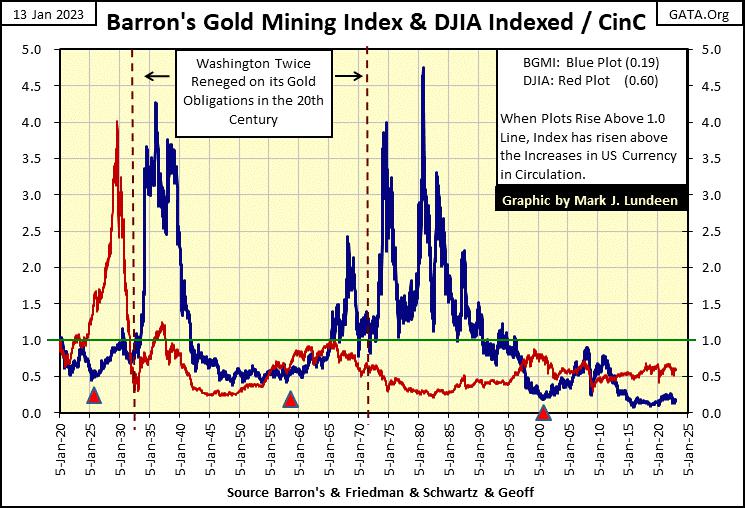
I’ve placed three triangles in the chart above noting historically significant events that marked bottoms in the BGMI. The first triangle is in 1925, when England was having difficulty returning to their pre-WWI gold standard. As per Allan H. Meltzer’s History of the Federal Reserve (vol 1), the Federal Reserve gave an enormous $200 million loan to the Bank of England, $200 million dollars payable in gold at $20.67 dollars per ounce of US Treasury gold.
The Fed also reduced interest rates to artificially make the British Pound more attractive than the US Dollar. I’ve seen where economists have argued this 1925 bailout of the Bank of England sparked the Roaring 1920s bull market, and also resulted in the Great Depression. I can see that. But anyway, this loan from the Fed to the BoE marked the BGMI’s bottom in the 1920s.
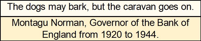
This loan from the New York Federal Reserve Bank to the Bank of England was controversial at the time. Congress held an investigation into it. But as Montagu Norman of the Bank of England would put it:
A run on the gold reserves began in 1957 (second triangle) which also marked a bottom in the BGMI. Following both of these two market events, the BGMI in the years that followed entered significant bull-market advances.
The third triangle in the chart above marks the beginning of the bull market in American single-family homes – the Sub-Prime Mortgage Bull Market, which also marks the bottom of the 1980-2001 precious-metals bear market. Twice in the next decade the BGMI attempted to break above the green 1.0 line, and twice was pushed back below it.
With the current BGMI to CinC ratio at 0.19, the gold and silver miners are very undervalued. Which historically, is the proper time to buy the precious-metals miners. But how undervalued are the gold miners?
To answer that question, we go to the BGMI’s Bear’s Eye View (BEV) chart below. A BEV chart plots a market series as Mr Bear sees it; with every new all-time high pegged at 0.00%, and never any more, as that is what Mr Bear thinks of every new all-time high; a big fat zero. Any data point not a new all-time high, registers as a negative percentage claw back by Mr Bear.
The BEV chart for the BGMI is a bit odd. Compare the chart before, and after August 1971 when the US Treasury removed the dollar from its Bretton Woods $35 gold peg. Before August 1971, most of the weekly closings in the BGMI were above its BEV -40% line. But after 1971, most of the weekly closings were below the BEV -40% line.
One would think removing the dollar from the gold standard, and the horrendous inflation that resulted in the following half century, would have benefitted the gold and silver mining shares. However, as seen below, that was not so, which is quite odd.
That is until one understands exactly what the idiots at the FOMC do for a living – they manipulate market valuations. As rising gold and silver prices, as well as rising valuations in gold and silver mining shares are seen as failing grades for the “policy makers”, they’ve made it their business to suppress valuations for precious metal assets, as seen below.
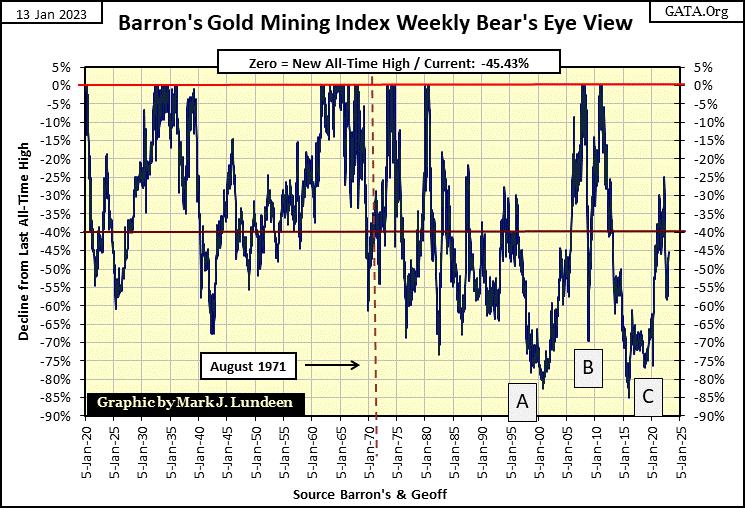
I’ve marked the big bear-market bottoms for the BGMI since 2000, with boxes A, B & C. Box-A was the bottom of the 1980-2001 precious metals bear market. It took over twenty years for the BGMI to break below its BEV -80% line, a bear market decline the BGMI had never seen before.
The bottom at Box-B happened during the sub-prime mortgage crisis. The BGMI was at new all-time highs in March 2008. Then Bear Stearns, the big Wall Street Bank failed. It self-terminated itself by ingesting its own toxic mortgages. Seven months later, as the mortgage crisis peaked, the BGMI was down by 70%, and that wasn’t by accident.
Following the sub-prime mortgage crisis, gold, silver and the BGMI all saw nice advances. Then came April 2011, and for no apparent reason, the BGMI began its deepest bear market decline in its over 100-year history, collapsing to its BEV -85% line in the BEV chart above in January 2016. It was the bear market from nowhere for no reason. Actually, I’d call this 85% collapse in the BGMI as idiotic – if you know what I mean. Gold and silver bullion also suffered greatly during this period.
Looking at this BGMI BEV chart above tells us just how undervalued, and under-owned the gold and silver miners currently are. Since 1971, the BGMI spent more time below its BEV -40% line than above it. Since 2000, it’s seen three massive bear market bottoms, each deeper than any it saw before 1971. For most “market experts” and the general population of investors, gold mining shares in 2023 are as popular as lice in a nudist camp. Yucky; no one wants any of that in their portfolios!
This was all by design by the idiots at the FOMC. Any investor who attempted to hedge market risk by taking a position in precious metals was going to get their fingers burnt. Think of this as a “monetary policy” thing. But I believe those days are over. Sometime in the not to distant future, the gold miners will be advancing, as investors in high-tech stand looking on from the sideline, staring on in wonder.
The market cap for the entire gold mining sector is trivial compared to the NASDAQ and NYSE listed companies. In a market panic, it won’t take many billions-of-dollars of flight capital from the NASDAQ & NYSE flowing into the BGMI & XAU to make this true.
The two frequency tables below are from the BEV data for the BGMI, which is weekly data. These tables answer a few questions, like how many new all-time highs has the BGMI seen since January 1920. Look at the values in the 0% rows, and add them together; 157 new all-time highs in the past 103 years. Which is pathetic. What is even worse is the number of new all-time highs the BGMI has seen since August 1971; a measly 46 during a period of 2682 weeks.
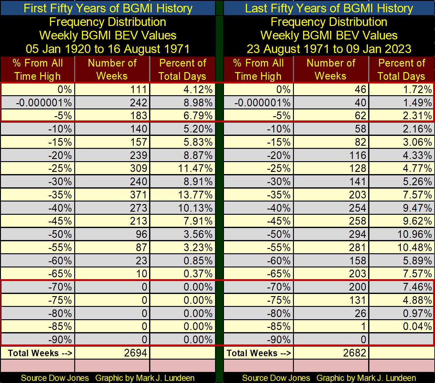
But what is seen above is a record of what happened to the BGMI during the bad old days, when idiots at the FOMC dictated market valuations in stocks, bonds and real estate to the acclaim of politicians, economists and “market experts” everywhere. When the flows of inflation coming from the FOMC stop flowing towards Wall Street, and begin flowing into consumer prices, and bond yields once again begin rising towards double-digits, I expect the BGMI will see a historic bull market that I want to be a part of.
Gold in its BEV chart below looks very positive. From its lows of mid-October, gold has displayed real power to the upside. But this big advance hasn’t yet seen a correction. Can gold rise up to new all-time highs without first testing its BEV -10% or -15% level? Normally I’d say no, but looking at the hard times gold has been through since August 2011, maybe its time for a little payback in the gold market.
Yea, the idiots have made life tough for us goldbugs since 2011. But, it took a lot of ammo to do that, ammo they don’t have now. It would be real “social justice” to see gold at new all-time highs sometime in March, or February, or two weeks from now. I have my fingers crossed!
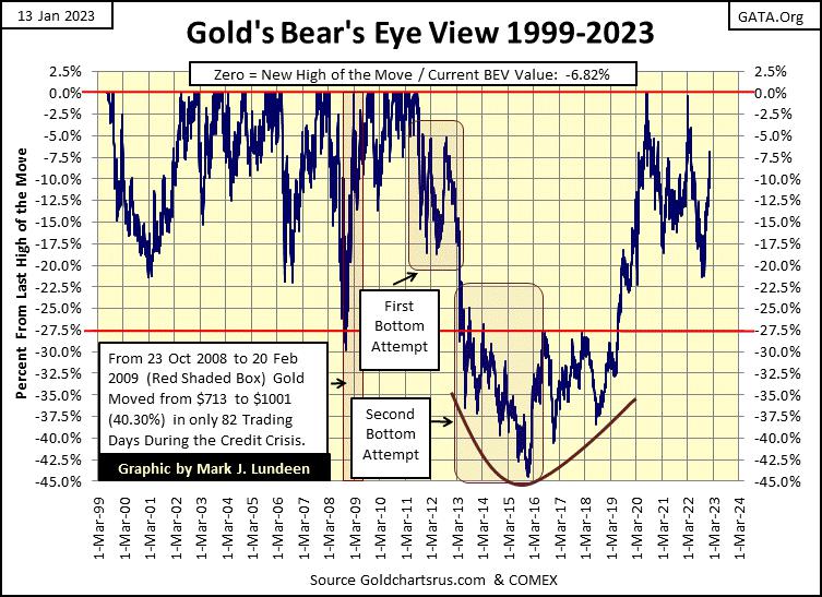
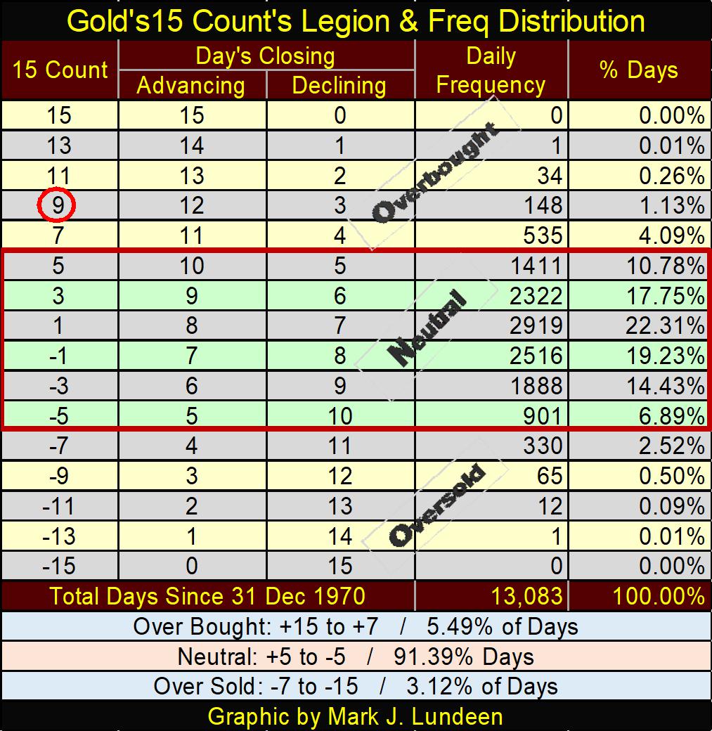
One item that suggests gold is due for a correction is its 15-count below closed the week at an extreme +9 in gold’s step sum table below. Markets don’t like being extremely overbought, so technically gold is due for a sell off to work off this +9 15-count.
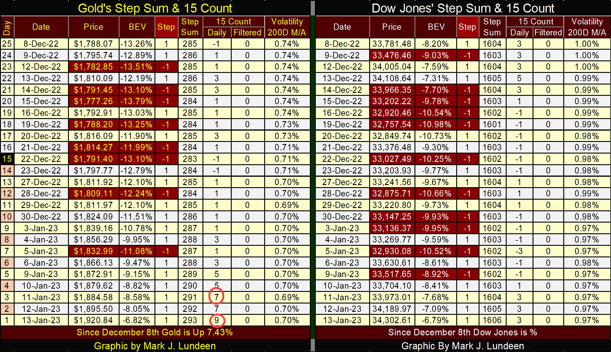
It could get worse. If gold is up on Monday, its 15-count will increase to a +11, and extremely overbought condition seen in only 34 daily closings since 1970. See table below. One has to believe the gold market would sell off from there to correct for this market extreme, but it doesn’t have too.
The next few months should be very interesting for precious metals.
Mark J. Lundeen
********


