I Still Don’t Like The Stock Market
 share
share
 share
share
 share
share
 share
share
 share
share
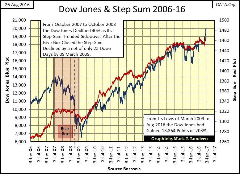
Since the November election, the stock market has become an amazing thing. How amazing? The election was twenty-six trading days ago. The Dow Jones Index closed at new all-time highs on sixteen of them…with the last on Tuesday of this week. The launching of the Dow Jones (Blue Plot) can clearly be seen below. But so far the venerable Dow has yet to close, or even break above 20K. The closest it got was on Wednesday, when its daily high was only 34 points from making history.
Strike while the iron is hot. With the Dow Jones so close to closing above 20K, after advancing 1,578 points in only twenty six trading days, for it to miss the 20K line by only thirty four points would be a disappointment.
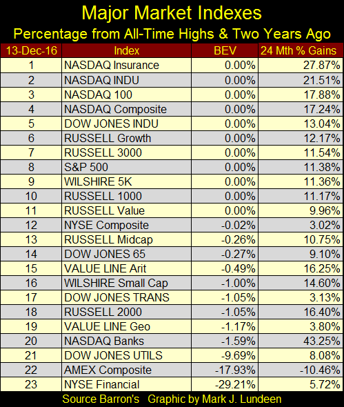
The Dow Jones has lots of company making new all-time highs. Here are the major indexes I follow in the table below. On Tuesday’s closing, the last time the Dow Jones (#5) closed at a new all-time high, ten other indexes did so too (0.00% in the BEV column). But I note the poor performance the stock market has made over the past twenty-four months. The Dow Jones may have advanced to a new all-time high on Tuesday, but it was up only 13% from two years ago.
If this is a new spurt in a continuing bull market, time will correct this glaring deficiency. If not, the Dow Jones may break below 19K before it breaks above 20K. I’m making no predictions mind you. I’m only keeping in mind that the market can go down as well as up.
Below is a startling chart of the Dow Jones with its trading volume. Before December 2nd if the thirty stocks in the Dow Jones saw a combined volume of 100 million in a day, it was a good day. Then starting on Monday, December 5th daily trading volume for the Dow Jones has been something over 300 million.
Then something strange happened today; (the 16th) the Dow Jones saw 576 million shares changing hands. That’s huge. So, why did the Dow Jones close down 8.83 for the day instead of making history by closing above 20K? I’ll tell you why; there were more people who wanted OUT of this market than those who wanted in. With the Dow Jones so close to 20K, there were those who saw today as an excellent opportunity to do exactly that.
For retail investors buying or selling big blue-chip stocks, liquidity is never an issue. But for a money manager who needs to sell a few million shares to raise cash, they are very aware of liquidity – the ability to execute buy and sell orders without impacting market valuations. Look at the big spike in trading volume below, so many shares traded without depressing the Dow Jones’ valuation for the past two weeks.
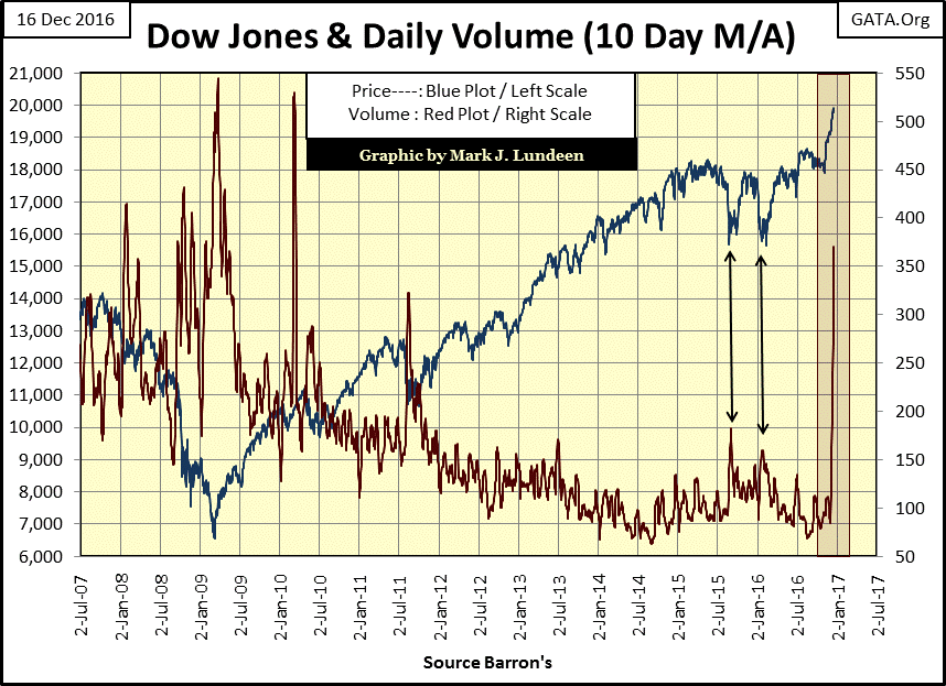
Here’s a thought; since January 2000 the Dow Jones only experienced rising trading volume during market declines and bear markets. Look at the March 2009 bear market bottom above; it occurred on all-time high trading volume. The same was true for the 2002 high-tech bottom. That wasn’t how the world worked before January 2000, where bear-market bottoms became illiquid purgatories that saw twenty sell orders for every buy. The thought I had was that the spike in volume seen above may actually be the highest trading volume ever seen during a market advance. I haven’t checked it out, but I’m sure it is.
That shouldn’t be remarkable, but since January 2000 it is. And I suspect that these last two weeks have made many money managers very happy. How happy 2017 will make the new owners of these shares of the thirty Dow Jones companies is something we’ll have to wait for to see.
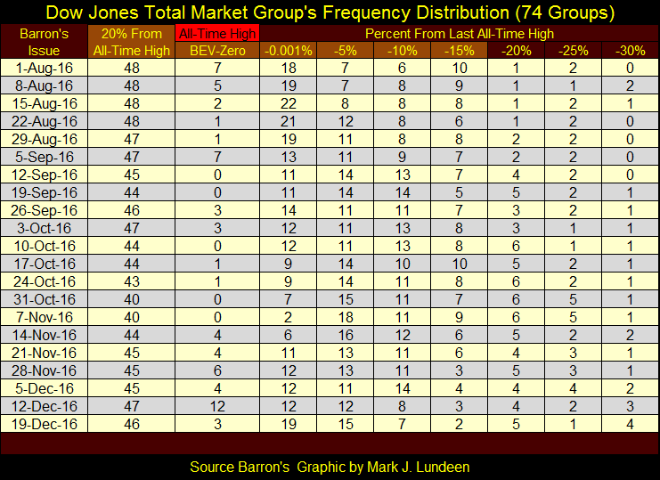
The Dow Jones and the other major market indexes have advanced wonderfully since the November elections. However, the fact is that just seeing just a few hundred blue-chip companies advancing in a big way could explain that. But what about the general market where the shares of thousands of companies trade? Looking at the Dow Jones Total Market Groups (DJTMG) will tell us that; and there isn’t much to get excited about. Look at the DJTMG Top 20 below; a 46 at week’s end, up from 40 at the election. A long way from the 52 it saw in July 2014.
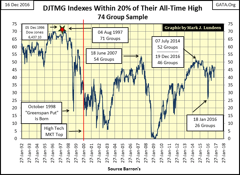
Below is the frequency distribution used to create the Top 20 plot above. Since August the Top 20 has been stuck in the 40s. And since last summer, the stock market hasn’t done much to produce new all-time highs in the DJTMG (BEV-Zero column). If this market advance is for real, in the weeks and months to come we’ll see these groups shifting leftward, ever closer to their last all-time highs. But so far this hasn’t happened, and there has been plenty of time for these groups to have done so since early November.
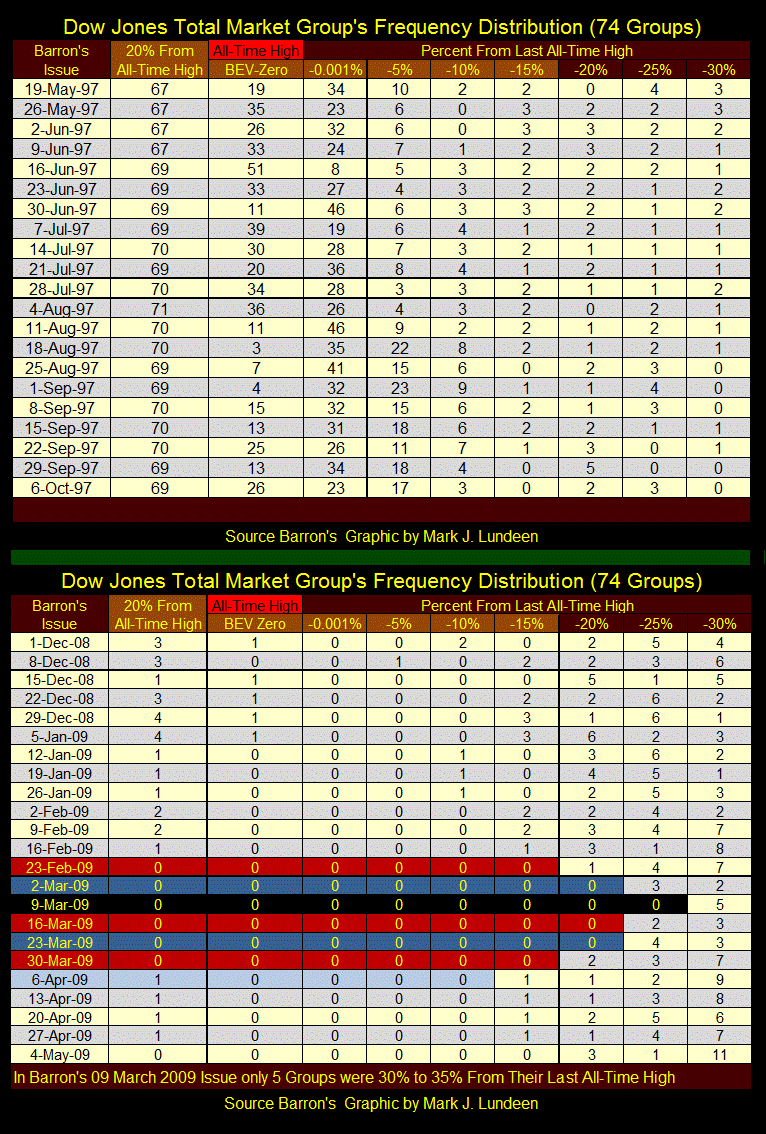
To illustrate how the distribution in the table above can change from bull to bear market, I made the graphic below. Keep in mind these distribution tables are used to construct the Top 20 plot in the chart above. It’s useful referring to the chart above when studying these tables.
The top table (below) was during 1997. In Barron’s 04 Aug 1997 issue, there were 71 groups within 20% of making a new all-time high; Alan Greenspan’s “irrational euphoric” high point of the Top 20 in the data set.
In Barron’s 16 June 1997, there were 51 groups in the DJTMG that saw a new all-time high.
The bottom table covers the bottom of the credit-crisis bear market. There were six weeks where * NO * DJTMG groups were within 20% of their all-time highs. March 2009 was a very hard bottom.
Here is my newly revised Step Sum and 15 Count Table; silver is out and the Dow Jones is in. It only takes one look to see why everyone is excited about the stock market, and couldn’t care less for gold. Look at all the BEV Zeros in the Dow’s BEV column, each 0.00% is a new all-time high. And since the election, the Dow Jones has yet to close more than 1% from a new all-time high.
I like this graphic. With one look one can see the difference between a -7 (gold) and a +7 (the Dow Jones). The two of them are almost a mirror image of each other.
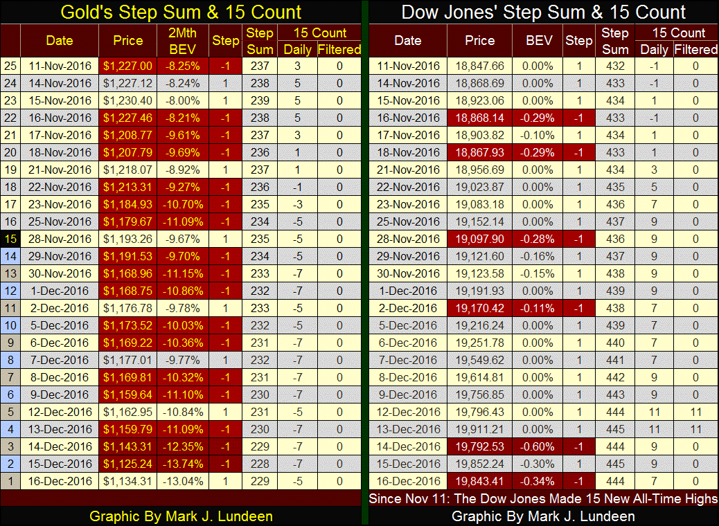
But 7s are hard to maintain, as over time it takes an unnatural preponderance of advancing or declining days to produce them. Heck, look at the Dow Jones. On December 12th & the 13th its 15 count saw a +11; only two down days out of fifteen. That’s something you won’t see every day! Historically, during both bull and bear markets, there are about as many advancing as declining days, something clearly NOT on display for gold and the Dow Jones above. At the end of this week, it’s safe saying that gold is oversold and the Dow Jones over bought.
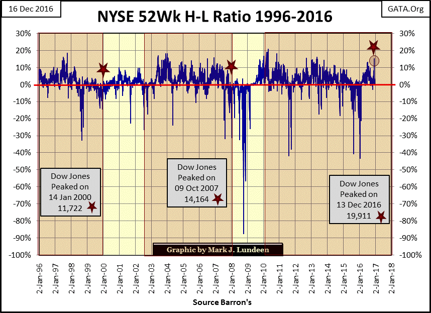
The NYSE’s 52Wk H-L Ratio (next chart) is at highs not seen since the end of 2013. The red stars on the chart below mark the Dow Jones last all-time highs for the high-tech, & sub-prime bull markets, as well as the Dow’s last all-time high of last Tuesday.
The pattern for the high-tech and mortgage bull markets were that early in their moves, the Dow Jones would be making many new all-time highs (each a new 52Wk high) along with many other shares trading at the NYSE. But as these bull markets matured, the Dow Jones would be making its new all-time highs with progressively fewer companies at the NYSE making new 52Wk Highs. Seeing the last Dow Jones all-time high being accompanied by so many 52Wk Highs at the NYSE suggest that there is still plenty of life in the move. That 21K in the Dow will follow its breaching its 20K line sometime in 2017.
But come March this advance has gone on for eight years. Most of what this move had to offer the bulls must now be past it. I expect that by April we’ll see that December, and possibly January was the last good opportunity to exit the stock market. The FOMC raised their Fed Funds Rate by twenty-five basis points this week, and is promising three more to follow in 2017. That’s enough reason for me to not like this market for the coming year.
I love long-term market history, like seeing the number of companies trading on the New York Stock Exchange since 1926 (chart below). The data points are computed from the NYSE’s breadth statistics by adding advancing, declining and unchanged issues. The data is weekly basis from January 1939 to present. But I have daily data going back to 1926, so I used Monday data to push back the plot.
The numbers aren’t perfect, as in the 1920s and 30s not every company listed on the NYSE traded every day. That can be true today too. So understand the data points I’ve plotted decades ago are actually the number of NYSE issues traded, not the total number of companies listed on the exchange. Still, there is a lot to be learnt from studying the data.
For one thing, during the “Roaring 20” bull market, from January 1926 to October 1929, NYSE listings increased from 620 to 953, an increase of 53%. Apparently the Roaring 1920s’ bull market was also a hot IPO market, but not as hot as seen during the 1990s high-tech mania. From December 1990 to March 1999, NYSE listings increased from 2133 to 3722, an increase in NYSE listings of 74%.
But here’s a difference; during the depressing 1930s, NYSE listings declined to 391 in July 1932, a 58% reduction. What happened to these companies? Some went bankrupt. There were also viable companies who unfortunately saw their share prices decline below the NYSE’s minimum, and so were delisted.
As is evident below, in the aftermath of the high-tech and sub-prime mortgage bear markets the NYSE didn’t see a massive reduction in its listings. I have to wonder what would have happened had Congress in October 2008 (an election year) not authorized the US Treasury and Federal Reserve to re-inflate the stock market with three bouts of Quantitative Easings?
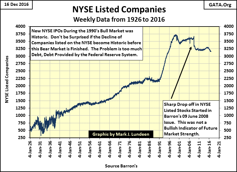
Since 2009, corporate America has taken on massive amounts of debt for the dubious purpose of funding their share buy-back and dividend programs. When Mr Bear returns and seriously begins stress testing everyone’s balance sheets, I expect a reprise of the 1930s’ mass delisting at the NYSE of companies, who can’t service the debts they taken on during the boom times of the Bernanke and Yellen Feds.
Oh Mark, there you go again with that stupid Mr Bear metaphor and the terrible things he is going to do when he returns; but he never returns!
Well I can’t help it if valuations for financial assets today, as government statistics, are rigged by the “policy makers.” The world that all too many people believe they now live in is only a media fiction. The “Main Stream Media” is an accessory to the fact of criminal activity being foisted on a trusting public.
It has been many, many years since Clarence Barron’s charged his staff at Barron’s with the following:
"You are in the field to defend the public interest, the financial truth for investors and the funds that should support the widow and the orphan."
- Clarence W. Barron’s; Founder of Barron’s Financial Weekly, Mission Statement.
The financial media today will pass on to the public, without challenge, any whopper told to them by an “economist” on the payroll of Wall Street or the Federal Reserve. The most recent whopper being passed on to the public is the desirability of introducing a cashless economy to reduce criminal activity.
I admit this innovation will make life difficult for a panhandler on a street corner, but it would have had no effect on the fund raising by the Clinton Foundation, or other “pay to play” schemes used by members of Congress to enrich themselves.
Anyways I like paying with cash. When I shop with credit cards I always over spend, as do most people. That’s why the banks like this idea; it will drive people deeper into debt. That plus the bankers would no longer have to fear bank runs, no matter how badly they’ve bungled things. Politicians like it because it will enable them to extract every penny of tax from the population.
A cashless economy is only another way of selling to the public a totalitarian intrigue straight out of the Bible’s book of Revelation, or how to make life for the little people hell on this Earth. The only other time something like this was tried that I’m aware of was by Pol Pot in Cambodia just after the Vietnam War.
Why are our elite always attempting to install on the rest of us something from Karl Marx or a communist monster like Pol Pot? Not that the MSM will ever point that out.
The MSM’s role in this thievery at the highest levels of “policy” is to keep the public dumbed down and quiet for as long as possible. A lapdog to power, the main stream financial media since the Greenspan era refuses to challenge the authorities, as Robert Bleiberg did in 1979.
“To serve as a central banker, as BARRON’S again reminded its readers early last year when G. William Miller took over at the Fed, one needn’t be a flim-flam man, but it helps.”
- Robert M Bleiberg: Barron’s Managing Editor, 11 June 1979
It’s comical how the dinosaur media is now going after organic internet providers of news by labeling it “fake news” when no one puts out more fake news than the usual suspects like, but not limited to CNN or CNBC.
This is all going to end very badly. All I’m saying is that a day of reckoning is coming when the truth can no longer be denied; that the American public has been pillaged by the best and brightest our Ivy League university system had to offer us in economics, politics and banking. In retrospect, that day may be identified when, as during the depressing 1930s, the listings on the NYSE begins a contraction of 50% or more in the plot above.
Here’s the NYSE Advance – Decline Ratio from 1926 to the present. I don’t do a straight A-D Line, as in 2016 we frequently see more daily advancing or declining issues than the NYSE had listed in 1926. To normalize the A-D data over the past ninety years I use a ratio computed as follows.
Advancing – Declining issues / Advancing + Declining + Unchanged
There’s a lot to this chart. I’m not going to explain it in detail as it’s not possible without making the text torturous reading. But I’ve identified the big bear markets by highlighting them in a red field. In the bull markets I’ve placed a table listing the start and stop dates, as well as the values of the Dow Jones. It’s obvious how each bull and bear market’s relationship to the NYSE’s Advancing and Declining data is unique. Still, there are things in the chart below that are hard to explain.
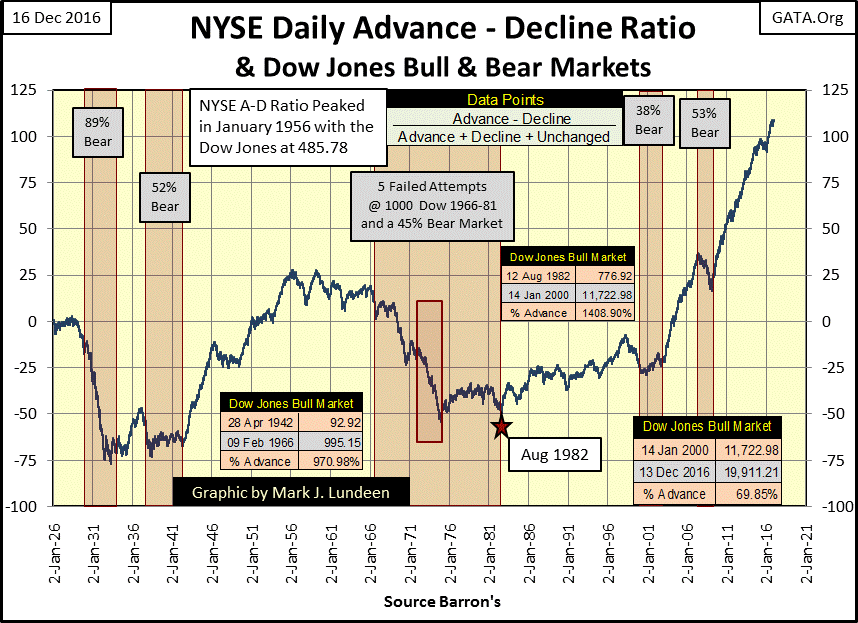
Look at the table for the bull market that began in January 2000, and ended in December 2016. Yes, I know that was the top of the 1982-2000 bull market, and that the Dow Jones would decline by 38% in the next year and a half. And who knows if the Dow Jones all-time high of last Tuesday is the last-all time high (or Terminal Zero {TZ} in BEV lingo), of this bull market. I don’t care; to make a point I choose to ignore all that.
What point is that? That from 2000 to today, the NYSE A-D Ratio has advanced from -25 to over 100 in seventeen years; that’s huge! Since 1926, the ratio has done nothing similar to what we see above from 2000 to 2016. And after all that advancing, and damn little declining at the NYSE, the Dow Jones has only advanced by 69.85% as of the close of last Tuesday? Really?? Well maybe, and then maybe not.
Try as they might, criminals always leave evidence behind that forensics can discover, and I believe the astounding advance in the NYSE A-D Ratio from 2000 to today is such evidence. But is this a crime perpetrated by “policy makers”, who I include the politicians, academics and bankers who all made this possible? I would say yes it is criminal, as for their benefit they have made a rigged stock market the only game in the town for the American population.
No longer can work-a-day people use the banking system as a source of income or appreciation by saving a portion of their wages. Not after that monetary maniac Dr. Bernanke lowered interest rates down to zero to “save the banks.” The same is true with the bond market. In the aftermath of the high-tech bubble they inflated a bubble into the real estate market that almost destroyed the global financial system in 2008. And now they’ve inflated another with suppressed mortgage rates. Where else but the stock market are people told to place their savings to fund their retirements?
Well, I don’t like what I see in my charts and tables, or the advice I hear coming from the financial media on how I should invest my savings. Interest rates and bond yields are rising for the first time since 1981, and that changes everything.
Personally, if the entire global political and financial establishment is taking so much trouble to allow me to purchase gold and silver at prices far below free market valuations; that seems the way to go. It really makes sense to buy gold or silver on a dollar-cost-average basis; a couple thousands or even a few hundreds of dollars of metal a month.
With Christmas and the New Year approaching, I’m planning to take the next three weeks off. I plan to send out my next article on Saturday night; January 14th. I hope my readers have a Very Merry Christmas, a Happy Hanukkah, or for a lucky few; both!
You know I, like most of us do a lot of complaining. But the fact is that God has blessed America and we should be grateful for that. We should also pray that our president elect; Donald Trump is successful in all his endeavors on our behalf.
Mark J. Lundeen
share
share
share
share
share