Important Inflection Point For The PM Complex (Part 2: Currencies)


In part 2 of this Important Inflection Point For the PM Complex, we’ll look at some US dollar charts along with a few important currencies of the world. I don’t have to tell you that the US dollar can play a very important role in how the PM complex and commodities in general may perform. Even though it’s never a perfect correlation important turning points can appear very close to the same time. We’ll start with the short term charts and work our way out in time to the very long term charts.
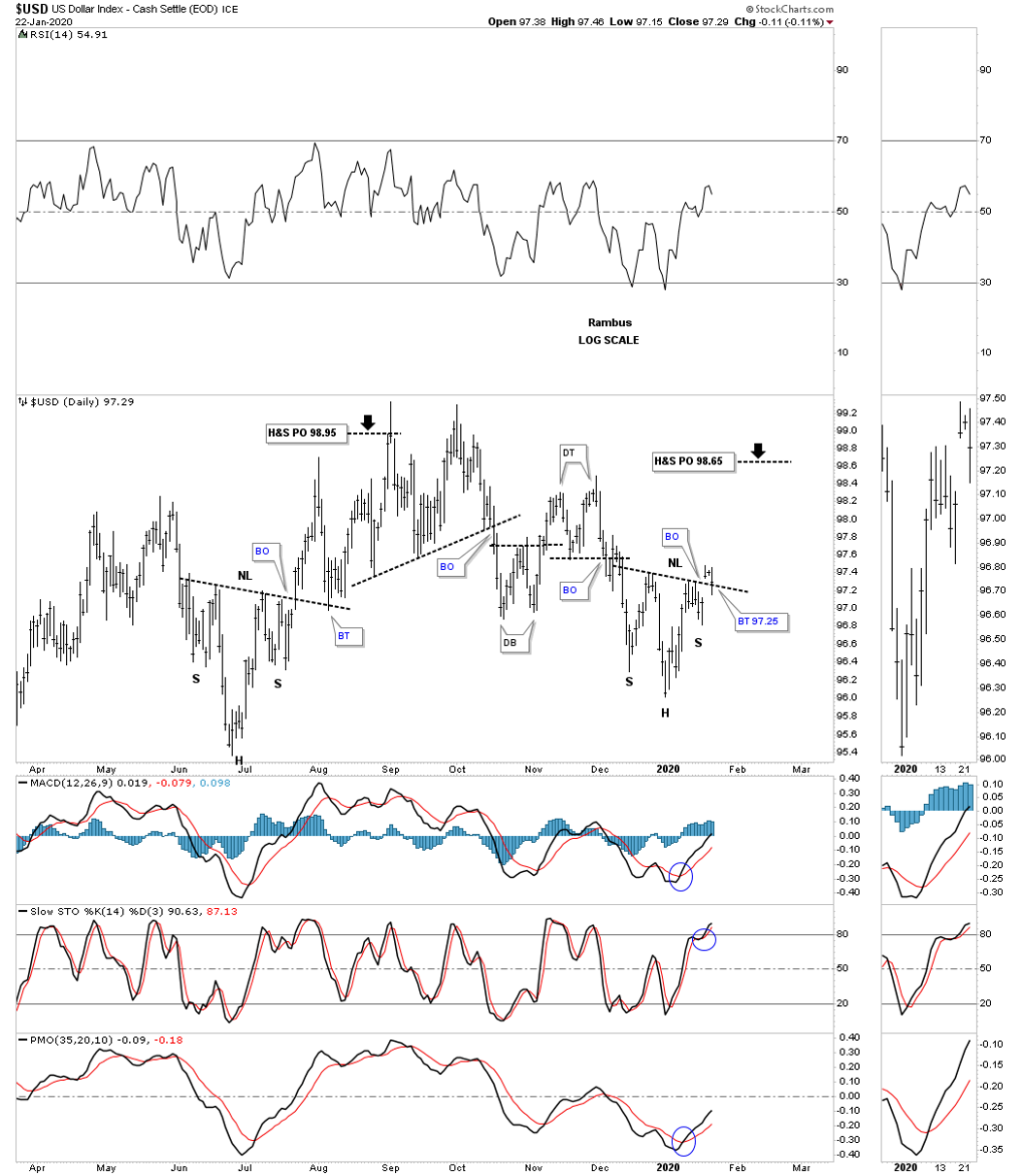
This first chart for the US dollar shows the sideways trading range with a H&S bottom that formed last summer and the current one that had a breakout above the neckline last Friday with the backtest now in progress around the 97.25 area today. The H&S price objective from last summers H&S bottom was up to the top of the trading range at 98.95. If our current H&S bottom plays out it will have a price objective again up to the top of the trading range around the 98.65 area.
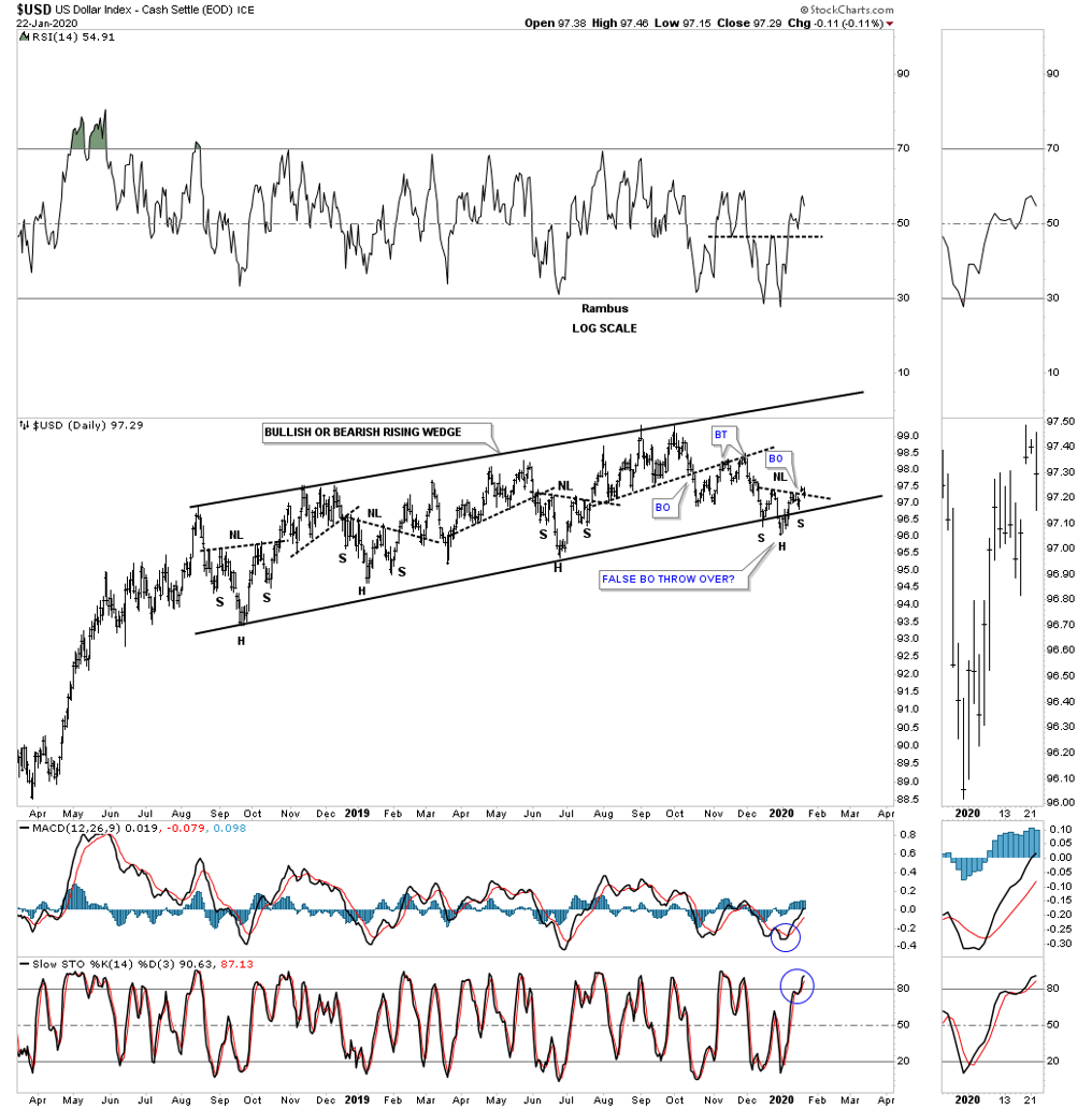
This next chart for the US dollar is basically the same one we’ve been following on the UUP / HUI combo chart on many of the Market Update posts. Here you can see the August 2018 rising wedge formation that is going to be either a bullish rising wedge or a bearish rising wedge depending on which direction the breakout occurs. This rising wedge in now 18 months in the making and a big move will take place once the direction is made. Note the smaller H&S bottoms that have formed on the bottom rail at each reversal point. You may have noticed the the right shoulder on the daily chart above is much shallower than the left shoulder. The reason that may be the case is because the right shoulder low has formed on the bottom rail of the August 2018 rising wedge formation after the head was made on the throw over.
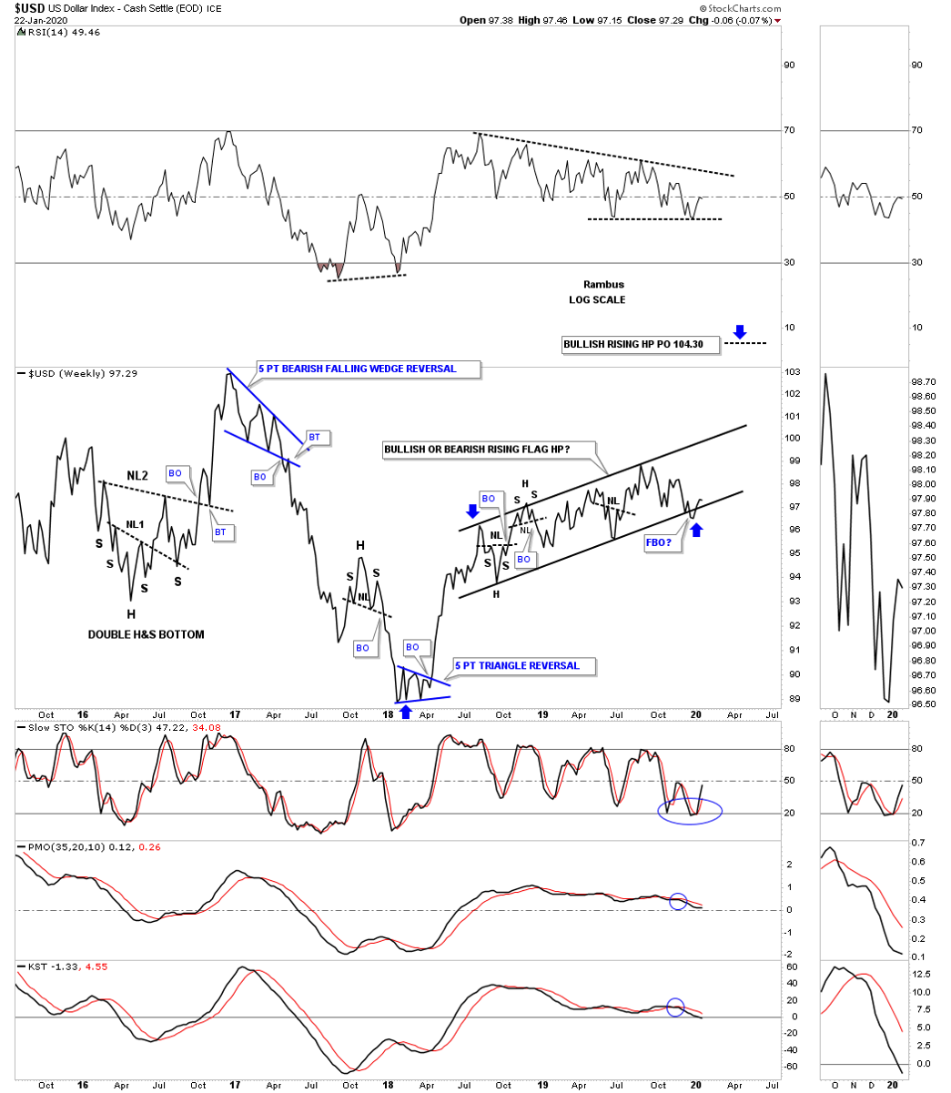
Now lets step back in time and look at a 4 1/2 year weekly line chart for the US dollar. Here you can see how the August 2018 rising wedge fits into the big picture. If the price action breaks out through the top rail it will be a bullish rising wedge and will be a halfway pattern to the upside. A breakout below the bottom rail would be good for the risk off trade.
Since the 2018 low the RSI has been declining while the US dollar has been rising. Many technical analyst would call that a negative divergence and would be very bearish on the US dollar. One of the hallmarks for a bullish rising wedge or flag is that they almost always are accompanied by a negative divergence. Another way to look at a bullish rising flag or wedge is that they are like a running correction, the price action slowly keeps rising while the indicators come off overbought conditions.
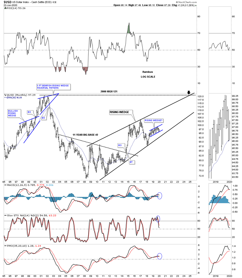
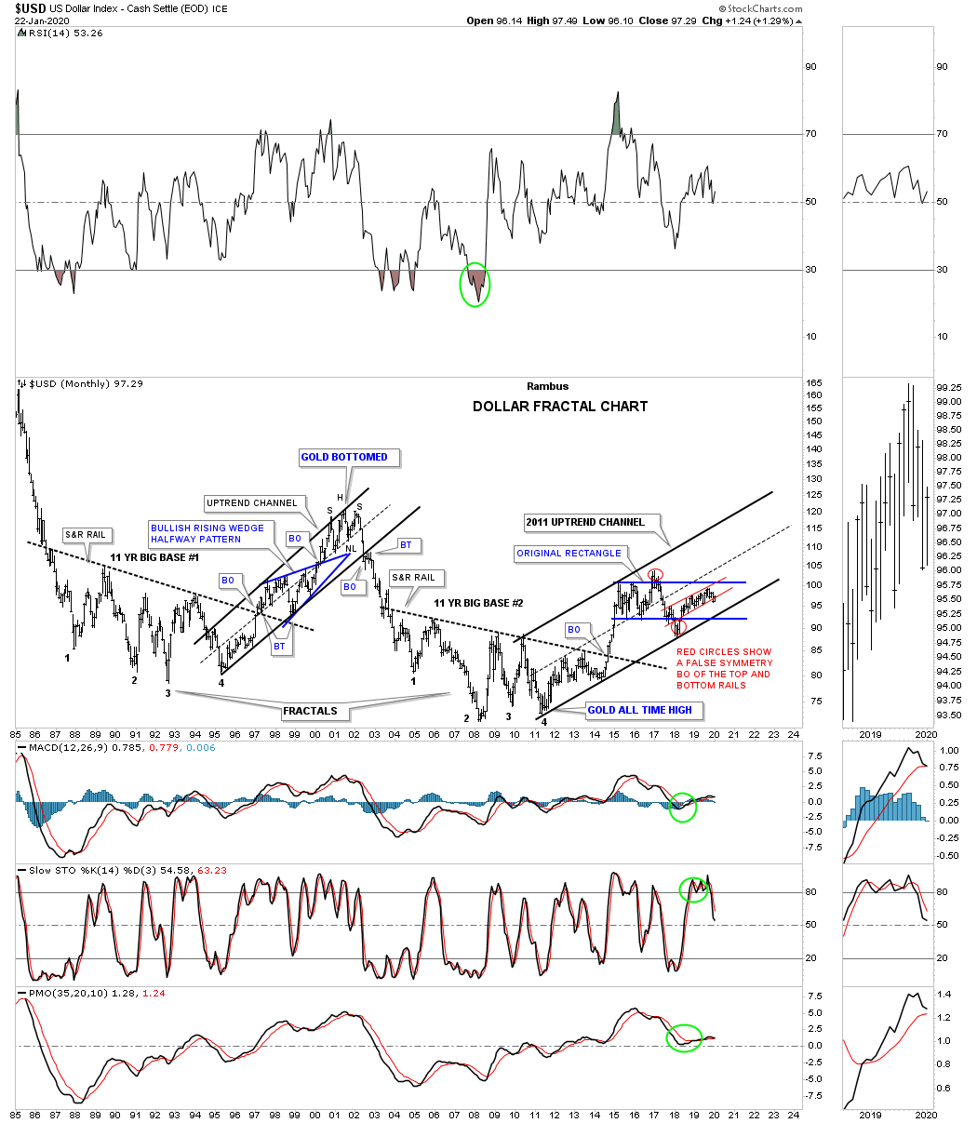
Now let’s go back even further in time and look at a 25 year monthly chart. This chart shows a very large rising wedge formation after the breakout from the 11 year big base #2 in September of 2014. This chart really puts the August 2018 rising wedge formation in perspective and shows how it could easily be a bullish rising wedge which has been slowly morphing into more of a rising flag formation over its life. The 30 month ema has been doing a great job of holding support during the formation of the 2018 rising wedge formation. If the big 10 year black rising wedge keeps playing out to the upside it could have a price objective up to the 2000 bull market high around the 121 area several years down the road.
Next is the old epiphany chart I built back in 2014 when I discovered the two 11 year fractal bases labeled, BIG BASE 1 and BIG BASE 2. That is one of those situations when you discover a big chart pattern well before it breaks out. We had to wait roughly 5 months before the actual breakout, but it was worth it. That big vertical rally out of big base #2 was something to behold which also put the risk trade back on for commodities in general. I put the August 2018 rising flag in red so you can see how it fits in to the 2011 uptrend channel.
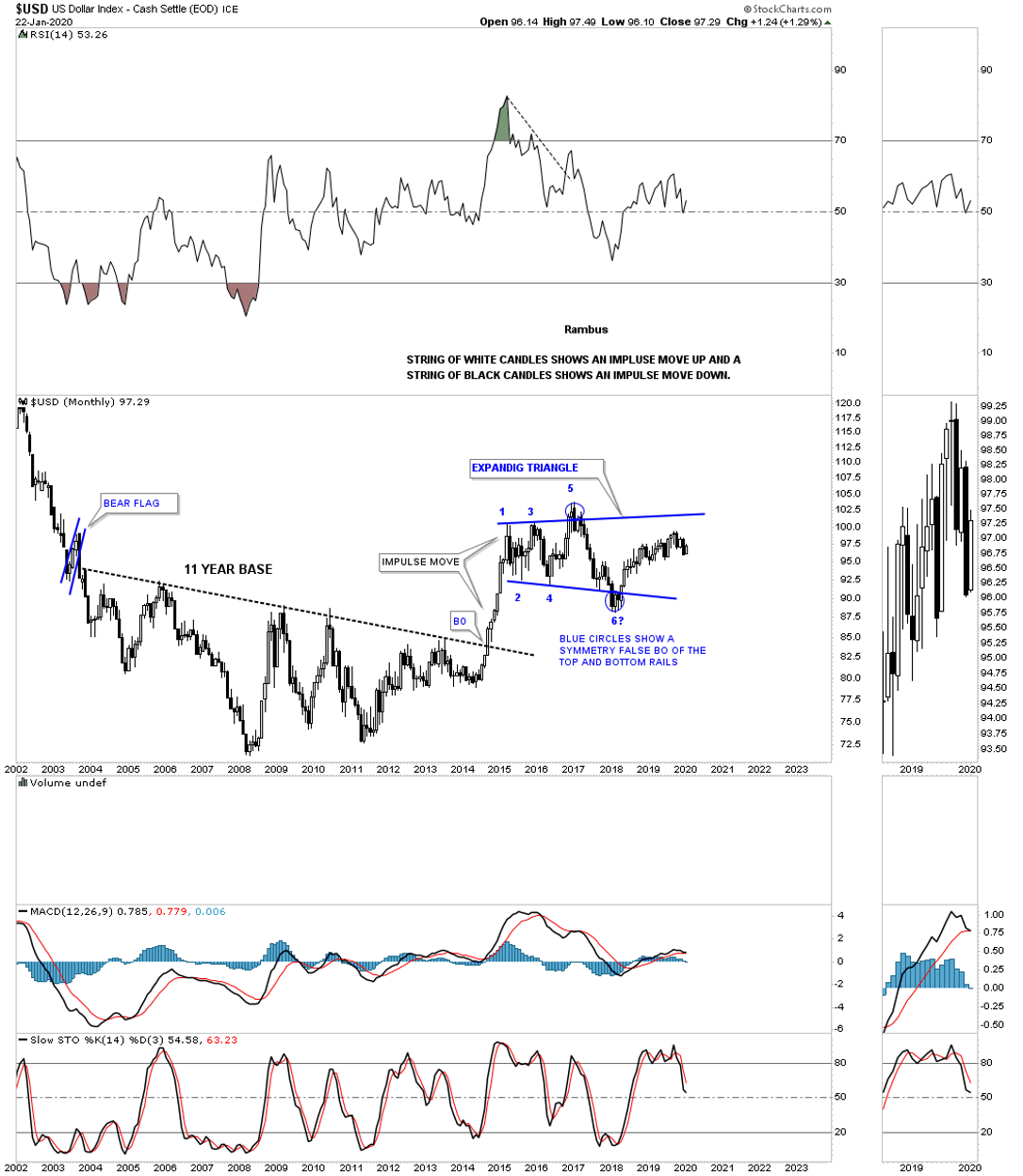
This next chart for the US dollar shows the impulse move out of big base #2. This is a good example of how a strong impulse move should look using monthly candlesticks. In a strong impulse move up you should see a string of white candlesticks all in a row. In a strong impulse move down you will generally see a string of black candlesticks all in a row.
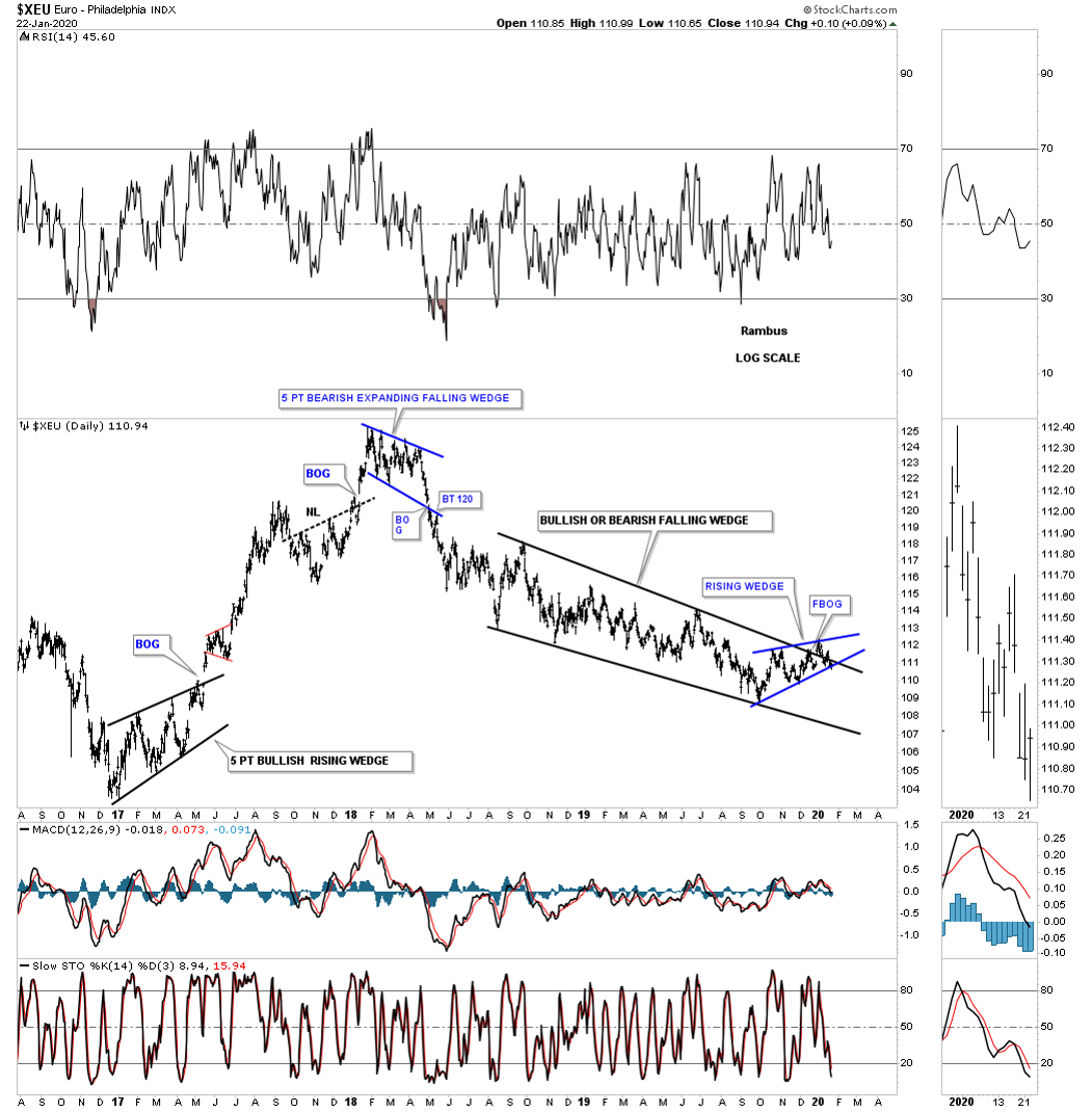
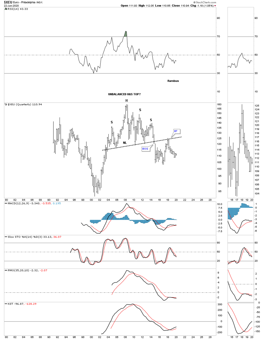
Lets change it up a bit and look at a daily chart for the $XEU, euro. If the US dollar is forming the 2018 rising wedge then the XEU will be forming a 2018 falling wedge of the same size. This long term daily chart shows the August 2018 falling wedge with a false breakout gap above the top rail. We looked at the possible small blue falling wedge on the US dollar earlier in this post while the XEU is forming a small blue rising wedge inversely to each other.
We’ve been following this 25 year monthly chart going back to when the right shoulder, blue rising wedge, was still under construction. That is the same impulse move down in 2014, out of the right shoulder, which also took out the neckline that most currencies had at the time which devastated commodities. Here again you can see the blue August 2018 falling wedge and how it fits into the big picture.
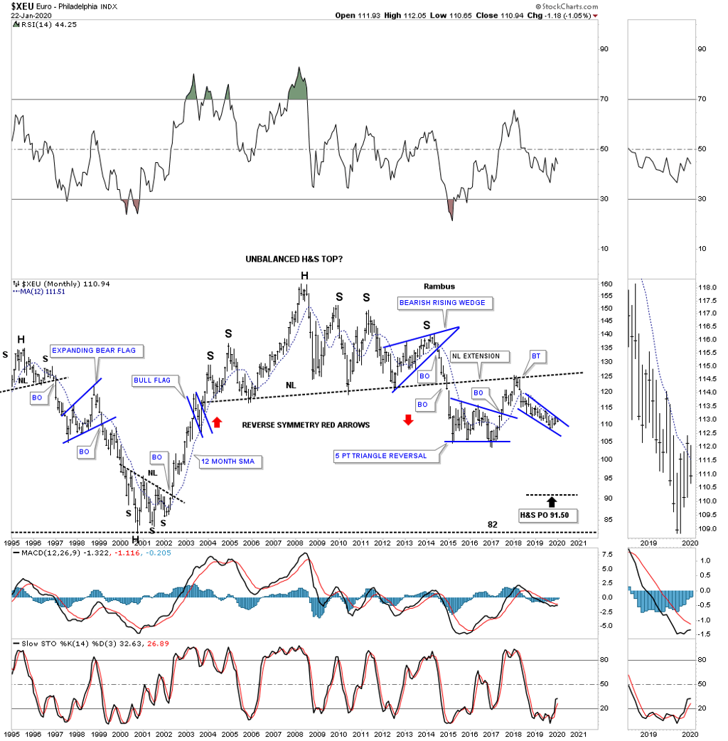
Below is the quarterly chart for the XEU which puts that massive H&S top in perspective.
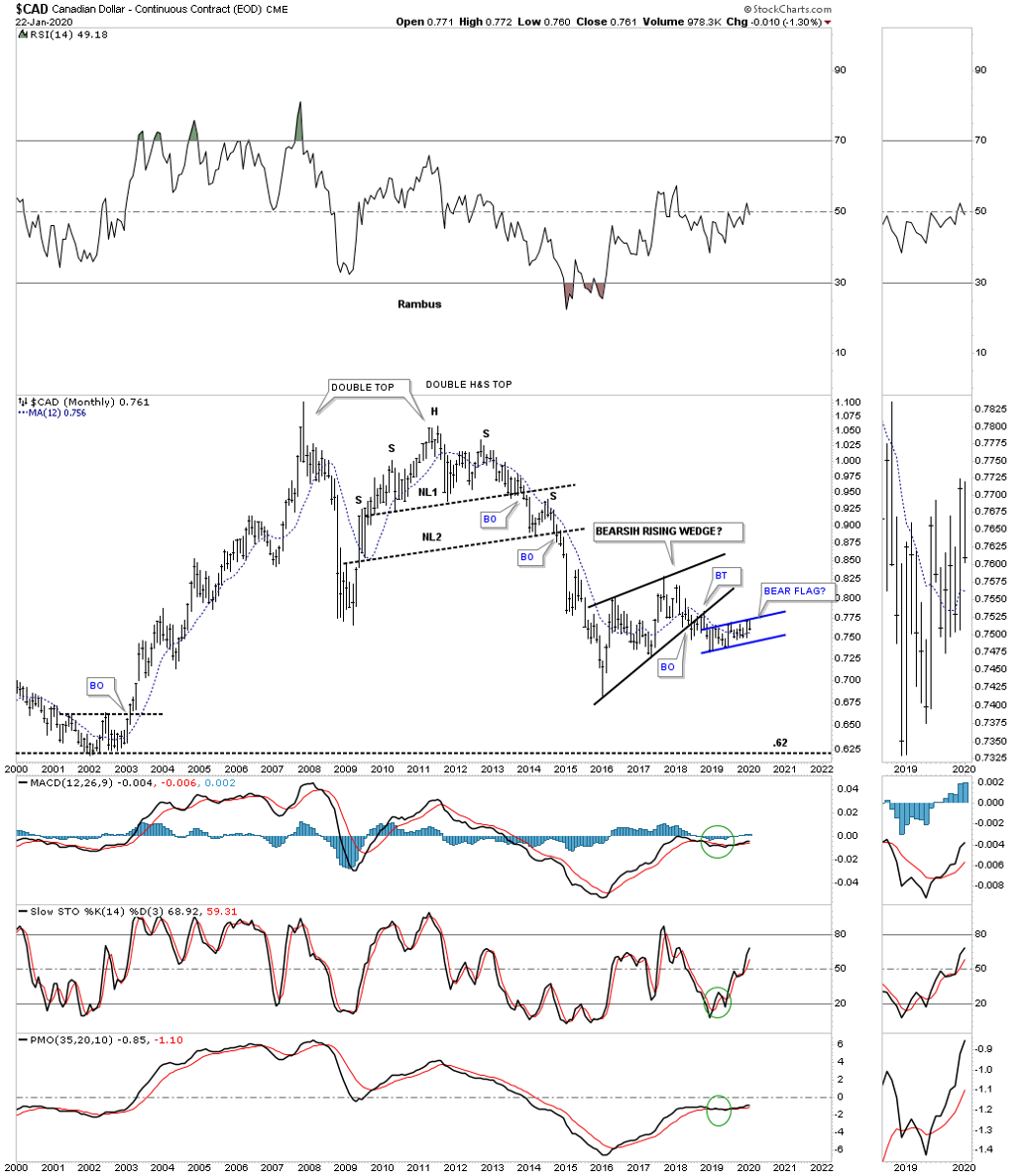
That August 2018 rising wedge we’ve been following on the UUP / HUI updates is showing up on most of the important currencies of the world. Below is a long term monthly chart for the Canadian dollar which shows its blue rising flag that began forming in December of 2018 shortly after the US dollar. As you can see this month the $CAD is beginning to decline off the top rail of its blue rising flag.
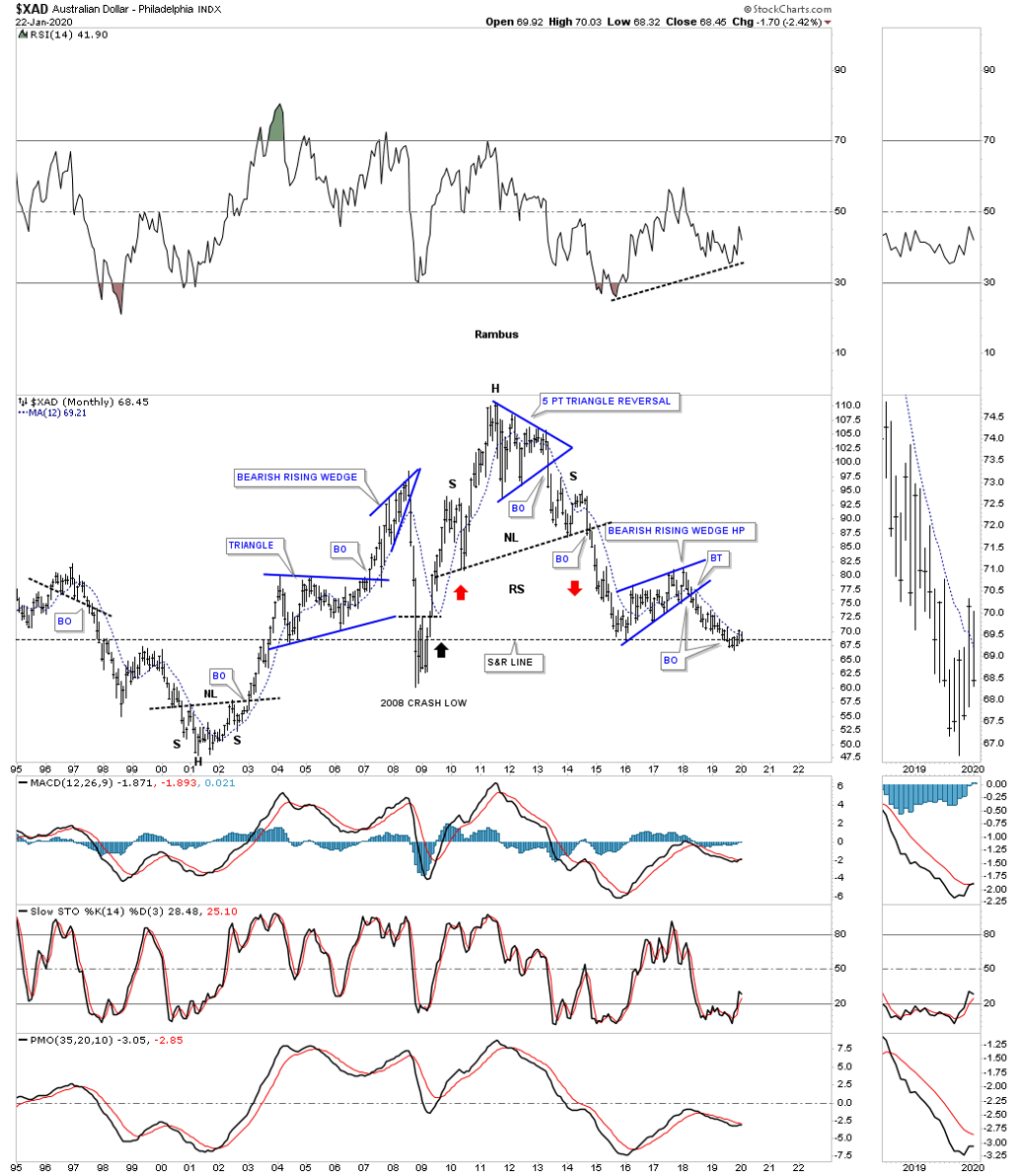
This next long term monthly chart is for the $XAD, Australian dollar. Its been finding some initial support at the previous low where the 2016 bearish rising wedge began forming. The 12 month sma has been doing a good job of holding overhead resistance.
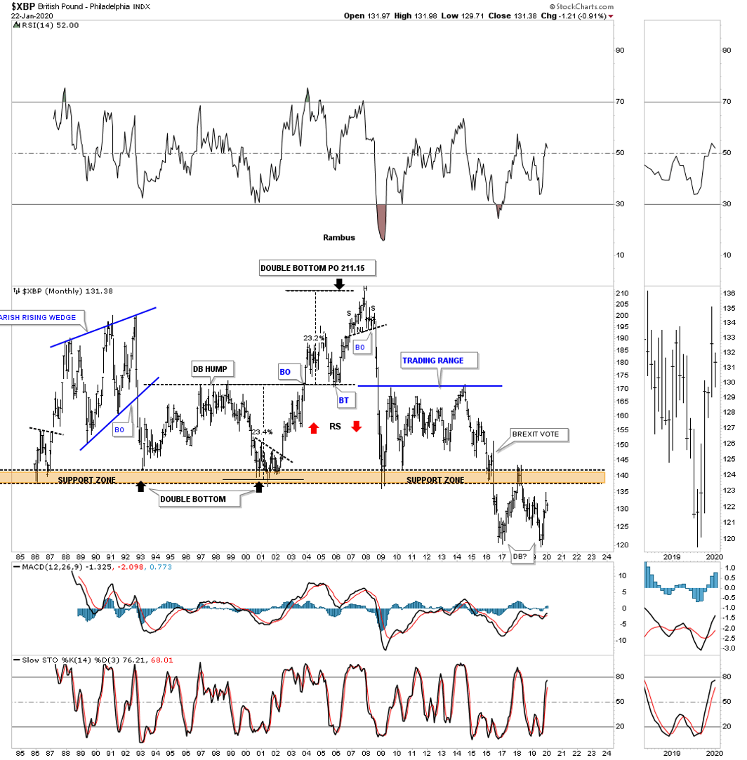
The $XBP, British Pound, was trapped in a massive sideways trading range for close to 30 years before it finally broke below its major brown shaded support and resistance zone shortly after the BREXIT vote in June of 2016. After the 2017 low was established a counter trend rally took the XBP back up to the brown shaded support and resistance zone where it had reversed its role to what had been support for close to 30 years to resistance. It looks like the price action is either building out a double bottom reversal pattern to the upside or a consolidation pattern that will take prices lower.
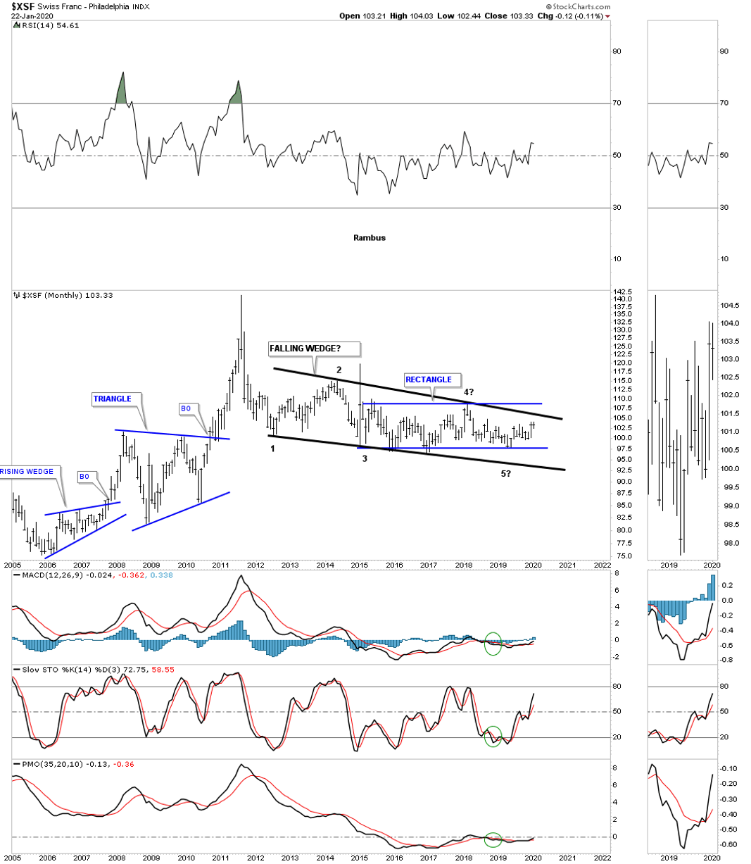
Next is the $XSF, Swiss franc, which has been trading in a fairly narrow trading range inside of the blue 2015 rectangle which is inside of a bigger black 2012 falling wedge. Not much more to say about this currency until it breaks out one way or the other.
What these long term charts are showing us is that while the US dollar has been in a bull market since 2011 most currencies have been in a bear market over that same timeframe. Can the PM complex sustain a bull market if the US dollar continues to move higher over the long term? A trend stays in motion until it changes or the trend is your friend, are a couple of axioms that hold up well when it comes to the markets.
I still have several more important charts to show you, but I will have to wait until this weekend as I’m out of time. All the best…Rambus
*********
 Meet Rambus, a seasoned trader and technical analyst renowned for his unbiased and insightful chart work. Through his website, Rambus Chartology, and Substack newsletter, Rambus shares his expertise with a global community of subscribers, providing daily updates, commentaries, and hands-on training in the art and science of chartology. With his calm, humble, and down-to-earth approach, Rambus demystifies complex market trends, helping his followers navigate the challenges of today's volatile markets. Join the Rambus Chartology community today and discover a unique blend of technical analysis, trading expertise, and time-tested protocols. Subscribe now at www.rambus1.com or https://rambuschartology.substack.com/


