Is It Time To Back Up The Truck…And Mortgage The Farm?
 share
share
 share
share
 share
share
 share
share
 share
share
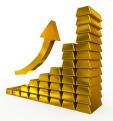
 Technical Analysis of the gold sector reveals a number of red flags, such as negative COT numbers and a mining sector that is at least temporarily overbought, having more than doubled since January.
And yet…….
Sometimes a market that is overbought can remain that way for longer than anyone anticipated. Remember the ‘Dotcom’ bull market of the 1990s? It became overbought and kept on rising for many months.
By comparison, gold, silver and mining stocks represent tangible value, not a concept of something ‘that might be’, or something ‘that may catch on’. Is it possible that gold, silver and mining stocks are entering an investment phase that is similar to the ‘dotcom’ investment phase of the 1990s? If the answer is ‘yes’, then we must be prepared for some lofty targets and wide swings.
(Charts are courtesy Stockcharts.com unless otherwise indicated)
The above chart courtesy Macrotrends.net shows the ratio between gold and the US Monetary Base. The latest turning up from an ‘oversold’ condition occurred in the year 2000, when gold rose from $260 to $1925. A similar rise in this index today, will take the price of gold to $8,000. In 1969 this index bottomed with gold at 41. Gold then rose to $850 by 1980. A similar rise today will take gold to $22,000. The average of these two numbers is $15,000 an ounce. These targets may seem lofty, but we must realize that never before in history has every nation on the globe printed money in concert with every other nation, or group of nations. Consider also the fact that there are now 2 billion people (most of them in Asia), who were not alive in 1980…and many of them like gold!
The above chart is also courtesy Macrotrends.net, and it shows the gold price colored brown and the US FEDs accumulation of ‘assets’ in blue. Since the two usually move in tandem, the expectation is for gold to catch up, as we don’t expect the FED to dump those ‘assets’ that they bought while keeping the banking system from collapsing in 2008, onto the market. In order for gold to catch up, the price will need to more than double from current levels.
Featured below is the weekly gold chart. Price broke out at the important 90-week moving average and twice came back for a test. The breakout is now firmly confirmed -- and the next target is at $1400. A further breakout there sets up a target at $1550.
This following chart courtesy Ronald Stoeferle at Incrementum AG shows the various stages of a bull market. Optimism is only just now returning to the gold sector.
This next chart courtesy goldchartsrus.com shows the seasonal tendency for gold in August is very positive.
Featured above is the index that compares gold to BKX the US banking sector - with the gold price at the top. The green lines draw attention to the bottoming at support in this index, and the positive effect this has on the gold price. Each time this index turns up from a support level, it coincides with gold rising, from a week to a month or more. The expectation is that this latest upturn is likely to coincide with gold rising into September.
Featured above is a chart that compares gold to bonds. From 2011 until the end of 2015, while the gold price was correcting, bonds outperformed. Then in January the trend reversed and gold took the lead again. The current pattern is an ‘inverted head and shoulders’ formation. Price is itching to break out at the blue arrow, and when it does, the target will be at the purple arrow. This will motivate a large number of bond holders to switch to gold.
Featured above is a chart that compares gold to Warren Buffett’s flagship stock Berkshire Hathaway. Gold is clearly outperforming. Warren will soon be wishing he had sold some of his shares and bought gold.
Featured above is the bar chart for Deutsche Bank, one of Europe’s largest banks. This bank is leveraged to the hilt with trillions of dollars in derivatives. The stock price is in obvious decline - and the breakdown at the blue arrow has just been confirmed at the purple arrow. The downtrend here is having a negative effect on banks around the globe. Moreover, the worse this trend gets, the more obvious will be the positive impact on gold – just as happened in 2008-2009 when Lehman Bros hit the skids.
Featured above is GDX the gold and silver miners ETF. The purple arrow points to a crossover of two moving averages that warned price was turning down. It took four years for this trend to reverse, as the blue arrow points to these moving averages turning positive again. As long as ‘blue’ stays above ‘red’, the trend is up. Having now risen above 30, the next target is at 40.
We end with a chart that shows silver outperforming gold. Everything bullish for gold is even more so for silver. The reason is that gold is recycled, whereas the majority of uses for silver, (and these are growing by leaps and bounds), seldom result in silver being recycled. Computers, cell phones, refrigerators, rockets, satellites, electrical switches and solar panels when discarded, are not yet mined for the silver they contain. Price is shown to have broken out at the blue arrow and the test a few weeks later confirmed the breakout. The supporting indicators confirm the new trend.
********
DISCLAIMER: Please do your own due diligence. Peter Degraaf is not responsible for your trading decisions.
Peter Degraaf is an investor with over 50 years of experience. He publishes a daily report for his subscribers. For a sample copy please visit www.pdegraaf.com
share
share
share
share
share
 Peter Degraaf became interested in silver and gold when the Governments of the US and Canada proceeded to remove silver coinage from circulation in the mid 1960s.
He noticed the effect of Gresham’s law: “Bad money drives out good.” He became a coin dealer, attending coin shows all over The US and Canada. In 2001 he semi-retired from coin sales and concentrated on investing in precious metals. He mastered the art of technical analysis and applies this to his investments. In 2001 he started publishing a daily and weekly market report. His website is at http://www.pdegraaf.com/.