James Sinclair’s QE To Infinity: Central Banking’s Manifest Destiny


I’m not surprised: The week following my article illustrating why I believed the gold and silver miners are “historic buys at today’s prices”; gold, silver and their miners get whacked to their lows of the current, so far eight week correction.
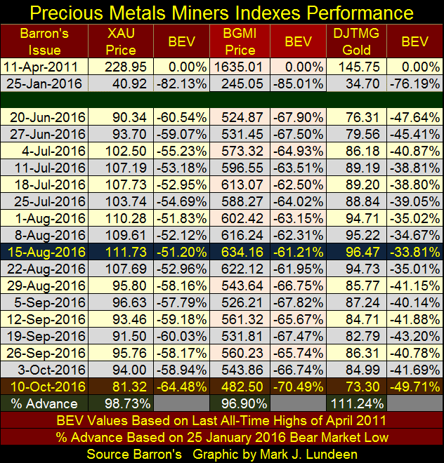
But last week I also said mining shares (and gold and silver) have been a source of frustration for investors for the past one hundred years. It is what it is. However a week later it needs to be emphasized that nothing has changed in the big picture. As we approach the November Presidential Elections, other than precious metals investments being an even a more compelling buy than they were last week, what other choice does one have?
Case in point is the global bond market. Today, as it was last week, central banks still find themselves painted into a corner. It’s a bad situation carried over from the 2007-09 mortgage debacle. Beginning nine years ago, the “policy makers” made the decision they would take any and all measures to save their precious banking systems. In 2007, after years of what Wall Street called “structured finance” they had no other choice if they were to “save the banks.”
To make a market for junk debt, such as sub-prime mortgages, these banks would slice and dice income streams from interest and principle payments from junk grade with AAA rated mortgages, which were then bundled into fraudulent creations with a specious derivative to “hedge credit risks.” With the full cooperation of the US Congress, they re-engineered the entire US mortgage market, and then marketed this garbage to the world as AAA rated debt.
As we all know now, it didn’t take long before this to develop into the greatest financial crisis since the depressing 1930s. The “financial engineers” responsible for this criminal enterprise weren’t prosecuted by the Obama Justice Department. Washington couldn’t “save the banks” doing that! Instead the big banks were bailed out by the Federal Reserve and US Treasury Department. This criminal scam was on an international scale, so the response to the situation was also international; flood the global financial system with “liquidity” as they lowered interest rates and bond yields worldwide.
Below we see the yields (Blue Plots) and prices (Red Plots) for the German and Japanese sovereign bonds. The vertical dashed green line fixes the time line to when the mortgage debacle entered its time of crisis. This was the point in time when the global central banking cartel began “monetizing” government debt at a rate it had never done before in a vain effort to save their banking systems by lowering interest rates and bond yields. Nine years later the global banking system is still on an IV drip to their central banks.
The problem now for these central banks, including the Federal Reserve; to terminate their Zero Interest Rate Policies (ZIRP), and now Negative Interest Rate Policies (NIRP), as you can see Germany and Japan have inflicted upon their debt markets, they now have to sell the bonds they purchased with monetary inflation.
But to who and at what price?
Their current predicament was identified very early on by James Sinclair when he attached to Dr. Bernanke’s first quantitative easing program the moniker: QE to Infinity. Mr. Sinclair doubted the ability of any central bank beginning a program of QE to cease monetizing debt, let alone the possibility of exiting from it by selling bonds to withdraw the “liquidity injected” into their economies. He saw the road central banks took to “save the banks” was a one-way road to monetary infamy – and so ultimately bullish for gold and silver.
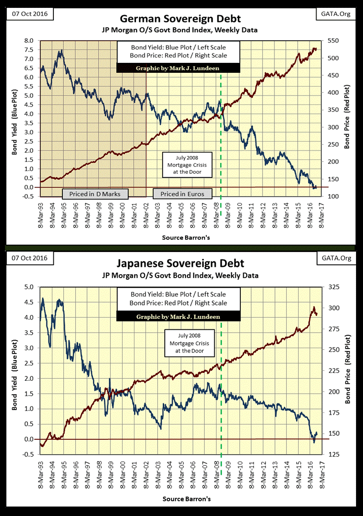
Be assured; these central banks have conducted detailed studies on this topic. The reluctance they’ve shown in raising interest rates and bond yields (by selling their sovereign bonds) just a pathetic percentage point from where they are now, must in part be for fear of what their own research has shown them. It’s not hard figuring out what their problem is; there isn’t a market for these bonds until yields increase far above where they are now. In other words; to begin raising interest rates, is to instigate a historic bear market in bonds as there are no buyers for what they are selling. And there won’t be until yields increase up to at least to where they were in July 2008 at a minimum.
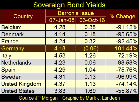
Next is a table showing sovereign bond yields for January 2008 and October 2016. If you were a fiduciary for a life insurance company or a pension fund, the institutions central banks are depending on to provide a market for their portfolio of sovereign bonds, why would you purchase any of these bonds at a current yield of say 2%? These people aren’t stupid; they know these central bankers intend to dump many trillions of dollars, euros and yen, of unwanted bonds, crushing the debt market as they do.
I wouldn’t be surprised if private-sector money managers wouldn’t be interested in these bonds until they’re discounted to yield something in the double digits. Newton’s third law of motion; where every action (in this case central banking manipulation of bond yields to historic lows), is followed by an equal but opposite reaction (a free market response of demanding historic high yields) seems a reasonable private sector response to the monetary mayhem of the past decade.
Seeing bond yields increase from less than 1% to something substantially over 6% has never been good for the stock market. Considering everything, I’m still wildly bullish on the old monetary metals and their miners, though at week’s end I’m not feeling particularly buoyant. I also accept I may not see my investment perform as they should until after the November election, or even until after the beginning of the next year. But with patience, our day will come.
So how did the Dow Jones do this week? Exactly as it has done for the past month; refusing to break out of the circle in its BEV chart below. Since January 2013, the past four years, the Dow Jones has never seen its price restricted to such a tight band for an entire month. What’s with that; the calm before the storm? I can’t see into the future, but I still believe that the next big move in the stock market will be down.
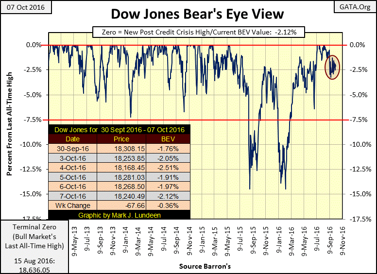
Knowing exactly when the market takes its next dive requires an insight I must confess I don’t have. But all bull markets, even the one that began in March 2009, offer the bulls only so much in capital gains. Whatever that will prove to be for the Dow Jones in the post credit-crisis advance, I think it’s safe assuming most of those gains are now best seen in the market’s rear-view mirror. In the coming months and years, I expect investors will find more pain than gain in the stock market.
The Dow Jones Total Market Group’s (DJTMG) Top 20, or the number of DJTMG’s indexes I follow (74 of them) within 20% of their last all-time highs, saw its post credit crisis advance peak over two years ago. In the chart below, the Top 20 peaked during the high-tech and mortgage bubble markets, sometimes years before the Dow Jones and S&P 500 began their bear markets.
The current peak occurred in Barron’s 07 July 2014 issue at 52 groups within 20% of their last all-time highs.
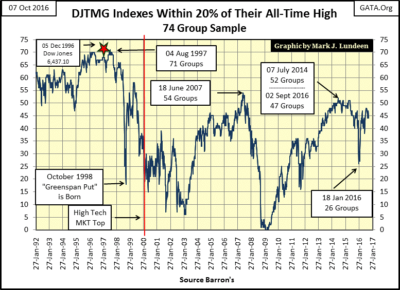
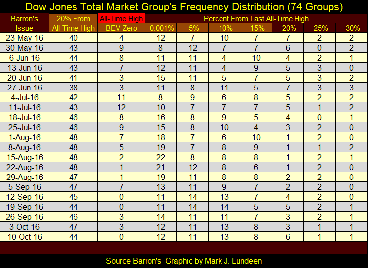
Below is the table for the Top 20 going back to last May. The data for the plot seen above is found in the “20% From All-Time High” column (far left), and closed the week at 44. I really like the Top 20 data series. Since 1992, following the DJTMG’s Top 20 is almost like watching the market inhale during the bull markets and exhale during the bear markets. After reviewing the Top 20 chart above and table below, I expect the next big move in the Top 20 will be towards its zero line, which won’t be good for the stock market. As always, exactly when is a question I don’t have an answer to.
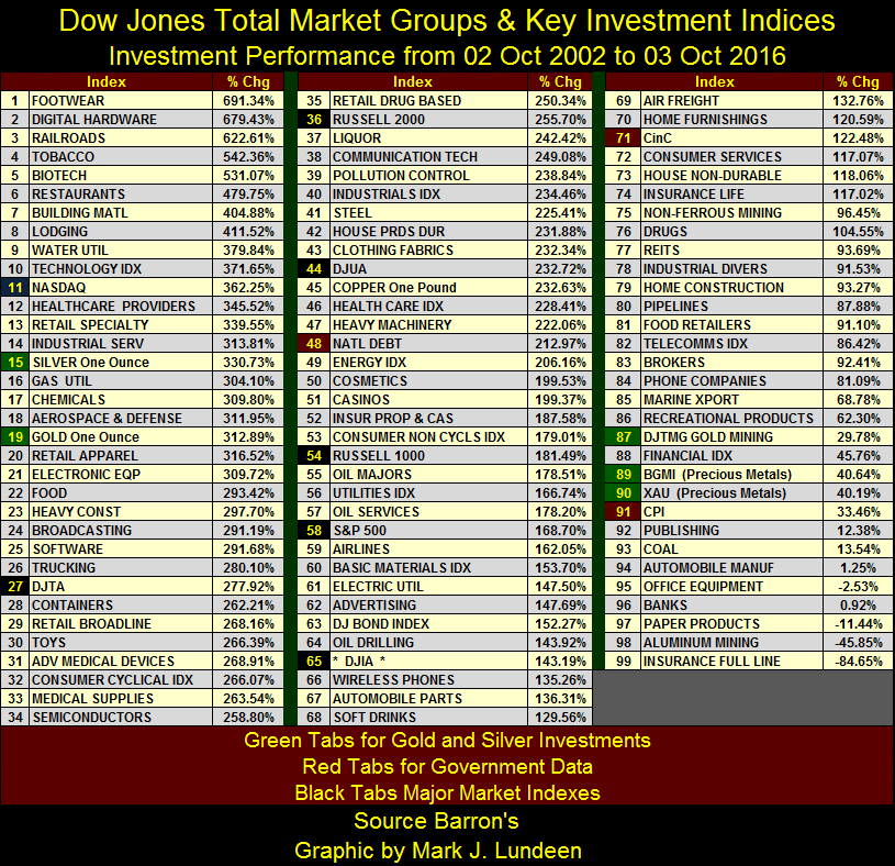
Let’s see how various investments have performed since October 2002, the bottom of the high-tech bear market as seen by the Dow Jones. I highlighted the items as follows:
- Green Tabs: Precious metal investments
- Black Tabs: Major Stock Market Indexes
- Red Tabs: Government statistics
Since the bottom of the high-tech bear market, the best performing major market index is the NASDAQ Composite (#11), the next is the Dow Jones Transports at #27. So except for the NASDAQ, the performance of silver (#15) and gold (#19) bullion since the bottom of the high-tech bear market has been superior to most stock groups and major market indexes. Keep in mind that currently the stock market is near it all-time high, while gold, silver and the mining shares are near the bottom of a vicious five year bear market.
The gold and silver miners are way back in the crowd (#87,89 &90). What do I make of this? The decline in the Barron’s Gold Mining Index (BGMI) from 2011 to January of this year was the deepest decline of the last 100 years; 85% from its last all-time high. Take a moment and review the first table of this article to see the specifics of the 2011 to 2016 decline in the BGMI. It’s just a fact the mining shares are still at historic lows, making them compelling bargains. Before this bull market in gold, silver and their miners is over, I expect to see the miners ahead of the metals in the table below.
Look at the national debt (#48), up 212% in the past fourteen years. What our elected officials in Washington are doing to the nation’s balance sheet is a crime against generations yet born, and everyone else too. Currency in Circulation (CinC at #71) isn’t much better; up 122%. The inflationary infrastructure for much higher gold, silver and precious metal mining share prices is firmly in place.
Uggh! What an ugly week for the precious metals! Look at all the red in the past ten trading days below.
But this selling is contrived by the same big banks you and I have been bailing out for years now. Well, the “policy” is that we all have to do what we can to “save the banks.” For grandma, this means she receives 0.01% on her life’s savings sitting in a bank, or 4% when invested in junk bonds. For you and me, it means to sit helplessly by as the big banks run the gold and silver markets down to the spec longs’ stops, and then some more price suppression for good measure at the government regulated COMEX precious metals market.
If it makes you feel any better, and the members of the FOMC really believe it should, in the chart below we see the selling seen above resulted in a collapse in COMEX gold open interest (Blue Plot) this week. So once again your losses helped saved the banks.
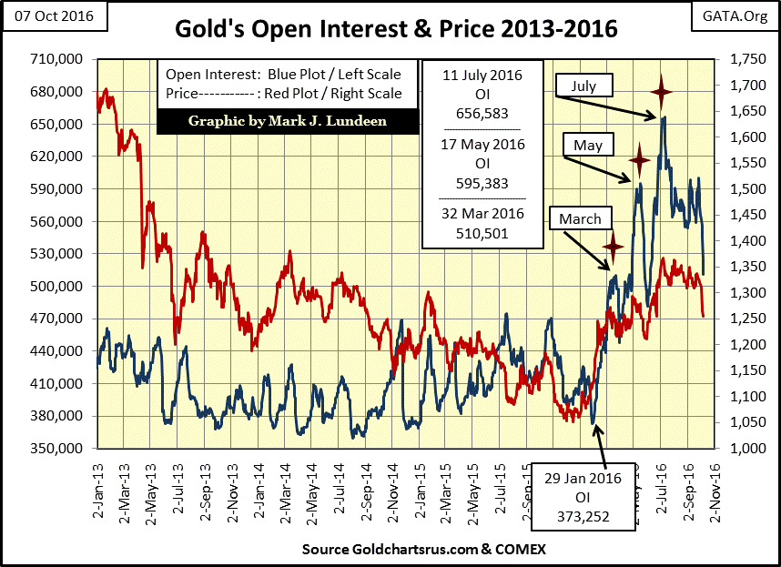
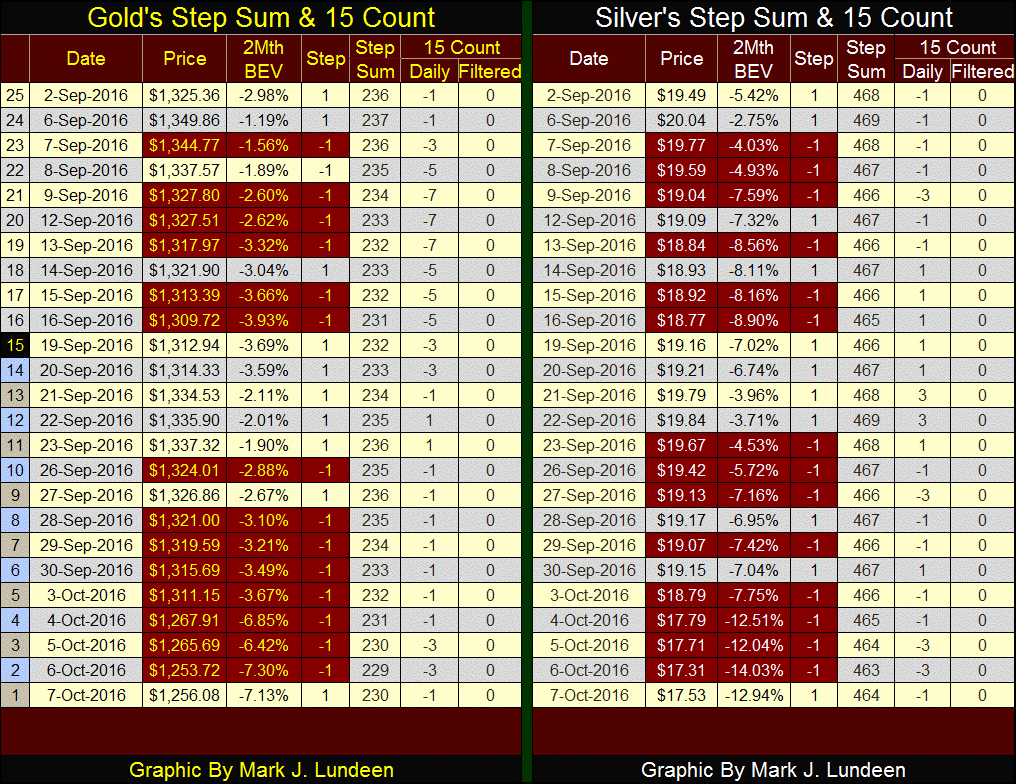
However, I note something else in the chart above; gold finally saw its largest correction since it began its current advance, which began last December. Bull markets frequently correct, sometime painfully so. This is exactly the situation from where a bull market can explode upwards to the surprise of all.
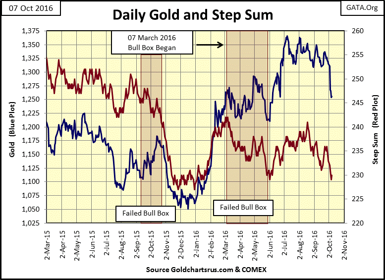
Market sentiment (the red step sum plot below) has declined to lows not seen since last February. But the price of gold has been resilient until two weeks ago when the big banks were finally successful in creating a panic at the COMEX.
It seems to me the big banks are progressively getting less and less for all the effort they apply to the market to depress the price of gold and silver. As I’ve said before, I don’t speculate in the futures market, so I’m not a leveraged player in this market. And that makes a big difference in my ability to get a good night’s sleep. Looking at the two charts above, it appears a lot of effort was expended in the past few months to make gold and silver collapse in the past two weeks. Yet gold is still a good way above where it was in early June of last summer.
We may see further declines in the weeks to come, but I expect the worst of the current correction is over. I wouldn’t be surprised to see some excitement to the upside in gold, silver and their mining shares before December.


