Looking Back With The Dow Jones Total Market Groups
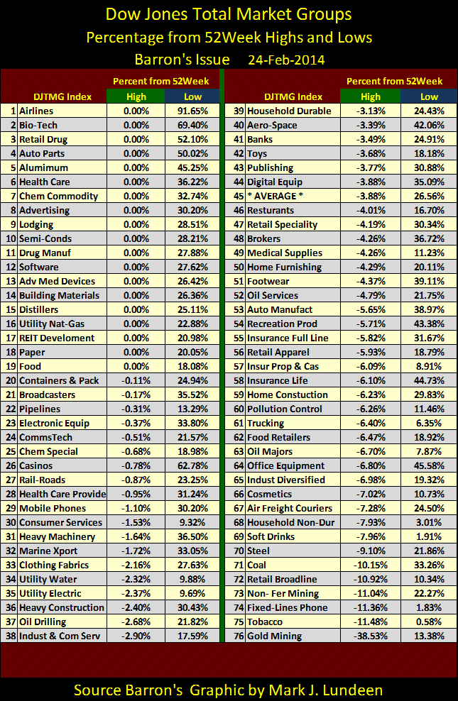
No doubt about it; 2013 was as hard for precious metals and their miners as it was rewarding for investments in the general stock market. The full truth of this can be seen below in the table of Dow Jones Total Market Groups (DJTMG) where I’ve compared these indexes’ performance to their 52 Wk Highs and Lows. With either the 52 Wk Highs (Green Tab) or Lows (Blue Tab), a 0% in the table indicates a new 52 Wk extreme was made at week’s end. For the 52 Wk High data, negative percentages tells us how far the index is below its 52 Wk High. With the 52 Wk Lows data, positive percentages indicate how far the index is above its most recent 52 Wk Low.
This shows us just how different groups within the DJTMG actually performed in 2013. For instance look at the Airlines (#1) in the table; they made a new 52Wk High this week (Green Tab 0.00%). But their real 52 Wk performance story is seen under the Blue Tab where we discover that the Airline stocks are also up 91.65% from their 52 Lows. The Airlines are the best performing group in the DJTMG. But there is always a hot group in any market; how well the general stock market itself performed can be seen in the DJTMG’s Average (#45): it’s currently 3.88% below its 52 High and 26.56% above its 52 Wk Low. That’s darned impressive, and unlikely to be repeated in 2014.
But anyone who follows the financial media knows these impressive gains are the result of “monetary policy” “injecting” trillions of ill-conceived dollars into the financial system. And as I’ve noted before, gold, silver and precious metals mining shares don’t directly benefit from inflation flooding from the Federal Reserve; the stock and bond markets do, as is clearly seen above. What index in the DJTMG is dead last in the table? Gold Mining (#76) is well into bear market territory at 37.96% below its last 52Wk High, but it’s actually worse than that.
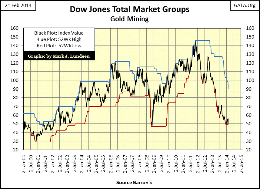
Here’s a chart plotting the DJTMG’s Gold Miners (Black Plot) with its 52 Wk Highs (Blue Plot) and 52 Wk Lows (Red Plot). Its current 38% decline is from a 52 Wk High of 90, but back in August 2011 the Gold Miners had a 52 Wk High of 146. So from the highs of August 2011 the Gold Miners are down 62%. As I’ve noted in past articles, inflation flowing from the Federal Reserve flows into stocks and bonds not gold mining shares – and that’s how things went in 2013. But the “wealth” created by the Federal Reserve with its engine-of-inflation is fragile and not long enduring. When the DJTMG’s indexes above stall in their advance and then go into reverse, we’ll see the Gold Miners benefit from their deflating valuations, as was the case from October 2008 to March 2009, seen below. I also note that the current correction low gives the DJTMG’s Gold Miners chart a bullish double bottom with their October 2008 lows. If their recent lows hold, technically the mining shares are ready to resume their bull market.
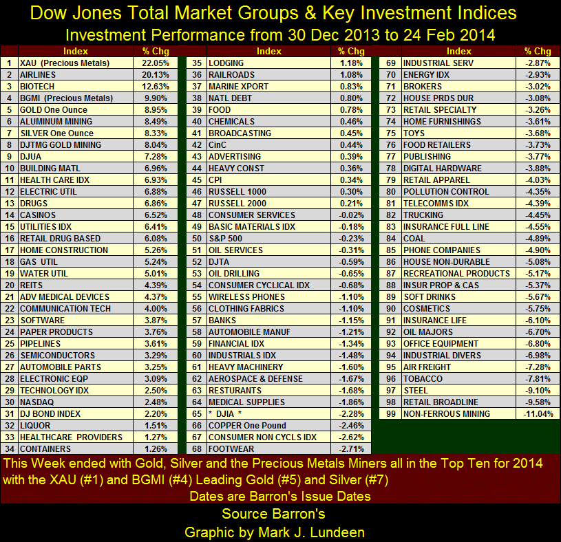
However, as bad as 2013 was for the precious metals and their miners, since New Years to late February 2014 there’s the scent of change in the wind as we see in the table below. The data weekly closing basis, and the dates listed are the issue of Barron’s where the data can be found. From Barron’s last issue of 2013 to this week’s (two months) gold, silver and the mining shares now find themselves in the table’s top eight positions; this is something that hasn’t happened for a long time! It seems the smart money is moving in early, buying at deep discounts what no one else wants – right now anyways.
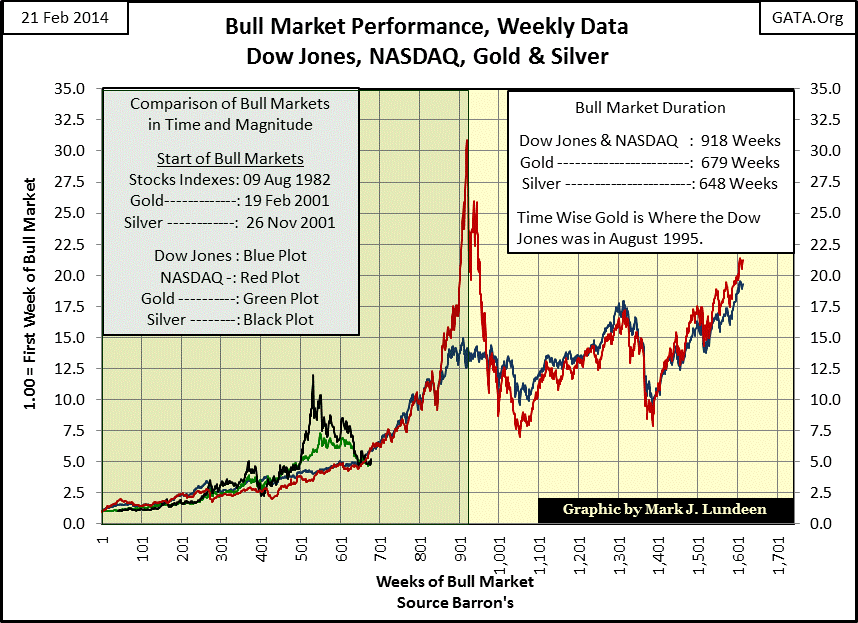
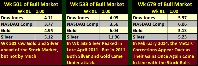
Next is a chart I haven’t published for a while; the bull market comparison for the Dow Jones (Blue Plot) and NASDAQ (Red Plot) during their 1982-2000 bull market with gold (Green Plot) and silver’s (Black Plot) bull markets beginning in 2001. The X-Axis is in weeks from the start of these two bull markets whose beginnings are separated by two decades; for example at the end of this week we find the gold bull market now in its 679th week since February 2001. After the August 1982 start, week 679 for the Dow Jones’ bull market found itself in August 1995, just as it and the NASDAQ began to go parabolic toward their historic January 2000 top.
Back in Wk 501 (September 2010), gold and silver began what looked at the time like the beginning of the metals’ bull market parabolic rise. However in Wk 679 (February 2014) we now know that didn’t happen. But remarkably, even after their traumatic corrections of the past few years, gold and silver have only dropped to gains similar to those seen by the Dow Jones and NASDAQ thirteen years into their bull markets. Table below gives the specifics. It’s a strange bear market that finds gold and silver almost as profitable as the Dow Jones and NASDAQ were from 1982 to 1995, thirteen years into their bull market.
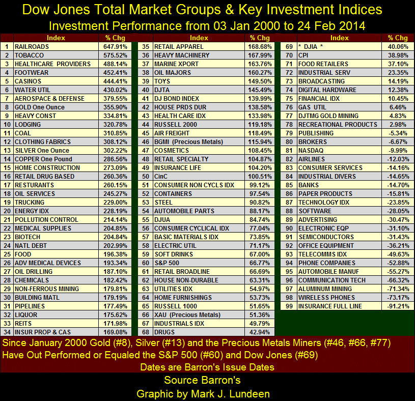
Of course the price of gold and silver could continue to go down, as Washington and Wall Street would like. And there’s no reason to assume the current precious metals bull market will continue for 918 weeks as did the Dow Jones and NASDAQ in the 1980s & 90s. But I find the dichotomy of Wall Street market opinion for almost identical gains in the stock market and gold and silver for most of the first 679 weeks of their bull markets as duplicitous. Look at the chart and table above to see the truth of what I’m saying. Since 1982, Wall Street has loved the venerable Dow Jones Industrial Average in good times and bad, as much as they’ve hated gold, silver and mining shares since 2001. It’s hard to justify their prejudice on the merits of market performances as is obvious in my next table covering the stock market, gold and silver bullion and the PM mining shares from 2000 to today.
I admit that January 2000 was a market top in the stock market and gold and silver were near their bear market lows, so the start date is beneficial for the metals and their miners. Still, for the past fourteen years Wall Street has promoted stocks as if the 1982-2000 stock market bull never ended and the bull market in gold and silver never began. Look at it this way; January 2000 is an interesting moment in market history, the moment high-tech dreams became nightmares. It’s interesting seeing which investments options have replaced the glamor shares of the 1990s as 2014’s top performers. I’ve included other metrics in the mix:
- #14: 1lb of Copper (285%)
- #23: US national debt (201%)
- #51: CinC (99%)
- #70: CPI (38%)
It’s not just gold (#8) and silver (#13) that have outperformed semiconductor (#91) and software (#88) stocks over the past fourteen years. Seeing the US national debt (#24) “outperform” 75 of the 99 indexes below is a point of concern to me. The United States publishes the global reserve currency. What happens to market valuations when the issuer of the global reserve currency declares bankruptcy or inflates its dollar to worthlessness? It can’t be good for financial assets like stocks and bonds.
Back to the table, gold and silver bullion are high on the list while the precious metals’ mining shares are below #40. So for the past fourteen years bullion has been more profitable than the miners, but that should change as the bull market in gold and silver progresses.
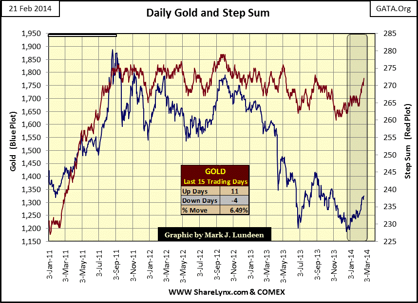
So are the bull markets for gold and silver back on track? Their step sum charts suggest they are. Let’s look at gold’s first. Since early November, gold has seen more up than down days, and the price of gold is benefitting. Since August 2011 gold’s step sum has stagnated between 260 and 278 as its price declined a big 37.5% from its last all-time high of $1888, forming a thirty month bear box. Thirty months is a long time, more than enough to see gold’s step sum (bullish market sentiment) collapse along with the price of gold. However that didn’t happen, though I wish it had as it would make reading this chart easier. Meanwhile, what has been happening for the past few months is a change in the gold market where we now have more up than down days, taking the price of gold up with it. Maybe it’s best not to look this gift horse in the mouth. Hopefully in 2014, we’ll see both gold’s price and step sum trends at new highs, leaving this difficult period of market history far behind us.
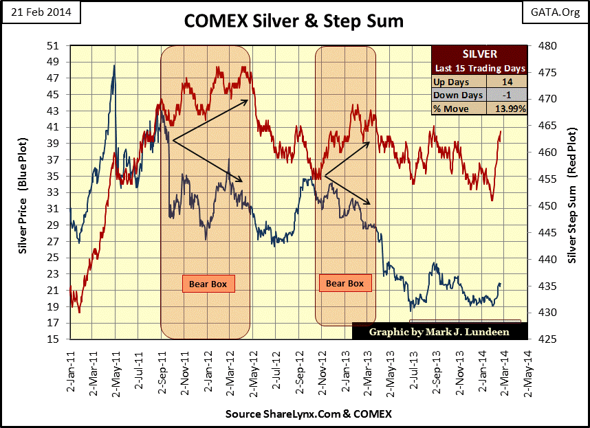
Since April 2011 the price of silver has collapsed a whopping 62%. But even considering the two bear boxes in the chart below, seeing silver’s step sum decline only a net of 25 down days during a three year, 62% market decline is very odd. Then starting on 29 January 2014, silver has closed up for fifteen of the last seventeen trading sessions on the COMEX. Such a concentration of up days on the step sum plot hasn’t happened since early 2011 when silver was approaching $49 an ounce. The net effect of all these up days on the price of silver was a 14% increase in only 17 days of trading. Something changed in the silver market, and hopefully we’ll see more of the same in the weeks and months to come!
In February 2014, along with all the lousy winter weather North America is having, there are encouraging signs of better times coming for the precious metals and their miners. They have endured a three year bear-market mugging. As no market trend continues forever it really is time for a change from their trials and tribulations of recent years. I expect the current bullish trends to continue for the foreseeable future, with an occasional bushwhacking from you know who.


