Market Turning Points


“By the Law of Periodical Repetition, everything which has happened once must happen again, and again, and again -- and not capriciously, but at regular periods, and each thing in its own period, not another’s, and each obeying its own law … The same Nature which delights in periodical repetition in the sky is the Nature which orders the affairs of the earth. Let us not underrate the value of that hint." -- Mark Twain
Current position of the market
SPX: Very Long-term trend – The very-long-term cycles are in their down phases, and if they make their lows when expected (after this bull market is over), there will be another steep decline into late 2014. However, the Fed policy of keeping interest rates low has severely curtailed the full downward pressure potential of the 40-yr and 120-yr cycles.
Intermediate trend – A short-term correction is under way.
Analysis of the short-term trend is done on a daily basis with the help of hourly charts. It is an important adjunct to the analysis of daily and weekly charts which discusses the course of longer market trends.
SHORT-TERM TOP IN PLACE
Market Overview
After several weeks of warning that it was ready for a correction, SPX finally reversed after re-testing its former high and finding itself unable to go beyond. This created a double top in the index and, when it dropped below 1870 for the second time, it kept on going.
Now that we have acknowledged that a top is in place, we must determine what kind of a top it is. We can get some guidance from the distribution pattern which formed at the 1870 level. In the last newsletter, I wrote this:
“And here is where the advantage of the P&F chart really shows; because that little 4-day phase of sideways trading on the P&F chart is equal to 60 SPX points across. Meaning that if we start a decline from here, we could be seeing the beginning of a 60-point decline potentially targeting about 1820 which is, incidentally, an important support level!”
In spite of the test of the high which formed a double top and added to the distribution pattern, I believe that the initial projection may still be valid. Another possibility points to about 1814. Consequently, we should look for a potential low forming in that area.
Assuming that we drop to that level, we should then analyze the state of the indicators to see if they are now in a position to generate a rally. If so, we should monitor that rally as a possible extension of the long-term trend leading to new highs, or if it is only the completion of a larger distribution phase which would result in an intermediate decline. We don’t have to speculate beyond that point. We have sufficient information to guide us to the end of the current down phase. Beyond that, we’ll just follow the market’s directions.
Chart Analysis
A thorough analysis of the daily SPX chart (courtesy of QCharts.com) should give us a good idea of the index’s position. There are three channels drawn on the chart: the long-term channel (light green, second phase of the bull market) provided the long-term resistance at its top which contained the last two peaks of the SPX. It’s important to note that the last peak of a few days ago came within only 9 points of the top channel line. This is not a sign of long-term deceleration and we will take it into consideration in our future analysis.
The next channel (dark green), is of intermediate proportion. The lower trend line is drawn across the June 2013 low, the October 2013 low and the February 2014 low. All three line up perfectly! The top parallel also lines up pretty well with the last 3 short-term peaks. I think we can safely state that we cannot have an intermediate decline until the lower trend line is breached. Since it currently runs around 1770, it is not threatened by the present level of distribution which only counts to the low 1800s. This means that if the decline does not exceed this level, there is a fair chance that we will see a new high.
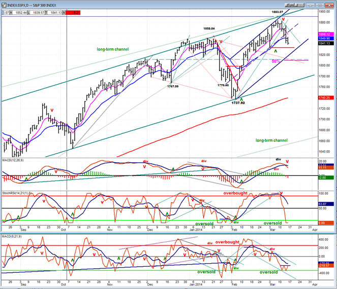
We’ll therefore focus our attention on the third (dark blue) channel which is a short-term channel encompassing the latest short-term trend from 1738. We’ve already broken through the resistance offered by the mid-channel line and it looks as if we are on our way to the bottom trend line, and beyond.
A 50% retracement of the last short-term uptrend would take us to about 1809. The green-dashed trend line, which is at the 1811, level represents good support from a previous peak. Finally, a refined count from the 1870 distribution level gives us two potential targets: 1814 and 1822. All this considered, it would be logical to conclude that the low 1800’s is where we should expect this decline to end.
The daily oscillators offer no contradiction. All three are in a declining mode and appear to need more work, before they can signal a rally. Most short-term lows from 6/13 consist of a final drop to the price target followed by a few days of a holding pattern, and then a sharp reversal which marks the start of the next uptrend. All of them resulted in a higher high in the index. If we end the decline, then start up with a similar pattern, it could be an indication that we are going for a new high. If not, it could be a warning that some important change in the market’s behavior is taking place…perhaps a sign that we’ve made an important top.
Let’s continue our analysis with the hourly chart. The short-term channel, the 50% retracement, and the green dashed support lines are all marked on the chart. I have also drawn a couple of potential channels (red) which define the current decline. Over the last couple of days, we reached a phase count around 1840 and have settled there and formed a sideways pattern.
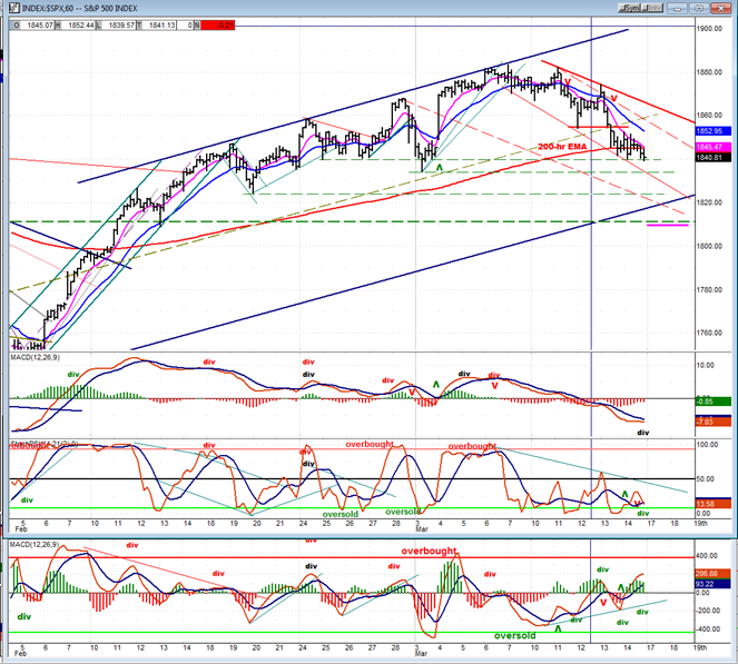
We are also holding at the 200-hr MA, which often provides support. On Friday, we closed at the lowest point of the move, and this brings some uncertainty about what will take place on Monday morning. Do we plunge through the support and make new lows, or do we have a bounce of a couple of days before moving lower? The hourly indicators are mixed. Throughout the entire decline, the A/D has shown little weakness. It never went below -1400 during the 43 point drop, suggesting that this is a mild corrective move rather than wholesale selling. On Friday, we hit +1200 in the first hour, and remained positive all day, closing at +456. The result has been a rising A/D oscillator which was also positive all day.
This action would suggest that we are ready for a rally in a downtrend if there is a lack of negative news over the weekend. The 15m chart shows a lot of deceleration in the MACD and a flattening of the hourly. This is usually a precursor of a near-term reversal. When you add the A/D performance, it sure looks like Monday will be an up-day. However, the hourly MACD did make a new low on Friday, and that, along with the daily indicators, tells us that the low of the decline has not yet been reached.
Cycles
What was written last week is still pertinent: “According to Clif Droke, some Kress cycles should be pressuring the market between now and the first week in April. It sounds like the conditions needed to initiate and keep a decline going for a potential 60-point SPX retracement.”
Breadth
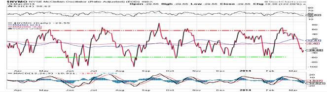
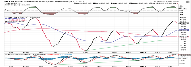
Charts of the McClellan Oscillator and Summation Index appear below (courtesy of StockCharts.com).
The McClellan Oscillator is approaching the level from which it normally reverses when the market is only experiencing a mild correction. I would expect that to be the case in this instance also. The NYSI turned down when the NYMO went negative. This has also caused the RSI to reverse, but it has a ways to go before becoming oversold. This matches what our chart indicators are telling us: that the decline is not over.
 Sentiment Indicators
This is getting to be a familiar pattern for the SentimenTrader (courtesy of same) long-term and short-term indicators. The have now remained at the same values for four consecutive Fridays.
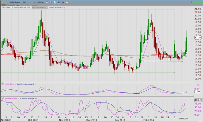
VIX (Velocity Index)
After warning of a correction – along with other indicators – VIX has now started an uptrend which, until Friday, seemed very reluctant to move up. It’s a little strange that it chose Friday for its biggest up-day of the move when SPX was essentially flat. Based on its P&F chart, VIX has reached a phase count, perhaps also suggesting that SPX is ready to bounce. Could VIX’s starting an uptrend from a higher low be suggesting that we have started something which is more than a short-term decline?
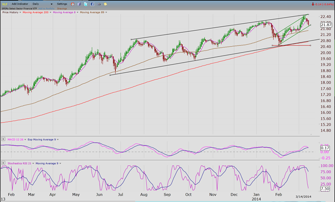
XLF (Financial Index)
XLF is making a pattern similar to that of SPX. It has a short-term up channel within a longer term intermediate channel. The difference between the two is that XLF has already reached the bottom of its short-term channel where is could find support and bounce.
Also, like SPX, the lower oscillators are not ready to suggest an immediate end to the decline.
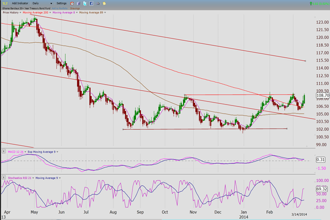
TLT (Barclays 20+ year Treasury bond fund)
The decline in equities has given the bond market a boost and TLT is already challenging its former short-term highs. This time, it should go through and attempt to reach the top trend line of its declining channel.
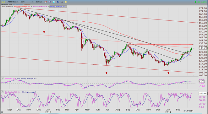
GLD (ETF for gold)
GLD continues to respond positively to the upward phase of its 25-wk cycle. IF it is not cut short this time, the up-phase should run a couple more weeks before turning down. This gives GLD ample time to reach its 134/135 minimum projection.
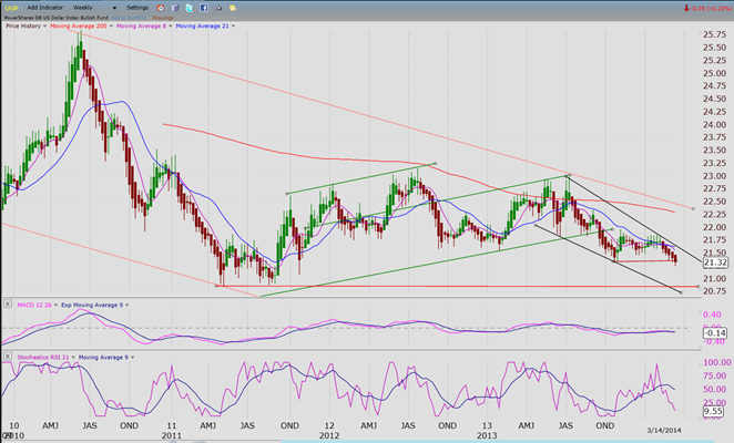
UUP (dollar ETF)
This weekly long-term chart shows UUP making a large corrective pattern that is re-testing its second and third quarter of 2012 low before it can reverse and start an uptrend.
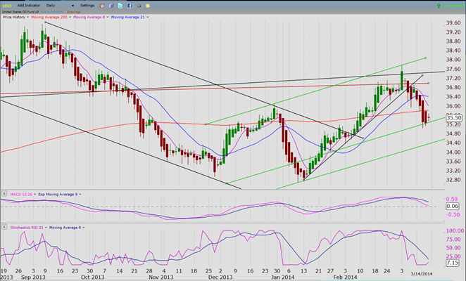
USO (United States Oil Fund)
IF USO’s up-wave from about 33 is a legitimate 5-wave structure, then another should follow after this correction. I doubt that it is, but we will wait for confirmation. I think that the index is more likely in the process of resuming its long-term downtrend. Time will tell!
Summary
SPX has started a correction which can only be labeled as short-term, for now. It is possible that it could evolve into one of intermediate nature, but we won’t be able to confirm that until we see what path it takes after this correction is over.
********
FREE TRIAL SUBSCRIPTON
Market Turning Points is an uncommonly dependable, reasonably priced service providing intra-day market updates, a daily Market Summary, and detailed weekend reports. It is ideally suited to traders, but it can also be valuable to investors since highly accurate longer-term price projections are provided using Point & Figure analysis. Best-time reversal estimates are obtained from cycle analysis.
For a FREE 4-week trial, send an email to: [email protected]
For further subscription options, payment plans, weekly newsletters, and for general information, I encourage you to visit my website at www.marketurningpoints.com. By clicking on “Free Newsletter” you can get a preview of the latest newsletter which is normally posted on Sunday afternoon (unless it happens to be a 3-day weekend in which case it could be posted on Monday).
The above comments and those made in the daily updates and the Market Summary about the financial markets are based purely on what I consider to be sound technical analysis principles. They represent my own opinion and are not meant to be construed as trading or investment advice, but are offered as an analytical point of view which might be of interest to those who follow stock market cycles and technical analysis.

When Andre Gratian was a stock broker years ago, a friend introduced him to technical analysis of the market. Consequently, it is not an exaggeration to say that Andre fell in love with this approach! Ever since then, it has become an increasingly important part of his professional life. Gratian has studied the works of Wyckoff, Edwards & Magee, Edward J. Dewey (cycles) and many others. However, one of my most profitable undertaking has probably been to study Point & Figure charting, which he finds invaluable in analyzing stocks and indices. If he were restricted to one methodology, this is the one that he would choose. This well-rounded background has given him what he feels to be a special insight into the stock market, facilitating the recognition of meaningful patterns and the ‘turning points’ in all trends, whether they be short or long term. Andre feels very comfortable discussing the stock market and passing on meaningful information to others. His subscribers include individuals and money managers throughout the world. Moreover, his Newsletters are currently published on several financial sites, here and abroad.


