More On Daily Volatility In The Gold And Silver Markets


The Dow Jones Index took last week off; In 4 days of trading it advanced only 0.11% In the BEV chart below, or 31 points. After the advance seen since December 24th I guess it earned a break.
From here what’s next for the stock market? After the big advance seen below, a short term correction in the Dow Jones should be expected before it resumes its advance. That’s assuming the Dow Jones is destined to make another round of BEV Zeros in the BEV chart below. However, if the stock market actually saw its last all-time high of the Bull Market, its Terminal Zero on October 3rd, then we can understand the post-holiday advance as a correction within a continuing decline towards much lower levels.
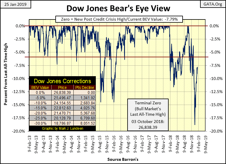
The one data set that may give us an early indication what is to come, whether:
- more new all-time highs for the Dow Jones
- pending declines in the Dow Jones below its BEV -20% line
would be NYSE 52Wk Highs and Lows. This indicator is currently neutral, as both daily 52Wk Highs and Lows are very low, single or low double digits, but with a bias for more 52Wk Highs than lows since January 8th.
I’m following the NYSE 52Wk Highs and Lows very closely as discovering what the future holds for the Dow Jones may be as simple as seeing which first develops the momentum to increases to triple digits in 52Wk extremes: the Highs or Lows. Personally I’m expecting the Dow Jones to once again rise to new all-time highs before the bottom falls out of the market, but I wouldn’t risk any money on it as the up side to this market is overwhelmed by the risks.
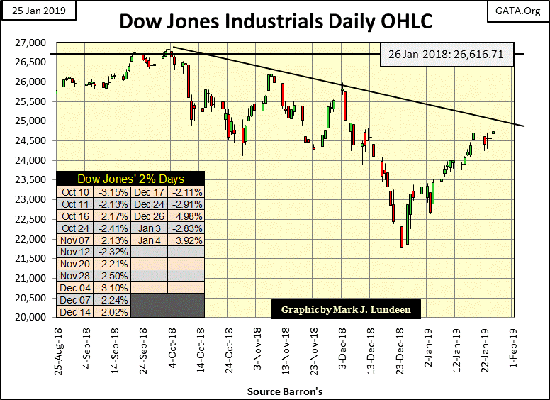
Moving on to the Dow Jones in daily bars below, it’s obvious daily volatility has decreased greatly since January 4th, and that is very bullish. But all that could be said for the market in early October too. Then came October 10th & 11th, the first of many Dow Jones 2% days that came out of nowhere, triggering the deepest decline in the Dow Jones since March 2009.
Keep in mind the stock market has been in a monster-bull market since August 1982. There are people born in August 1982 who then graduated from high school and college and went on to earn a Ph.D., hopefully in something useful to society, and have worked in their chosen profession for well over a decade during this bull market.
To be sure, there have been the occasional unpleasant 50% plus declines, but to the general public, if there is one certainty in life it’s that valuations for assets trading on the NYSE and NASDAQ over the long term only go up. Thanks to the “liquidity injected” into the financial system by the Federal Reserve since 1982, that has been true, but it’s only inflation.
Here are two very interesting historic factoids. The editors of Barron’s 21 August 1961 issue covered the construction costs for the US Navy’s latest aircraft carrier, the USS Kitty Hawk (CV-63). At $230 million Barron’s said the new carrier was too expensive.
This week the New York Times reported a 24,000 square foot penthouse unit at 220 Central Park South closed at $238 million, see link below.
https://www.nytimes.com/2019/01/23/nyregion/238-million-penthouse-sale.html
So, fifty-eight years ago an aircraft carrier with 5 acres of steel flight deck, and all the related machinery to drive it through the seas at “30 plus knots” cost eight million dollars less than a New York Penthouse in 2019. Here’s a video of the Kitty Hawk in action. I’d like to see 220 Central Park South do this!
Be that as it may, God help us when this bubble begins to deflate in earnest!
Look at the chart below; the correction seen in it for the 2007-09 sub-prime mortgage bear market was also the #2 largest percentage decline in the Dow Jones since 1885; a massive 54% market decline only exceeded by the Great Depression’s 89% decline. Yet within the context of the four decade long bull market seen in the chart, this massive bear market is only a correction!
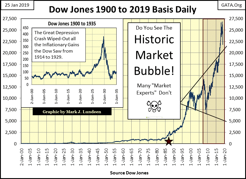
Uggh, what a mess then Federal Reserve Chairman Doctor Ben Bernanke, seen below making “monetary policy” with his FOMC colleagues; made in the financial system with his three bouts of quantitative easings to bailout Wall Street during the 2007-09 crisis. Don’t expect the next ten years to like the last, but that’s a certainty the general public has yet to accept.

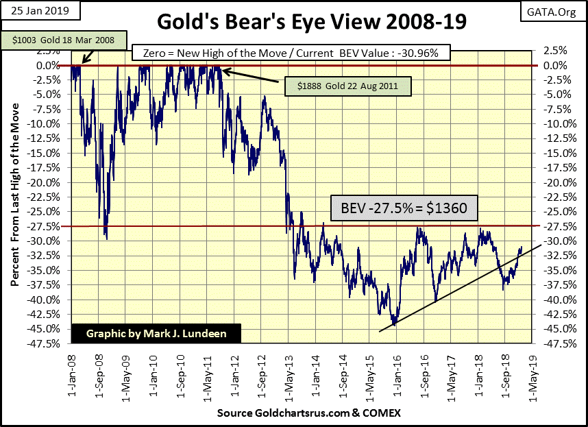
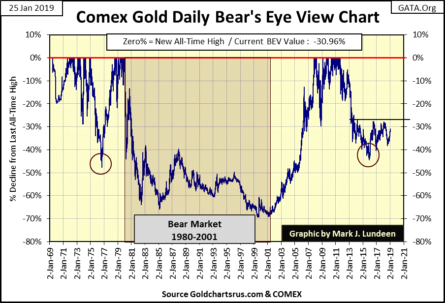
Here’s Gold’s BEV chart going back to 2008. On 18 March 2008 gold made a new all-time high of $1003, from which it declined by 30% during the credit-crisis in November 2008. I also noted our last all-time high of 22 Aug 2011 ($1888), yet within a BEV chart both new all-time highs are only valued as 0.00%, or as I call them BEV Zeros, and BEV lines are percentage claw backs from those BEV Zeros.
Since the summer of 2013 the -27.5% BEV line ($1360) has been the key level, a strong line of resistance for the past six years. I inserted a rising trend line anchored at the bottom of the December 2015 low, which until last summer acted as a line of support for the price of gold. In the past weeks gold has broken above this trend line and now appears to once again test the -27.5% BEV line. That’s only about 3 BEV points from where gold closed this week. Not much of a move.
But in January 2019 gold isn’t in a hurry to go anywhere. As I’ve said before, I’m not expecting much in the way of excitement for gold and silver until the Dow Jones begins to deflate again, and bond yields break upwards with some enthusiasm. Still, seeing gold trade at levels not seen for six years should it clear the -27.5% BEV line is an important development in the gold market.
Next is a dollar plot of gold with its step sum going back to 1998. Let’s look at the 1998 to 2001 bull box. From 1998 to 2001 gold’s step sum declined about 75 steps; that’s a lot of steps, a lot of selling pressure.
Still for all that the price of gold ignored this overwhelming bearish sentiment. As it turned out, after two decades of bear market, where the price of gold declined 70% from its bull market highs of January 1980, enough was enough. Come early 2001 both gold and its step sum reversed upwards, signaling the start of our current bull market.
Was there anything happening in the financial markets in 2001 other than the price of gold and silver beginning a bull market? Why yes there was; the Dow Jones and NASDAQ were actively deflating from their high-tech bull market tops.
The Dow Jones suffered a 38% decline while the NASDAQ deflated by 77.4% by November 2002. I think it’s accurate saying the 2000-2002 high-tech bear market kick started our current bull markets in gold and silver. That plus the sub-prime mortgage bear market provided the fuel necessary to drive the price of gold from $713 in October 2008 to $1888 in August 2011.
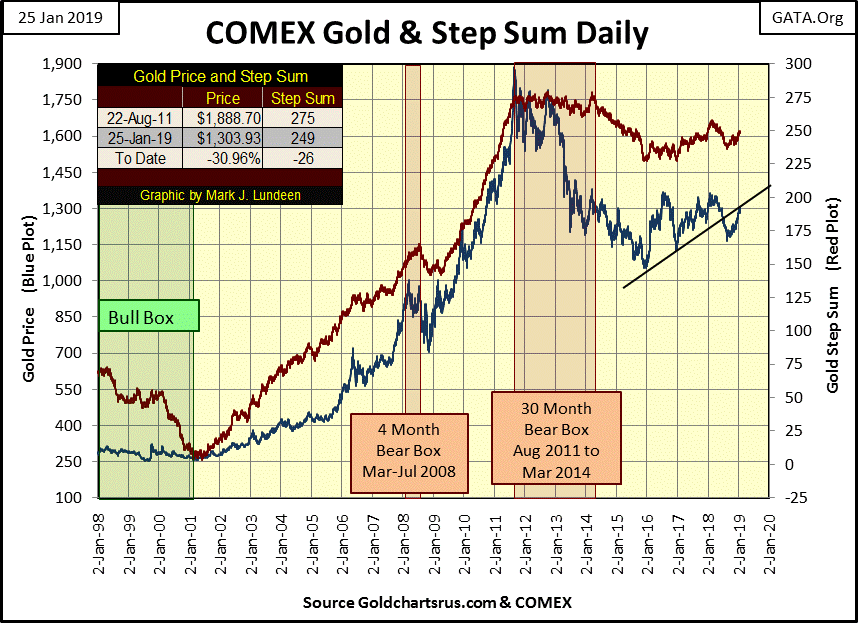
Note that since August 2011 the Dow Jones has done very well, not so for gold and silver.
Keep in mind gold and silver don’t directly benefit from monetary inflation flowing from the Federal Reserve; stocks, bonds and real estate does. What drives the price of gold and silver up during their bull markets are dollars fleeing deflation in the previously inflated stock, bond and real estate markets. This being so, I’m expecting some historical advances in the old monetary metals (and their miners) when the three quantitative easings Doctor Bernanke “injected” into financial assets begin to flow out of Wall Street and into gold and silver.
Here’s the Dow Jones and its step sum plots. The reason I call a bear boxes, a bear box is because the bears are supposed to win. I call a bear box closed after the step sum finally collapses along with the price plot, as that is the point when market sentiment reverses from bullish (or neutral) to bearish. In other words, the collapse in the step sum plot signals the point in time where the bulls admit they were wrong and surrender to the bears.
But so far in the bear box below that isn’t happening. The Dow Jones reversed to the upside before the step sum collapsed. I’m very near to announcing this bear box as a failed bear box, that in fact it was the bulls who were correct in expecting a rising Dow Jones; but not just yet.
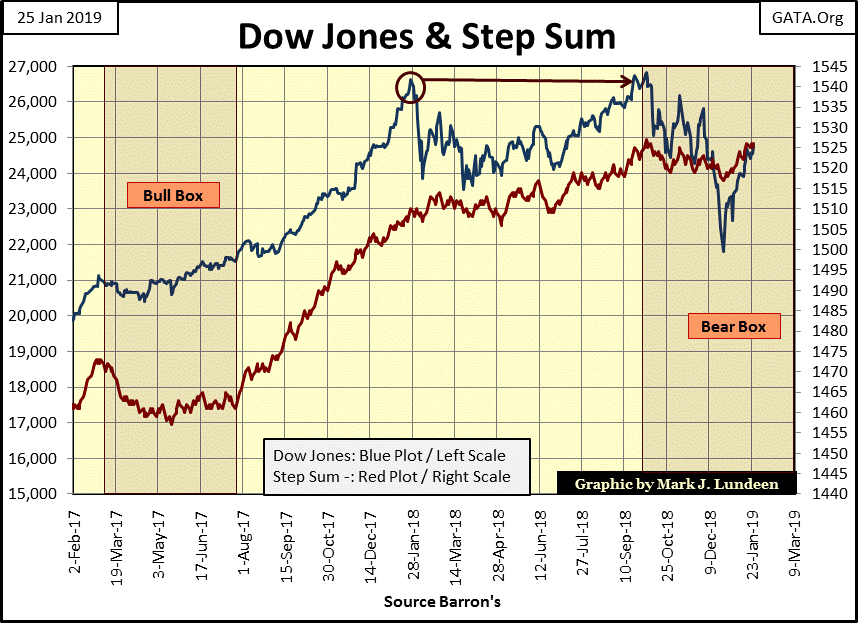
Here is why I’m keeping this bear box open; the post December 24th advance is not only a big advance, but it is also an advance that has yet to see a correction. I want to see what happens when the Dow Jones once again tests it lower limits. Will it do so with some extreme volatility (2% days), and will the correction take the Dow Jones below its low of December 24th?
That’s the bearish case. The bullish case is if the Dow Jones continues going up with its step sum plot, resulting in this bear box failing. It’s still too early to make a call.
In gold’s step sum table its step sum is rising, or at least it was until January 4th. But who cares as the price of gold continued going up as its step sum stalled. If these trends continued for another two months I could call it a bull box.
Looking at gold’s 15 count which measures buying and selling pressure, in the past twenty-five trading sessions the 15 count was positive, with a 7 seen on January 3rd that moved gold up about $50 in ten days of trading. Then selling pressure began to take the count down, with it ending at a -1 on this week’s close. No matter, as gold still advanced about $20 as the count declined. This is good market action.
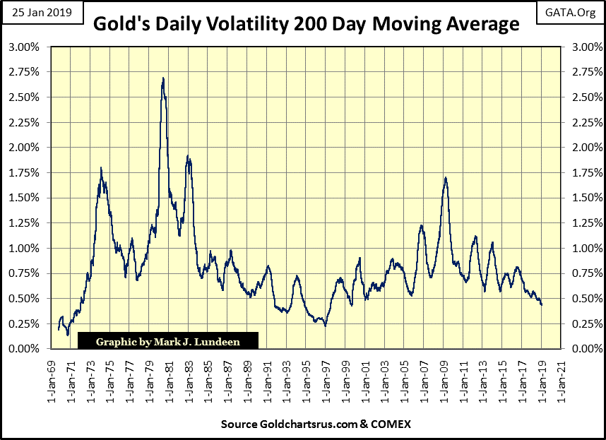
The only problem with gold is its 200 Day M/A stuck around 0.44%. I have a chart for this metric later in this article that goes back to 1969. Maybe you should skip forward and review this chart now. If you do you’ll see daily volatility for gold is about as low as it has been since its bull market began in 2001, which is most likely why few “market experts” are actively following gold and silver in January 2019.
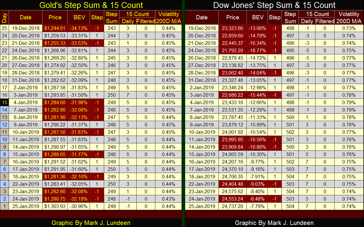
Looking at the Dow Jones’ step sum table, we see its step sum rising since mid-December, taking the Dow Jones up with it. This is no way to close a bear box! The Dow Jones’ 15 count was in decline as the Dow Jones descended to its December 24th bottom, then buying pressure reversed the 15 count from -5 to +7 at the close of this week. Again, this is no way to close a bear box!
Every now and then it’s good taking a long term look at a market, such as this BEV chart for gold going back to 1969 when an ounce of gold first began trading outside the Bretton Wood’s $35 gold peg. Not seen in the BEV chart below, as BEV charts only plots new all-time highs (0.00%) and the percentage declines from them, but from January 1969 to January 1980 gold saw its first bull market since the end of the American Civil War, rising from $43.50 to $825.50 during these eleven years.
Note the 47% correction from November 1974 to August 1976. A similar percentage decline in the stock market would be a massive bear market. However gold and silver bull markets are volatile market events.
After gold’s 21 January 1980 market top it began a twenty-one year bear market which bottomed in July 1999 on the announcement that the Bank of England was selling 800 tons of their gold reserves. The market recovered soon after, then saw a double bottom in early 2001, on which the second gold-bull market of the post Bretton Wood era began.
One would think an advance from gold’s -69% bear market bottom to its first new all-time high seven years later in November 2007 would have been an exciting market event, but I don’t remember it being anything like that. Those were the days I would watch CNBC for my market news, and I remember the psychological operations the MSM used to suppress excitement in the gold and silver markets.
When the price of gold was rising, the MSM had little good to say and frequently much was bad. Then, just before the “policy makers” engineered a short-term top in gold, they’d had their “market experts” become wildly bullish on gold and silver to draw the suckers in before they crashed the price of the old monetary metals in the paper COMEX market.
Gold and silver were two of the best performing market assets from 2001 to 2007, but they never caught the public’s fancy as they too were following the main-stream financial media for their market news.
During the high-tech bear market of January 2000 to October 2002 the Dow Jones declined 38%; the NASDAQ Composite fell 78% as gold advanced 14%.
Gold and silver continued advancing until March 2008 when the first cracks in the sub-prime mortgage bubble came into view. Historically, the price of gold would rise during times of financial crisis; not so with our modern “regulated markets.” Gold declined 30% from March to November 2008, which was much better than the 54% decline the Dow Jones saw in March 2009.
From their sub-prime mortgage corrections bottom (November 2008) until late August 2011, gold advanced 166% while silver advanced by a whopping 453% in late April 2011, after which began the current unpleasantness in the gold and silver markets, painfully obvious in gold’s BEV chart above.
How best to label the post August 2011 decline seen above? Bear market or market correction within a continuing bull market? Most market commentators call the current decline a bear market, as I do too sometimes. But I still believe the post 2011 decline in gold and silver are only a prolonged correction within a continuing bull market that began in 2001.
For one thing, in the mid-1970s gold saw a 47% correction. With gold’s current bull market, at its worst (December 2015) it declined only 45% from its August 2011 last all-time high. The one factor that argues our current decline to be a bear market is the length of time gold and silver have been struggling since their last all-time highs.
Most investors’ focus on price trends in the markets they follow, but the current market funk for gold and silver is nonsensical. Historically, the old monetary metals have served as safe harbors for wealth during times of financial crisis. In the 19th century, even a rumor that Commodore Vanderbilt was going into gold could start a run on Wall Street. Today, even a pending collapse in the global financial system during the 2007-09 mortgage debacle saw gold decline by 30%. So what changed?
Today our markets are “regulated” in the worst sense of the word – manipulated by a self-appointed elite to the disadvantage of everybody else. Debt issued by governments, corporations and individuals is threatening a universal collapse in solvency, yet gold and silver are still far from their 2011 highs.
None of this would be possible without a compliant Federal Reserve suppressing bond yields and interest rates far below where a free market would have them. Gold and silver, assets with zero counter-party risks should be trading at many multiples of where they are now, if the “policy makers” had not intervened in their markets.
Back when the Commodore ruled Wall Street, to when the US Government terminated the dollar’s $35 gold peg in 1971, one could judge the market risk or credit worthiness of an investment or bank by the interest rates the market made them pay.
However that is no longer the case, as admitted by these two former Federal Reserve officials. Note: I capitalized some words to highlight them, and comments in [***] are mine.
“The POLICY MAKERS are finding it tempting to pursue 'financial repression' SUPPRESSING MARKET PRICES that they don't like.” [certainly Fed Governor Warsh isn’t talking about prices for stocks and bonds, but the price of gold and silver?] He added, "Efforts to manage and manipulate asset prices are not new."
- Fed Governor Kevin M. Warsh, Wall Street Journal Quote
* * *
"Now that I am out of government, I can tell you what I really believe. ---
--- Central banks are now so heavily influencing asset prices that investors are unable to ascertain market values. This influence is especially evident, with the Fed's purchase of government bonds, which has made it impossible for investors to use bond prices to learn anything about markets.
- Kevin M. Warsh: Former Federal Reserve Governor. Comments made to the Stanford University Institute for Economic Policy Research, 25 Jan 2012.
* * *
“I spent 10 years (through last March) as a participant in the deliberations of the Federal Open Market Committee, setting monetary policy for the U.S. The purpose of zero interest rates ENGINEERED by the FOMC, together with the massive asset purchases of Treasury and agency securities known as quantitative easing, was to create a wealth effect for the real economy by jump-starting the bond and equity markets. ---
--- By February of 2009, the Fed had purchased over $1 trillion in securities. With interest rates throughout the yield curve moving in the direction of eventually resting at the * LOWEST LEVELS IN 239 YEARS OF HISTORY *, the stock market reacted: It bottomed in the first week of March of 2009 and then rose dramatically through 2014.”
- Richard Fisher, the former president and CEO of the Federal Reserve Bank of Dallas from 2005 to 2015; 06 January 2016 CNBC interview
If the price of gold and silver is today languishing far below their highs of 2011, it’s because they, as well as everything else trading in our “regulated markets” have been disconnected from economic reality as a matter of “policy.”
But when will the Day-of- Woe come as our markets once again recouple to economic reality? I believe we’re currently in the early phase of having our financial markets recoupling with reality. Bond yields have bottomed (prices topped) in the summer of 2016. That plus market volatility in the stock market has increased significantly beginning in October 2018. As for gold and silver, I expect we’ll also know when they recouple to market reality when they too see their daily volatility increase greatly.
Next is gold’s daily volatility 200 day M/A since 1969. Rising volatility for the stock market is always a negative factor, but this is not so with gold and silver. For the old monetary metals, rising market volatility signals the price for the metals are making big moves to either the up or down side. A good example for this was the spike in volatility seen in 1980, where in the first few weeks of January gold advanced by 55%, and then crashed by 41% only two months later.
Those periods of low daily volatility indicate when there is little to no excitement in the precious metals markets. As gold volatility’s 200 day moving average is now less than 0.50%, you can be sure that nothing exciting is happening in the gold and silver market. All that will change when the plot below once again advances.
Using volatility, as measured by one day’s closing price to the next, below are two charts for gold market volatility. The upper chart plots daily moves of +/- 3% or greater, which I call days of extreme volatility or 3% days. The lower chart plots total days of extreme volatility by year.
These charts are worth the time spent studying them, but the key item I found is the extremes in daily volatility seen in the 1969-80 bull market, extremes in volatility so far missing in our current bull market. 1979 & 1980 alone saw more extreme days than our current bull market has since 2001.
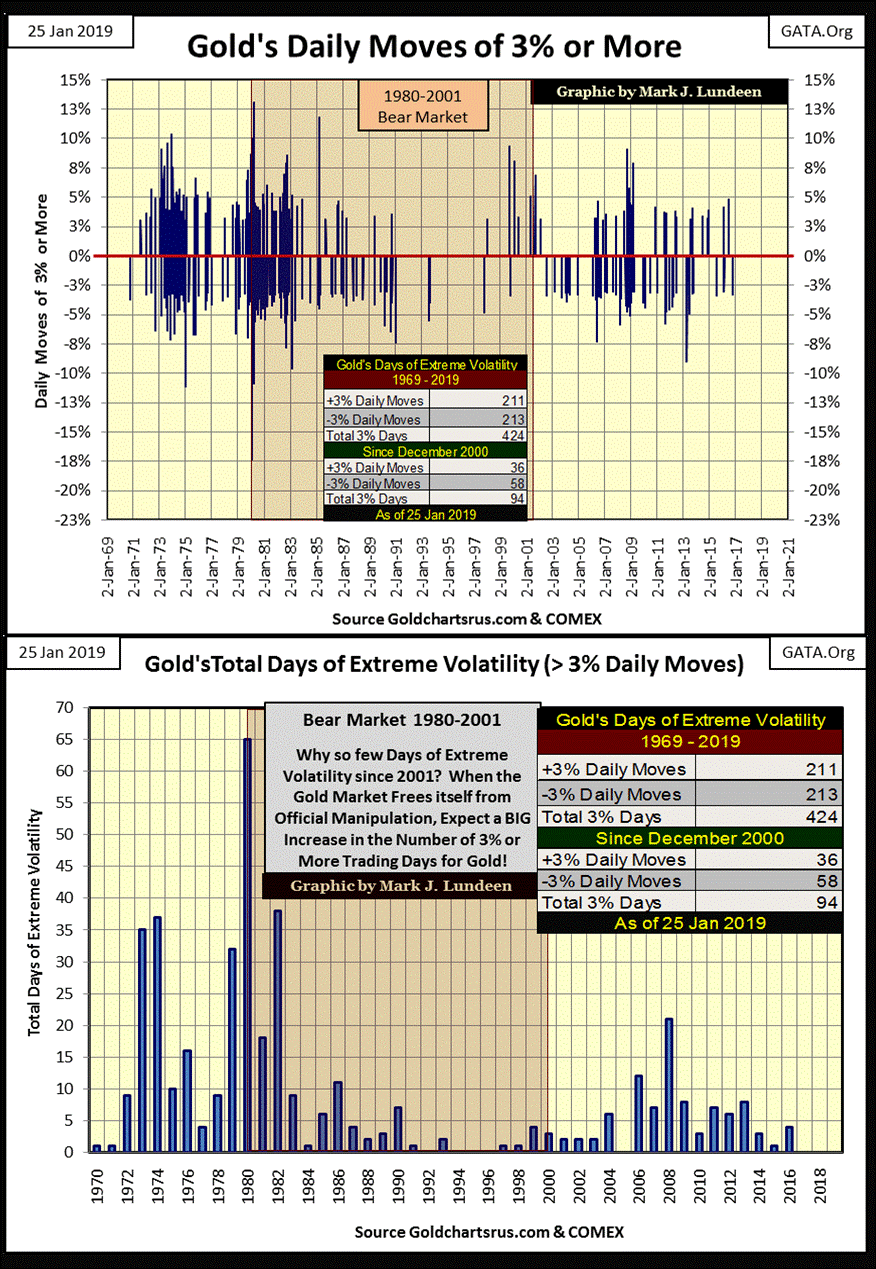
Note too how in the chart above, 2017 & 2018 saw no 3% days in the gold market. This is something not seen since the mid-1990s where 1994, 95 & 96 were free from extreme volatility. As then, 2017 & 18 were years where gold provided little in the way of excitement to its investors, but as then should prove to be excellent buying opportunities.
Mark J. Lundeen


