The Most Hated Bull Market In History


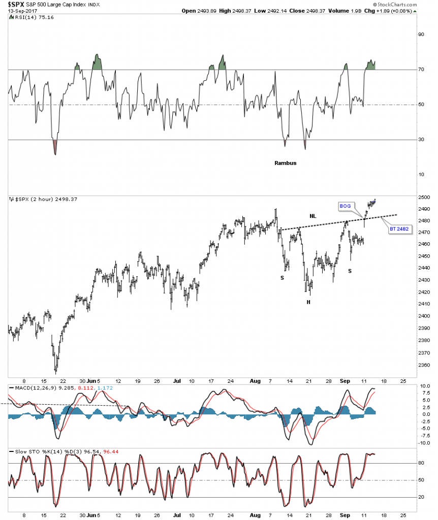
On the 2-hour charts I’ve spotted several small H&S bottoms building out on some of the stock market indexes. It wasn’t until Monday of this week that they began to show themselves when several broke out above their necklines. Some of these small H&S bottoms are part of a bigger pattern that has been building out for most of this year. At a minimum their price objectives should get some of the stock market indexes back up to the top of their 2016 uptrend channels.
Let’s start with a 2 hour chart for the SPX which shows it gapped above its neckline on Monday of this week and closed at a new all-time high today. A backtest to the neckline would come in around the 2482 area.
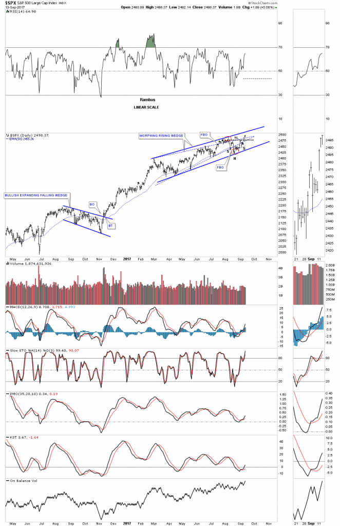
Several weeks ago I posted this chart which was showing how the original rising wedge, blue dashed trendiness, was morphing into a bigger pattern as shown by the red circles with a symmetry false breakout of the top and bottom blue dashed rails. It’s getting pretty busy in the apex, but you can see how the small H&S bottom fits into the bigger pattern that began building out back in February of this year. If that little H&S bottom plays out it strongly suggests the SPX is going to breakout topside from that 7 month morphing rising wedge in a new impulse leg up.
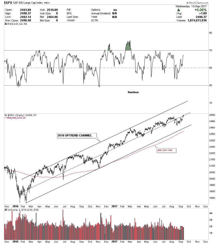
Below is a 2-year daily chart for the SPX which just shows its 2016 uptrend channel. On many of the stock market indexes the 200 day moving average does a good job of showing you the angle of the uptrend channel.
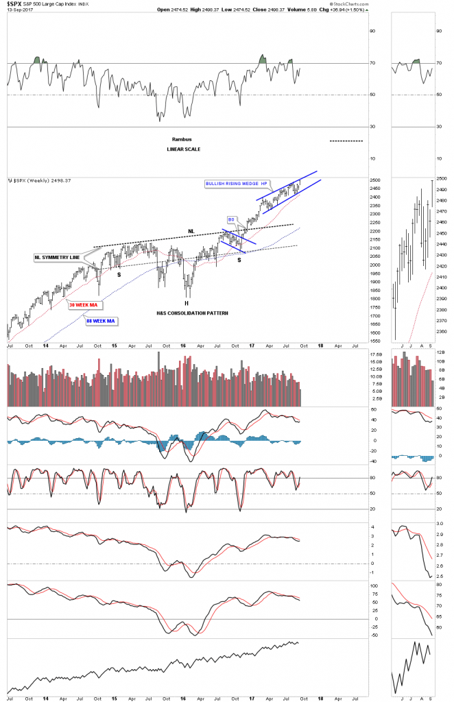
Perspective is everything when you discover what may be an important chart pattern. The weekly chart below shows the 2 year H&S consolidation pattern that corrected the last impulse move up. Now you can see how the blue morphing rising wedge fits into the very big picture. Keep in mind the rising wedge hasn’t broken out yet so the pattern isn’t complete. The reason I think the rising wedge is going to breakout topside is because we are in a bull market and patterns like this tend to form in strong bull markets. If we do get the upside breakout from the rising wedge I would view it as a halfway pattern that would have formed between the neckline and the ultimate price objective.
As I mentioned earlier perspective is everything. Below is a 20 year monthly chart for the SPX which we’ve been following before the top rail of the 13 year expanding flat top triangle consolidation pattern was broken. On this chart I’m showing the 2014 and 2015 consolidation period as a bullish expanding falling wedge halfway pattern. I have to tell you that it has been pretty lonely being a long term bull, but it has even been harder over the last several months as the rising wedge has been developing on the daily charts above. It’s these long term charts that take out all the noise that give me the confidence to hang in there when most say the bull market can’t keep going up. This chart shows you the wall of worry since the breakout from the blue bullish expanding falling wedge.
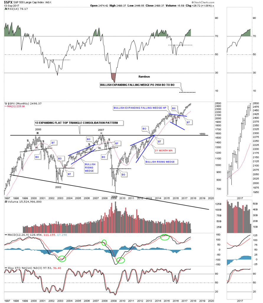
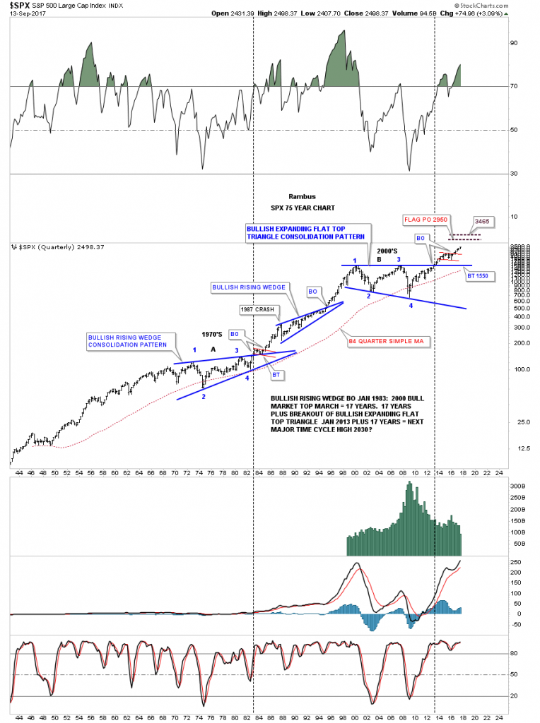
Again perspective is everything when you look at this 75 year quarterly chart for the SPX. The blue expanding falling wedge on the chart above is the small red consolidation pattern at the top of this chart. This chart along with the Jaws of Life on the INDU has given us a look into the future that few want to believe. For whatever reason investors love to hear bad news or that the markets are going to crash. Fear sells where bullish scenarios go by the wayside. For all the reasons this bull market that began in March of 2009 can’t keep going up, it keeps going up regardless of all the reasons it can’t, and there are a millions reasons why it can’t keep going up. The price action above all else has the final say when everything else is boiled away.
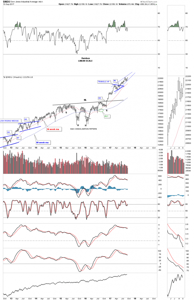
This weekly chart shows the INDU’s H&S consolidation pattern with the breakout and impulse move higher.
The monthly line chart for the Jaws of Life.
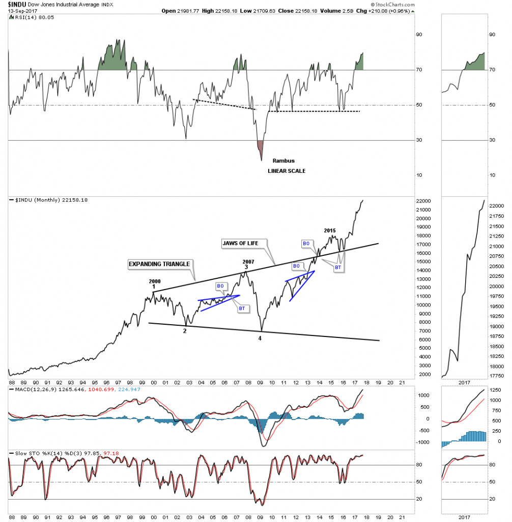
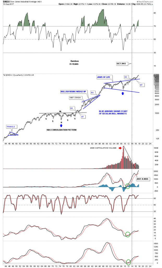
Below is the 75 year chart for the INDU which shows the Jaws of Life and a glimpse into the future.
********
 Meet Rambus, a seasoned trader and technical analyst renowned for his unbiased and insightful chart work. Through his website, Rambus Chartology, and Substack newsletter, Rambus shares his expertise with a global community of subscribers, providing daily updates, commentaries, and hands-on training in the art and science of chartology. With his calm, humble, and down-to-earth approach, Rambus demystifies complex market trends, helping his followers navigate the challenges of today's volatile markets. Join the Rambus Chartology community today and discover a unique blend of technical analysis, trading expertise, and time-tested protocols. Subscribe now at www.rambus1.com or https://rambuschartology.substack.com/


