Mr Bear Is Back…And He's Not Fooling Around!


I did a weekly article on the Dow Jones bear market starting in October 2008, after it declined 40% below its highs. I developed several indicators not seen anywhere else. I stopped covering them as they became boring, doing little since the Dow Jones began its market rebound. Unfortunately, they've become interesting again. Let's start with the Dow Jones' 8-count.
The Dow Jones' 8-Count
Two percent, day-to-day Dow Jones moves are extreme market events. When extremes in daily volatility occur in bull markets, they tend to be solitary events. Years can pass between one 2% day to the next. However, as bull markets enter their terminal phase, and during the following bear markets, the Dow Jones see a great increase in the frequency of its 2% days. It makes no difference to Mr Bear if the Dow Jones goes down, or up 2% from one daily closing price to the next. What Mr Bear does to the longs one day, he does to the shorts on the next: he claws back their profits. These unpredictable days of extreme volatility makes it almost impossible for most short-side speculators to profit in bear markets.
The best way I've found to display these days of extreme volatility is to count the number of 2% days occurring in a moving eight day count, or 8-count. In the chart below, I've plotted the Dow Jones in a Bear's Eye View (BEV) with its 8-count from 2006 to 2011. BEV plots are simple to understand, they compress data in a range of one hundred percentage points. Each new all-time high is converted into a Zero percent, and never more. A BEV of -100% is a total wipeout in value. Data points in between are registered as a precise percentage decline from their last all-time high. Bull market advances in a BEV plot can be identified as running series of Zeros along the BEV's 0% line. Plotting the Dow's BEV plot, with its 8-count, provides an interesting insight of the Dow Jones advances and declines, and its daily volatility.
All the data in the chart below is derived solely from the daily closing prices of the Dow Jones, and nothing else. One thing that is very clear, rising clusters of 2% days mark bearish events in market history. But all clusters are not created equal. The Dow's 8-count hit a 7 in October 1987, just as the Greenspan era in central banking began (more on that below), but there wasn't much of a buildup in 2% days previous to this spike. But then why would there be, as this event was a freak one-day event, caused by computers on Wall Street running wild with program trading. The exchanges were actually afraid to turn off the machines, so the big banks' computers kept selling stocks until the close of the trading day, as programed!
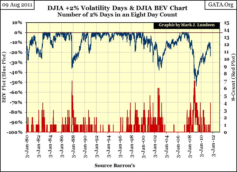
In terms of 2% days, the next ten years were very quiet as Doctor Greenspan "injected ample liquidity" into the financial system. However, artificial stimulation eventually has negative consequences, and the Dow's 8-count tells us when the stock market began feeling over medicated. On 03 November 1997, four, 2% days occurred in a moving 8 day count. This hadn't happen since the early 1980s. From this day, until the market top in January 2000, Doctor Greenspan became famous for his "Greenspan Puts", when all eyes turned to the Fed whenever the Dow began to decline. But as we see in my first chart, the Dow's growing 8-count cluster tells us that all was not right with the stock market.
After the "tech-wreck" bottom of 2002, the market entered an amazing period of low volatility. From July 2003, to February 2007, the Dow Jones saw only one 2% day. The Dow Jones saw solid gains during this 3.5 year period. However, in February of 2007, once again the Dow began building a cluster of 2% days, which peaked at 7 in October 2008, as the Dow Jones saw its first 40% bear market since 1974. Interestingly, at the actual March 2009 -53% bottom in the Dow, its 8-count was only 4.
Since I created the Dow's 8-count, I guess it's appropriate that I get to say what is and what isn't, within reason. I'm going to say that the cluster formation beginning in February 2007, has not yet been terminated. In other words, the bear market that took the Dow down 53% in March 2009, is still active. Look at the chart, I don't see any significant gaps in the 8-count since March 2009, do you? That makes the 8-count of 4, formed yesterday (09 August), part of a massive bear market that will be four years long in October.
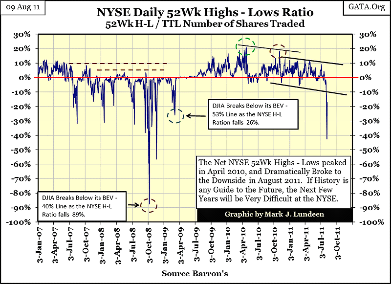
The NYSE 52 Week High-Low Ratio
But bear markets also see an increase in 52Wk lows at the NYSE, and on Monday (08 Aug), the NYSE 52Wk H-L ratio declined to -42.53%. In past few weeks I've spent lots of time on this indicator, so I won't bore you with repeating the details again. But seeing this large decline so early in a market turndown seems a bad sign of things to come. Note how the initial break downs in 2007 were only -30%.
Don't be surprised if this ratio becomes positive in the weeks ahead. Seeing the ratio increase to positive single digits on bear market corrections is expected. But if the bear market has resumed, and I think it has, we'll see this indicator continue to spike down to progressively lower levels as Mr Bear goes about his work.
The NYSE 70% Advancing - Declining Days Indicator
The most usual way of using NYSE advancing and declining shares data is to construct an A-D line, where net differences are added to a cumulative total over time. Sure, I keep one. But I use A-D data to create a ratio, exactly like the NYSE 52Wk H-L ratio, with one difference; I then filter out all days that were less than +0.69999% and more than -0.69999%. This creates a plot of what I call the NYSE 70% A-D days. The resulting information is not a day trading tool, but provides a long term, strategic view of what is happening in the market. Like the Dow's 8-count, NYSE 70% days form clusters during Bear Markets, and become rate events in bull markets. For your information, since 02 January 1924, there have been 22,678 trading sessions at the NYSE, but only 339 of these trading days were NYSE 70% days. It's not a good sign that 4 of these 339 NYSE 70% A-D days occurred in the past two weeks.
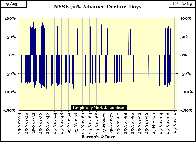
Notice the monster cluster that formed in the 1930s! After that cluster terminated in 1940, retail investors were extinct on Wall Street, as Mr Bear liquidated all the little people. The aftermath of this cluster was so horrible, that at the 1942, -52% Dow Jones bear-market bottom, the Dow's 8-count could only manage a little-tiny 2. That was the second deepest bear market bottom, until ours took its place as #2 in March 2009, and it bottomed without producing a single NYSE 70% A-D day!
The chart above is self-explanatory, but I want to note something that may not be. Clusters of positive NYSE 70% days are toxic events in the market. In the above chart, where you see * clusters of positive * NYSE 70% days, know that the bulls are dying, in mass, from bear market hoof-and-mouth disease! One would think it would be the other way around, but it's not! Look at the mid-1930s' gap, the Dow Jones saw a nice rebound off its lows of 1932 in it. Negative NYSE 70% A-D days continued the entire time, with no ill effects. But in July 1937,when the NYSE began seeing positive 70% A-D days again, the stock market began its decent towards its April 1942 -52% bottom.
Of concern to us today, is that this cluster of NYSE 70% A-D days continues to grow. The NYSE saw a positive 70% A-D day on 09 Aug, this after it saw a new all-time low of -96.47% on 08 Aug. The Great Depression never saw the NYSE A-D data fall to this extreme. These are not a good sign of things to come.
Other Bear Market Considerations
- Earnings
- Dividends
- Interest rate environment
- Economic Growth
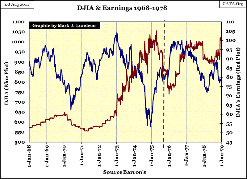
What is supporting the financial markets today? Mostly ignorance. One of my sore points CNBC frequently rubs is the myth that stock earnings drives stock valuations. Historically, it has been the other way around. Take a few minutes and study the relationship between earnings and valuation for the Dow Jones from 1929-38. Valuation led earnings.
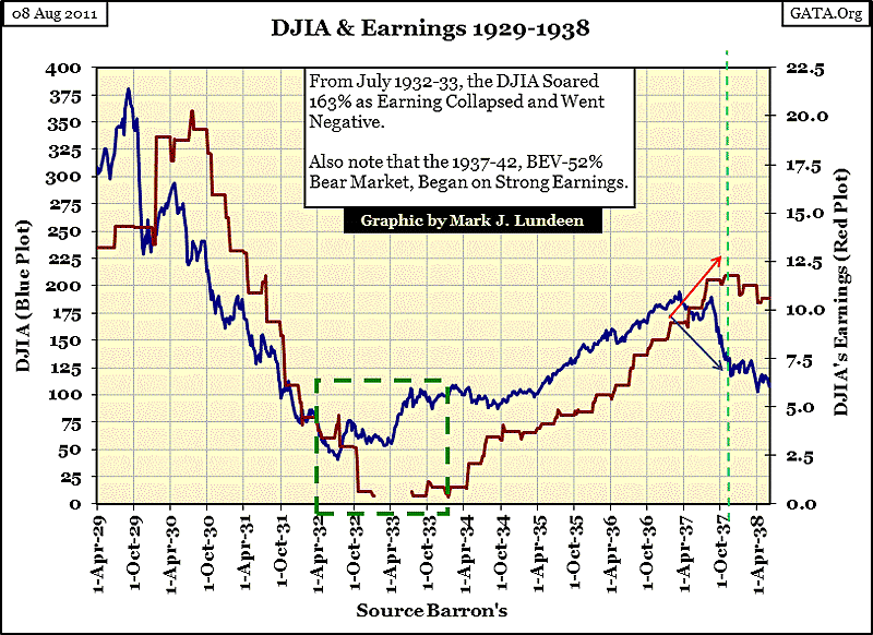
It goes without saying that trends in earnings and valuations frequently agree with each other. But my point is that in the 1930s, using earnings for * timing signals * of future changes in market valuations, made people stay in the markets when they should have exited, and kept people out when they should have returned during this historic decade.
The predictive powers of earnings didn't improve from 1968-79, a decade when the Dow's valuation seemed to only go up as its earnings went down, and down only as its earnings when up. The Dow Jones' December 1974 bottom was the first 40% bear market since 1942. Note how the Dow Jones crashed 45% * AS * its earnings increased 65%, and how the Dow Jones quickly rebounded to 1000 as its earnings declined 31%.
In a past article written in 2007, I plotted the Dow's earnings with its valuation from 1929-2007. Sure, there are times in the past eight decades when timing the market with changes in earnings paid off, but such cases are relatively rare.
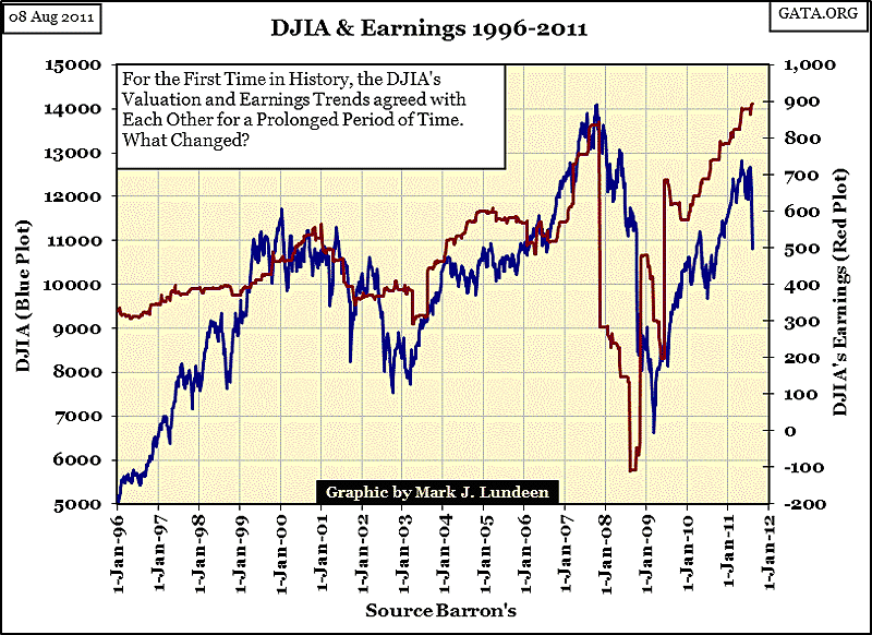
As you can see in the chart below, during the Greenspan/Bernanke bubble years, the trends in the Dow Jones and its earnings have closely followed one another. No mystery here, just sloppy accounting and massive "injections" of "liquidity." So I guess I understand the current fixation on stock earning trends. But the question in my mind is, if the "policy makers" lose control over the markets, will the valuation of the Dow Jones decouple from its earnings, as was frequently the case before the Greenspan Fed? I expect they will.
Here is another article I wrote just last April, (at the top in the Dow Jones) I was concerned that the rising earnings in the Dow was once again going to keep people in the market.
"But the stock market is a story of many surprises. Things change all the time on Wall Street with no notice provided to the investing public. There are many examples shown in my charts where Mr Bear took the bulls to the woodshed ON RISING EARNINGS. It can happen."
- From my April 2011 article
Back in April, I wasn't 100% sure what the stock market would do in the coming months. But now in August, I'm not surprised that the Dow's valuation is now being mauled by Mr Bear - on rising earnings. Since 1929, when Barron's began publishing data on the Dow's earnings, Dow Jones usually began its big bear markets on rising earnings, exactly like we see happening now (chart below). We should also note that in 2007, the Dow's valuation and earnings began their decline together, which is not typical of a massive bear market. Mr Bear may only be a metaphor, but for a metaphor, he has a fine sense of irony. It would be just like Mr Bear to begin his BIG-PUSH, FINAL ASSAULT on the Greenspan/Bernanke financial bubble as he began the 1929-32 bear market: on rising earnings. This is something for us to pay attention to!
Dividends
How far can the Dow decline? A lot! There are two methods of valuing the stock market:
- Capital Gains (bull markets)
- Dividend Yields (bear markets)
During bull markets, who cares about single-digit dividend yields when double-digit capital gains are at hand? I don't, and you shouldn't either. But in bear markets, when capital losses become the rule, yields become all important in fixing valuations on all financial assets. Stocks today have at best microscopic yields, meaning that they are mostly yielding below the real rate of consumer price inflation. The yield for the Dow Jones itself is under 3%. That doesn't mean much to people, but it should!
Below, we see the Dow's dividend yield from 1925. Falling dividend yields indicate rising stock markets. Rising dividend yields indicate bear markets. Years ago, there was a well-known rule-of-thumb: exit the stock market when the Dow's yield fell to 3%, and scoop-up the cheap stocks when the Dow was once again yielding something over 6%.
I placed a black vertical line on the chart when Doctor Greenspan became Fed Chairman. It's apparent that Doctor Greenspan wasn't going to allow a bear market on his watch! Most people think of bull and bear markets in terms of prices. But if we look at the stock market from a dividend yield standpoint, we really should date the start of the current bear market from Barron's 17 January 2000 issue, when the Dow's dividend yield fell to an incredible 1.30%. Such an understanding of our current market has much to say for it. Why would that be? Because in bear markets, dividend concerns dominate valuations!
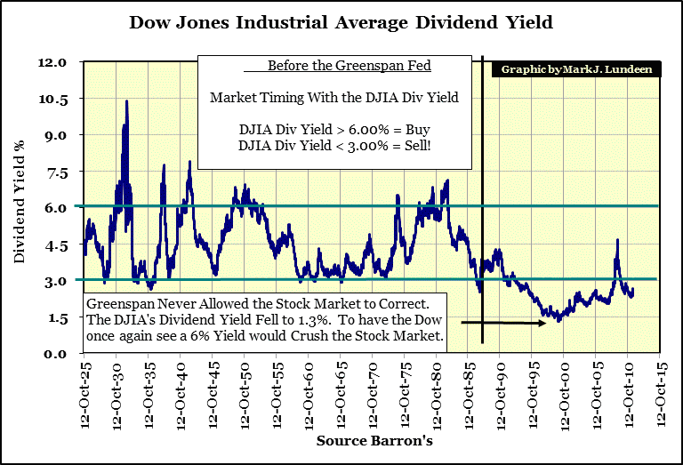
The relationship between the Dow's valuation, dividend payout and yield are mathematical. When capital losses once again dominate market psychology, and interest rates and bond yields are driven higher by concerns of rising consumer prices, once again the stock market's valuation will be fixed by dividend yields, just as it was before Doctor Greenspan decoupled market valuations from VALUE.
What that would mean to market valuations can be seen in the chart above. At the March 2009 bottom, the Dow was yielding 4.68%. Had Mr Bear taken the Dow to a 6% yield, the Dow would have seen its valuation decline to 5169. That would have been a bear market decline of 64%, from the Dow's October 2007 highs.
But there are two ways for the Dow's dividend to increase to 6%:
- On a Decrease in the Dow's Valuation
- With increases in the Dow's Dividend Payout
From 1960 to 1982, the Dow's dividend yield increased from 3% to 7% not by a crippling bear market, but on rising dividend payouts during a twenty year period when the Dow Jones was range bound from 700 to 1000. However, this is not how the Dow Jones will once again see a 6% yield in 2011.
But if you review my earnings charts (and the links provided), you'll see that in massive bear markets, when the Dow breaks down, earnings soon follow. And as dividend payouts are financed by earnings, falling earnings eventually force companies to reconsider their generous dividend payouts, or cut them entirely.
That is exactly what happened during the Great Depression Bear Market, where dividend payouts declined by 78%. Using Mr Bear's handbook of "Market Math Made Easy" we can understand why the Dow fell 89% from 1929 - 32: the Dow's dividend yields increased from 3% to over 10.5% (weekly closing values), and its dividend payouts fell 78%.
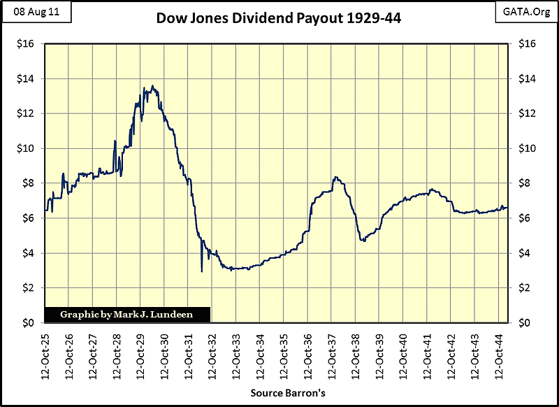
Note also in the chart above, the 1937-38, 40% bear market, the Dow Jones cut dividend payouts by 43%. In an economy in collapse, like we have now, cuts in dividend payouts by blue-chip stocks are to be expected.
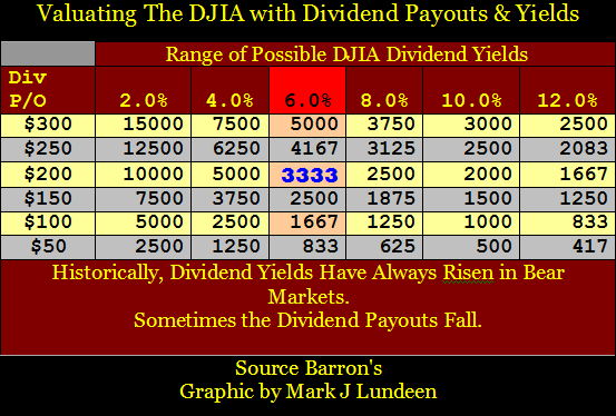
Here are two tables fixing the valuation of the Dow Jones and the S&P500 under different yields and payouts. Currently the Dow's $302 payout is off the scale, but I expect Mr Bear will adjust this downwards in the next year, or two. Should he cut the Dow's dividend payout to $200, and raise its yield to 6%, that would fix the Dow Jones at 3333, for a 76% decline in the Dow. Such a decline in the Dow is well within the historical range of possibility.
Don't blame Mr Bear if this happens. Had Doctor Greenspan, in a fit of bubble-mania, not driven the Dow's yield to a microscopic 1.30% in 2000, there would be no concern today that a totally normal 6% yield in the Dow would resulting in a 73% decline in its valuation!
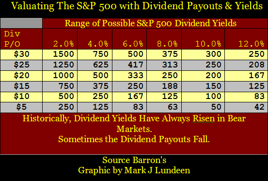
For my readers who like following the S&P 500, this table is for you. Currently the S&P is paying $26.39.
Interest rate environment
If you don't like these tables; you're really going to hate my next chart. From 1971 to 2001, US Treasury long-bond yields and the price of gold increased and decreased together. Their ratio was not fixed, but the chart below makes clear that long-term trends in the price of gold and long bond yields had a connection: rising consumer prices caused capital flight from fixed-income into gold. When rising consumer prices stopped being a market concern, people sold their gold to purchased fixed-income assets.
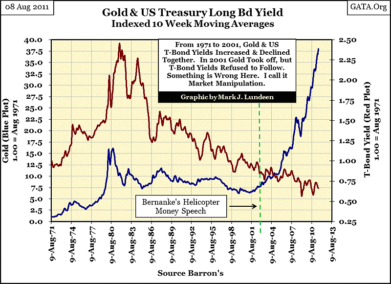
All that changed in 2001, when the price of gold decoupled from bond yields. The "policy makers" finger prints are all over this chart. Their "quantitative easing" (pt1&2), are only their latest market manipulation of the bond market. And the gold and silver markets have been manipulated, in one manner or another, since President Roosevelt. I expect the day is coming when once again the trends in the price of gold, and yields in US Treasury long bonds will again recouple, with gold's ten year trend seen in the chart above, pointing the way for future bond yields. Using the fantastic rise in the price of gold, the possibility of plus 20% yields on Treasury debt is a distinct possibility. And as treasury yields go, the Dow's dividend yield will follow! At the bottom of the Great Depression bear market, the Dow's yield peaked at 12.70%, (on a daily basis). As I read the chart above, Mr Bear intends to drive bond and stock dividend yields to historic levels before he is finished with us. A sub $1000 Dow is a distinct possibility.
Economic Growth
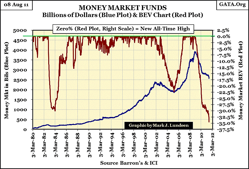
But my anticipated decline in the Dow's dividend payouts, and increase in its yield, is all predicated on the assumption that the economy is going to collapse as it did during the 1930s. Is it? Well it hasn't yet, but there are no shortages of bad omens that it just might. Proctor and Gamble, a "recession proof" stock, is having a hard time as sales of soap and diapers are declining. P&G's customers are not forgoing their need for soap and diapers without reason. People with jobs are seeing their income consumed by debt service, and the people without jobs just don't have the money to purchase soap from P&G. Walmart, the great discount retailer, which many "market experts" believed was also "recession proof" is seeing sales fall off too. But these examples are anecdotal. However, when we examine the current collapse in the demand for short-term money in the money market, we can safely assume that the problems P&G and Walmart are experiencing, is an economy wide phenomena.
Ninety day money market funds (the money market) provide short-term money to commerce for inventory management. The following chart's red BEV plot shows the current 35% collapse in short-term funding needs by business. It's seeing the deepest decline since 1980. This is proof positive that American business (not just P&G and Walmart) is having difficulty in selling what is already stored in their warehouses. If this trend doesn't turn around soon, the American economy will find itself in a depression. No blue-chip stock's dividend payout can be said to be "secure" in such an economy.
I've spent a lot of time studying the market. The data from Barron's is an excellent database to work with. Who else has data series going back to the 1920s? Still, my work is not flawless, and I don't give any guarantees on my market conclusions. But I eat what I cook, and what I see coming my way is something I think all my readers want to avoid too: that the 2007-2011 (2000-2011?) bear market is going after the heavy weight crown currently worn by the 1929-32 bear market. Time will tell if I'm right or wrong. But retail investors are always well advised to invest in what is currently going up, and avoid what is going down. And right now, and for the foreseeable future, that means they should keep it simple by exiting the stock market completely, and just purchase gold and silver related investments. No futures or ETFs please.
Mark J. Lundeen
[email protected]
[email protected]
More from Gold-Eagle


