New All-Time High For The Dow Jones: No Big Deal


The Dow Jones ended the week at a new historic all-time high. In late 1999, this news would have greatly excited the media and investing public, but fourteen years later, there are scant signs of excitement that the Dow Jones has surpassed the October 2007 pre-crash high by 1500 points and is now 4000 points above its January 2000 high. And just why does the Dow Jones continue going up in a bull-market that began in August 1982? Well it’s not just me saying it anymore; today the financial media continuously assures the public that Federal Reserve’s monetary policy is causing stocks to rise, which I’m sure is true. But is that something that should comfort the public? No, but it does.
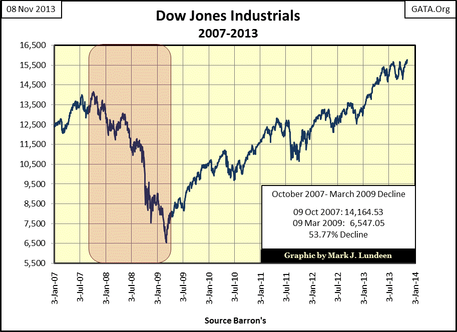
Let me tell you a little secret; after thirty-one years, this is one tired bull! In fact, I believe that this is actually a bear market in bull market clothing. Since the advent of the “Greenspan put” in the late 1990s, no new all-time high in the Dow Jones was accomplished without a little “liquidity” shot in the arm by the Federal Reserve. But what about the 2007-2009 53% Dow Jones panic crash? Didn’t that terminate the bull market that began in 1982? Heck no; that crash is seen today as just a little speed bump on the way to today’s new all-time high as far as Wall Street, and the media are concerned. For most people today, there is little fear of a market crash as the lesson they learned from the high-tech and mortgage bubble’s crashes is that the government has everything under control, but with each passing day that’s beginning to be less and less true.
I don’t want to belittle the “policy makers” success in driving the Dow Jones on to another new all-time high, but the Dow Jones is computed by using only thirty big blue-chip stocks, while the stock market itself consists of thousands of companies. Let’s look at the Dow Jones Total Market Group (DJTMG) and see how many stock groups made a new all-time high with the Dow Jones this week: only thirteen of seventy four groups I track.
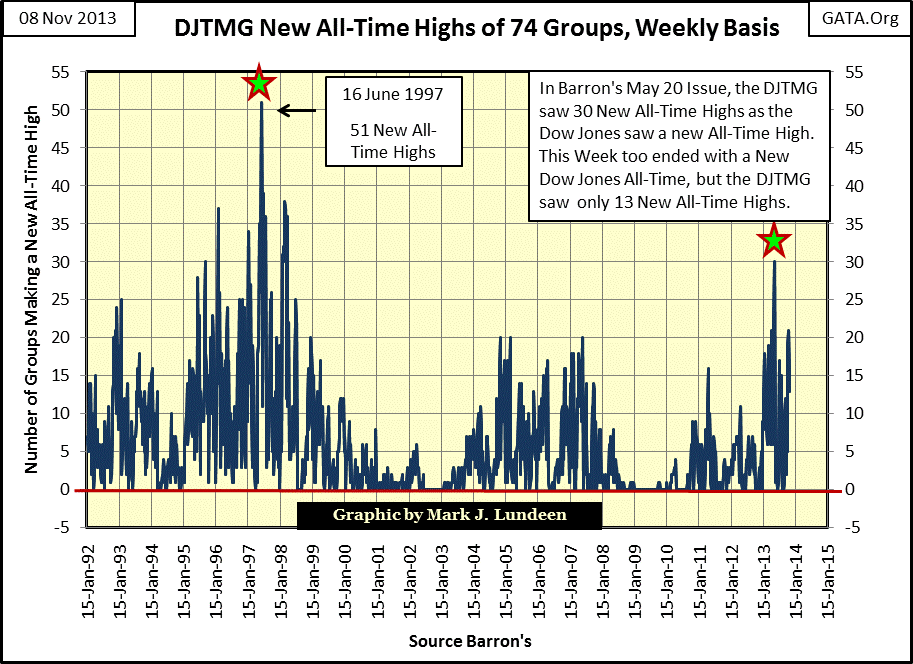
Now, seeing fewer DJTMG groups participate with the Dow Jones in making new all-time highs isn’t an indication of an imminent collapse in the stock market. The peak in new all-time highs for the DJTMG during the late 1990s was in June 1997 with the Dow Jones at 7782; two and a half years before the Dow Jones January 2000 top of 11,722. But I expect last May’s thirty new all-time highs will prove to be the high-water mark in all-time highs for the DJTMG in this phase in the “bull market.” Like the late 1990s, I expect many stocks, and stock groups in today’s “bull market”, will begin their bear market long before the Dow Jones reaches its ultimate top. I also believe that in the near future (within three years), the Dow Jones will see a deeper decline than the 53% decline of March 2009, as the Federal Reserve proves incapable of preventing Mr Bear from doing what must be done; finally taking out Wall Street’s garbage asset valuations.
One thing that’s obvious to me is that the Federal Reserve’s QE program is losing its ability to control long-term interest rates. Look at the chart below showing the performance of the US Treasury 30 Yr Bond issued in August 1997. During the Federal Reserve’s current QE3, this bond’s yield (Red Plot) has increased a full 100 basis points over the past year. The Fed may be “monetizing” 45 billion dollars in US Treasury debt each month, but since last autumn, US T-bond holders (like central banks), have sold more than the Federal Reserve has purchased. This is a huge problem for the Federal Reserve as the Fed’s portfolio of US Treasury debt has shifted towards the longer end of the yield curve.
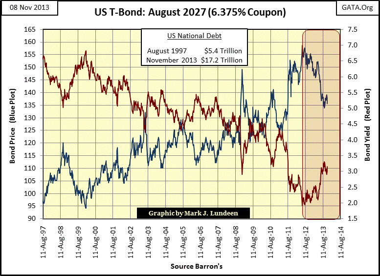
I don’t have the numbers to chart, but sources I trust are saying that as much as 50% of the 10 to 30 year Treasury bonds are now held by the Federal Reserve. I hope they are wrong, because that makes the blue plot above critical to the US dollar in the currency markets. QE or not, the decline in the blue plot isn’t good for the US dollar or the stock market.
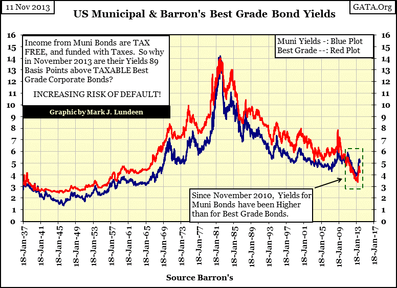
But this chart is for the AAA Rated US Treasury market, though the Chinese have already made a token downgrade of US T-debt to AA for the sake of honesty, but not all the way to CCC, which would destroy the value of their huge US Treasury bond portfolio. There are still other bonds people can buy that aren’t Washington’s IOUs, like tax free muni-bonds, but there are bad signs to be seen in the solvency of local governments in the United States as well, that will one day have an impact on the stock market.
For the past three years (158 weeks), the muni-bond market has discounted muni-bonds to where their yields have been higher than high-grade corporate bonds. Currently, they are paying muni bond buyers eighty-nine basis points more than high-grade corporate bonds, and muni bonds payout tax free income. So, in after tax terms, these bonds are yielding several percentage points more than corporate bonds. This is quite a difference from October 2008 when muni-bonds were yielding two full percentage points below corporate bonds (see next chart).
What has changed since then? The mortgage bubble finally went bust, and with it went all the easy money from property taxes rolling into county courthouses in all fifty states in the union as housing values were artificially inflated. During the good times of the mortgage bubble, most local governments were very generous with their union employees’ wages, health care and retirement packages. But now, in the current recession, local governments’ revenue assumptions made during the boom times are coming back to haunt them, and you can see the bond market’s reaction to this in the chart below.
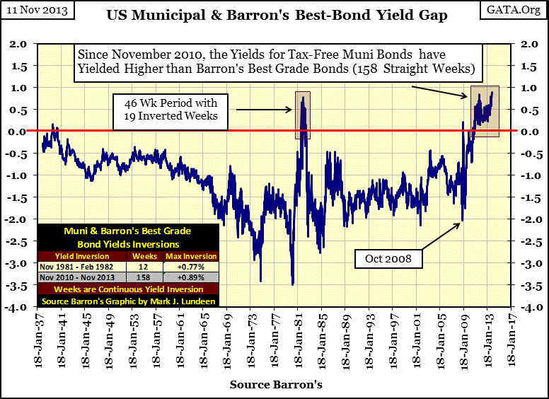
But in one sense not much has changed at all. For decades, local government has taken on debt for this, that and the other things that make local politicians popular with voters and their union employees. Historically, government has had little regard for their future solvency or the safe return of funds lent to them by their creditors. Detroit may be an extreme example, but don’t believe that cities like New York and Chicago have managed their finances for the benefit of their bond holders’ capital. Seeing muni-bonds yielding more than taxable corporate bonds for the past three years is a bad indication of things to come in the muni-bond market, and the ability of local government to provide for basic services like fire and police protection. The holders of local government bonds, at least the smart ones, are selling their tax-free muni bonds while there is still a market for them.
Here’s a chart plotting bond yields from data published by Barron’s going back to 1937. That’s a long time. These are the yields I used to calculate the yield gap above. The chart below shows the current historical anomaly in municipal and high grade corporate bonds. Note that like the yields for the US Treasury market, corporate and muni bond yields have been rising during Doctor Bernanke’s QE3; that wasn’t supposed to happen.
Well, after a thirty year bull market in bonds, it really is time for a visit from Mr Bear. Unfortunately, with all the cheap credit created by the Federal Reserve since Alan Greenspan was its chairman, governments and corporations have seldom passed on any opportunity to impair their finances with debt for dubious purposes. Wall Street’s investment bankers have always been there to make the deals and bundle a few derivatives to the new bonds that would raise risks in the bond market, while lowering the coupons payouts to purchasers of American bonds. The bond market today is a house of cards that will one day soon come falling down, and that is not good for the stock market, or you and me.
Since I’m focusing on bond yields, here are the two component yields for corporate bonds used in constructing Barron’s Confidence Index (CI). Like all the other bond indexes I compile every week, these too have seen their yields increase since the summer of 2012, in spite of the best efforts of the Federal Reserve to keep long term bond yields low. Look at the current yield rate spike for intermediate grade bonds during the mortgage crisis; they spiked up to 15% - wow! These bonds could have been purchased for 30 cents on the dollar. And then Doctor Bernanke and his minions hammered these yields down soon after to “restore normalcy” to the market. No doubt the big Wall Street banks, and their friends, were the main beneficiaries of this restoration of normalcy in the corporate bond market.
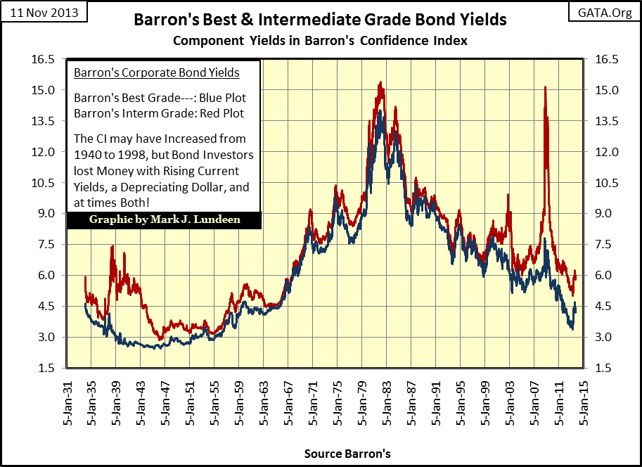
The bonds used in the red plot are not junk grade bonds. To see something like this happen so recently should give one cause for caution in the fixed income markets. We live in a world where we are only a “policy decision” away from seeing radical changes in the financial markets, sudden shifts in valuations that will be long remembered by future generations.
Here is Barron’s Confidence Index (CI). The CI is not a bond market timing indicator. If you care about your investment funds, don’t even think of using it for choosing entry and exits points in the fixed income market. But since 1934, the CI has been an excellent indicator of the bond market’s expectation of lower grade bond issuers' ability to service their debts. And right now the bond market is anticipating increasing difficulty for lower grade corporate debtors to pay their bond coupons, and even avoiding bankruptcy in the foreseeable future.
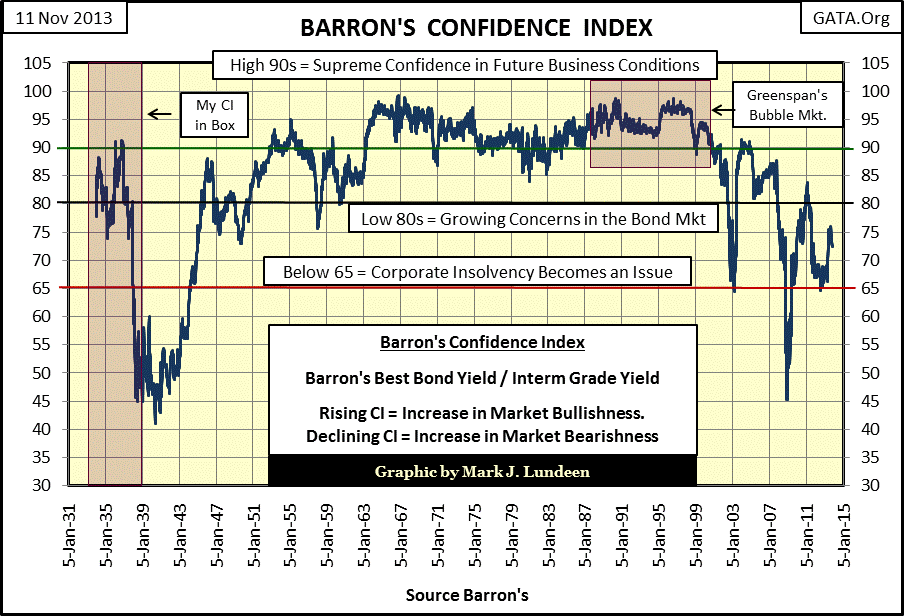
I really like this data. We see CI’s first Greenspan bubble-market breakdown in the chart above in January 1999. It wasn’t much, just a swift breakdown from 96 to 89 early in 1999. But this little breakdown was an accurate harbinger of worse to come. Soon after the 2000 top in the Dow Jones, Barron’s CI made it clear that the 21st century was going to be very different than the post WW2 world of finance. As the Federal Reserve loses its control over the debt markets, I expect to see the CI decline far below 65, and that will be very hard on anyone who today is reaching for yield in the bond market to maintain their standard of living. Will Rogers (the Jay Leno of the Great Depression) said it best:
“I’m not worried about the return ON my money.
I’m worried about the return OF my money.”
- Will Rogers; Humorist during the Roaring 1920s and Depressing 1930s.
Like the 1930s, the risk to principle is something people today should keep in mind too because there are big problems in the financial markets. Look at the Bear’s Eye View for the NYSE Financial Index below. These companies were ground zero for the mortgage crisis of 2008-09. When these companies began their fall from grace in mid-2007, they took everything else down with them. Geeze Louise, the big banks in this index dragged the NYSE Financial Index down 80% from its last all-time high of 2007 in less than two years.
Since then they have received trillions-of-dollars in government assistance in one form or another, as well as changes in accounting rules for their assets and earnings. They are also allowed to inside trade on Federal Government information with no fear of legal consequence any day the US government releases some bogus number for GDP or employment. And after all that, this is the best they can do?
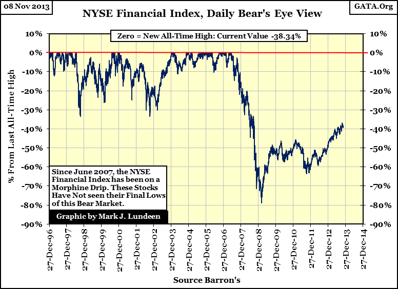
If the health of any economy is largely dependent on its banking system, which I believe is true, then the chart above indicates that our economy is far from being healthy, and that isn’t good for the stock market either.
So what is good in today’s world of bad investments? Well I haven’t changed my opinion since I began posting articles on the internet; I like gold and silver bullion as much as the banking system seen in the chart above hates them. Look at the chart below.
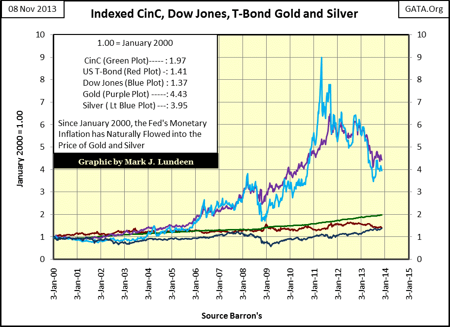
In its table we see the gains for CinC, US T-bonds, the Dow Jones, gold and silver since January 2000. I’m painfully aware that since 2011 gold and silver have seen a nasty correction in their bull markets, but they have still outperformed the Dow Jones and Treasury debt since January 2000 by a wide margin. Also note that in the past fourteen years, the US T-bond issued in August 1997 (Red Plot), whose chart I used in this article, has since January 2000 seen better capital gains than has the Dow Jones (Blue Plot), even as the Dow Jones saw a new all-time high this week with T-bond declining since June 2012.
This is yet one more indication that financial assets and precious metals prices are not what they would be in a free market, a market unfettered by the hands of “government policy.” I expect history will prove me correct, that big changes in market valuations lie ahead, and that gold and silver investments at today’s low prices will prove to be a lifeboat to people who buy them at current prices and hold on to them in the years to come.


