No Sign Of Mr Bear Leaving US Just Yet


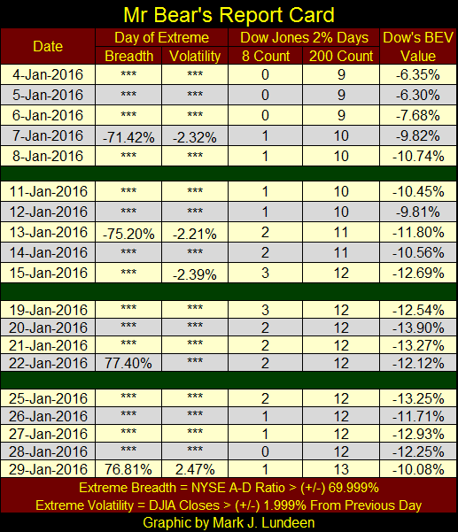
This was the fourth week that saw days of extreme-market breadth and volatility; NYSE 70% A-D Days and Dow Jones 2% Days. Yes, this week they were positive days. They helped investors and CNBC commentators forget the trials and tribulations of the first three weeks of January. That makes no difference. Actual, real bull markets never see eight extreme-market events in a single month as we saw in January 2016; but bear markets do.
From August 1987 to March 2006 when Alan Greenspan was Fed Chairman, the stock market saw two massive bull markets. Yet during these nineteen years the NYSE saw just eleven days of extreme-market breadth. Those two positive NYSE 70% days occurred during the crash of October 1987, and the last of the eleven in May 2004. This is what one expects during bull markets; extreme-market events are rare, mostly negative, and years apart.
Ever since the current cluster of extreme-market breadth began in February 2007, (with the first cracks in the sub-prime mortgage bubble) nothing has been the same.
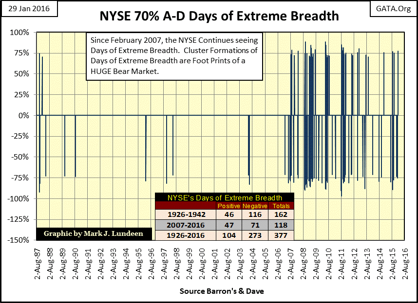
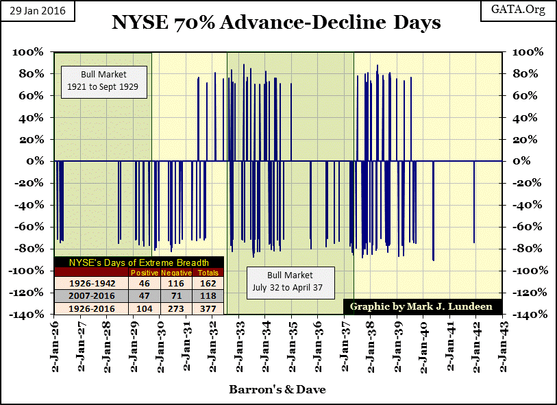
Sure there have been plenty of positive days of extreme-market breadth since 2007, but that also happened during the depressing 1930s. You can easily identify the little NYSE bull market after the Dow Jones bottomed in July 1932 (below); the stock market stopped seeing positive NYSE 70% A-D days.
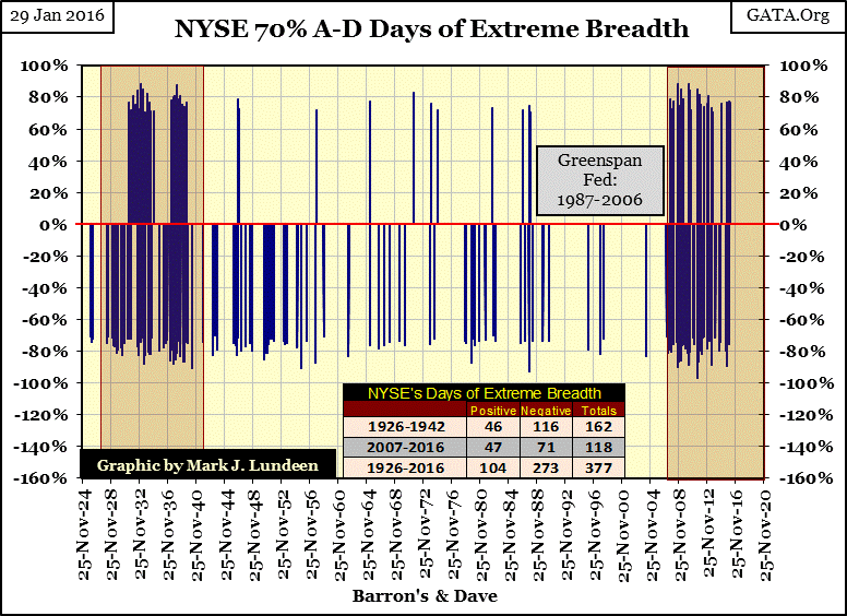
Here’s a chart showing the cluster of extreme-market breadth days during the Great Depression. There were no positive days of extreme-market breadth from 1926 through the summer of 1931 until after the Dow Jones had declined 68% from its bull market high of September 1929. As the Dow Jones plunged to its ultimate bottom: the 89% collapse of July 1932; positive NYSE 70% A-D days became regular features of the final decline. Note also how the end of the 1932-37 bull market was marked by the resumption of positive days of extreme-market breadth. The point is that frequent positive extreme-market events aren’t necessarily indications of a healthy bull market. In fact history shows just the opposite.
Here’s the Bear’s Eye View chart for the Dow Jones since January 2013. The BEV -7.5% line provided support for a long time. Now we are waiting to see if the Dow Jones 7.5% BEV Line (Dow Jones: 16,940) becomes a line of resistance in the weeks to come.
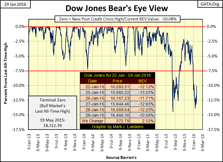
But if it does break above it, it’s meaningless unless the Dow Jones can manage to make a new Bev Zero (new all-time high) sometime soon, say by July. That’s only about a 10% market move, something a real bull market would do easily in five months. Personally, I expect the Dow Jones last all time of 19 May 2015 will prove to be this BEV chart’s Terminal Zero – the last all-time high of a bull market.
Long, long ago in an economy far away, it was widely known how market risks were priced into the yield of stocks and bonds; the greater the risk to principal the higher the yield. Bonds are contracts for debt. In those days any failure to pay a bond coupon amounted to bankruptcy for the bond issuer; so well managed companies always made timely payments on their bonds. Dividend payouts for stocks on the other hand are used by companies to distribute corporate profits to their shareholders. However when there were no profits dividend payouts could be reduced or even totally eliminated without legal consequence to the company. As dividend income carried risks that bond coupons didn’t, dividend yields demanded by the market were higher than bond yields for the same company.
Below the Dow Jones dividend yield (Blue Plot) is plotted against the Barron’s Best Grade Bonds yield (Red Plot). Before 1958 (Red Box), a time when the stock market was seen more as a source of income than capital gains, market watchers used this data to time the stock market.
Knowing the stock market has inherent risks the bond market doesn’t, income seekers would invest in stocks only when dividend yields were substantially higher than bond yields since high dividend yields relative to bond yields coincided with bear market bottoms in stocks. Income seekers held stocks for higher income than bonds would pay until dividend yields began to approach yields for bonds. Such times coincided with bull market tops in equities. They would then sell their stocks, (receiving a nice capital gain in the process) and move their funds into the bond market until dividend yields once again surpassed bond yields, signaling it was again time to sell their bonds and go back to holding dividend paying stocks.
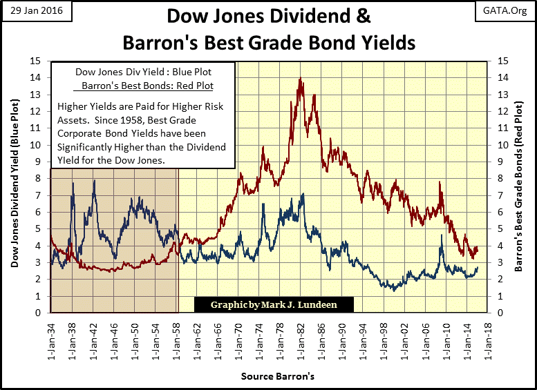
Prior to 1934 up until 1958 this simple timing technique provided a brilliant method of maximizing income from the financial markets, ensuring one was fully exposed to dividend paying stocks during bull markets as well as avoiding reductions in dividend payments (as well as capital losses) during bear markets at the NYSE.
Then the 1958-71 run on the US Treasury gold reserves began and the world changed forever. As is apparent above, after 1958 bond yields rose above dividend yields because the bond market became a riskier place for wealth than the stock market. As the United States continued issuing ever more paper money than agreed at Bretton Woods, ($35 paper dollars per ounce of gold held in reserves (table below)), concerns over the future purchasing power of the US dollar began to dominate the fixed income market.
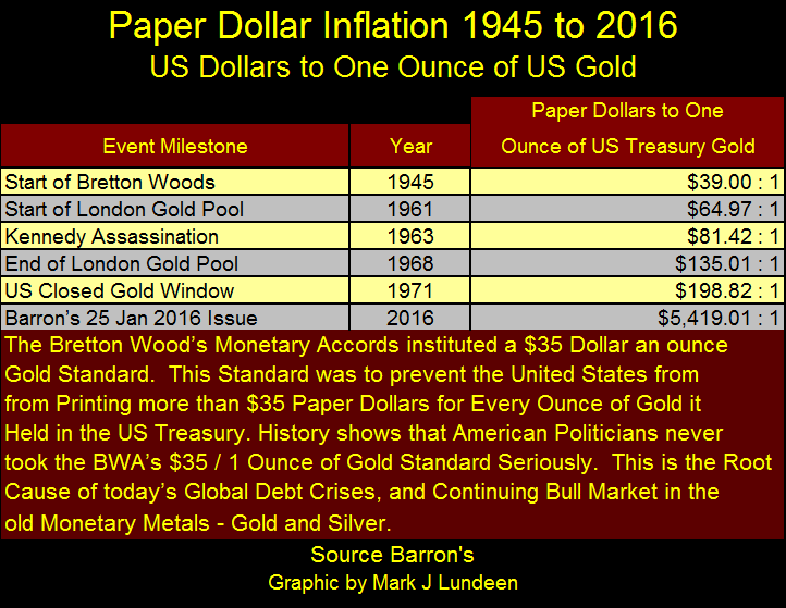
In 1958 foreign-central banks began demanding US Treasury gold for all the paper dollars building up in their vaults, starting a run on US gold reserves which continued until the day President Nixon “closed the gold window” in August 1971. History always blames Nixon for the termination of the $35 an ounce gold standard. But as is evident in the table above and chart below, post WW2 US “monetary policy” was highly inflationary making the run on US gold reserves inevitable. Currently the “policy makers” have issued $5,419 paper dollars for each ounce of gold they claim the US Treasury holds in reserve.
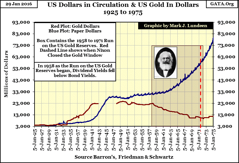
Below in the box containing the run on the US gold reserves I placed a photo of Karl Marx as this was the realization of his dream. In his Communist Manifesto he listed ten things Communists should attempt to implement in capitalist economies to bring them down, thus ushering in socialism. One of these was to create a central bank which controlled the issuance of credit and currency; another was to eliminate the gold standard.
As seen in the chart below, from 1925 to 1971 that’s exactly what the Federal Reserve & US Treasury accomplished. Ever since the 1971 termination of the $35 gold peg, “monetary policy” has been highly inflationary resulting in ruinous booms and busts in the stock, bond and real estate markets.
In his 1966 article titled “Gold and Economic Freedom” Alan Greenspan addressed this exact topic:
“An almost hysterical antagonism toward the gold standard is one issue which unites statists of all persuasions. They seem to sense - perhaps more clearly and subtly than many consistent defenders of laissez-faire - that gold and economic freedom are inseparable, that the gold standard is an instrument of laissez-faire and that each implies and requires the other.
“--- In the absence of the gold standard, there is no way to protect savings from confiscation through inflation. There is no safe store of value. If there were, the government would have to make its holding illegal, as was done in the case of gold.
“--- This is the shabby secret of the welfare statists' tirades against gold. Deficit spending is simply a scheme for the confiscation of wealth. Gold stands in the way of this insidious process. It stands as a protector of property rights. If one grasps this, one has no difficulty in understanding the statists' antagonism toward the gold standard.”
- Alan Greenspan: [written in 1966] “Gold and Economic Freedom” originally appeared in a newsletter called The Objectivist published in 1966 and was reprinted in Ayn Rand's Capitalism: The Unknown Ideal
To fully appreciate the horrendous inflation plaguing the stock market, and its effects on the Dow Jones, I indexed Currency in Circulation (CinC) and the Dow Jones from 1920 to present below. Since 1920 the only Dow Jones bull market that actually exceeded CinC inflation occurred during the 1920s. All other Dow Jones bull market tops fell short of the increase in CinC.
I placed a table in the chart showing the growing gaps between CinC inflation and Dow Jones bull market tops since the top of the high-tech market bubble (January 2000). The point is that the FOMC may continually increase the supply of dollars, but as time passes, these dollars pumped into the economy are having less and less effect on the market value of equities trading in the stock market.
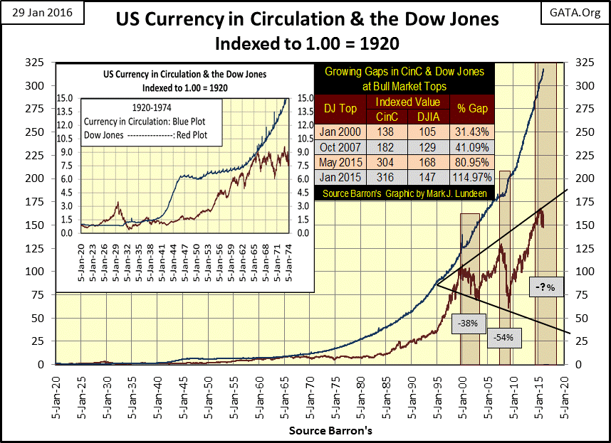
I placed two trend lines along the Dow Jones post 2000 bull market tops and bear market bottoms. The upper trend line rests nicely on the three bull market tops. For the lower trend line to do the same the Dow Jones will have to decline to around 5000 during the next bear market, a 73% decline from its 19 May 2015 top of 18,312. Can the Dow Jones possibly decline 73% in the next few years? Yes it could and likely will when the stock market begins to deflate in earnest.
So should today’s investors in the stock market move their funds into the bond market just like in the days of old at a market top? NO WAY!
Dow Jones used to publish bond averages. One was the 10 Utility Bond Average, which was discontinued in 2002. The price (Blue Plot) and yield (Red Plot) data for the 10 Utility Bond Average is plotted below.
Keep in mind bonds are fixed income. One purchases a bond for say $1,000 yielding 5% and the company sends you $50 a year for the next twenty years and then returns your $1,000. But if you wish to convert your bonds into cash before the bond matures you have to take what the market offers. With rising interest rates the market will pay less than face value for a bond years from maturing.
Back in 1938 the index used completely different bonds than it contained in 1981, so it’s not an apples to apples comparison with later years. But looking at the raw unadjusted data the Dow Jones 10 Utility Average lost 45% of its value from 1946 to 1981 as bond yields increased from below 3% to more than 15%. That actually understates the inflationary damage done to wealth stored in the bond market by a fourfold increase in bond yields since from 1938 to 1981 as the cost of living was also inflating.
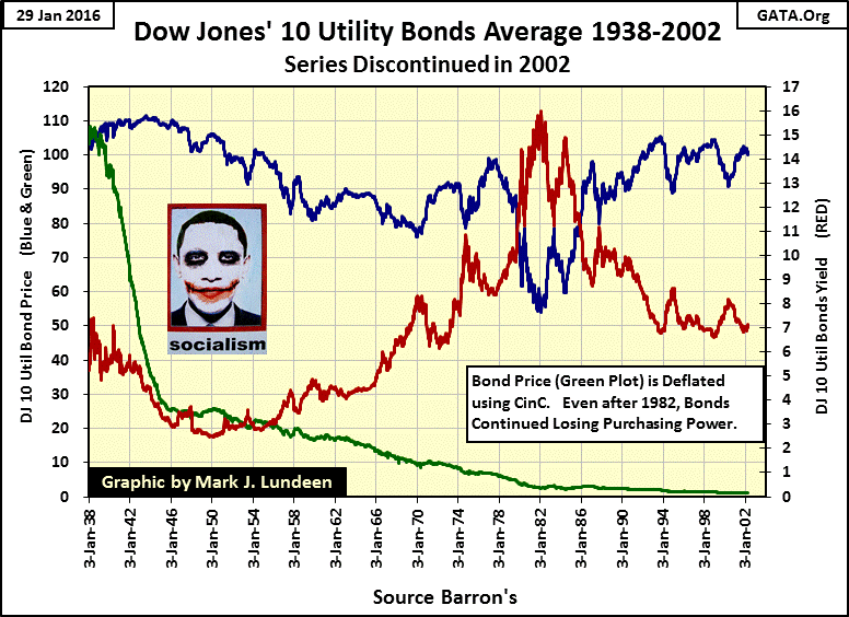
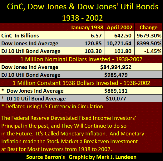
I deflated the 10 Utility Bond price data using CinC in the chart’s green plot. The impact monetary inflation had on wealth invested in bonds from 1938 to 2002 can be seen in the table below where I list the values for CinC, the Dow Jones and the DJ 10Bond Average for January 1938 when Barron’s first published data for the 10 Bond Average and in April 2002 when Dow Jones discontinued the series.
As recorded in the dusty old pages of Barron’s, CinC increased by a factor of 96.7 during these seven decades as the Dow Jones increased by a factor of 84. The price for the DJ 10 Utility Bond Average lost $1.50 in nominal dollar terms. The table’s second section shows how a million dollars fared from 1938 to 2002 invested in the Dow Jones or the DJ 10 Util Bond Average. A million dollar investment in dividend paying blue chip stocks increased from $1 million to $85 million, while high quality utility bonds lost their owners $14,521. The table’s third section shows how a million dollars fared in the Dow Jones and utility bonds in constant 1938 dollar terms. In terms of 1938 dollars an investor in blue chip stocks is no longer a millionaire, but they are still living the good life while the bond investor is in need of a day job.
Incredibly, today “market experts” still refer to high quality bonds as a conservative investment for risk adverse investors. In a world where central bankers are being urged by the financial media to flood the markets with monetary inflation, with bond yields still near lows not seen since the mid 1950s, the bond market promises to be a killing field for private wealth in the years to come.
The best way to sum up the effects of the Federal Reserve’s Open Market Committee on the wealth of average Americans is with a quote from George Burns from the popular 1950s Burns and Allen Show.
“The real problem with retiring is money. Most people save their whole lives to retire in the same style they enjoyed when they were working, only to realize that they can’t live like they used to even while they’re still working. You see these ads for retirement and they always have fishing boats in the background. That’s because for $120 a month, fishing is the only way retired people can feed themselves.
- George Burns: Burns and Allen Television Show / Season 8 Episode 9, 1957
Is anyone you know retiring today on $120 a month? In 1957, a year before the run on the US gold reserves began many retired people did. If that is no longer possible it’s because of the Federal Reserve and their inflationary monetary policy.
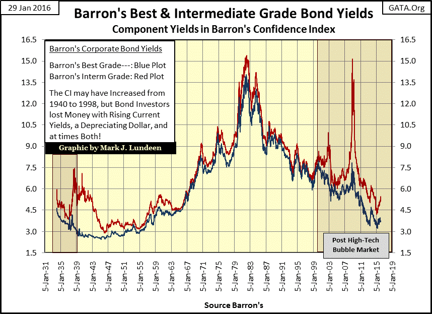
There are signs the bond market is under increasing stress. Here are the plots for Barron’s Best and Intermediate Grade Bond Yields from 1934 to present. Both of these bond series are considered investment grade, yet in the wake of the January 2000 high-tech market top the spread between best and intermediate grade bonds has widened. That’s not good. During the credit crisis of 2007-09 the yields for intermediate grade bonds doubled, halving their market value from December 2007 to December 2008.
Bonds today, with their fixed income, have all the disadvantages of blue-chip stocks without the possibility of ever increasing their payout. Bonds are relics of a gold standard now long gone. Today bonds should be held by museums rather than fiduciaries and investors, but if institutions and people need income what are they to do?
Here’s Barron’s Confidence Index (CI). Take a moment to study the yields above with their spread (the CI) below. The CI may use bond yields to construct it, but it’s really not a bond market metric. Since 1934 it has proven itself to be ineffective at identifying bond bull and bear markets. What the CI is good at is gauging the bond market’s best guess of the prospects that less than Best Grade Bond issuers will be able to service their debts to term – and that’s it! But that’s still enough to make it an excellent metric for measuring the health of the economy and financial system.
During the Greenspan Fed, from 1987 to 2000 the bond market (the CI) agreed with everyone else that monetary inflation flowing from the Federal Reserve was mother’s milk to the market. However after the high tech bubble popped in January 2000, the Confidence Index has seen increasing concerns for less than best grade credits in the bond market. It touched its 65 line at the bottom of the high-tech bear market, broke down to its 45 line in December 2008, then quickly recovered with more than a little help from Doctor Bernanke’s QE-1.
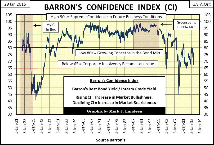
Since the March 2009 credit-crisis bottom the Confidence Index has oscillated between its 65 and 80 lines, there’s good reason to expect the CI’s next big move to be down below 65. Modern central banking has expanded debt in the global economy far beyond the economy’s ability to service it. When the CI next breaks below its 65 line, I expect we’ll see the beginnings of massive defaults in junk bonds and other lesser grade bonds, and in time ultimately defaults in sovereign debt. The process has already begun in the energy sector. The Dallas Fed just last week ordered its member banks not to push those energy companies unable to service their debt into bankruptcy proceedings. The banks are playing for time, but they still hold a losing hand in a card game with Mr Bear the dealer.
Keep in mind that inflation never flows directly into precious metals. Central banks provide credit to the banking system which then make loans benefitting their corporate clients’ stocks and bonds, inflating bubble valuations (aka bull markets) in financial markets with the passage of time. It’s when these bubbles in stocks and bonds begin to deflate, with wealth fleeing deflating financial assets, that gold and silver become second-hand beneficiaries of monetary inflation. I believe that time is near.
Mark J. Lundeen


