The Not QE4 Is Now 9 Weeks Old


Since mid-October the Dow Jones has been at a new all-time high, or within 2.5% of one in the BEV chart below. I can’t complain about that.
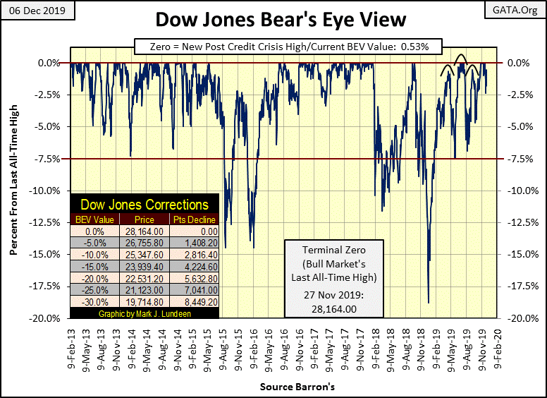
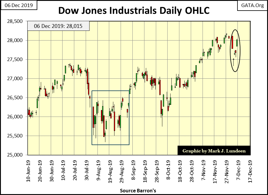
Looking at the Dow Jones in daily bars below; Monday and Tuesday saw some weakness in the market, but by Friday the market had recovered almost all of its losses. What’s next? I’m still thinking the market has more to go before it sees its Terminal Zero (TZ) in the BEV chart above – the last all-time high (Last BEV Zero) of an extended bull market advance.
The table below lists the daily BEV values of the major market indexes I follow. No new all-time highs last week, but the week closed with fifteen of these indexes in what I call scoring position; within 5% of making a BEV Zero. Twelve of them are less than 1% away from making a new BEV Zero. This is a market positioned for further advances in the weeks to come.
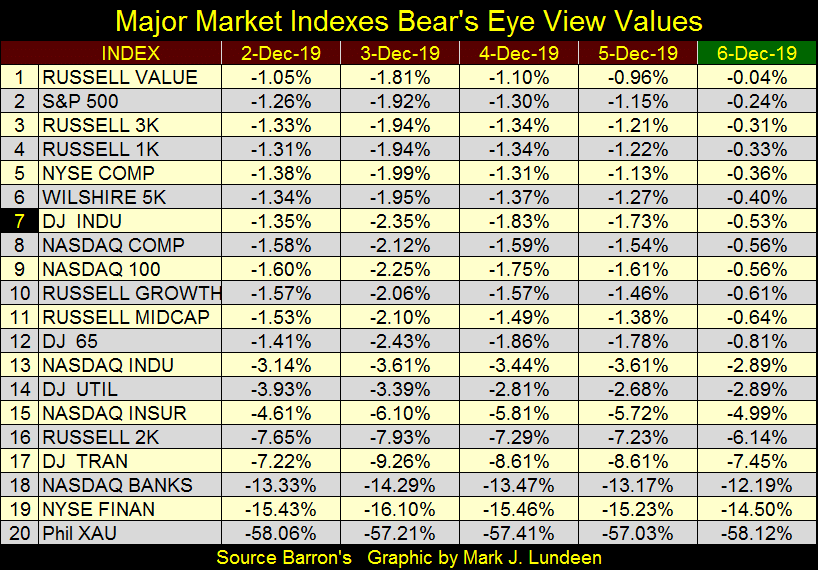
What are the chances this advance will continue? Right now the stock market is operating as a well-oiled machine, and as long as it continues to do so I’m expecting this advance to continue. But I’m looking for weakness in the financial indexes (#18 & 19 above) for a clue of pending disaster in the stock market. Should their BEV values slip below -20% it wouldn’t be a positive for the market. Seeing the XAU begin an advance toward its -30s would also indicate that flight capital is beginning to flow towards precious metals assets.
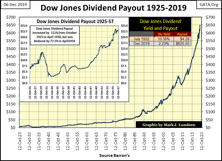
No sign of anything like that yet. Looking at the dividend payouts for the Dow Jones below; this week ended with the Dow Jones paying out $636 in dividends. Earnings also continue to increase. These trends in dividend payouts and earnings are driven by monetary inflation flowing from the Federal Reserve, but then so are the gains in the Dow Jones’ valuations, and no one is complaining about that.
So everything is coming up roses, right? Yes, but there is a disturbing trend now developing with the Federal Reserve’s balance sheet we all need to follow.
We all knew it; that our “monetary-policy makers” would never admit they had begun a fourth round of quantitative easing, as seen three times during and following the 2007-09 sub-prime mortgage crisis. Here’s what Federal Reserve Chairman Powell said in an October 8th press conference:
“While a range of factors may have contributed to these developments, it is clear that without a sufficient quantity of reserves in the banking system, even routine increases in funding pressures can lead to outsized movements in money market interest rates. This volatility can impede the effective implementation of - monetary policy -, and we are addressing it.
“Indeed, my colleagues and I will soon announce measures to add to the supply of reserves over time.
* "I want to emphasize that growth of our balance sheet for reserve management purposes should in no way be confused with the large-scale asset purchase programs that we deployed after the financial crisis.”*
- Federal Reserve Chairman Powell. 08 October 2019
Ya right. Reminds me of something Robert M. Bleiberg warned Barron’s readers of in June 1979: forty years ago. As somethings never change, for my readers in December 2019 I’d keep the following quote in mind as we progress towards 2020.
“To serve as a central banker, as BARRON’S again reminded its readers early last year when G. William Miller took over at the Fed, one needn’t be a flim-flam man, but it helps.”
- Robert M Bleiberg: Barron’s Managing Editor, 11 June 1979
What’s interesting is a month prior to the Federal Reserve Chairman Powell’s statement above, the Chairman of the SEC also made a public statement:
“A ripple of anxiety ran through Wall Street on Sept. 9 when Jay Clayton, chairman of the SEC, warned that corporate debt now stands at $11 trillion, half the annual gross domestic product of the United States. "Should we be cognizant of the growth in corporate debt, who holds that debt and the potential ramifications for our markets and our economy?" Clayton asked. "Of course we should."
- Hollywood Reporter, 5:15 AM PDT 9-Oct-2019 by Stephen Galloway
For my readers’ information: the banking system has plenty of “reserves.” What they don’t have are “reserves” that haven’t been trashed. Reserves that can be sold by one bank to another as these banks are still stuffed to the gills with abandoned mortgages from the 2007-09 mortgage debacle. These illiquid “assets” have never been written off, as they would have in days-of-old, because if they had been the global banking system would have ceased to exist as we know it a decade ago.
So the banking system’s current reserve base can’t be sold, or used as collateral within the banking system itself. Ten years after the mortgage crisis the banking system remains mired in a decade-long malaise, and that’s why I believe the Federal Reserve was forced to begin what they don’t call their QE4.
Be-that-as-it-may-be, two months following this reassuring announcement of the Not QE4, it has only become more evident that whatever they choose to call it; a new round – the FOMC’s fourth round of quantitative easing has begun.
What does that mean? Not what Chairman Powell would have us believe, that the FOMC is “managing” its balance sheet; but rather their balance sheet is now managing the FOMC. In other words it’s what Richard Russell said long ago in the early 1990s: “inflate or die.”
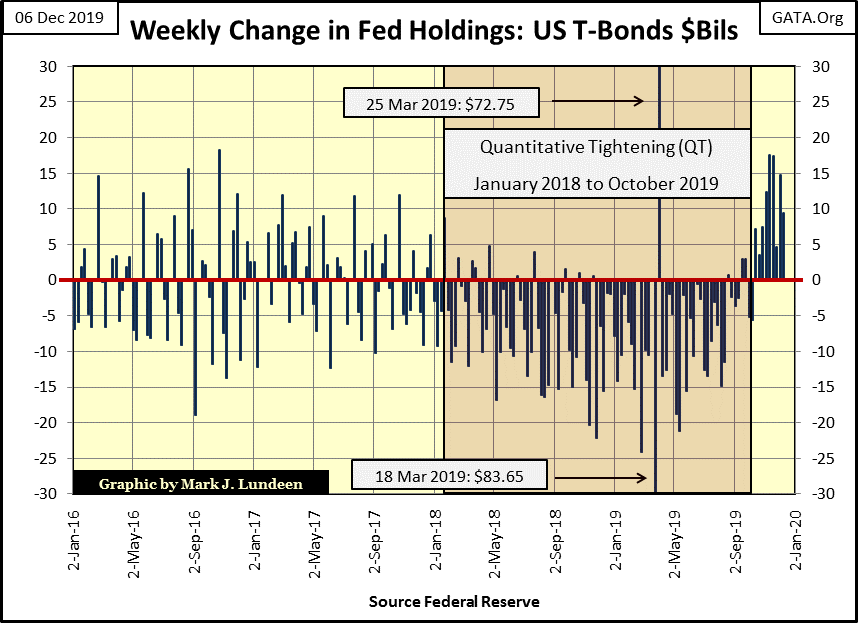
The impact of the three previous bouts of QE on the Federal Reserve’s balance sheet is painfully apparent in the chart below. And the FOMC’s attempt to drain its balance sheet of the “liquidity” they had taken on since late 2008, beginning in January 2018 with a quantitative tightening (QT) is also there to be seen. But beginning in mid-October they stopped liquidating their holdings of US Treasury debt, and once again begun buying.
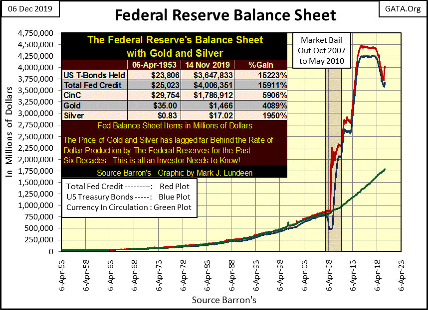
It’s not just Uncle Sam’s IOUs (Blue Plot above & below) the Federal Reserve is “monetizing”, the FOMC has also increased their portfolio of mortgages (Red Plot above) at an even greater rate. Is this an early indication of growing problems in the housing market? In a housing market whose valuations have been inflated far beyond what most prospective homeowners can afford, someone has to “support valuations” in the housing market, and that someone is the Federal Reserve.
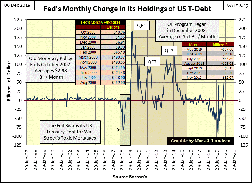
Next is a chart of the monthly changes (in billions) in the Federal Reserve’s holdings of US Treasury debt, or their “monetary reserves.” In November they “monetized” an additional $52.07 billion of Uncle Sam’s IOUs.
Looking at the FOMC’s “monetary policy” previously to 2008, where on averaged they “monetized” only $2.98 bil a month, we see “monetary policy’s” reaction to financial crises: oversized activity in the US Treasury Market as seen in their QE1-3. That’s just a historical fact. So how should we understand the large purchases of Treasury debt by the FOMC beginning in October and now again in November?
Using the same data, but on a weekly basis as seen below, this was the ninth week of the Federal Reserve’s Not QE4.
The table below lists the weekly purchases / sales of US Treasury debt by the Federal Reserve since the last week of August, with the Not QE4 beginning immediately following Fed Chairman Powell’s October 8th announcement.
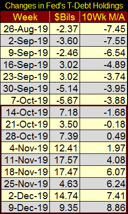
I took a 10 Wk Moving Average of the weekly changes in the Fed’s Treasury holdings since 1995, the same data seen in the far-right column above, and plotted it in the chart below. I find this chart fascinating.
Is there anyone who doesn’t know the NASDAQ High-Tech bubble of the 1990s, as well as the following housing / mortgage bubble (2002-07) weren’t bubbles inflated into these markets by the Federal Reserve? These were HUGE HISTORIC MARKET BUBBLES, yet look the tiny amounts of Treasury Debt the Federal Reserve had to monetize from 1995 to 2007 to fund these massive inflationary bubbles in the financial markets.
From May of 1995 to December 2007, on the 10Wk M/A basis seen below, the maximum amount of Treasury debt monetized was only $2.61 billion dollars in a single week during this historic inflationary epoch. This was when being a central banker was fun, when Alan Greenspan was one of the most admired and recognizable men on the planet for all the wealth global investors were racking in.
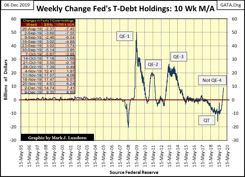
Then beginning in January 2008 the FOMC began being pushed around by its own balance sheet. What do I mean by that? That the unanticipated consequences of the Greenspan Fed’s low interest rates and easy-money policies began degrading the banking system’s credit standards and so their assets. Here is a quote from the Wall Street Journal from May 2005:
"Despite the opinions of old sages, many economists led by Federal Reserve Chairman Alan Greenspan see the expansion of credit to lower income families as a sign of progress. Some speak of the 'democratization' of credit. In an April speech, Mr Greenspan said that in colonial times through the late 19th century, only the affluent had access to credit and rates were high. --- Now, Mr. Greenspan says, 'Innovation and deregulation have vastly expanded credit to virtually all credit classes."
-WSJ 17-May-2005
And when the Federal Reserve extended trillions-of-dollars of credit to” virtually all credit classes” to purchase single family homes at greatly inflated prices, disaster resulted when the housing bubble popped in 2008 and an entire asset class (mortgages) became toxic. This forced the Federal Reserve to use its balance sheet to shield the banking system from a self-inflicted catastrophe.
The first evidence of that in the chart above was the huge draw down in the Federal Reserve’s Treasury Reserves (January – May 2008) as the FOMC had to swap its T-debt for Wall Street’s toxic mortgages to “save the banking system.” That was followed by Doctor Bernanke’s three rounds of QE with which he halted a historic market crash in stocks, bonds and real estate valuations and ultimately reflated valuations in the financial markets.
This gluttony of “monetizing” Uncle Sam’s IOUs ceased in 2015. Then in January 2018 the Federal Reserve attempted to shed some of the “monetary reserves” they had taken on during the panic with a QT. But all that stopped in early October of this year with the implementation of Chairman Powell’s Not QE4.
Take a good look at the spike in the chart above that Powell’s Not QE4 has created. This is a HUGE market intervention taken on by the FOMC. They don’t do something like this unless they are forced to by circumstance the public most likely are not aware of, just yet. I’m thinking we are looking at the beginnings of something historic, historic in no positive sense of the word – Tick Tock goes the clock.
So, it must be time for something, and for retail investors I think it’s time to sell some of their stocks into our current strong market, and use the proceeds to take a position into gold and silver bullion.
I know I’ve been saying this for years, but patience is a great virtue in the market. However, it’s just a fact that best-market practices are to sell into strength and buy on weakness. Historically, retail investors refuse to sell until the market finds itself deep into a bear market and they also tend to buy at market tops. Selling the stock market at this time, and taking a position in gold and silver would break this unprofitable cycle.
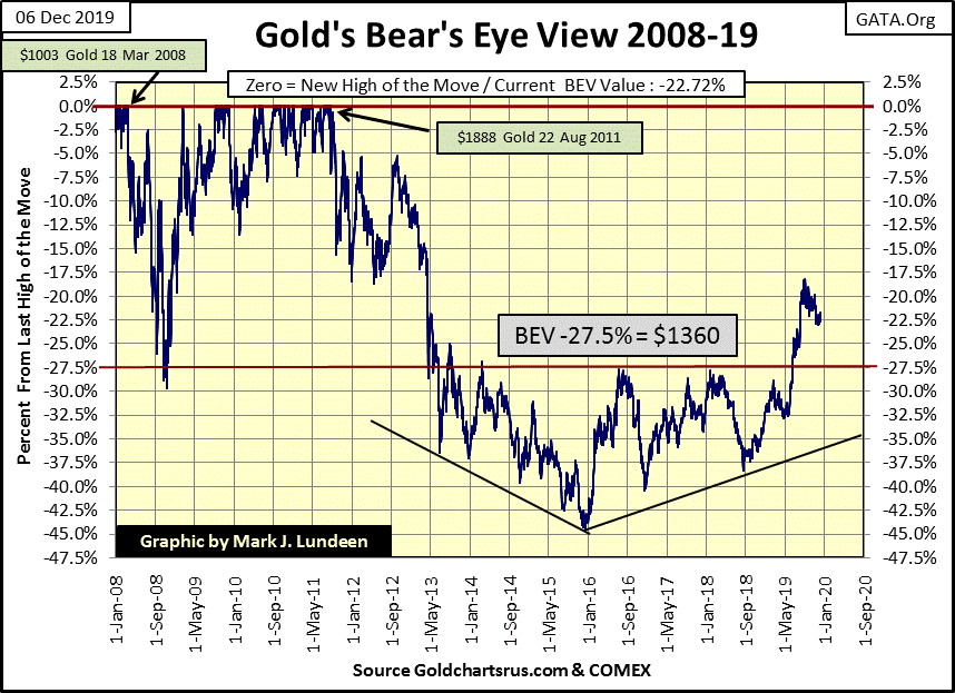
Below is gold’s Bear’s Eye View (BEV) chart. Since September 2018 gold has seen a nice advance. There was the correction of early 2019. That done gold resumed its advance in early May until early September, where it now is in its fourth month of the current correction. Just looking at this BEV chart, I’d say it’s time for gold to resume its advance to much higher prices.
But there is more to the gold market than the above BEV chart. There is the chart of the price of gold (Blue Plot) along with its COMEX open interest (Red Plot) seen below. Rising OI represents an increasing amount of phantom gold promised for delivery at the COMEX gold market. Though this promised gold will never be delivered, it still impacts the price of gold as a rise in supply would. This is because most longs in the gold futures’ markets aren’t interested in the 100 ounce bar of gold each contract represents, but only in the price changes in dollars those bars represents in the daily trading at the COMEX.
We see below why gold began its current correction in early September. Since May OI had increased by a huge 180,000 contracts; each - promising to deliver - 100 ounces of gold to the COMEX stopped the advance.
Since then the shorts have continued piling on their supply of gold they will never deliver to the market, and as they did the price of gold did correct. But not by much as $1450 has - so far - proved to be a solid floor since the end of October.
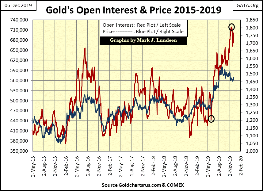
Exactly how this will play out I don’t know. Best case for us bulls in the gold and silver markets would be for the stock and bond markets to begin a major correction leading to a big jump in the price of gold, forcing these shorts to close out their contracts at a huge loss. But sadly, typically what happens is that COMEX open interest collapses along with the price of gold, as happened in 2016 in the above chart.
Should that happen it wouldn’t be a fatal event for the bulls in the gold market; just another correction in a continuing bull-market advance in the price of gold.
Another bearish factor for the gold market is currently it’s in a bear-box in the step sum chart below. What’s a bear box? A bear box exists when market reality (Blue Price Plot) is declining as market sentiment (Red Step Sum Plot) continues to advance, or trends sideways for longer than eight weeks. Gold’s current bear box began in early September, so it’s gone on now for twelve weeks.
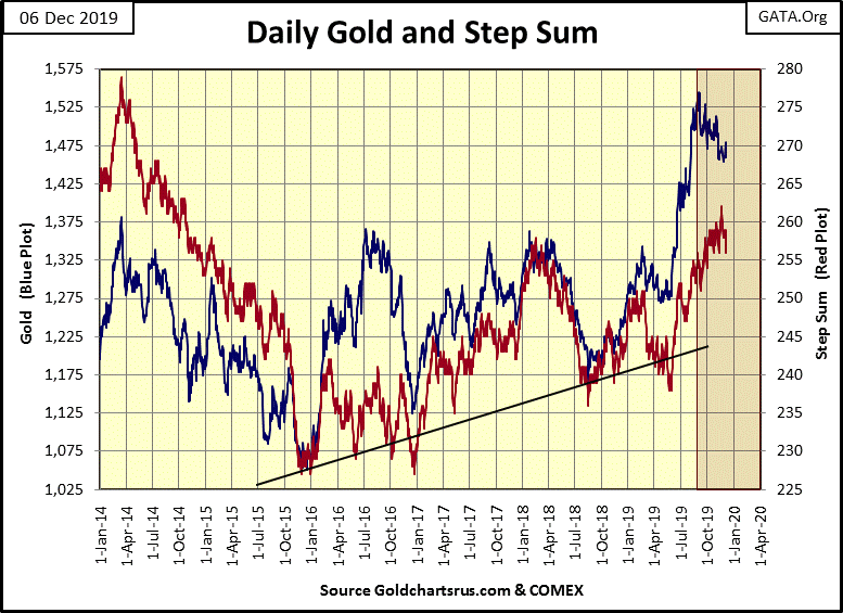
Historically, the blue-price plot is a superior predictor of future price trends than is the red step-sum plot. So I have to say chances are that further declines in the price of gold are being predicted in the chart above. How deep of a market decline I can’t say.
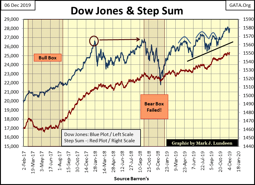
The step sum chart for the Dow Jones below is bullish. It took almost two years for the Dow Jones to clear its peaks of January 2018 & October 2018, that plus the failed bear box during last year’s 18% market correction indicates the Dow Jones is now advancing on a very strong base that can support much higher prices in the weeks and months to come. For the bulls in the stock market, we see a very pretty picture in the chart below.
All that said I still prefer precious metals assets to financial assets like stocks and bonds. With the gold market still advancing from a horrible bear-market bottom in December 2015, yet to see a new all-time high since August 2011, I think of buying gold and silver bullion at current prices as buying deeply discounted market assets.
The Dow Jones is completely different; it’s been advancing since August 1982.
Note the red circle in the chart above: the January 2018 market top, exactly when the FOMC began their QT. My charts on the Fed’s US Treasury reserves (above) also show the Federal Reserve began their Not QE4 in early October. Within a month the Dow Jones once again began making new all-time highs, eleven of them since the end of October.
Why be bearish on the stock market when it’s obvious the FOMC is having success inflating valuations in the Dow Jones? But the Dow Jones has been advancing since August 1982, when Dow Jones 1,000 seemed like an impossible dream. After a thirty-seven year advance, inflating the value of the Dow Jones by 27,000 dollars, for the bulls the grass just has to be greener somewhere else.
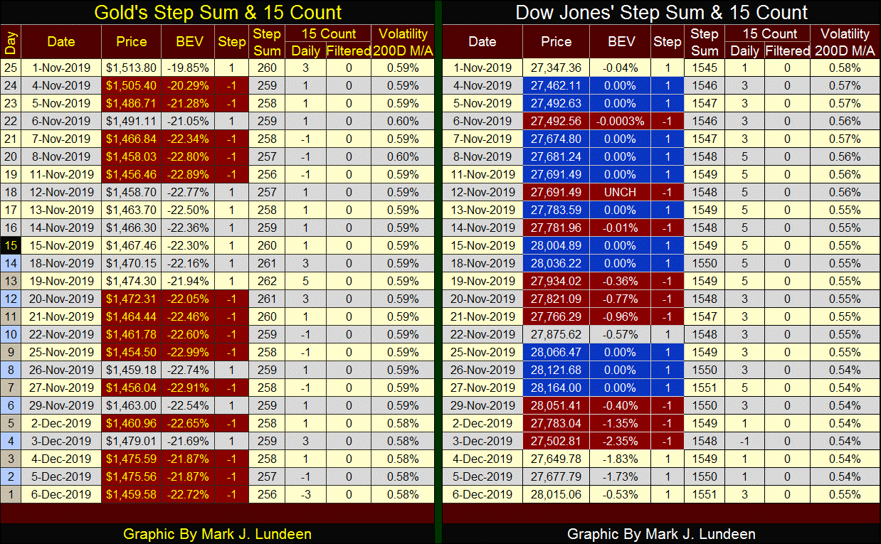
In gold’s step sum table below we see lots of selling; but its 15 count closed the week at -3, so the market isn’t oversold. Still I have my fingers crossed that $1450 will hold until the price of gold once again begins advancing.
The fact is for gold, as for the Dow Jones and anything else sees about as many up as down days in bull or bear markets. Look at the table below. On the table’s right lists possible values for a 15 count, as well as how many advancing and declining days in a running 15 day sample for any particular 15 count from +15 to -15.
The frequency distribution table (left table) lists the number of days each count has seen since January 1900. The range spanning from +3 to -3 includes 67% of its daily closings, this range of counts really don’t tell us much of what the Dow Jones or of gold is doing.
However, when the 15 count exceeds a + or – 3, the 15 count can be useful as a measurement of a market being oversold (counts of -5 or less) or overbought (counts of +5 or more).
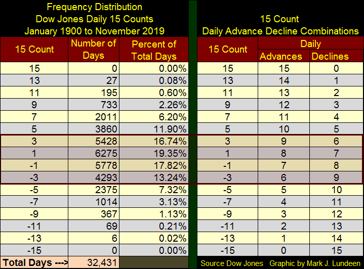
Double-digit 15 counts are rare-market events that can and do signal an impending major market event.
In November 2015, weeks before the gold market saw the bottom of the bear market that began in August 2011, gold saw a 15 count of -13 on 17 November 2015. Silver saw a 15 count of -15 on 18 November 2015. These were extremes in bearish market sentiment that occurred just days before this four-year decline bottomed, signaling the beginning of a market advance in gold and silver that continues to this day.
The 15 count for the Dow Jones in the summer of 1929 saw a series of double-digit counts, spiking at a +13 on 08 July 1929. The Roaring 1920s bull market peaked two months later. Surprisingly, at the Great Depression market bottom of July 1932, the Dow Jones 15 count remained between +3 & -3.
I guess by July of 1932 everyone had left the stock market, considerable poorer than they came into it. Too bad, as a year later (July 1933) the Dow Jones saw its best year in history; a one year advance of 163.63%.
Mark J. Lundeen
********


